There are a lot of great Divi designs across the web. One thing that makes many of the best Divi themes stand out is section divisions. Section divisions are a great way to add some visual flare to your website. The best way to add them is with CSS styling, but you don’t have to know CSS to add them to your Divi website. You can use a plugin called Section Style Manager Pro.
Section styling adds unique ways that sections separate from each other. Standard sections are straight across. Styling can create unique angles, boxes, circles, triangles, and more. Even something as simple as an angle can make your website stand out and look more interesting. In this plugin overview we’ll take a look at the styles available in Section Style Manager Pro and see how easy it is to use.
Section Style Manager Pro is available from: Bolt Themes
Inspired by Divi Module Editor and the selection of separators on CodDrops, the plugin provides an easy way to add CSS styling to create 28 unique separators for the sections of your Divi website.
The plugin adds CSS classes that you can then assign to sections using the proper CSS Class. You don’t have to know CSS or even what the classes are. You just select the style you want from the images it gives you on the screen. All you have to know how to do is paste into a field.
Section styles include:
- 3 triangle
- 3 diagonal
- 3 half circle
- 2 round split
- 3 angle
- 2 sliders
Advanced includes:
- Boxes
- Castles
- Dots
- Double lines
- Folded corner
- Inczigzag
- Multiple triangles
- Rounded edges
- Slit
- Transparent big triangle
- Transparent small triangle
- Zig zag
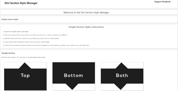
After uploading the plugin a new link is added to the dashboard menu called Section Styles. This opens the menu screen where you can see the available styles and the instructions on using them.
Using the Styles
First, in the plugin’s page in the dashboard click on the style you want to use. The CSS class for that style will automatically be copied to your clipboard.
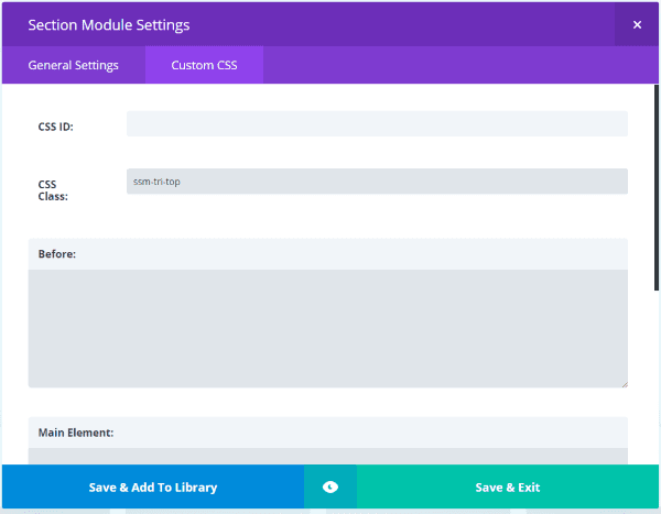
Next, go to the section that you want to have the style. Go into the section’s settings, select Custom CSS, and paste into the field called CSS Class.
Finally, click Save & Exit and update the page. The style is now added to that section.
Examples of Regular Section Styles
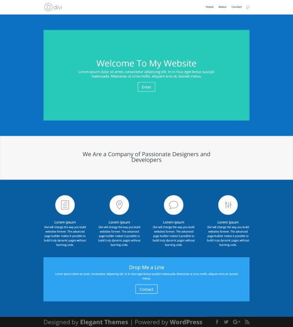
In order to create examples I made a test page using the Homepage Basic layout from the Divi Library. The second section is a full-width header with text. This is the section where I will add the styles. To help this section stand out I’ve styled the sections above and below in blue.
Now, let’s look at a few examples.
Triangle Sections Top
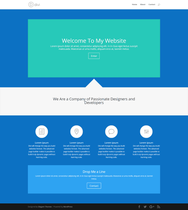
Here’s a Triangle Section. This one places it the triangle on top. It’s also available on the bottom, or on both the top and bottom.
Diagonal Sections Both
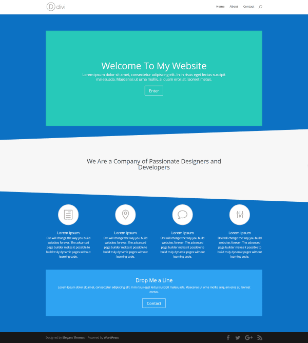
The Diagonal Section adds a diagonal slope either on the top, bottom, or both. This one uses both.
Half Circle Sections Bottom
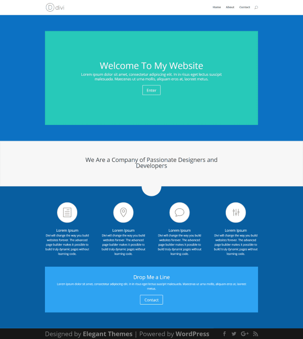
This one places a half circle on either the top, bottom, or both. This one places is on bottom.
Round Split Sections Curved Top
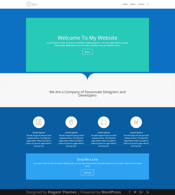
This is the Round Split style with curved top. It also has an option for a curved bottom.
Angle Both
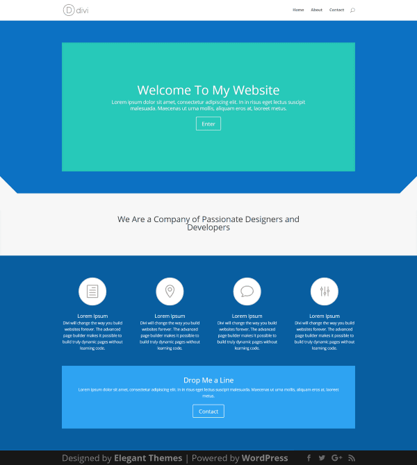
The Angle style places an angle on either the left, right, or both at the top of the section. This one uses both.
Sliders Full Screen
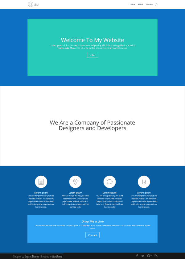
This style works with full-screen sliders, allowing you to easily make a slider to horizontally take up the full screen or half the screen. This one is a full-screen slider.
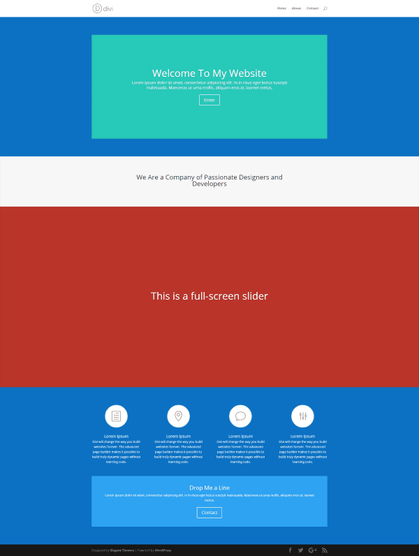
If you have something else in the section, that module will not show as full or half screen. In the image above, the original row and the slider are in the same section. I’ve styled the background of the slider so it stands apart.
Styling the Background
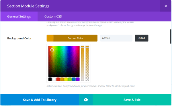
To style the background simply select a background color in the section. The styles will automatically match the background color styling.
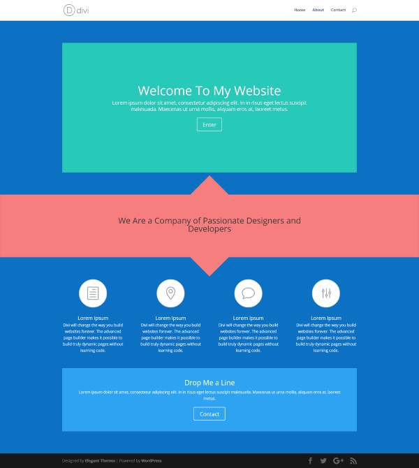
This one uses triangle for both top and bottom.
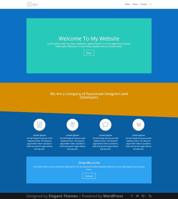
This one uses a diagonal section on the bottom.
Using Images
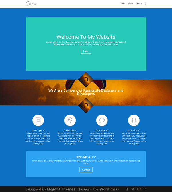
Although it was only intended to work with color backgrounds it does work somewhat with images, but it reacts differently than anticipated. Using trial and error you might get some interesting effects. Parallax turns off the styling. To be fair it wasn’t their intent for me to use it with images, so this isn’t a negative on the plugin, but I had to experiment and I think it’s worth trying. I do recommend testing your images in several browsers though if you do decide to try it.
Advanced Section Styles
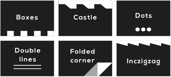
The Advanced Section Styles adds an extra level of customization – they have more complex patterns and they can be customized using the Theme Customizer.
SSM Advanced Theme Customizer
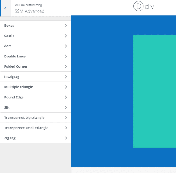
A new tab called SSM Advanced is added to the Theme Customizer and includes a tab for each of the Advanced Section Styles. Here you can adjust colors for each of the styles independently. These are global customizations, meaning these adjustments will appear everywhere that style is used.
Boxes
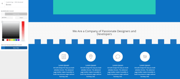
Boxes gives you adjustments for two colors, which is great for creating a castle wall effect. In the example above I used the colors from the current section and the section below it to tie the two sections together.
Dots
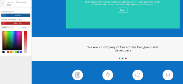
You can style the before and after dots one color and style the middle dot another color.
Double Lines
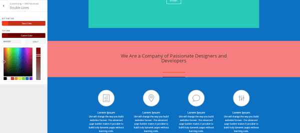
The Double Lines can be styled independently. Here I’ve used two variations of red to go along with the section’s background color.
Folded Corner
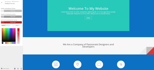
Here’s a look at the Folded Corner. I found this one difficult to style because it really only works if you style the corner to match the section. I’ve styled the top of the corner a touch darker than the color of the section in order to make it stand out a little. The backside of the corner is much darker and the area under the section is a different color completely. To help make the reader’s eye perceive the red as under the section I could style something else in that section to look as though it were peeking through.
Inczigzag
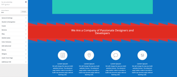
Inczigzag makes some interesting effects. I’ve made the bottom background color match the previous and next section background colors to give the effect of this section overlapping them.
Multiple Triangle
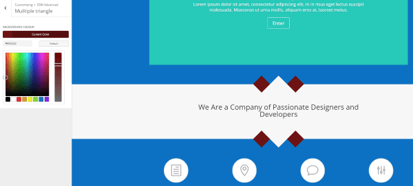
Here’s a look at the Multiple Triangle. I added a dark red background color to make it stand out.
Slit
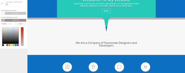
Here’s a look at Slit. It places a large band across the top of the section and has styling for two colors. I made the main background match the section and the second background a darker version of the main color.
Transparent Big Triangle
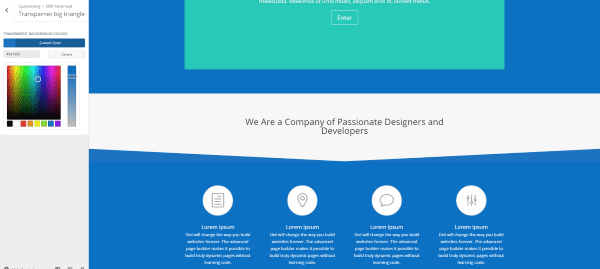
This is the Transparent Big Triangle. To style it I used the same color as the section under it to create an interesting down-arrow design.
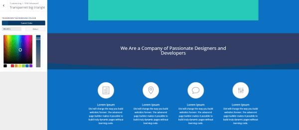
In this one I’ve added a dark blue background to the section and used a slightly lighter blue for the transparent background color.
Transparent Small Triangle
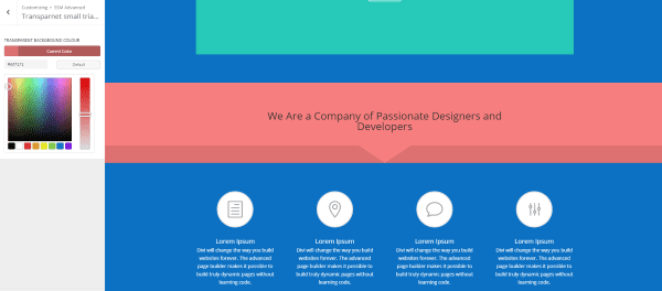
Here’s the Transparent Small Triangle with styling with two variations of the same color.
Front End Builder
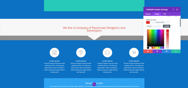
Since the plugin just gives you an easy way to add pre-made CSS classes to your sections it doesn’t actually have any code to conflict with or be restricted by the front end builder. You can still adjust your section styling using the front end builder just like any section.
The styling for the CSS will have to be done from the Theme Customizer, but it can all be adjusted from the front end. As expected you can paste the CSS Class into the proper field from the front end. If you prefer to use the front end builder you won’t have any problems using Section Style Manager Pro.
Using it with Extra
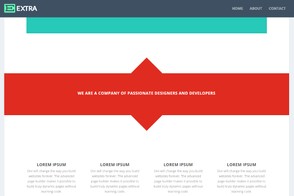
It works well with pages and posts in Extra. The category builder did give me some problems with formatting. I recommend trying different styles to see what works best for your design.
License, Documentation, Updates, and Support
Section Style Manager Pro can be used on unlimited websites for you and your clients.
The plugin includes free lifetime updates. Updates are done automatically and a link is added to the plugin in the list of plugin’s where you can check for updates.
Documentation is provided on the page in the dashboard and covers how to copy and where to paste the CSS Class, and how to style the advanced styles using the theme customizer. There are two video tutorials on the plugin’s sales page to step you through using both types of styles.
Lifetime support is provided through email. You can also email them with pre-sales questions.
Final Thoughts
Section Style Manager Pro provides an easy way to add 28 section division styles to your website. You’ll need to paste the CSS class into the section you want it, but being able to choose from multiple styles just by clicking on the class you want in the dashboard screen simplifies the CSS styling process. No programming required… simply click and paste.
You can use the styles on as many sections on a single page as you want, but I recommend only using one style per section. Using two styles might cause them to conflict. The plugin is light, so there’s no extra strain on your website.
All of the styles use the section’s background color and blend in perfectly. The advanced styles provide multiple layers that can be colored individually using the Theme Customizer. It’s easy to match your website’s color pallet or your own branded colors.
It’s available from Bolt Themes (found here: Divi Section Style Manager Pro). If you just want the basic styles and the two slider styles you can give the free lite version a try (found here: Divi Section Style Manager Lite).
Have you tried Section Style Manager Pro? Let us know what you think about it in the comments below!
Featured Image by Lesia_G / shutterstock.com



This is a great little plug-in. Unfortunately I wanted to re-produce the styled “shout-boxes” above and it is unable to do that. How did you produce them? I am sure that would make an interesting article
can it change the header section like on this site
https://joshflagg.com/
I like the theme but a lot of the shortcuts and codes should be added to Divi itself.
This is Thankful!
it’s no code css for Divi Section Style Manager Lite
merci
Excellent work. I already Purchase Divi Theme. Please share Video tutorial for the divi theme..
Wow. I always admire seeing those fancy section designs on Divi websites but never felt bold enough to experiment with them myself. This plugin would make it easy! 🙂
I have a problem to copy css [Wacom Pen]. It’s a problem to display somewhere a list of css class, please? Thank you.
Hi Deana, please send me an email and I will send you an email in the next 24 hours with the list of css classes
Thank you James, I already sent email address via contact on Bolt themes site.
Thanks Randy for reviewing my plugin
You’re welcome James 🙂
MASSIVE time saver!
This plugin review reminded me of this previous blog post:
https://www.elegantthemes.com/blog/divi-resources/15-fun-divi-section-divider-styles-you-can-use-on-your-next-project
Plugin is not a bad idea though.