Find It In The Divi Marketplace
Divi SOS is available in the Divi Marketplace! That means it has passed our review and has been found to meet our quality standards. You can visit Superfly in the marketplace to see all of their available products. Products purchased from the Divi Marketplace come with unlimited website usage and a 30 day money back guarantee (just like Divi).
Simple Overlay Solution is a third-party plugin for Divi that makes it easy to create full-screen overlays, popups, and mega menus with the Divi Builder. Add multiple overlays to any page. Choose between a click or an automatic timed delay trigger, a light or dark loader, and a light or dark background. Style the close button, or create your own background and buttons with the Divi Builder. Each overlay has a 30-day cookie.
Simple Overlay Solution
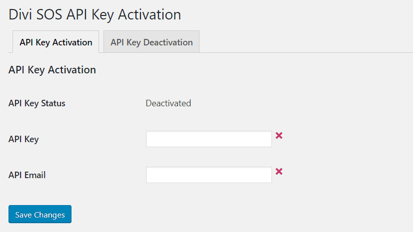
Upload and activate the plugin as normal. Then, you’ll need to activate the license. In the dashboard menu, go to Settings > Divi SOS Activation and enter your API key and email.
Import SOS Samples
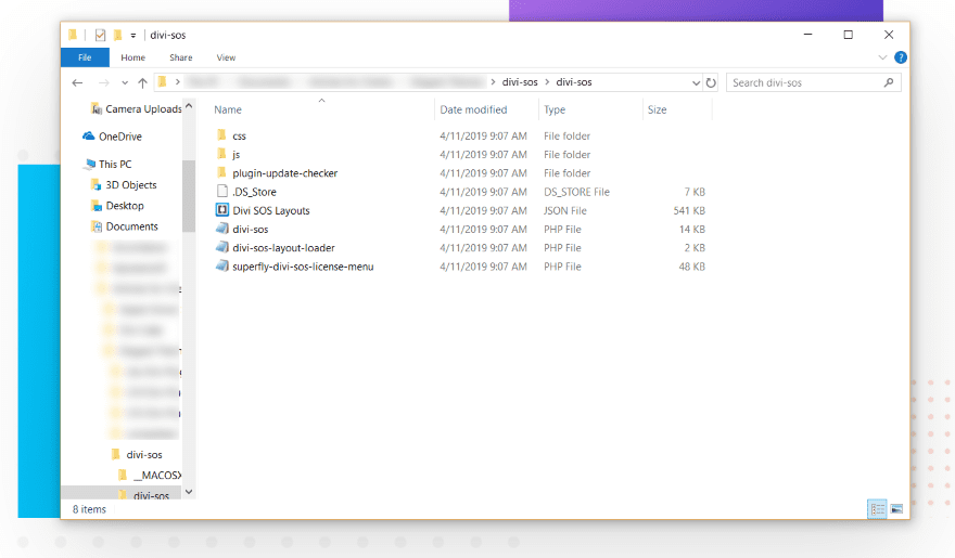
The SOS plugin comes with a set of demos as a JSON file that you can import into the SOS library. First, unzip the download file to access the JSON file. These are great to get you started.
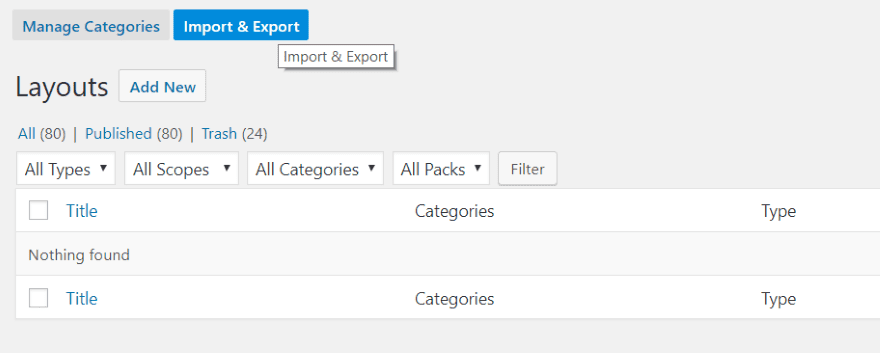
In the dashboard menu, go to Divi > SOS. Select Import & Export.
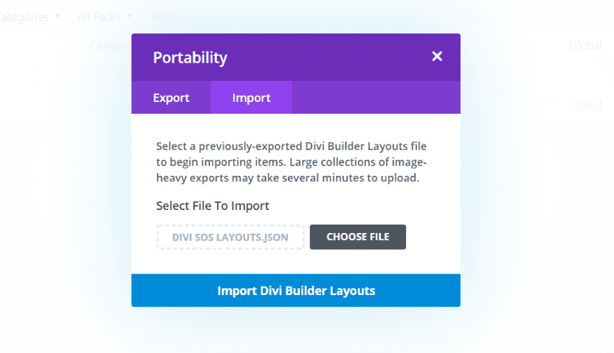
Import the JSON file like any layout.
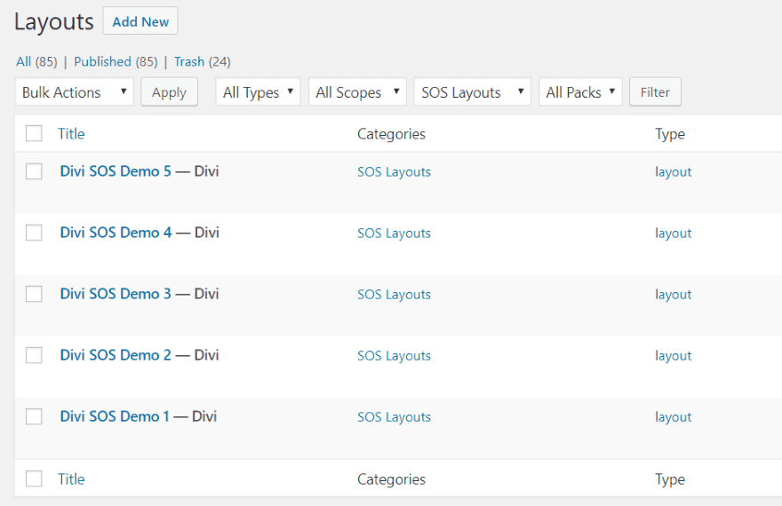
You now have 5 demos in the SOS library. You can see the demos at the developer’s website.
Creating SOS Layouts

SOS Layouts are also created in the SOS library. Go the library and click Add New.
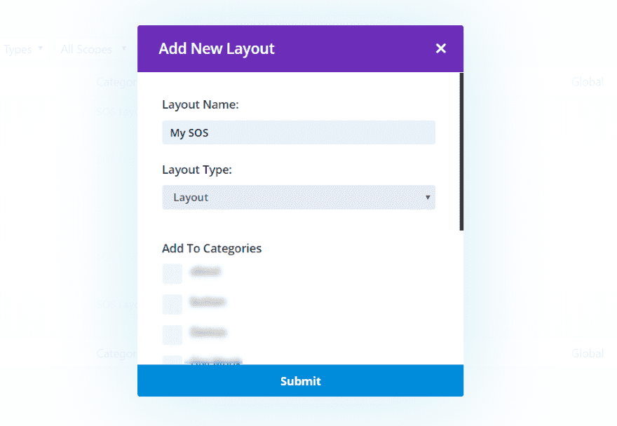
Name the layout something that makes sense to you. Choose Layout for the Layout Type.
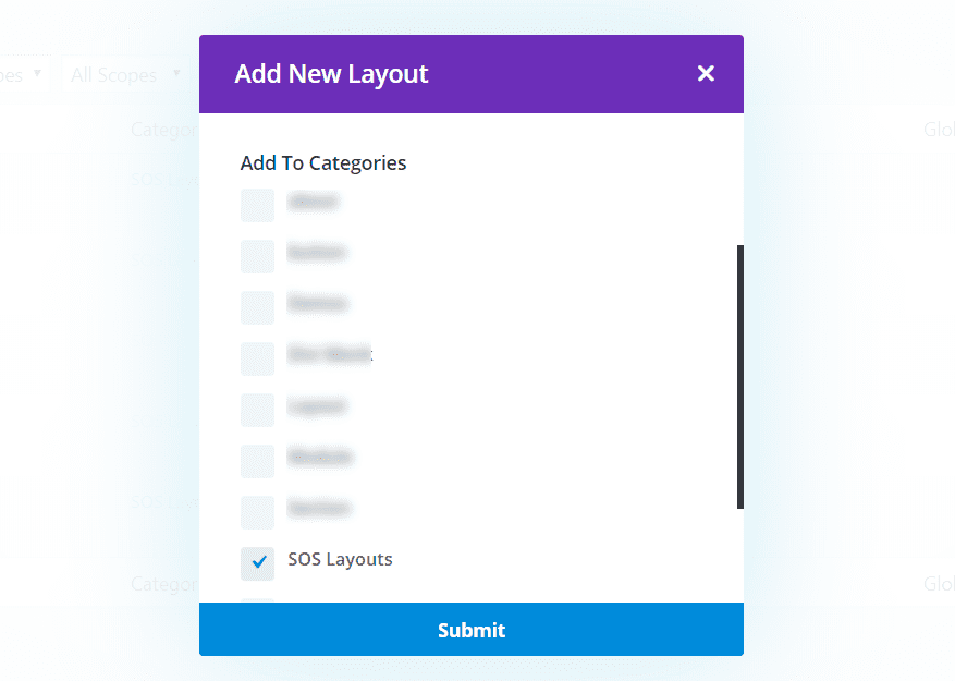
Select SOS Layouts for the category.
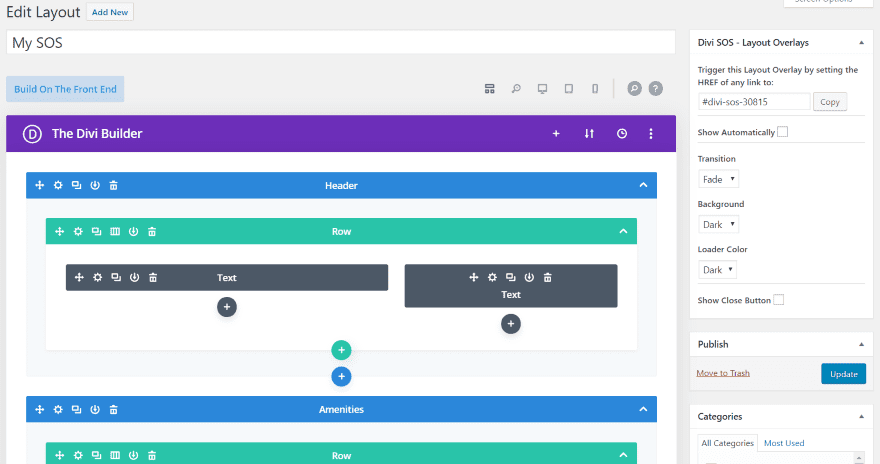
I chose a premade layout and then selected the Contact page from the Resort layout pack. To the right (or at the bottom if you’re viewing with visual mode) is the layout settings. This gives you the HREF code for the layout so you can trigger it on any page (anywhere that allows for a URL). This is the link you’ll use for buttons, text, etc., to trigger the overlay.
You can also have it to show automatically (this opens a setting for time and to enable a cookie so it knows the visitor has seen the overlay or popup). Set the transition to fade, slide, or none. Choose a light, dark, or no background. Select a light or dark loader color. Select whether or not to show the close button. You can style the button and its background.

The loader can be light or dark. Here’s the dark loader over a light background.
Example SOS Overlays
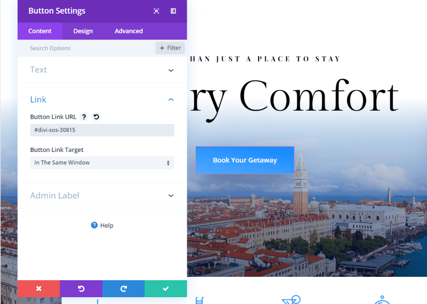
I’m creating an overlay that will show booking information when the visitor clicks on the Book Your Getaway button. Add the link to your button URL in order to trigger the overlay.
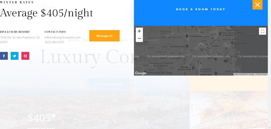
I set the section’s background to transparent, chose a light background in the SOS settings, and customized the layout to use only one of the sections. Clicking on the Book Your Getaway button opens the section to book the stay. The background includes the white overlay. I’ve also added the close button and styled it to match the layout. The layout is placed at the top of the screen and takes the full width. This can be customized with padding.
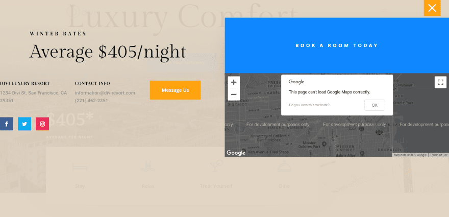
I’ve added a little bit of padding to the top of the section. I’ve also disabled the background so I can control it with the Divi Builder.
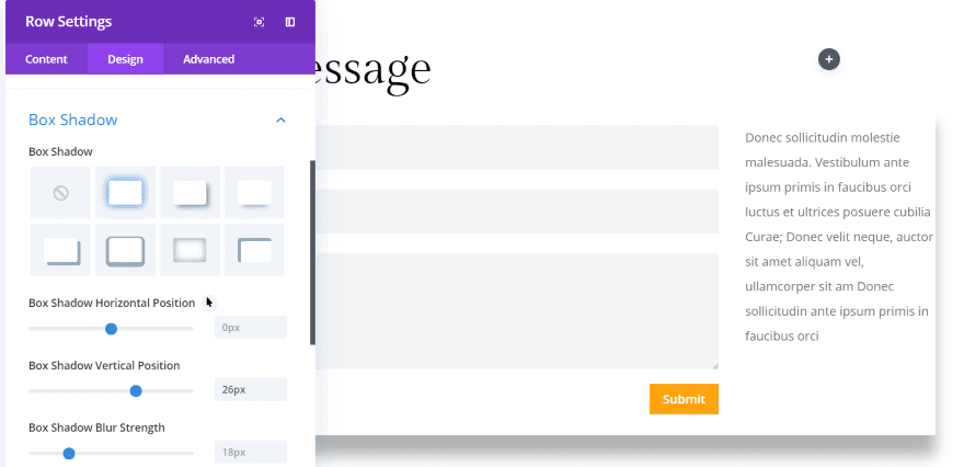
For this one, I’m using the contact form from the same layout. This time, I’ve added a box shadow to the bottom row so it will stand out from the overlay’s background.
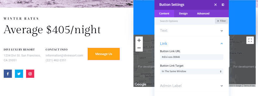
I added the link to a button on the same page as the first overlay (you can add as many as you want). This one opens a contact form when they click on the Message Us button.
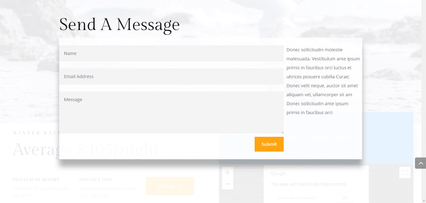
The result looks interesting. I didn’t add a close button to this one. The visitor can click anywhere off of the form to close the overlay. I’ve added a background to the row and set the opacity so just a little of the background shows through.
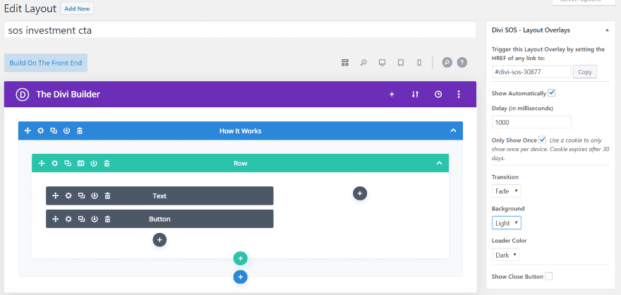
This one uses a section from the Investment Company layout. I want to create a popup with a call to action. I’ve set it to show automatically with a 1000 millisecond delay. When showing automatically, you don’t have to add the link anywhere. It automatically shows on every page. I’ve also set the cookie to only show the popup once every 30 days.
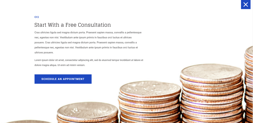
The popup shows 1 second after the page loads. This creates a CTA as a popup, and it will only show once every 30 days. You can’t tell in this image, but I also gave it a parallax background, just because. This allows you to be as creative with popups as with any page design.
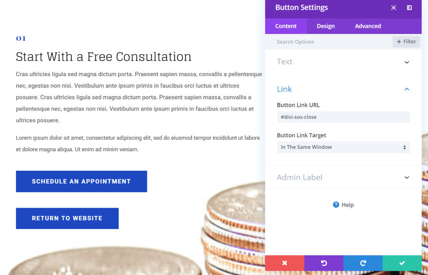
I’m moving the close option from the button in the top right corner to a button created with the Divi Builder. I cloned the button from the layout, changed the text, and added the close link to the URL.
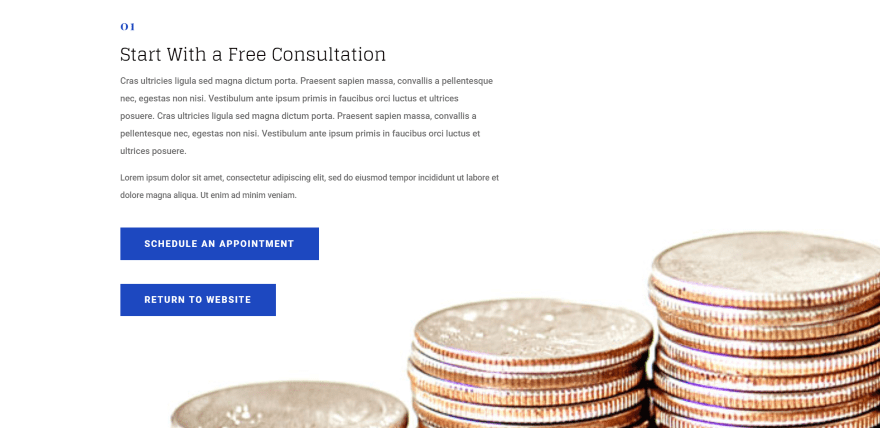
The result is a clean design that works great as a CTA.
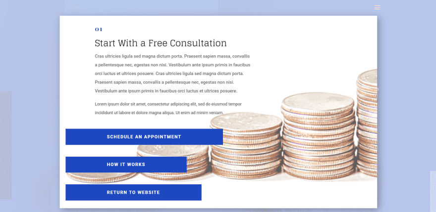
I went back to the design and added a new background and a button that opens another page.
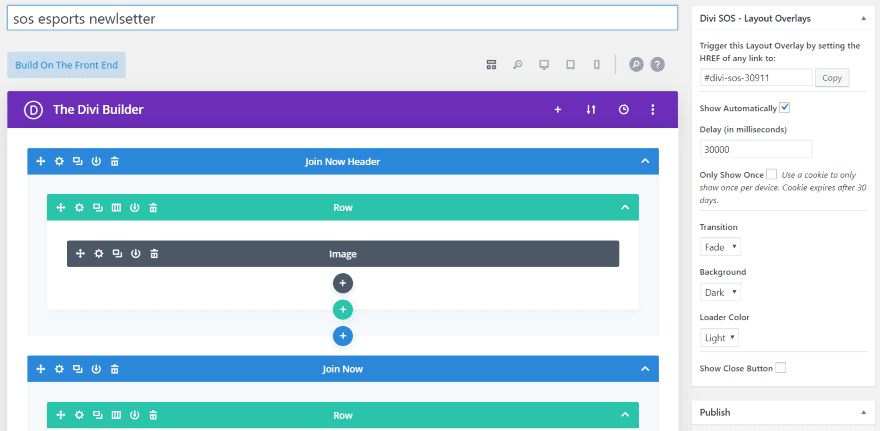
For this one, I created a newsletter popup based on the Esports layout. I’ve set the popup to open automatically after 30 seconds. The background is set to dark and the loader is set to light. I will also include a close button using colors from the layout.
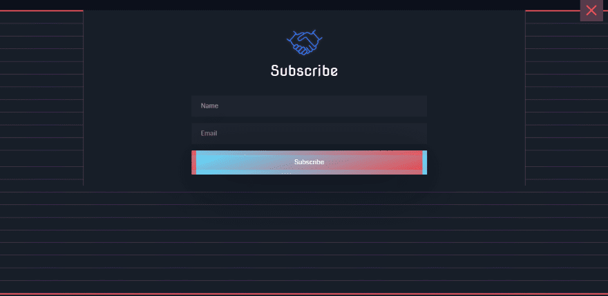
The subscribe popup looks great and fits perfectly within the site’s design because it’s actually from the site’s design. I like that it can use regular Divi layouts to create the popups.
Mega Menus
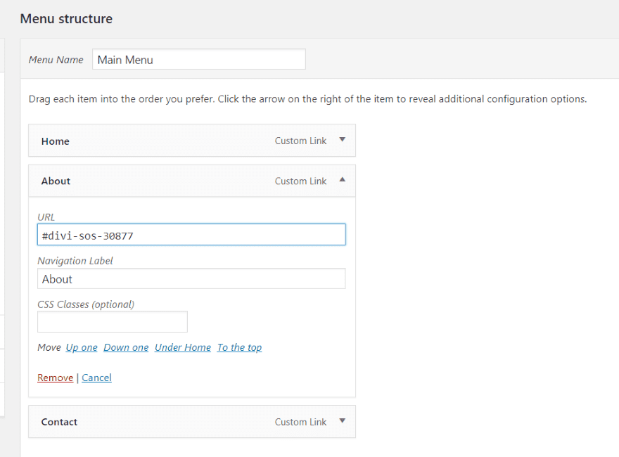
You can also create mega menus with SOS. Create a custom link as a menu item and then add the overlay’s link to the menu item’s URL.
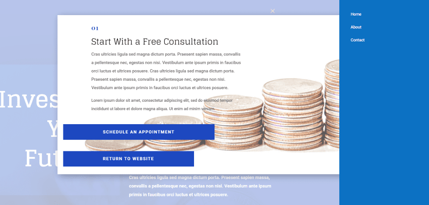
I’ve added the overlay to the About link in my slide-in menu. You can have a different overlay for every link in the menu if you want, and they can be anything you can build with Divi.
Simple Overlay Solution Price
There are two licenses for SOS. Both have a one-time fee and include lifetime updates.
- 1 website and 1 dev site – $25
- Unlimited websites – $45
You can purchase SOS from the developer’s website.
Ending Thoughts
Simple Overlay Solution is easy to use. The controls simple and intuitive. Building the overlays is almost the same as building a page with Divi. If you can use the Divi Builder you can use SOS. The Divi pages load fast because the overlays are not preloaded. Overlays and popups also load fast.
I like that it has a cookie. This gives you some control over your popups so the same visitor won’t have to see the offer every time they visit the website. I’m sure it wouldn’t be easy to do, but I’d like to see a few cookie options. For example, maybe set it to show once per week, once per day, twice per month, etc. A few loader options would be nice, too. Maybe different choices and color customizations. I’d also like the ability to exclude a page from showing the automatic overlays.
I like that a regular Divi button can be used for the close button. This opens up a lot of design possibilities and you’re not limited to using the built-in button. If you do want to use the button, it does have a lot of color options.
SOS is an easy plugin to recommend. If you’re interested in an easy way to create overlays, popups, and mega menus with the Divi Builder, Simple Overlay Solution (SOS) might be the plugin you need.
We want to hear from you. Have you tried the Simple Overlay Solution plugin to create overlays and popups? Let us know what you think about it in the comments.
Featured Image via Bakhtiar Zein / shutterstock.com


I would like Elegant Themes to make more plugins though, because they would likely be supported for a long time, vs. using plugins that may be abandoned by their authors – has happened to me. VERY annoying.
Hi There
The first thing is thanks for the new plugin tutorial.
The one thing I ask is that there be more care taken on the building of third-party plugins as they are still plugins that do not work on the front end builder after a year of requests to the developer that he needs to make it compatible to the front end builder but still nothing happens.
This just shows poor service to his customer that are buying these products.
The one I can tell you about with requests been done to rectify this is MATERIAL BLUBS and there are many more out there. There are always excuses on why it cannot be done. We as customers do not want to hear that we want solutions.
I worked in the construction business for many years and can you imagine if there was a structural problem that arose and I told the owners I do not have a solution for them to fix this, I defiantly would not last in this business.
I would like to know if Divi could stop these developers using your platform to make money with sub-standard plugins to customers and put in place more stringent criteria for developing plugins?
I hear a lot of people saying, “why isn’t this or that included with divi?”. I’d simply say this: It’s like saying Microsoft should include Photoshop in Windows 10.
Think of Divi as the operating system, and all these plug-ins as apps. That may make it easier for all those commenters to understand. ?
Thank you for all you do for the WordPress community
How does this one compare to divi overlays?
From personal experience, this one is much better. This one has all the functions for lifetime for a fraction of divi overlays price and they offer great customer support.
Hello, please pay attention to whether the comments are less and less compared with the previous ones. There are fewer comments on this type of paid plug-in. Please think about changing the business model. Please add these features directly to the theme instead of letting us pay for it. Otherwise, it will be a matter of time.
I appreciate learning about new plugins that can help my design agency grow in capacity to deliver. I don’t have the time to run aroubd reading a billion things about what’s available and wondering if it works with Divi and how I’d customise it. Hence the appreciation of curated sources of such info. Thank goodness Divi isn’t locked down to disallow development of other awesome things that compliment what they have chosen as their strongest business offering, otherwise our sites would be less because of it. We certainly subscribe to other sources of info for site funactionality tips, but appreciate ET adding in articles on this as well. We would love to see more about what and why, earlier on in the articles, opposed to scrolling a long way until we see examples of what it would actually look like, which only then informs what it’s actually for, then scroll back to the how. Would love to see more of a use based focus earlier on. 🙂 e.g. this plugin does xyz, you could use it in some of the following ways, a, b, c, d etc. Here’s what that would actually look like on a site. Now you can see the reason….. here’s how to grab it, tweak it, and oh by the way where to buy it if you want it and pricing options etc.
Anywho, I’ve included my wish list for benefits to client, in a hopefully supportive comment of all the good that ET.does, my business wouldn’t be what it is without it. Thank you.
I dont agree with this. Leave something out of Divi. What you need may not be what someone else needs.
Everything Elegant Themes builds goes right into Divi, free with the membership. Sure it would be great if we employed 10,000 people and made Divi do everything you could ever imagine, but there is no magic wand I can wave to make that happen. The fact that people are inspired to build additional plugins for Divi that add even more functionality is great. We want to support their work. The fact that a third party plugin exists does not take anything away from Divi, it only adds to it. The existence of third party plugins does not equate to a lack of features in Divi. The two are not connected.
There is room for a thriving community of Divi developers to exist. What would WordPress be without all of the plugins and themes created by the community? What would WordPress be to our community without Divi? What would an iPhone be without all of the amazing apps in the app store? Sure if would be nice if everything in the world was free, but I don’t think that’s the point.
The community is stronger when there are thousands of people dedicated to building great things for each other. Also, it’s not up to us. If people want to build great Divi extensions, and other people want to use them, then they are free to do so. We think it’s great regardless.
I definitely agree with what Nick’s saying: Divi has the strongest framework I’ve ever seen (and I’m unhappily using other famous builder for some of my clients) and was capable of creating a whole universe of small and micro companies building extensions. Divi was so good in this that at present time, releasing a bunch of new and advanced, refined, full-features modules would be devastating for those companies.
And yes, most of the themes we all have heard of come with many plugins in the box (Contact Form, revolution slider and other layered sliders, advanced carousels, advanced galleries…) but:
they all have builders miles away from the Divi builder in terms of efficiency and consistency;
they are sold on a per-website license plan which is good for the occasional developer but would be bankrupting for any pro developing dozens of sites.
And this was my yellow hat on.
But you have to switch to the black also, in order to see it from every possible perspective. And so…
I must admit that I’m a bit disappointed by recent updates in Divi. Let’s say, specifically, by the latest updates to the builder interface: it must have costed a lot of time and energies – probably, possibly – and IMHO it was not worth it: the builder interface is getting too intricated, too many things moving, too many things you can drag and change and set, and it could all rest on the properties pane insetad of gettin the live interface so confusing. Small glitches appeared, nothing so bad I would report to the support esepcially because I have no idea how tosistematically replicate them but hey, it almost looks like those recent features are there to spoil new and occasional users instead of pro and long-time ones.
It still could be ok if many other missing features would have been already implemented, but it’s not the case. And I’m specifically addressing:
more control on responsive behaviours (you have to code it down if you want those 2 cols in the row not to stack right when you go below 981px – any row layout not to change at any brakpoint – that row with visible overflow because you have something expanding beyond its borders – and so on…);
more control on where the breakpoints are and wether or not to trigger them (one example for all: you have 3 settings for desktop, tablet and smartphones, but 4 breakpoints cosidering the horizontal view of a smartphone, and no way to plan your layout in that case, something that always pushes me to use code blocks and flex scratch built layouts to define my own breakpoints);
more background options with layered multibreaks gradients, size and positioning options, layered images and some fancy effects (moving horizontally, moving on mouse move and something like this);
a more advanced gallery;
a decent carousel of, at least, blurbs, texts and image modules.
I’m kinda new to Divi, since I started working with it less than 2 years ago: I designed and deploied since, 8 commercial sites and as long as my clients let me choose I always start with Divi in mind. But this said, I think I ain’t wrong in saying that since I started with Divi, no new module was added or heavily redesigned (toggles and tabs are lacking properties and features and so the gallery is).
Just to sum it all up, I do really love Divi and am greateful to Nick’s and Nick’s staff efforts, but I kinda have the feeling that many efforts are not going in the proper direction. And since this could be heavily specific to me, I would better say: I have the feeling that all the staff efforts are going in the same way: refining (too much) the builder interface, missing any real improvement in modules and less eye-catching but more professional triggers, switched and properties.
Sorry for having been sooooo long.
yes, it is correct to some extent.. but the point is people any have, have to use some plugins with out which we cannot build a website with required functionality. This itself is crossing a dozen full of plugins in most of the cases. . we definitely choose a theme that can minimise this dependency so that it can boost the performance of the website. But if the core theme itself demands some more additional plugins which can be otherwise just a part of it .. here comes the versatility of the plugin whether to choose or not. No doubt divi is gr8 because of its every day improving and the support it is being offered and its pricing plans. But it seems it is a bit crippled when we see that we need to add one more dozen of plugins to make use of already existing features in elegant themes like category builder, builder every where, and category modules in divi modules and some core features, which is common requirement for any website like popups etc.. If they were given built in accessibility or integration i dont know, i think divi can become the first choice of other community too..
I think you are missing the point. Of course Divi would be better if we added everything our users wanted. That’s what we are working to do every day. That will always be our goal. That’s not the question here.
The question is whether or not the existence of third party plugins is a good thing, and whether or not third party Divi developers should be supported. If we get rid of all third party Divi plugins, does that somehow make Divi better? I don’t see how that could ever be the case. The existence of third party plugins is an amazing plus for the community. That’s why we promote them and are happy to see them succeed and build more great stuff.
thanks Nick for your efforts in Divi in recent improvements with out increasing its cost.. I am thankful to you and the team for making my business successful, enjoying with divi. Extending the theme functionality is always ever growing necessity and is most appreciated as it serve the purpose of website but some times when it is already with elegant themes, i could not get why it is not made accessible may be with little with tweaks from your side with out additional plugins ( builder every where, category modules..). I dont know if it is that simple.. forgive me if i am wrong..
Divi has bloom. All you could have done is add some bloom theme samples without the email part but with a CTA button. I’ve always wondered why that’s not on offer in bloom.
Well said.
I agree with Nick. Divi can’t be everything to everybody. It would start to become bloatware.
The analogy to WordPress is spot-on.
Well said Nick! Thank you for all you do for the WordPress community!