Blurbs are popular within Divi layouts. They display text, images, icons, and more, which is great for showcasing products and services. What if you wanted them to stand out more and provide some interesting hover animations? Common animations can be done through CSS, but what if you wanted something different? A plugin called Tilt Blurb Divi Module might be what you’re looking for.
What is Tilt Blurb Module?
Tilt Blurb Module is a third-party plugin from Hædworm that adds a new blurb module to the Divi Builder (for both Divi and Extra) that adds interesting tilting effects, creating a 3D look. In this plugin highlight we’ll take a look at the module and see what it can do. I’ve show a few gifs but most will be images due to the gif’s file sizes. Images for the examples are taken from Unsplash.com and from WordPress.org.
Installing Tilt Blurb Divi Module

Upload and activate the plugin as normal. In the Plugin link within the dashboard menu you’ll find a new item called Tile Blurb License. Click this, enter your license key, and save changes. This will ensure you get updates.
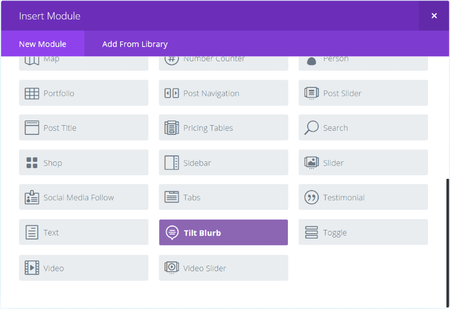
A new module is added to the Divi Builder called Tilt Blurb. It’s colored purple within the Divi Builder so it’s hard to miss. I like when developers use different colors for their modules so they stand out from the standard modules (for what it’s worth).
The module includes the standard tabs plus a new one:
- Content – text, link, image and icon, background, admin label
- Tilt Settings – tilt settings, tilt background, tilt layers
- Design – image and icon, text, header text, body text, border, sizing, spacing
- Advanced – CSS ID and classes, custom CSS, animation, visibility
Tilt Settings
For these examples I added a background and then placed a smaller image as a foreground over it to create the 3D effects. And then made coffee. Lots of coffee.
Example with Default Settings
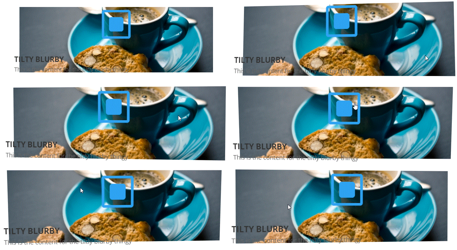
Here’s an example of how the 3D tilt looks before tweaking. I added a title, text, background, and icon. The tilt follows my mouse and sets the text and icon apart from the image giving it a 3D look. For me the parallax effect got rid of the background so I didn’t use it.
Size with Image

This sizes the blurb using a hidden image and centers the content.
Tilt Blurb Size with 2 Images with Float Content

This one includes two images – one for the foreground and one for the background. The foreground image and text are in 3D using the float content feature.
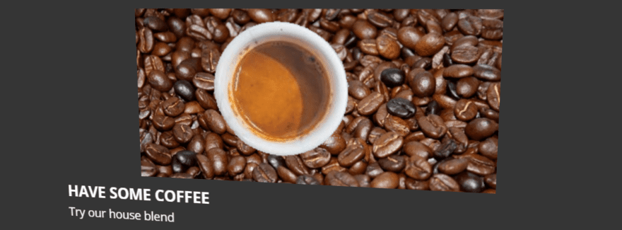
You can adjust the amount of float which works like a zoom, bringing the foreground content closer to the reader. This image uses 200 for the float amount, which is maxed out.
Tilt Amount
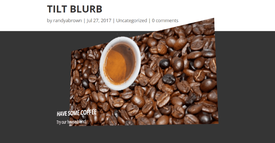
The tilt amount slider lets you control how far the image will tilt. The default setting is 20. This one uses 100.
Tilt Perspective
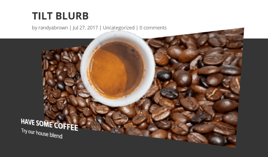
Tilt Perspective deepens the perspective. The lower the number the deeper the perspective. The default is 1000. This example is 200.
Tilt Scale
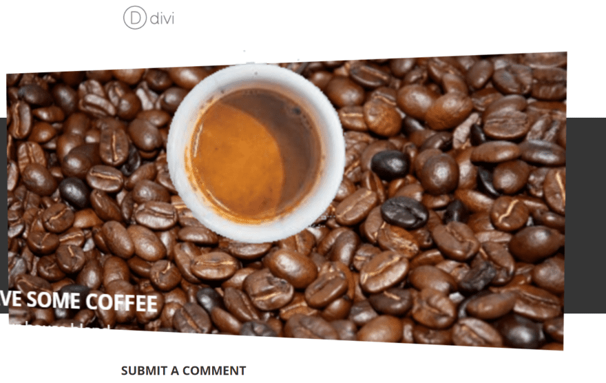
Tilt Scale is a zoom level. The default is 1.1, meaning that on hover the image is multiplied by 1.1. This example is 2. It goes to 0 but the 0 level created a continuous back and forth zoom that didn’t work for this image. It may take some experimenting to get it to do what you want it to.
Tilt Speed
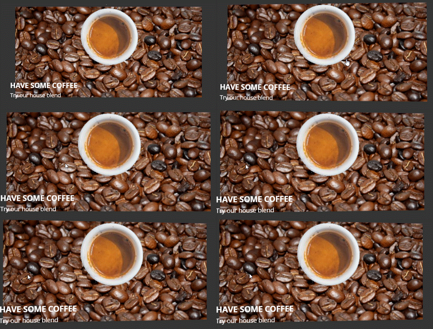
Tilt Speed controls the speed that the image moves as you hover. The lower the number the faster it moves. The default is 100. This one is 5000. I’m partial to the slow effect.
Tilt Reverse

Tilt Reverse changes the direction of the tilt. Normally the tilt moves away from the mouse. Reverse tilts the image toward the mouse.
Tilt Glare
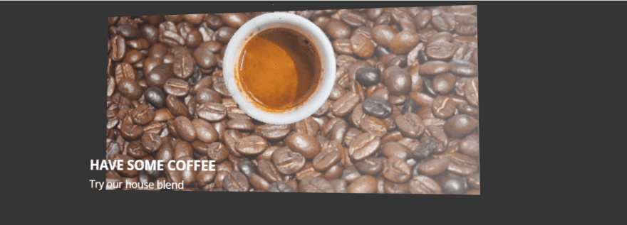
Tilt Glare adds a glare effect that follows the mouse. The glare amount is adjustable. The image above uses .8 which is the default setting. This is great for creating lighting effects.
Border Radius
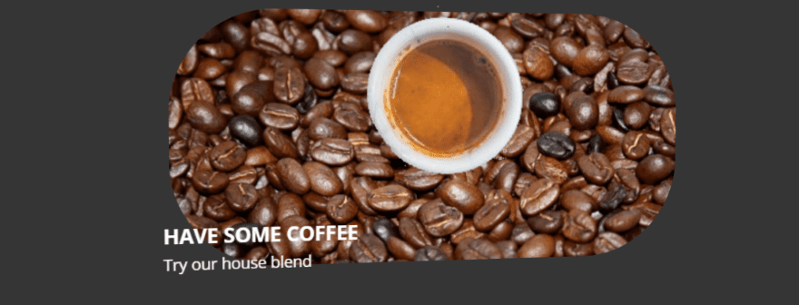
Border Radius changes the shape of the border. The default is 40. This is set to 100, the maximum amount.
Tilt Background
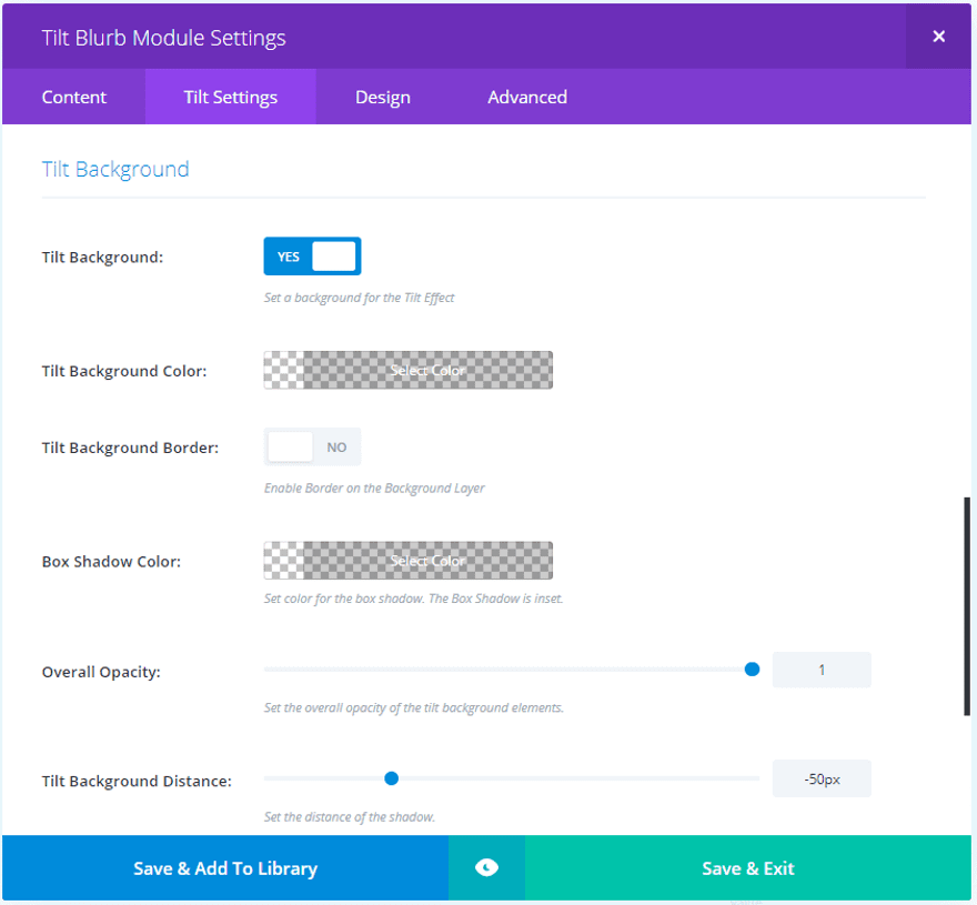
Tilt Background lets you set a background color and border effects.
Tilt Background
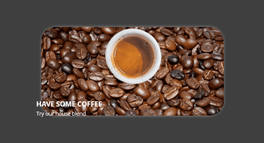
One side-effect of the Tilt Background Color is that it creates a nice glow around the image.
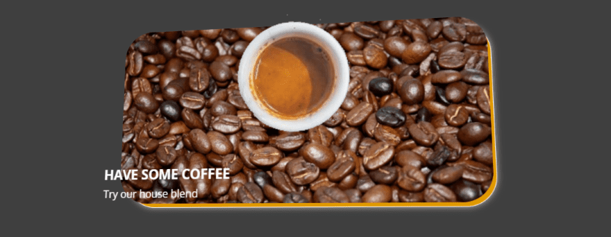
Adjust the Tilt Background color, border width, background border style, border width, and border and box shadow color.
Tilt Background Distance
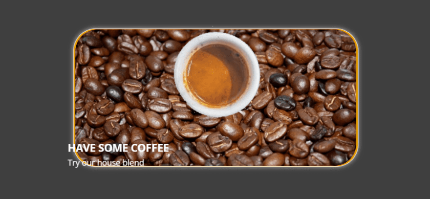
The Tilt Background Distance adjusts the distance of the shadow. It’s set to -50 by default. This example uses -25.
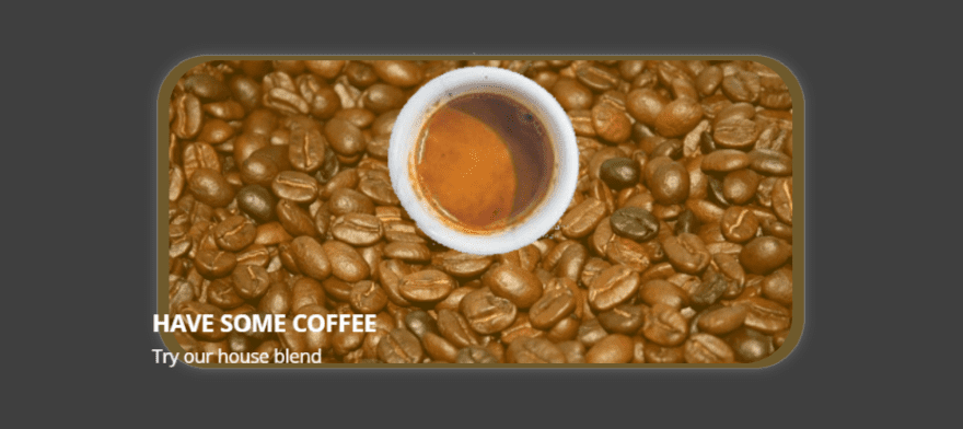
This example uses a tilt background distance of 0 and an opacity of .3, which creates an overlay over the background.
Tilt Background Size/Scale
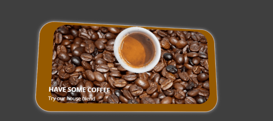
Tilt Background Size/Scale changes the distance of the tilt background. The default is 1.04. This one is 1.2.
Tilt Layers
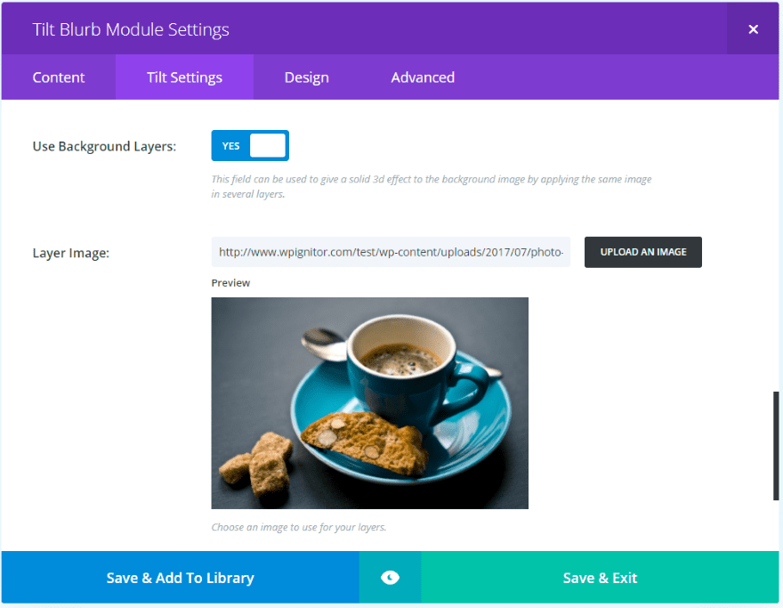
Tilt Layers applies the same image over and over as multiple layers, creating a solid 3D effect. It can use an image or a background color and you can adjust the layer depth. I’ve applied the image above with a layer depth of 50.
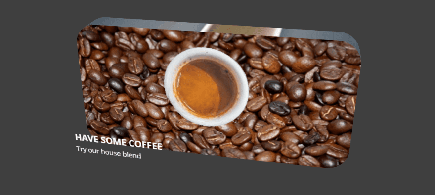
The image I applied is seen here as the border. I’ve adjusted the tilt amount to make it easier to see.
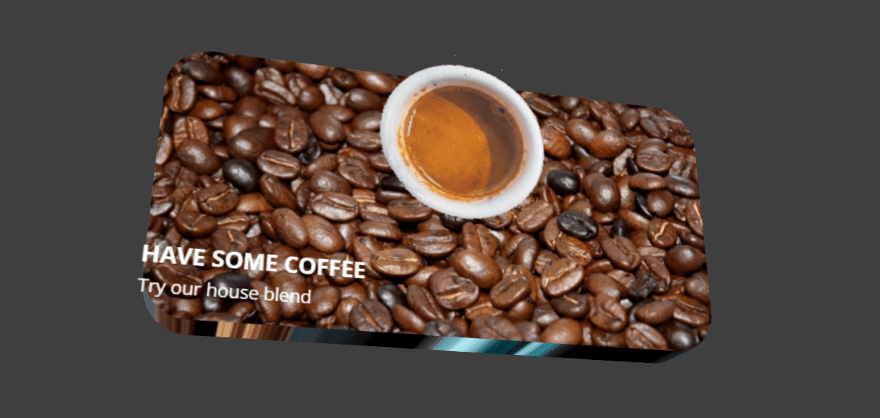
As expected the bottom of the image looks different. This is a great way to add some texture to the border. A smaller layer depth will make the border thinner.
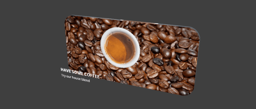
This one uses a layer depth of 10.
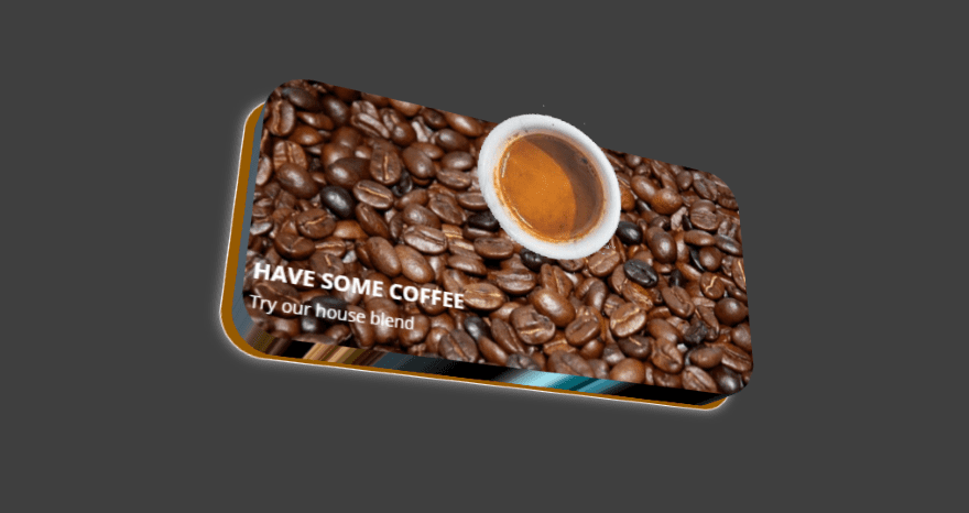
This example uses both tilt background and tilt layers.
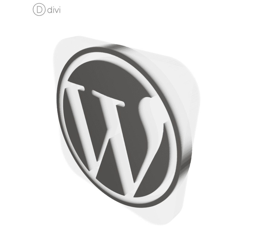
Here’s a 3D WordPress logo that looks to be encased in crystal. I uploaded the logo into the Image & Icon image area, set the tilt amount to 100, used the default tilt glare, added the logo to the layer image under Tilt Layers, set a layer depth of 50, and set the layer color to white and almost completely transparent.
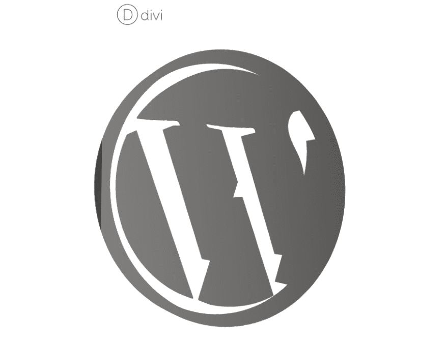
Here’s the logo with no layer color. The sides are more difficult to see.
License, Support, and Documentation
The plugin can be used on unlimited websites for you and your clients. It includes 6 months of support. Documentation is provided at the developer’s website. It includes instructions on how to create some of the examples that are shows on the website. I’d like to see even more examples such as how the logos were made.
Final Thoughts
Tilt Blurb Module provides lots of interesting tilting effects, which creates a nice 3D look to the images, icons, and text. It’s a great way to create CTA’s, 3D book covers, and product images. Tilt Blurb Module is both innovative and intuitive. If you want to add some nice tilting effects to your blurbs, Tilt Blurb Module is worth a look.
We want to hear from you. Have you tried Tilt Blurb Divi Module? Let us know what you think about it in the comments below.
Featured Image via hobbit / shutterstock.com



I would not use a plugin like this reminds me of the Flash days of whizbang that now runs people off from a website. And anything here should always work on MOBILE Devices… Always!
I fully agree. I’d like tips on how to style DIVI modules with what is already under the hood—seems like every time I want to do something with DIVI it means buying, installing and managing another Plugin.
Simple font styling for example.
Having components jump around is a bit clunky. Most look like bad animated gifs.
Nice toy. The kind of effect that should be used with a lot of caution and only when it really makes sense. But it doesn’t work well with safari.
Respectfully, I wish this blog would give us more insight into what Divi can do without buying more Plugins. I like an occasional top 5 new plugins post, but I prefer “look what you can do with Divi.
I agree more “Look what Divi does out of the box” articles with a Top X of plugins thrown in once in a while.
My 2¢
Hi, doesn’t works with my safari 9.1.3…
Many thanks Randy, an excellent post, extensive and enjoyable, this effect gives much game at least for desktop, for mobile I prefer to void anything that negatively affects the user experience.
🙂
Nice effects. But its not looking good on mobile devices. So, since we all should build our sites responsive, I think this one is not the best tip to give to Divi-users. Don’t get me wrong, I really love your work here. But for example for blurbs, there are better solutions, like the one from Divi-Dan with animated SVGs. Maybe worth a post here as well 😉
Just because we can tilt blurb now with a DIVI Module does not mean we should. This idea just looks like something that will cause viewers to NOT come back a second time to your site.
This is a really neat and unique effect. The demos on Hædworm really show where it can shine. I like example of the Earth one with the tilting black background. It’s subtle but shows it being used well.
Their site does show some great examples. I liked that one too!