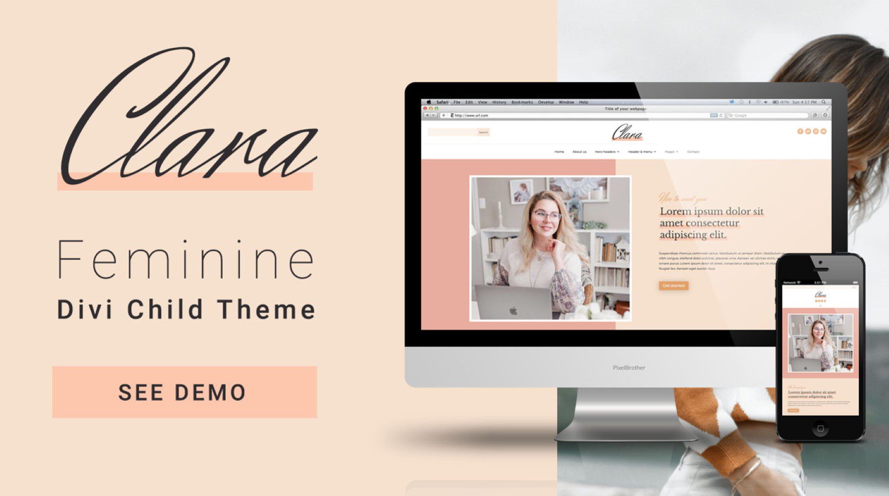
Clara is a Divi child theme with a modern and feminine design. It comes with over 16 fully customizable pages and several design variations for the header and hero sections. The Clara Divi child theme is perfect for service-based businesses and includes layouts for your portfolio, service pages, testimonials, and more. In this post, we’ll take a close look at the Clara Divi child theme to help you decide if it’s the right Divi child theme for you.
Let’s get started!
- 1 Installing Clara Divi Child Theme
-
2
Clara Divi Child Theme Pages
- 2.1 Clara Home Page
- 2.2 Clara About Us Page
- 2.3 Clara Services Page
- 2.4 Clara Single Service Page
- 2.5 Clara Projects Page
- 2.6 Clara Single Project Page
- 2.7 Clara Testimonials Page
- 2.8 Clara Pricing Page
- 2.9 Clara FAQ Page
- 2.10 Clara Blog with Sidebar
- 2.11 Clara Blog Grid
- 2.12 Clara Contact Us Page
- 2.13 Clara Thank You Page
- 3 Clara Divi Child Theme Divi Theme Builder Templates
- 4 Clara Divi Child Theme Additional Layouts
- 5 Where to Purchase the Clara Divi Child Theme
- 6 Final Thoughts
Installing Clara Divi Child Theme
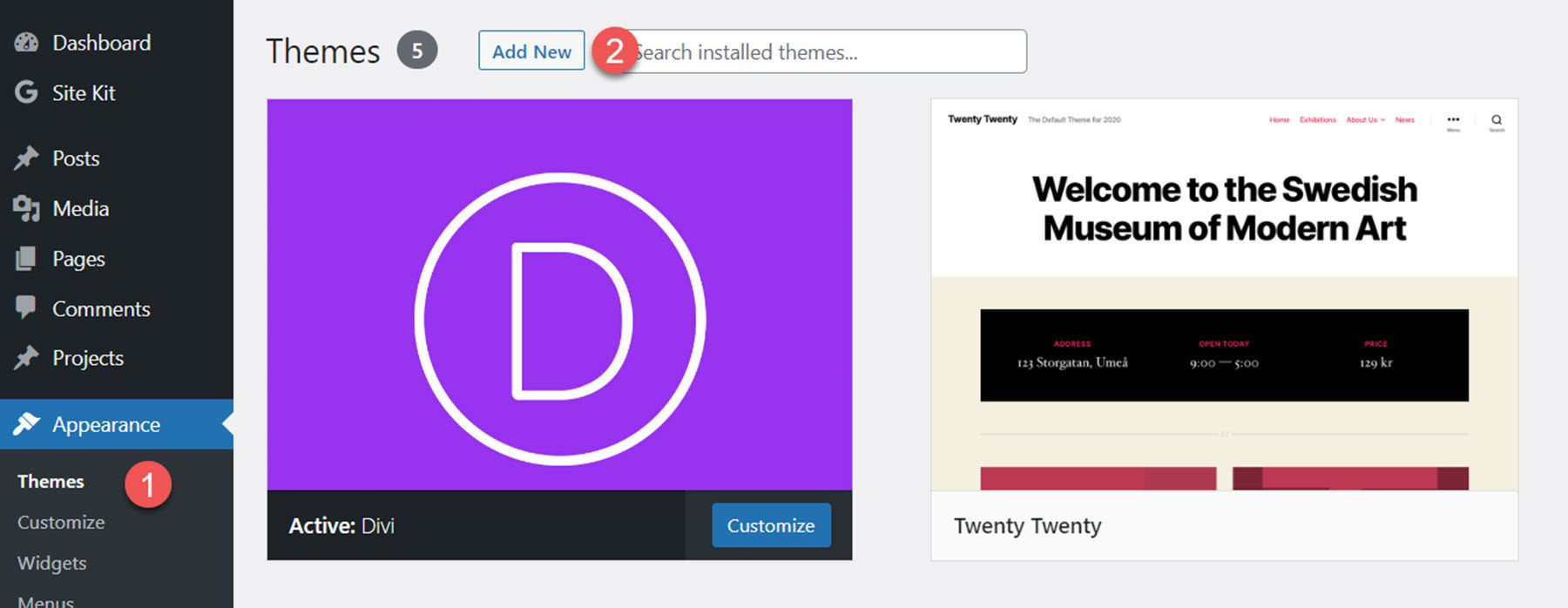
Before installing the Clara Divi child theme, make sure you have Divi installed on your WordPress site. The theme author recommends installing Clara on a fresh WordPress installation since the child theme will overwrite the existing website. Once you are ready to install, navigate to the Themes page under Appearance in your WordPress dashboard and click Add New.
From the Add Themes page, click the Upload Theme button at the top. Select clara-divi-child-theme.zip from your files, then click Install Now.

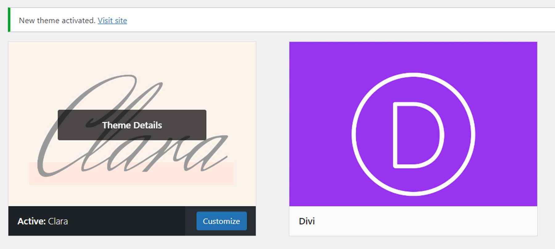
Once installed, activate the theme.
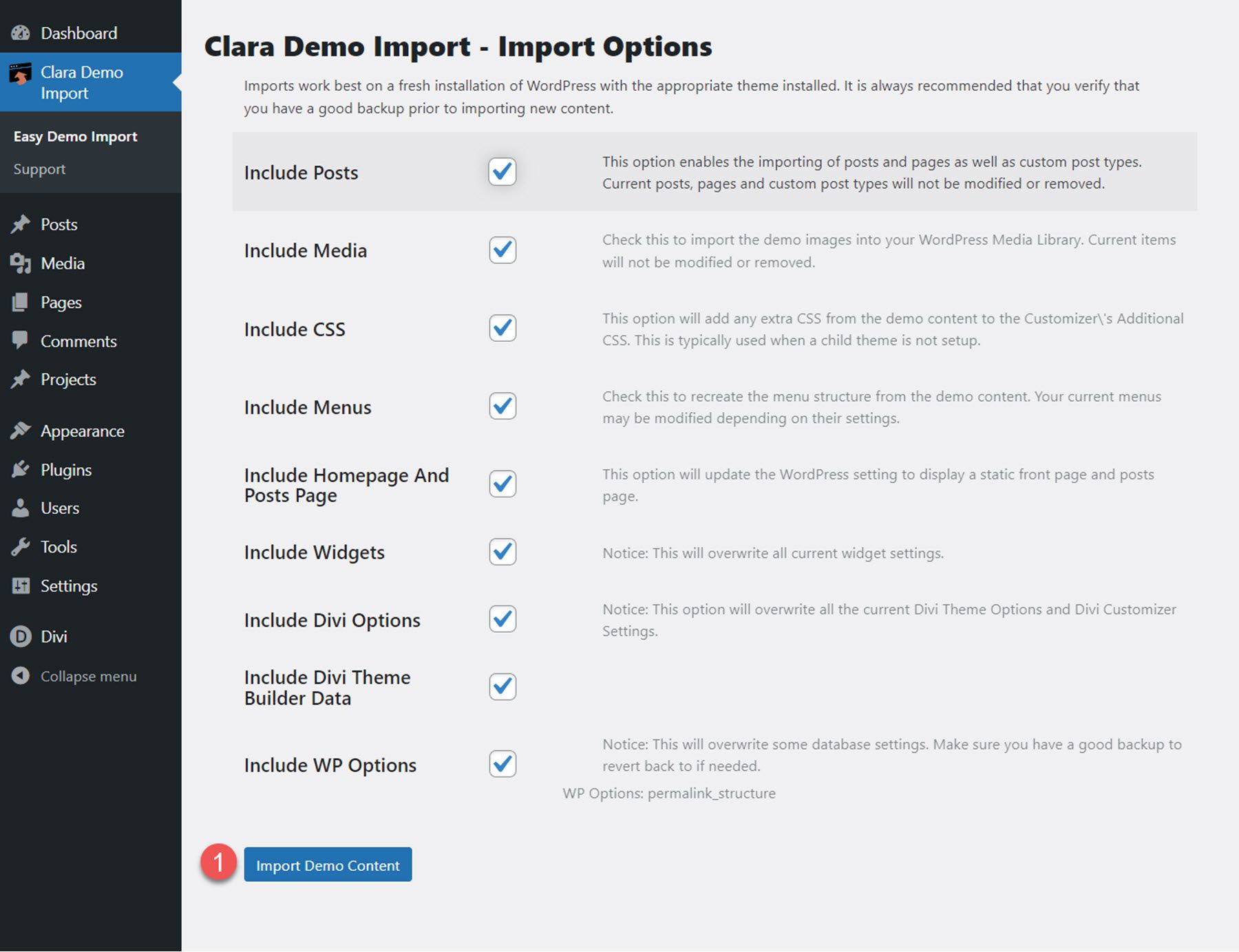
When the child theme is activated, the Clara Demo Import tab will appear in the Dashboard menu. This page allows you to easily import all child theme content and settings with one click. Select Import Demo Content to begin.
Once the installation is successful, you will see a completion message.
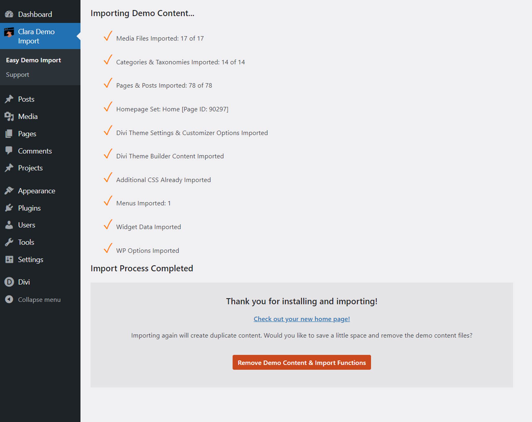
Now the child theme has been fully installed and set up for you to use – all you need to do is replace the content! Let’s explore the page layouts that come with the Clara Divi child theme.
Clara Divi Child Theme Pages
The Clara Divi child theme comes with 16 different page layouts, including blog and project pages. Some of the layouts are set up as pages, and some are set up as Divi Theme Builder layouts. The child theme is editable with the Divi Builder, so you can easily change the content or modify the design and colors as you like.
The design of the Clara Divi child theme is simple, elegant, and feminine, with a muted pink and orange color scheme. I like the primary serif font that was selected for the headings, and the script font used as an accent adds a nice touch to the design. Loading animations are used on images throughout the design, adding some subtle but effective movement to the layouts.
Let’s take a closer look at each layout.
Clara Home Page
The home page opens with a hero header section with an image that slides in from the side and a call-to-action button. The page also features a services section, a call-to-action section, a testimonial section, a how we work section where you can highlight steps of a process, recent blog posts, and a newsletter sign-up form. I really like the home page layout, especially the how we work section with the overlaying text and arrows.

Clara About Us Page
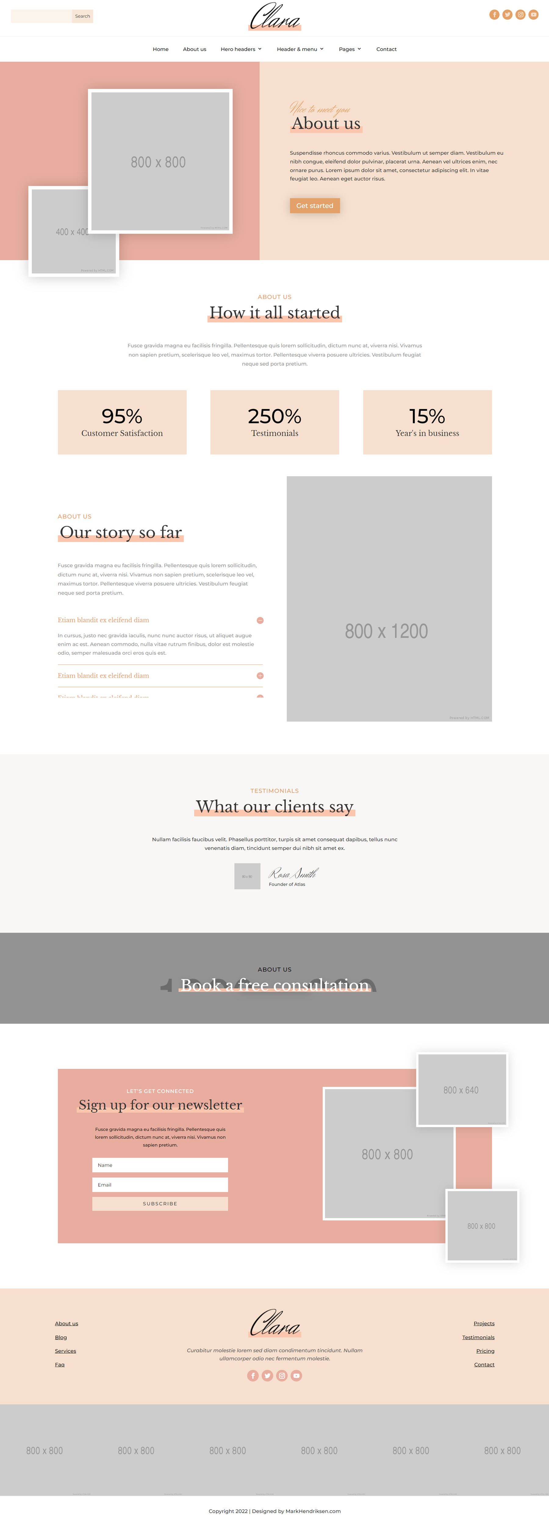
The About Us page has a header with two images, followed by a How it all started section that has three number counters. The Our story so far section has an image on the right and a toggle section. Following this is a testimonial section, a CTA section, and a newsletter sign-up form.
Clara Services Page
The services page features a header, some description text, and 6 blocks to show off each of your services. This is followed by the testimonial, CTA, and newsletter sign-up sections.

Clara Single Service Page
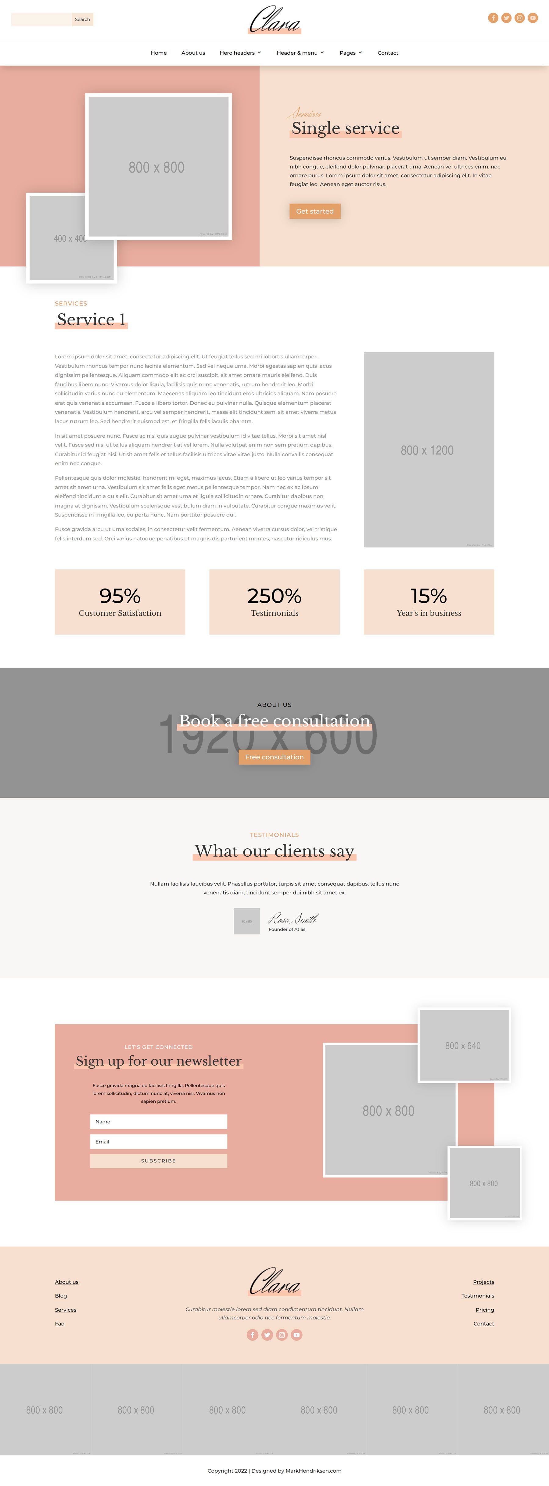
This page layout is where you can share information about your service in-depth. Like the other pages, this page begins with a header section with two images that slide in from the side. The main section on this page features a long section of text with an image on the right. Below this are three number counters followed by a CTA section, testimonials, and a newsletter sign-up.
Clara Projects Page
The projects page can serve as a portfolio to show your past work. The layout has a header, followed by the portfolio section with large images to show off your work. An orange overlay appears on hover. Like many of the other pages, this page ends with a testimonial section, a CTA section, and a newsletter sign-up.

Clara Single Project Page
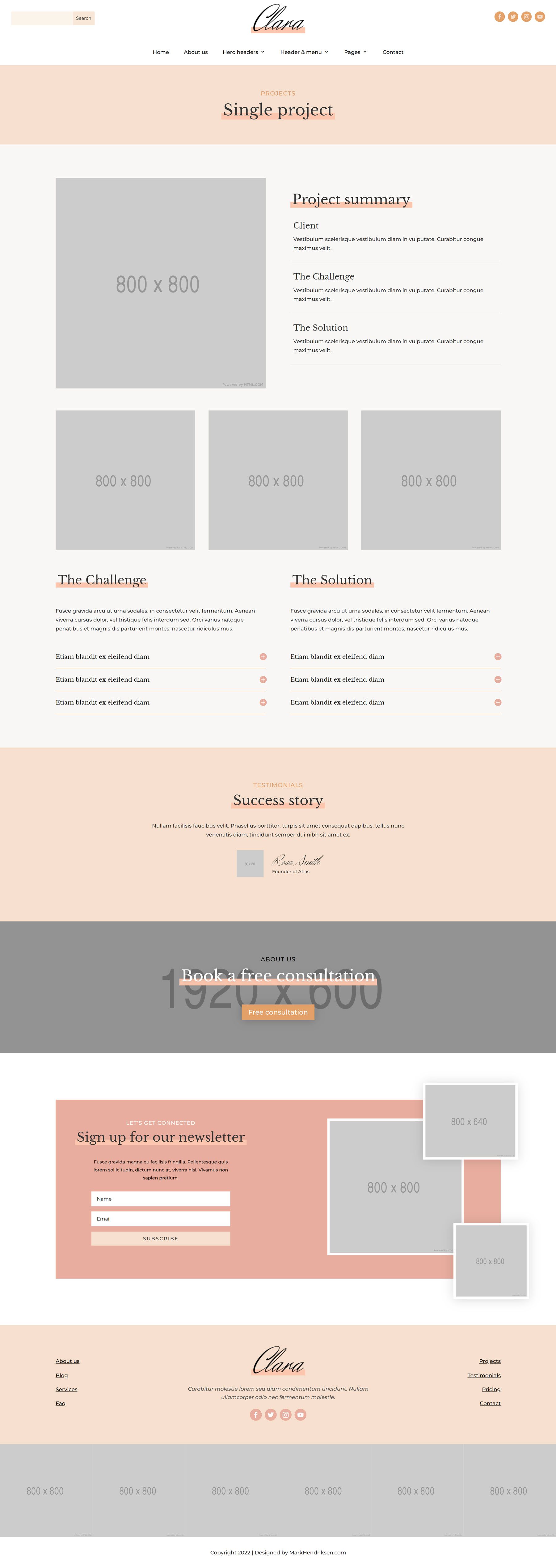
The single project page is where you can highlight a single project or portfolio item you would like to showcase. The layout uses a simple heading section with the title, followed by a project summary section where you can write about the client, the challenge, and the solution. There are four images in this layout, which you can use to show images of your work. Below these are two subheadings for the challenge and the solution with a toggle section that can open to reveal more information about the work. This is followed by the testimonial section, the CTA section, and the newsletter sign-up section.
Clara Testimonials Page
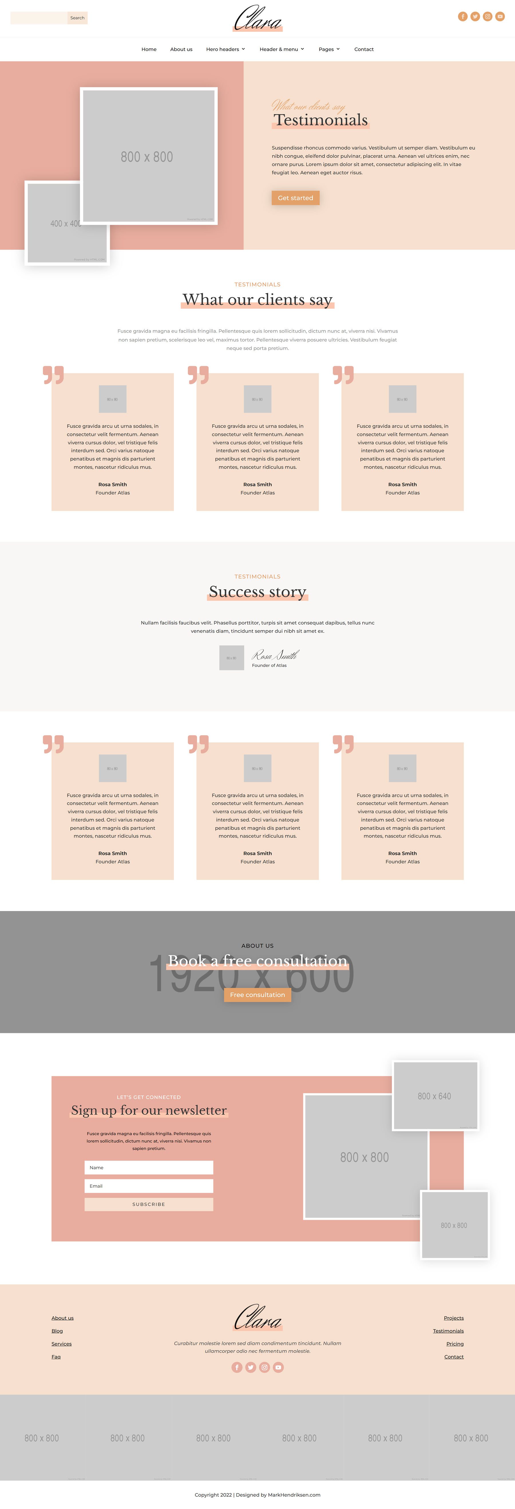
The testimonials page features a header, followed by the testimonials section. Each testimonial is in a box with a quote icon at the top right corner. There are two rows of these testimonial sections, with one full-width testimonial featured in between. The page ends with a CTA and a newsletter sign-up section.
Clara Pricing Page
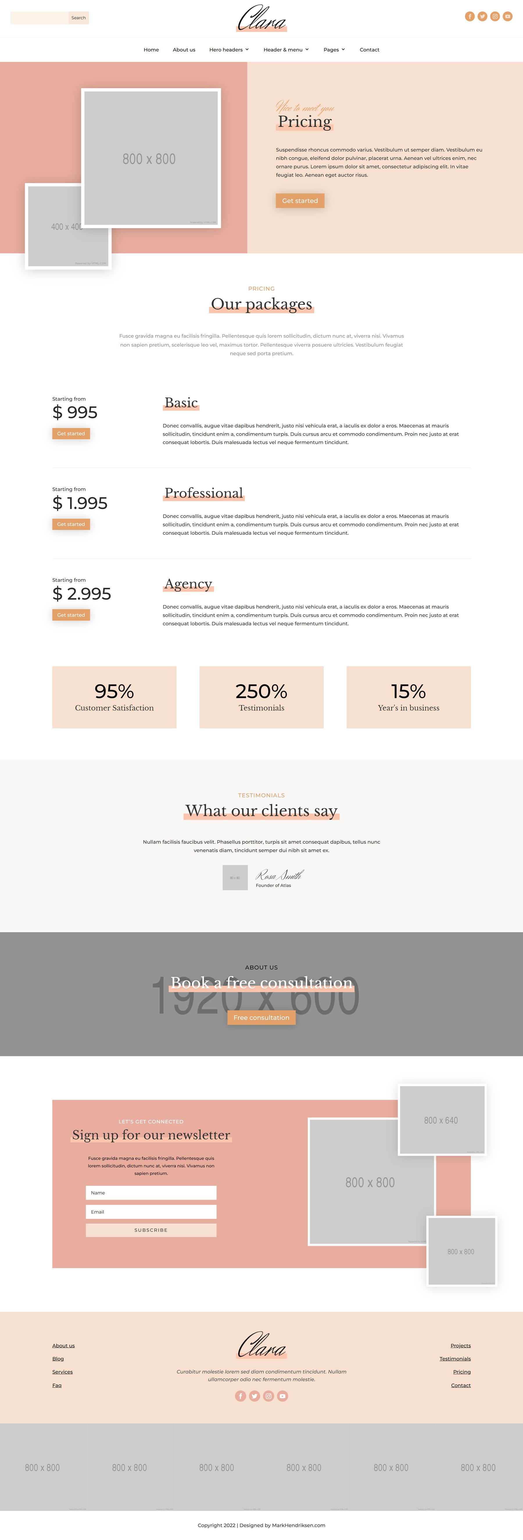
The pricing page opens with a header section. The pricing section is below and features the pricing and a button on the left, with the pricing tier title and a description on the right. This section also has three number counters, which are followed by the testimonial, CTA, and newsletter sign-up sections.
Clara FAQ Page
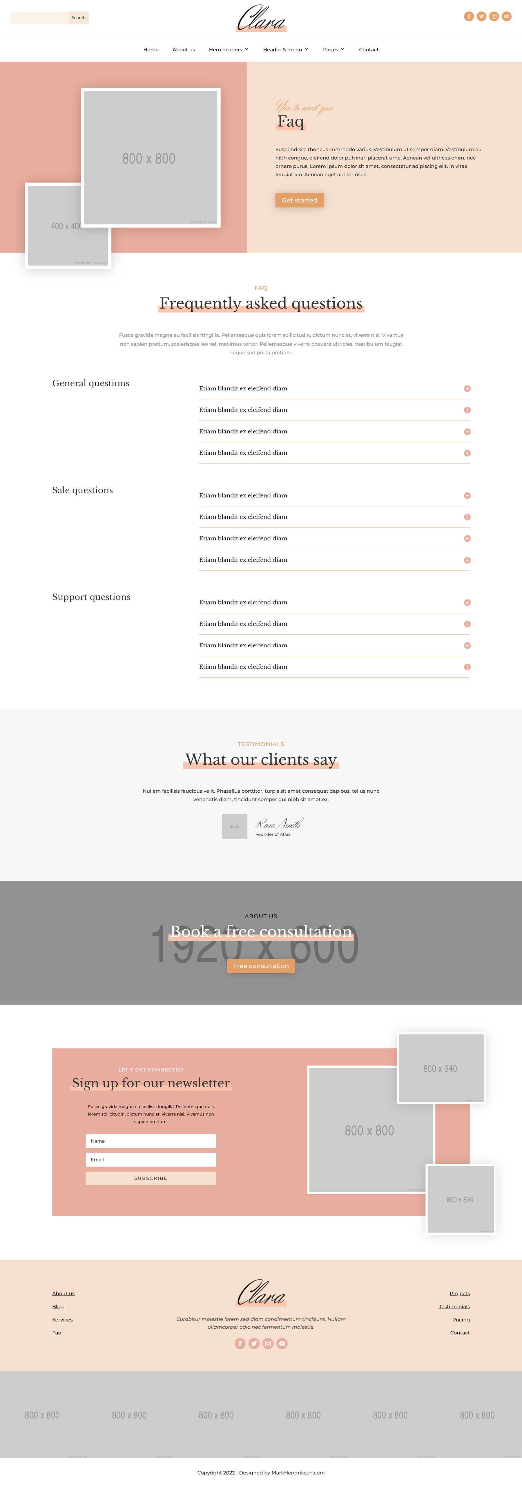
The FAQ page layout also begins with a header section with two images. The FAQ section below is split into three sub-sections, which I think is a nice touch to help customers navigate the page easily. FAQ questions are formatted in toggle modules that expand on click. This is followed by the testimonial, CTA, and newsletter sign-up sections.
The Clara Divi child theme comes with two different blog page layouts. The first layout is the blog with a sidebar layout. This layout begins with a large header, followed by a blog section split with the blog content on the left and a sidebar on the right. The blog content is centered and has a large featured image. The sidebar features an introduction section, a search module, recent posts, and links to blog categories. At the bottom of the page is a newsletter sign-up section.

Clara Blog Grid
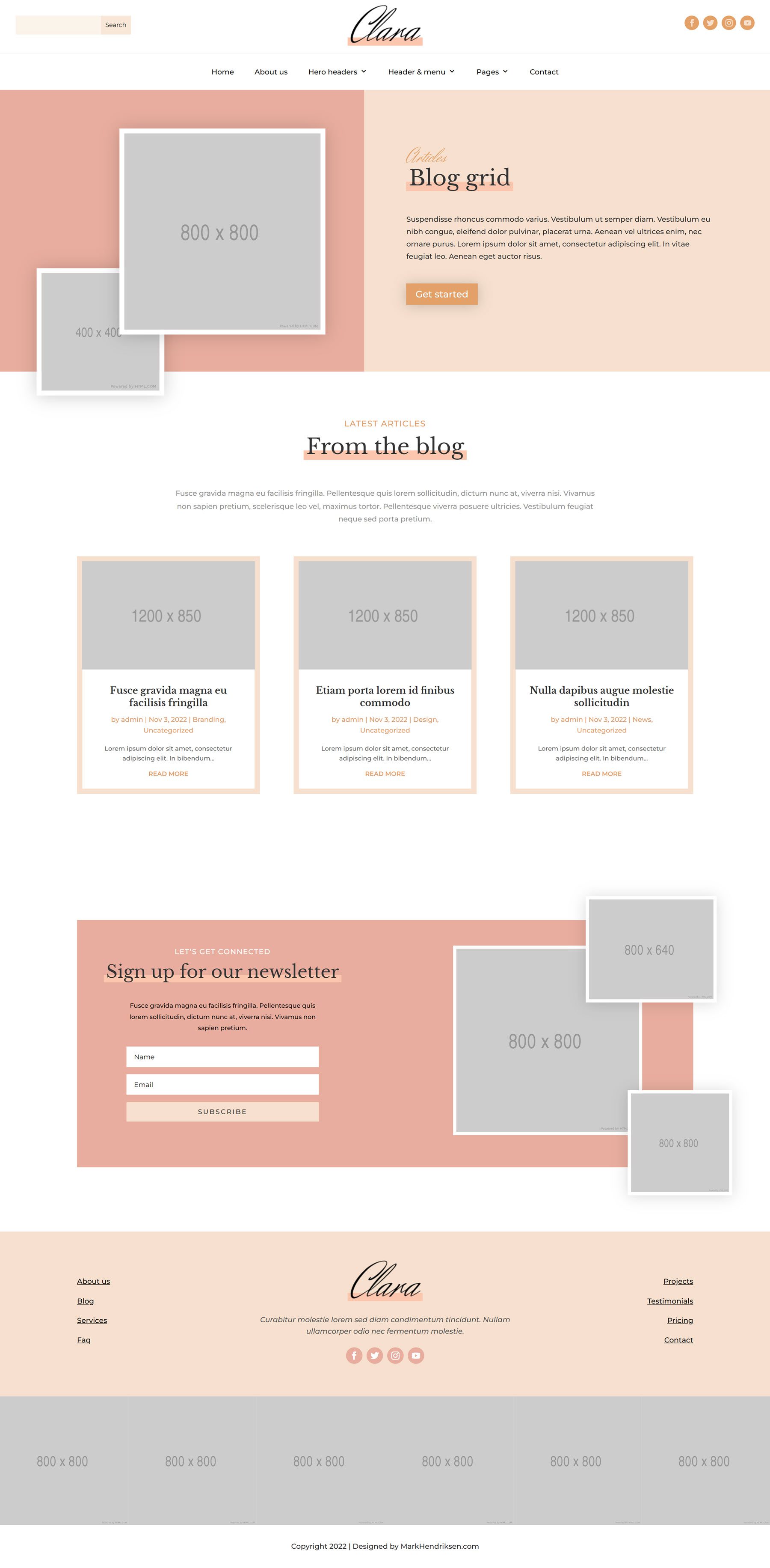
The alternative blog layout is the blog grid layout, which does not come with a sidebar. The page begins with a large header, and the blog posts below are organized in a grid. Below is a newsletter sign-up section.
Clara Contact Us Page
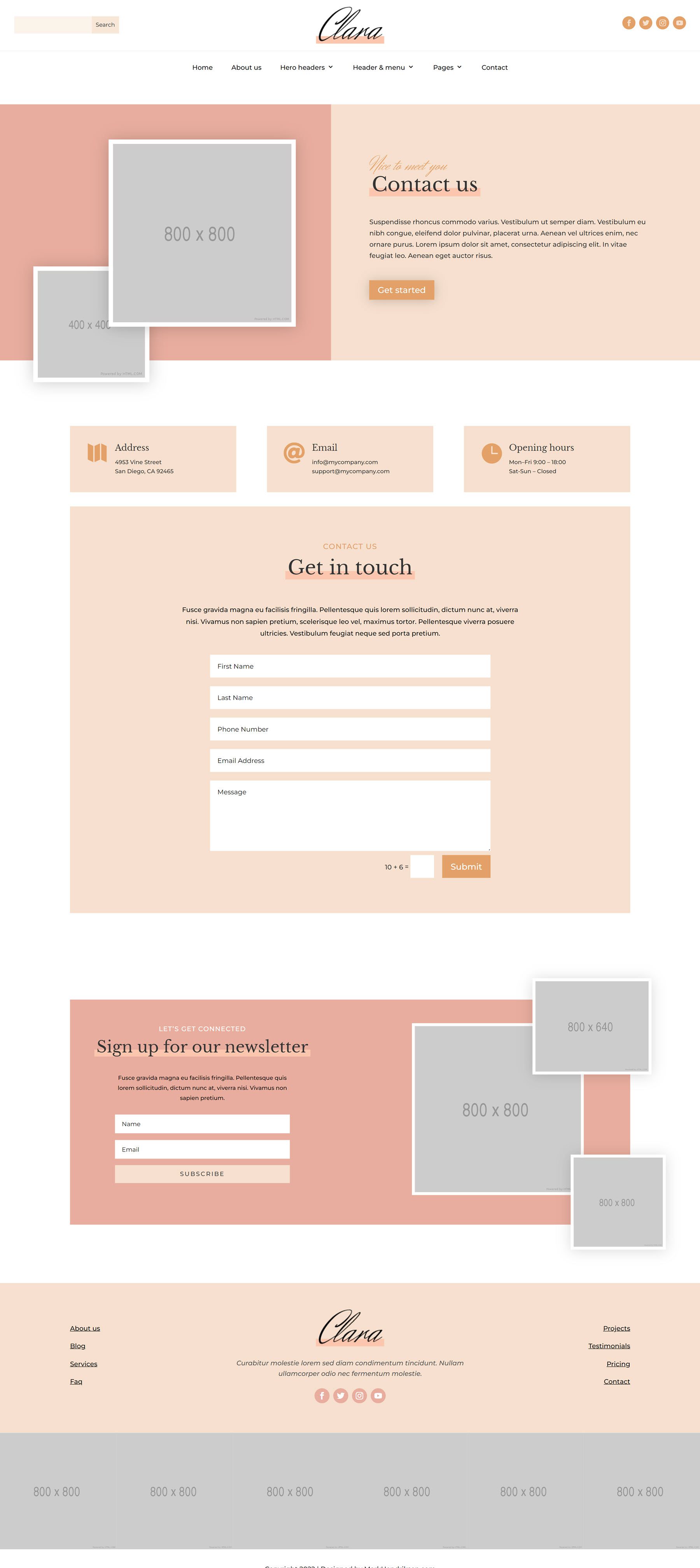
The contact page features a header section with two images. The address, email, and opening hours are highlighted below with icons. Following this is the contact section which has some text and a contact form. Below this is a newsletter sign-up form.
Clara Thank You Page
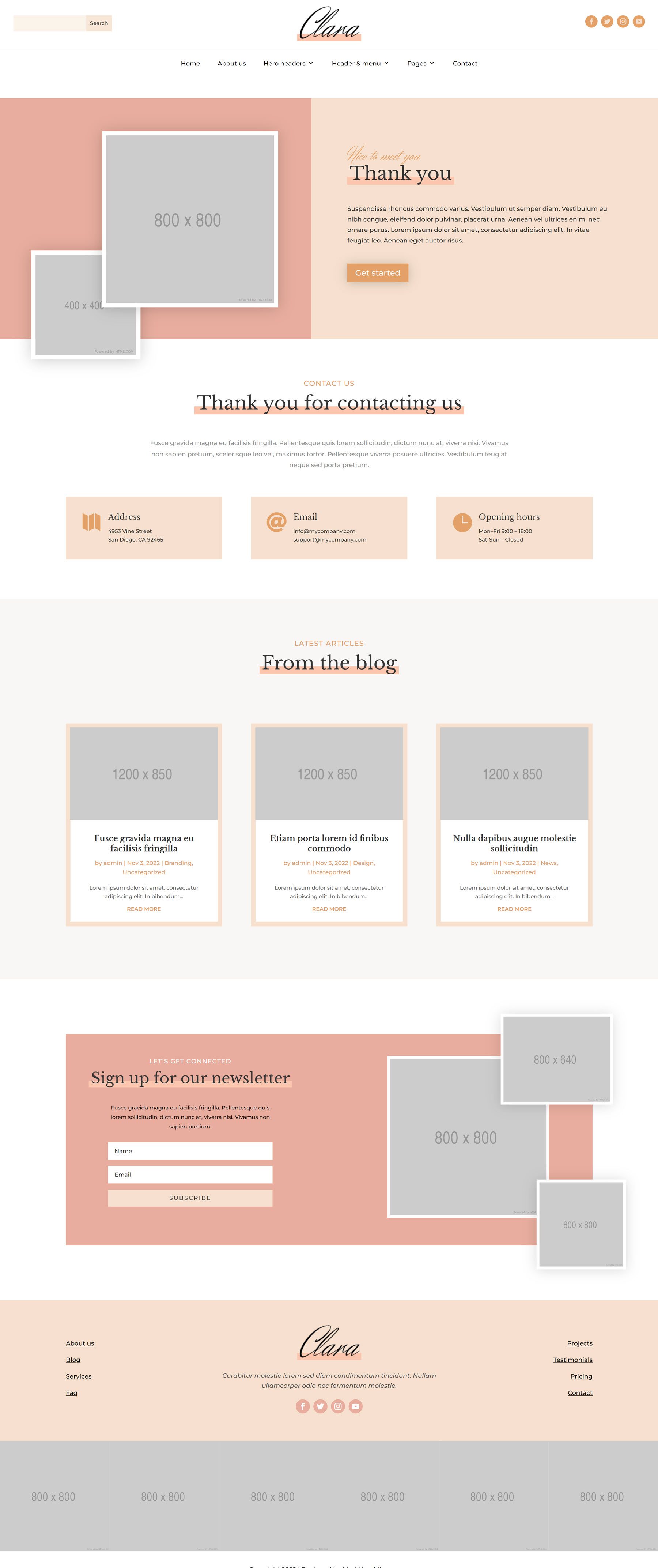
The thank you page is displayed after the contact form is completed. This layout features a header, three blurbs for the address, email, opening hour information, and recent blog posts, followed by a newsletter sign-up form.
Clara Divi Child Theme Divi Theme Builder Templates
Clara Category Layout
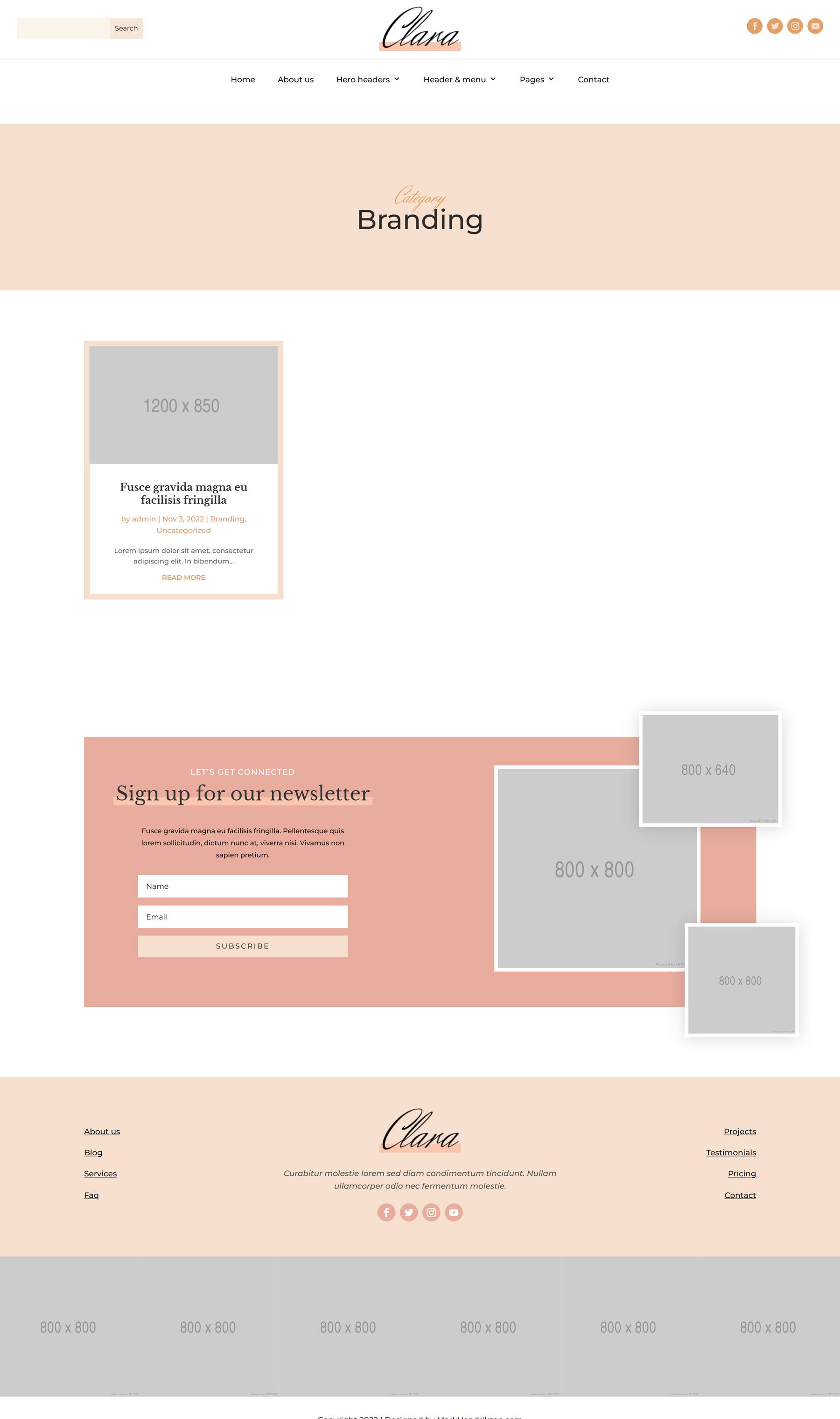
The blog category layout opens with a simple header and features blog posts in a grid layout, followed by a newsletter sign-up section.
Clara Single Post Layout
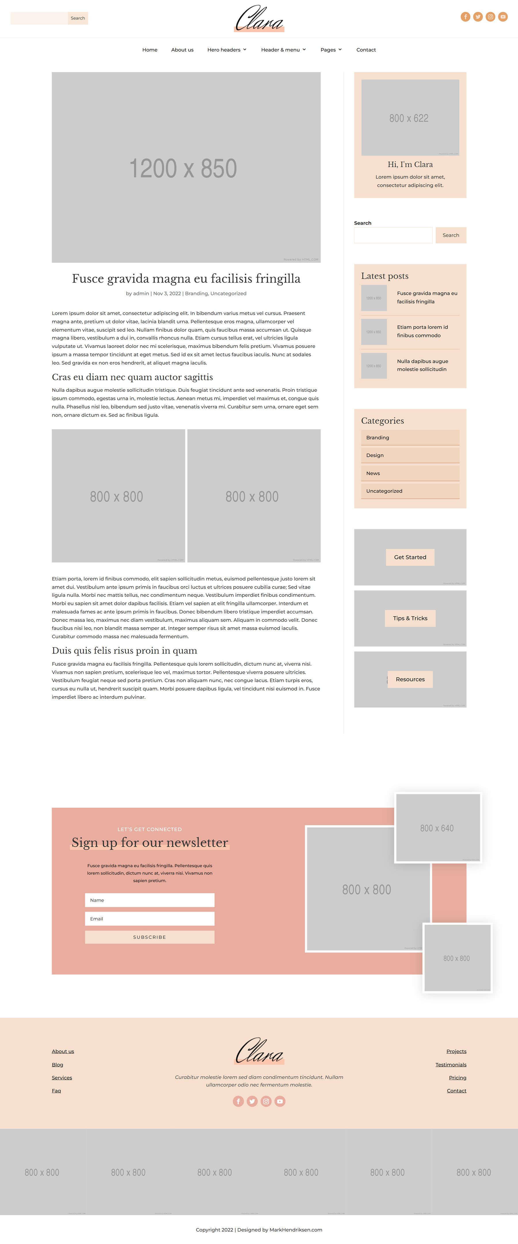
The single post layout features the blog post content on the left with the sidebar on the right. The content is followed by a newsletter sign-up section.
Clara 404 Page Layout
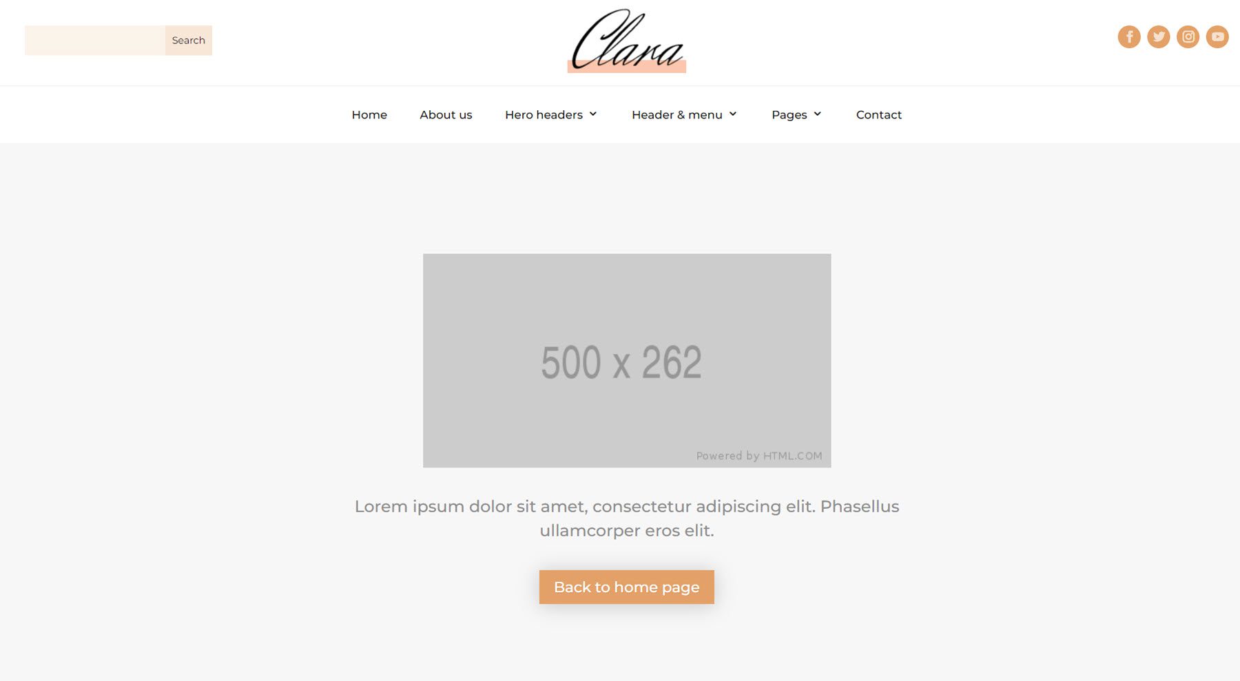
The 404 page features a placeholder for an image, text, and a button to lead users back to the home page.
The Clara Divi child theme comes with four header and menu layouts you can choose from.
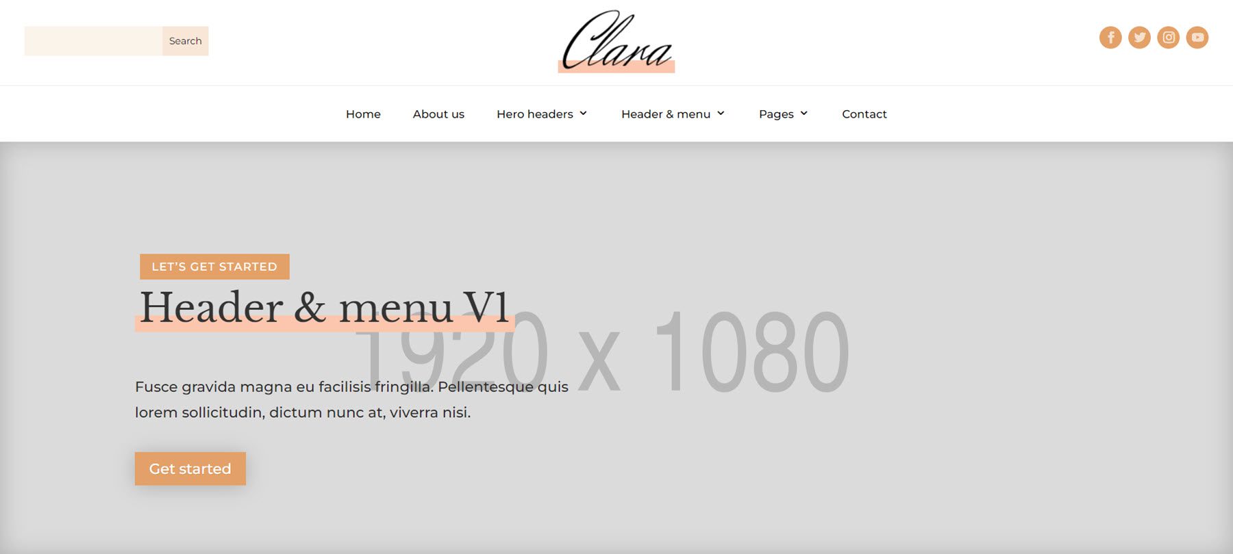
Clara Header & Menu Layout V1
The first layout features a large, centered logo at the top, a search field on the left, and social media icons on the right. The menu is centered below.
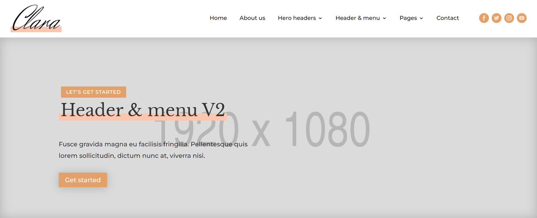
Clara Header & Menu Layout V2
Header and menu layout 2 feature the logo on the left, a right-aligned menu in the center, and social media icons on the right.
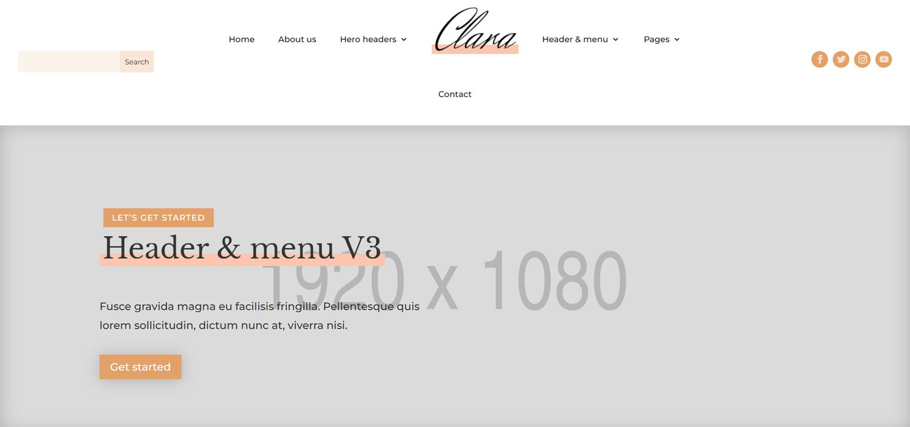
Clara Header & Menu Layout V3
The third layout has a centered menu with an inline logo. There is a search bar on the left and social media icons to the right.
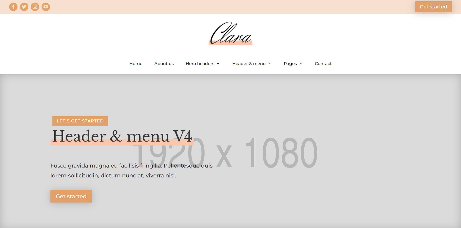
Clara Header & Menu Layout V4
The fourth layout uses an orange submenu at the top to display the social media icons and a CTA button. Below this, the logo is centered with the menu below.
Clara Divi Child Theme Additional Layouts
The Clara Divi child theme also includes alternative hero header and sub header layouts. Let’s take a look.
Clara Hero Header Layouts
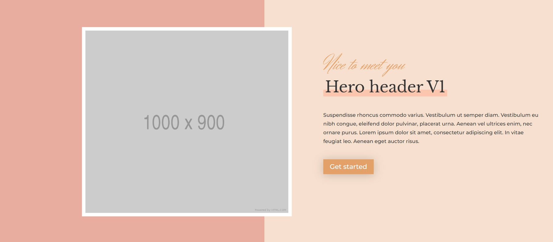
Clara Hero Header V1
This header layout features a large image that slides in from the side.
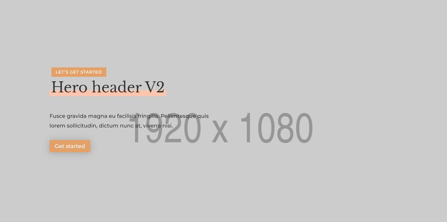
Clara Hero Header V2
This header features text and a button on a large image with a dark overlay.
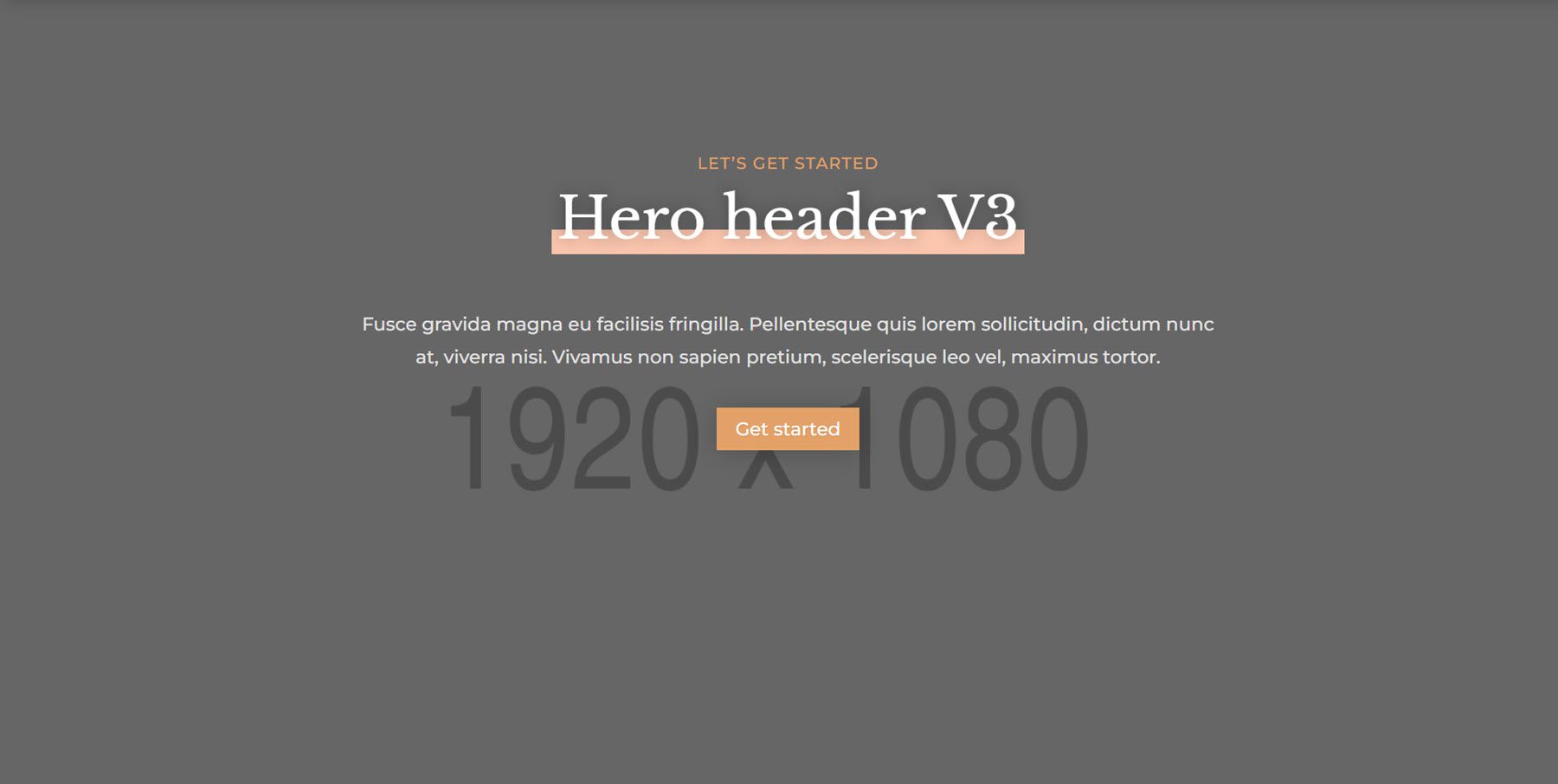
Clara Hero Header V3
This header also features a large image background with a dark overlay. The header text is centered.
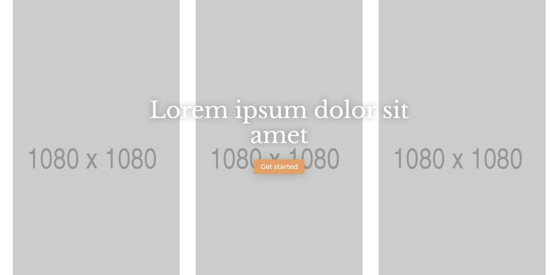
Clara Hero Header V4
The fourth hero header features three images side-by-side with large heading text.
Clara Sub Header Layouts
Clara Sub Header V1
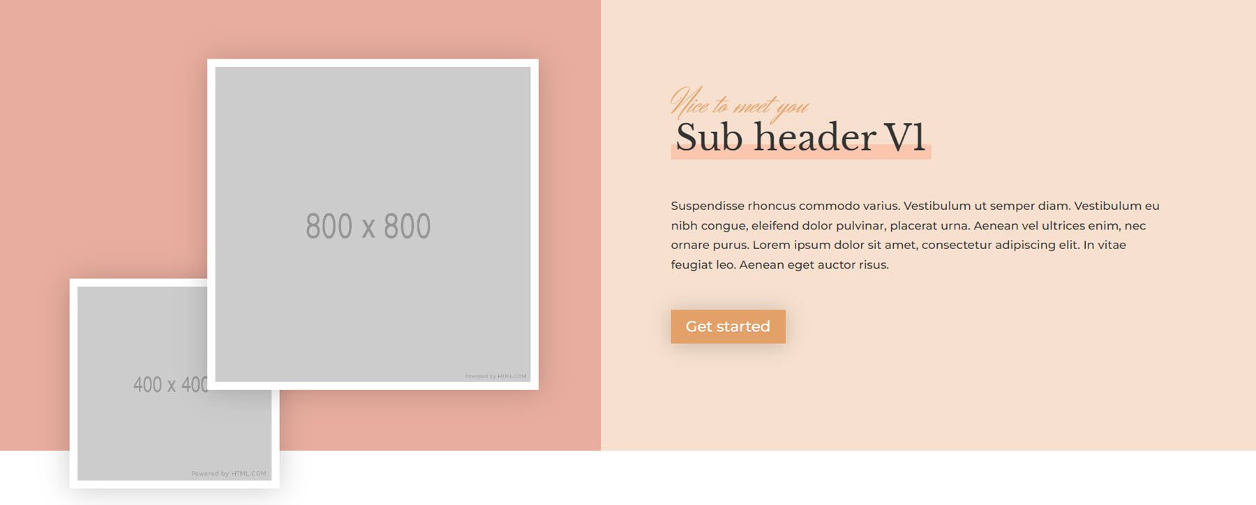
The first sub header layout features two images that slide in from opposite sides and overlap. The subheader content is on the right, with a CTA button.
Clara Sub Header V2
Sub header v2 is on a large image background. The text is left-aligned.

Clara Sub Header V3
Finally, the third subheader is also on a large image background and has a dark overlay. The text is centered in the section.

Where to Purchase the Clara Divi Child Theme
The Clara Divi child theme is available in the Divi Marketplace. It costs $35 for unlimited website usage and one year of support and updates. The price also includes a 30-day money-back guarantee.
Final Thoughts
This concludes our look at the Clara Divi child theme. Clara is straightforward to install and can help you jumpstart the web design process. I really like the overall design of the child theme, and I appreciate the variations of some of the design elements that the theme author included. Because it’s a Divi child theme, you can easily use Divi’s design options to customize the design. Or, you can simply replace the content and have a website ready to go with minimal effort. If you are looking for a modern, well-designed Divi child theme to promote your services, the Clara Divi child theme is a great option.
We would love to hear from you! Have you tried the Clara Divi child theme? Let us know what you think about it in the comments!



Leave A Reply