Divi Block is an online tool to mix and match premade blocks. It simplifies layout design and provides a file to upload and customize even further. In this post, we’ll look at Divi Block to see what it can do to help you decide if it’s the right Divi building tool for your needs.
What is Divi Block
Divi Block is an online drag-and-drop tool that lets you build layouts with close to 480 pre-designed blocks. Once you’ve created the layout, you can download it as a JSON file and upload it to any Divi website.
Divi Block includes:
- Header Builder
- Layout Builder
- Footer Builder
- Section headings
- Special module designs
- Light and dark versions
- Color schemes
You can preview your layouts on a real Divi website.
Divi Block Online Tool
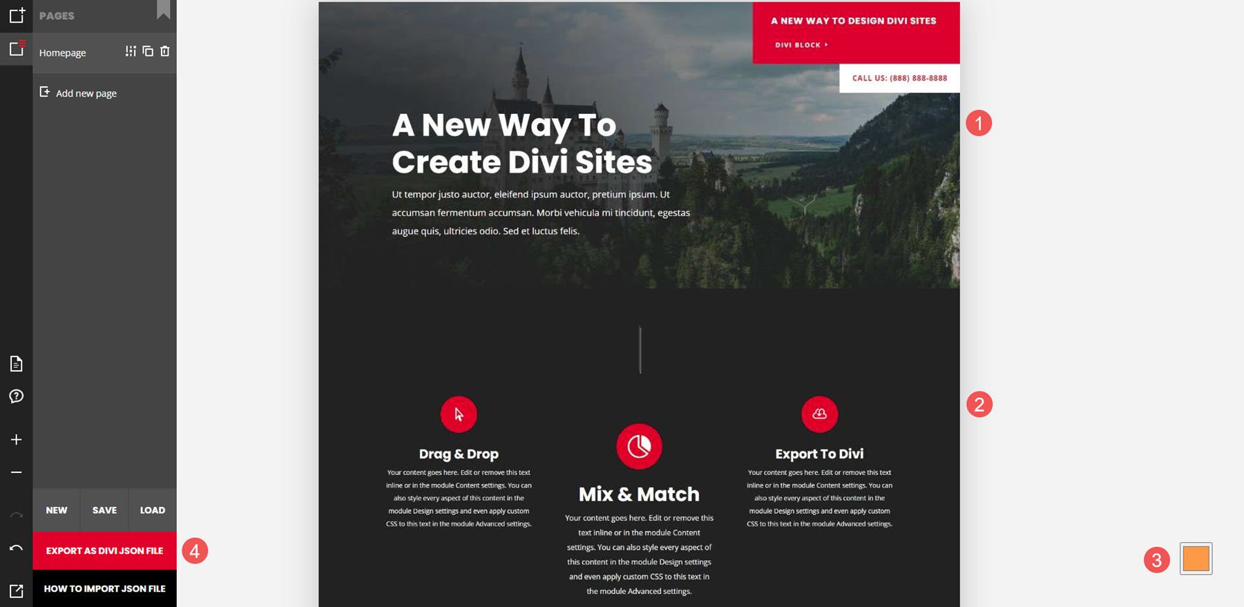
The Divi Block layout includes 4 areas. I’ve named them by their function:
- Page menu – the first menu lets you add and edit blocks, manage pages, export to Divi, see the documentation, see the support forum, zoom in and out, undo and redo, and preview the page on a live Divi website.
- Block menu – the second menu opens when you hover over it. It includes all the blocks you can add to your page. Clicking on one of the blocks opens a submenu with all the designs for that block.
- Editing area – this is the canvas where you’ll drag the blocks to and arrange them in any order you want.
- Color scheme – this is the color selector to change the color scheme for the layout.
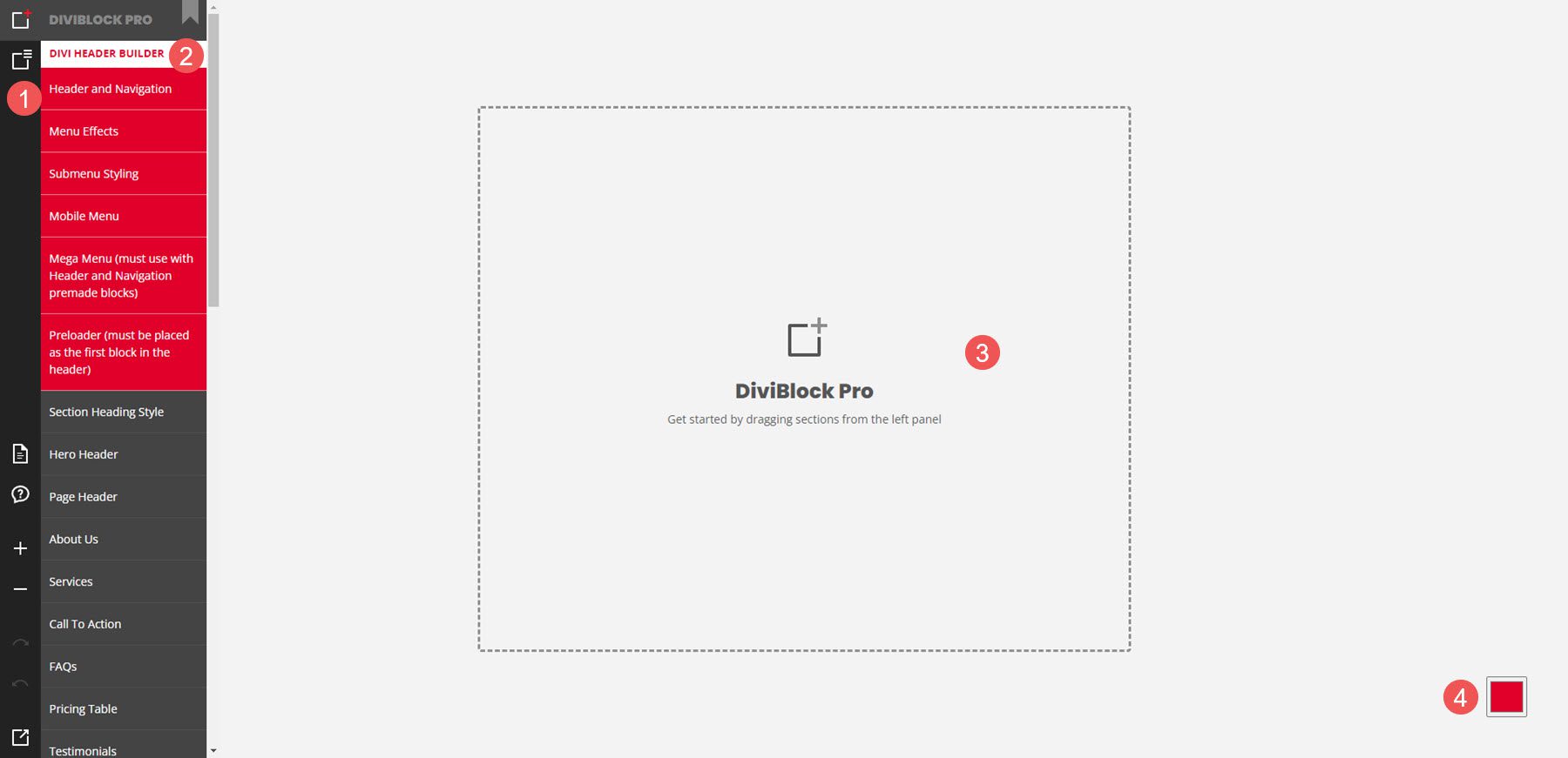
The first menu controls the pages. Here, you can edit and export the page, create new pages, save your work, load a page, etc. When you save your work, it will download a file to your computer. You can load this file to pick up where you left off. You can also preview and export the layout from here.
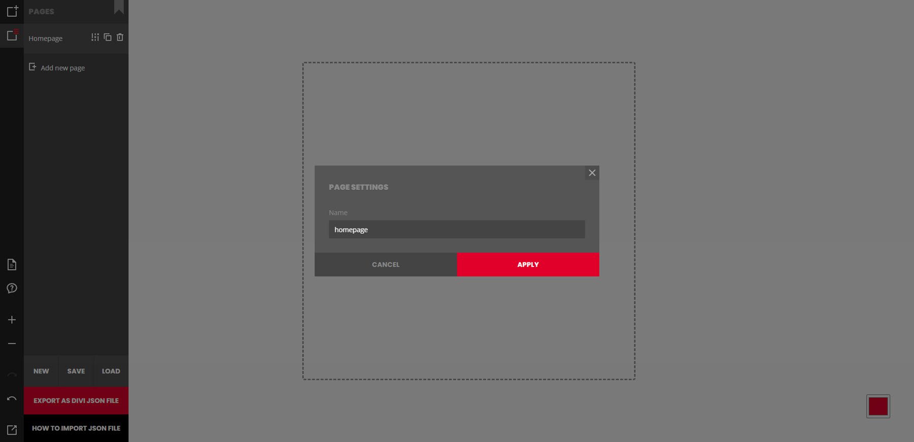
In the example below, I’ve clicked the Manage Pages & Export to Divi icon and selected to edit the page settings. It has opened a modal where I can enter a title and apply it to the new page.
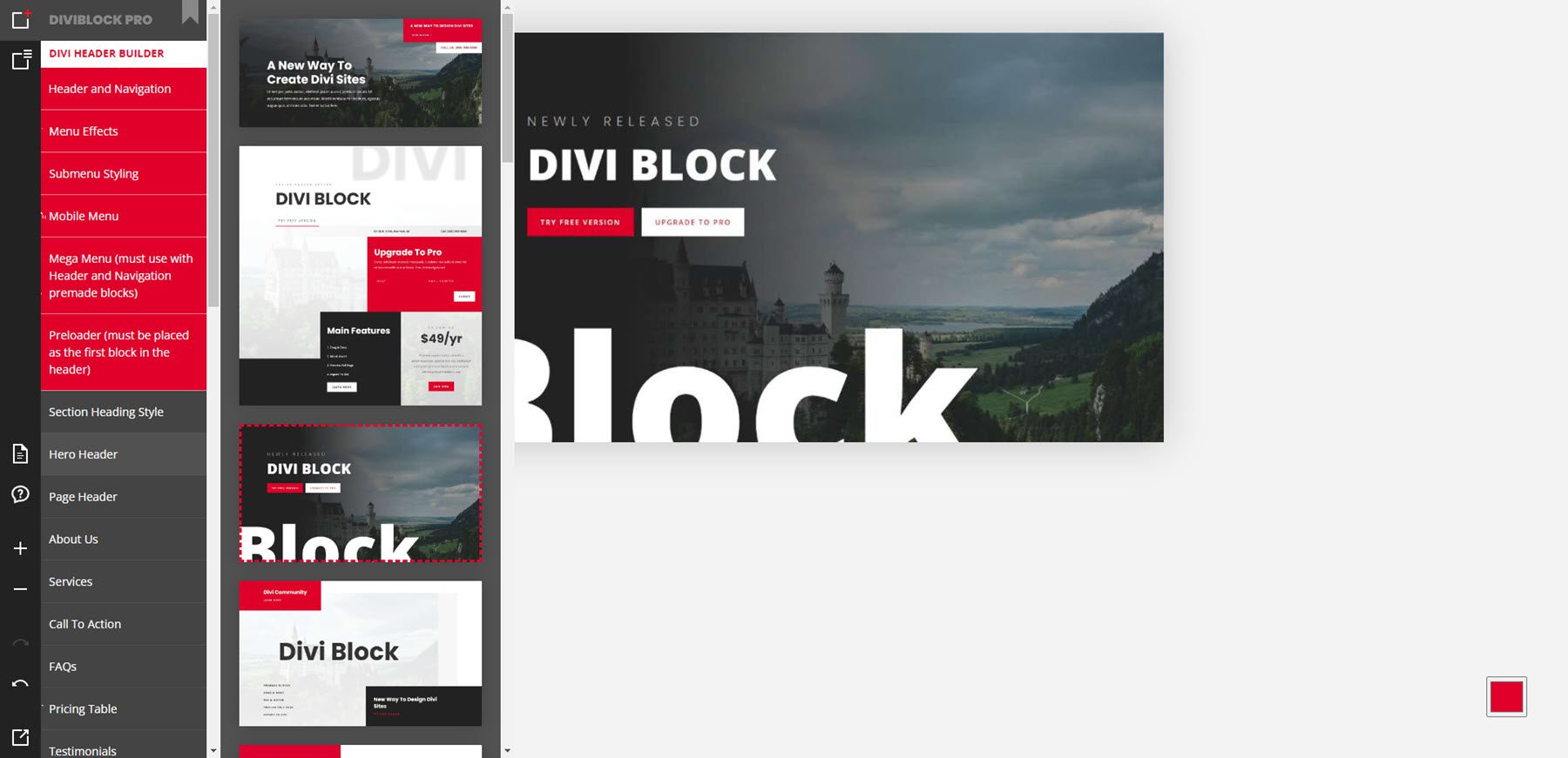
The block menu includes all of the blocks and elements you can add to the page. Hover over any element to see all the designs for that element. It includes headers, page layouts, footers, and custom modules. Many of them include features that are added without plugins. Click the element to add it to the page. In the example below, I’ve selected to see the hero headers. I clicked on the third hero header and added it to the page.
Editing Area
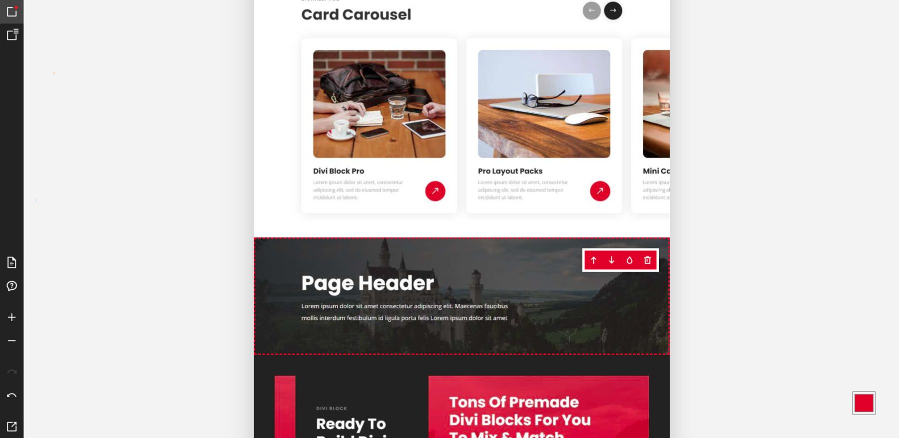
When you click on any of the blocks, they’re added to the editing area. You can then edit the layout further. Hovering over a block shows a small window with some editing tools. You can move the block up or down, change it to a light or dark version of the block, and delete the block from the layout. You can’t make changes to the layouts such as colors, text, etc. Those changes will be shown in the preview and in the layout on your website.
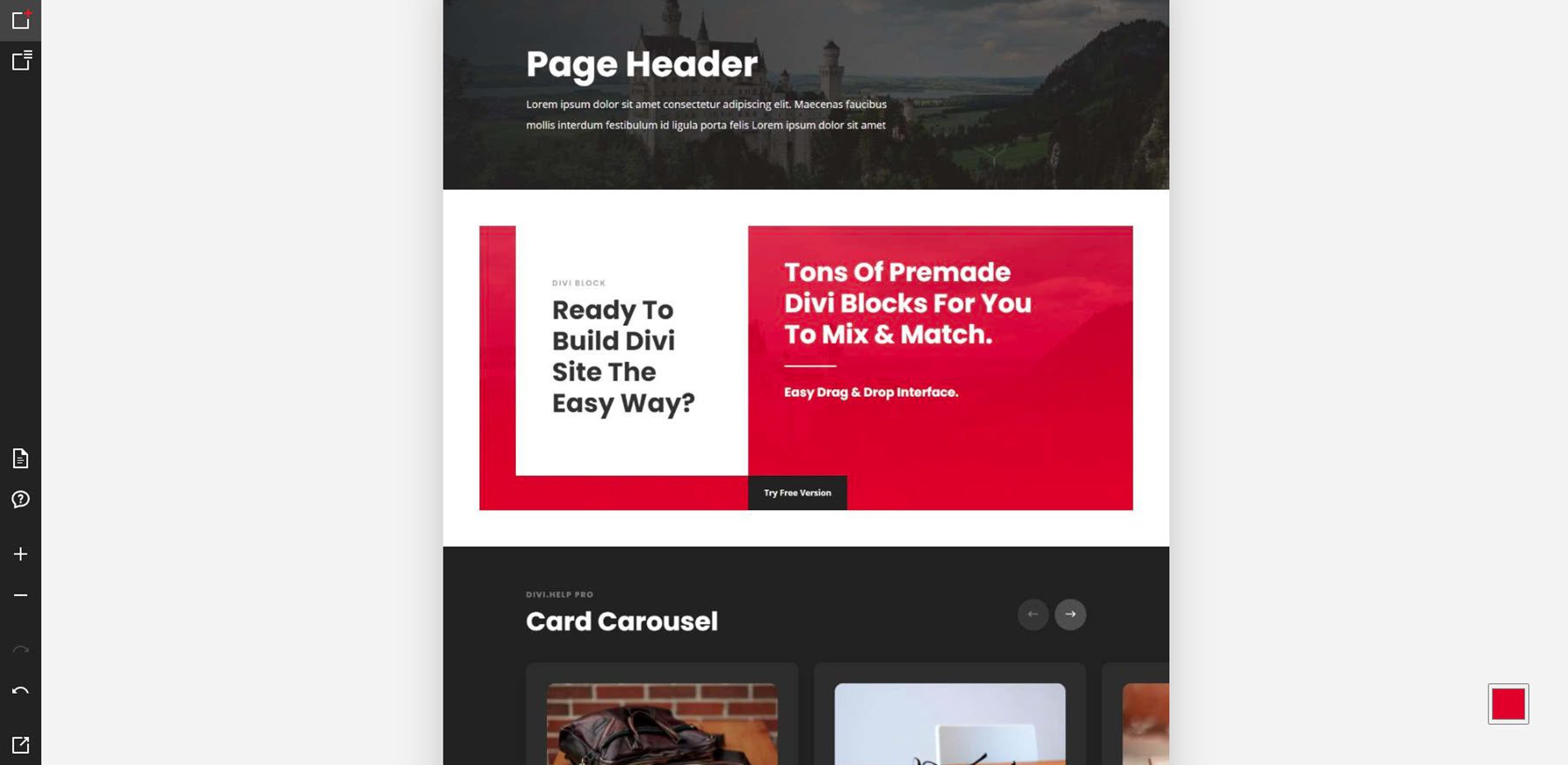
For this example, I’ve added three blocks: a card carousel, a page header, and a CTA. They were placed on the page in the order that I selected them.
Header Builder Examples
In this example, I’ve moved the blocks to different locations within the layout. I’ve also changed two of the blocks. The CTA is now light, and the card carousel is now dark. The blocks moved and changed extremely fast. I didn’t have to wait to see the new layout.
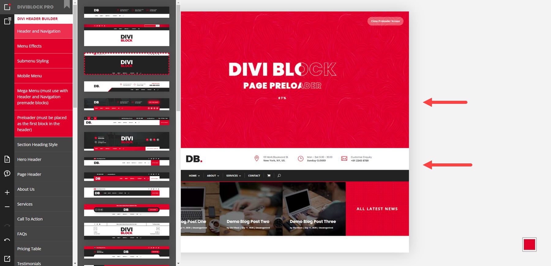
The header builder has 6 options that include pre-made headers, effects, sub-menus, mobile menus, mega menus, and preloaders. The effects show in the previews when you hover over them. In this example, I’m hovering over the Header and Navigation options, which include the pre-made headers. I’ve added a preloader and a mega menu to the layout.
Layout Examples
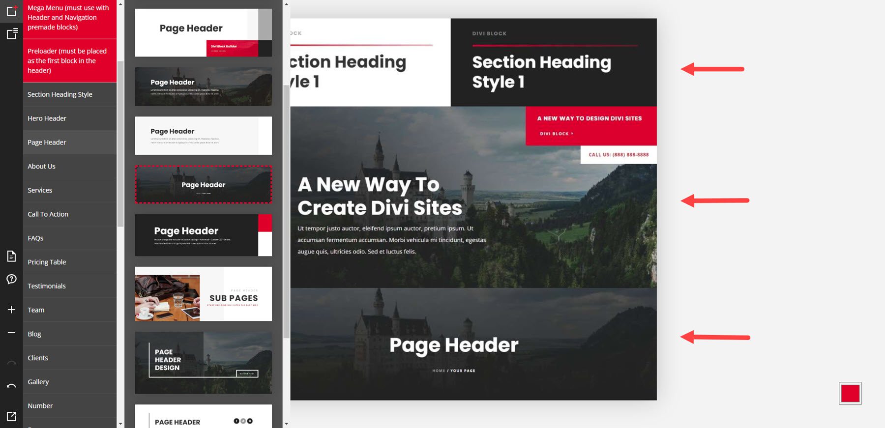
The layouts include hero sections, headers, about us pages, services, CTAs, FAQs, pricing tables, testimonials, team members, blogs, clients, galleries, numbers, processes, portfolios, email forms, contact forms, and footers. The example below shows a section heading, a hero header, and a page header.
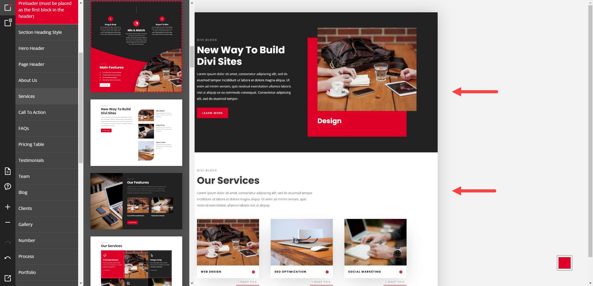
This example shows sections for About Us and Services.
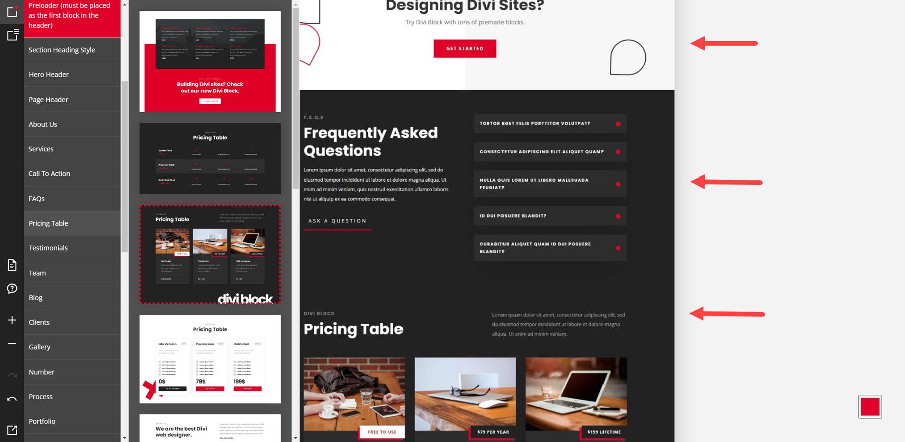
This example shows a CTA, an FAQ, and a pricing table.
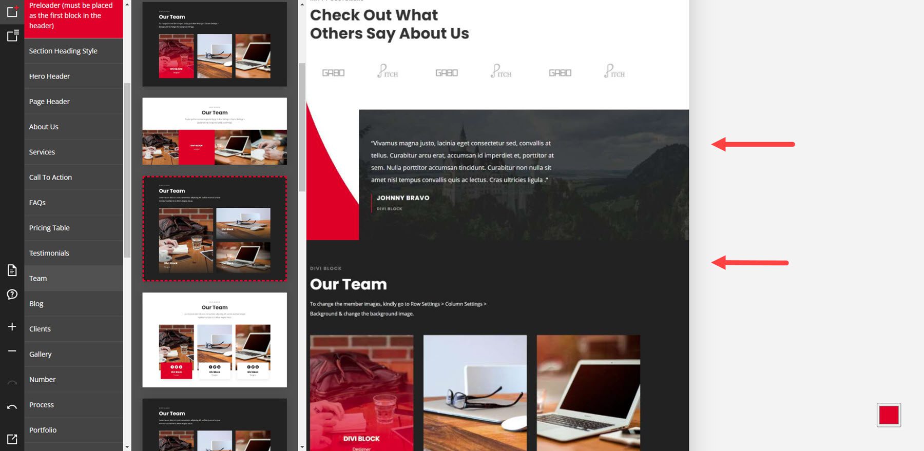
Here are examples of a testimonial and a team layout.
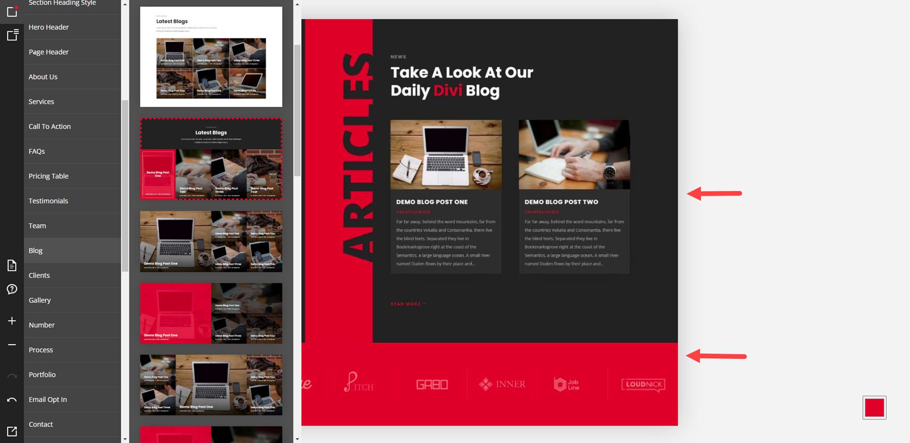
This one shows a blog layout and client logos.
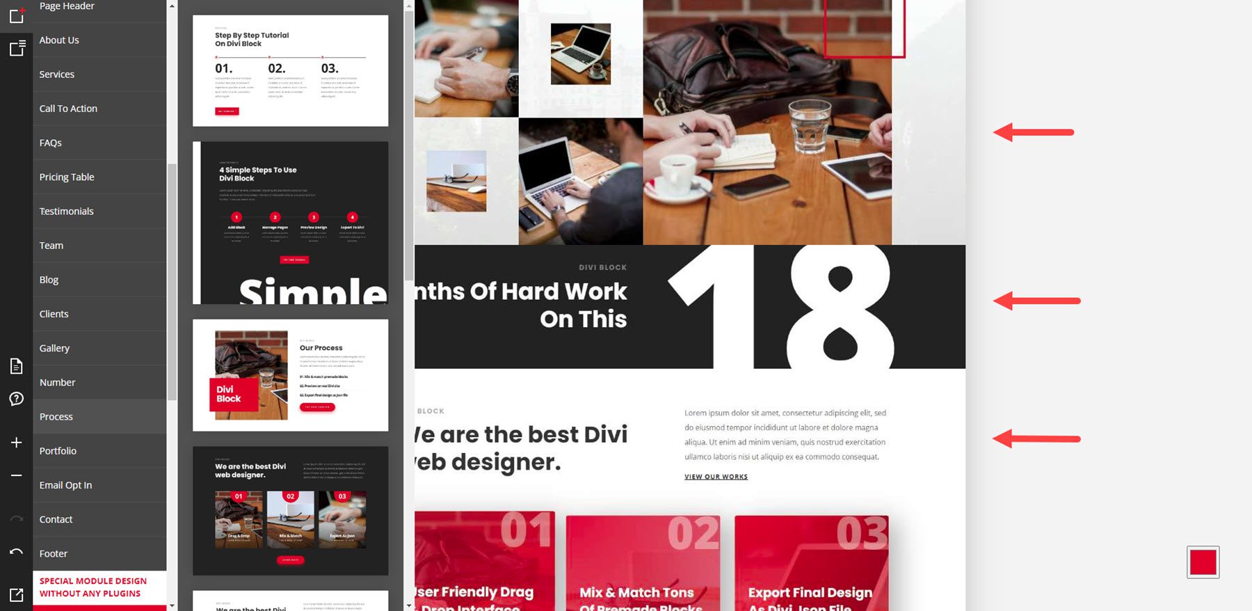
This example shows a gallery, a number section, and a process section, which shows the steps of a process.
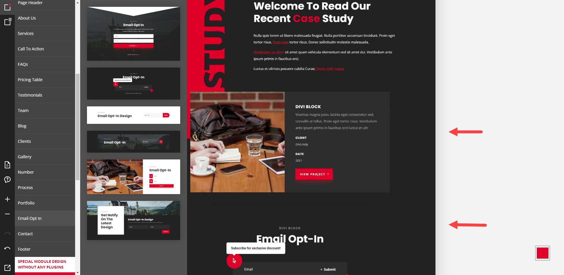
Here are examples of a portfolio and an email optin form.
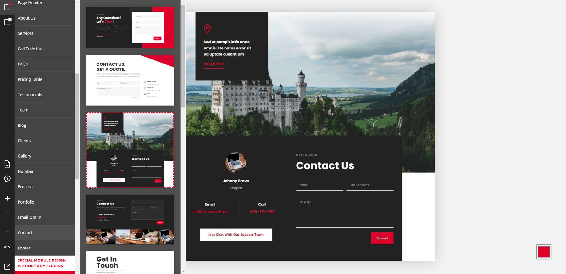
This example shows a contact form.
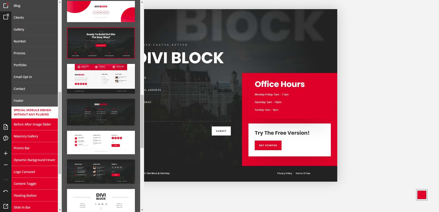
This example shows a footer.
Special Module Design Examples
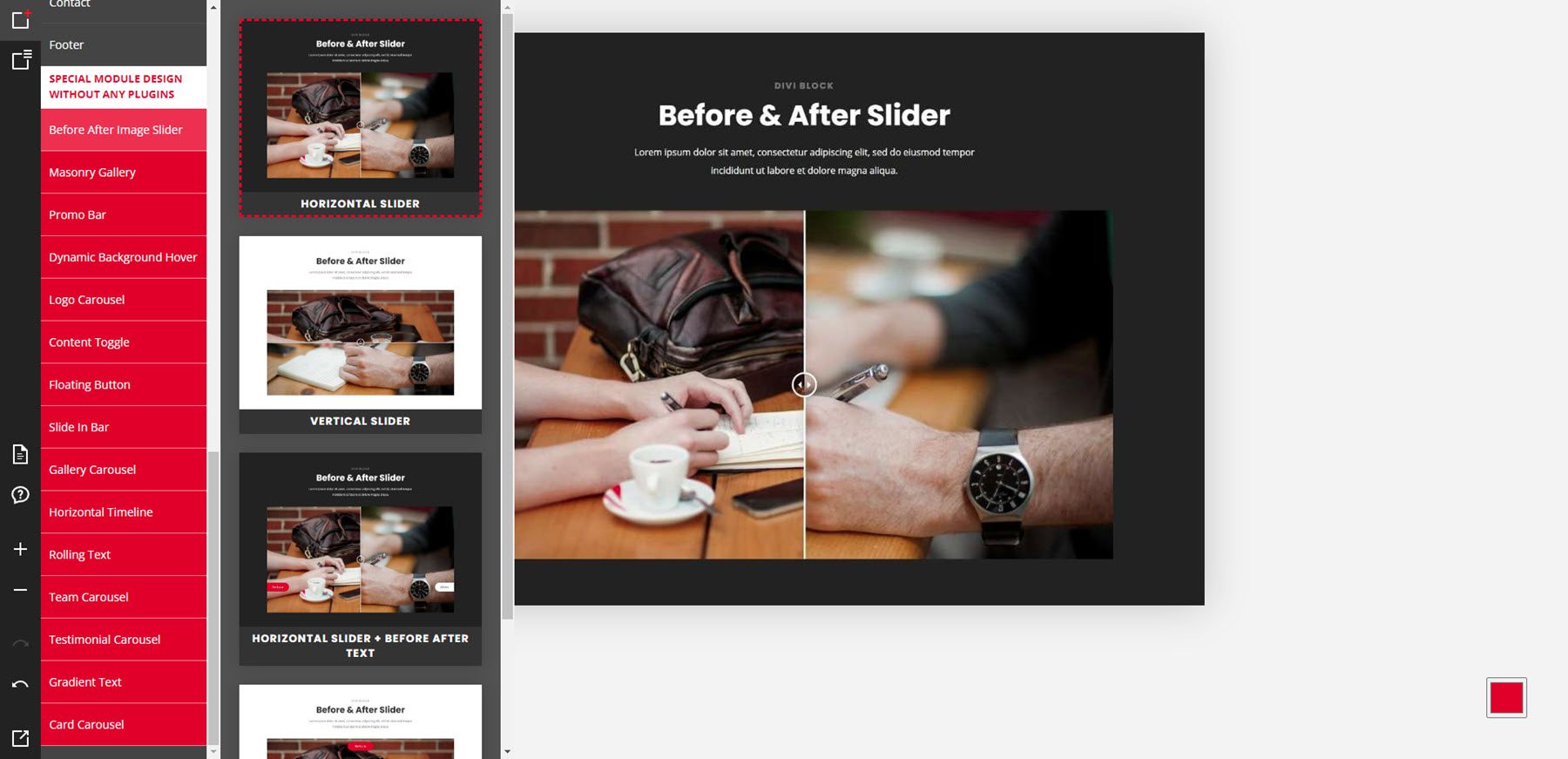
The last portion of layouts includes special modules that add features without using plugins. Some of these are seen in the other layouts, but I’ll show a few of them. This one shows the before and after slider options.
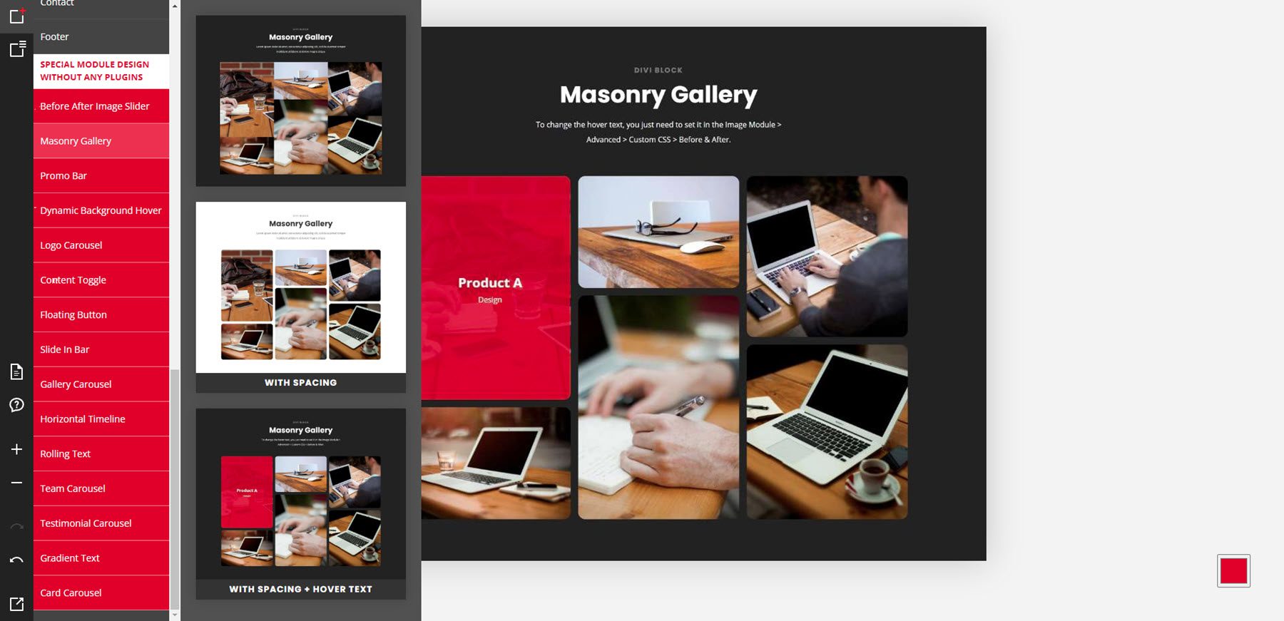
Here’s the masonry gallery.
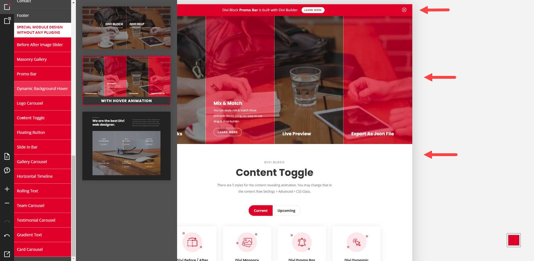
This example shows a promo bar, dynamic background, and a content toggle.
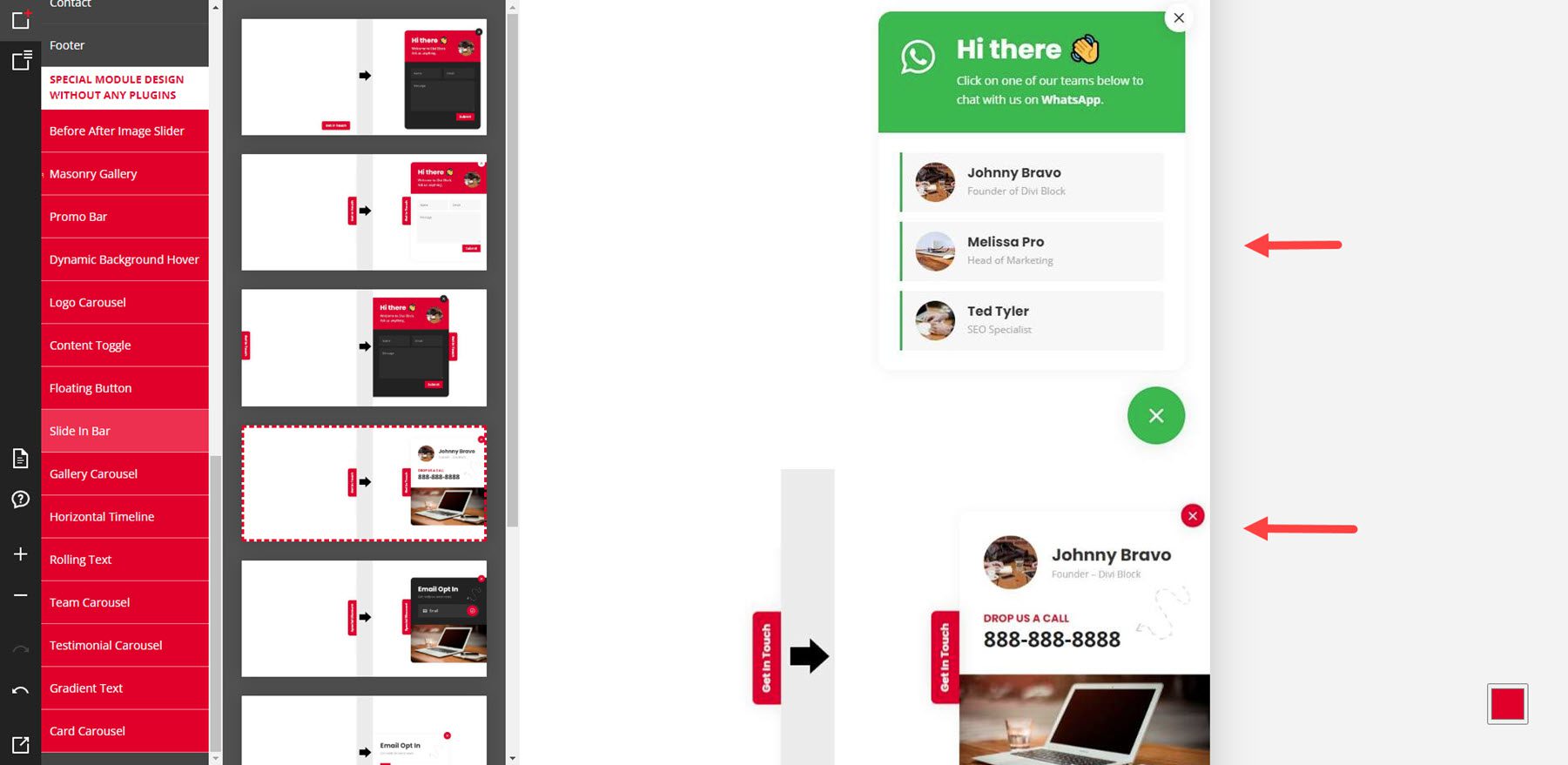
For this example, I’ve selected a floating button and a slide-in bar.
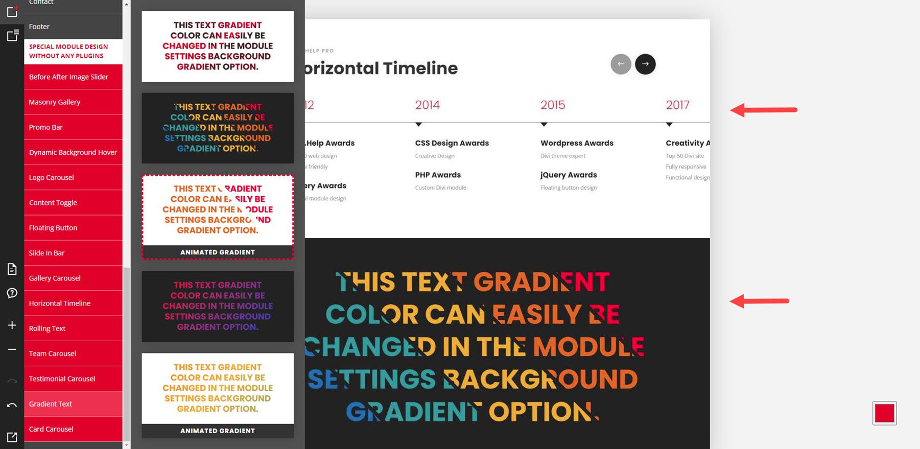
This example shows a horizontal timeline and gradient text.
Color Scheme
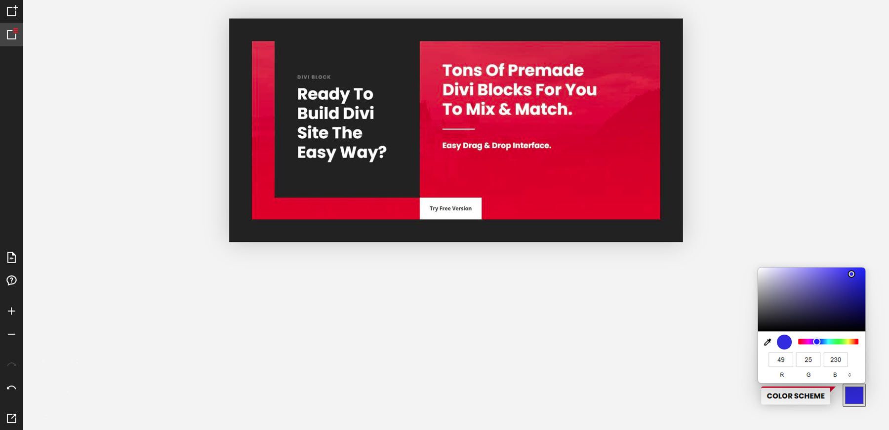
Clicking the color square in the lower right corner opens the color picker. This controls the color scheme for the elements on the page. The default is red, hex code 229, 27, 35. You can change it by moving the circle on the color area, moving the circle in the color slider, or adding the RGB values you want. Once you’ve changed the color, you can use the preview button in the bottom left corner to see your color in action.
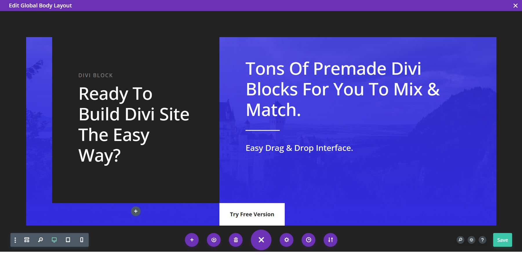
Here’s the layout on my website. It shows the blue that I chose. Next, we’ll see how to get the layout from Divi Block to your website and what you can do with it once you get it there.
Designing a Layout with Divi Block
I’ll use Divi Block to create a header, home page, and footer. I’ll then upload them as templates in the Divi Theme Builder.
Header
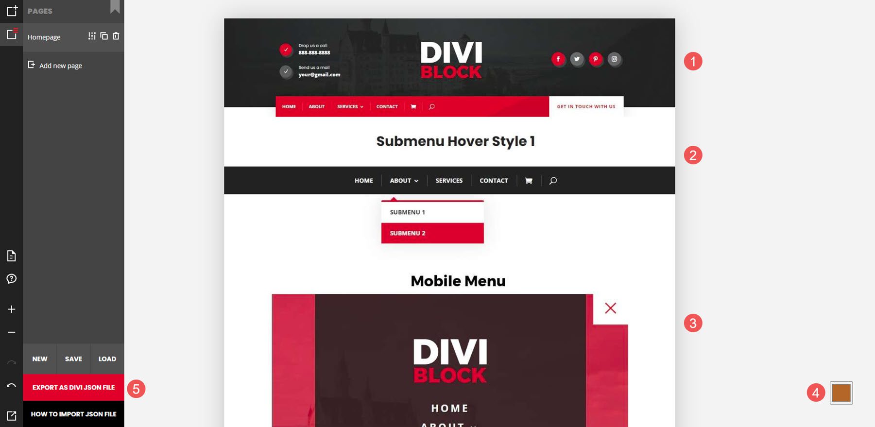
For the header, I’ve used a header with effects, submenu styling, and a mobile menu. I’ve used a brown color for the color scheme. I’m exporting the JSON file. It downloads as a zipped file, which I’ll unzip on my computer.
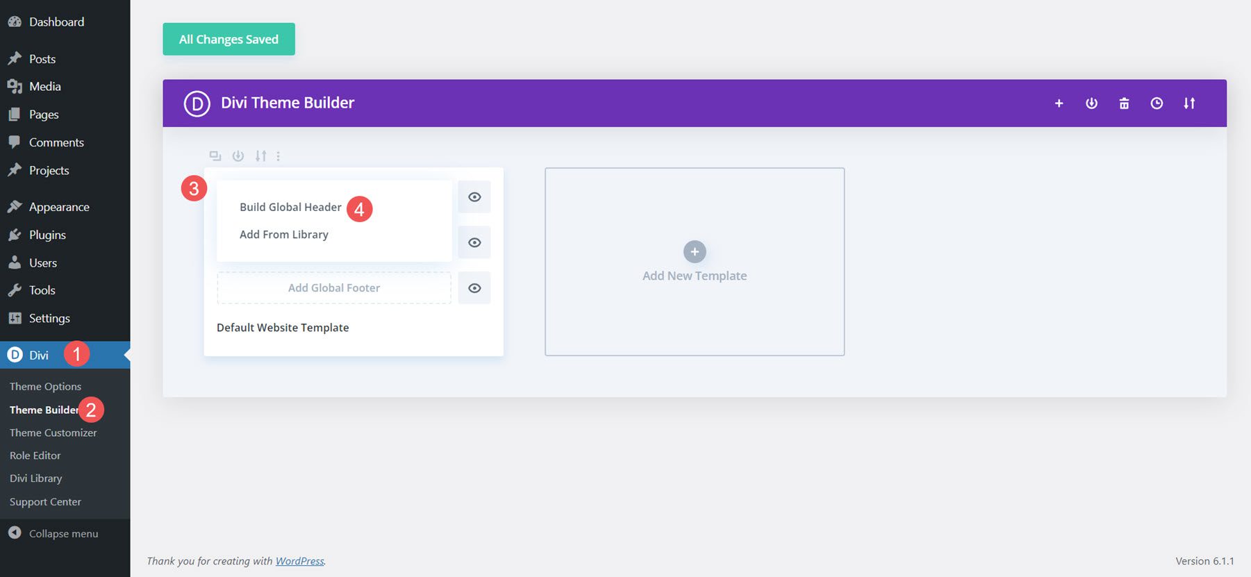
Next, I’ll build a global header from scratch in the Divi Theme Builder.
Next, I’ll import the layout.

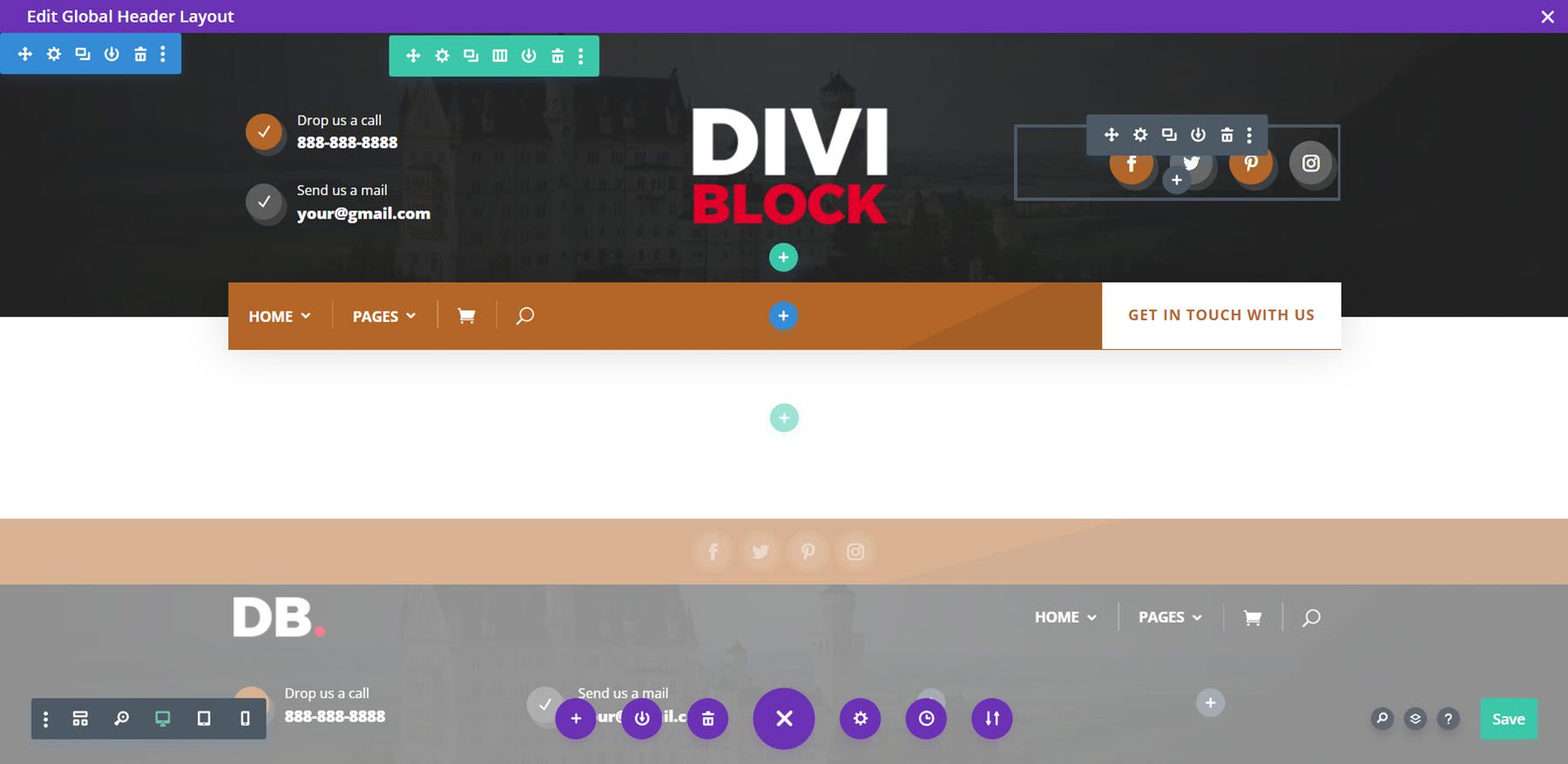
Finally, I can now make any adjustments I want to the layout. I’ll add my primary menu, contact information, social links, and logo. Once I save it, the header appears on my site.
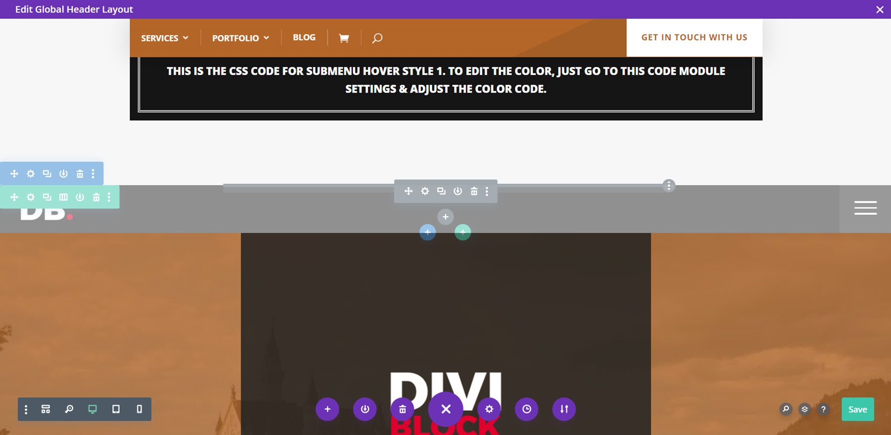
All the CSS is added to code blocks. The mobile menu is grayed out, as normal.
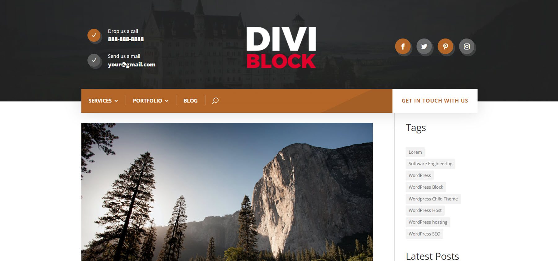
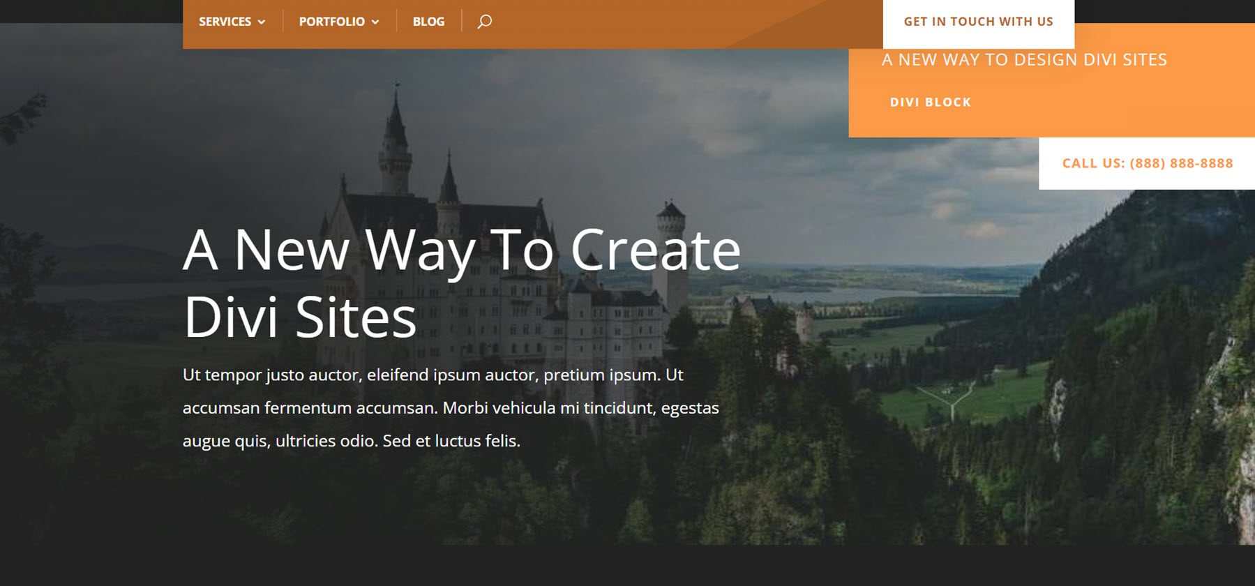
Here’s the header on the front end. The menu is sticky, so it remains at the top of the page when the user scrolls.
Homepage
For the homepage layout, I’ve added a hero section and a CTA. I’ve used a light orange for the color scheme. I’m exporting the JSON file, which I’ll unzip on my computer.
Next, I’ll build a homepage template from scratch in the Divi Theme Builder and add a custom body.
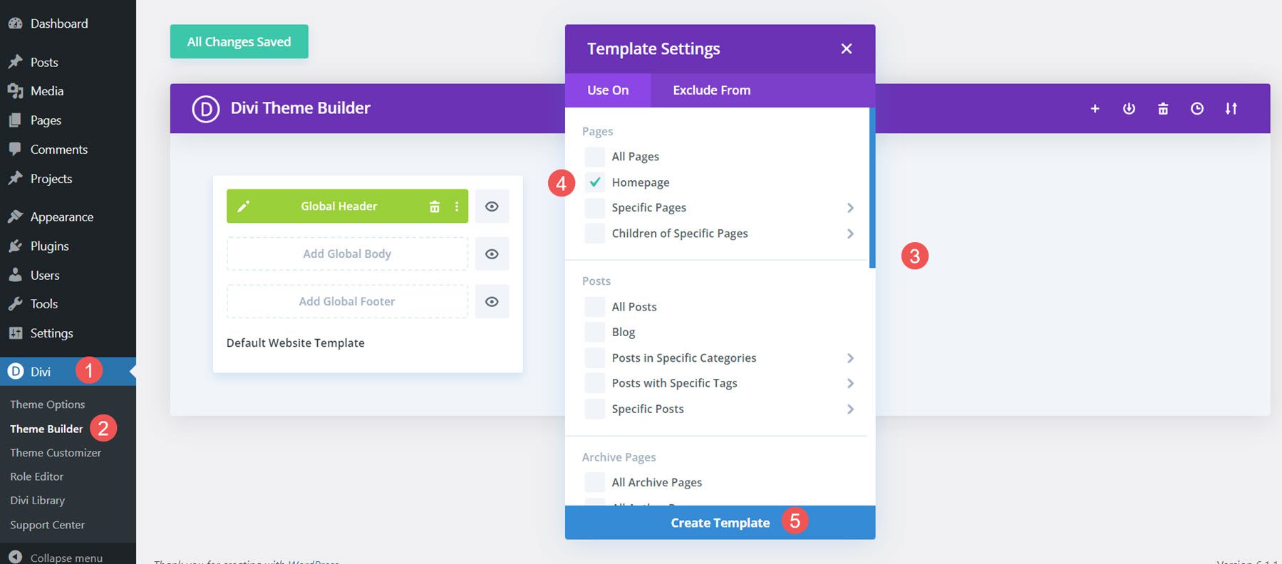
Next, I’ll import the layout.
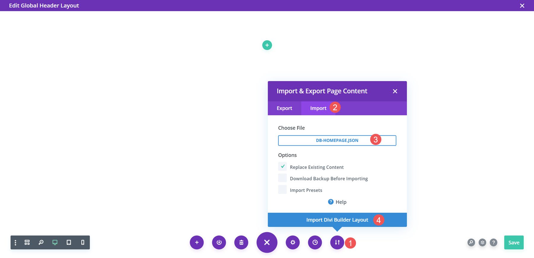
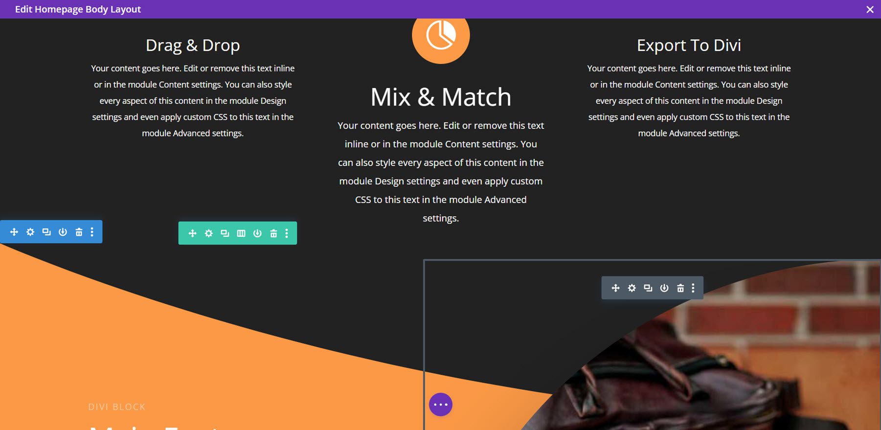
Finally, I can now make any adjustments I want to the layout. I’ll add my text and images. Once I save it, the layout appears on my home page. This is the hero section.
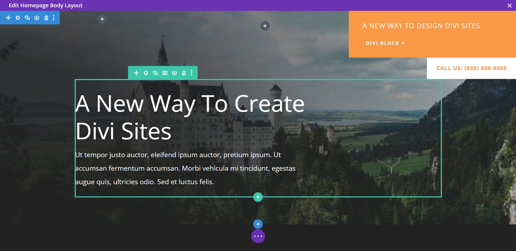
Here’s a portion of the CTA.
Here’s the hero section on the front end. I’ve scrolled down to show the menu sticking to the top of the screen.
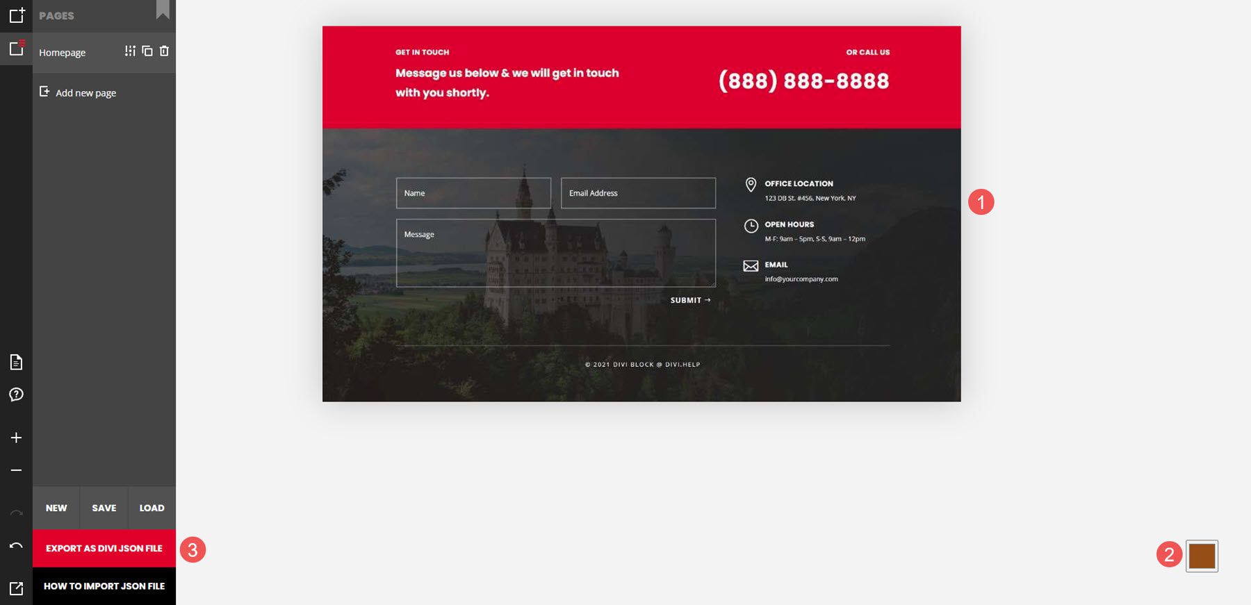
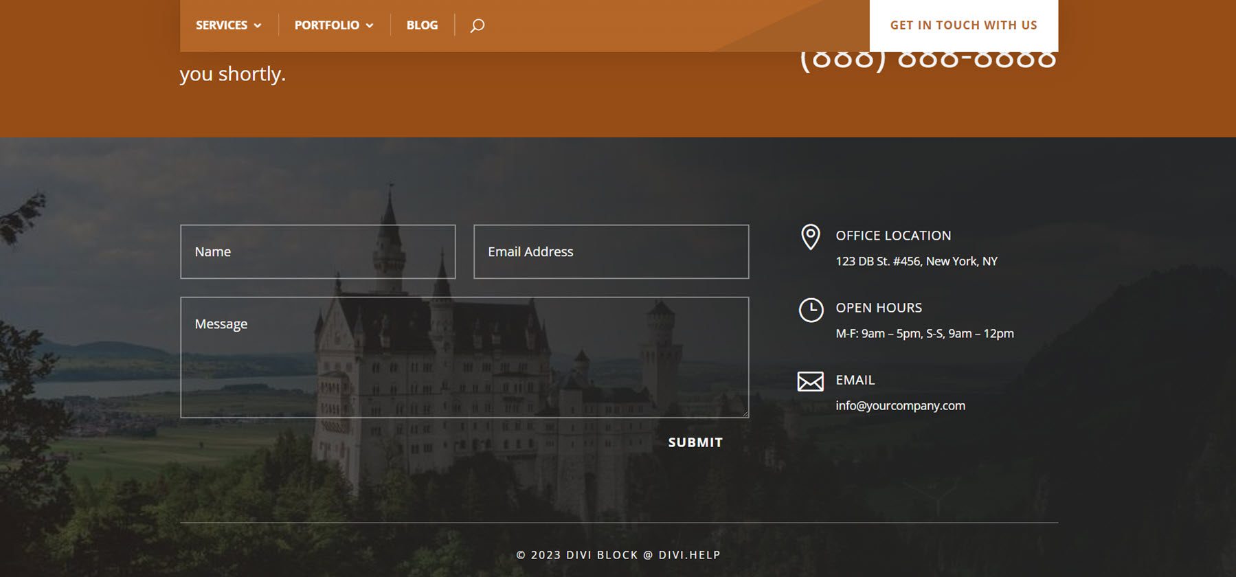
For the footer, I’ve used a layout with contact information. I’ve used a brown color for the color scheme. Now, I’m exporting the JSON file. I’ll unzip it on my computer.
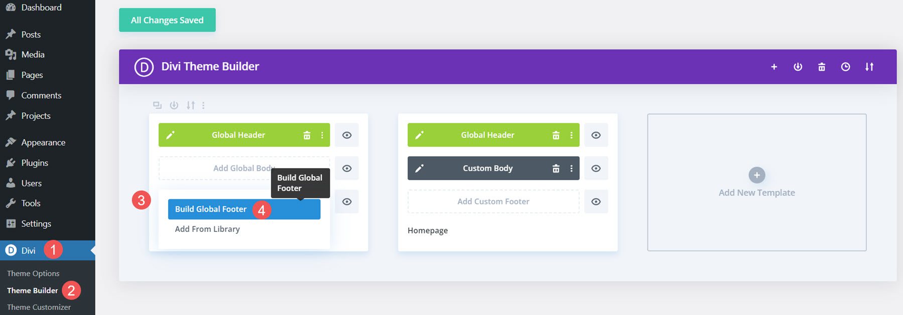
Next, I’ll build a global footer from scratch in the Divi Theme Builder.
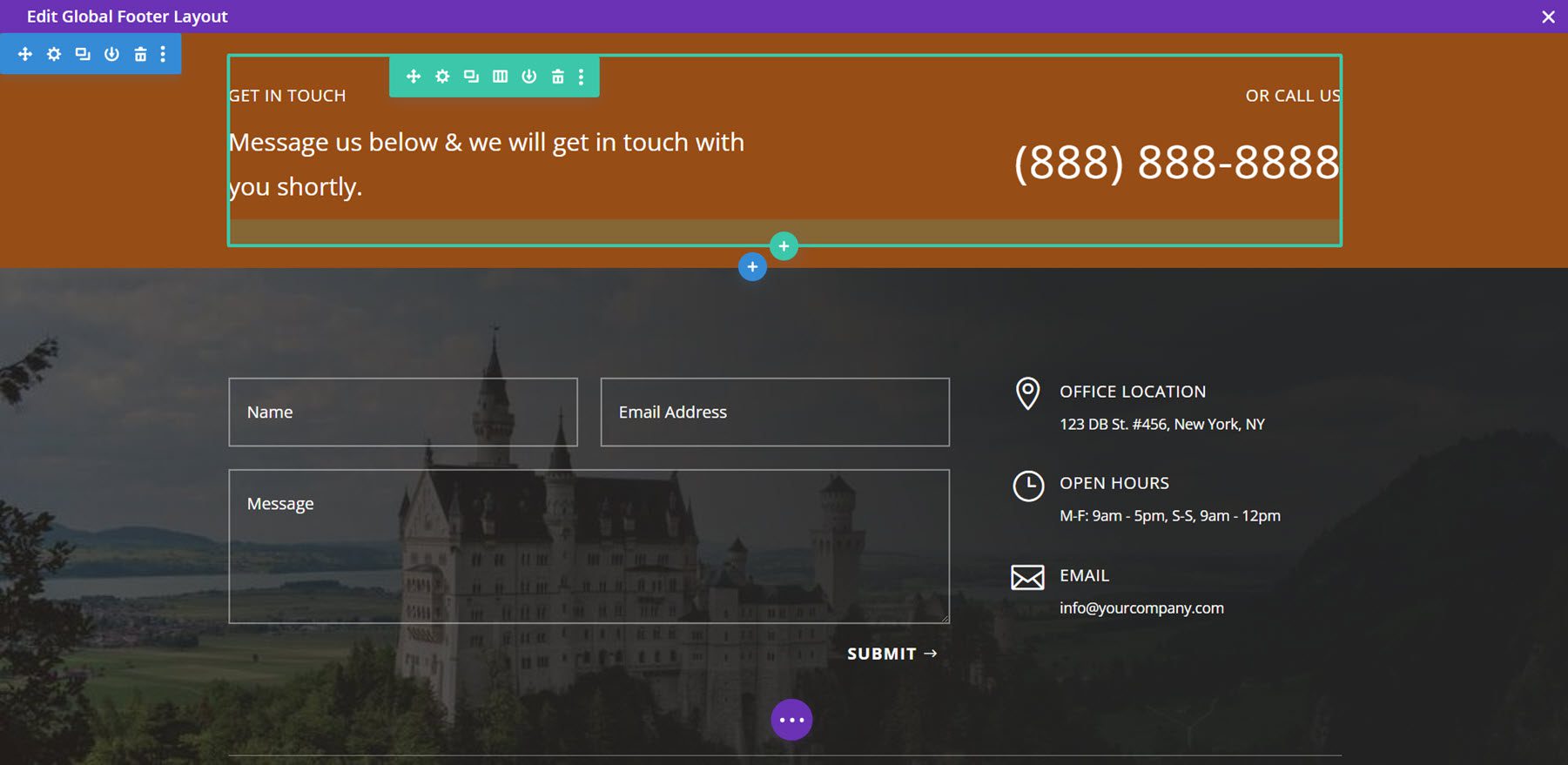
Next, I’ll import the layout.

Finally, I can now make any adjustments I want to the layout. I’ll add my contact info. Once I save it, the footer appears on my site.
Here’s the footer on the front end.
Where to Get Divi Block
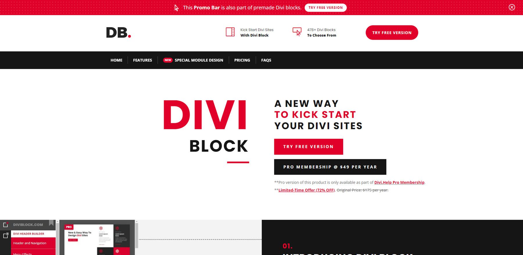
Divi Block is available on the publisher’s website. The free version is available for anyone to use. The Pro version of Divi Block is only available as part of their Divi.Help Pro membership. Subscribers gain access to all of their Divi-related products, including the Divi Block Pro version, premium plugins, child themes, and layout packs. The Pro membership is $49 per year.
Ending Thoughts
That’s our look at Divi Block. This is an interesting drag-and-drop builder. Rather than moving modules and other elements around, we’re working with full elements as pre-rendered blocks. This makes it easier to create layouts without getting bogged down with where everything should go on the page. It also simplifies full layout design because we can mix and max pre-made sections. You won’t see the custom colors while you’re working in Divi Block, but since the blocks are pre-rendered, it makes sense. We can preview it and adjust everything once the files are imported into the Divi Builder. I found Divi Block easy to use and it makes Divi layouts quickly and easily.
We want to hear from you. Have you tried Divi Block? Let us know what you think about it in the comments.



looks good.
Hello,
Thank you for this presentation.
It is indeed a very interesting tool for creating visuals quickly!
In addition, it is really accessible and the site well documented.
Really a good tool, I’m a taker!