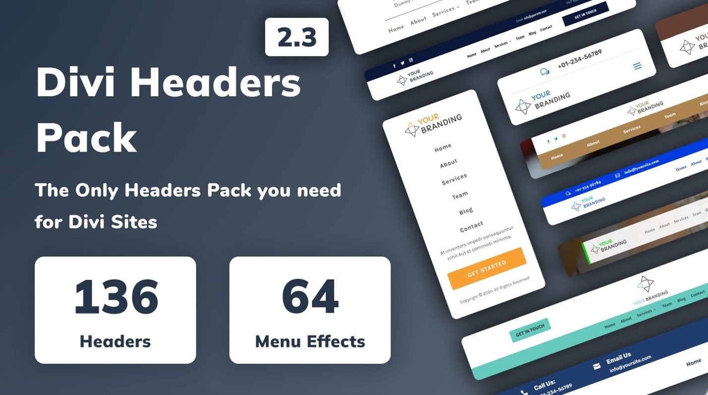
Are you running out of creative ideas for your website headers? Or are you looking for a pack of header layouts to save you time and effort for your next design project? Divi Headers Pack is a Divi Marketplace product with 960+ header layouts for the Divi Builder. Each header design is mobile-friendly and comes with many varieties for you to choose from. And because it’s built with Divi, it’s all completely customizable within the Divi Builder. In this product highlight, we’ll look at some of the layouts you get with the Divi Headers Pack to help you decide if it’s the right product for you.
Let’s get started!
Installing Divi Headers Pack
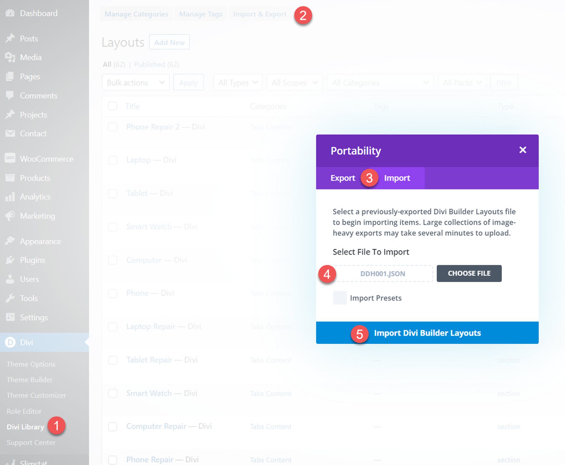
Divi Headers Pack comes as a ZIP file containing Divi Library .json files. To install the header layouts, start by unzipping the file. Then, open your WordPress dashboard and navigate to the Divi Library page.
Click Import & Export at the top, then select the import tab. Choose the layout file, then select Import Divi Builder Layouts.
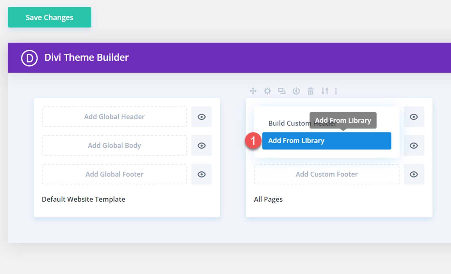
Once the layout has been imported, open the Divi Theme Builder. Click Add Custom Header, then select the uploaded layout from your Divi Library.
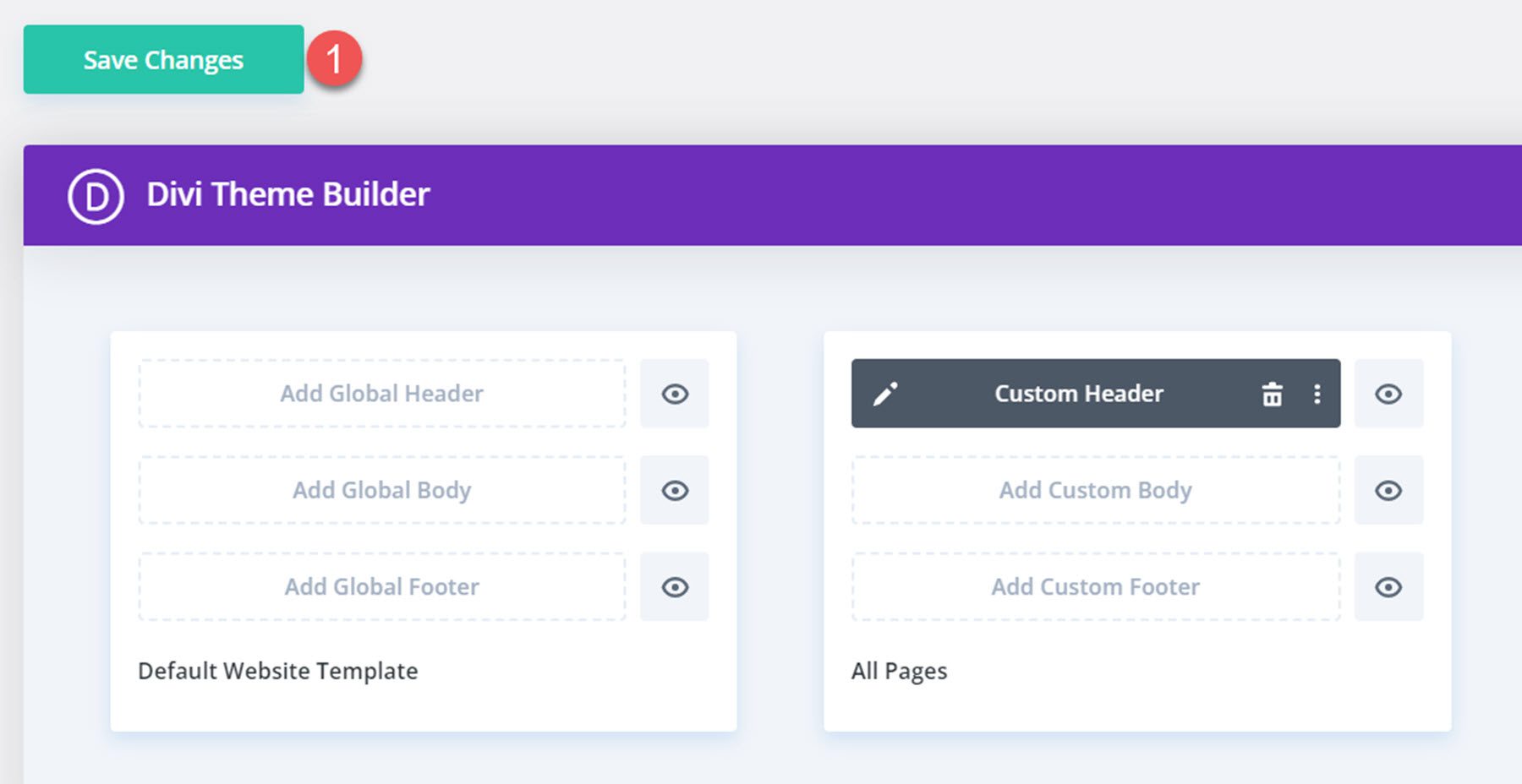
Click Save Changes once you’re done, and your header should appear on your website.
Divi Headers Pack
Many of the header layouts have multiple variations with different effects, functionality, and styling. Additionally, many of the header layouts come with three versions – one with a mobile menu that slides in from the left, one that slides in from the right, and one with a full-screen mobile menu. With all of the variations, there are a total of 980+ header layouts that come with the Divi Headers Pack.
Easy Headers
There are 50 easy headers included in the header pack. These are headers built with Divi’s default options and are simple and ready to use. These layouts do not have separate variations either.
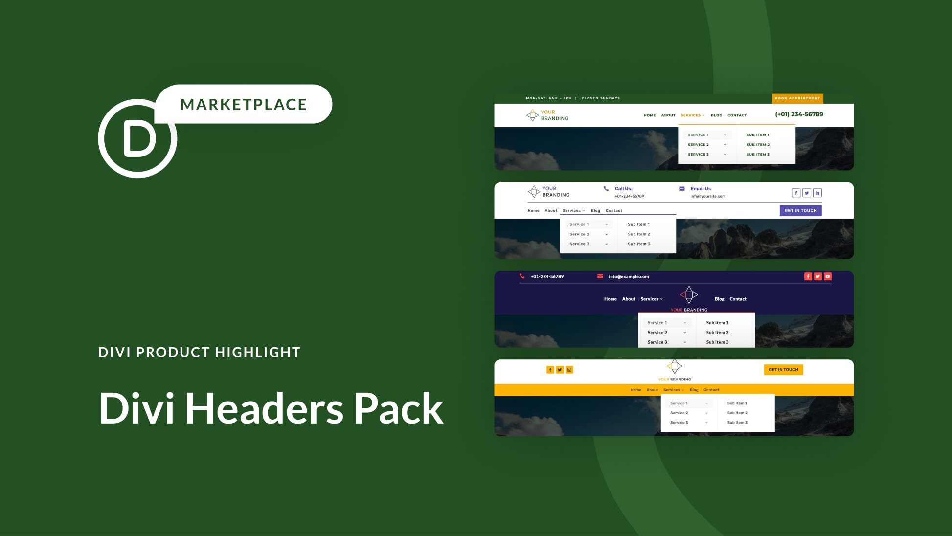
Easy header 8 features a green secondary menu bar with office hours and a CTA button. The primary menu bar has a logo, menu items, and a phone number. The primary menu bar is sticky.

Easy header 20 has the logo, contact information, and social media icons at the top. There is a divider bar in the middle, and below are the menu items and a CTA button.

This is easy header layout 25. The phone number and email address are listed at the top, along with social media icons. The menu is below, with an inline logo. The primary menu bar is sticky.

Easy header 32 features a header bar with social media icons on the left, the logo in the middle, and a CTA button on the right. The menu bar is below, with an orange background.

RTL Headers
The RTL headers are designed for RTL languages. There are 5 basic designs and several variations of each, with a total of 42 RTL header layouts.
RTL header 3 is a transparent layout. It has the logo on the left, menu items in the center, and a button on the right. When you scroll up, a white background appears behind the menu.

RTL header layout 12 also has a transparent layout and a white background that appears when scrolling down the page. It features a logo, menu items in the center, and a phone number blurb with an icon on the right.

RTL header 36 overlays the content on the page and does not span the full width. It lists the address, phone number, and social media icons at the very top. Separated by a divider, the logo, menu, and CTA button are below.

Finally, RTL layout 39 has a brown secondary menu bar with some text and social media icons. The primary menu bar features a logo, address information, office hours, menu items, and a CTA button.

Standard Headers
Most of the standard headers have several variations. These variations include layouts with transparent backgrounds, different shadow styling, sticky settings, scroll-up settings, and more. These slight variations are great to have and make it easy to find the perfect header for your site. With 249 standard header layouts to choose from, you won’t run out of options! Let’s take a look at a few of the standard headers.
Standard header 27 is a transparent variation. It has a logo on the left and a right-aligned menu bar as well as some social media icons. The menu background turns white on scroll.

Standard header layout 60 floats above your page content. It features a top bar with the address, office hours, and phone number. The primary menu bar has a logo on the left, menu items centered, and a CTA button on the right.

Standard layout 101 has a secondary menu bar at the top with office hours, an email address, a CTA button, and social media icons. The primary menu bar has a logo and right-aligned menu items.

Standard header layout 176 is a transparent variation and has a logo, menu items, and a phone number blurb. There is a white background that appears on scroll.

Vertical Logo Headers
The vertical logo headers are specifically designed for taller, vertical logos. There are 19 layouts in total.
Vertical header layout 5 is transparent until you scroll, then a white background appears. It features a call icon on the left, a menu in the middle with the logo inline, and a search icon on the right.

Vertical logo header 11 features a large top menu bar with a phone number, the logo in the center, and the hours on the right. The menu bar is below, and it stays sticky at the top of the page as you scroll.

Vertical logo header 14 is a large header layout with a secondary menu bar at the top with three links and social media icons. Below this are a phone number, the logo in the center, and the hours. There is a divider after this, and then the menu bar on the left and a CTA button on the right.

Finally, this is vertical logo header layout 16. The logo is on the very left and spans the full height of the header. There is a blue secondary menu bar with some text and a CTA link. Below this is the primary menu bar, with the menu items and a phone number on the right.

WOO Headers
Woo Headers are integrated with WooCommerce to feature cart and shop information in the header. There are 29 total Woo headers.
There is a plugin you need to install in order to display the cart count with the bag icon, and you need to create a menu and update a setting in one of the header modules for the icon to appear, but the documentation that comes with the product is clear and easy to follow and was no problem to set up.
Woo header 5 is transparent until scroll and has a logo on the left, menu items on the right, and cart, shop, and login icons on the right.

Woo header layout 20 has a white background and a secondary menu bar with some text and a phone number. The primary menu bar has a logo, menu items in the center, and search, cart, and login icons to the right. The primary menu bar is sticky as you scroll.

Woo header layout 24 floats above the page content. There are two transparent modules at the top with some text and a phone number. The primary menu bar floats at the top of the page and has a logo, centered menu items, and search, cart, and login icons on the right.

Finally, Woo header layout 28 features a blue secondary menu bar with some text and a phone number. Below this is a logo, and then the menu to the left and the search, cart, and login icons to the right. The primary menu bar sticks to the top of the page as you scroll.

Creative Headers
The last category in the Headers Pack includes 10 creative headers. These layouts are for people who are very familiar with Divi, and who have basic CSS knowledge.
The first header layout in this list has a logo on the left, and a hamburger icon on the right.

Once you click the hamburger icon, your menu with all its menu items will appear.

Header 7 in the creative headers category has a hamburger icon on the right.

Once you click the hamburger icon, a set of icons will slide down. You can link these icons to the relevant pages.

And our last example from this category, header 9, has an advanced design with multiple elements that are well-balanced. One of those elements is a search bar that goes above the menu items.

Purchase Divi Headers Pack
Divi Headers Pack is available in the Divi Marketplace. It costs $19 for unlimited website usage and lifetime updates. The price also includes a 30-day money-back guarantee.
Final Thoughts
Divi Headers Pack is jam-packed with lots of different headers and many variations of each design, making it easy to find a layout that works perfectly for your design. Because there are so many layouts to choose from, it might be overwhelming to know where to start, but the documentation for the product is great and you can download a preview folder that contains a helpful index of all of the different layouts you can use. You can also take a look at the demo site here and view some of the header designs. Overall, the product is easy to use and install, looks great, has great variety, and is easy to customize with your own content. If you’re looking for some premade header layouts for your next design project, this product could be great for you.
We would love to hear from you! Have you tried Divi Headers Pack? Let us know what you think about it in the comments!



Leave A Reply