DiviCommerce is a third-party child theme for Divi that’s designed for building online stores. It includes lots of pages and features to create WooCommerce shops that stand out from the crowd. In this post, we’ll look at the pages and features of DiviCommerce to help you decide if it’s the right Divi child theme for your needs.
- 1 Installing DiviCommmerce
-
2
DiviCommerce Pages
- 2.1 DiviCommerce Home One
- 2.2 DiviCommerce Home Two
- 2.3 DiviCommerce Home Three
- 2.4 DiviCommerce Home Four
- 2.5 DiviCommerce Home Five
- 2.6 DiviCommerce Home Six
- 2.7 DiviCommerce Shop One
- 2.8 DiviCommerce Shop Two
- 2.9 DiviCommerce Shop Three
- 2.10 Product Page One
- 2.11 Product Page Two
- 2.12 Cart Popup
- 2.13 Cart Page
- 2.14 Checkout Page One
- 2.15 About Us
- 2.16 Contact Us
- 3 DiviCommerce Headers
- 4 DiviCommerce Footers
- 5 DiviCommerce Popup
- 6 DiviCommerce Search
- 7 Where to Purchase DiviCommerce
- 8 Ending Thoughts on DiviCommerce
Installing DiviCommmerce
I found installing DiviCommerce to be intuitive. Install it like you would any WordPress theme but with Divi as the active theme. Got o Appearance > Themes > Add New Theme.
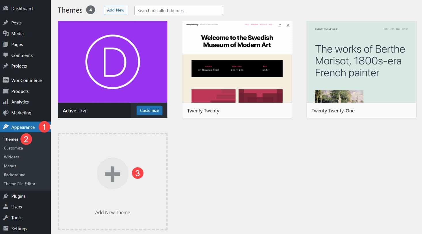
Select Upload Theme, click Choose File, select the DiviCommerce zipped file on your computer, and click Install Now.

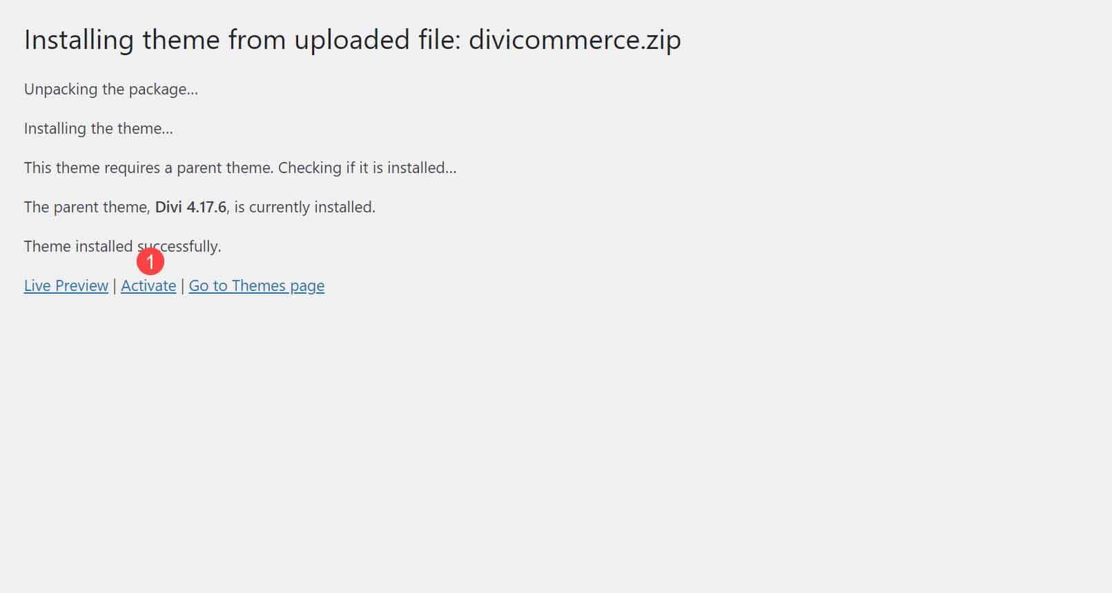
Next, click Activate.
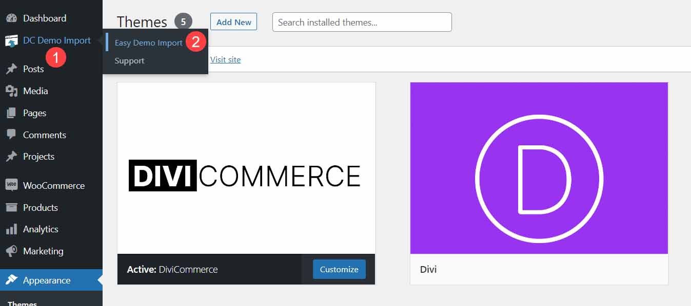
Finally, select DC Demo Import > Easy Demo Import.
Choose the files to import and click Import Demo Content. I recommend using the default settings.
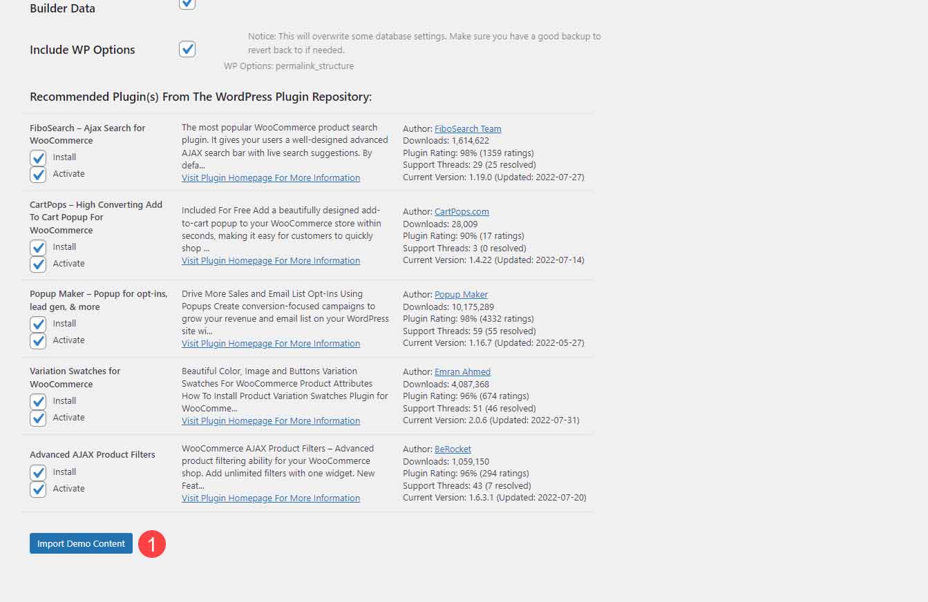
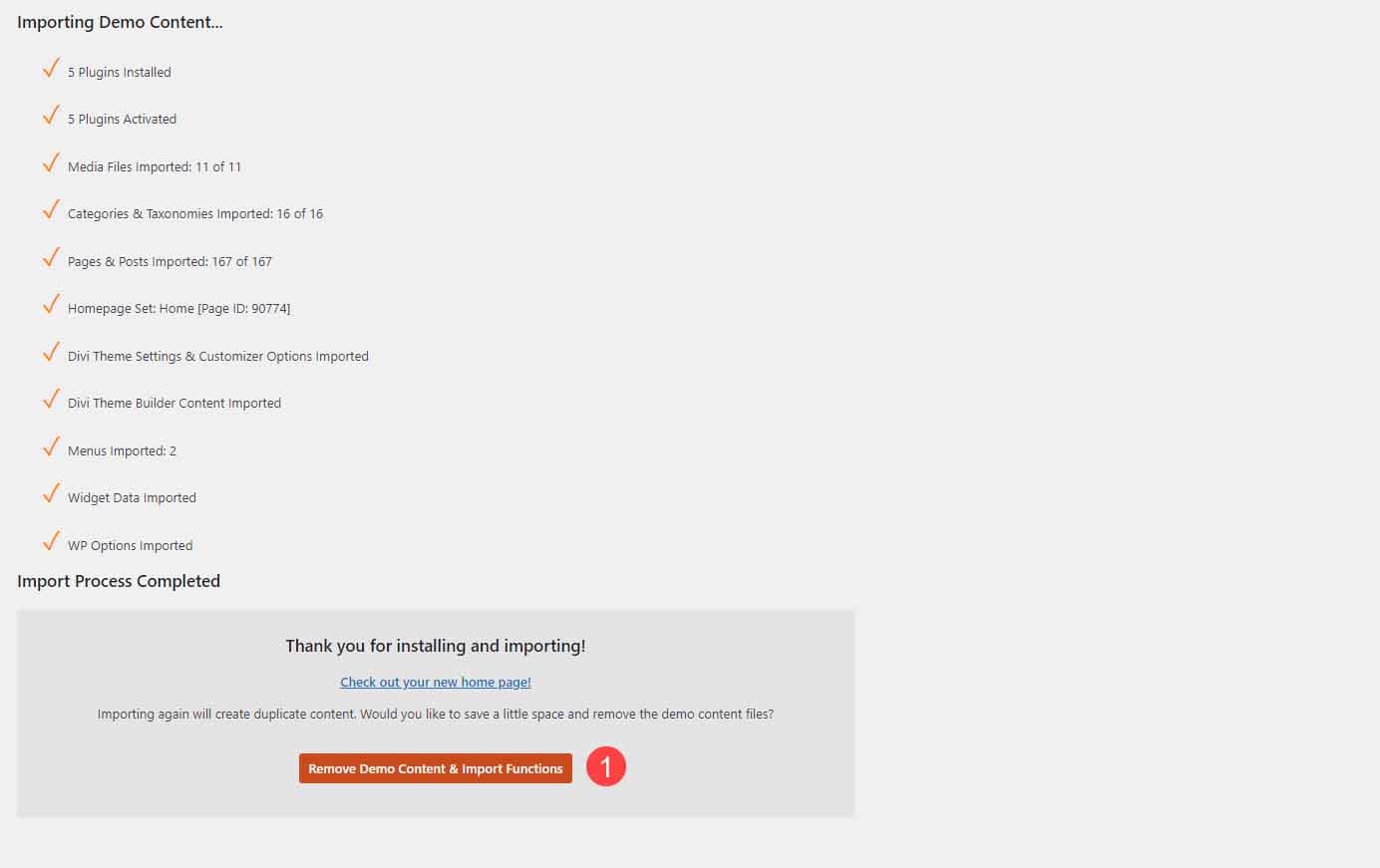
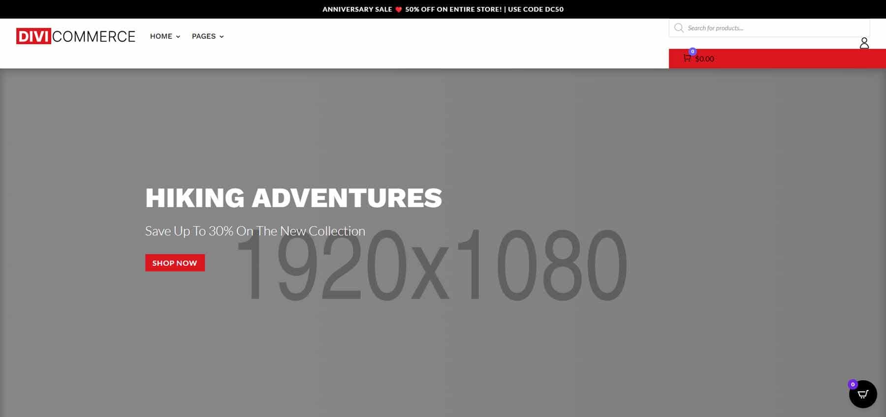
Once the demo content imports, click Remove Demo Content & Import Functions. Your site now looks like the demo with dummy images to show the sizes needed. Add your content and your site is ready to use.
DiviCommerce Pages
DiviCommerce comes with 26 pages that include 6 home pages designed to create multiple types of online shops. It also includes 3 shop pages, 2 product pages, 2 checkout pages, 5 headers, 2 footers, and lots of extras. Features include Ajax product filters, cart popups, product Ajax search, popup forms, and WooCommerce variation swatches.
Let’s take a look at the layouts. I’ll break the larger layouts into smaller groups so they’re easier to manage and show images from the downloaded child theme and the product demo.
DiviCommerce Home One
The hero section shows a full-screen image with a CTA.
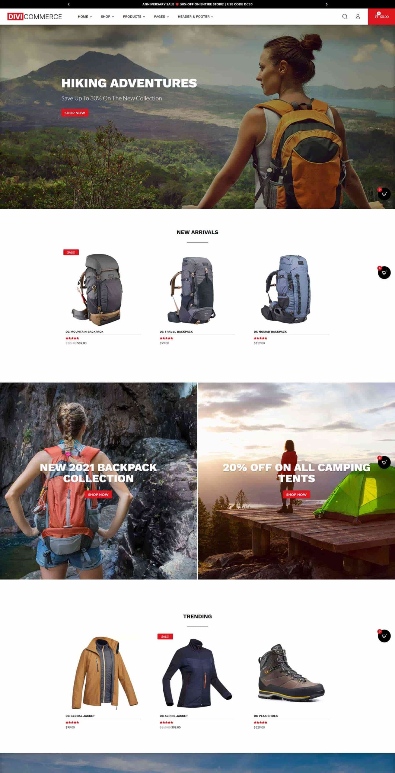
Following this is a section for new arrivals. This includes hover effects for the product cards. A two-column section displays images that link to the shop. The images include the Ken Burns effect. Next, is another shop section with hover effects. Here’s the top portion of the product demo.
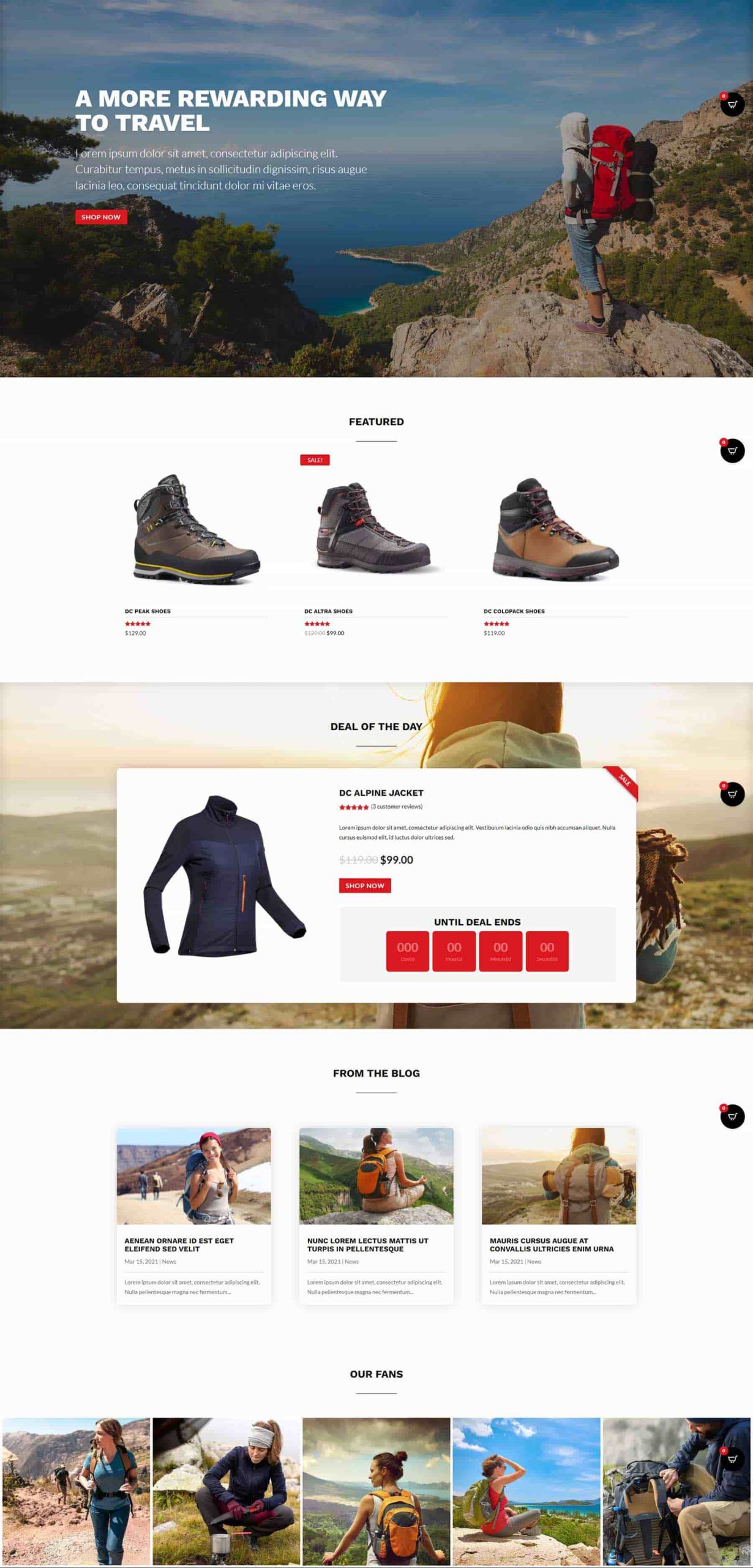
The bottom half of the first home layout shows another full-screen CTA, featured products, a unique deal countdown, a blog, and images.
DiviCommerce Home Two
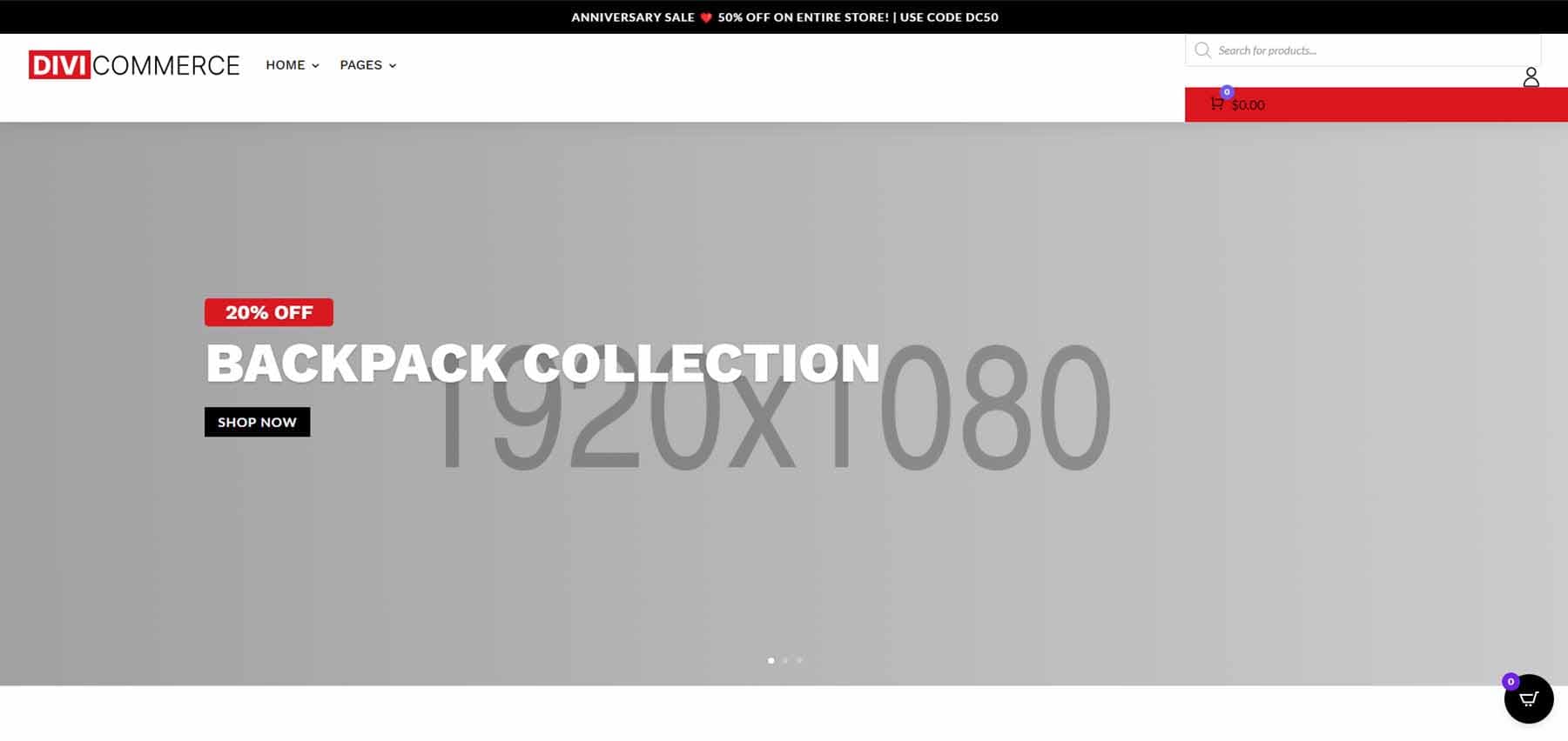
The second home page shows a full-screen slider with CTAs.
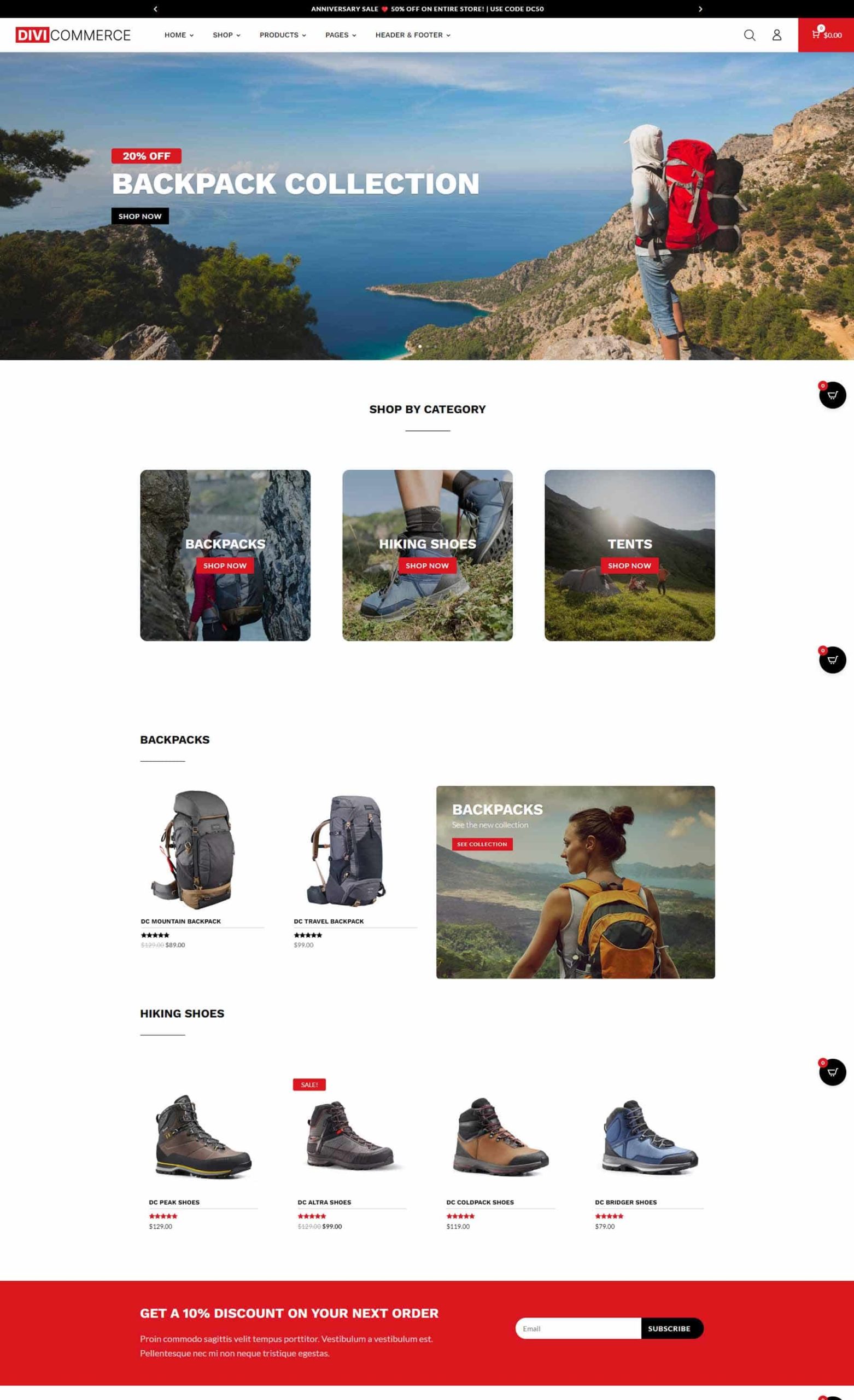
The top half of the page includes CTAs to shop categories, a unique shop section with two products on one side and a CTA on the other, a shop section, and a full-width email signup form. All the product cards and buttons include hover effects.
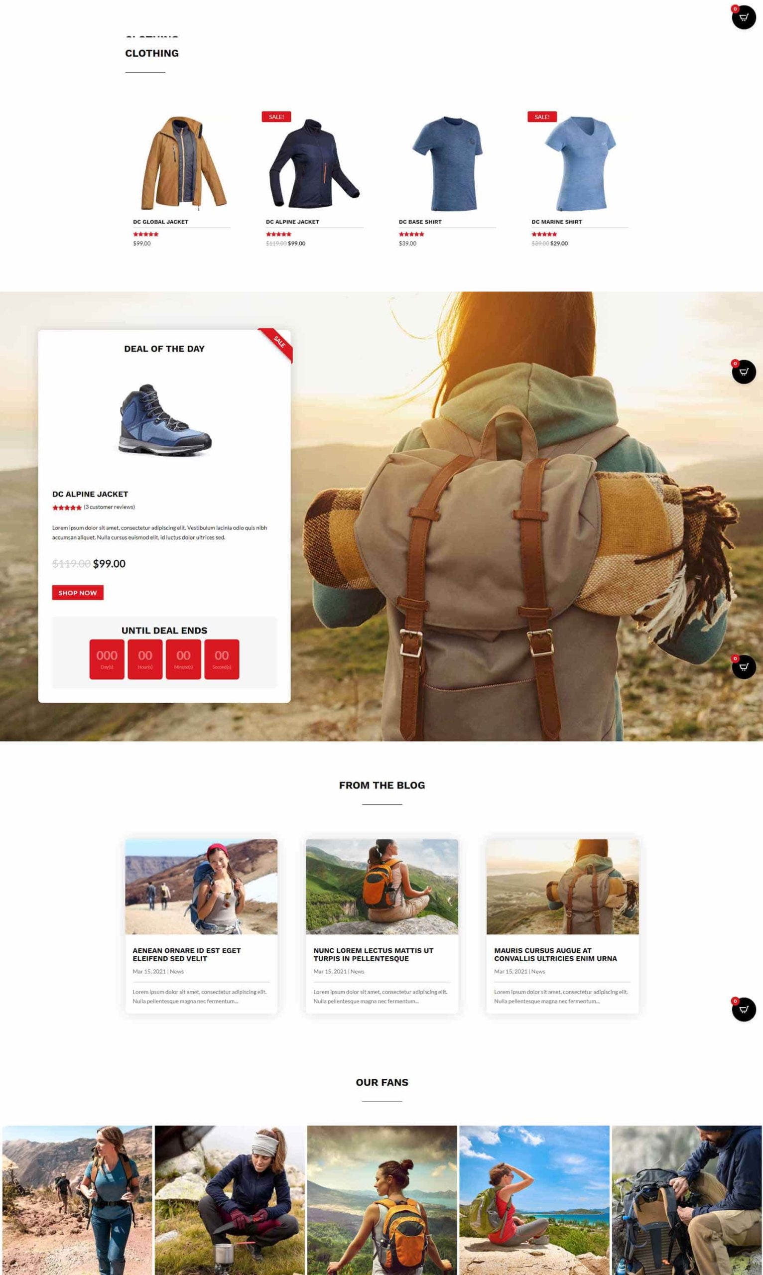
The second half of Home Two shows a shop section, a deal countdown timer in a card over a full-screen background image, a blog, and images.
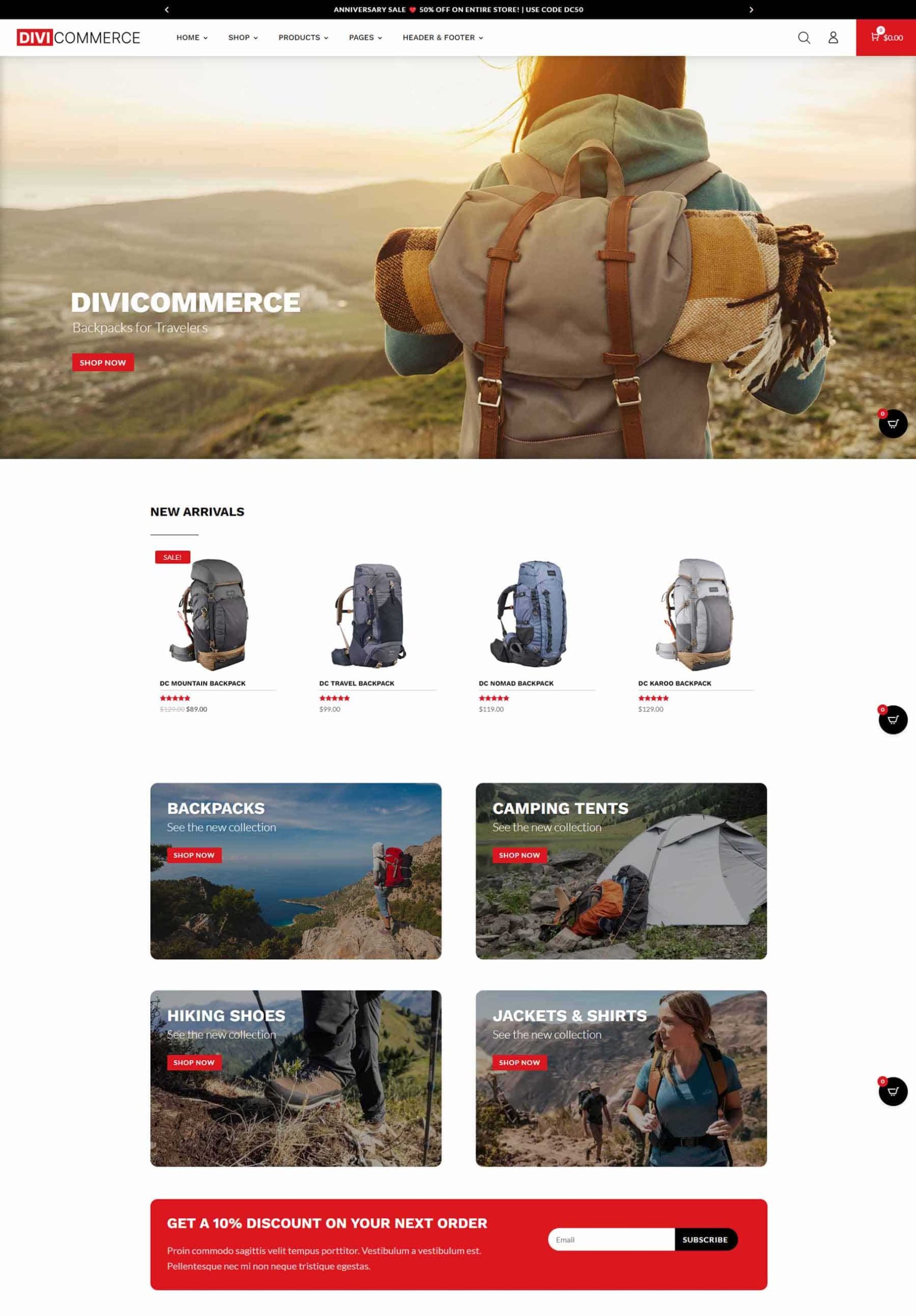
DiviCommerce Home Three
The top half of Home Three displays a full-width CTA, a shop section with new arrivals, a section with four images in two columns for category CTAs, and a wide email form.

The second half of the layout displays section shop sections, a blog section with a background image, and a section with customer images.
DiviCommerce Home Four
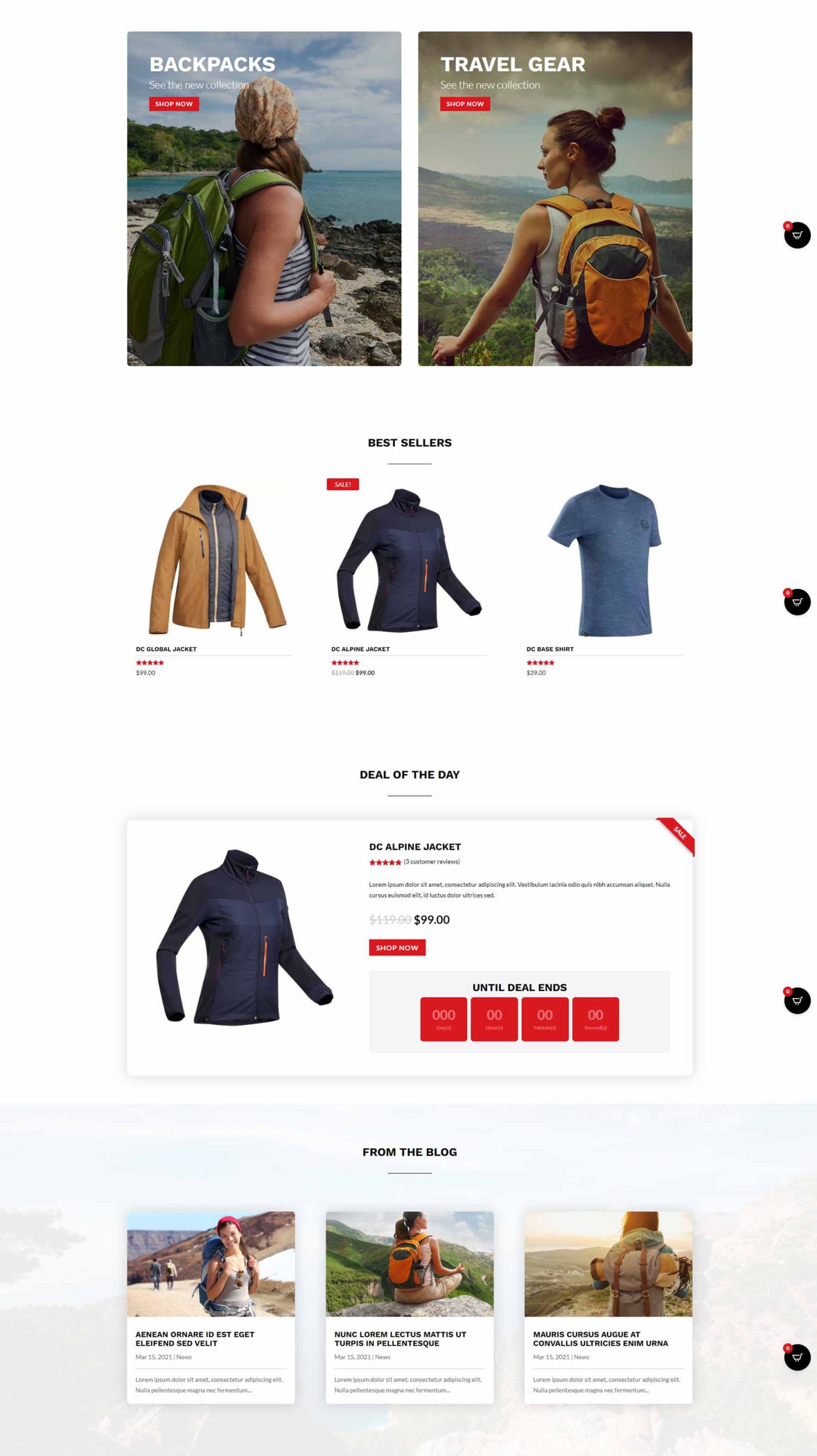
The fourth home page includes a unique hero section with two images. One is longer than the other and the text and CTA overlap both images. It also includes category images with the title at the bottom of the card and a shop section.
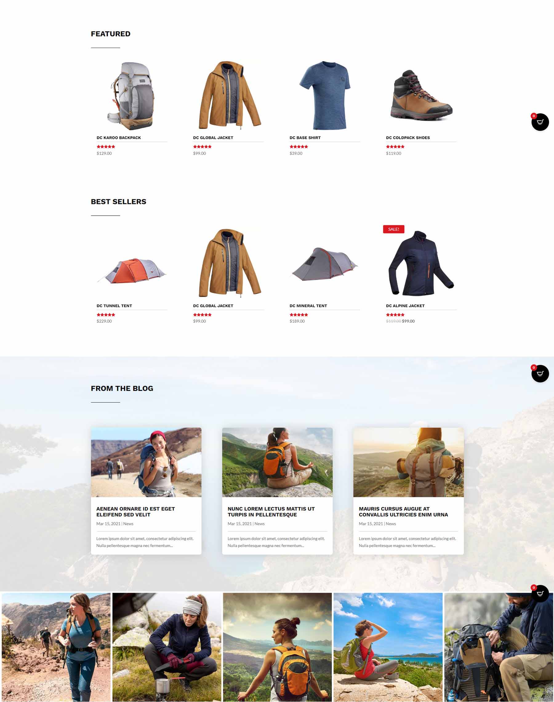
The second half of the layout displays two large category CTAs, a shop section, a deal section with a countdown timer, and a blog with a background image.
DiviCommerce Home Five
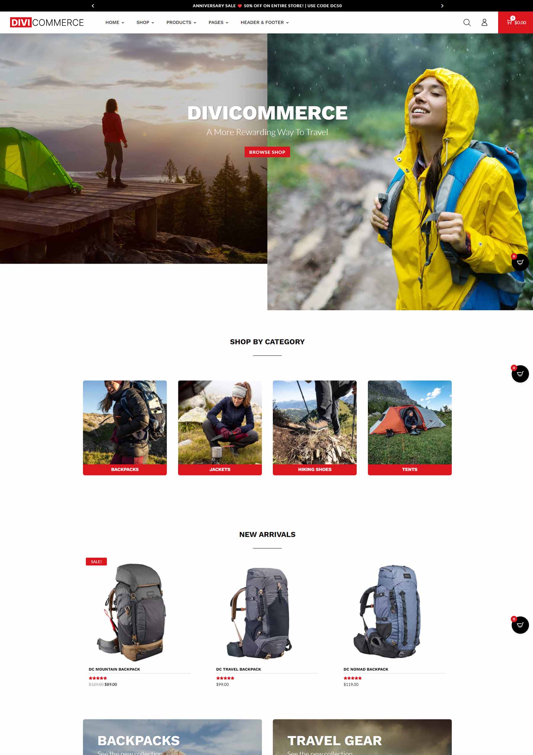
The fifth home page displays a full-screen hero section with the CTA on the right. It has a large section of category images with five smaller images and three larger images. Three shop sections show what’s new, what’s on sale, and the best sellers. This layout also includes the full-width email form and customer images.
DiviCommerce Home Six
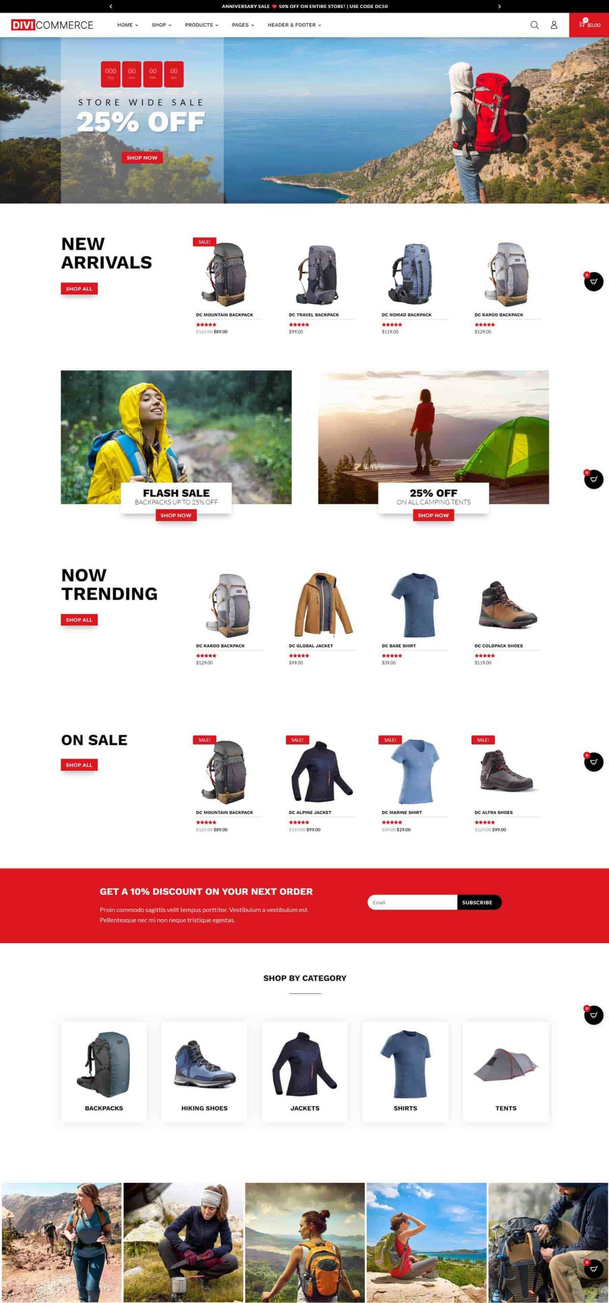
The sixth home page is the most unique. It displays a sale countdown timer in the hero section. Each of the shop sections places the title in large text to the left of the section. This is followed by two image CTAs that include the title and button that overlap the image and each other. Another category section places includes images with box shadows that disappear on hover. This layout also includes the email form and customer images.

DiviCommerce Shop One
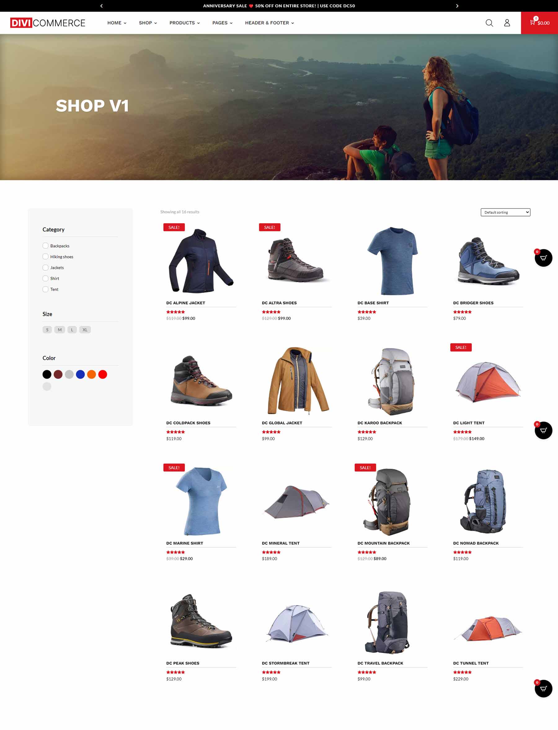
The first shop page displays a full-width image with a page title followed by the products in four columns with a sorting filter and a sidebar to the left. The sidebar includes the category, size, and color options. Products display a box shadow on hover.
DiviCommerce Shop Two
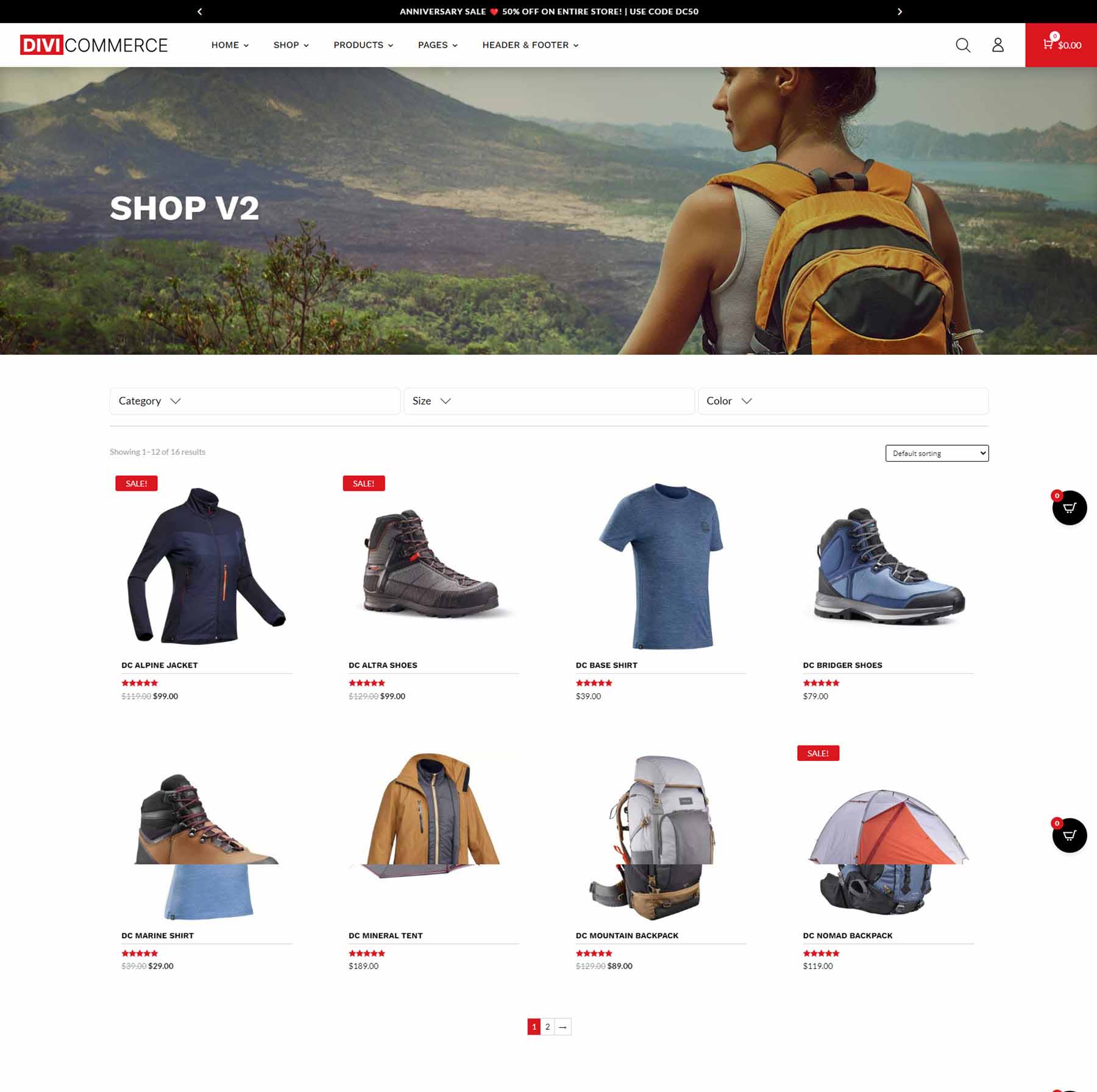
Shop Two includes a full-width image, places the products in a single column, and adds an interesting product filter where users can filter by category, size, and color above the shop section. It also includes the sorting filter and adds pagination at the bottom of the page. The filters open on hover.
DiviCommerce Shop Three
Shop Three doesn’t include a full-width image. It places the shop categories at the top of the page with images. The shop section includes the sidebar, filter, hover effects, and pagination.
Product Page One
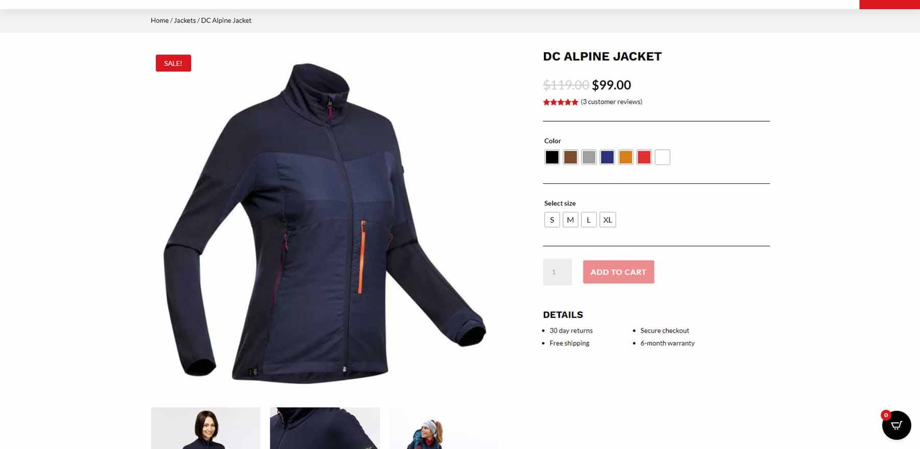
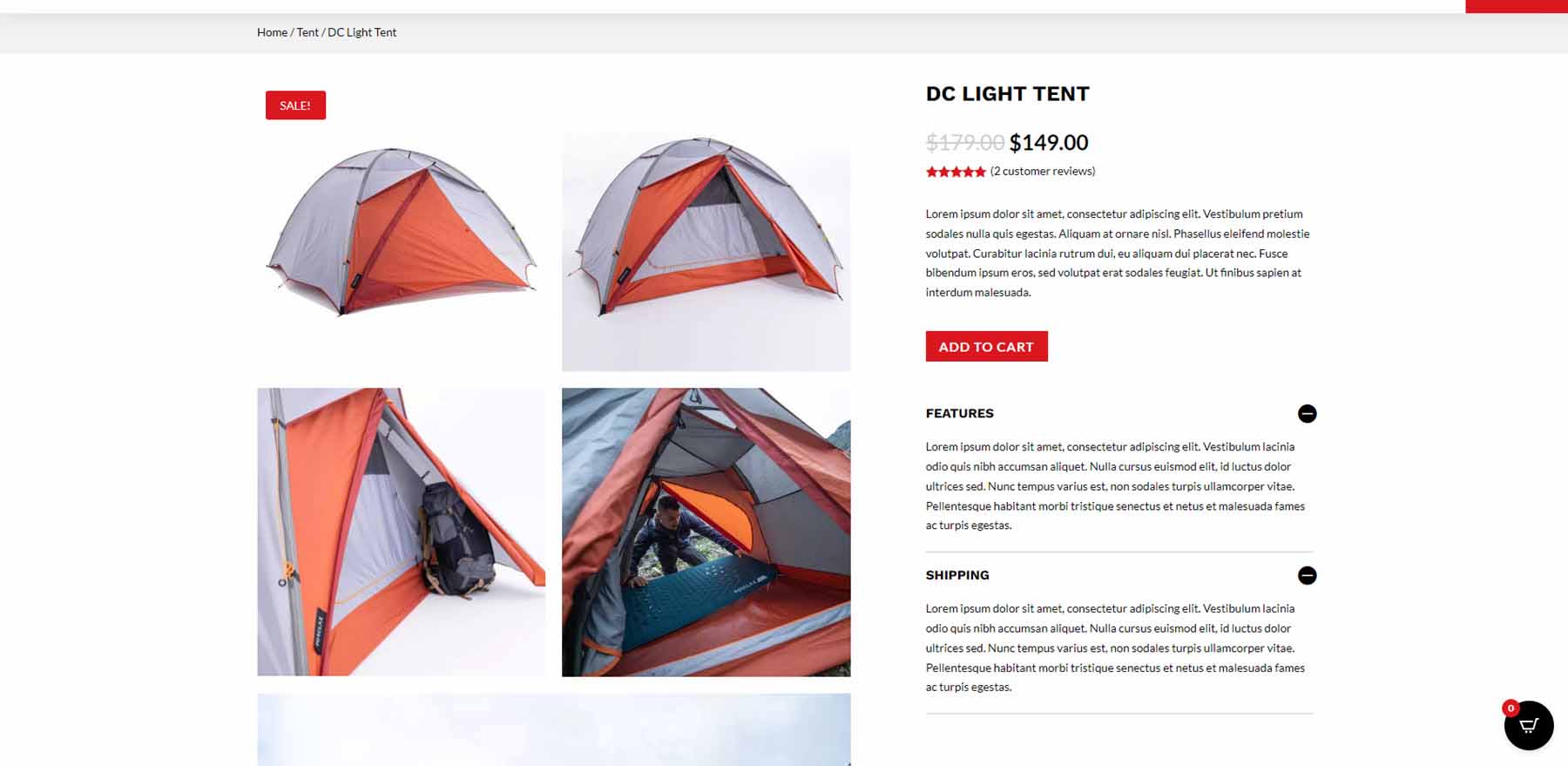
The first product page displays a large, featured image on the left and the product options on the right. The product options remain in place as you scroll. Breadcrumbs at the top of the page show the customers where they are in the navigation structure.
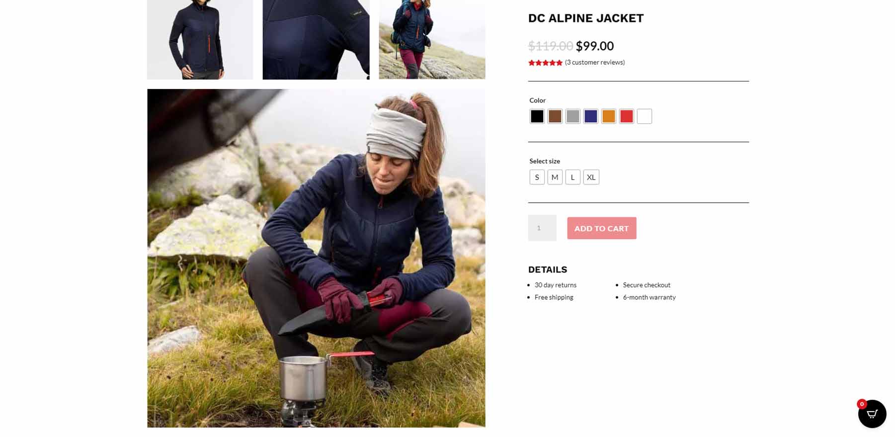
Following the featured image is a set of thumbnail images and another large image. Once the large image reaches the area of the product options, the options scroll with the page.
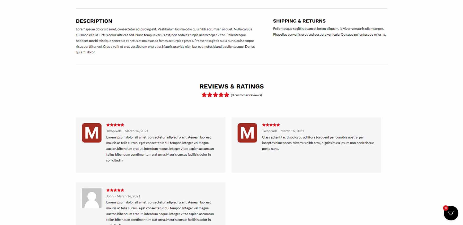
Next is the description and shipping information and a section for reviews.
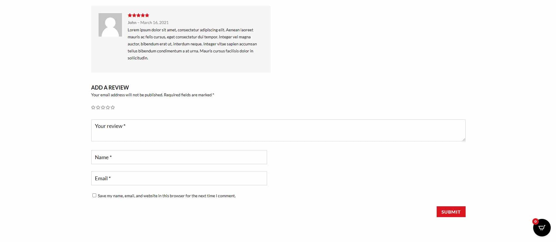
Lastly, there is a section where customers can add their own reviews.
Product Page Two
The second product page follows the design of the first but adds the description and shipping information to the product options area in the toggles.
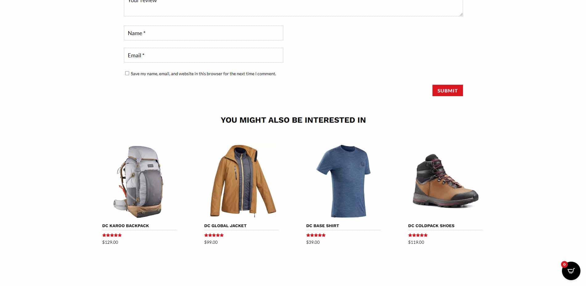
The bottom of the page adds a section of products the customer might be interested in. The product cards add box shadows on hover.
Cart Popup
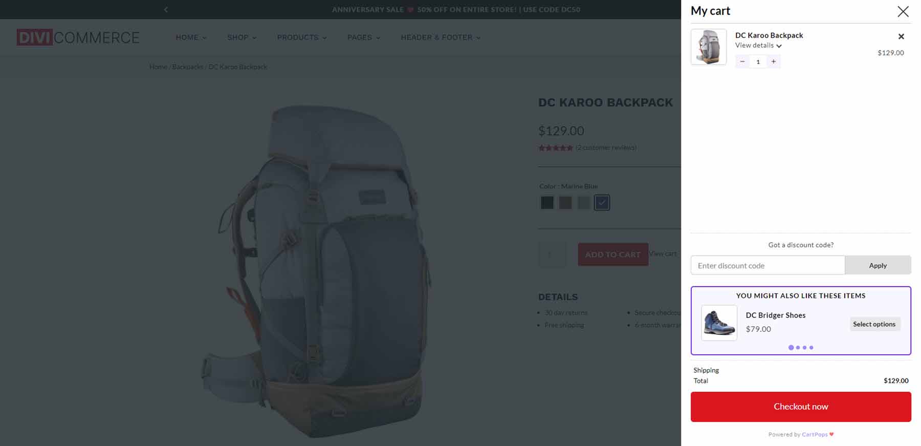
The cart popup appears when a product is added to the cart. It includes a field to add a coupon code, a slider with similar products, and a checkout button.
Cart Page
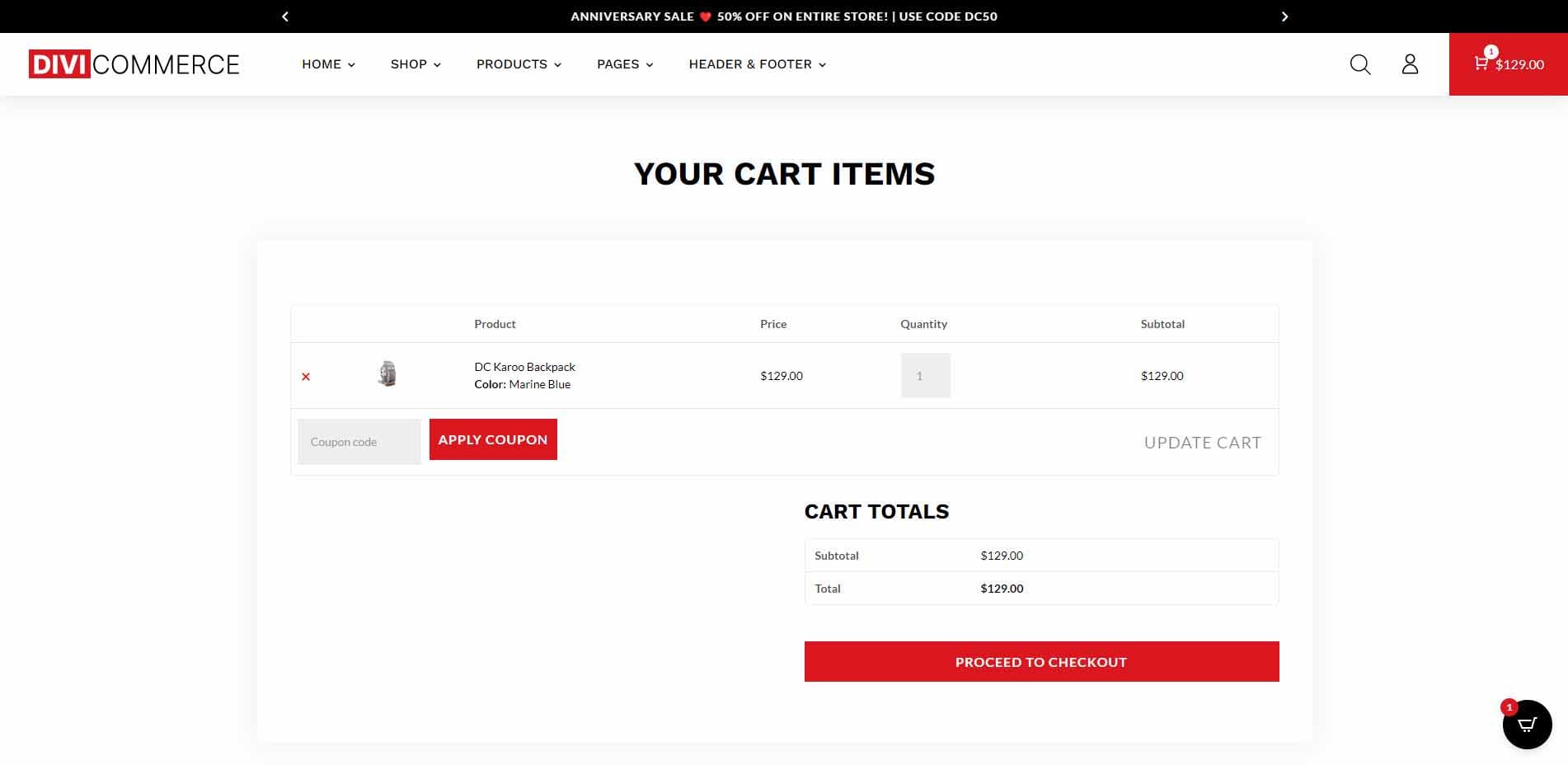
DiviCommerce includes a styled cart page. The cart information includes a box shadow. The buttons are red to match the child theme’s design.
Checkout Page One
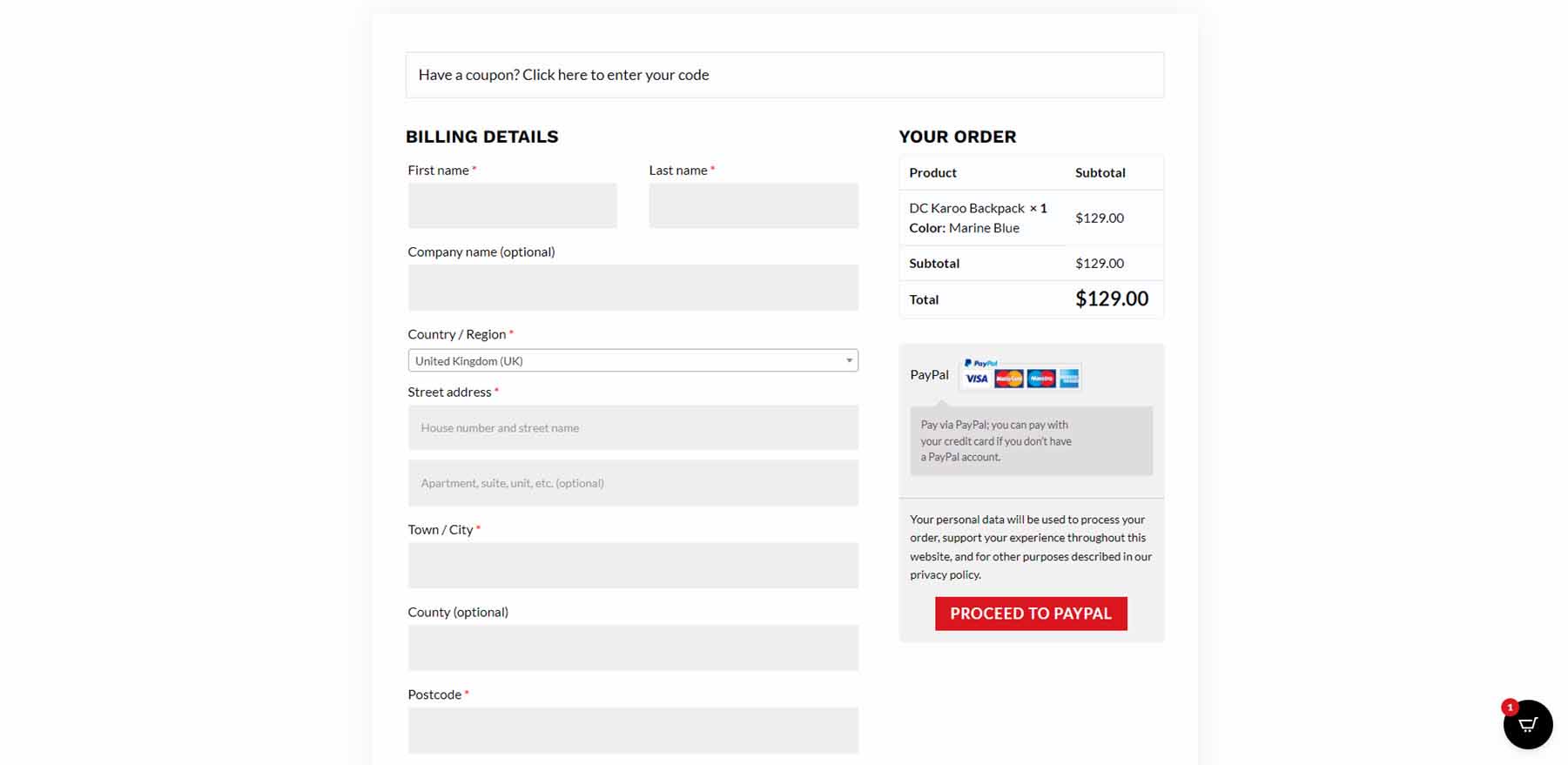
It has two checkout pages. This is the first checkout page. It places the order and payment information on the right of the checkout form. The second checkout page places this information under the form and places company information on the right of the form.
About Us
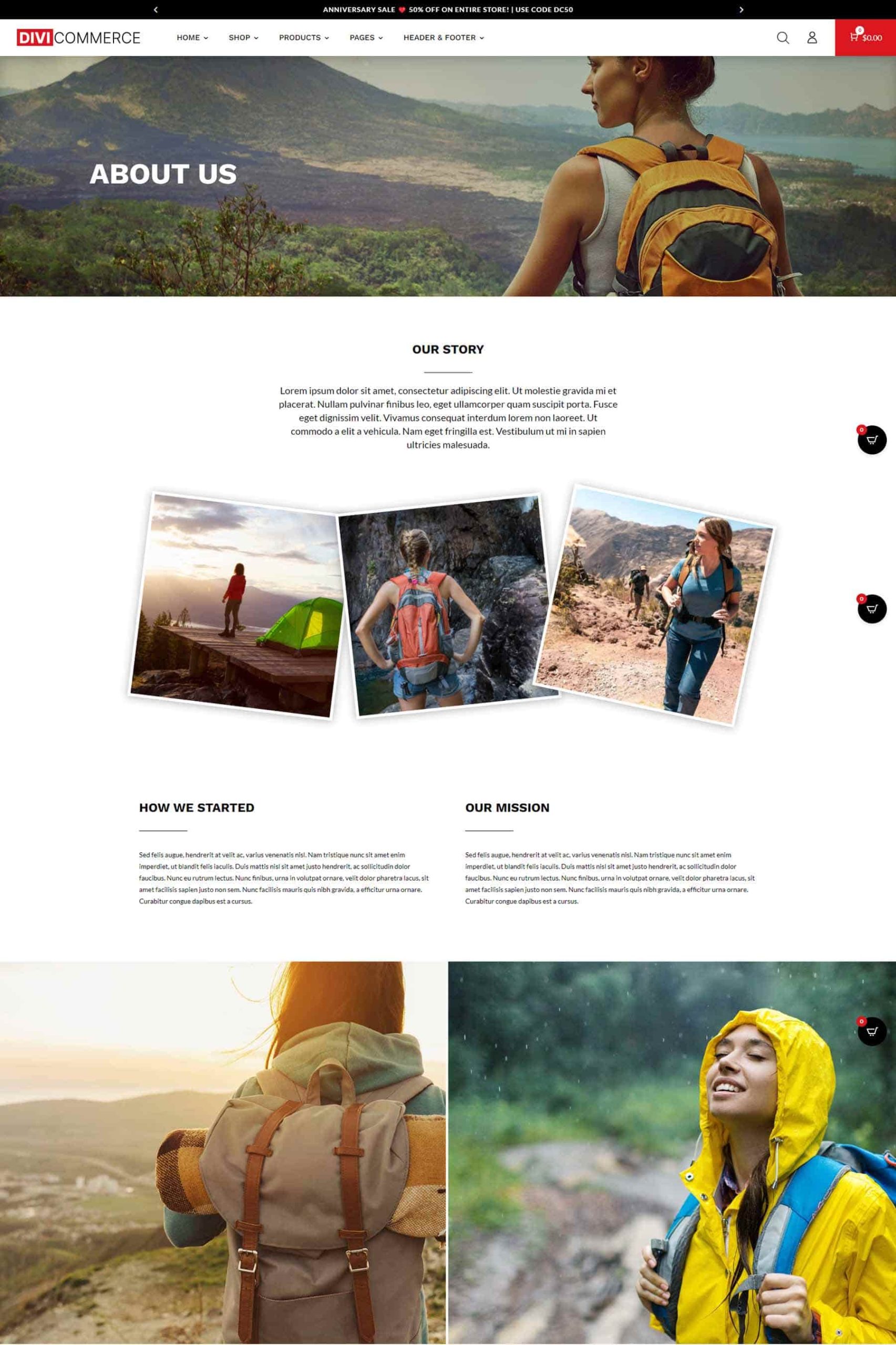
The About Us page displays angled images that stand out. The page also includes a full-width image, several areas for text, and a couple of larger images.
Contact Us
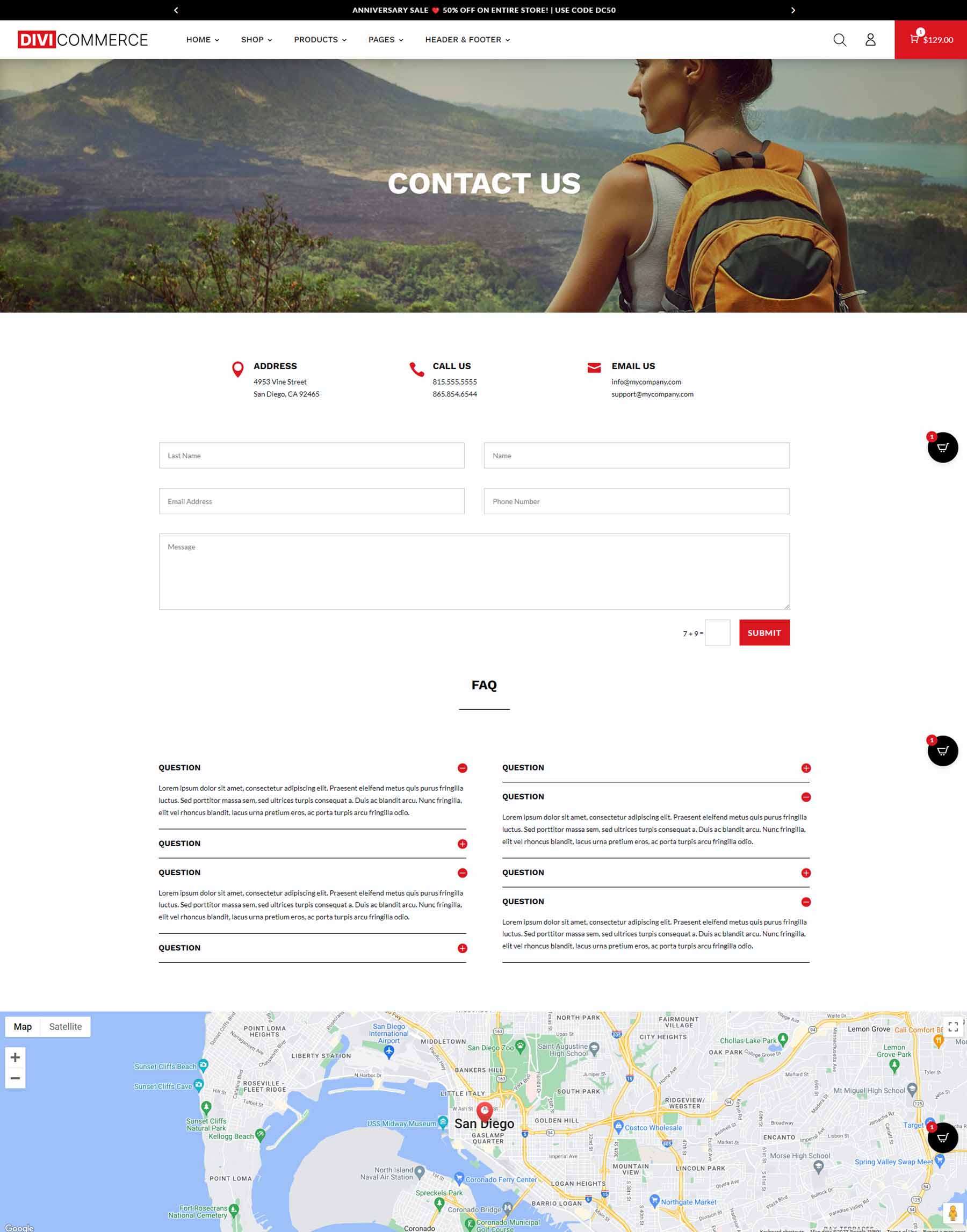
The Contact Us page displays the contact information with blurbs, displays a contact form, toggles for the FAQs, and includes a full-width map.
DiviCommerce Headers
DiviCommerce includes 5 headers. They include multiple sections that can be used, deleted, or swapped to another header.
Header One
The first header adds a sale bar at the top and includes a search, account login, and a link for the popup shopping cart on the right. The logo and menu are on the left.

Header Two
Header two places the search box in the top bar. The shopping cart and menu swap sides.

Header Three
The third header places the menu in a new bar in the center and at the bottom and moves the search to the center.

Header Four
The fourth header centers the logo and the menu, places the search on the left, and the cart on the right.

Header Five
Finally, the fifth header places the search box in the top bar, moves the logo and menu to the left, and places the cart on the right.

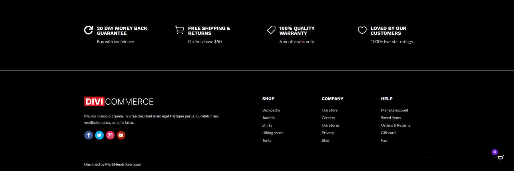
DiviCommerce includes two footers. Both work well for eCommerce.
Footer One
Footer number one includes two sections. The first section contains blurbs for information provided as text. The second section includes an Image Module for the logo, a Social Media Follow Module, and lots of Text Modules for information and links.
Footer Two
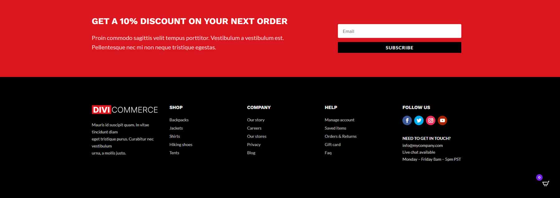
The second footer replaces the top section with an email form. The second section moves the Social Media Follow buttons to the right in its own column.
DiviCommerce Popup
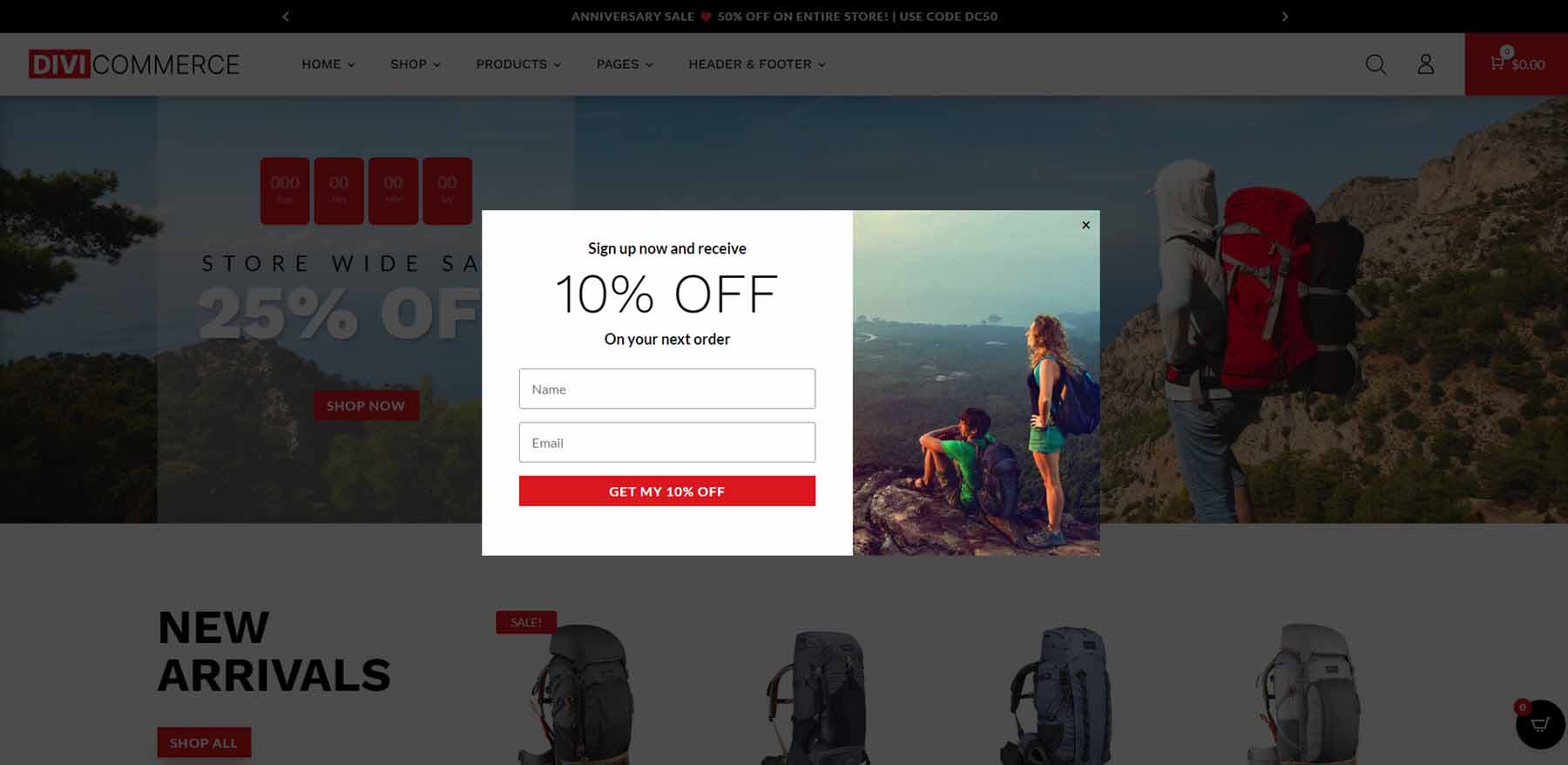
DiviCommerce includes a popup made with the Divi Builder and a plugin called Popup Maker. The popup itself displays an email form with a sign-up CTA on one side and an image on the other side. It includes an overlay and a close button.
DiviCommerce Search
The Ajax search lists the categories and products as you type. The search is fast and the results stay open, allowing the customer to click anything in the results.

Where to Purchase DiviCommerce
DiviCommerce is available in the Divi Marketplace for $25. It includes one year of support and updates, unlimited website usage, and a 30-day money-back guarantee.
Ending Thoughts on DiviCommerce
That’s our look at the DiviCommerce child theme for Divi. This child theme includes lots of pages and layouts to build any type of WooCommerce shop. The five extra plugins with the child theme add many interesting features, such as the cart, popups, and filters. The Ajax features are fast They give the website many elegant and useful tools and stand out from the crowd.
We want to hear from you. Have you tried the DiviCommerce child theme? Let us know what you think about it in the comments.





Does DiviCommerce child theme needs woo commerce plugin anyway?
Thanks
Cristina
Yes, WooCommerce is required in order to use this Child Theme.