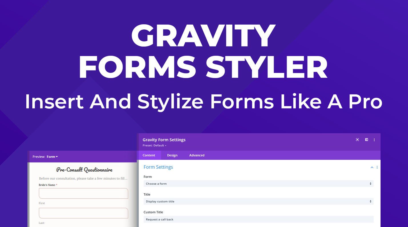
Gravity Forms Styler Module for Divi is a plugin available in the Divi Marketplace that makes it easy to completely customize the styling of your Gravity Forms right within the familiar Divi Builder interface. With this plugin, you can add Gravity Forms to your Divi layouts just like you would any other module. Using the options in the design tab, you have full control over each form aspect.
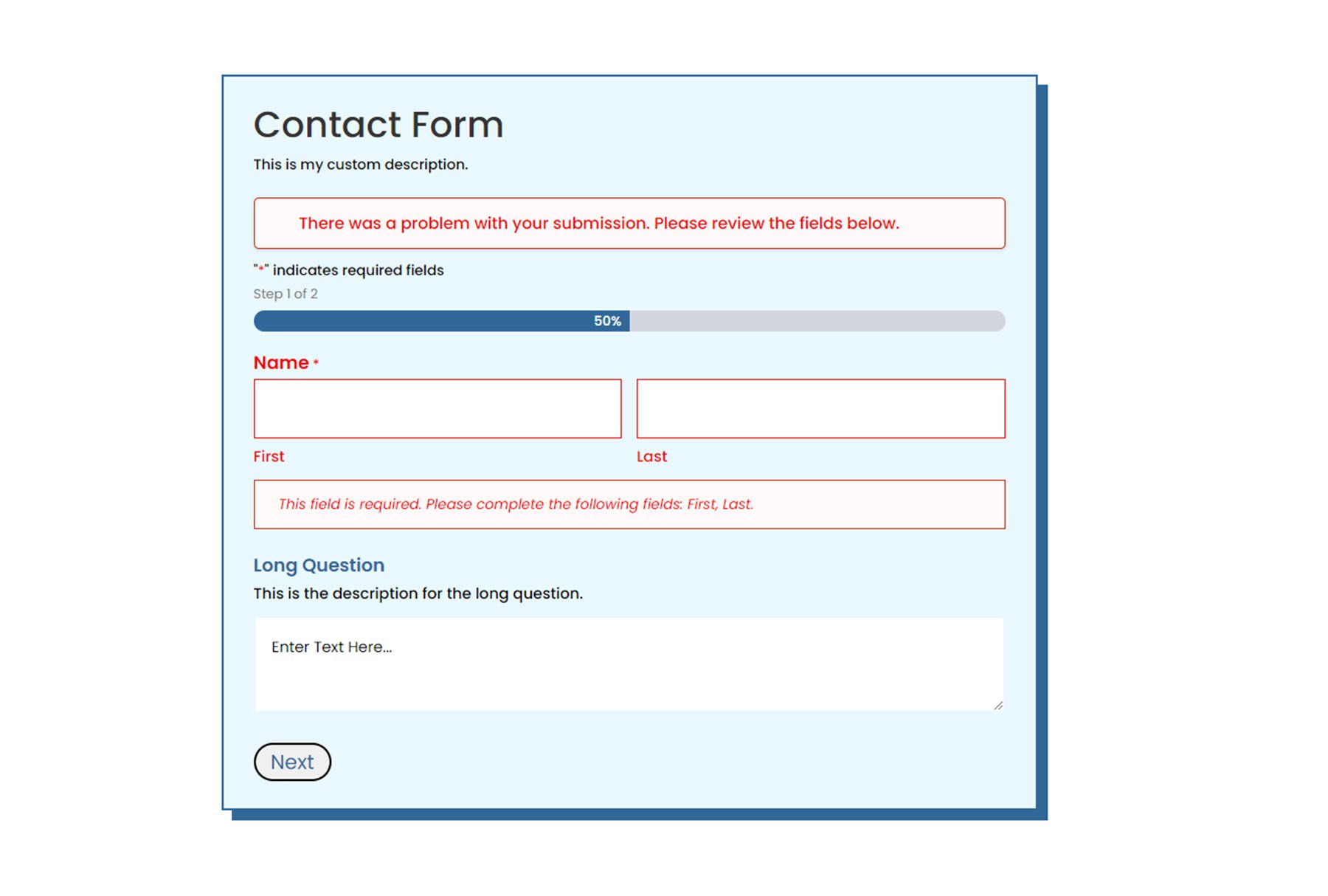
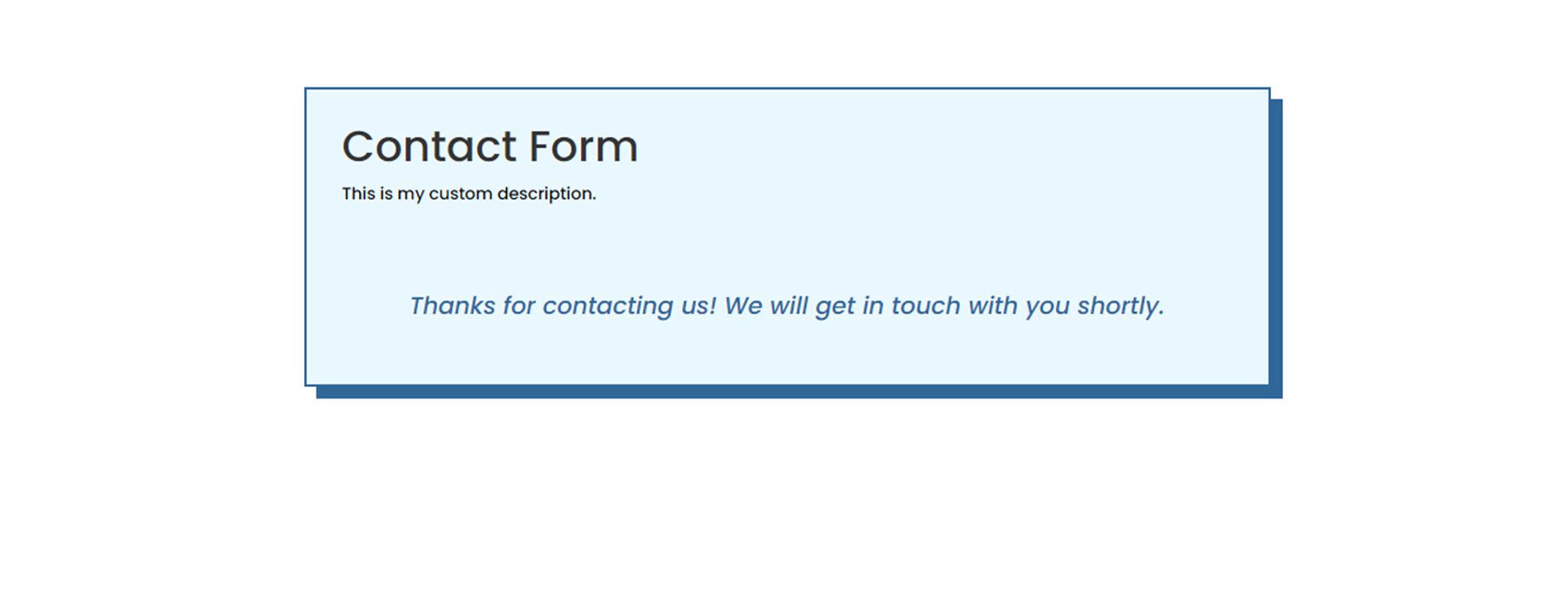
One unique feature of this plugin is that you can preview the entire form, the form with validation errors, and the confirmation message page right within the Divi Builder. In this product highlight, we’ll take a closer look at the Gravity Forms Styler Module for Divi and help you decide if it’s the right product for you.
Let’s get started!
Installing the Gravity Forms Styler Module for Divi
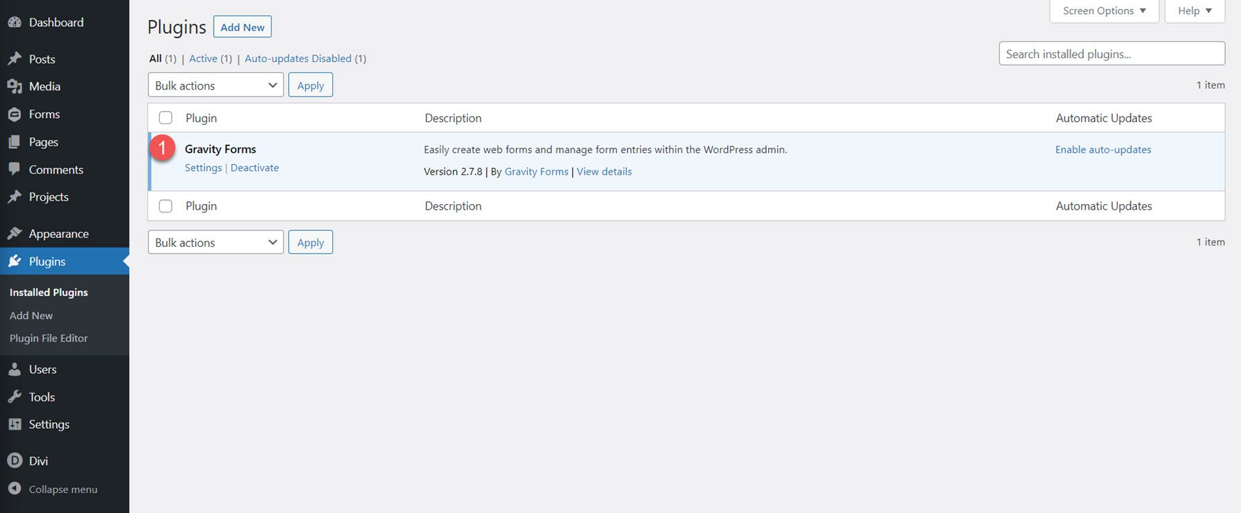
First, ensure the Gravity Forms plugin is installed and activated on your site. Additionally, purchase the Gravity Forms Styler Module for Divi plugin from the Divi Marketplace and download the plugin file.
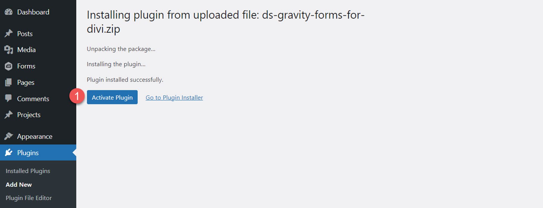
To install the plugin, open the Add New page under the Plugins heading in the WordPress dashboard. Click the Upload Plugins button, then click Choose File to select the plugin file from your computer. Finally, click Install Now, and the plugin will be added to your website.

Once the plugin is installed, click Activate Plugin.
Gravity Forms Styler Module for Divi
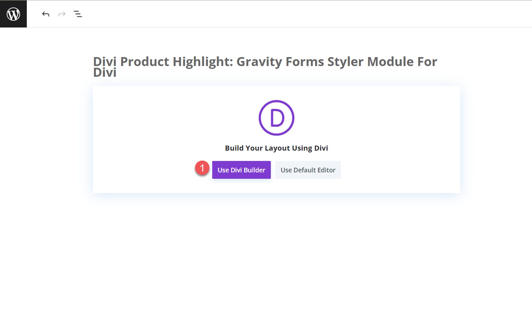
The Gravity Forms Styler Module for Divi is a module that is added to the Divi Builder, which means that you can add Gravity Forms anywhere you could add any other Divi module, giving you the ultimate flexibility in your layouts and designs. Start by adding a new page to your site and select the Divi Builder option.
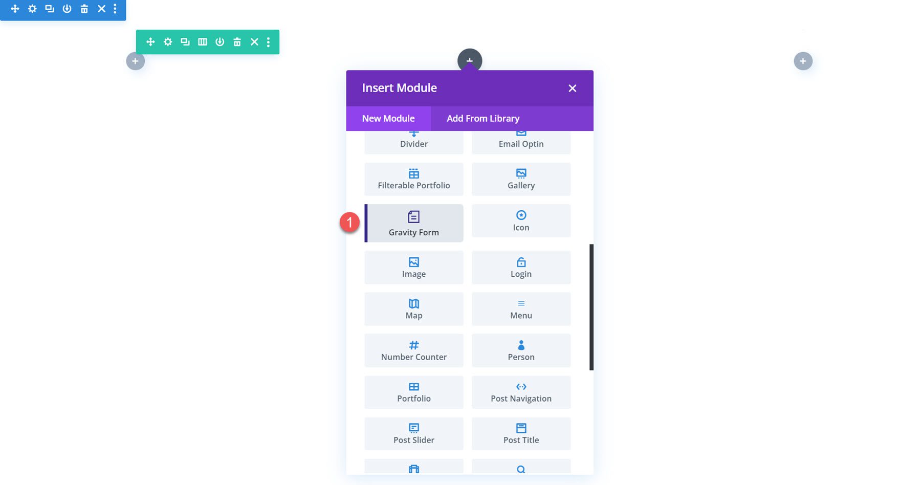
On the new page, click the grey plus icon to insert a module. Select the Gravity Form module from the list.
Content Settings
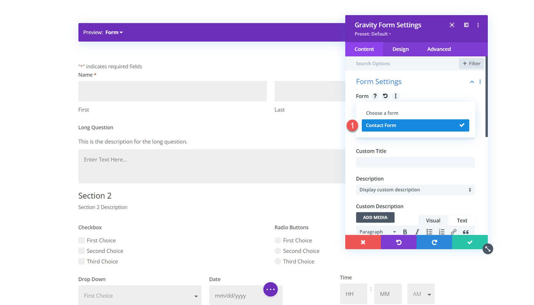
Open the options for the Gravity Form module. The first option, titled “Form” allows you to select the Gravity Form you want to display.
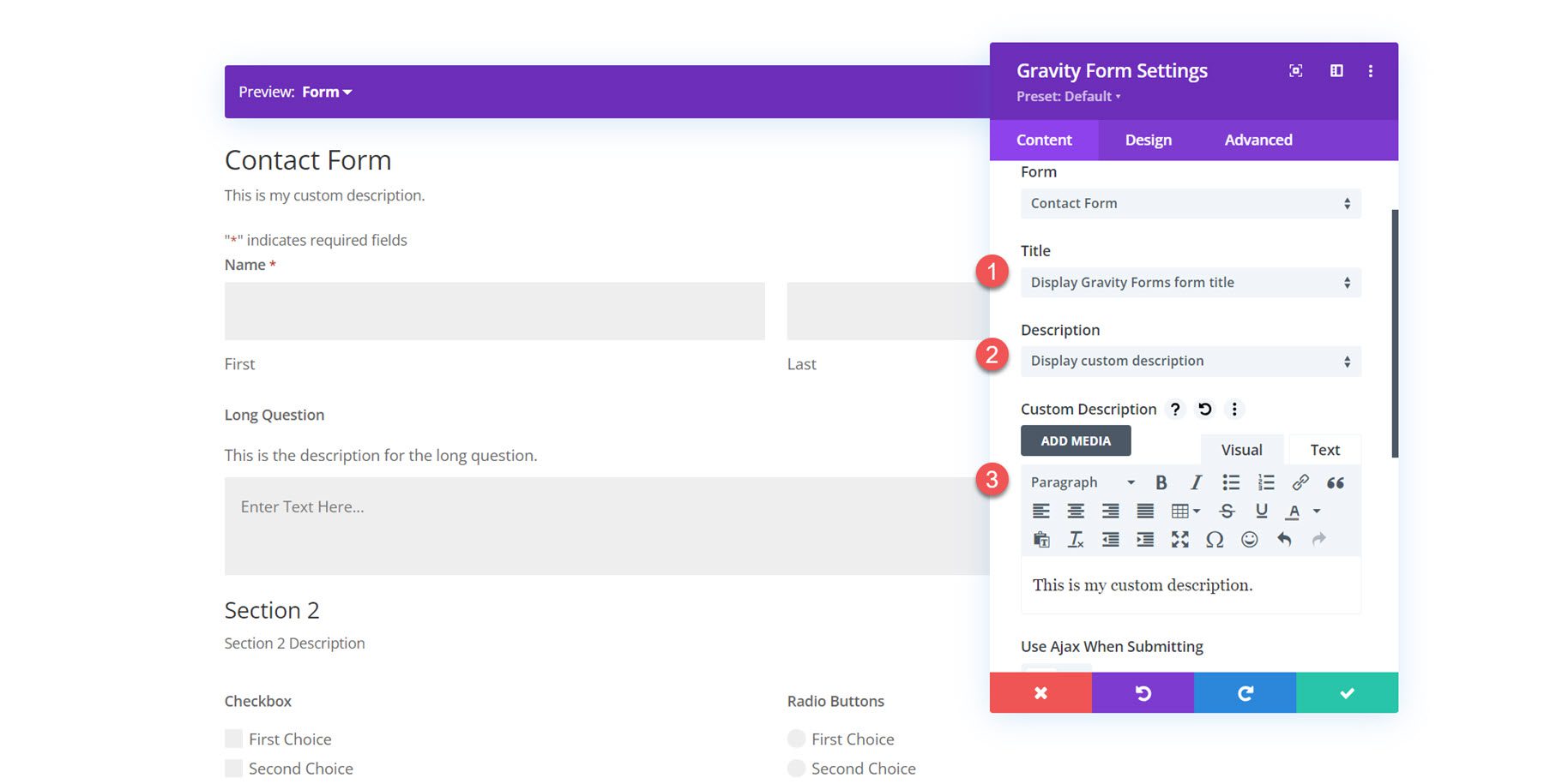
You can also customize the title and description shown on the form. You can hide each of these elements, set a custom title or description, or display the title or description set in the Gravity Forms settings.
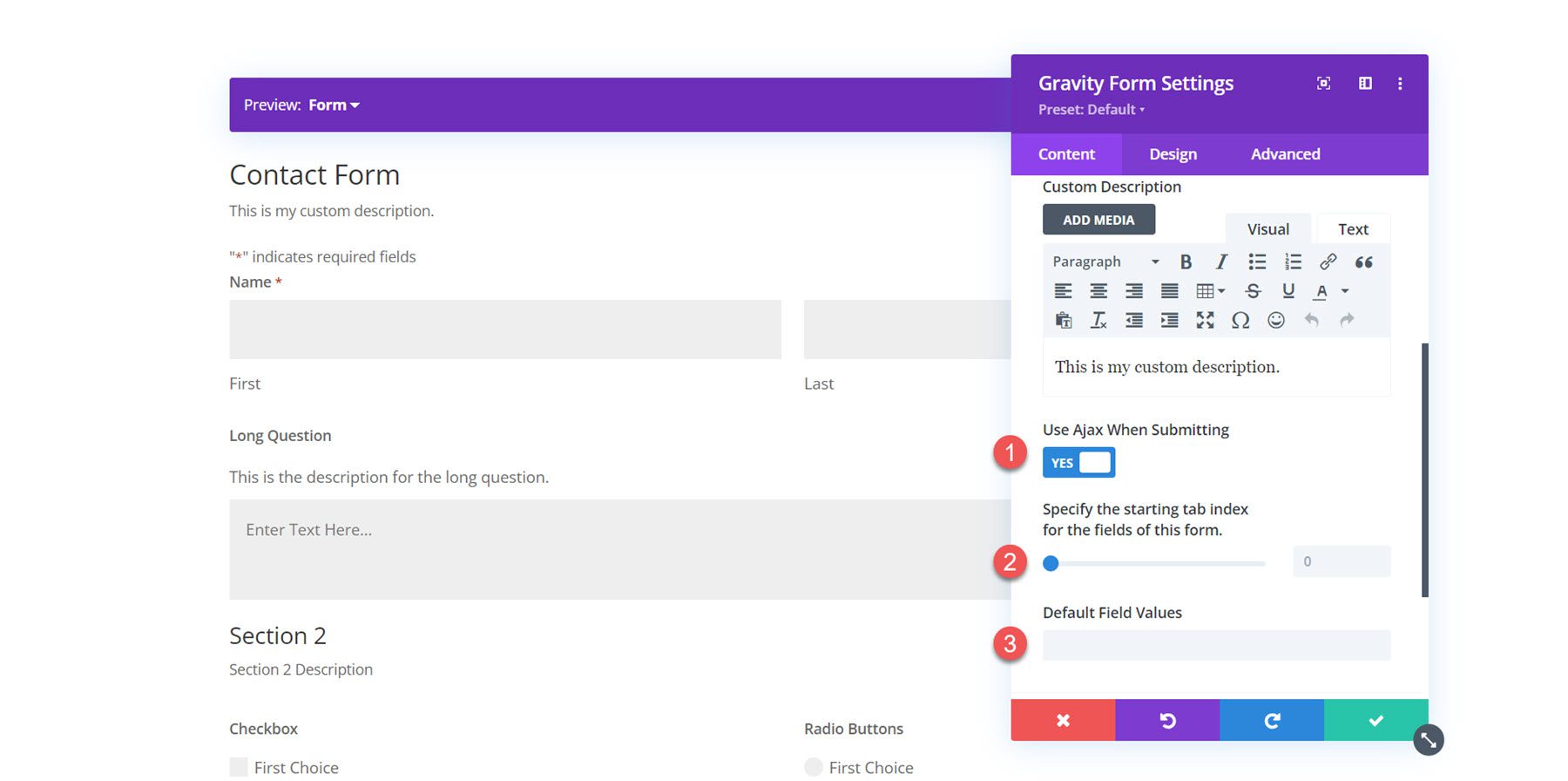
Next, you can enable Ajax for form submissions. If enabled, the page will not reload after form submission. You can specify the starting tab index for the form fields and default field values in the content settings.
Background
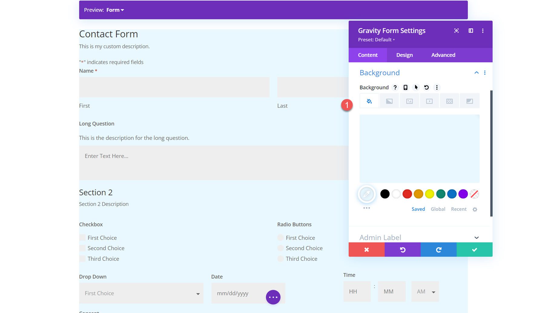
In the content tab, you can also add a background to the Gravity Forms module. Using Divi’s extensive background options, you can add a background color, gradient, image, video, pattern, or mask to create unique layouts for your form.
Design Settings
Now, let’s move over to the design tab. Here is where you can fully customize the design of every element in the form.
Font
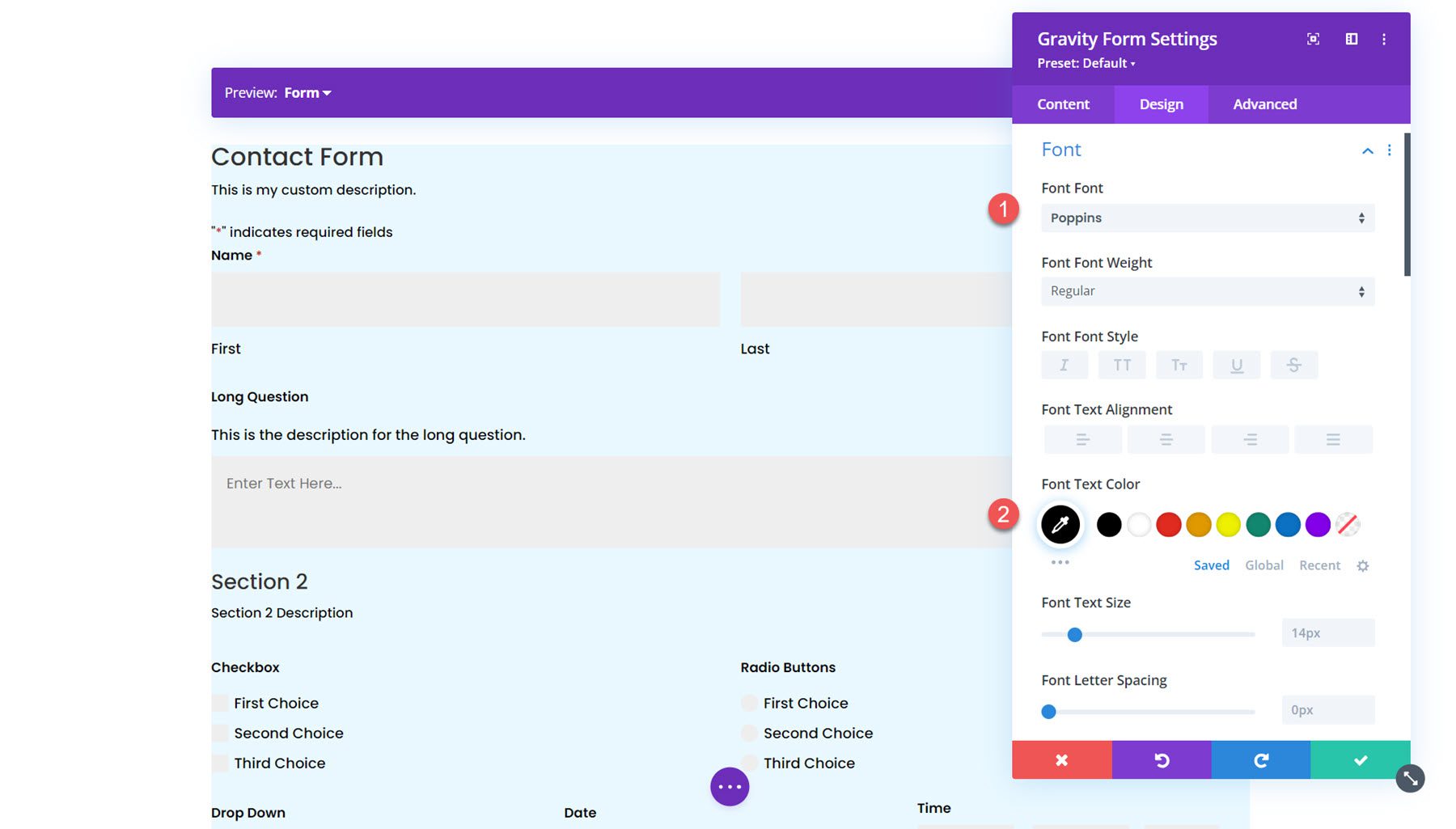
Under the font tab, you can set the styles for the text in the form. In this section, you can set the font, font weight, style, alignment, color, text size, letter spacing, line height, and text shadow. Here, I set the font and font color.
Form Heading
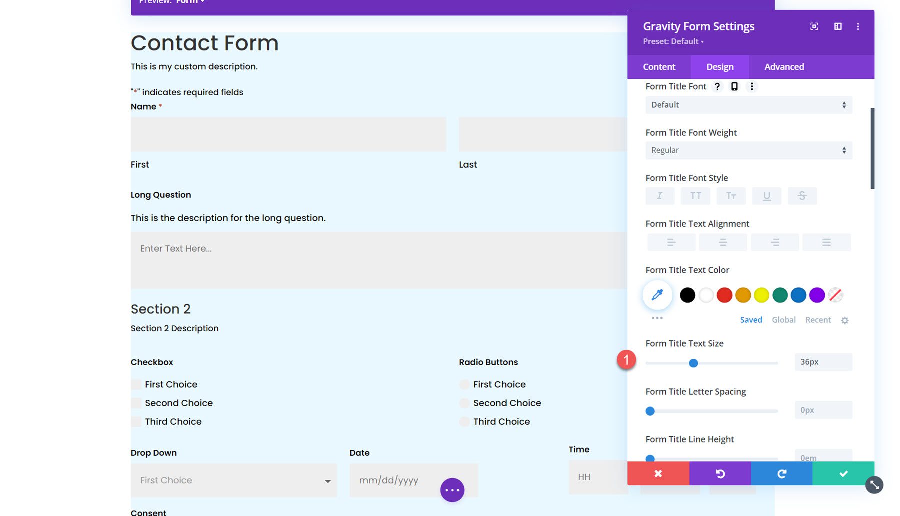
In the form heading settings, you can customize the styling of the form heading font, title font, padding and margin, border, and background. With these options, you can fully customize the heading section separate from the rest of the form. For this example, I increased the size of the form title text.
Fields
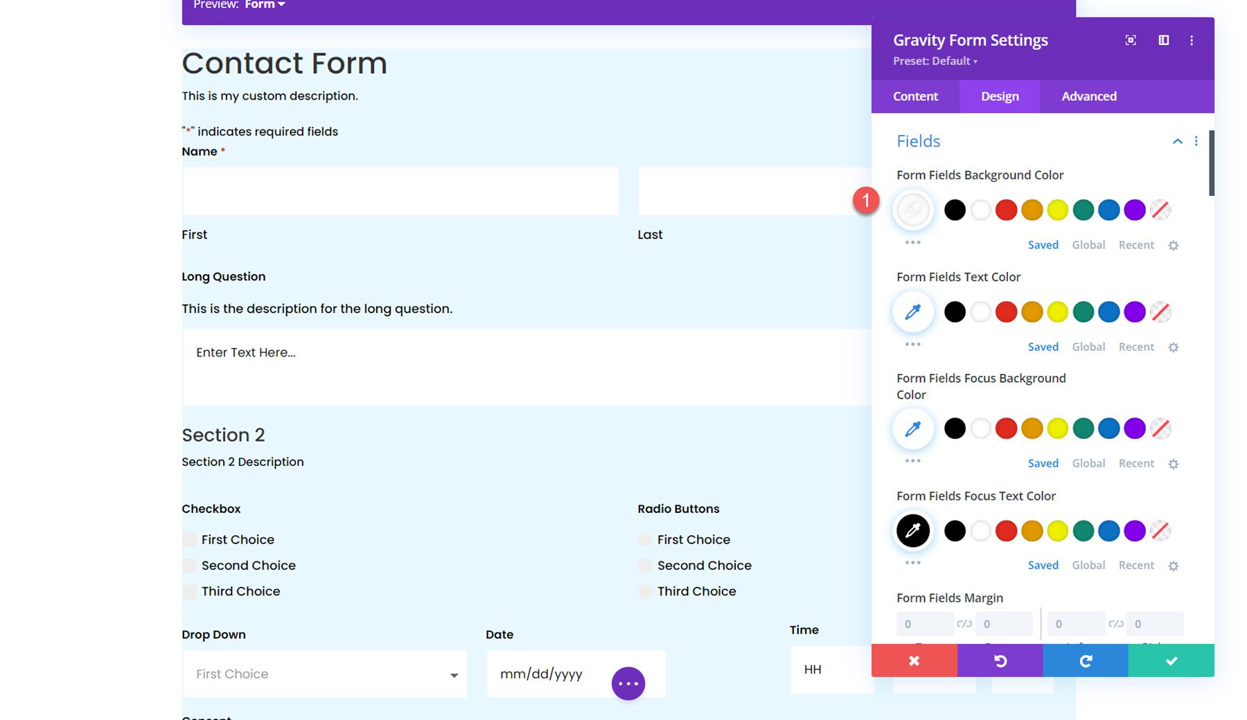
The fields setting section is where you can set the styling of the form fields, including the background color, text color, focus styling, margin and padding, font styling, and border styling. In this section, I set the field color to white.
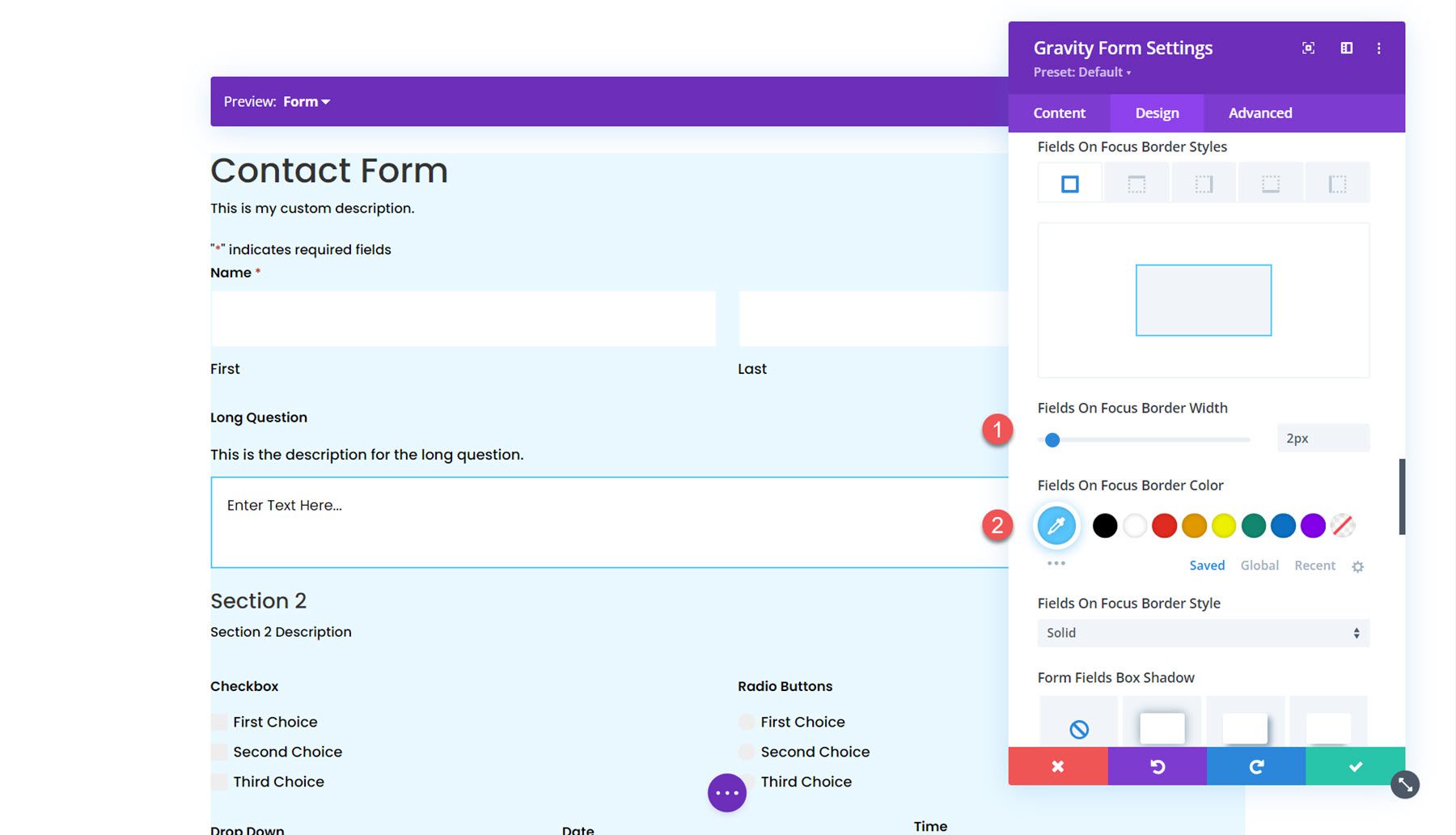
I also enabled focus borders. This applies unique styling to the border of the active field, as you can see in the screenshot.
Fields Error
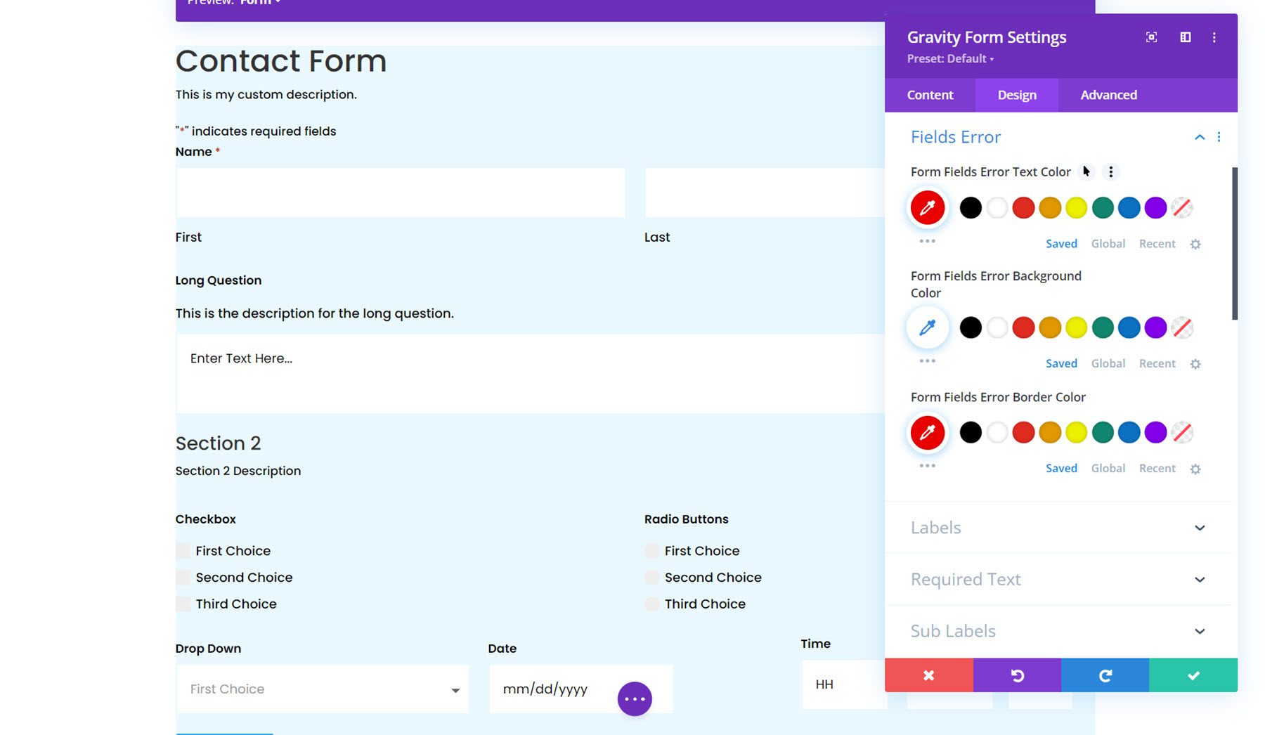
Next, the fields error section is where you can style the text, background, and border colors for the form fields error.
Labels
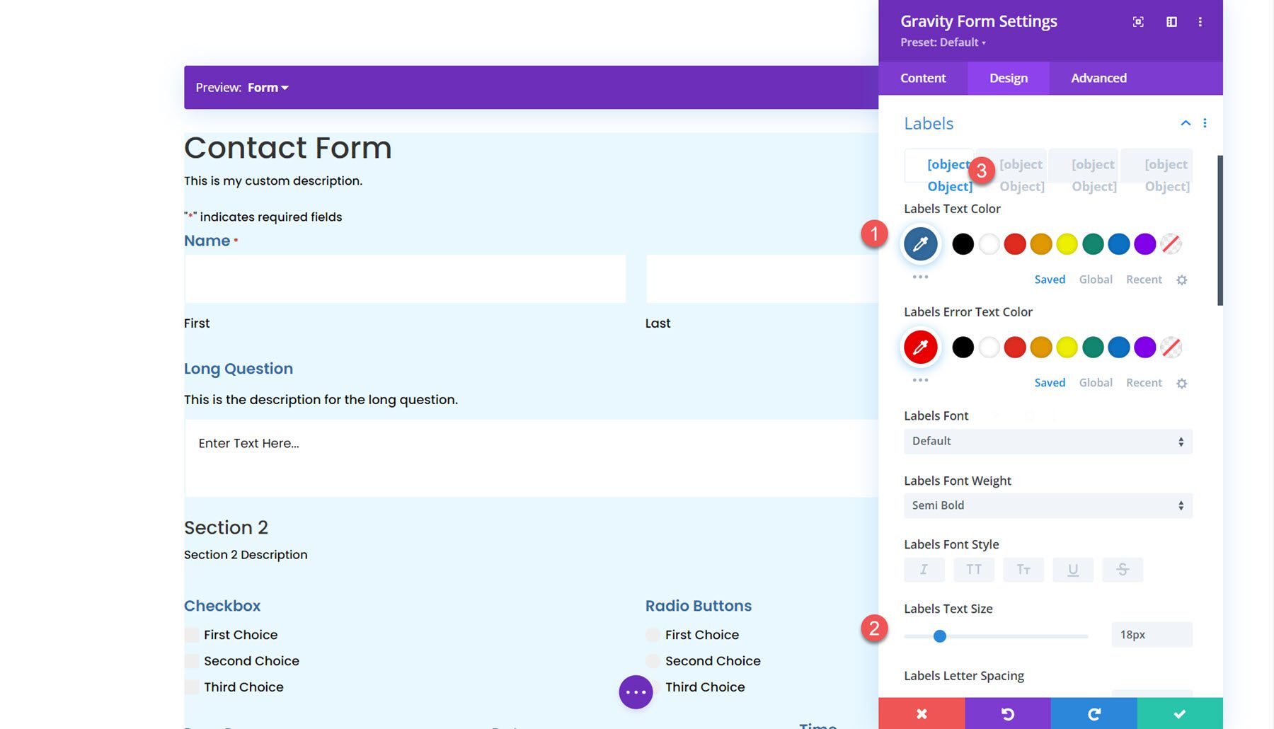
In the labels section, you can style the label text, set the padding and margin, style the border, and add a background or box shadow. For this example, I increased the label text size and changed the color. I also removed the bottom padding.
Required Text
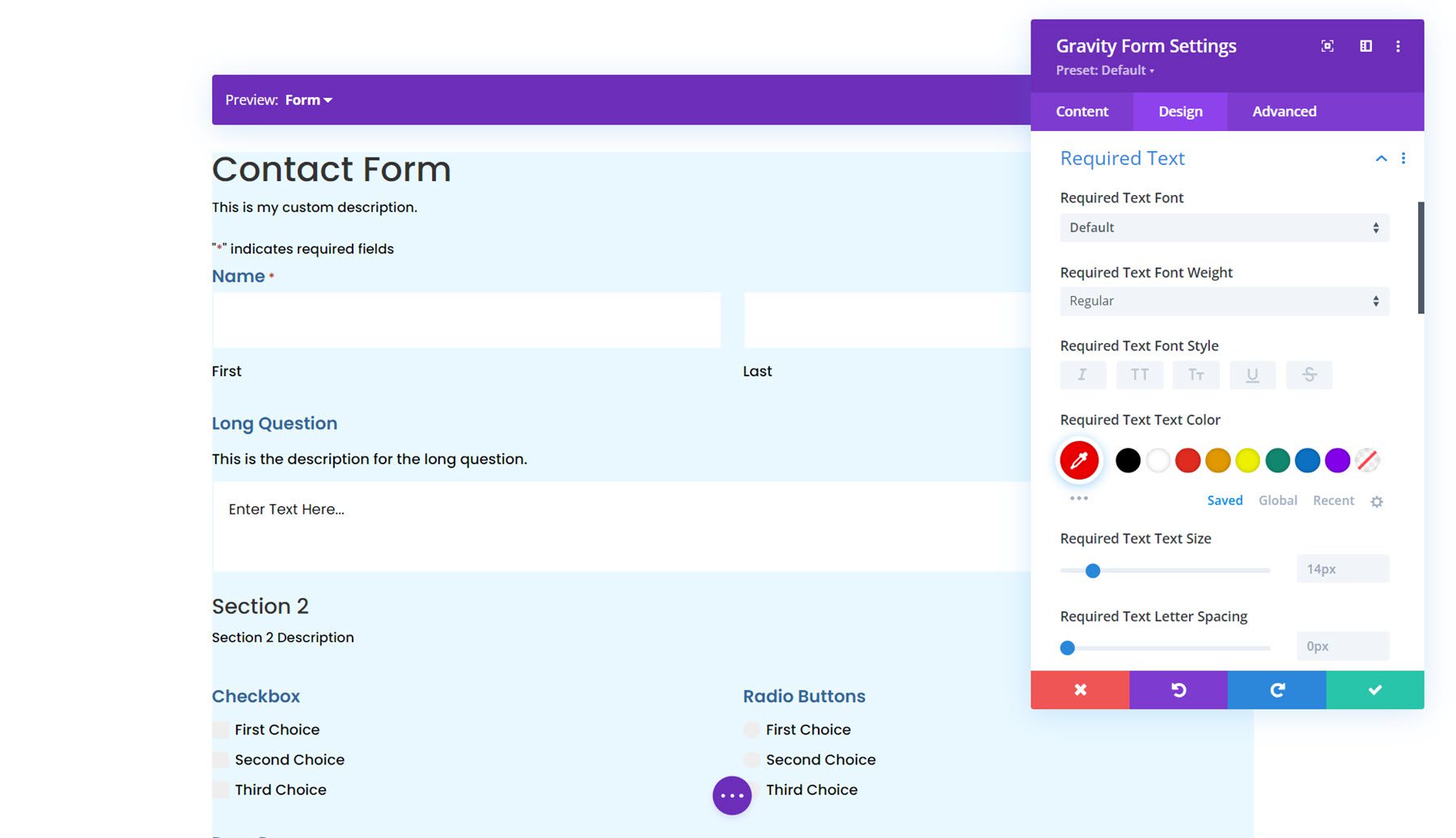
The next section is where you can style the required text. The options allow you to style the asterisk that appears next to the required fields.
Sub Labels
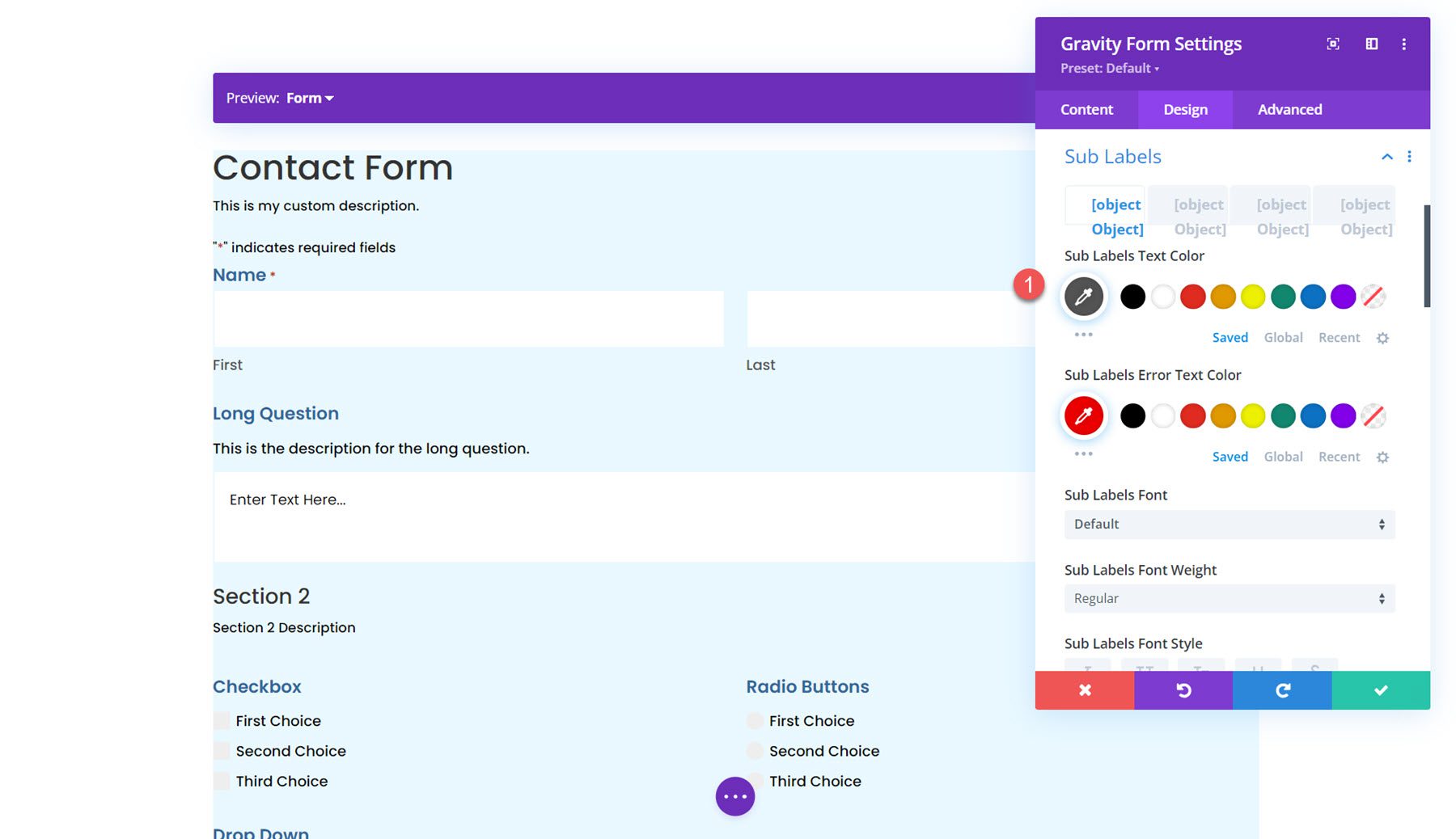
Next is the sub labels settings. Here, you can customize the styling of the sub label text, padding and margin, border styles, background, and box shadow. I set the sub label text color to grey and adjusted the top margin.
Fields Description
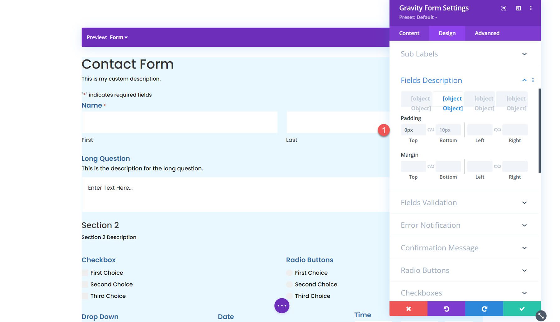
The fields description settings are similar to the last, where you can customize the text styling, padding and margin, border styles, background, and box shadow. I adjusted the margins in this example to bring the description and title closer together.
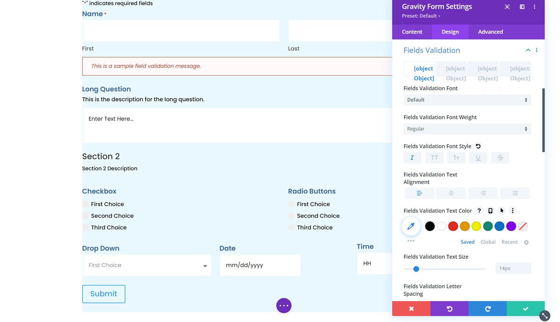
Next, you can set the field validation font styling in the fields validation setting. Additionally, you can customize the padding and margin, border styles, background, and box shadow.
Error Notification
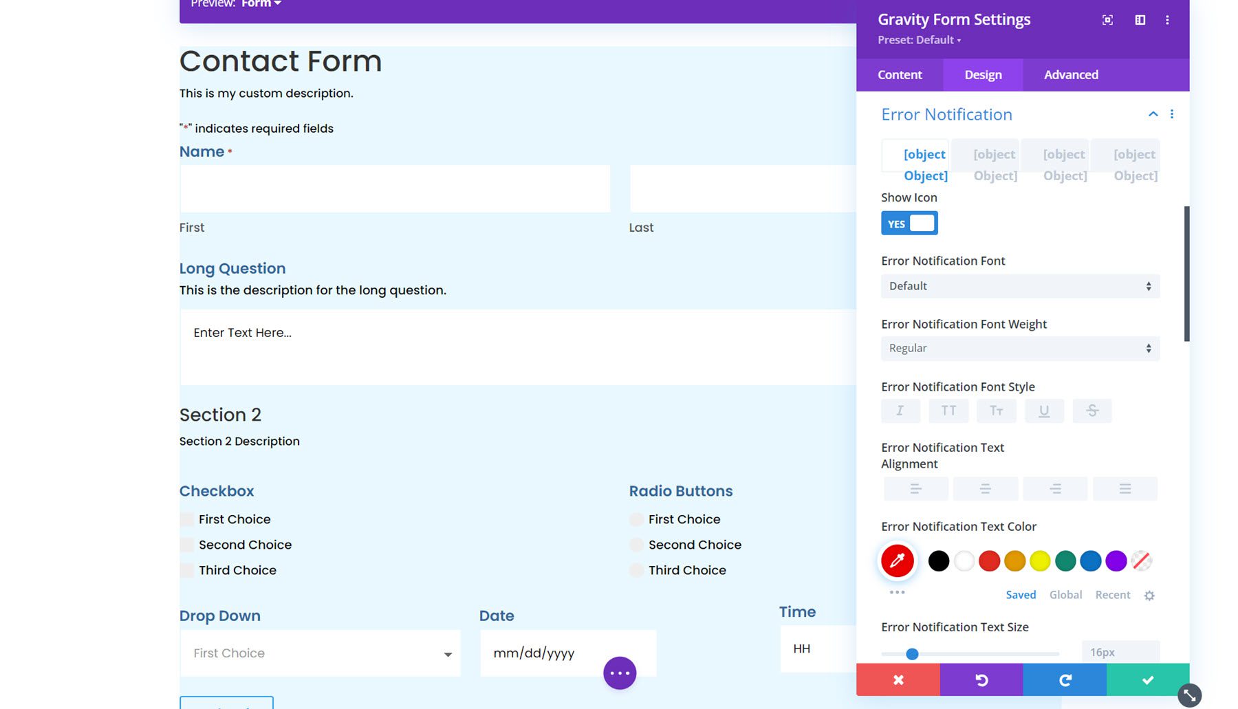
The error notification settings are very similar, with options to customize the font, spacing, border, background, and box shadow.
Confirmation Message
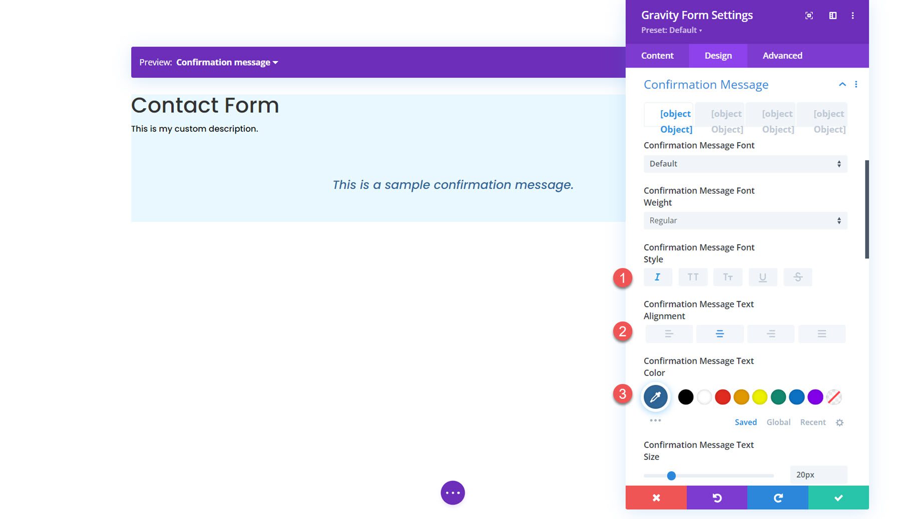
The next section is for customizing the confirmation message. You can use the preview option at the top to view the confirmation message layout.
Radio Buttons
In the radio buttons settings, you can set the radio colors, text styling, and list spacing. Here, I modified the checked background color.

Checkboxes
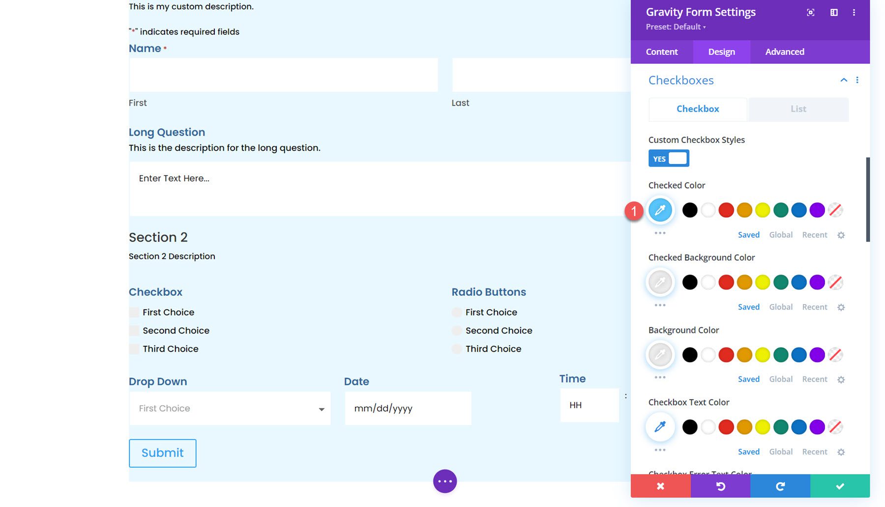
Similarly, you can change the checkbox colors, text styling, and list spacing in this section.
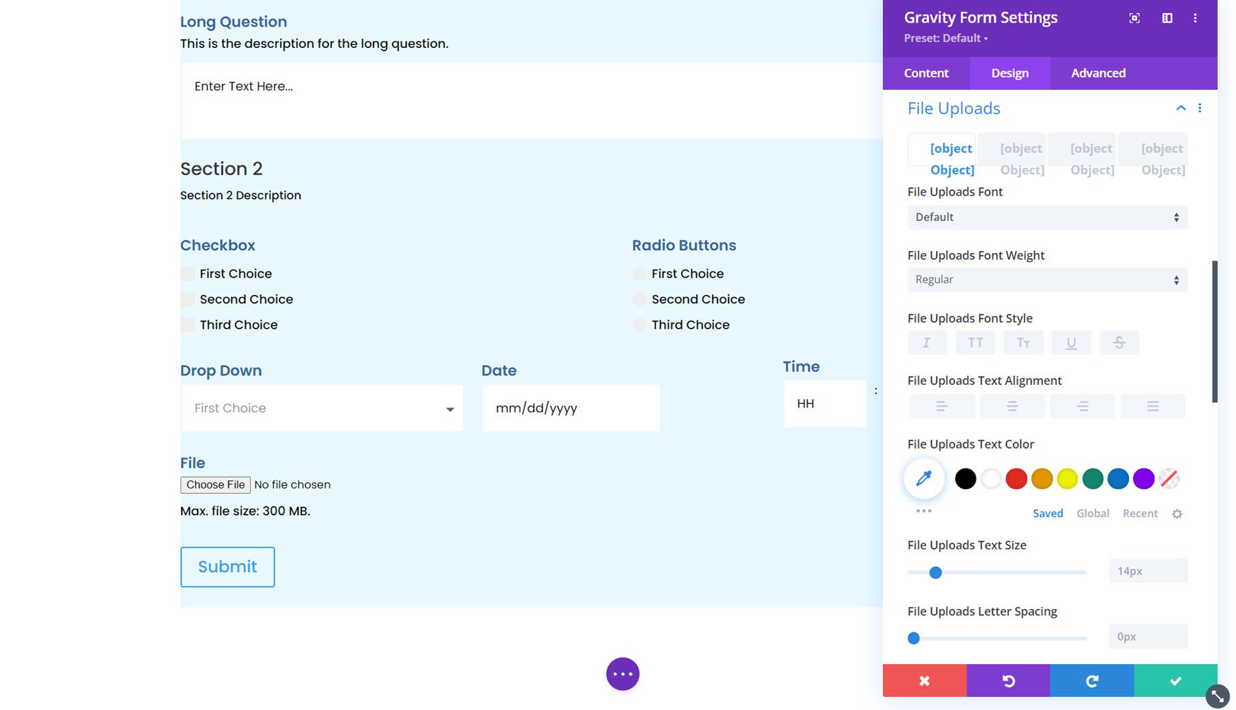
File Uploads
The file uploads section can be customized here. You can customize the font styling, spacing, border, background, and box shadow.
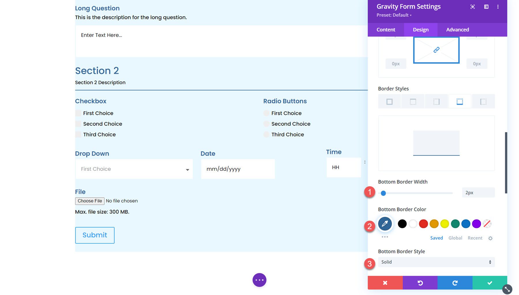
Section Break
Here you can customize the font styling for the section break description and heading and customize the spacing, border, background, and box shadow.
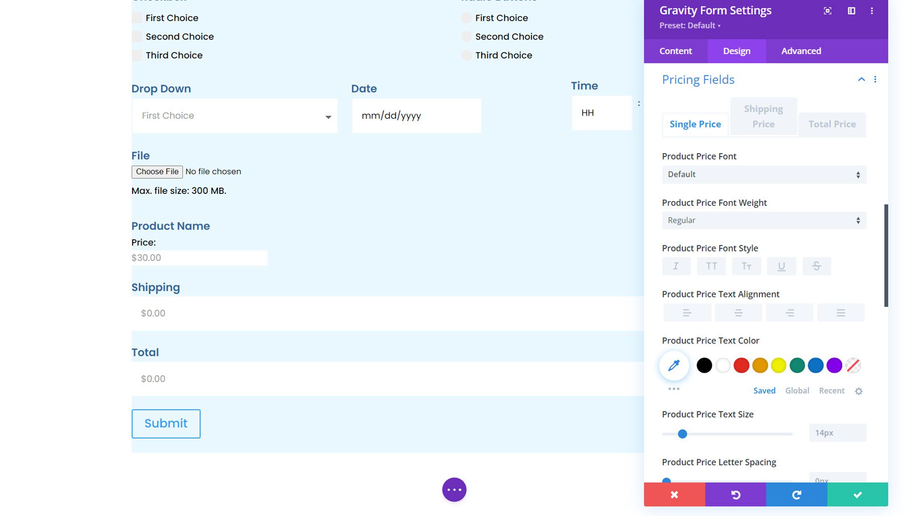
Pricing Fields
You can also customize the Gravity Forms pricing fields using this module. You can style the product price, shipping price, and total price fields.
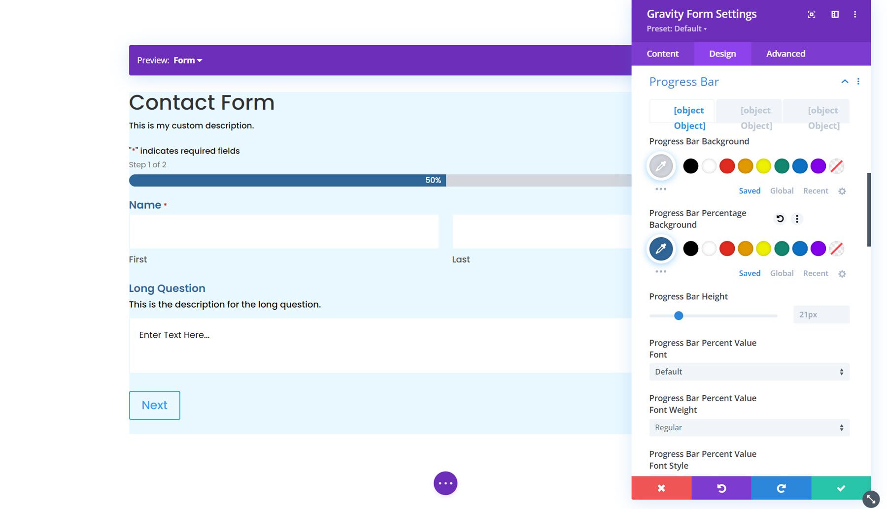
Progress Bar
Next is the progress bar option. The progress bar appears in the form if there are multiple pages and provides a visual indicator for how far along in the form you are. In the design settings, you can customize the styling of the progress bar. You can set the colors, the bar height, customize the font options, add a border, and adjust the spacing.
Form Footer
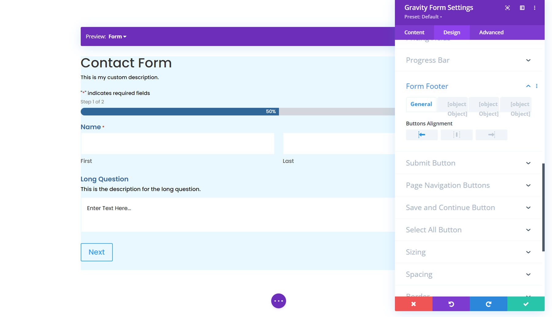
In the form footer options, you can set the button alignment, spacing, border styles, background, and box shadow styles.
Button Styling
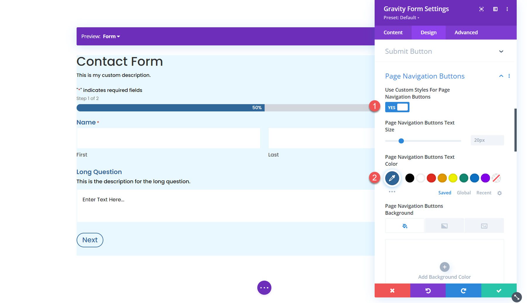
Next are four sections where you can customize the buttons in the form: Submit Button, Page Navigation Buttons, Save and Continue Button, and Select All Button. In each of these sections, you can enable custom button styles to modify the styling to match the design of your form.
Sizing
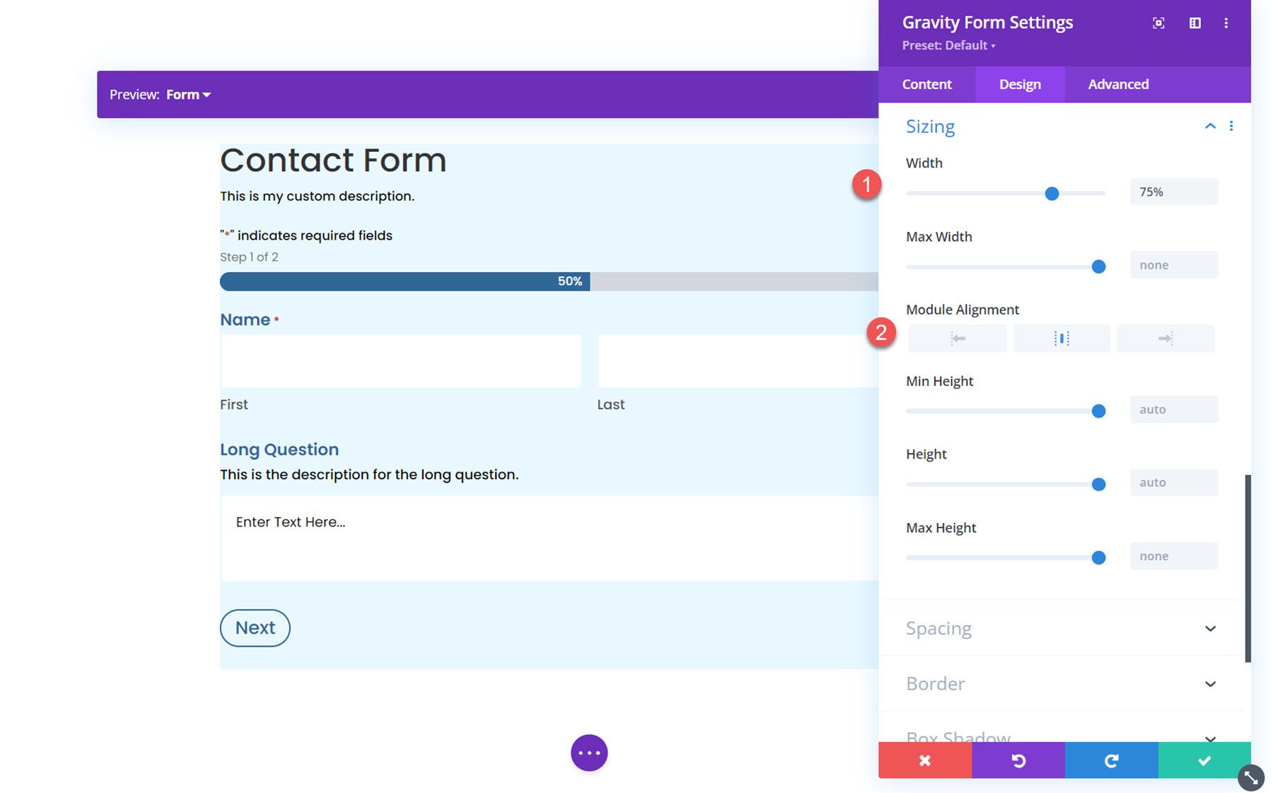
In the sizing settings, you can adjust the form width, height, and alignment. Here, I set the width to 75% and the alignment to center.
Spacing
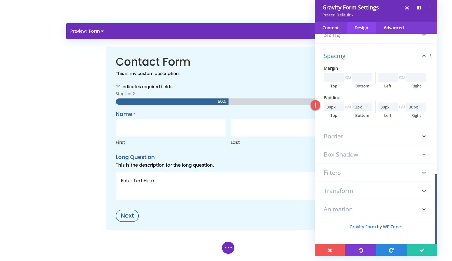
Next, you can modify the margin and padding for the form. I added some padding to each side for this example.
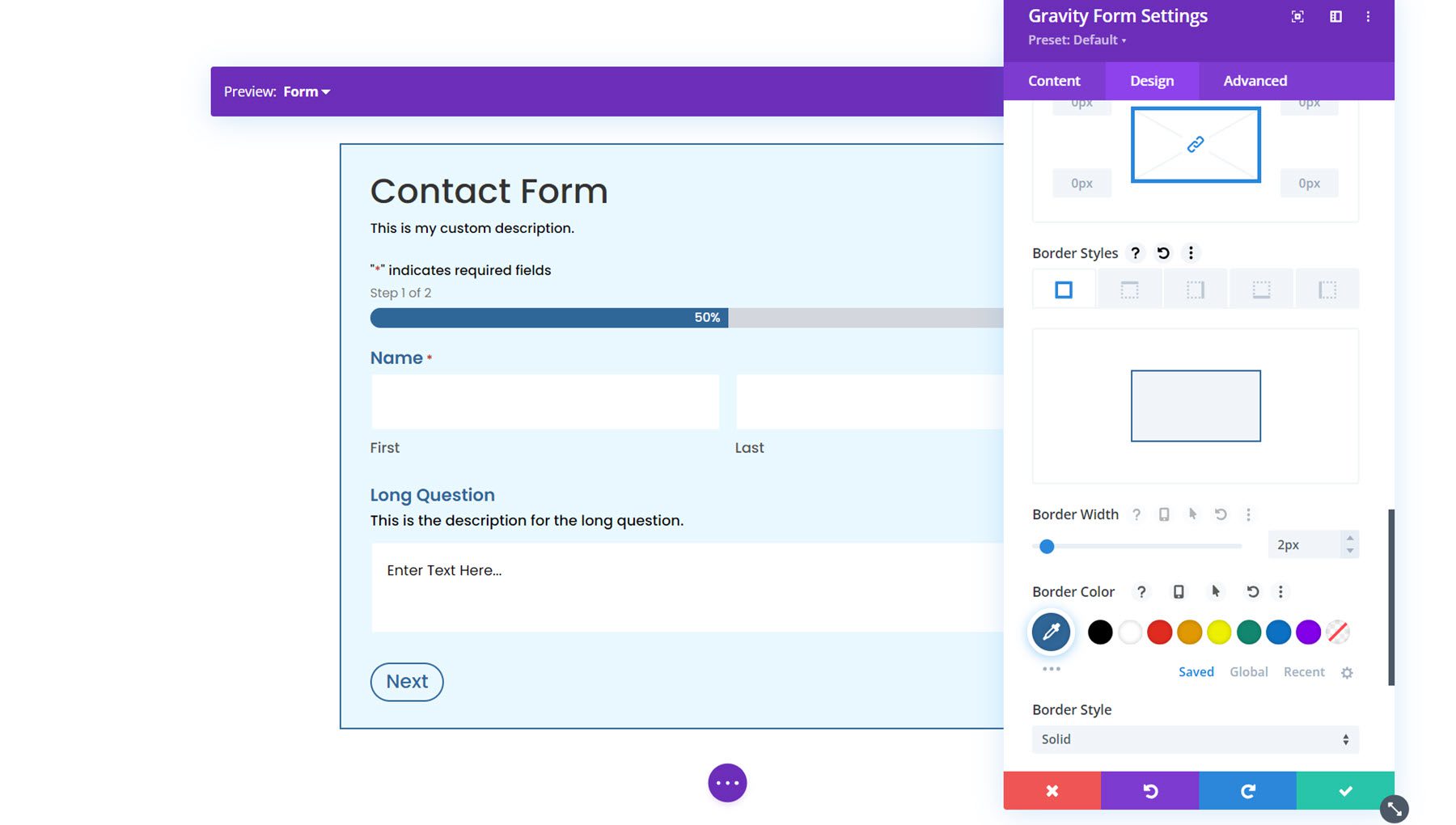
Border
In the border settings, you can add a border around the form. Here, I added a blue border.
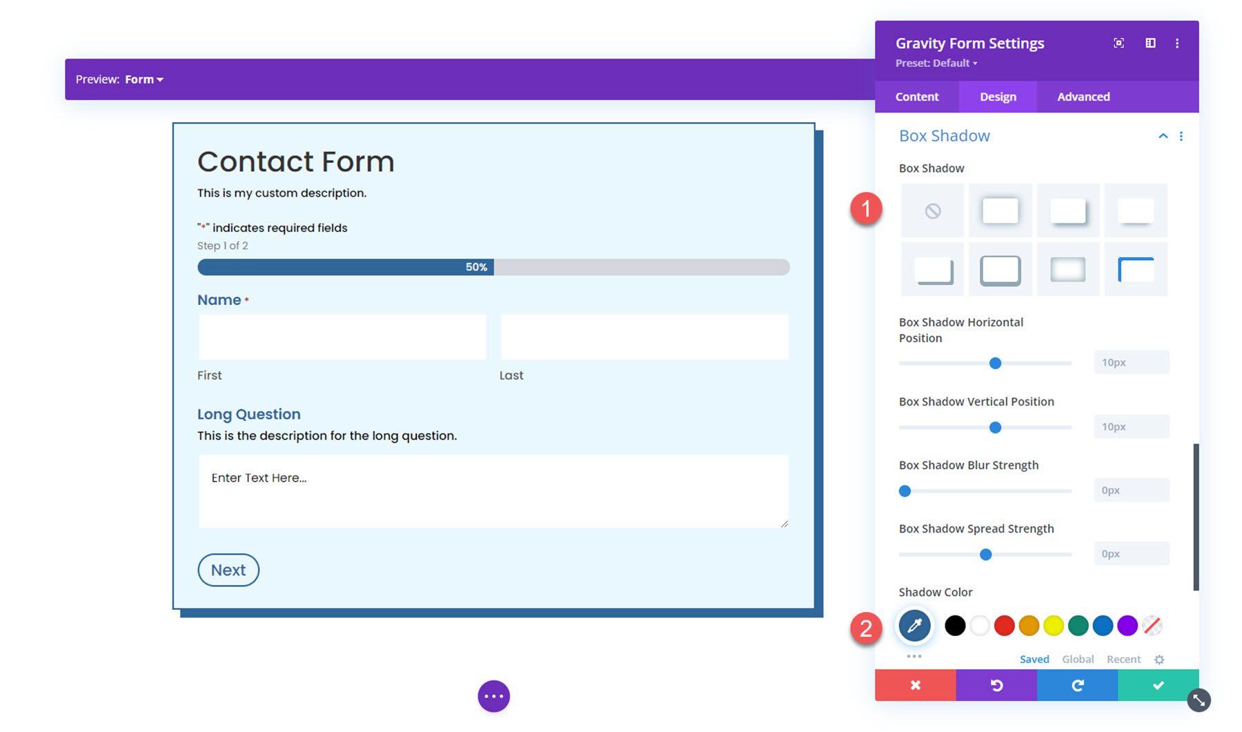
Box Shadow
Next, you can add a box shadow to the form.
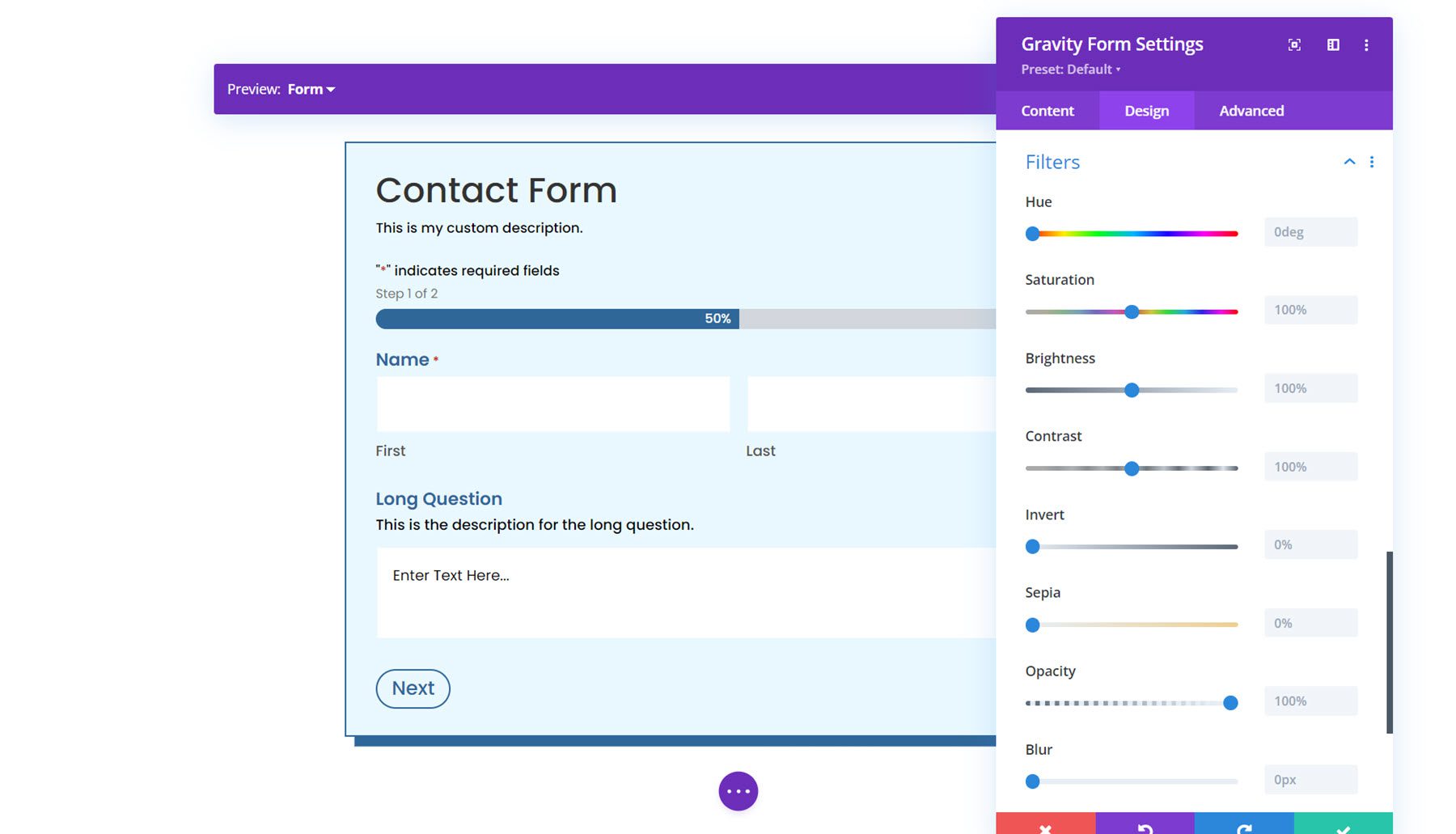
Filters
Here, you can use different filters to modify how the form is displayed.
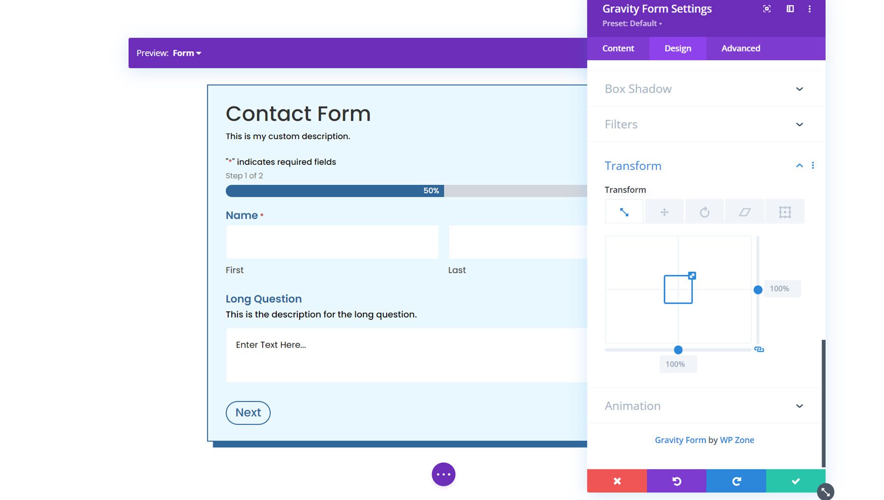
Transform
In the transform settings, you can adjust how the form appears using scale, translation, rotation, skew, and transform-origin settings.
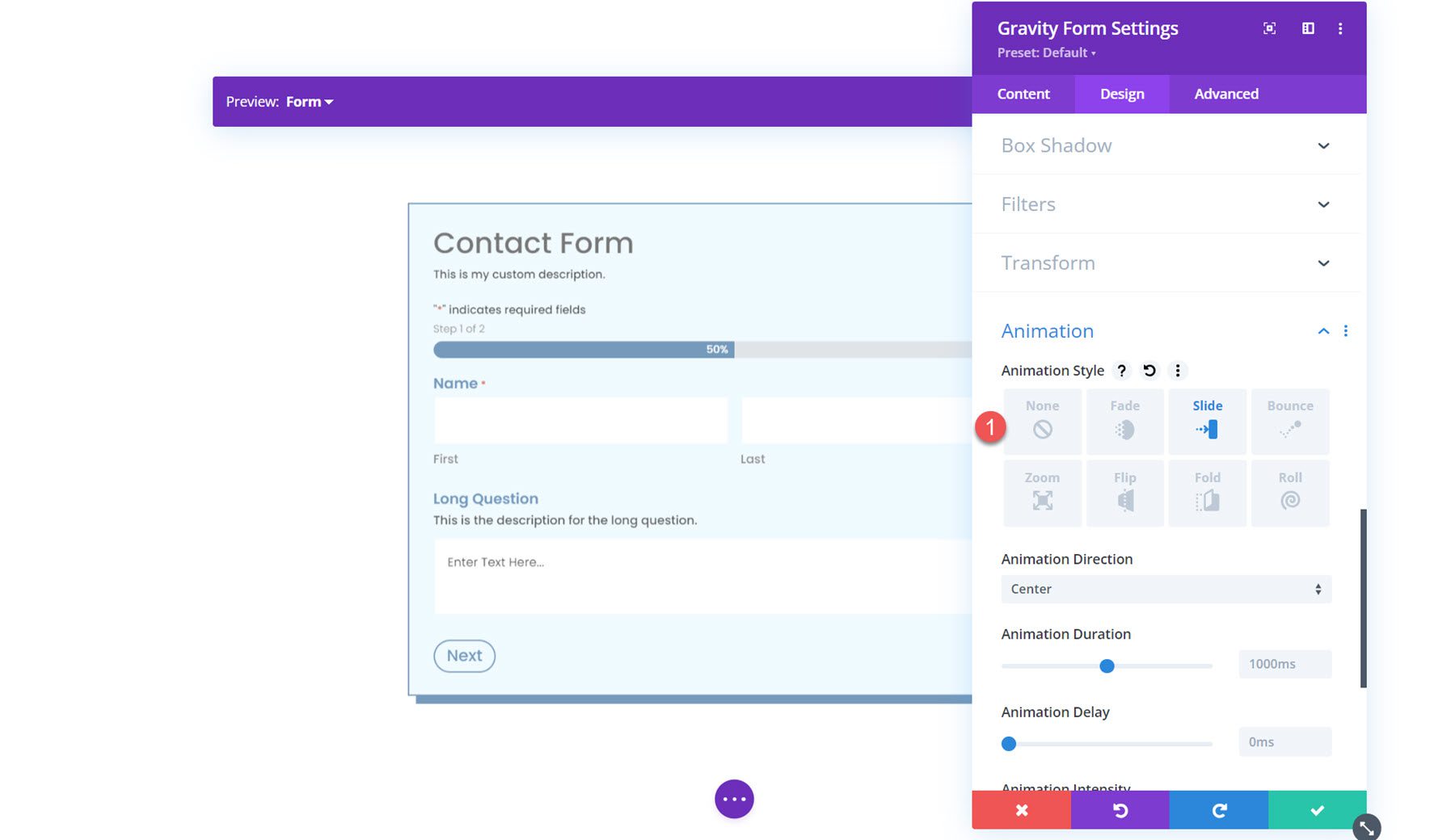
Animation
Finally, you can apply an animation effect to the form in this section. You can select from seven different animation styles and customize the animation duration, delay, intensity, and more.
Predesigned Layouts
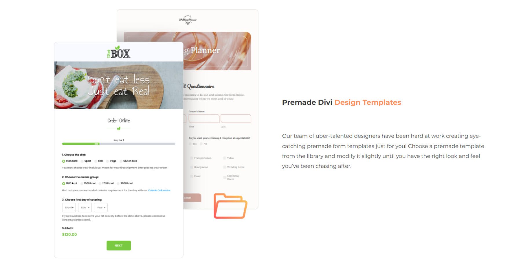
Gravity Forms Styler Module for Divi also comes with access to some predesigned layouts for fully-styled forms. You can download the layouts from the plugin author’s website. These layouts are a great way to get a head start on the styling process.
Gravity Forms Styler Module for Divi Layout Example
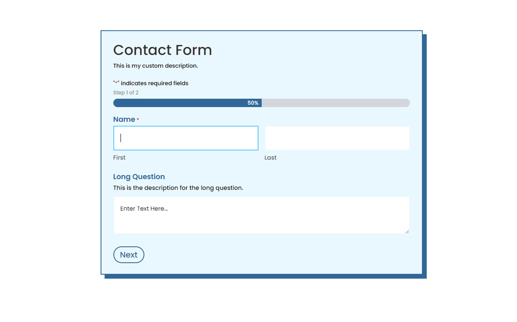
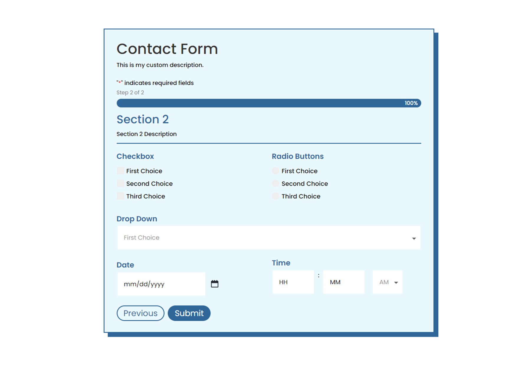
Here is one example of how to style your Gravity Form using the Gravity Forms Styler Module for Divi.
First Page
Second Page
Validation Error
Confirmation Page
Purchase Gravity Forms Styler Module for Divi
Gravity Forms Styler Module for Divi is available in the Divi Marketplace. It costs $39 for unlimited website usage and 1 year of support and updates. The price also includes a 30-day money-back guarantee.
Final Thoughts
Gravity Forms Styler Module for Divi brings all of the function and design flexibility of Divi to your forms built with Gravity Forms. With so many ways to customize the styling of each element, the design options are practically endless. If you’re tired of using Custom CSS to achieve your form styling and want an easy way to customize Gravity Forms using the Divi Builder, this may be a great product for you. We would love to hear from you! Have you tried the Gravity Forms Styler Module for Divi? Let us know what you think about it in the comments!




O M G!!!! This is EXACTLY what GF needed. You don’t know how many times I’ve defaulted to the Divi contact form (which doesn’t have very good and reliable delivery) just because I was too lazy to CSS the GF form to match my site. Best plugin E V E R!! :-). xoxox. Kudos to the author.
I’ve used this plugin a number of times for websites. It works brilliantly for being able to style Gravity froms within a Divi environment – a huge time saver. Recommended!
Excellent, that’s a plus, just one question; Do you have an option to print the form?