The header is one of the first elements to load for any Divi website you create. This means the header often makes the first impression anyone sees for a website, making header design a crucial part of every website. Fortunately, you don’t have to create your header from scratch. There are lots of header layouts in the Divi Marketplace to give you a head start. Header Layout Pack is one example. This is a set of over 80 custom headers that work for just about any type of website. In this post, we’ll look at Header Layout Pack to help you decide if it’s the right product for your needs.
Upload Header Layout Pack
Header Layout Pack includes two zipped files. The first is a single file that contains all 81 layouts. These layouts are uploaded together. The second is a supplementary file and includes six files. These are the categories of the header layouts. This allows you to upload just the layouts in a particular category, such as WooCommerce. This is also helpful if you have a file-size upload limit and can’t upload all the files at the same time.
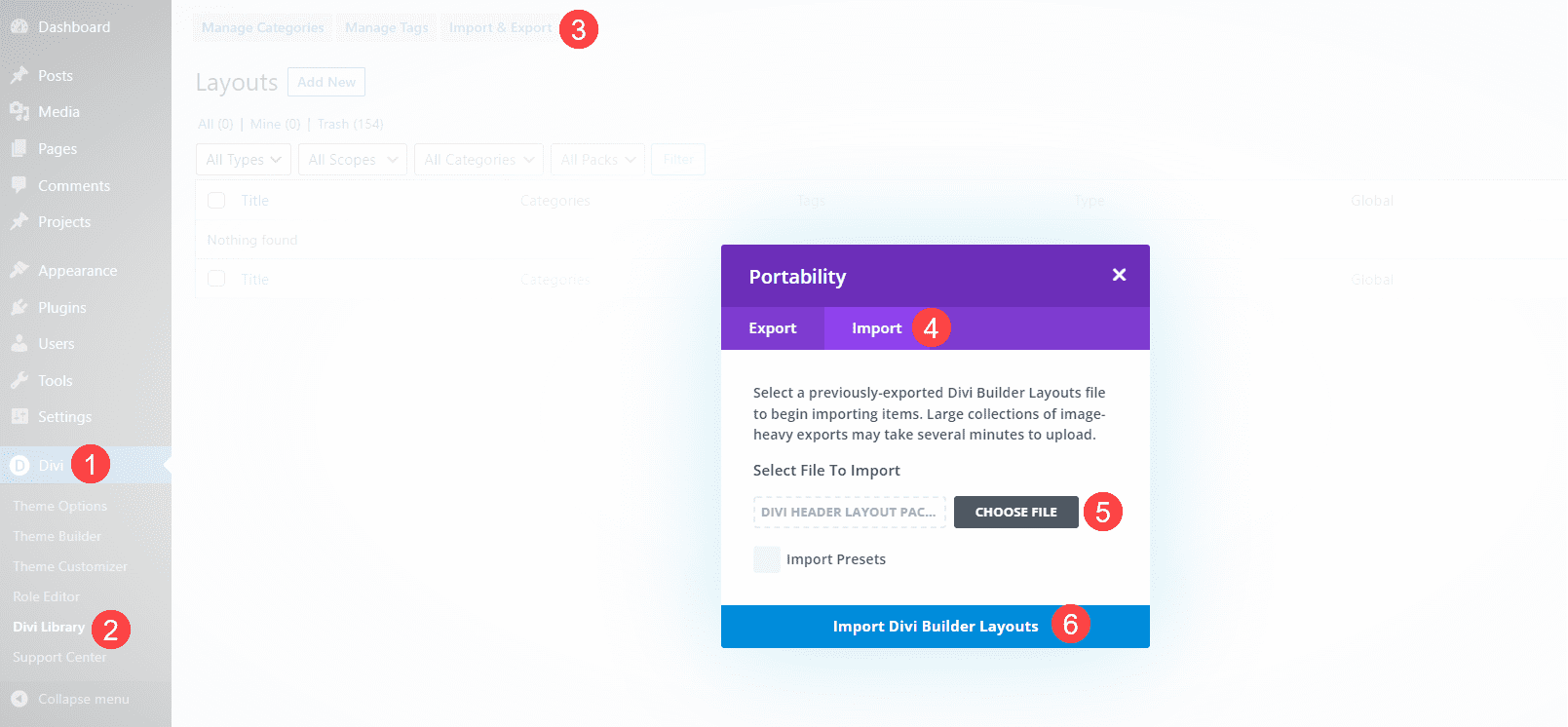
The process to upload the layouts is the same for all the files:
- Go to Divi
- Select Divi Library
- Click Import & Export
- Select the Import tab
- Click Choose File and navigate to the unzipped JSON files on your computer
- Click Import Divi Builder Layouts
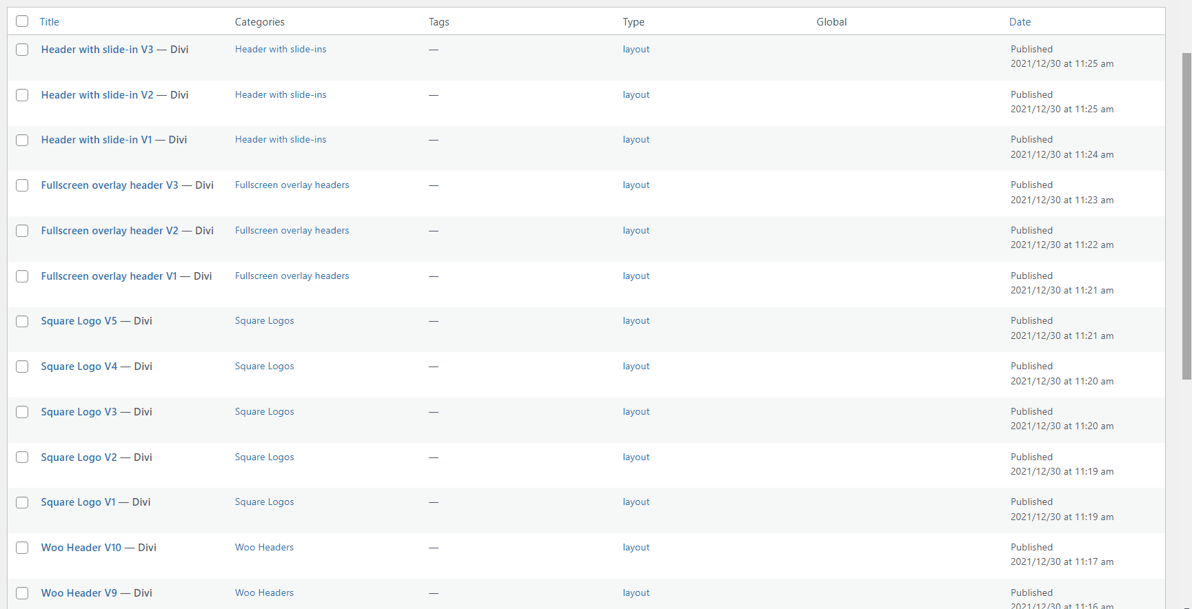
Once the import completes, you’ll have 81 new items in your Divi Library (if you chose the main JSON file). They’re labeled and named according to their categories, so they’re easy to identify. These layouts are standard Divi Library layouts, so they can be used with any Divi layout for a page, post, or any layout in the Divi Theme Builder, and stored in Divi Cloud for use on any Divi website. We recommend using them in the Divi Theme Builder and assigning them to global or individual categories.
Header Layout Pack Examples
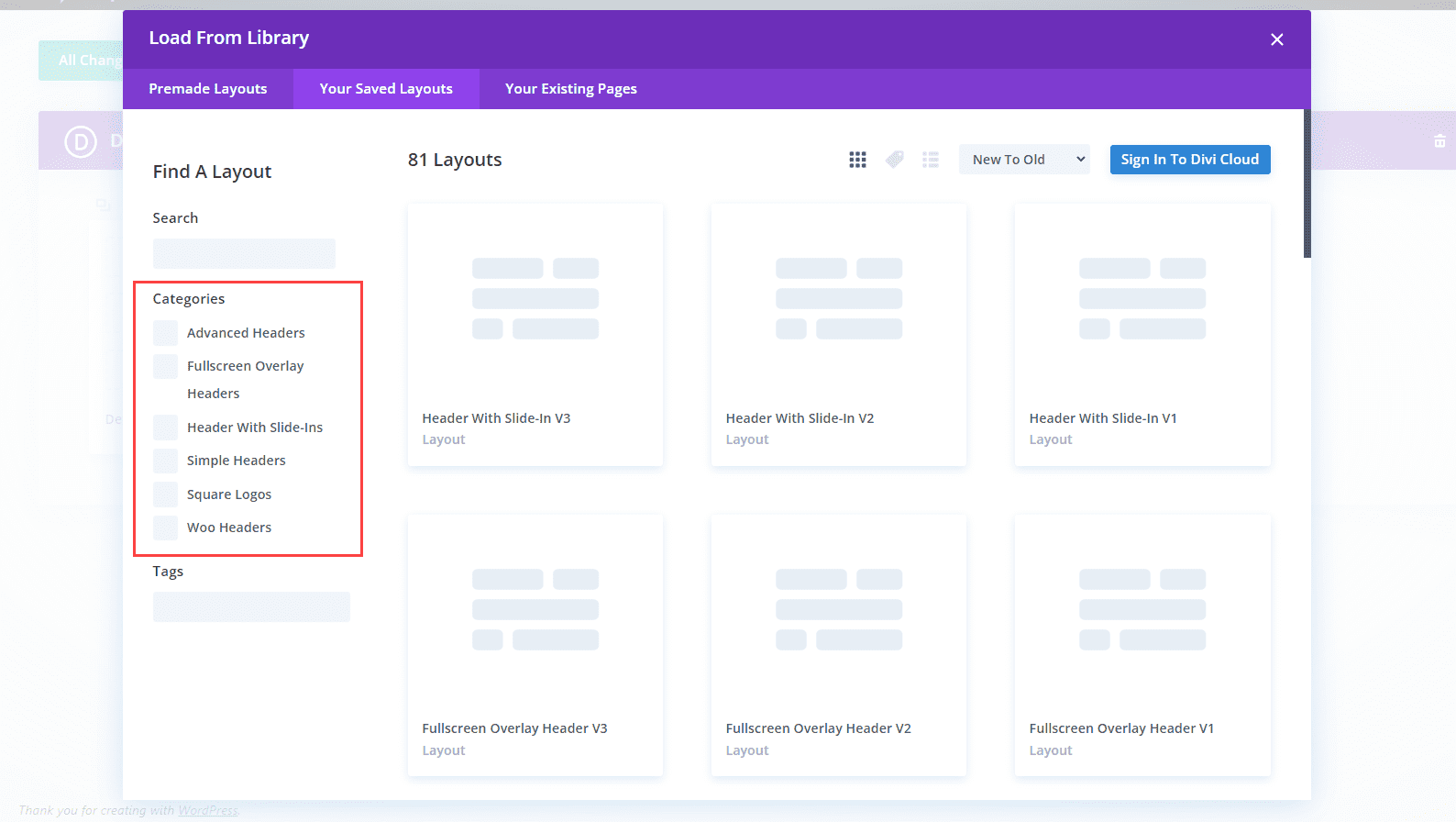
Let’s look at a few header layouts from each of the six categories. In my examples, I’ll load each layout into the Divi Theme Builder. New layouts are often added to the Header Layout Pack. I’m selecting them at random, but I’ll focus on a mix of older and newer layouts. When viewing them in the Your Saved Layouts tab, you can select the categories or view all the layouts.
For my screenshots, I’m using the home page from the free Home Remodeling Layout Pack that’s available within Divi. We’ll look at the wireframe, desktop, and phone versions of the headers.
Advanced Headers
Firstly, here’s a look at Advanced Headers, which contains 30 layouts.
Advanced Header V1
The first Advanced Header includes a Menu Module, Button Module, and two Text Modules. It also includes a Code Module with CSS.

The header includes styled dropdown submenus. A quote CTA button stretches on hover.
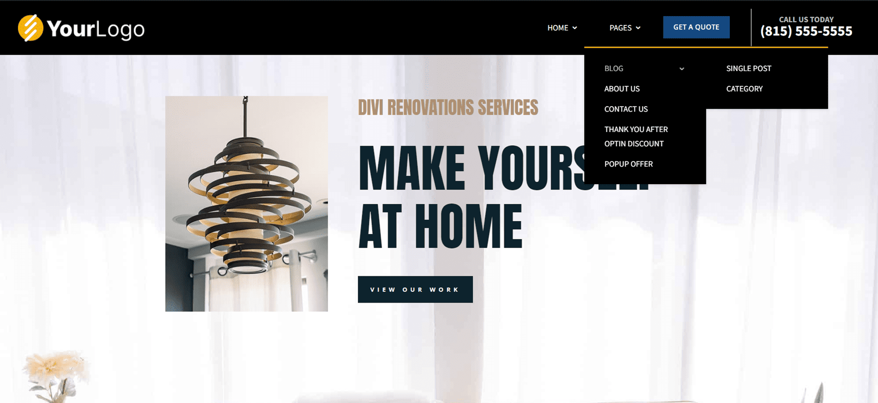
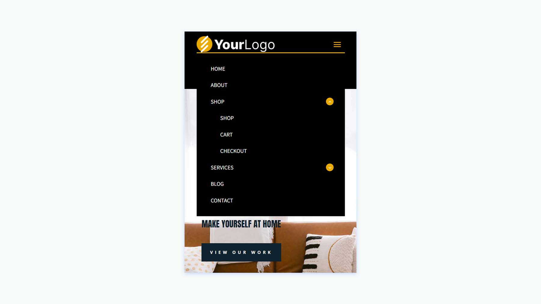
While the menus in the desktop version open on hover, the CSS creates a custom mobile menu toggle with buttons that include arrows showing if the menu can be opened or collapsed.
Advanced Header V20
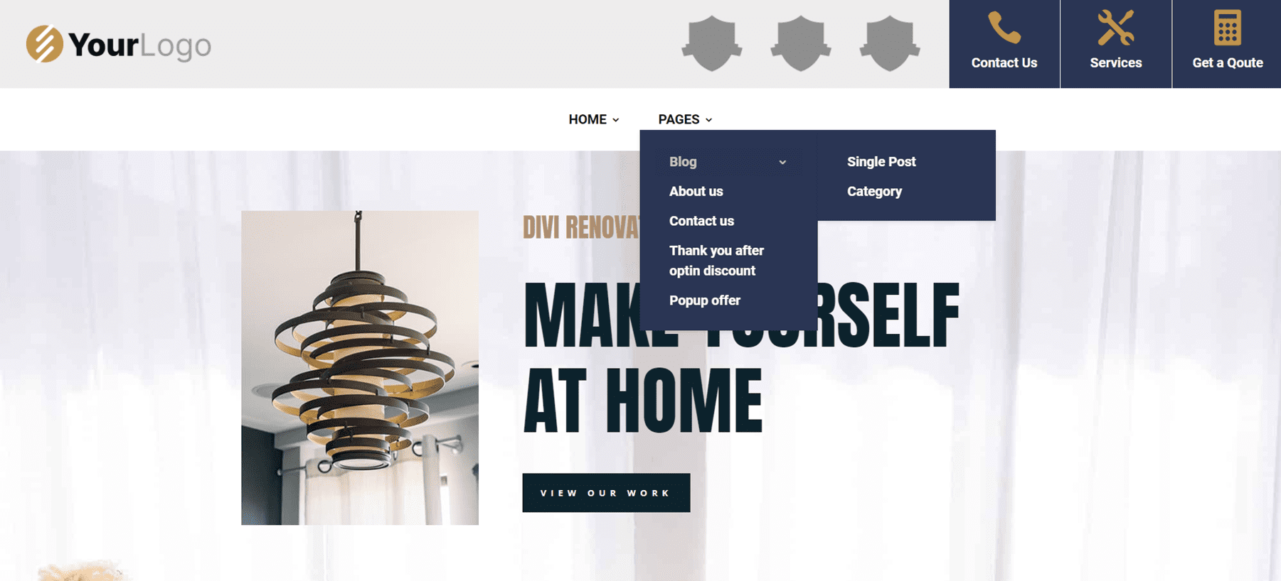
The Advanced Header version 20 includes four Image Modules, three Blurb Modules, a Menu Module, and a Code Module.
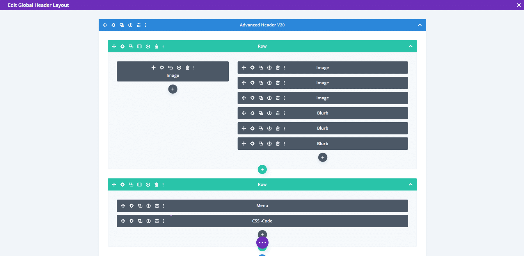
The Image Modules can be used for logos. All Blurb Modules are clickable buttons for contact information, services, and a CTA to get a quote.
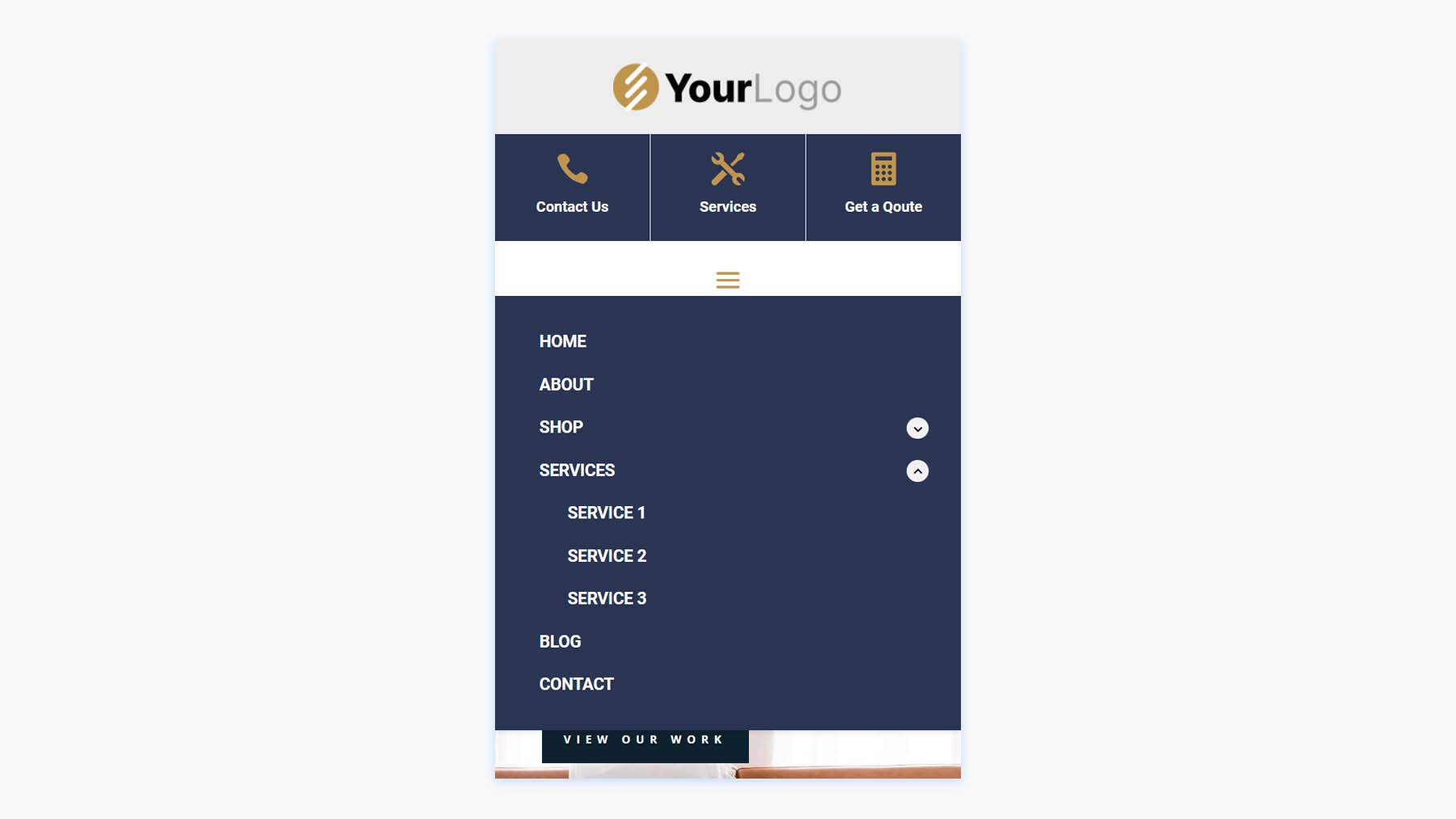
Mobile menu toggles are added to the phone version with CSS.
Advanced Header V30
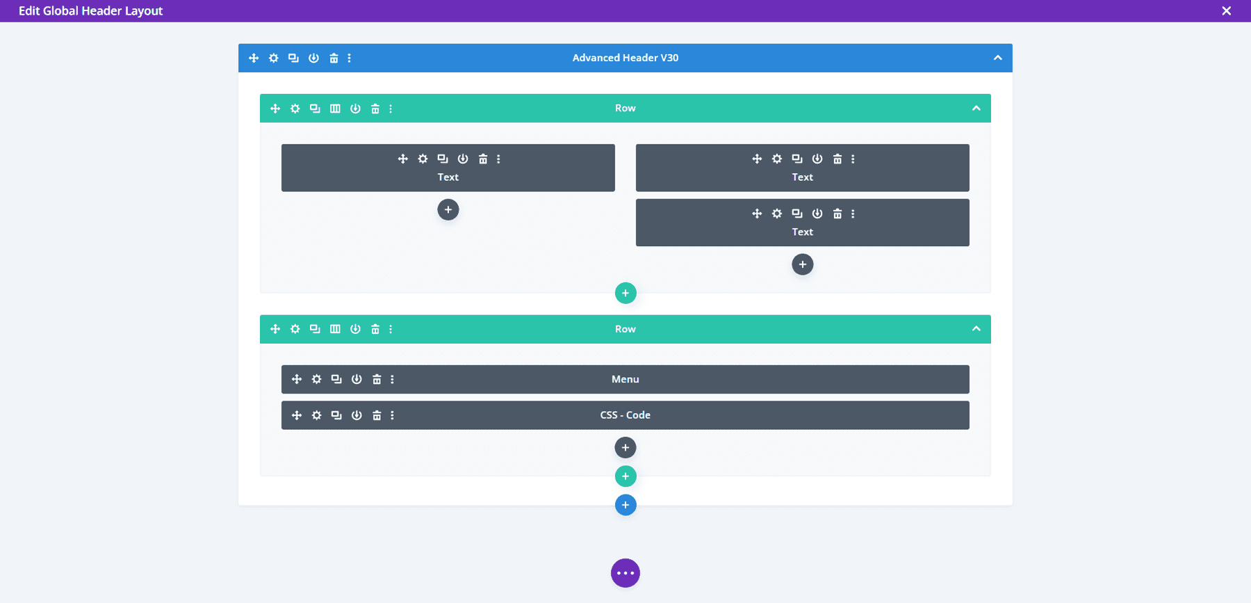
Advanced Header V30 includes three Text Modules, and Menu Module, and a Code Module.
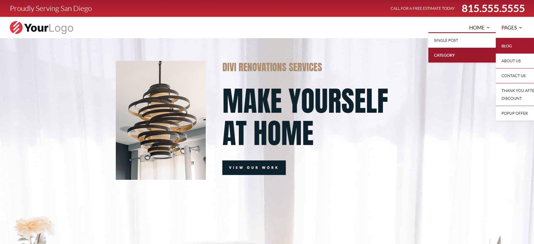
The Desktop version displays a red top menu bar with a short message and a phone number in large text. A logo and menu are placed under this and include a dropdown submenu styled to match the top menu bar.
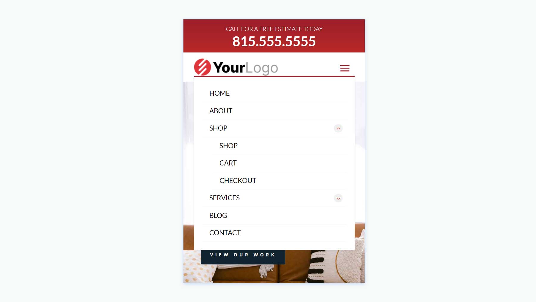
While the desktop version includes red highlights, the Phone Version removes the red background of the submenus and includes the CSS toggles.
Fullscreen Overlay Headers
Secondly, we’ll see Header Layout Pack’s Fullscreen Overlay Headers, which includes 3 layouts.
Fullscreen Overlay Header V2
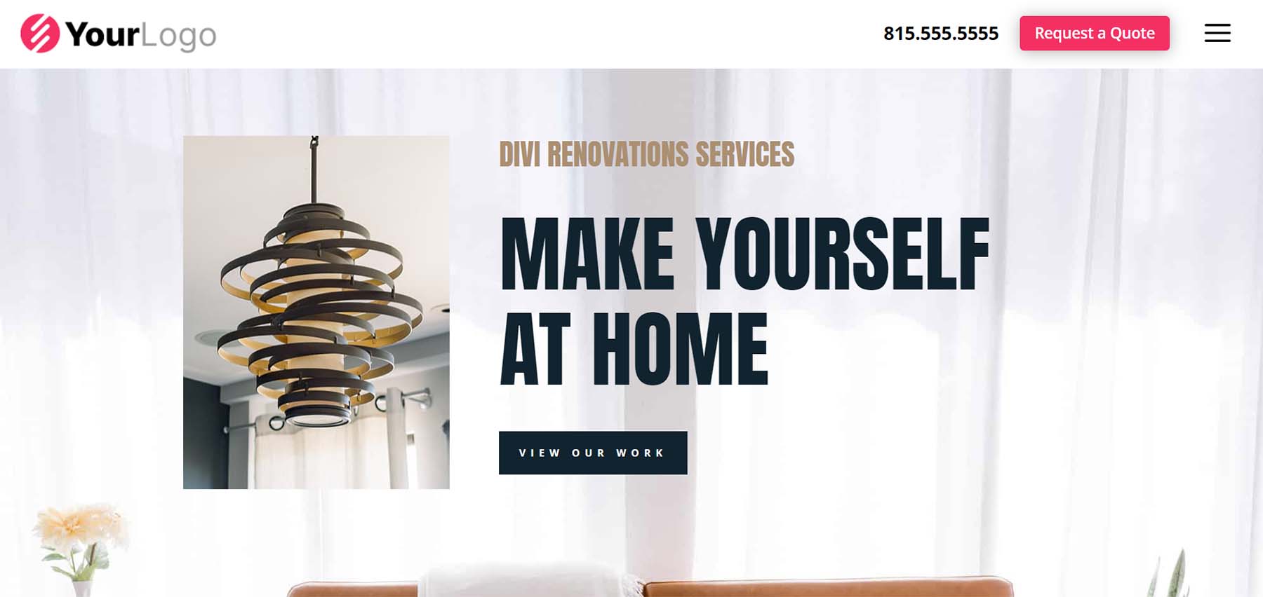
Fullscreen Overlay V2 comes with lots of elements including text, images, buttons, blurbs, code, social media, a menu, etc.
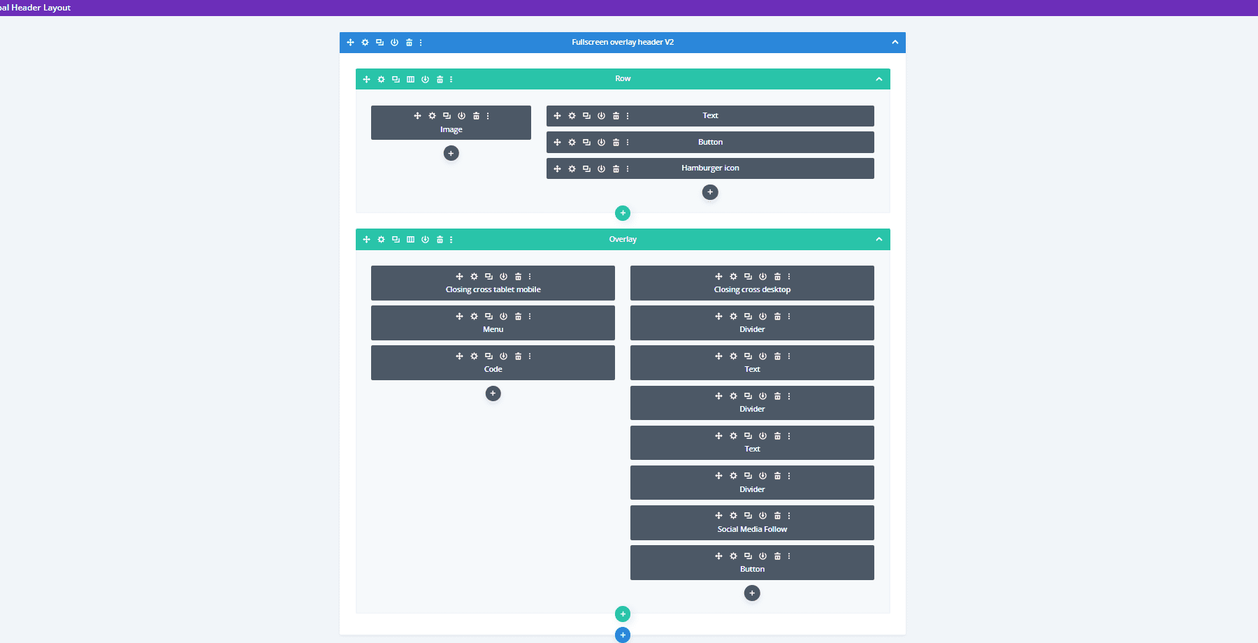
It includes a hamburger menu icon with a hover animation. The CTA button widens on hover.
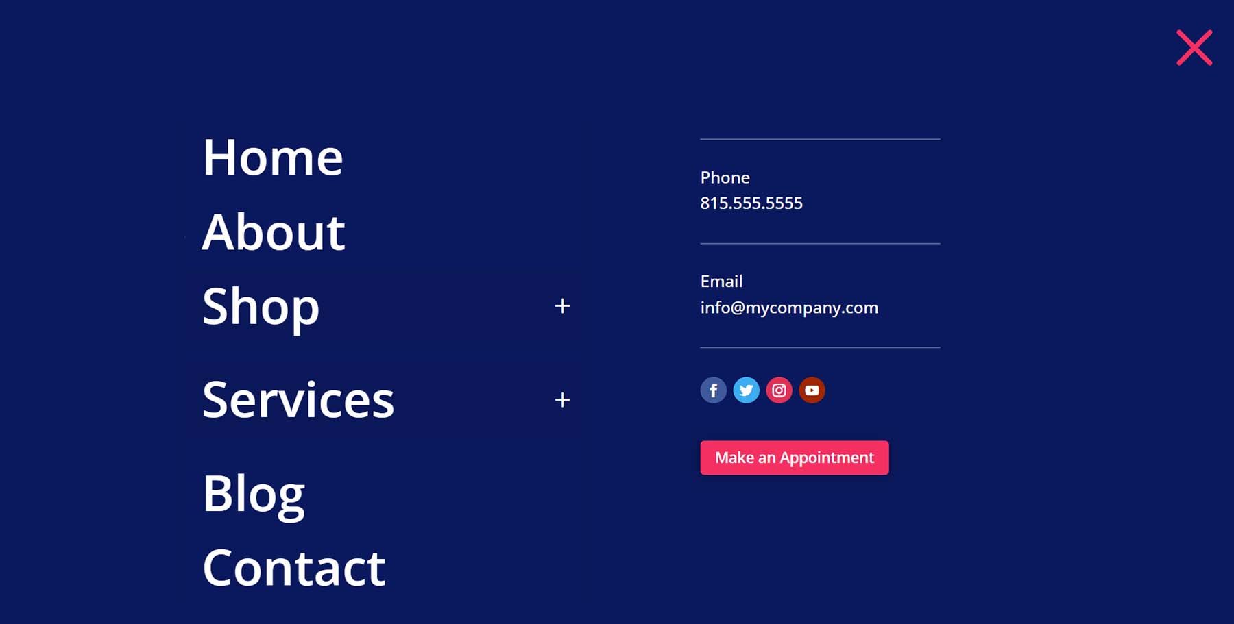
The menu opens full screen when clicked and includes clickable submenus.
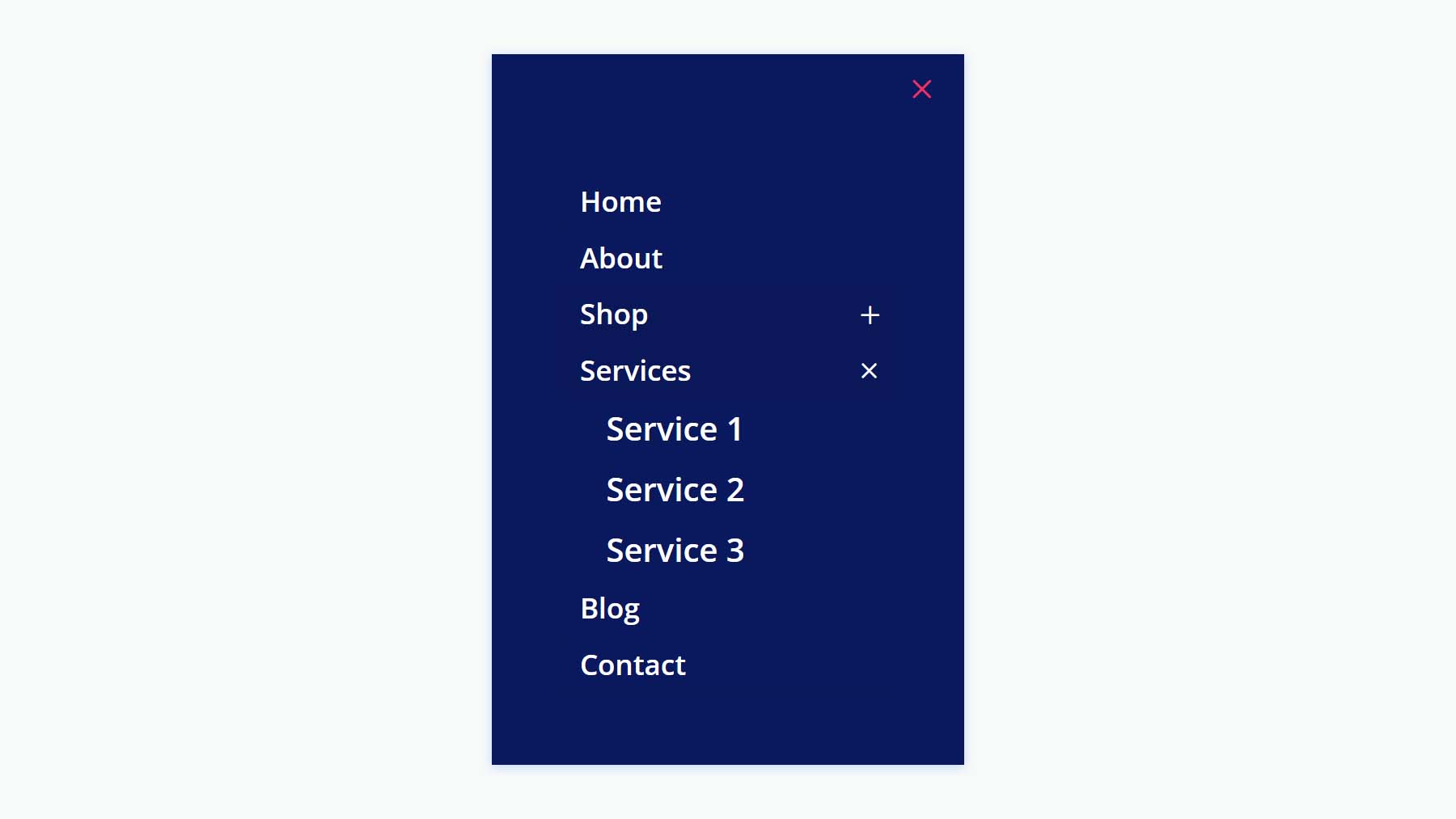
Here’s the phone version, which follows the same design.
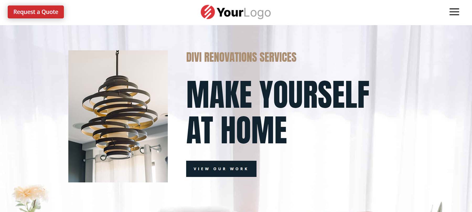
Fullscreen Overlay Header V3
Fullscreen Overlay Header V3 utilizes similar modules as the previous layout but creates a different design for the full-screen overlay.
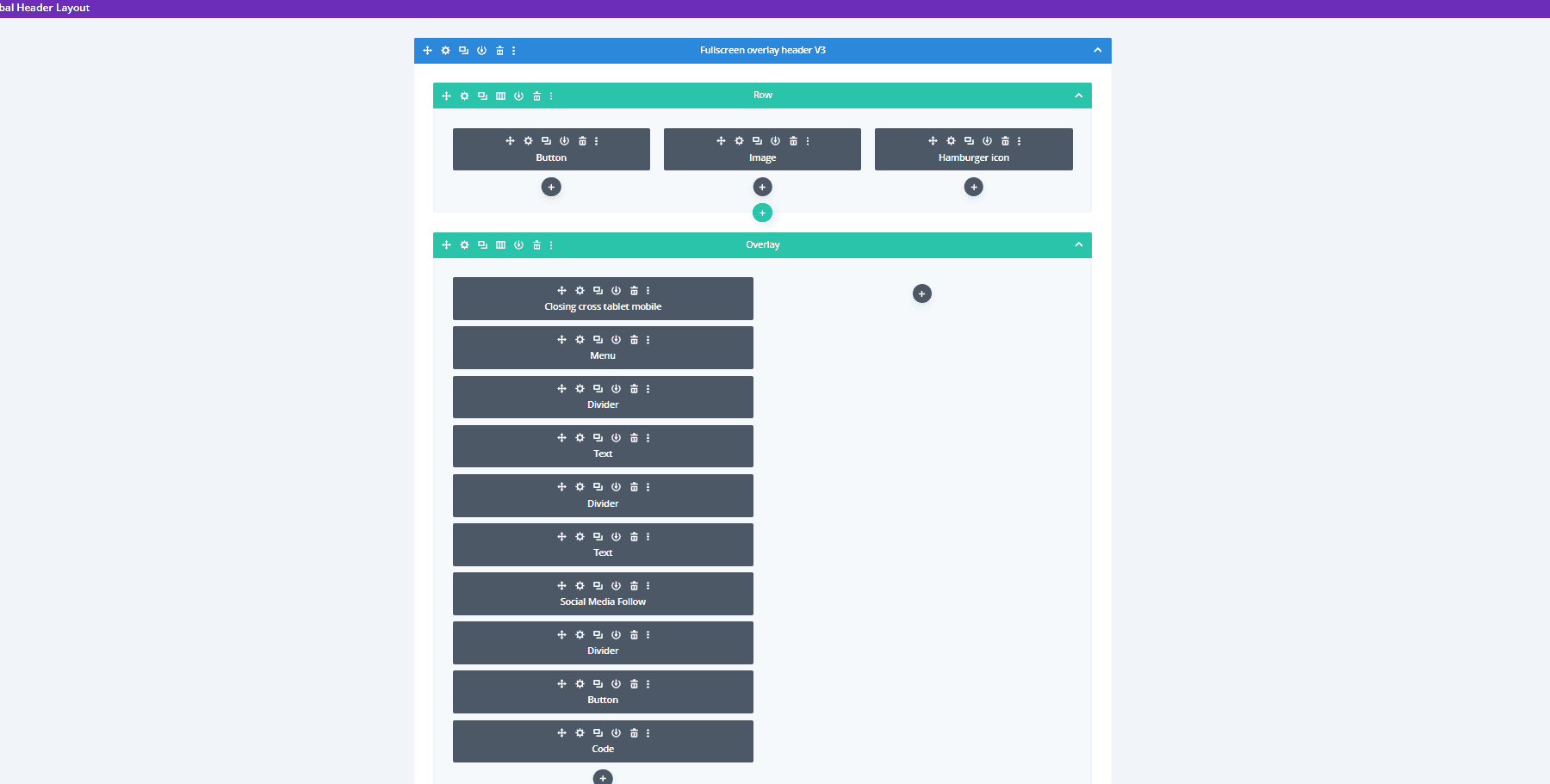
The desktop header includes the CTA and hamburger icon with hover animation.
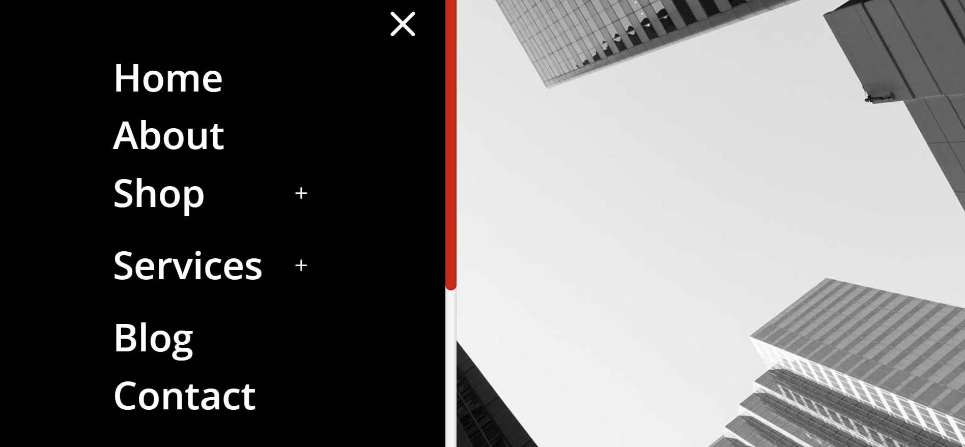
Its menu covers half the screen while an image takes the other half of the screen.
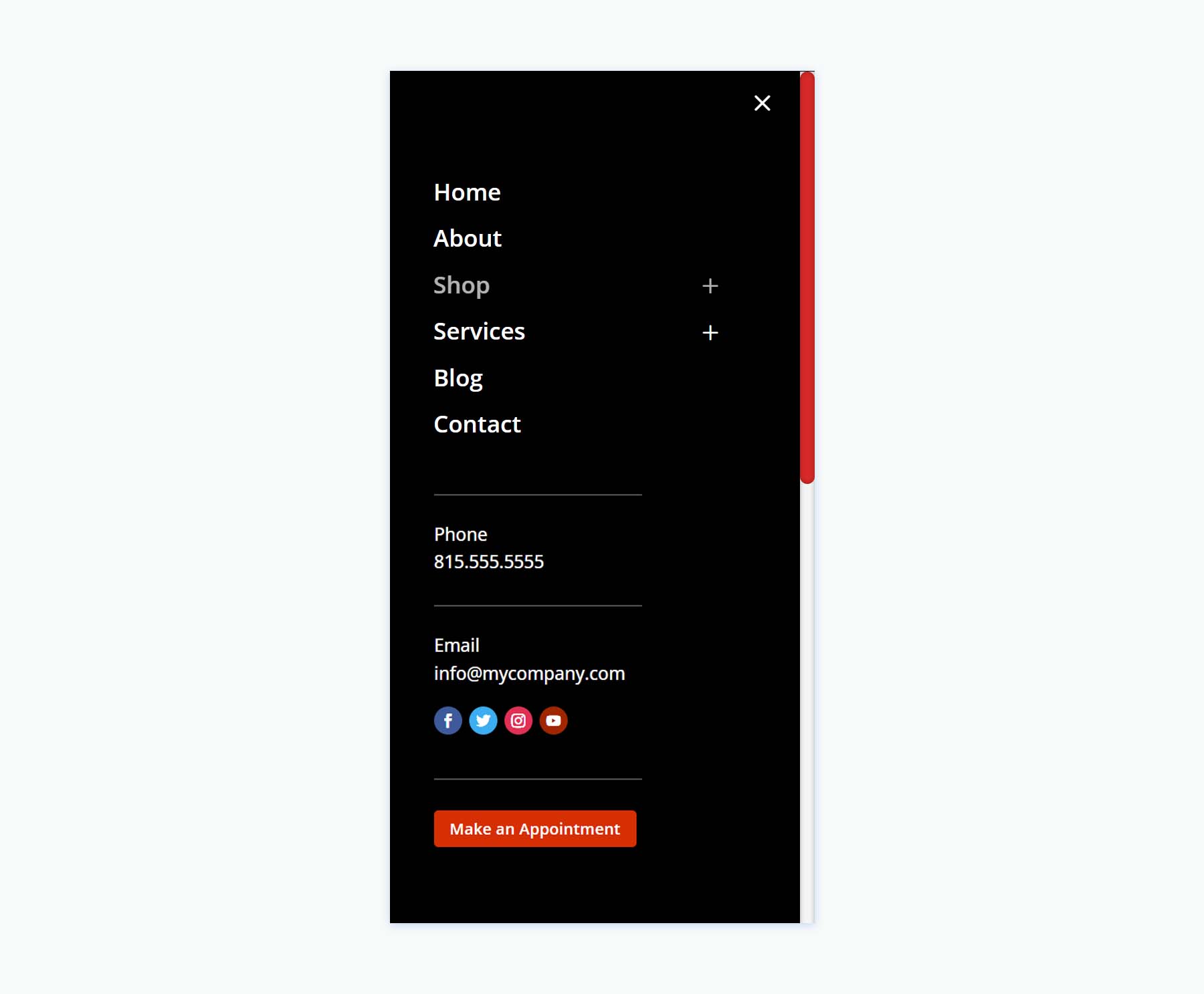
The phone version follows the same design for the menu, but doesn’t include the image.
Header with Slide-ins
Thirdly, we’ll look at Header Layout Pack’s Header with Slide-ins, which includes three layouts.
Header with Slide-ins V2
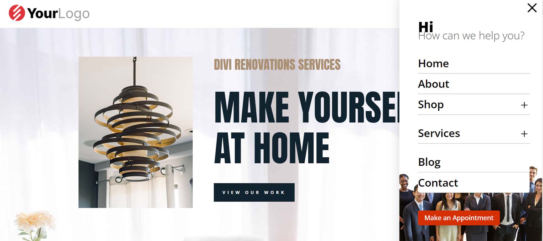
Version 2 creates the slide-in with a Blurb Module, several Text Modules, a Menu Module, a Button Module, and code.
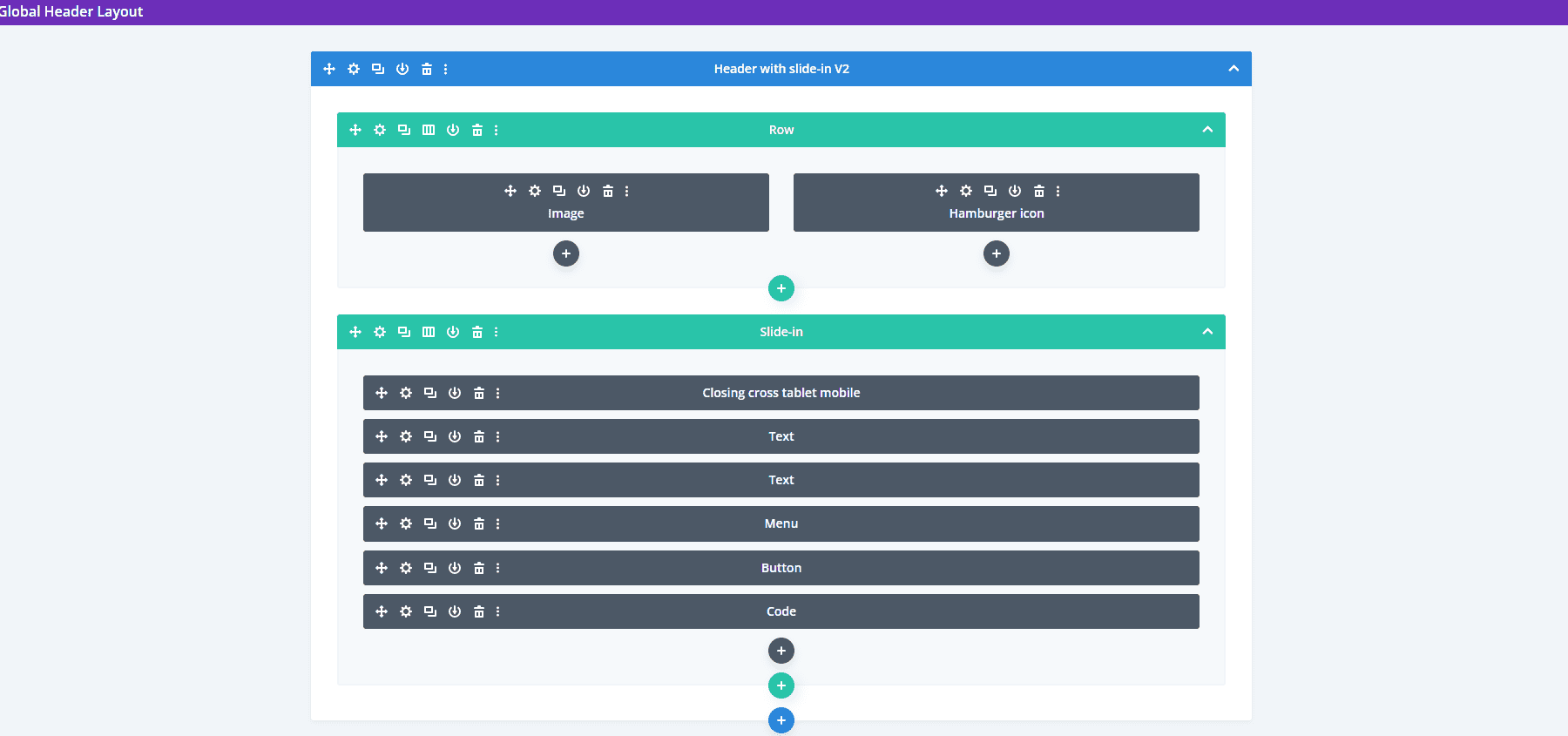
The slide-in menu displays the submenus under a message. At the bottom of the menu, you can find a CTA and an image.
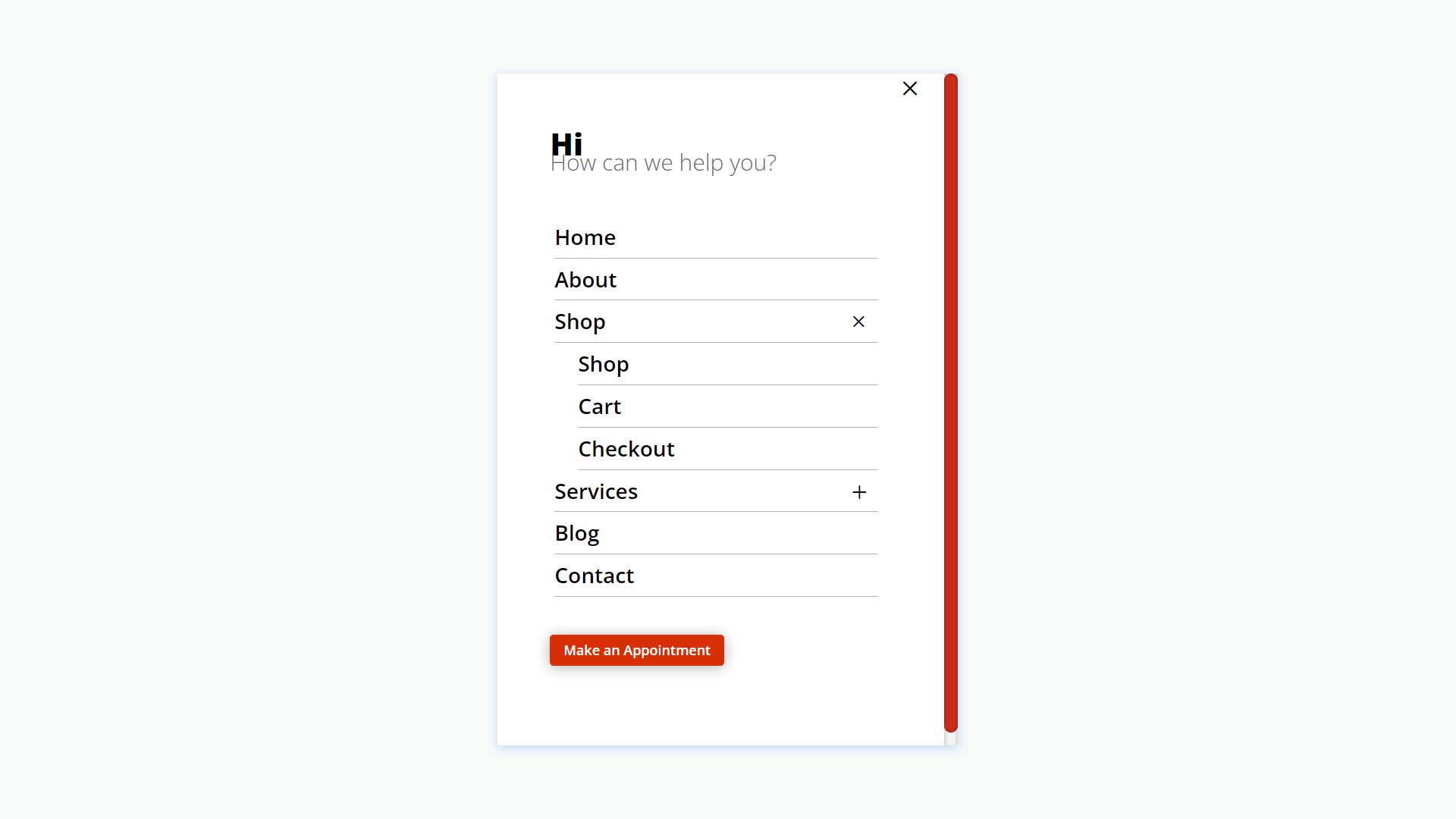
The phone version removes the image while keeping the menu design.
Header with Slide-ins V3
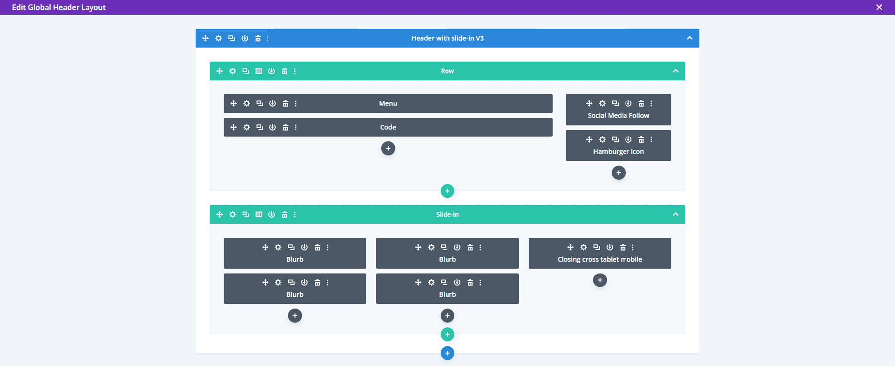
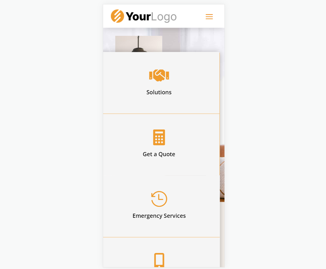
Version 3 includes Blurb Modules to create the slide-ins.
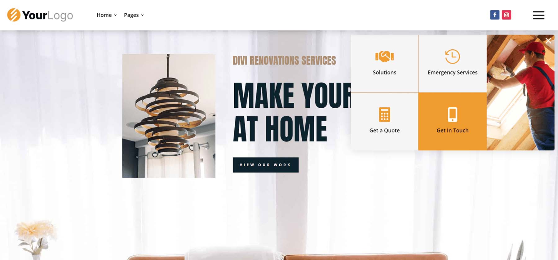
The desktop slide-in includes hover animation and displays text and icons. Each of the elements is clickable.
The clickable elements for the phone slide-in menu are much larger than the desktop version, making them easy to use on mobile.
Simple Headers
Fourthly, Simple Headers includes 30 layouts.
Simple Headers V15
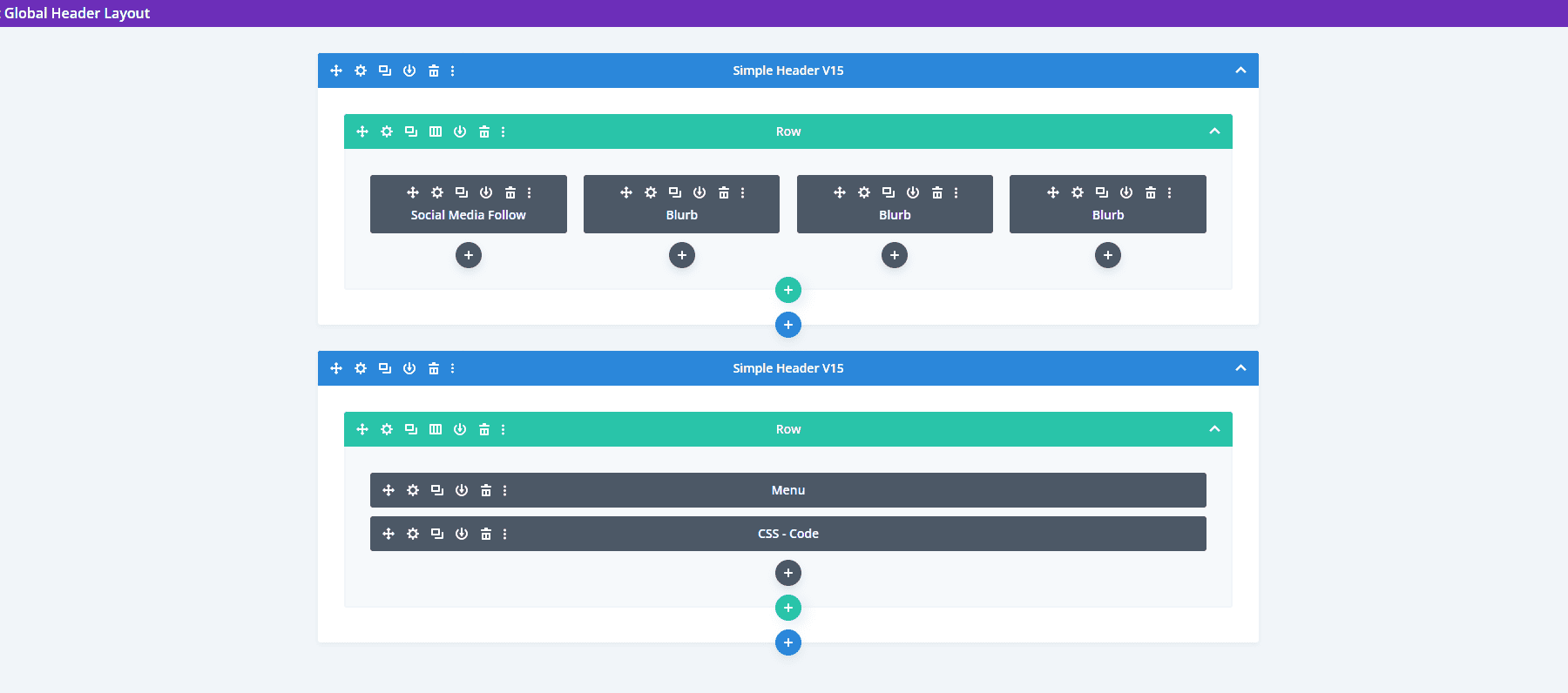
Simple Headers version 15 has two Rows and includes a Social Media Module and several Blurb Modules.
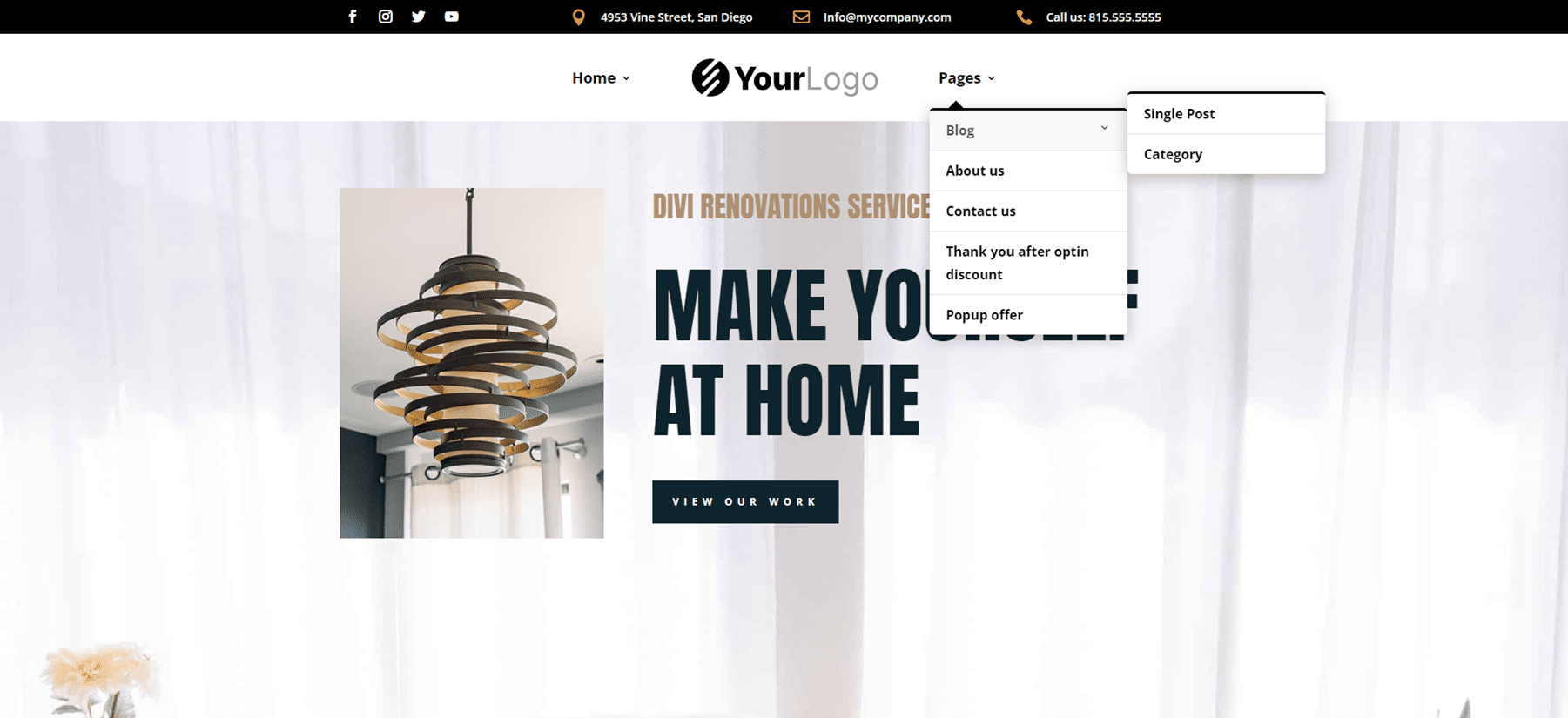
The desktop version includes a top bar with contact information. A logo is centered, and the menu includes submenus.
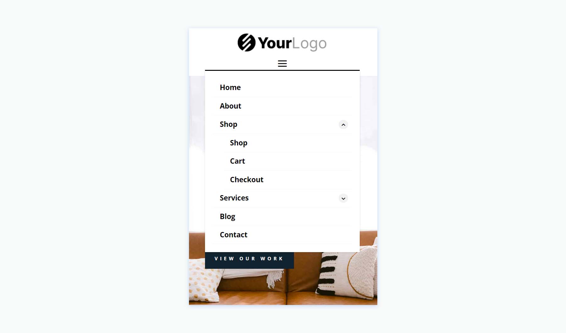
The phone version adds the toggle buttons for the submenus.
Simple Headers V22
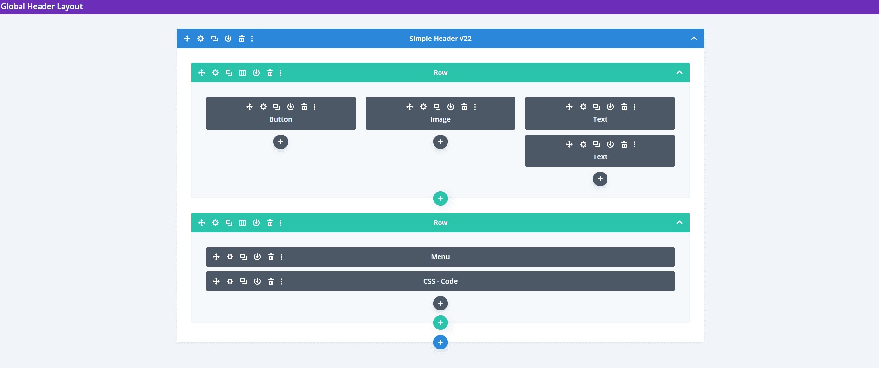
This one includes two Rows to create the header.
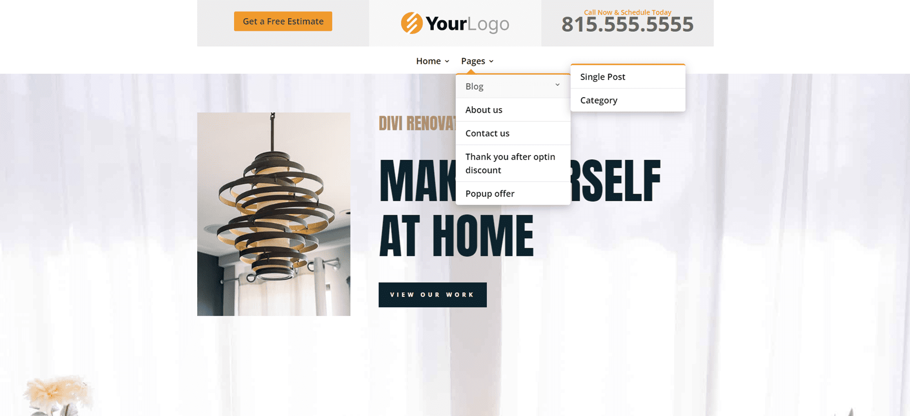
The top bar displays a CTA with a hover animation, the logo in the center, and a phone number. Its menu includes styled submenus.
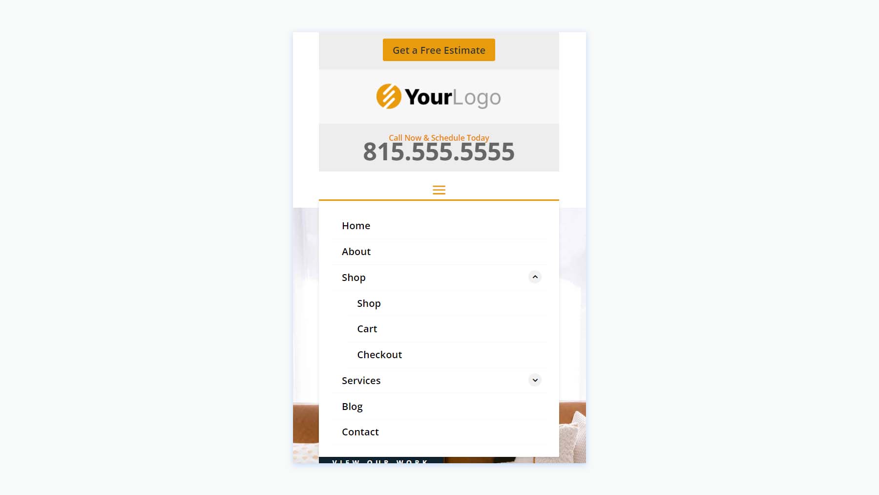
The phone version displays the submenus with toggles created in the Code Module.
Square Logos Headers
Fifthly, the Square Logos Headers includes five layouts. They’re ideal if you have a logo that’s taller than most logos.
Square Logos Headers V3
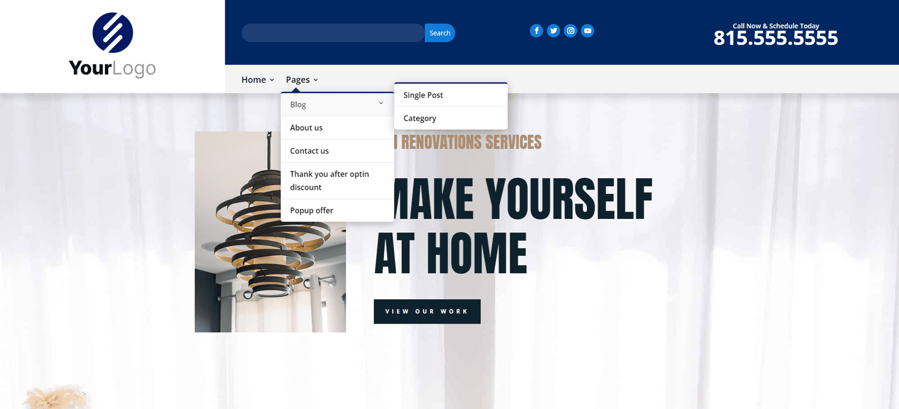
This one was built with a Specialty Section to include a multi-column layout. The square logo is created with an Image Module in its own column.
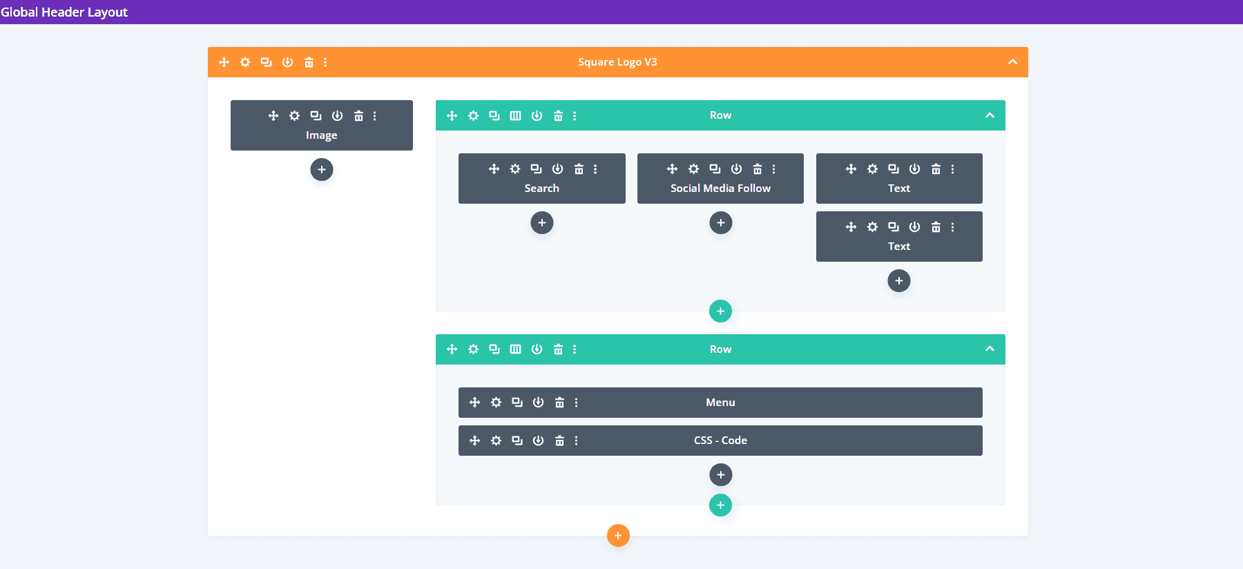
The desktop version includes a top bar with a search box and contact information. All menus are styled to match the top bar’s background.
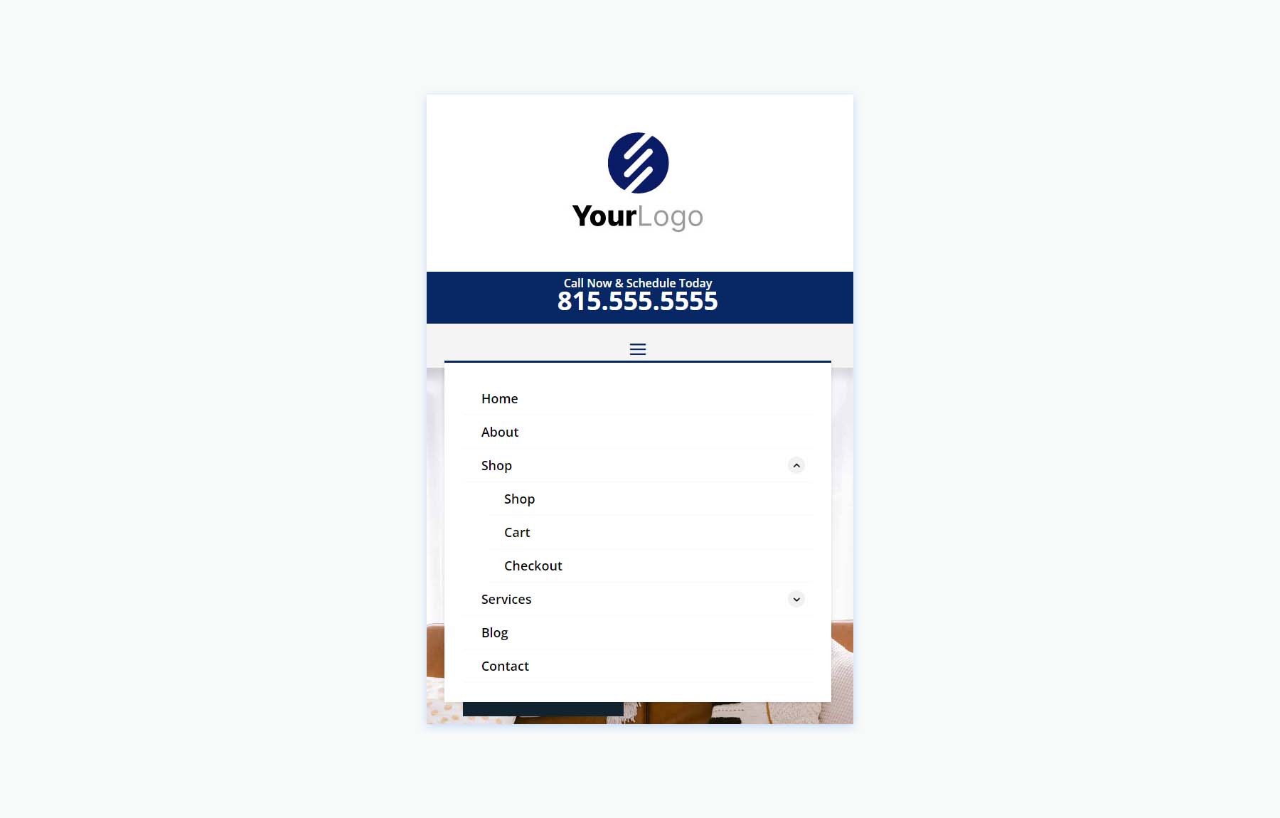
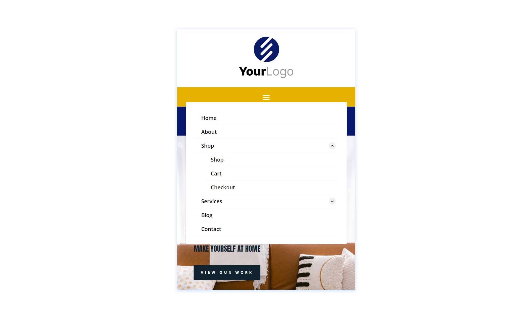
The phone version includes the submenu toggles created with CSS.
Square Logos Headers V4
Version 4 includes three columns to create the logo, menu, and CTAs.
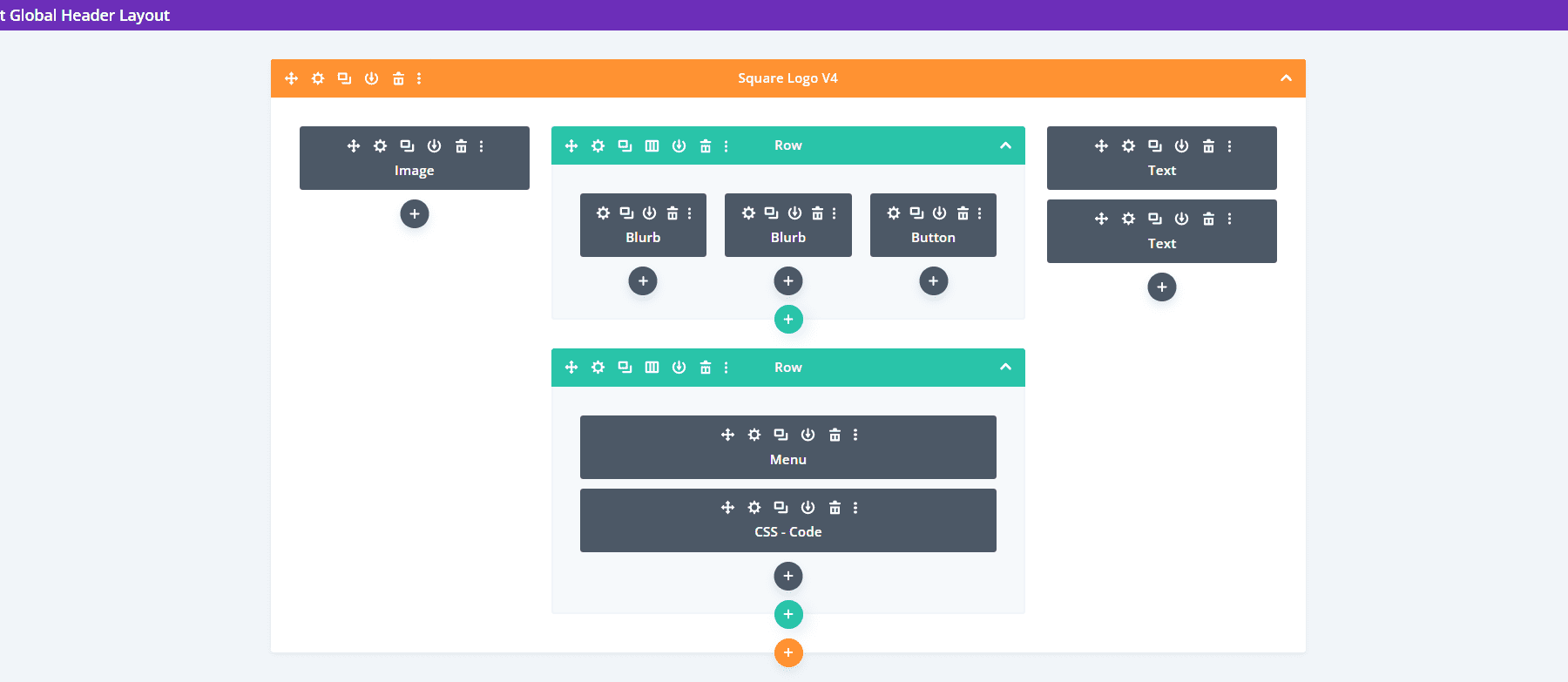
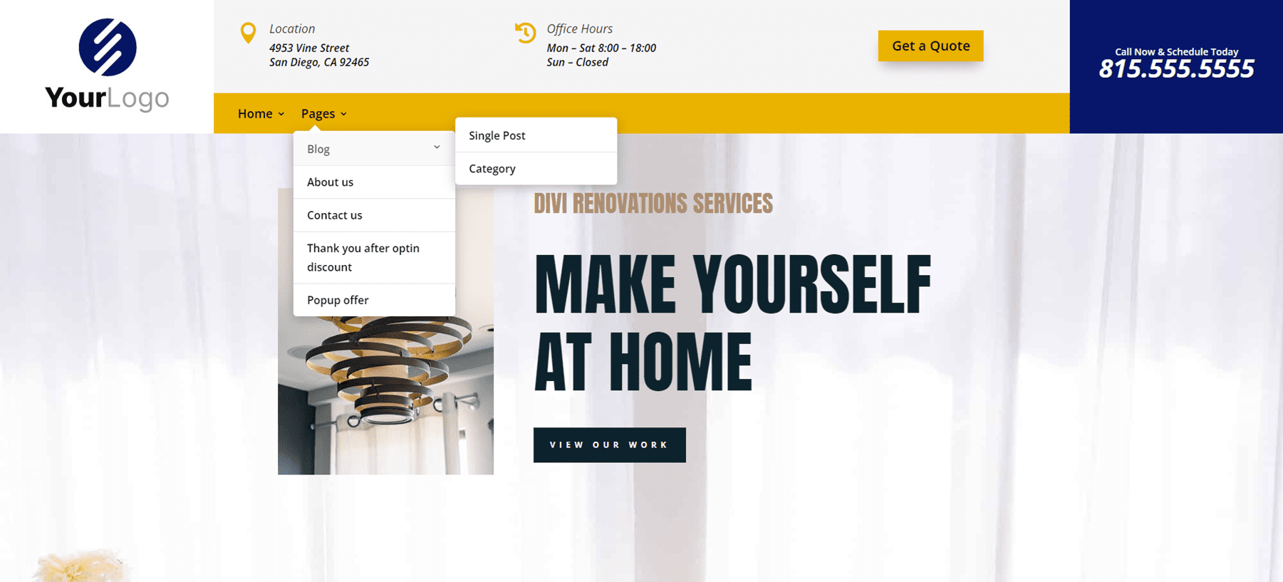
The desktop version displays the logo and phone number in the two outer columns. A center column includes two Rows. The top Row shows contact information and a CTA, while the bottom Row displays the menu with a background styled to match the icons and the button of the top Row.
The phone version includes a large logo area. The submenus include the toggles created with CSS.
Woo Headers
Lastly, we’ll look at Header Layout Pack, which includes 10 WooCommerce headers.
Woo Headers V3
Our first Woo Header includes two Rows. The top Row includes a Text Module, while the second Row displays a Menu Module and several Icon Modules.
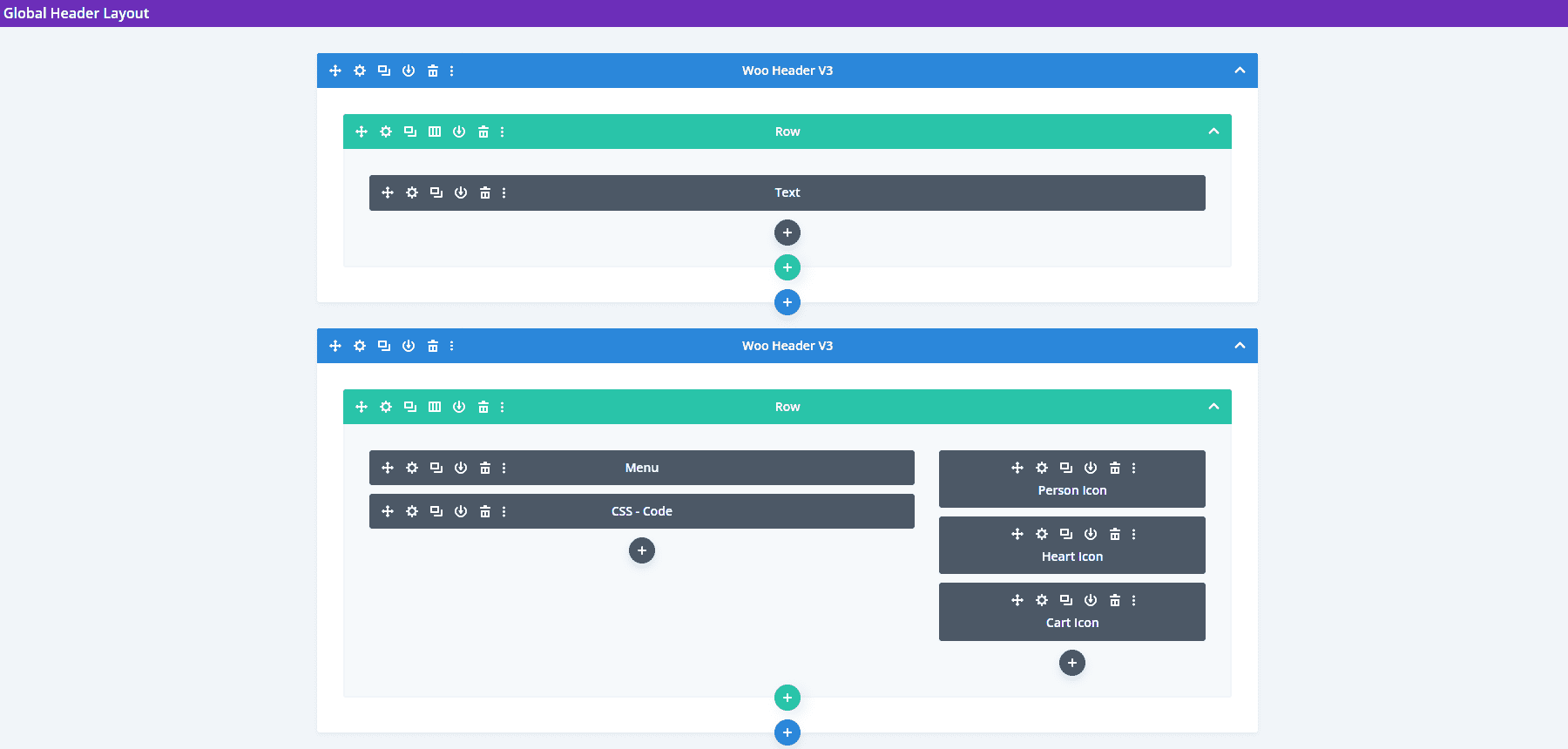
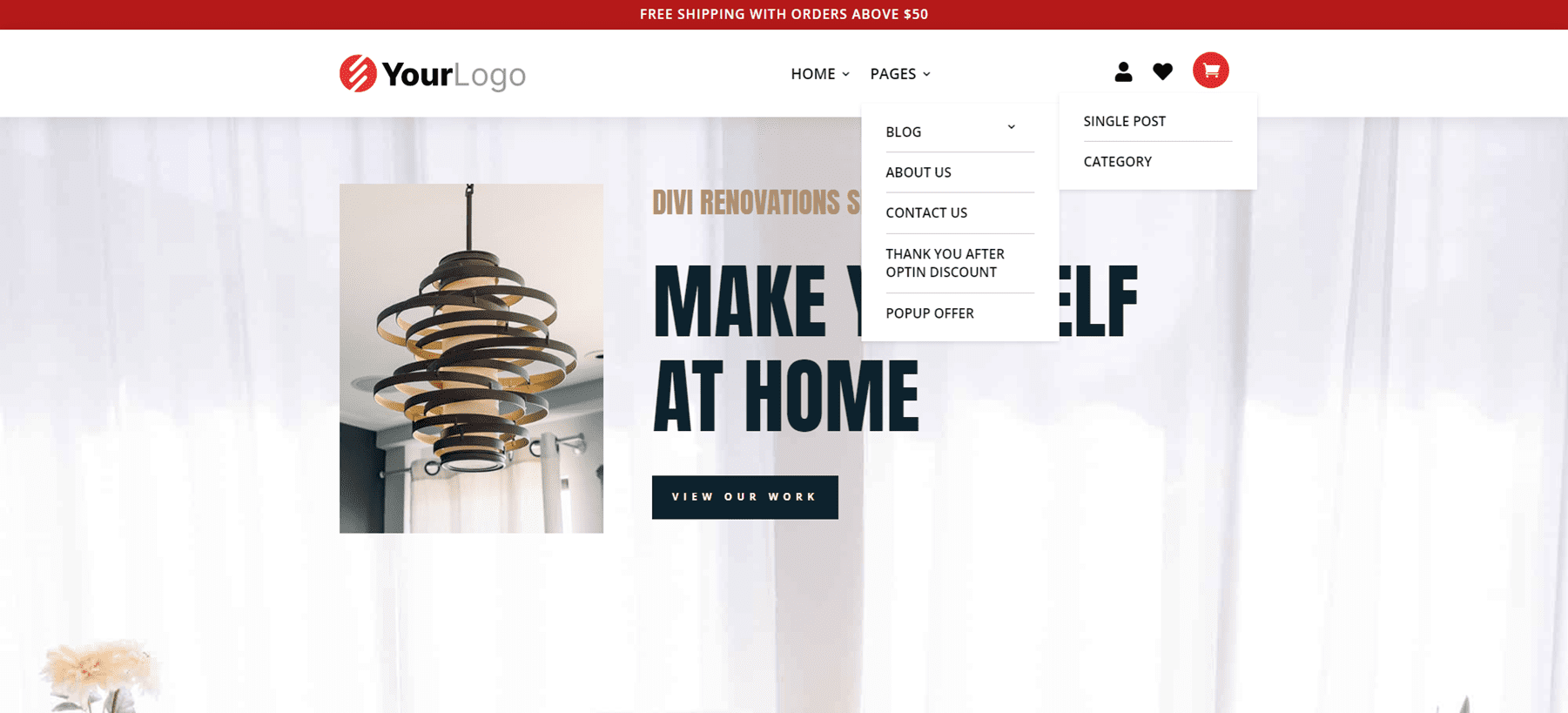
The Text Module for the top Row creates a sales banner. Graphics include Person, Heart, and Cart icons that can link to the person’s account login, their favorites list, and their shopping cart.
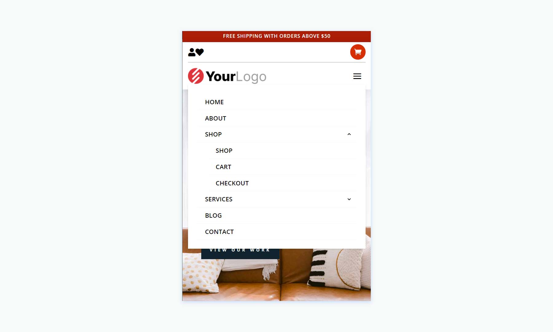
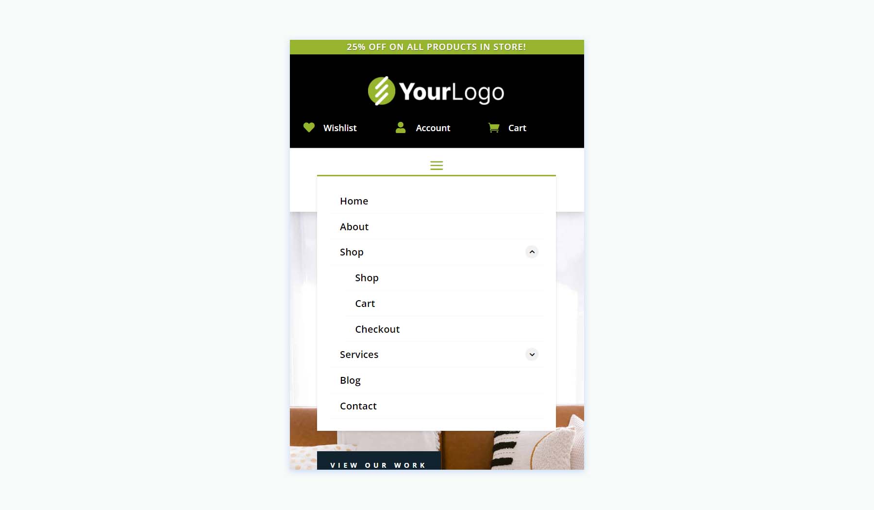
The phone version moves the icons above the hamburger menu. Like the others we’ve seen, this submenu includes toggles created with CSS.
Woo Headers V7
Woo header version 7 was built with three Rows that include Blurb Modules to create interesting WooCommerce links.
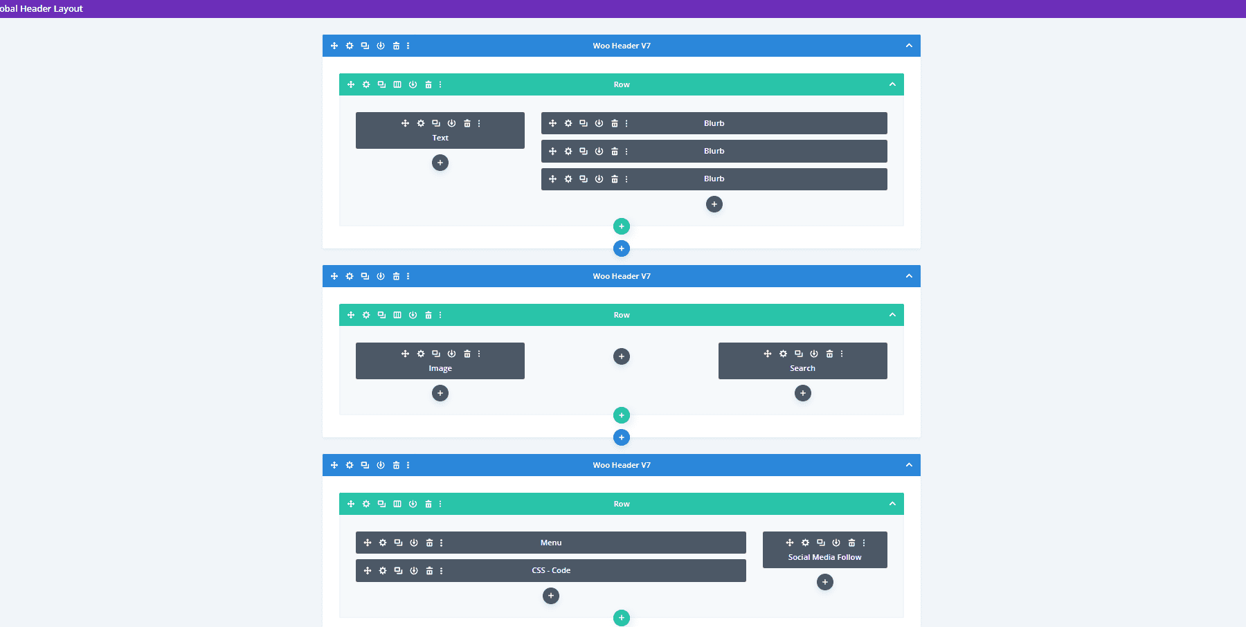
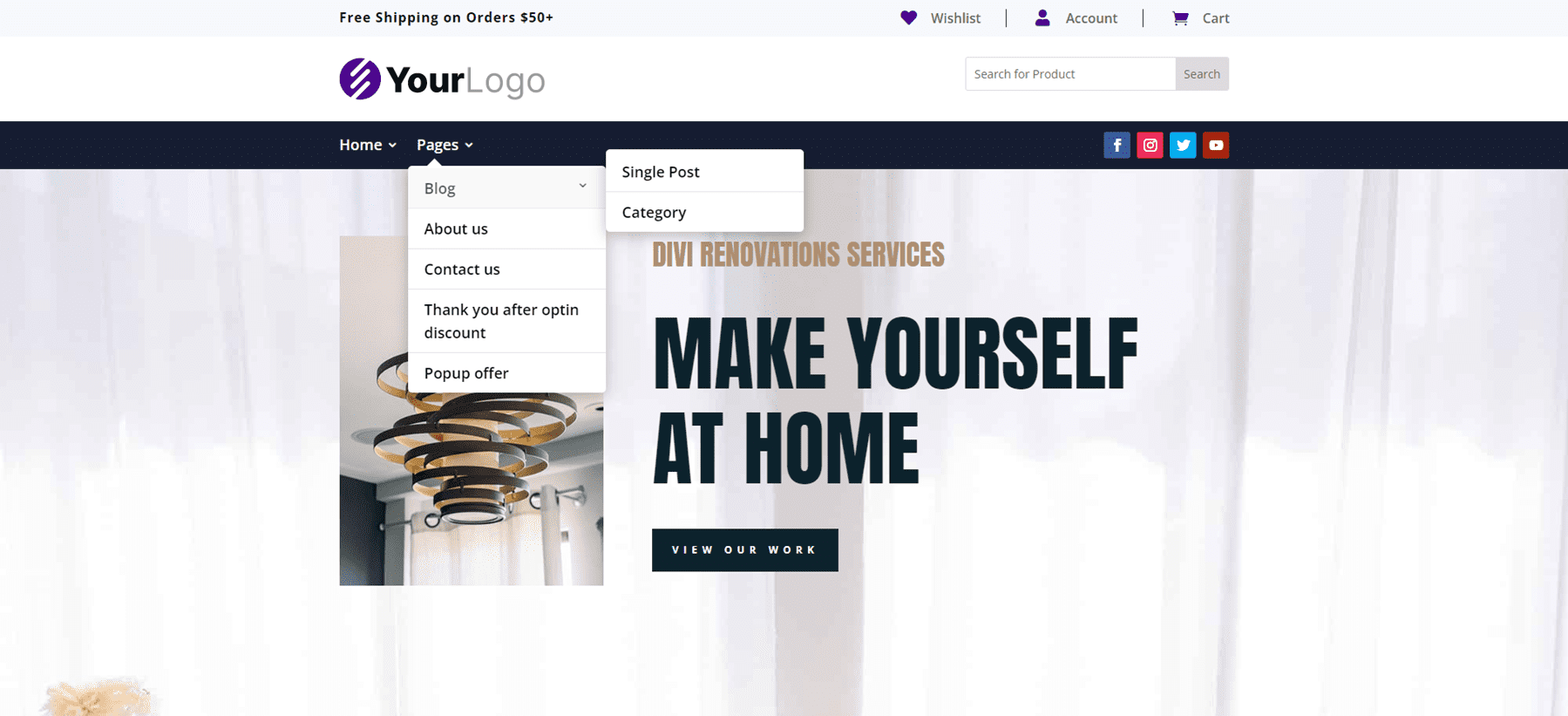
The desktop version shows a message and the Woo links in the top bar. A middle bar displays a logo and a WooCommerce product search. The menu bar includes social media buttons.
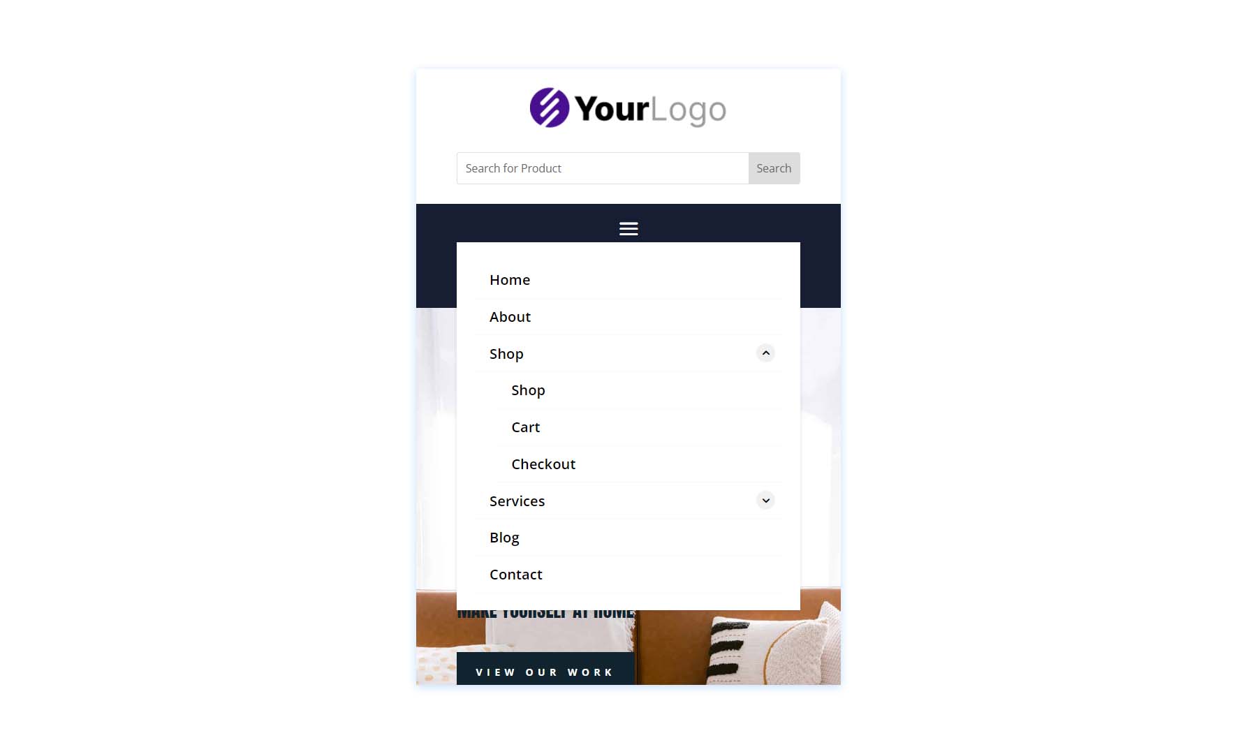
This is the phone version, which places the social media icons under the hamburger menu icon. Everything is spaced well on the phone screen, and it even includes the WooCommerce links and the product search box.
Woo Headers V10
Woo Header version 10 also includes three Rows. It includes a product search and uses a Text Module to create a banner.
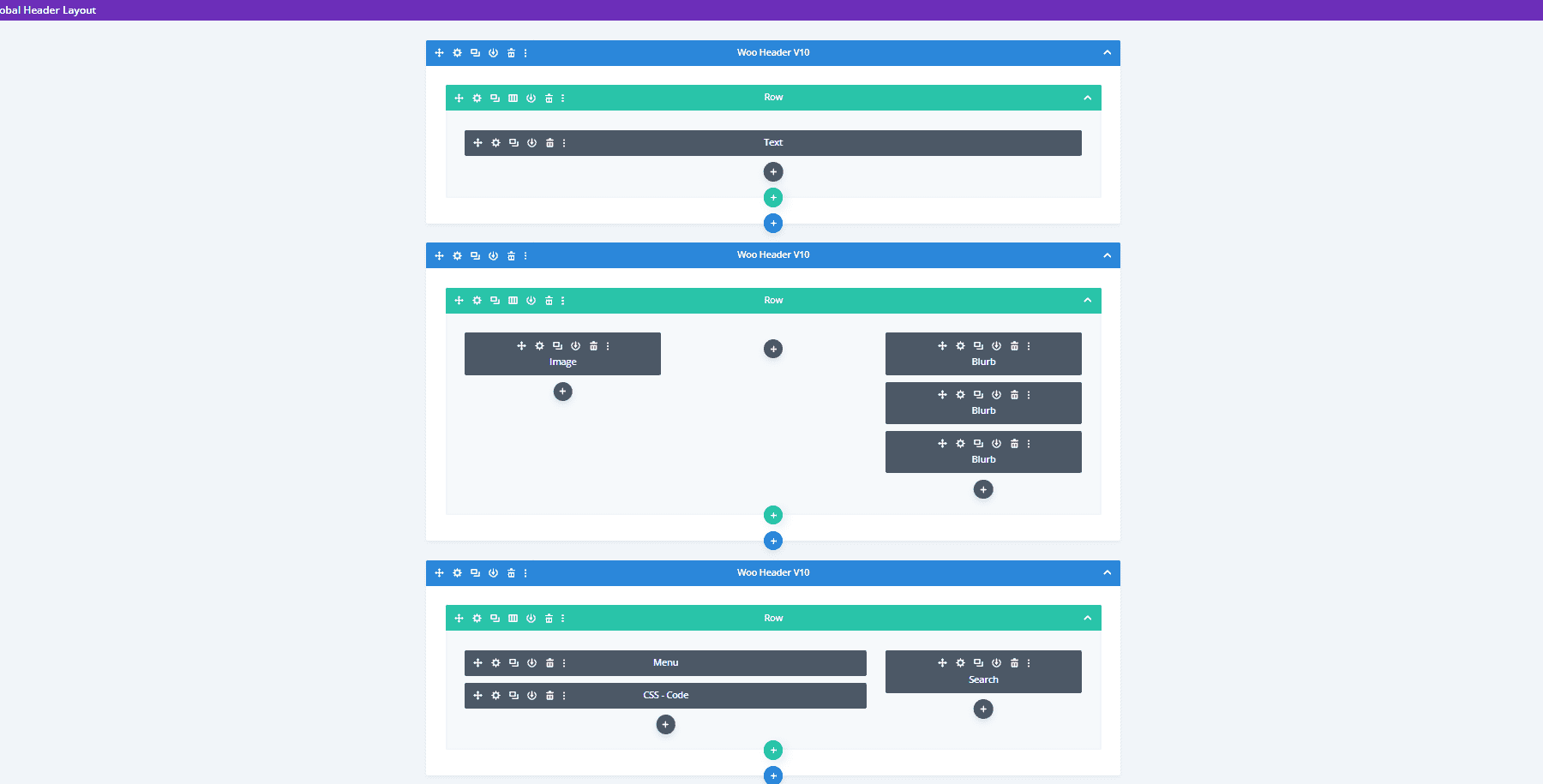
The desktop version displays a green sales banner at the top. The icons, button, and highlights match the green bar. The middle bar includes the WooCommerce icons, while the menu and search at placed at the bottom.
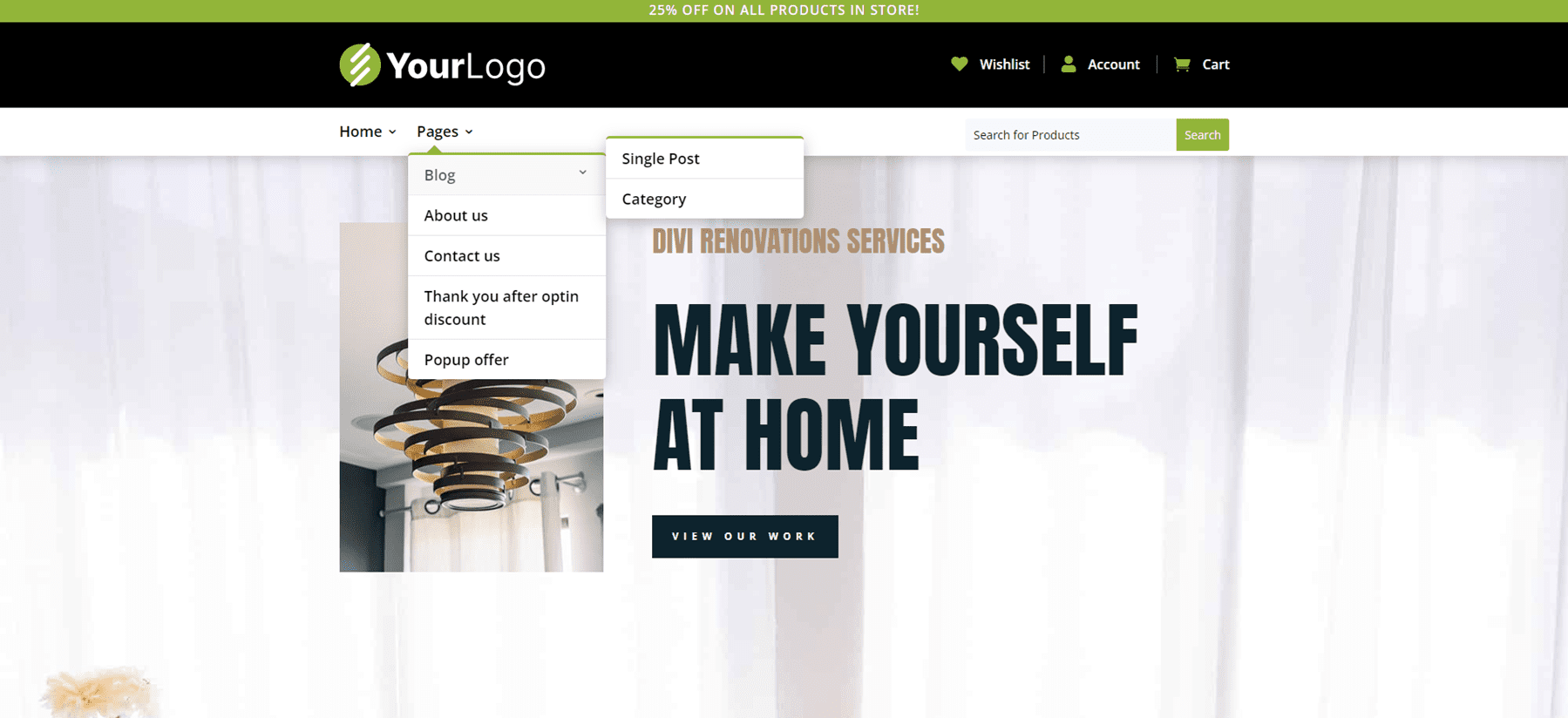
Here’s the phone version, which places the search box under the hamburger menu. This one also includes the submenu toggles created with CSS.
Purchase the Header Layout Pack
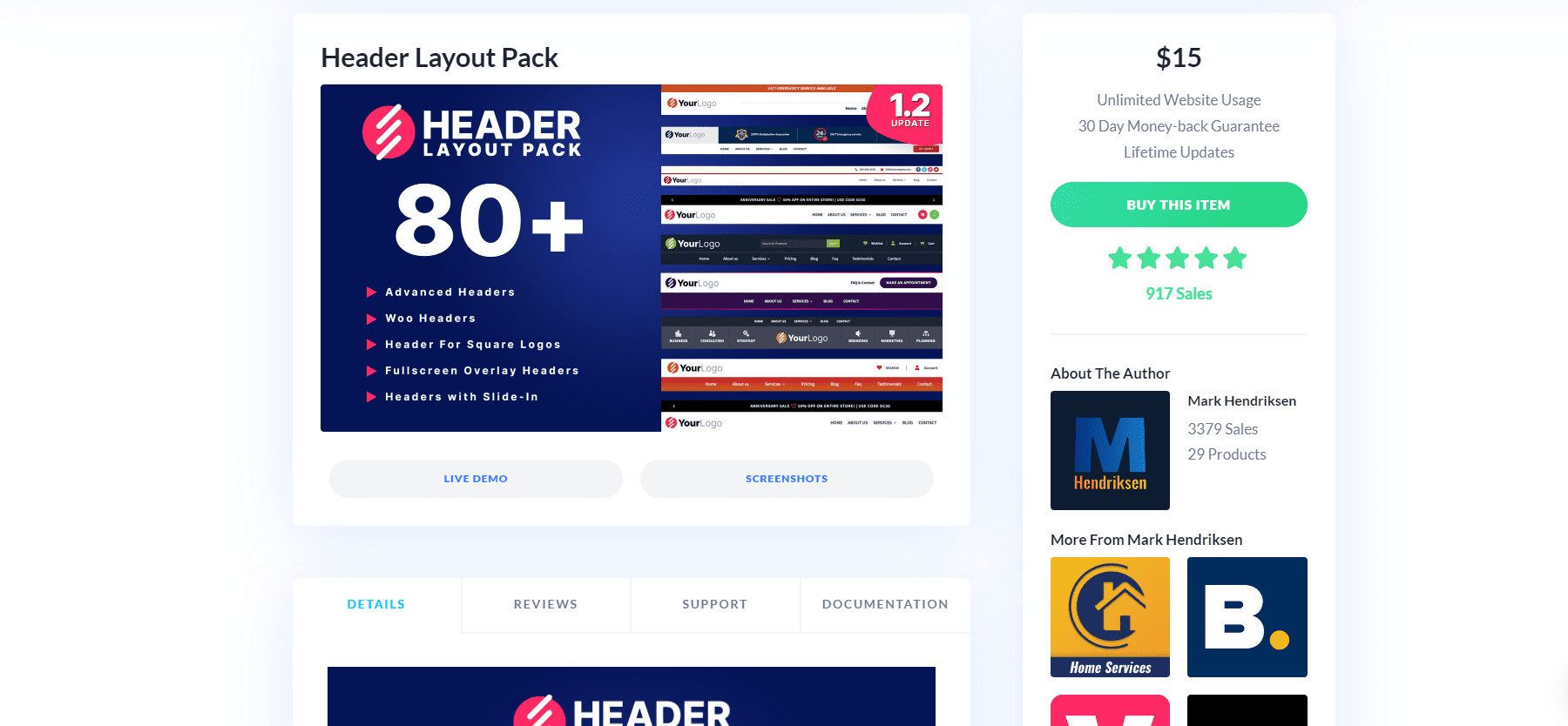
Header Layout Pack is available in the Divi Marketplace for $15. It includes lifetime updates, unlimited website usage, and a 30-day money-back guarantee.
Ending Thoughts
That’s our look at Header Layout Pack. There are a lot of layouts in this header pack. They look elegant, have lots of design options, and they’re easy to use. Since the layouts were created by the same person, they share a commonality that I find makes them easier to use. The methods are standardized, so if you know how to customize one of the layouts you can customize the rest. If you’re interested in an extensive set of headers, Header Layout Pack is work considering.
We want to hear from you. Have you tried Header Layout Pack for your Divi website? Let us know about your experience in the comments.



Good value for all different header layouts. Only criticism, quite a lot of them suddenly lack sophistication with the menu once viewed in the tablet and mobile viewport. Hopefully versions in the future, with better flexibility in this area with the Divi theme itself, will make this feasible. I may purchase this pack and take some of the layouts on file with the mobile layout finished and ready for re-export.
I always admire Divi creativity and it is very easy to use. Can you please guide me the header or template layout that best showcase products related to education? Thanks in advance