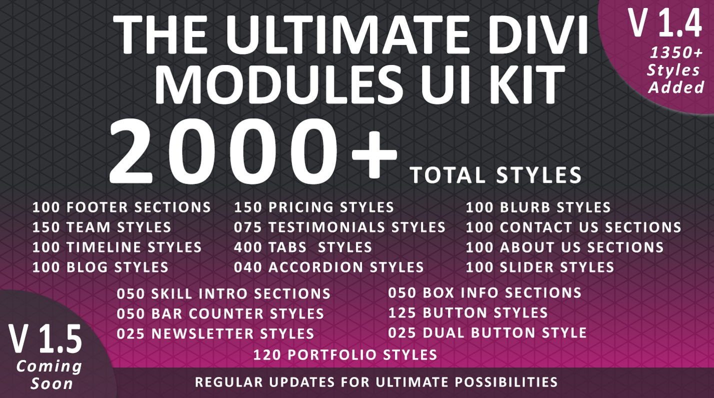
The Ultimate Divi Module UI Kit is a Divi Marketplace product that offers 2000+ premade layouts to make designing your next Divi website a breeze. The product offers about us sections, pricing table styles, contact form layouts, button styles, and even some one-page website layouts that can be fully customized. In this product highlight, we’ll take a closer look at The Ultimate Divi Module UI Kit and help you decide if it’s the right product for your next project.
Let’s get started!
- 1 Installing The Ultimate Divi Module UI Kit
-
2
The Ultimate Divi Module UI Kit
- 2.1 Tab Modules
- 2.2 Blurb Modules
- 2.3 Person Modules
- 2.4 Blog Modules
- 2.5 About Us Sections
- 2.6 Pricing Modules
- 2.7 Testimonial Modules
- 2.8 Contact Form Sections
- 2.9 Newsletter Sections
- 2.10 Accordion Modules
- 2.11 Slider Modules
- 2.12 Timeline Sections
- 2.13 One Page Layouts
- 2.14 Portfolio Modules
- 2.15 Footer Sections
- 2.16 Bar Counter Modules
- 2.17 Box Info Sections
- 2.18 Skill Sections
- 2.19 Buttons
- 3 Purchase The Ultimate Divi Module UI Kit
- 4 Final Thoughts
Installing The Ultimate Divi Module UI Kit
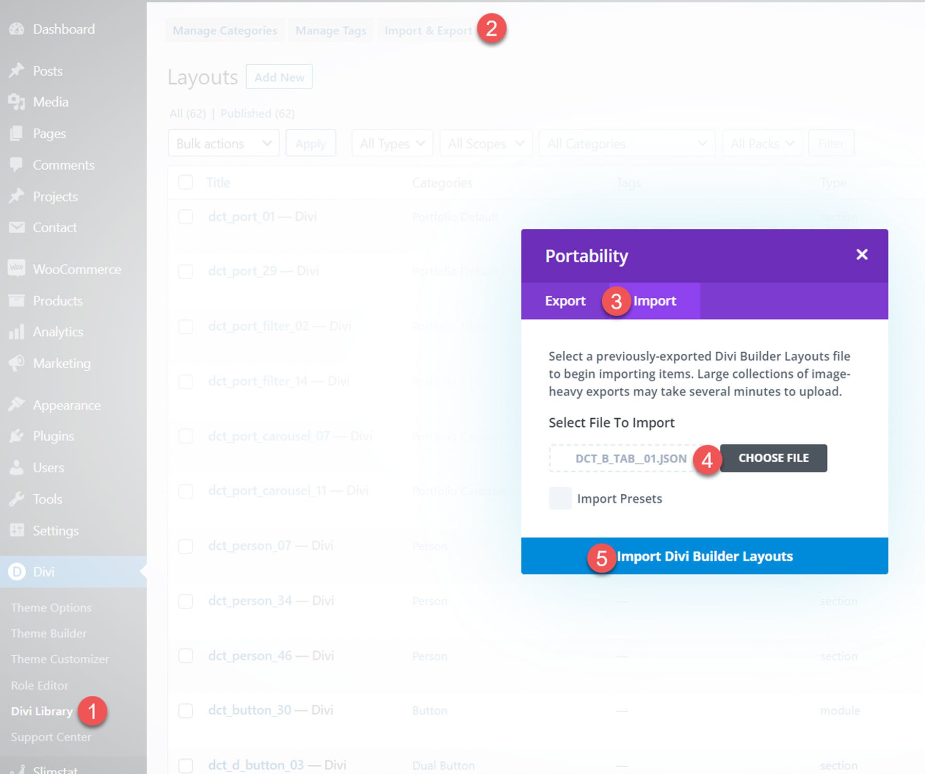
The Ultimate Divi Module UI Kit comes as a ZIP file containing Divi Library .json files. To install the layouts, start by unzipping the file. Then, open your WordPress dashboard and navigate to the Divi Library page.
Click Import & Export at the top, then select the import tab. Choose the layout file, then select Import Divi Builder Layouts.
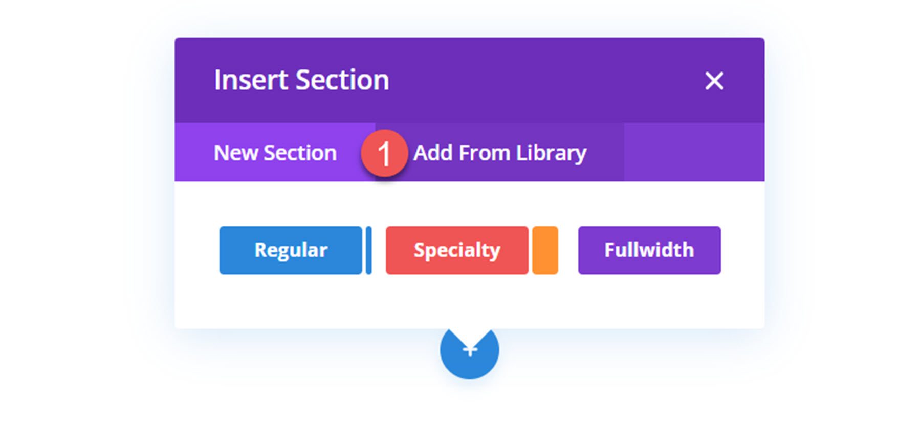
Once the layout has been imported, open your page in the Divi Builder. Click the blue plus icon to add a new section, then select Add From Library.
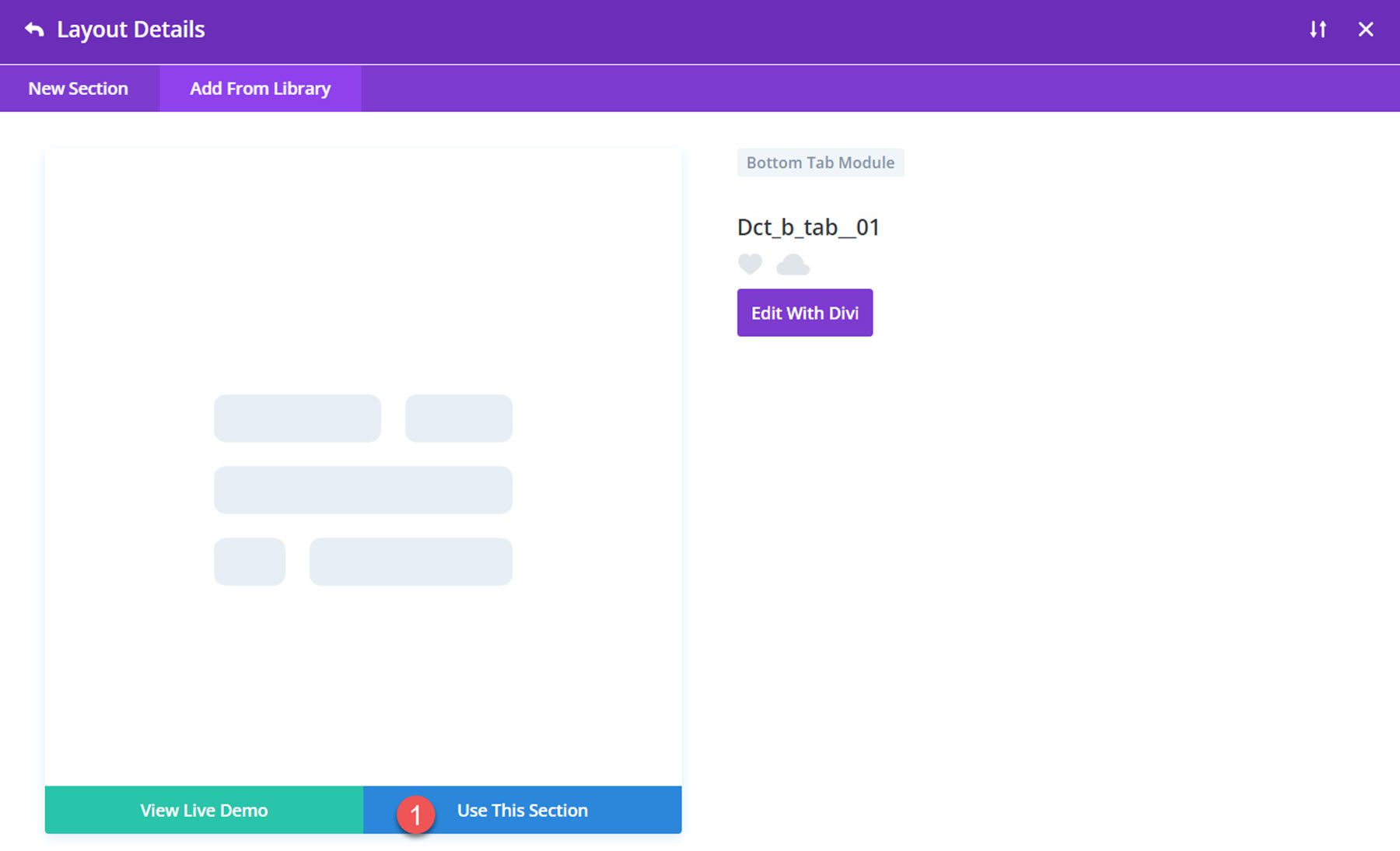
Locate your layout, then click the Use This Section button to load the layout.
The Ultimate Divi Module UI Kit
The Ultimate Divi Module UI Kit comes with over 2000 layouts, so we won’t be able to cover everything. We’ll take a look at a few designs from each category so that you can get a better idea of what this product has to offer and whether it’s the right purchase for you.
Tab Modules
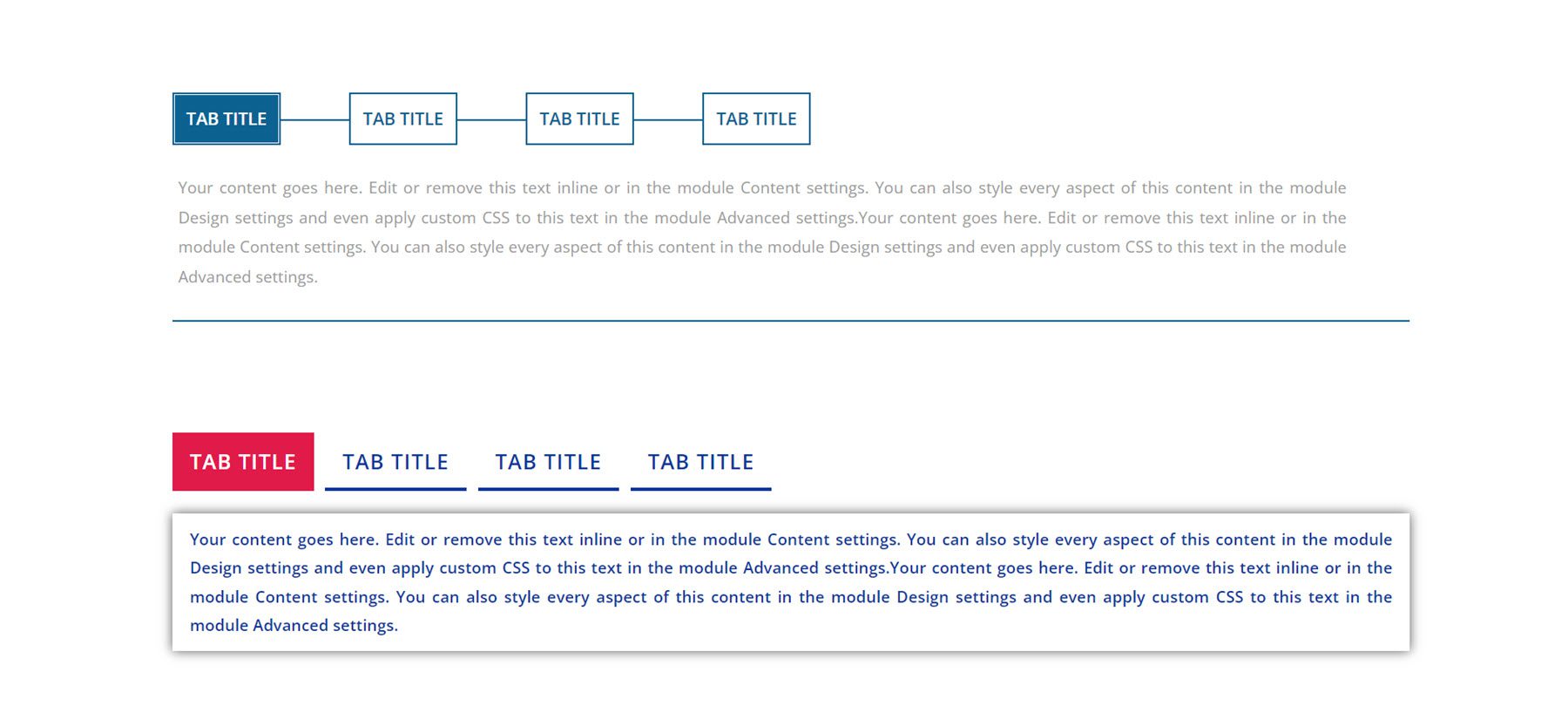
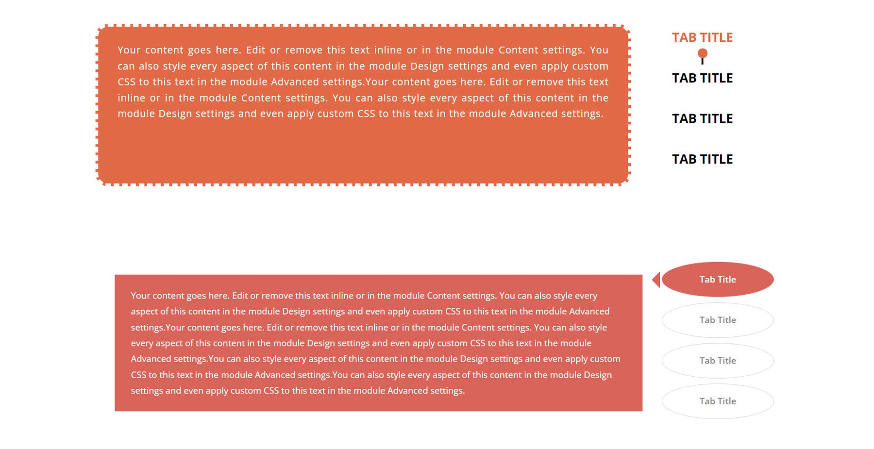
There are 400 different tab module styles, with 100 bottom tab styles, 100 default tab styles, 100 horizontal tab styles, and 100 vertical tab styles. All of the tab modules feature hover animation on the tab titles and a tab transition effect. I’ll show you a couple of examples of each style of tabs.
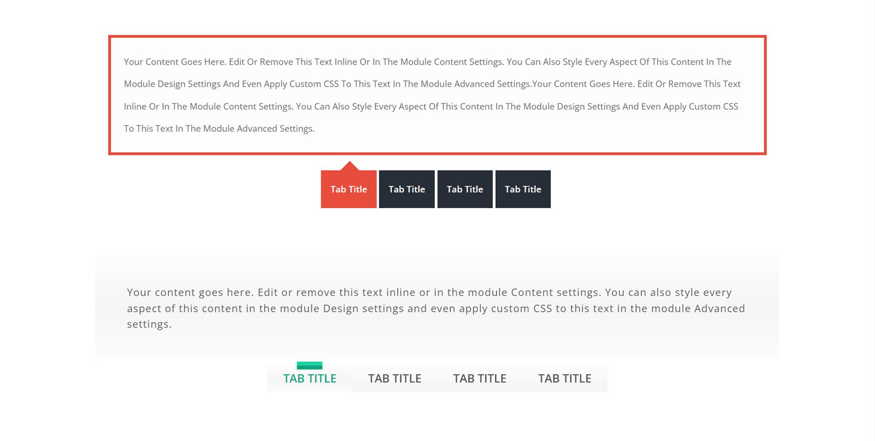
Here are bottom tab styles 1 and 79.
This is style 9 and 38 in the default tab layout.
Next is the vertical right layout, with styles 14 and 52. This layout is labeled Horizontal in the product files.
Finally, this is the vertical left layout, labeled Vertical in the product files. This is style 71 and style 95.
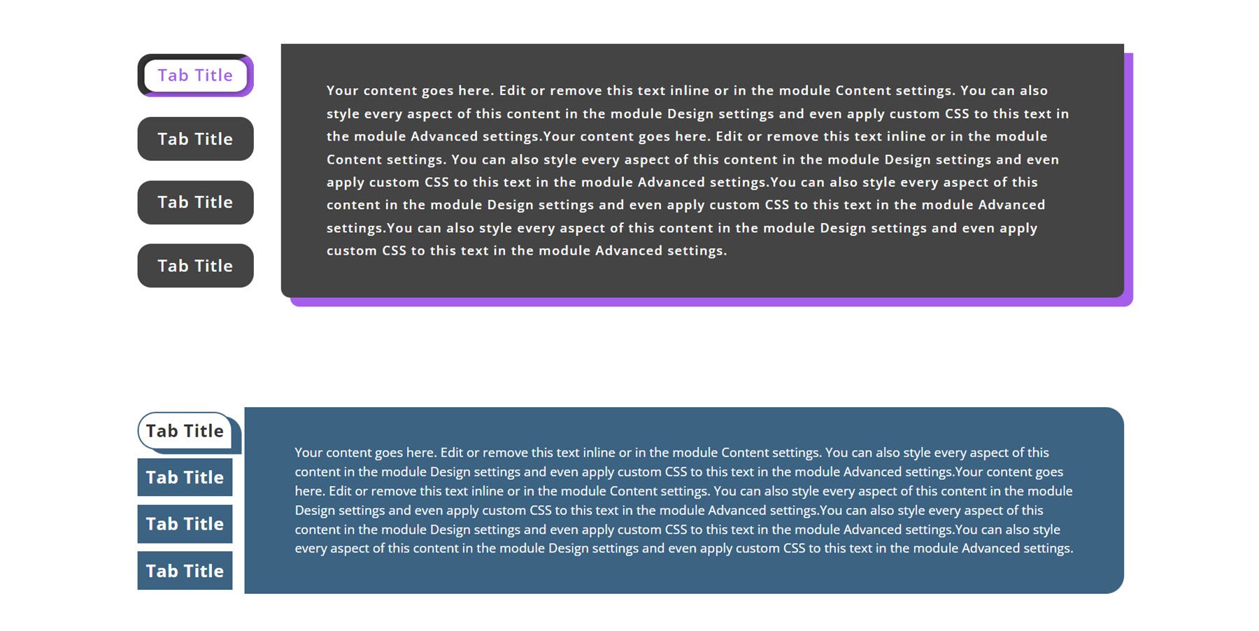
There are a wide variety of styles and layouts to choose from, and the tabs can all be easily customized with your own content and design options.
Blurb Modules
There are 100 blurb styles in total. Each blurb style features some type of hover effect. Let’s take a look at a few in detail.
This is blurb style 4. On hover, the two pink bars turn vertical, the icon background turns pink, and there is a pink shadow border.

Blurb style 9 has two background bars that shift colors and angles on hover. The icon background also changes on hover.
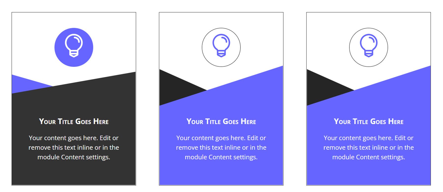
Blurb 40 features a thick green border and an icon that flips on hover.

Finally, blurb style 50 changes to red on hover, and the tab at the top with the icon shifts to the right.

Person Modules
There are 150 different person module styles.
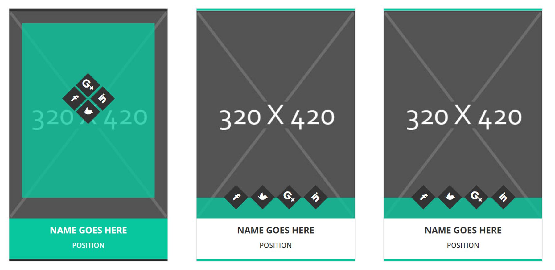
Person module style 7 has a green color scheme and social media icons that move up into a grid formation over a green overlay on hover.
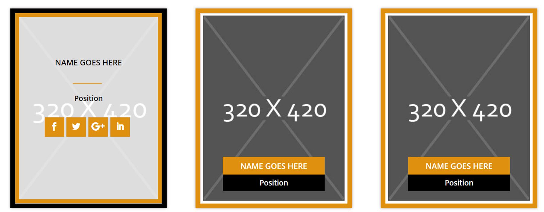
Style 34 features the name and position with an orange border. On hover, the information moves up and over the photo, and social media icons are revealed.
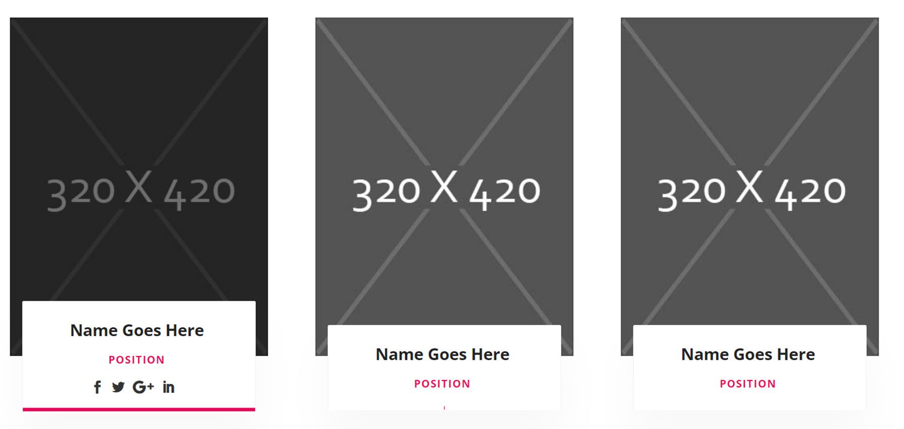
This is layout 46. It features the name and position on a white box below the photo. On hover, the box expands to reveal social media icons.
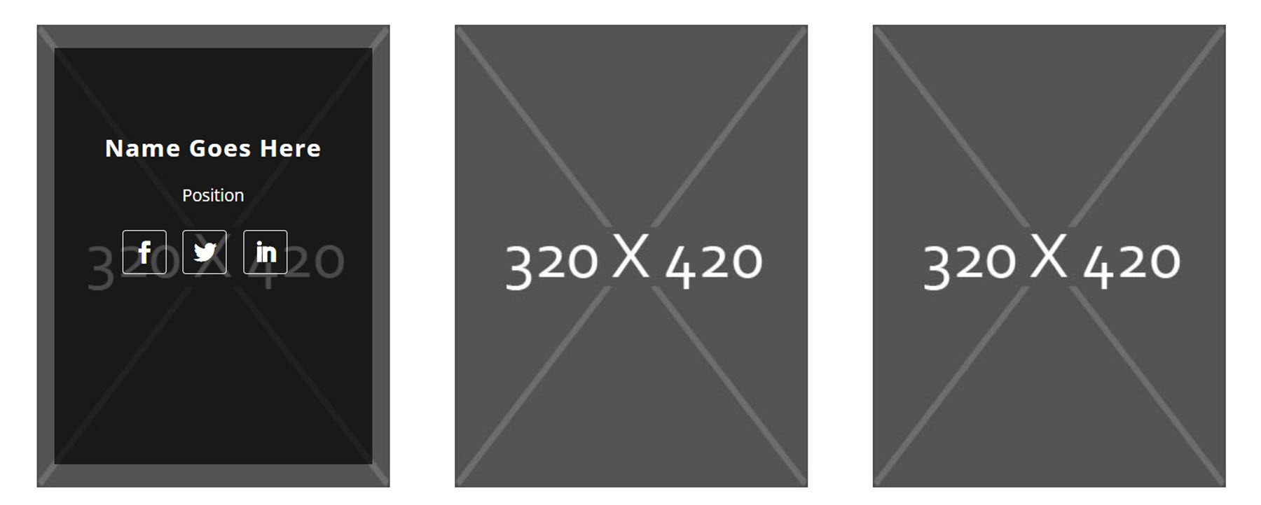
Layout 127 has a simple image layout. On hover, the name, position, and social media icons are revealed.
Blog Modules
There are 100 blog modules in total, with 50 grid view styles and 50 list view styles. Let’s take a look at a couple of each style.
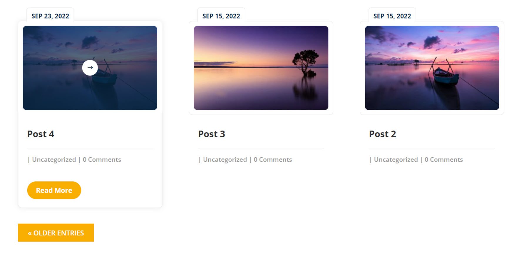
Grid layout 3 features the post image and details on a card with the date on a tab at the top. On hover, a read more button is revealed and an overlay with an icon appears over the image.
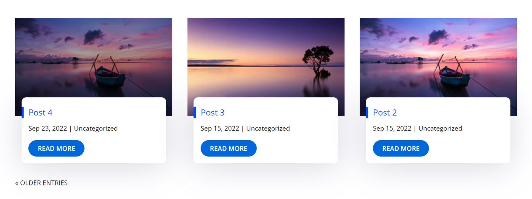
Grid layout 40 features a card with post information and a read more button overlaying the featured image. On hover, a dark overlay appears over the image.
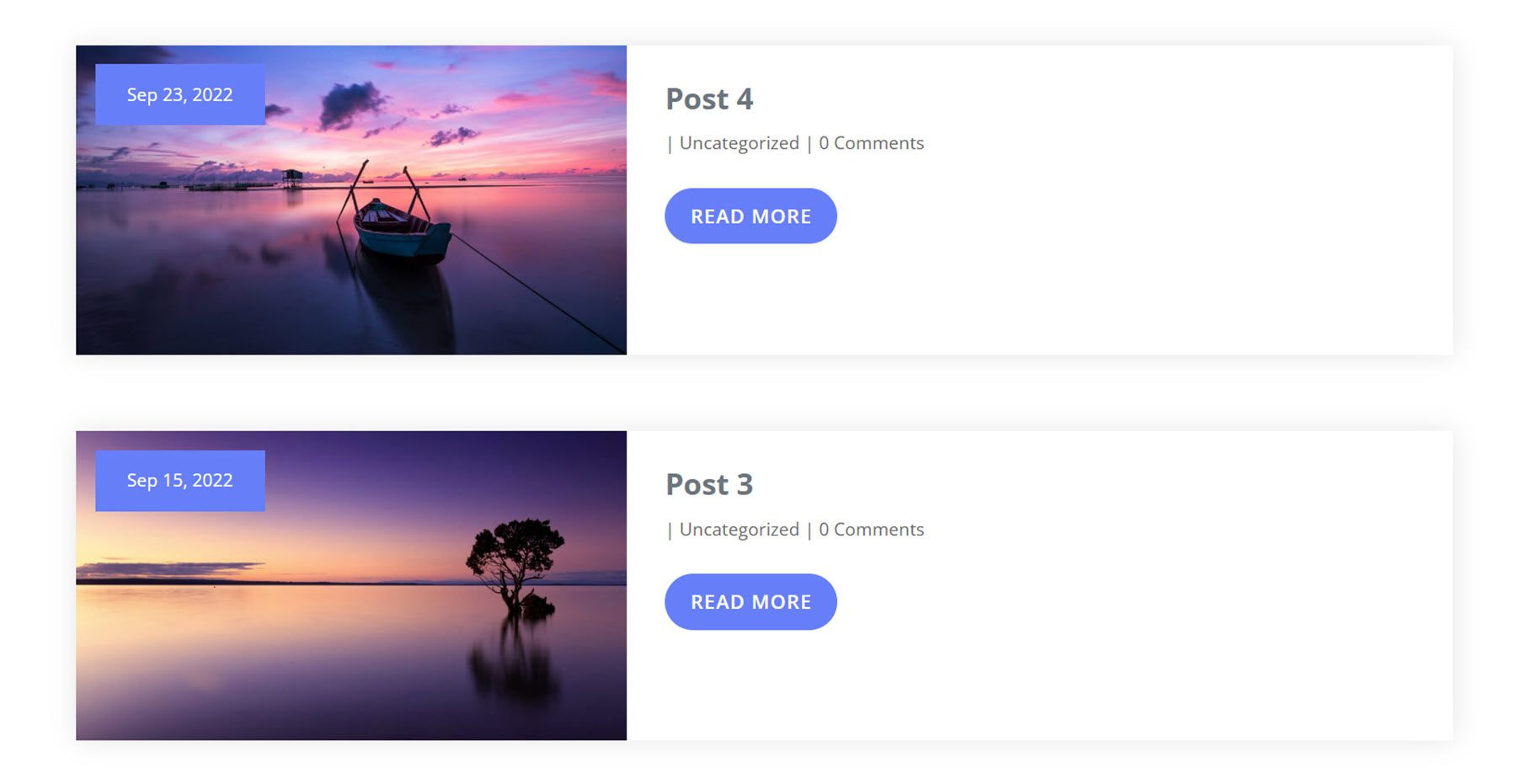
List view layout 7 features the post information and a read more button on a card with the image on the left. The date is in a blue box over the image.
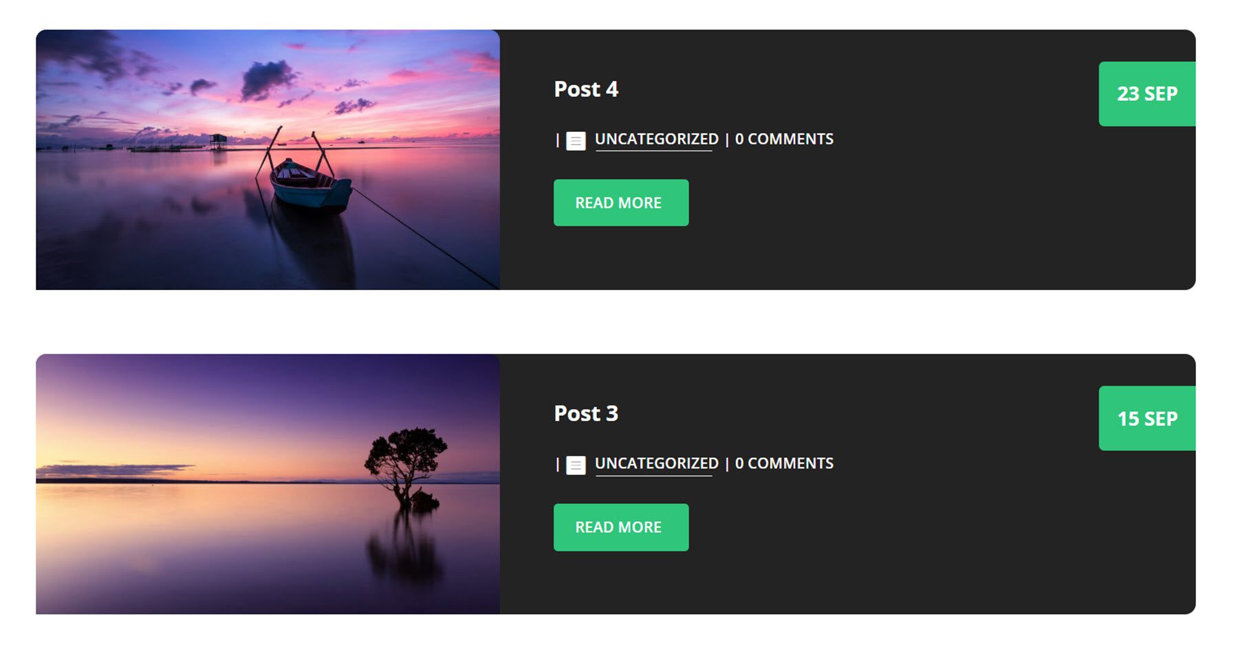
List view layout 18 features a darker layout with an image on the left and post information on the right. On hover, the card moves up slightly and the image expands.
About Us Sections
There are 100 about us section designs.
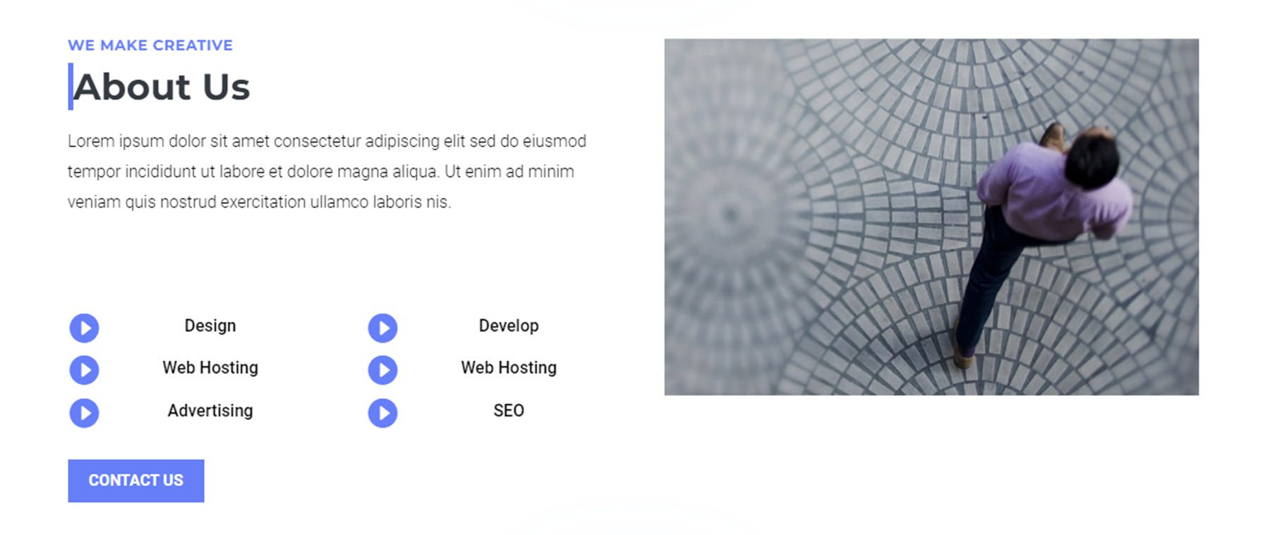
This is layout style 7. It features some text on the left, along with some features marked with icons. There is a contact us button below this, and an image on the right.
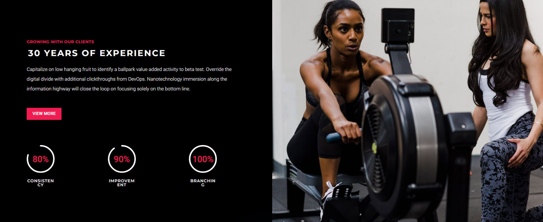
This full-width section features some text at the top, a CTA button, three number counters, and an image on the right.
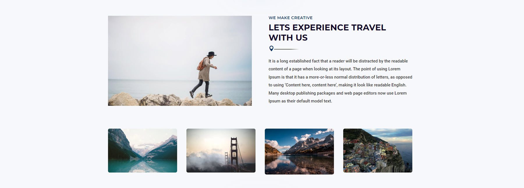
This travel layout is style 17. It features a large image on the left and some text and an icon on the right. Below are four images that enlarge on hover and open up in a lightbox when selected.
Style 61 features some text on the left, three features highlighted with a checkmark icon, and an image in the center. On the right, you can find a yellow box with hours and a button to book an appointment.

Pricing Modules
There are 150 pricing module styles in total.
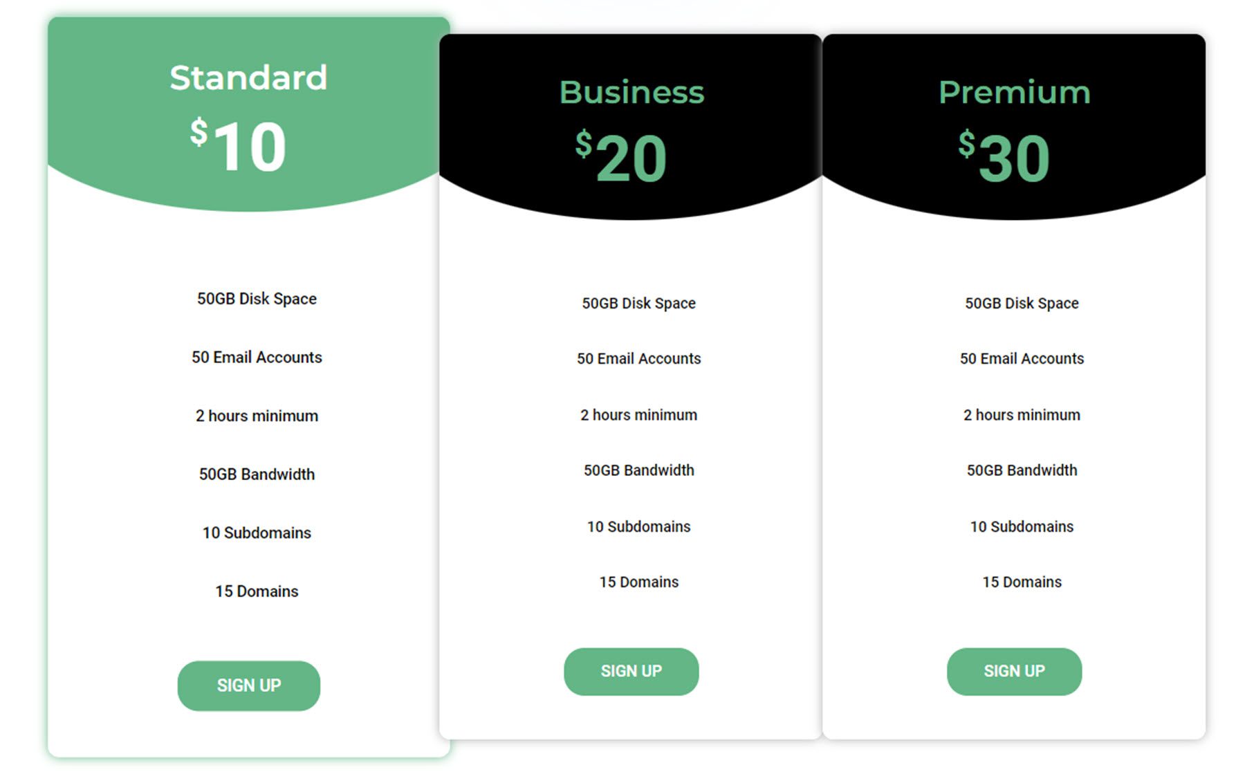
Pricing module style 3 uses a black and green color scheme. On hover, the pricing box expands and the header turns green.
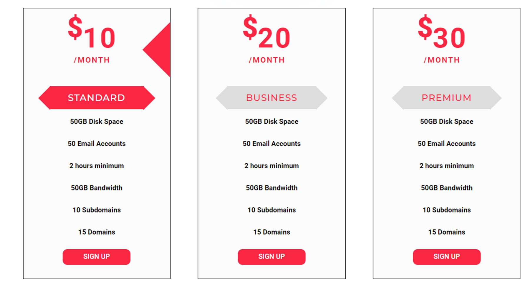
This is pricing module 29. On hover, a red arrow appears to the right of the price, and the tier title is highlighted in red.
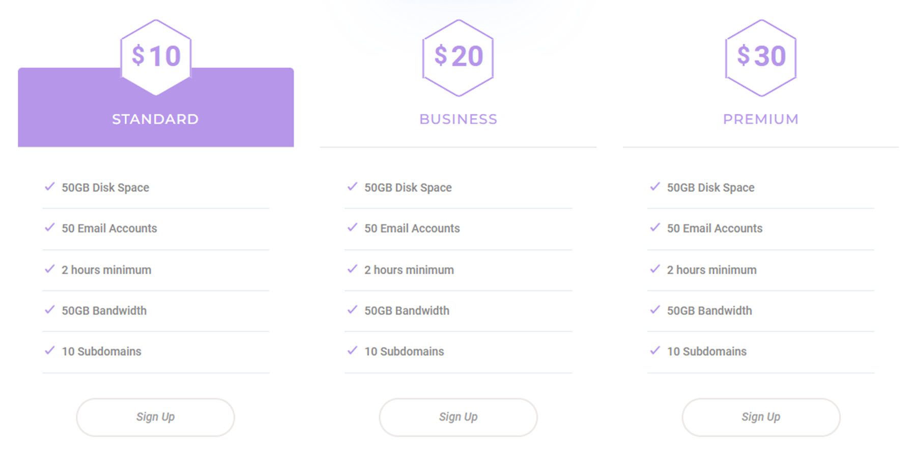
Pricing module style 66 features a header that turns purple on hover.
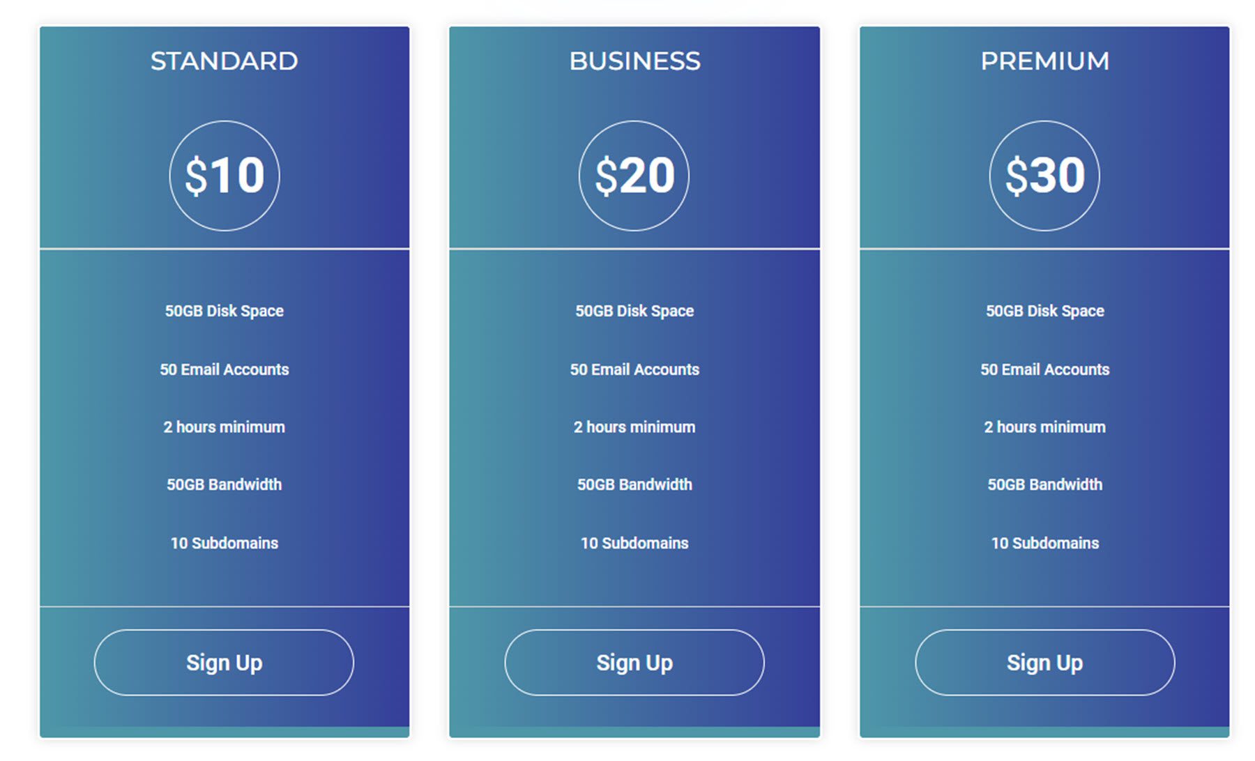
Layout 72 features a gradient background.
Testimonial Modules
There are 75 different testimonial module styles that come with the UI Kit. Here are a few.
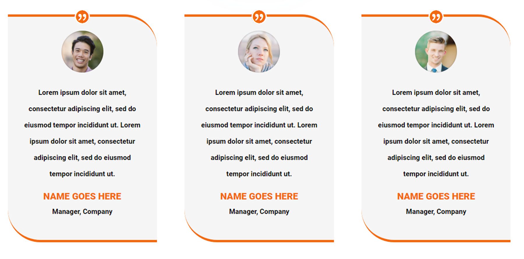
This is testimonial layout 5. It features an orange border and a quote icon at the top, followed by the profile image, testimonial, name, and job information.
Layout 33 features a card containing the testimonial, name, position, and an image on the left side. On hover, the card is outlined in green, the name font turns green, and the image flips.

Layout 71 features an image on the left over a large image background. On the right is a testimonial slider within a quote box.

Contact Form Sections
There are 100 contact form sections to choose from. Here are just a few.
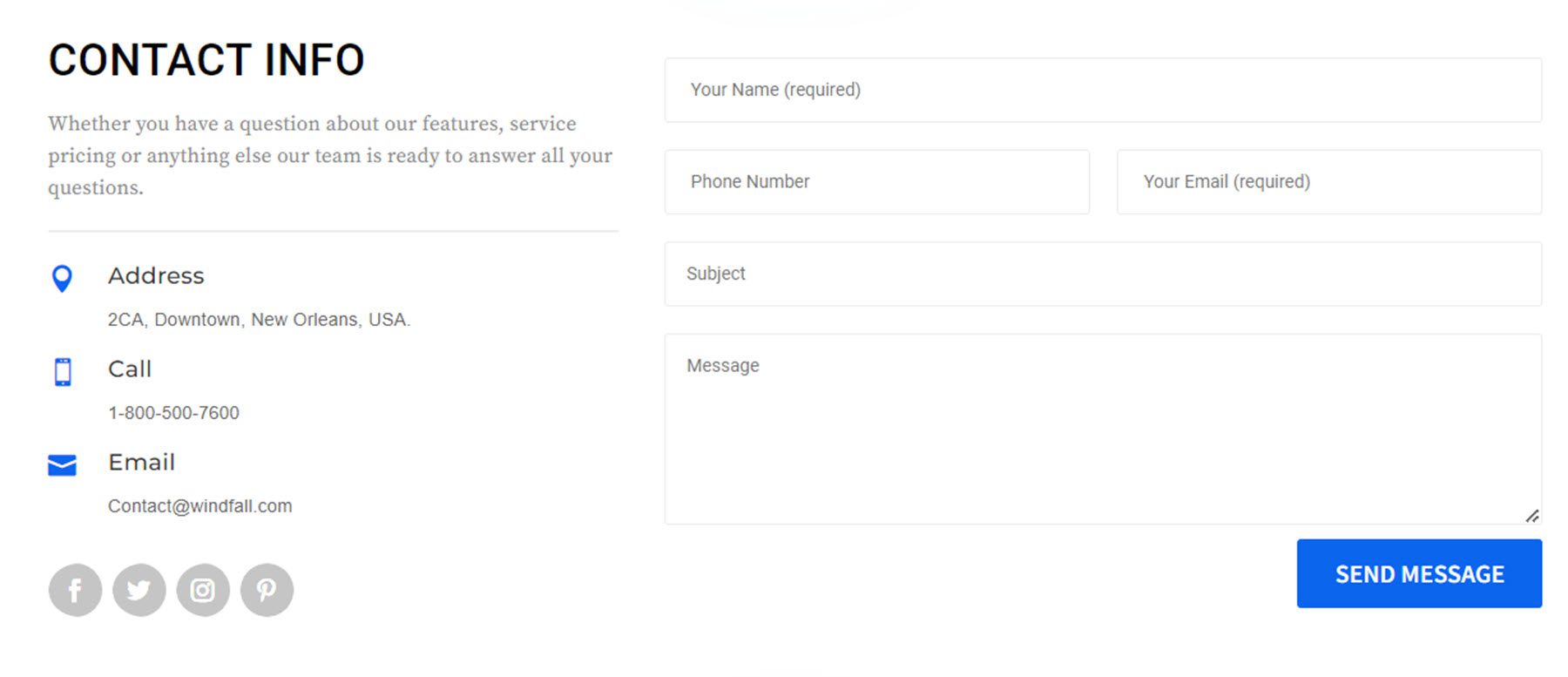
Layout 1 is a simple design with some text on the left, contact information with some icons, social media icons, and a contact form with a blue button.
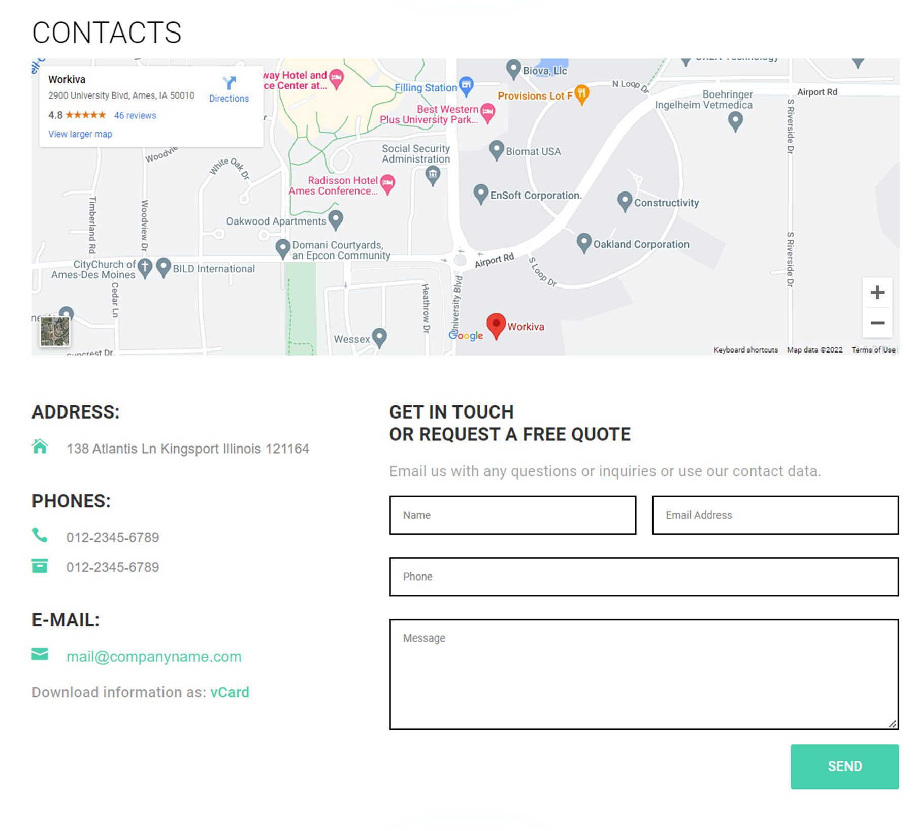
Layout 29 features a large map at the top, followed by the address, phone, and email information on the left. On the right is a contact form.
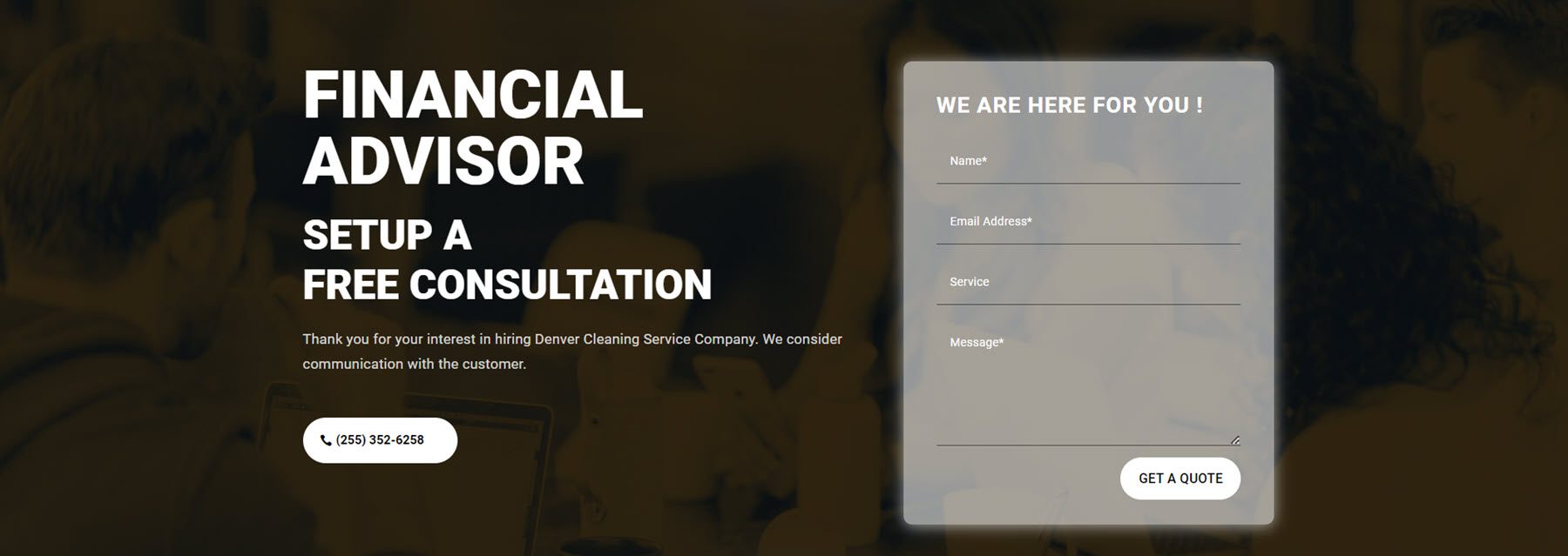
Contact section layout 41 features an image with a yellow overlay. There is text on the left with a CTA button listing a phone number. The contact form is on the right, over a white overlay.
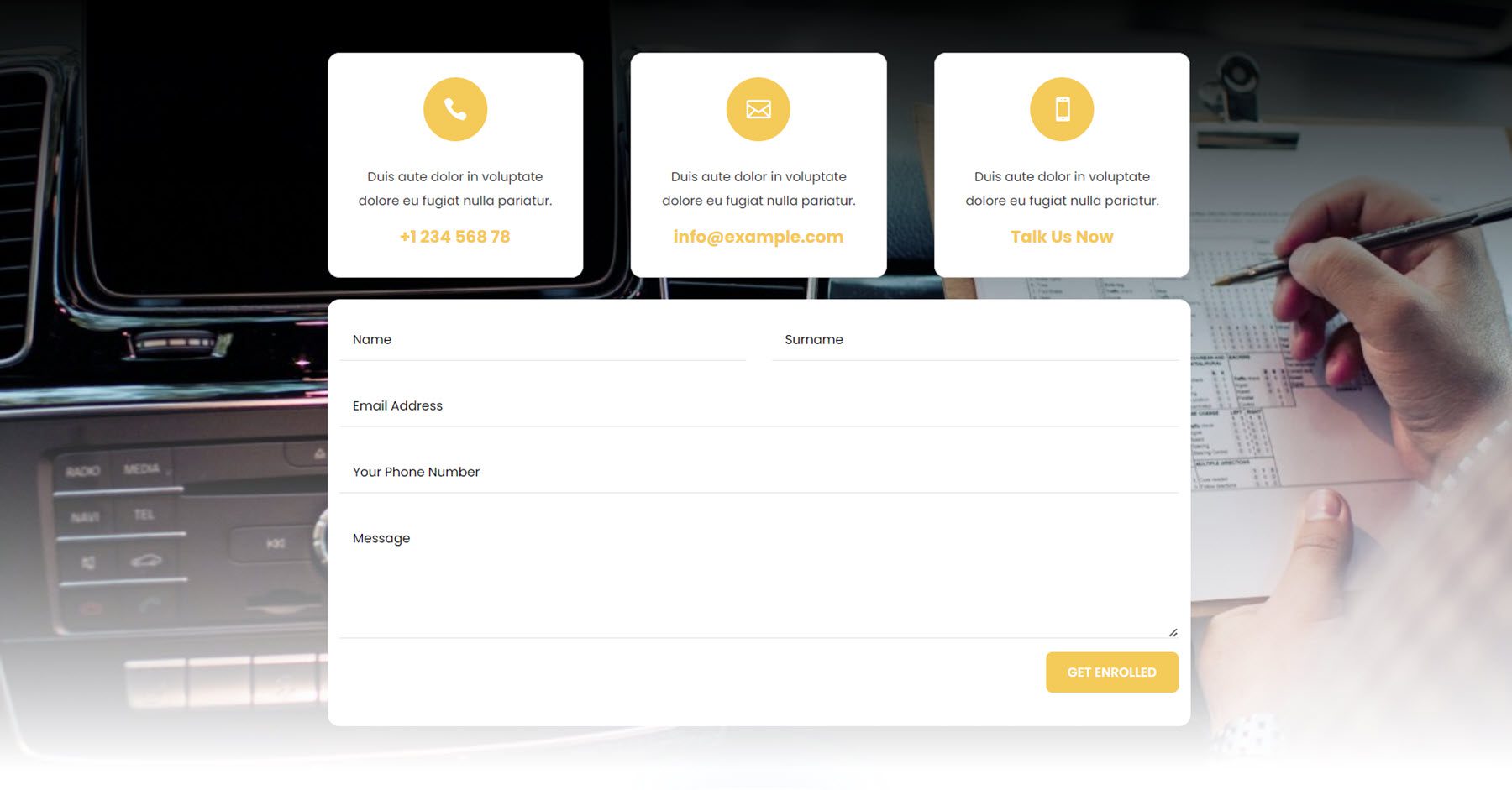
Layout 75 features three boxes with contact information and yellow icons. Below this is the contact form, with a yellow button. This is on an image background that is fading into white.
There are 25 newsletter signup sections.
Style 2 features some heading text and an email sign-up form on a parallax image background.

Style 5 has an image on the left and some heading text on the right, followed by a sign-up form.

This is newsletter layout 15. It features some heading text on the left, followed by a sign-up form and some social media links. There is a round image on the right.

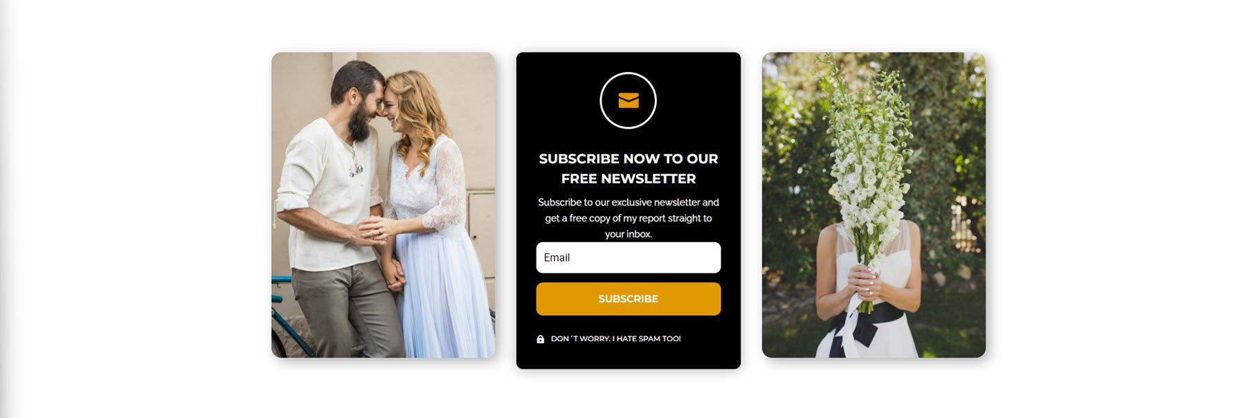
Layout 20 is a card-style design, with two card-style images on each side and the sign-up form on a card in the middle. There is an icon at the top, followed by a heading text and the form. At the bottom is a small disclaimer text with an icon.
Accordion Modules
There are 40 accordion styles in total.
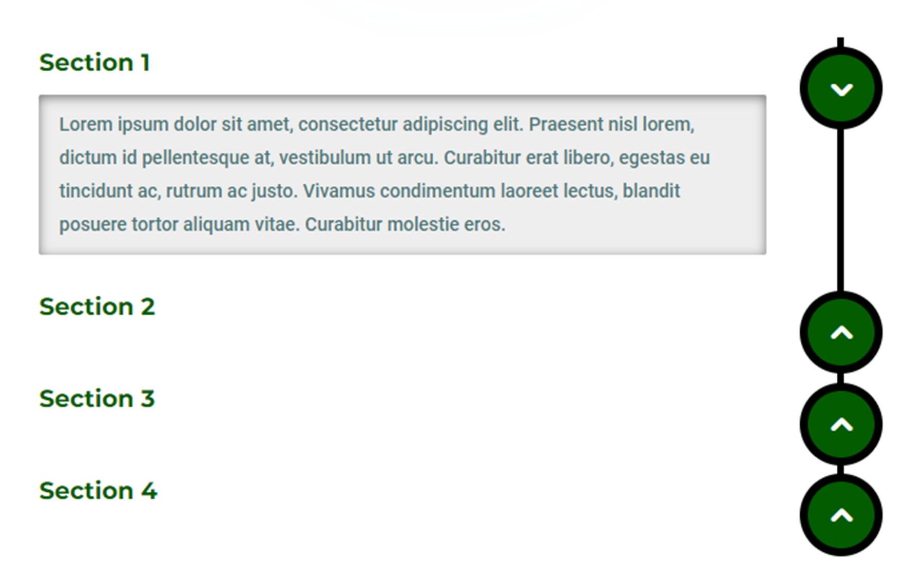
Style 2 features a green title and the accordion content in a grey box. The button for each tab is on the right.
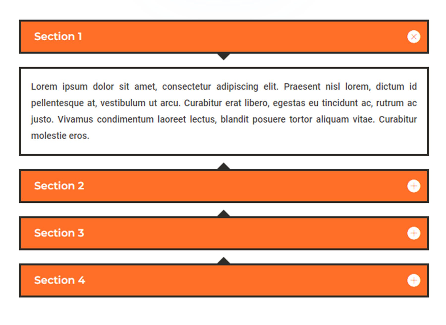
Accordion style 8 uses orange tabs and white content boxes. There are black arrows that point to the open tab.
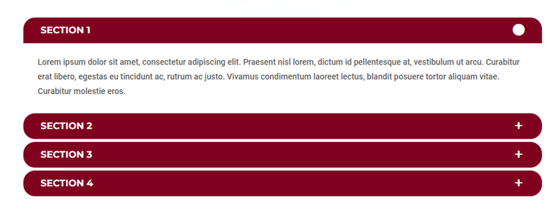
Accordion style 14 features a rounded style tab with a white content section.
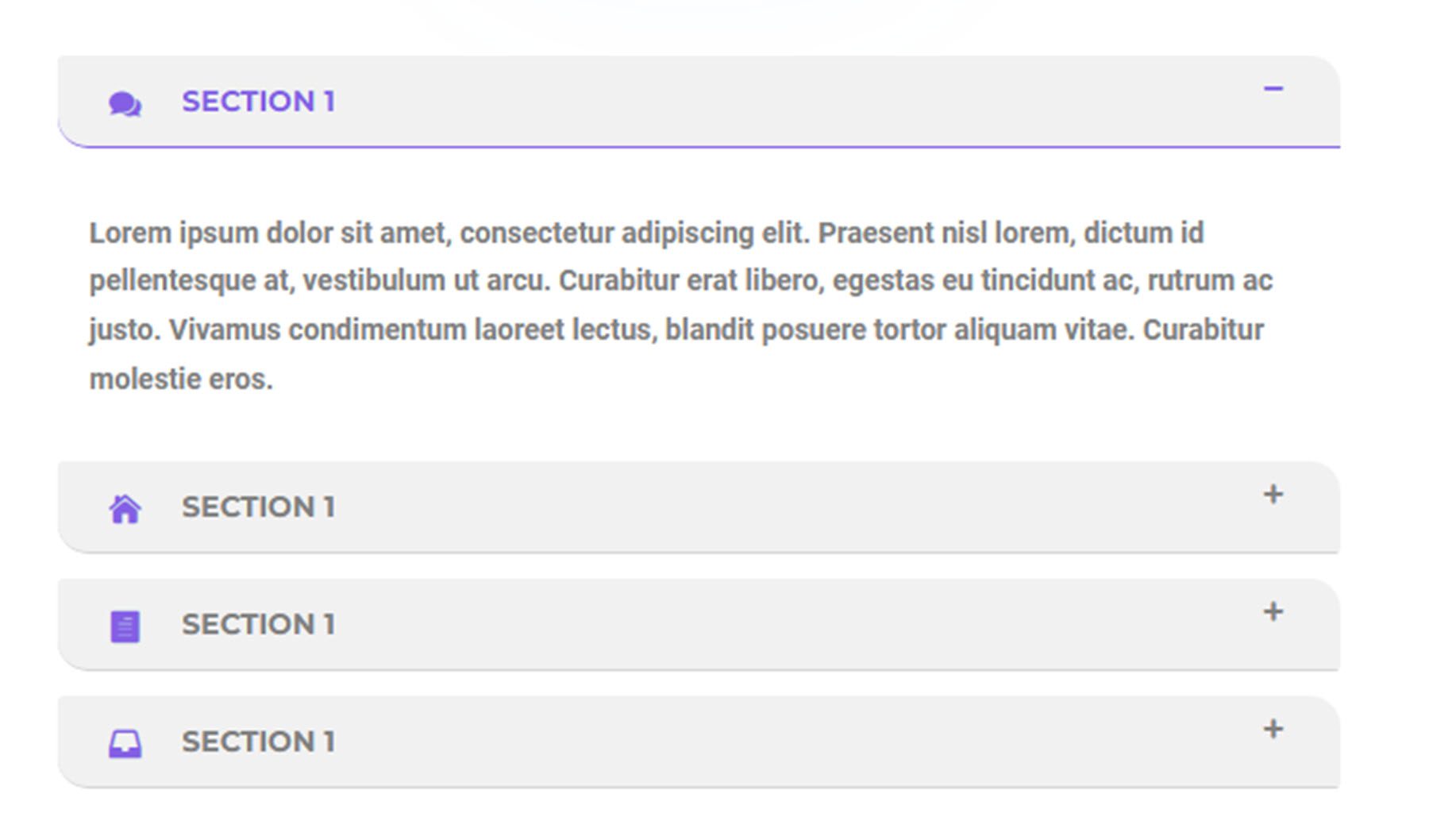
Finally, style 36 features purple icons with each tab and has a purple border underlining the active tab.
Slider Modules
The Ultimate Divi Module UI Kit comes with 100 slider module styles.
Slider 2 features some large heading text and a CTA button over a large parallax image with a dark overlay.

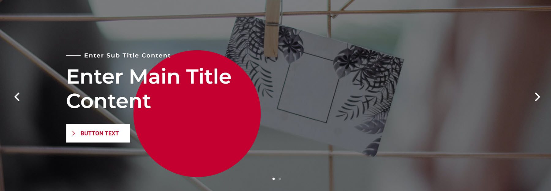
Slider style 31 also features heading text and a CTA button on an image with a dark overlay. There is a red circle behind the heading text.
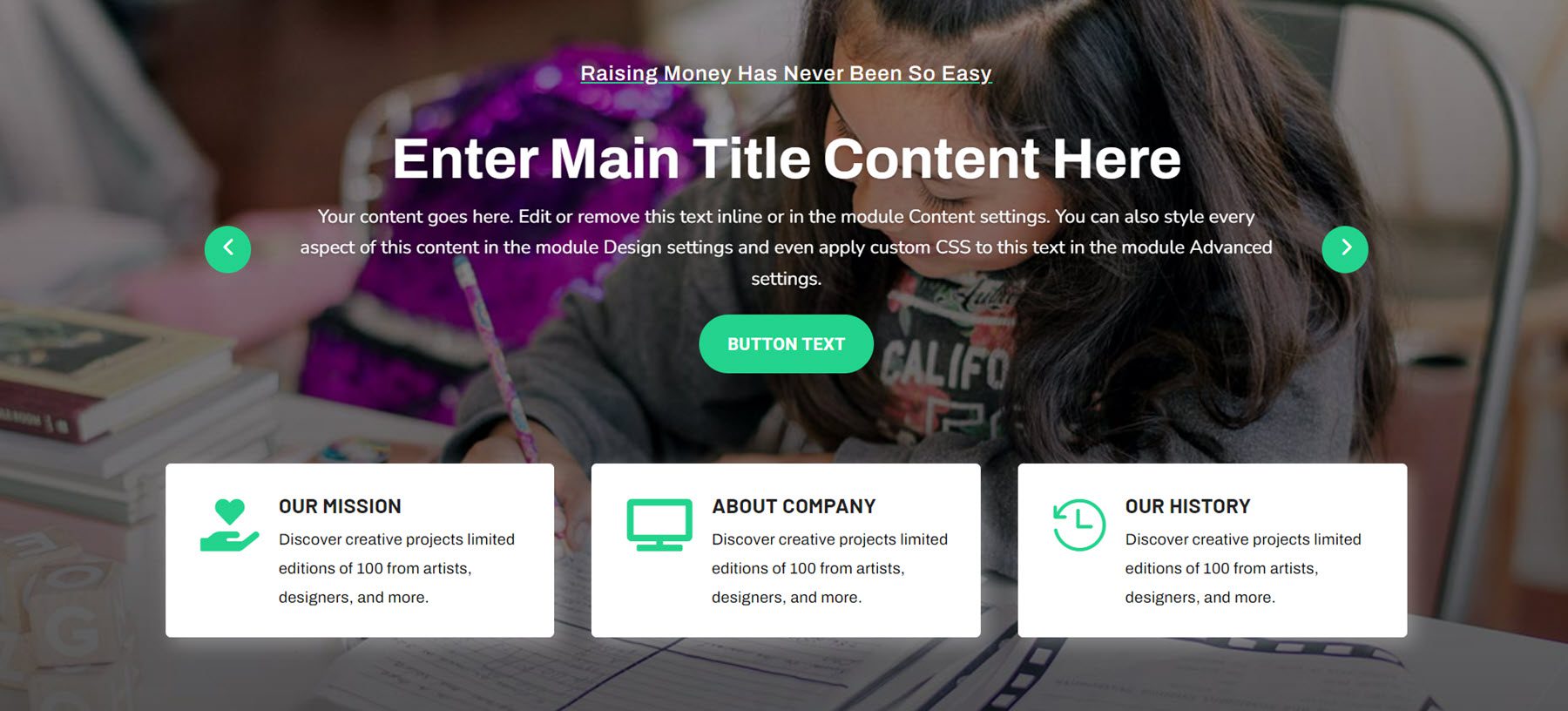
Slider 72 is more content-heavy, with a slider that changes the text content at the top and a CTA button below. There are three content boxes below this with an icon and some description text.
Finally, slide layout 86 features some text content on the left that changes each slide, as well as two CTA buttons. There is a video on the right, followed by another CTA button.

Timeline Sections
There are 100 different timeline styles to choose from.
Timeline style 4 features cards with an icon and text for each step of the timeline.
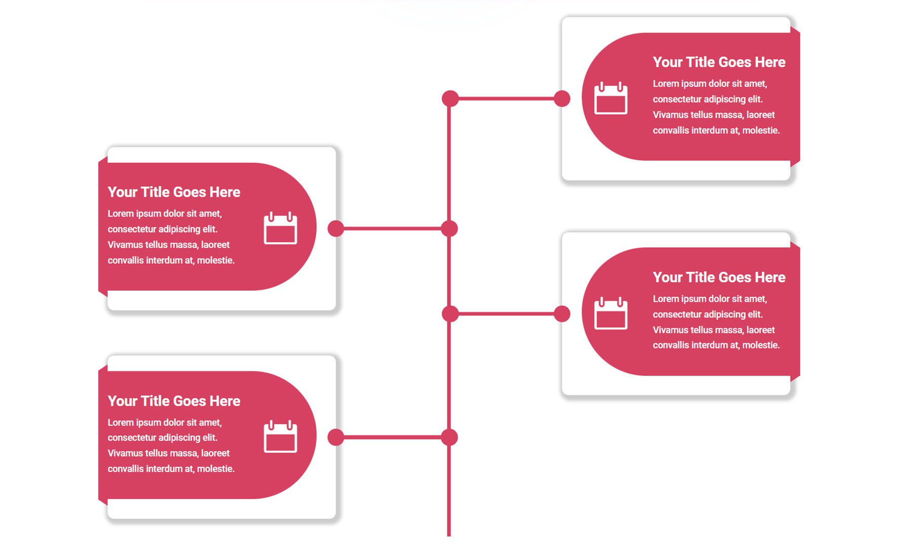
Next, timeline 12 has the timeline icon on one side and the timeline description text on the other side.
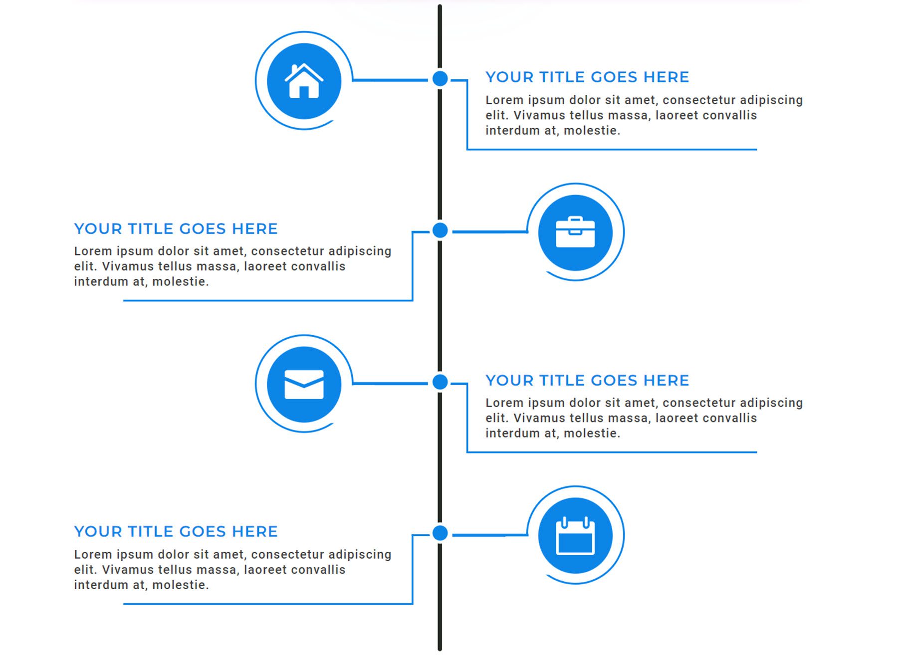
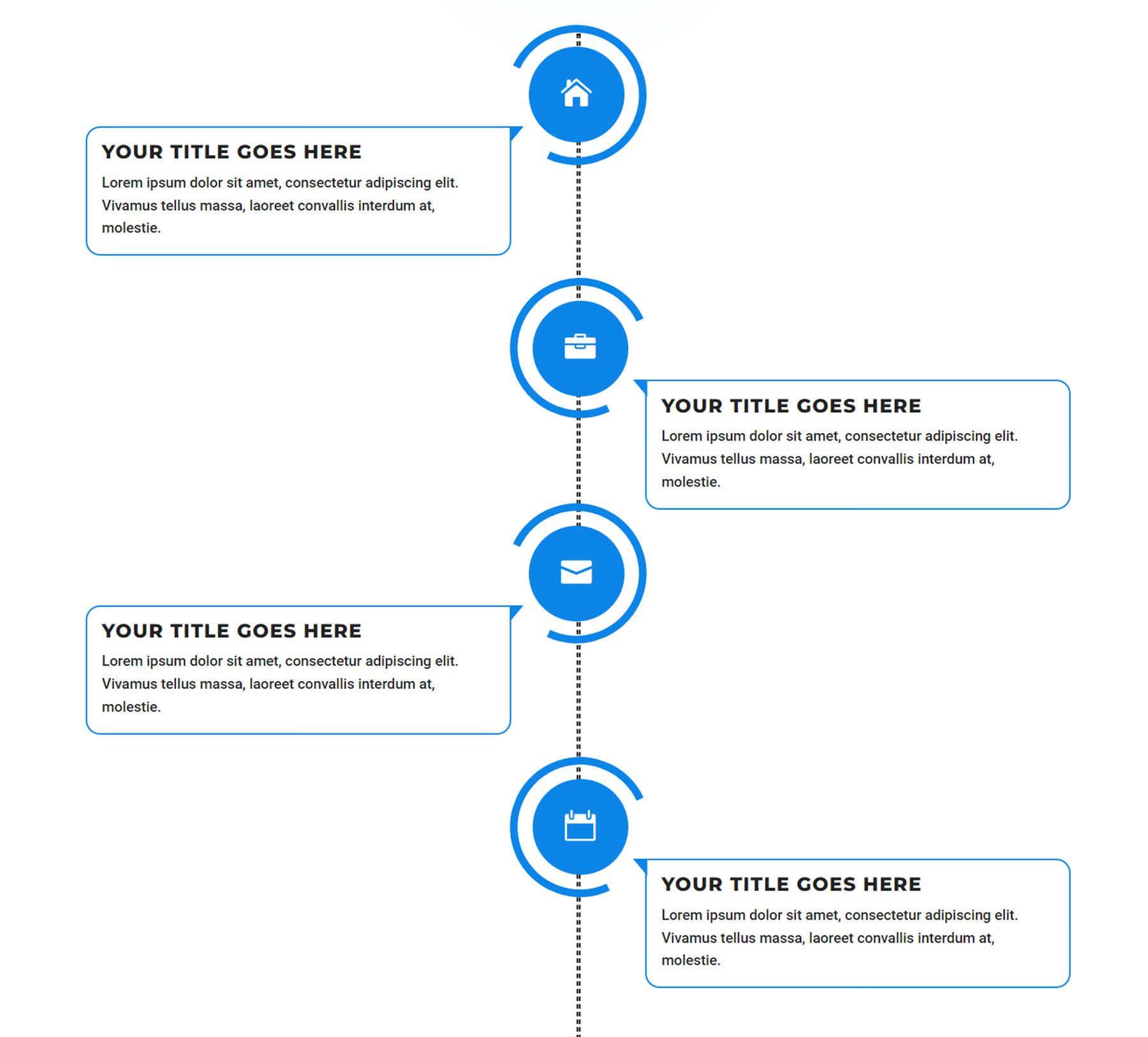
Timeline style 32 features a dotted line with icons for each step. The description text is contained within a box that points to the corresponding icon.
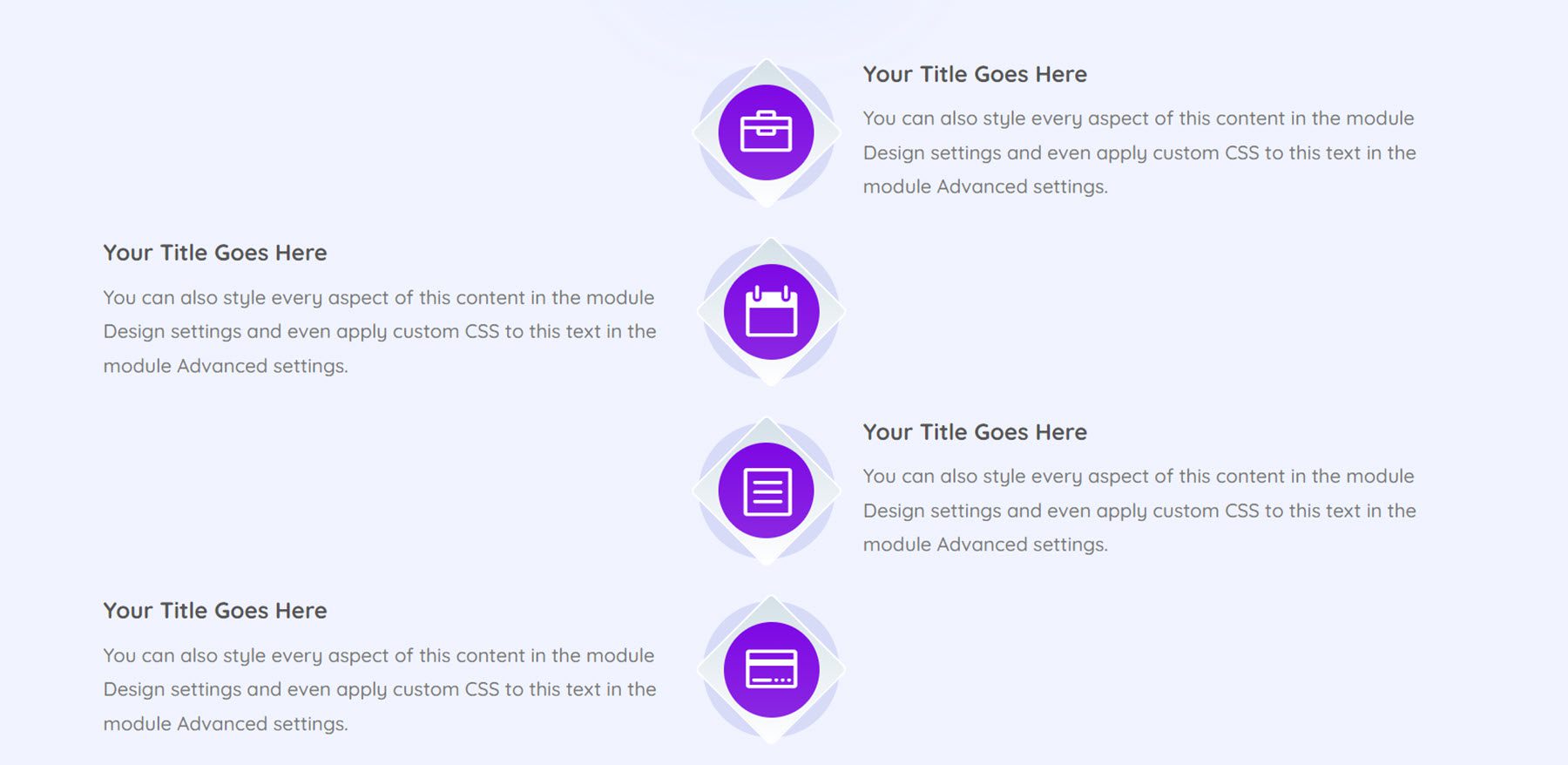
Timeline 91 is a simple layout with icons in the center and timeline description text on each side.
One Page Layouts
The UI Kit also comes with 42 different one-page website layouts that cover a wide variety of industries and use cases. We’ll just take a look at a couple of them.

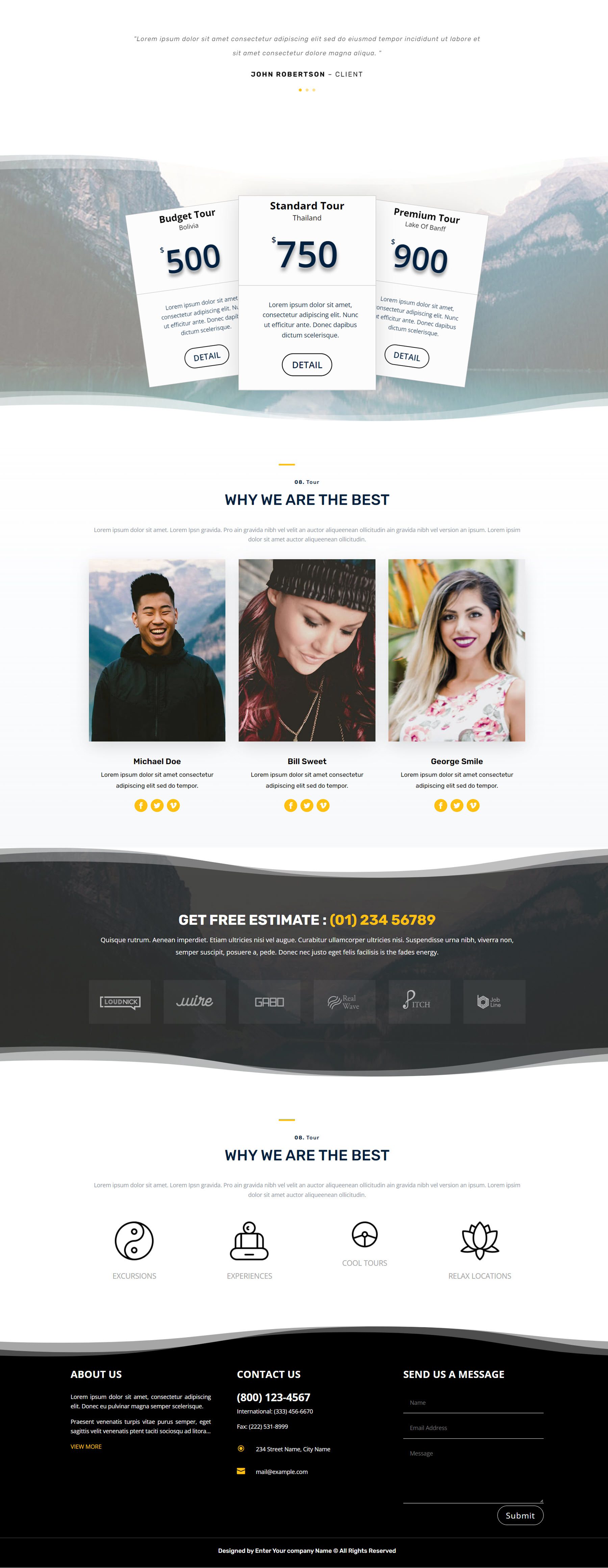
This is the travel and tourism layout. It begins with a secondary menu bar listing the logo, address, hours, and contact information. The primary menu bar has menu items and a button to log in or register. The heading is a large image with some text and a CTA button. This is followed by some numbered sections with images and text that describe travel destinations. There are some number counter modules in the section with a yellow background, and the next section features some modules with icons.
Below is a testimonial slider, followed by a pricing table. Next is a team section with social media links, followed by a section with text and company logos, and then another section with some text and icons. The footer features some about text, contact information, and a contact form.
This is the startup agency layout. It features a menu bar with a logo, menu items, and a CTA button. The header features some text, an illustration on the right, and two CTA buttons. Below are some company logos and three features highlighted with some icons. A CTA section follows this with two buttons, then a team section with photos and social media icons. After this are two sections with some text, illustrations, and some features distinguished with checkmarks.
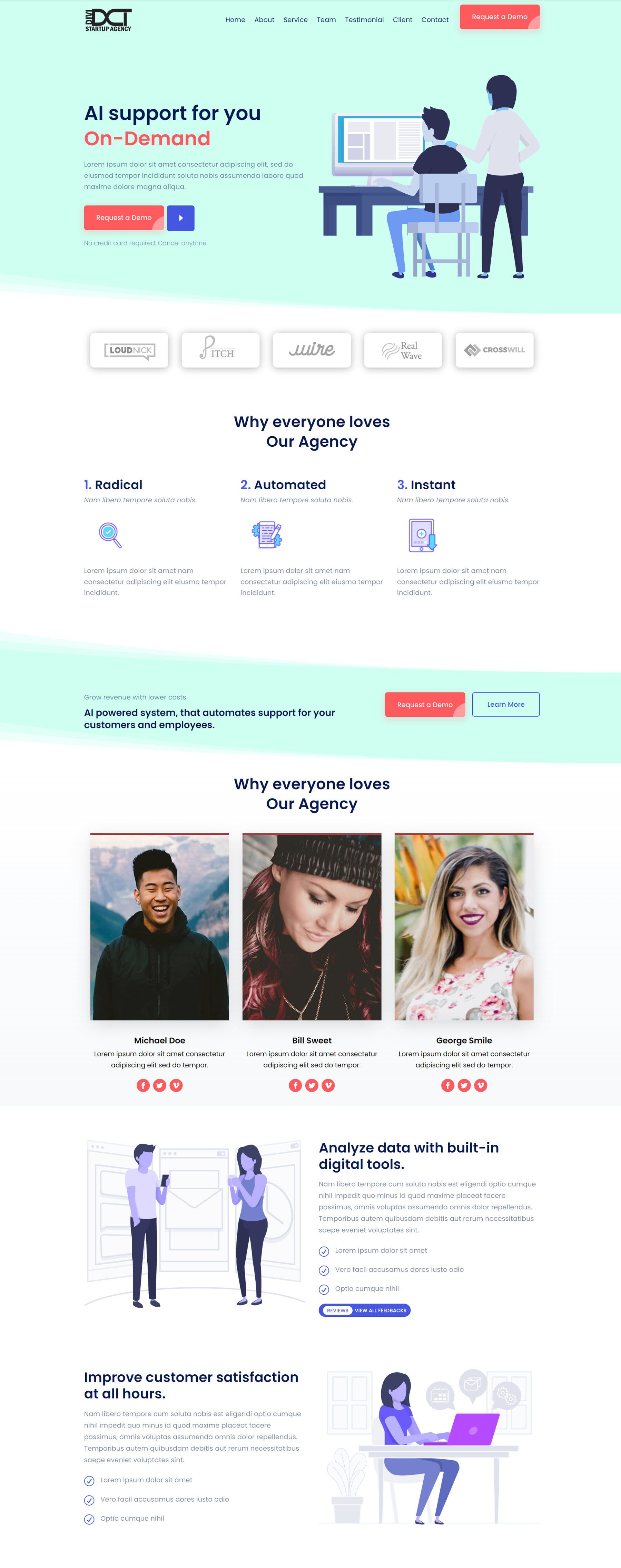
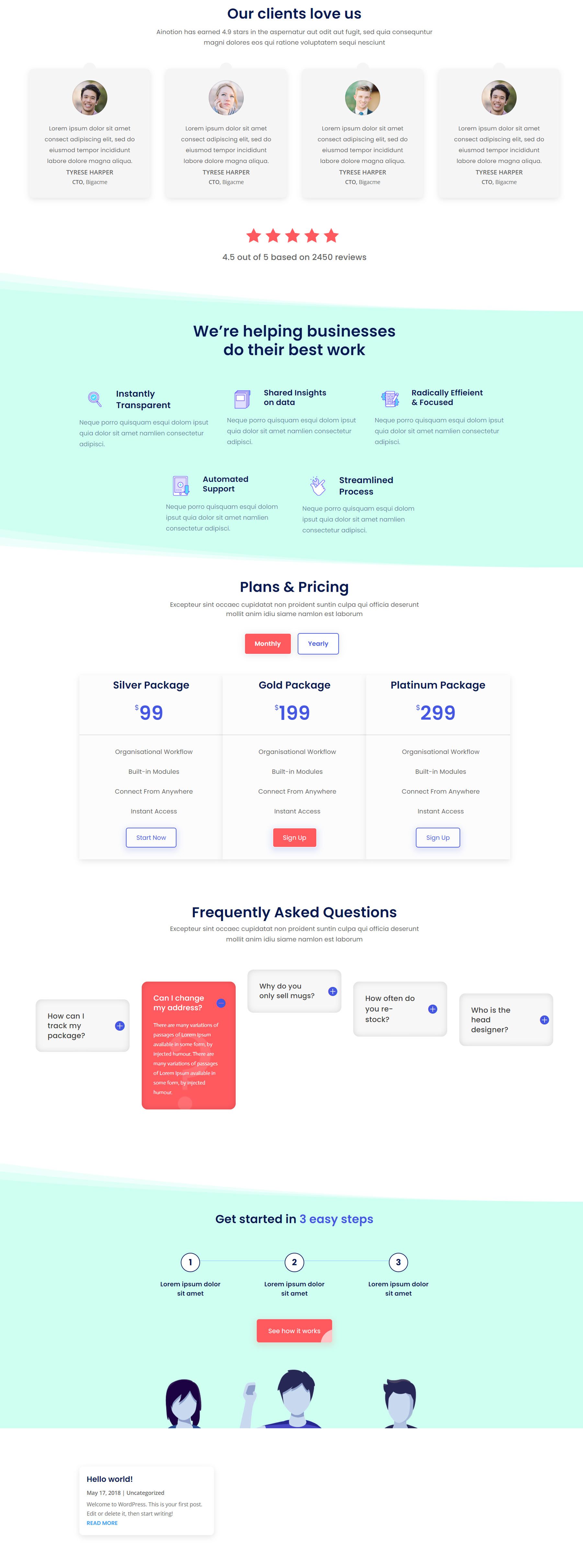
Next are some client reviews, then another features section with icons and description text. There is a pricing table, an FAQ section, another CTA section with an illustration, and some recent posts.
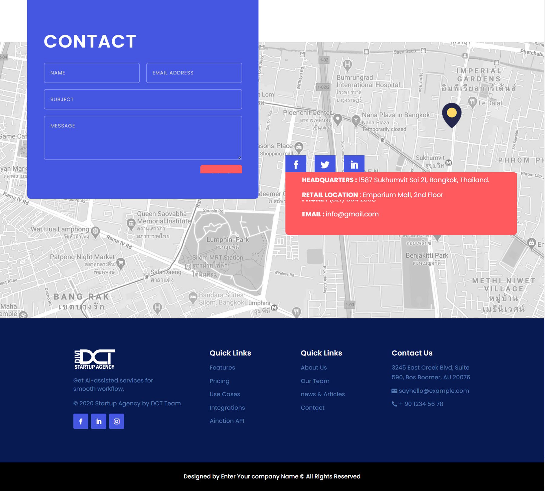
Finally, there is a contact form and another box with contact information and social media links over a large map, followed by the footer with a logo, social media links, menu items, and contact information.
Portfolio Modules
There are a total of 120 portfolio styles – 40 default portfolio module styles, 40 filterable portfolio styles, and 40 carousel portfolio styles. Let’s take a look at a couple of each style.
The first default portfolio module features a simple grid layout and an overlay that appears over the images that feature two green border bars, the title, and the year.
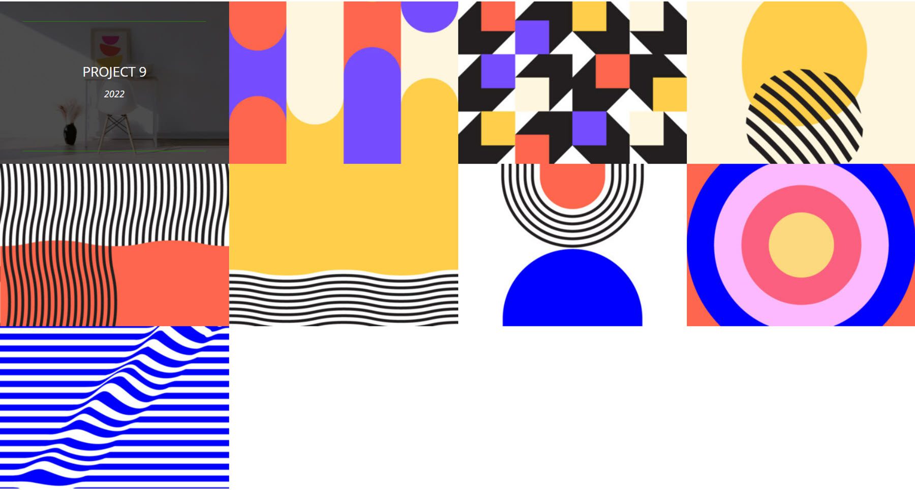
Portfolio layout 29 uses a similar grid layout and features an overlay that appears on hover with a pink arrow and the project title and year.
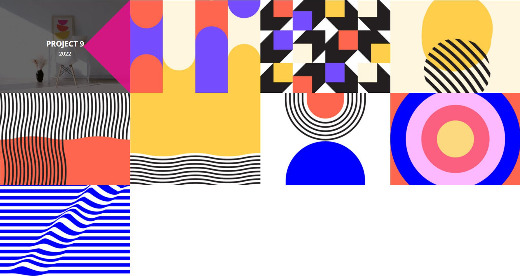
The filterable portfolio layout 2 features an orange filter bar at the top as well as a black navigation bar at the bottom. On hover, a dark overlay appears with the title and the year of the project.
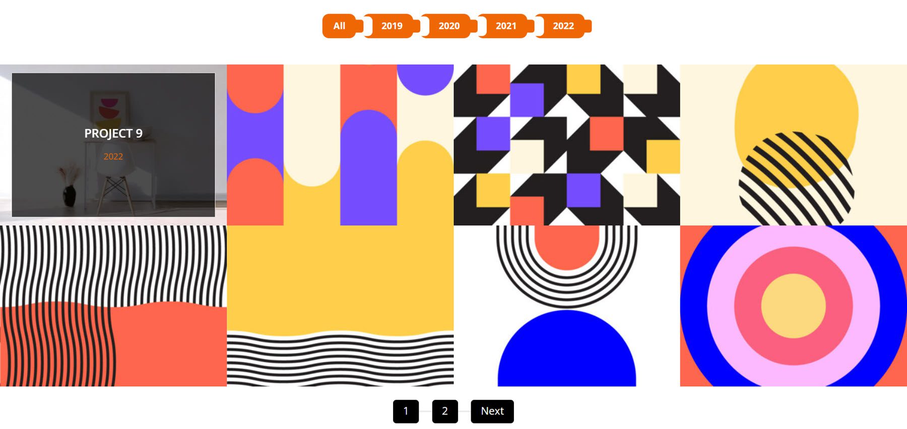
Filterable portfolio layout 14 features a filter bar with blue buttons and a black navigation bar at the bottom. On hover, a blue overlay is revealed and the title and date are contained within a white border.
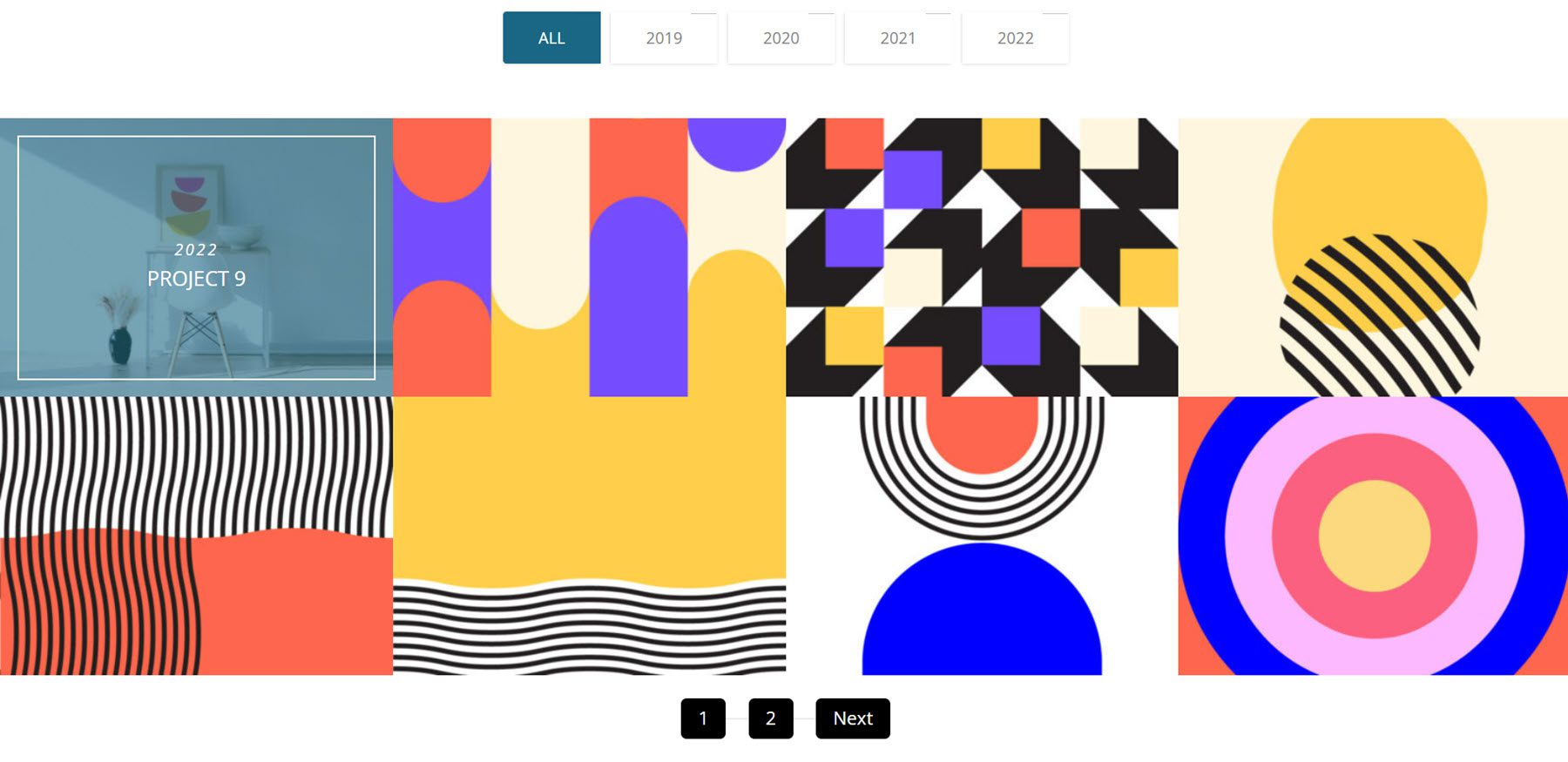
Carousel portfolio layout 7 features two blue arrows on each side to navigate. On hover, there is a blue-shaped overlay and the project information.

Carousel layout 11 features orange arrows for navigation and an orange slide containing the project information that is revealed on hover.

There are 100 footer sections that come with the UI kit.
Footer layout 3 features the contact information at the very top with some large icons. You can find some about text, social media icons, menu links, and hours. There is a secondary footer bar at the bottom containing copyright information and a link to the terms and conditions.
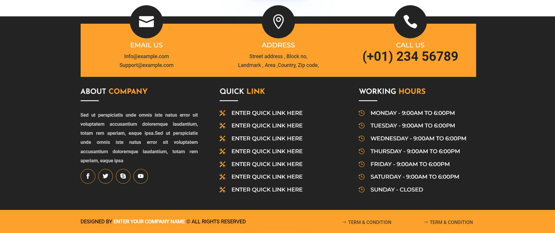
This is footer layout 26. It has two modules at the top with large icons, followed by a contact form and contact information. At the bottom are some links, followed by copyright information.
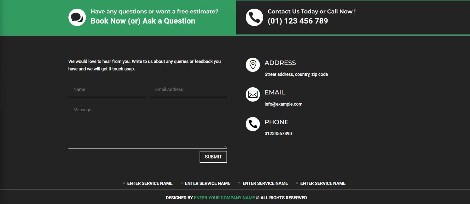
Footer 43 has an email sign-up form at the very top. There are several columns for menu items, some contact information, payment logos, and copyright information.
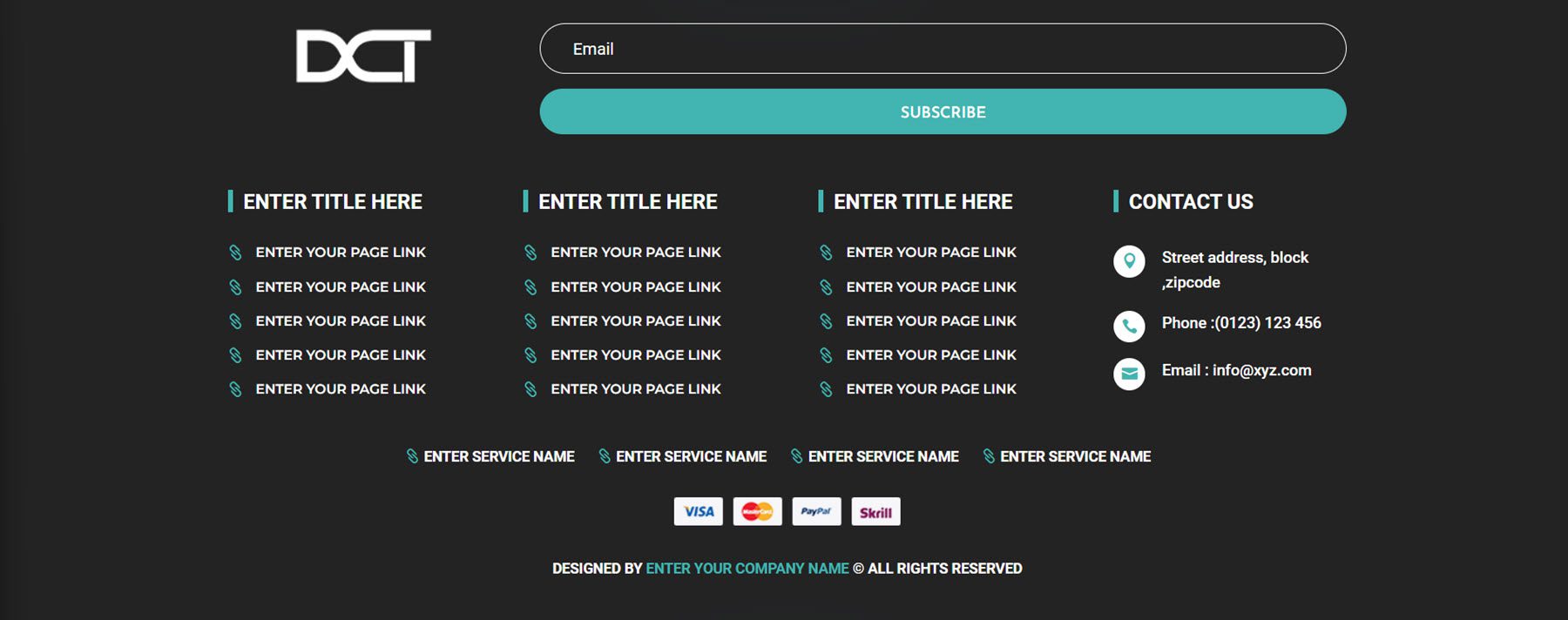
Footer style 84 has a background image with a dark overlay. The logo is on the left, along with social media icons. There are several menu items, then a newsletter sign-up form. The contact information is listed on the very right, and finally, the copyright information is at the very bottom.

Bar Counter Modules
There are 50 different bar counter styles to choose from.
Style 3 features blue bar lines with a black percentage indicator.

Style 13 features a title on the very left and the percentage is highlighted with a darker red background at the end of the bar.

Bar counter style 32 has a rounded design with a title on the left and the percentage within the bar.

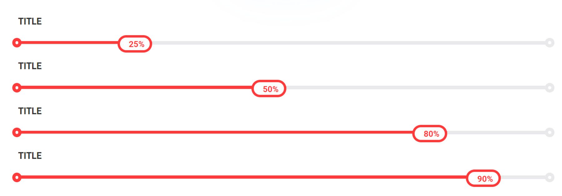
Finally, layout 37 has a title above the bar, rounded ends, and a rounded section at the end of each bar that contains the percentage.
Box Info Sections
There are 50 box info styles.
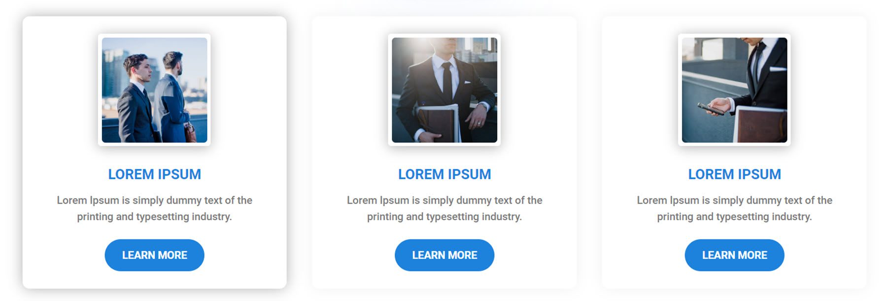
Box info section layout 2 features an image with a white border, blue heading text, description text, and a CTA button. The shadow around the box strengthens on hover.
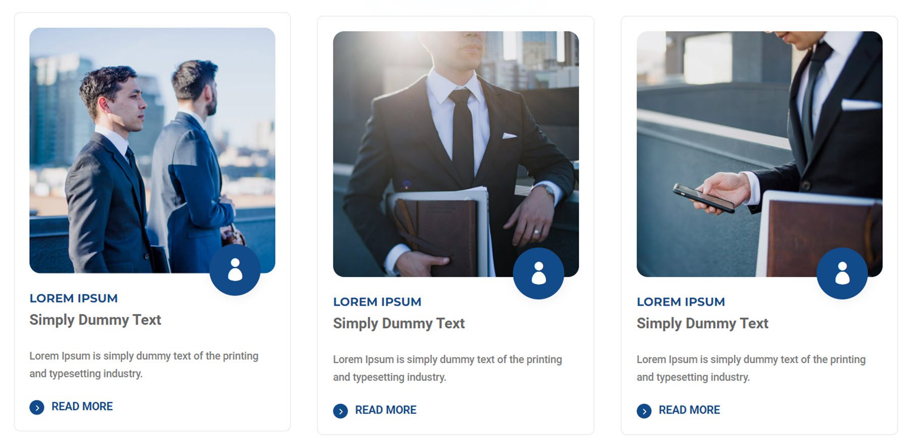
Style 6 features an image with rounded corners, an icon, two heading text styles, and a read more button. On hover, the box shifts up.
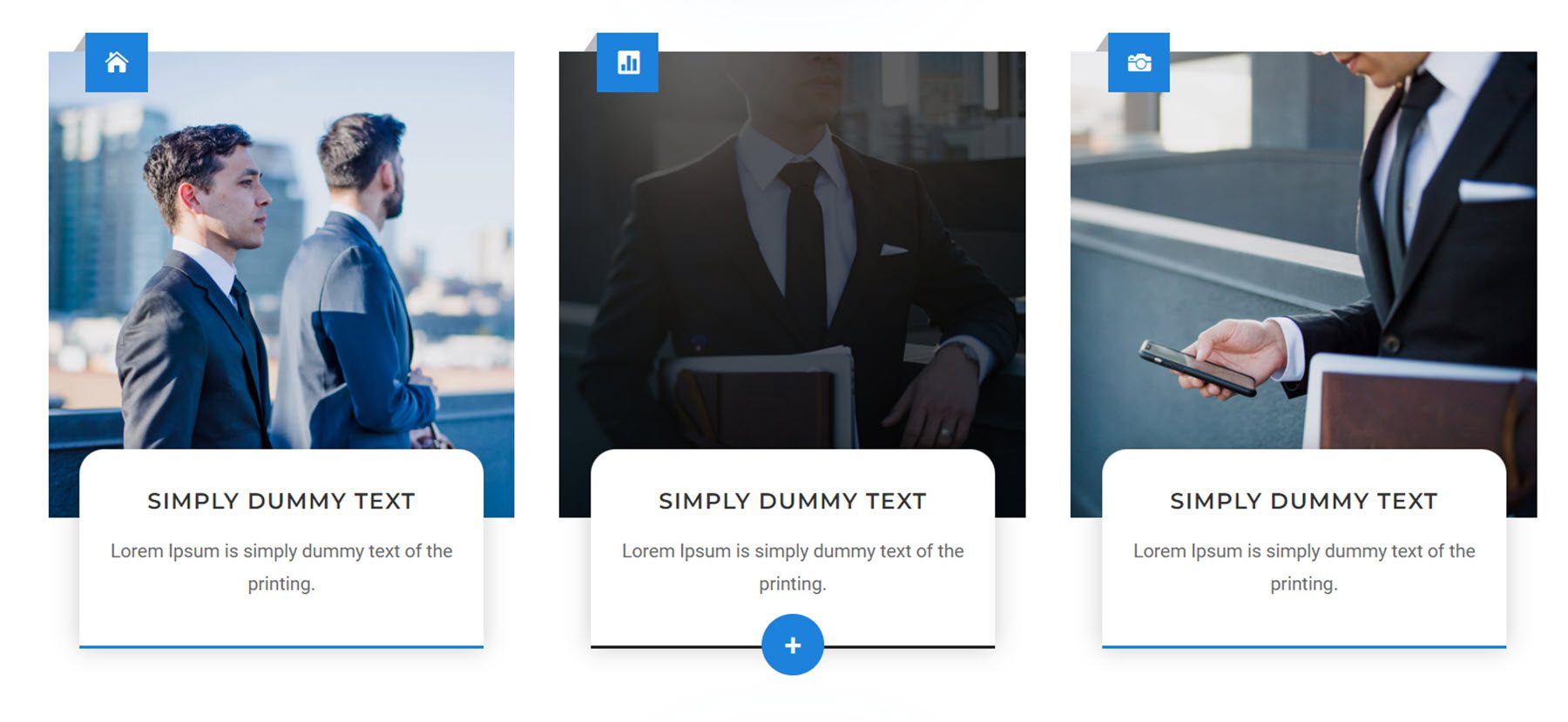
Box style 11 features an icon at the top over a large image and a card with the heading and body text. On hover, a dark overlay appears over the photo, the bottom border color changes to black, and a plus button appears.
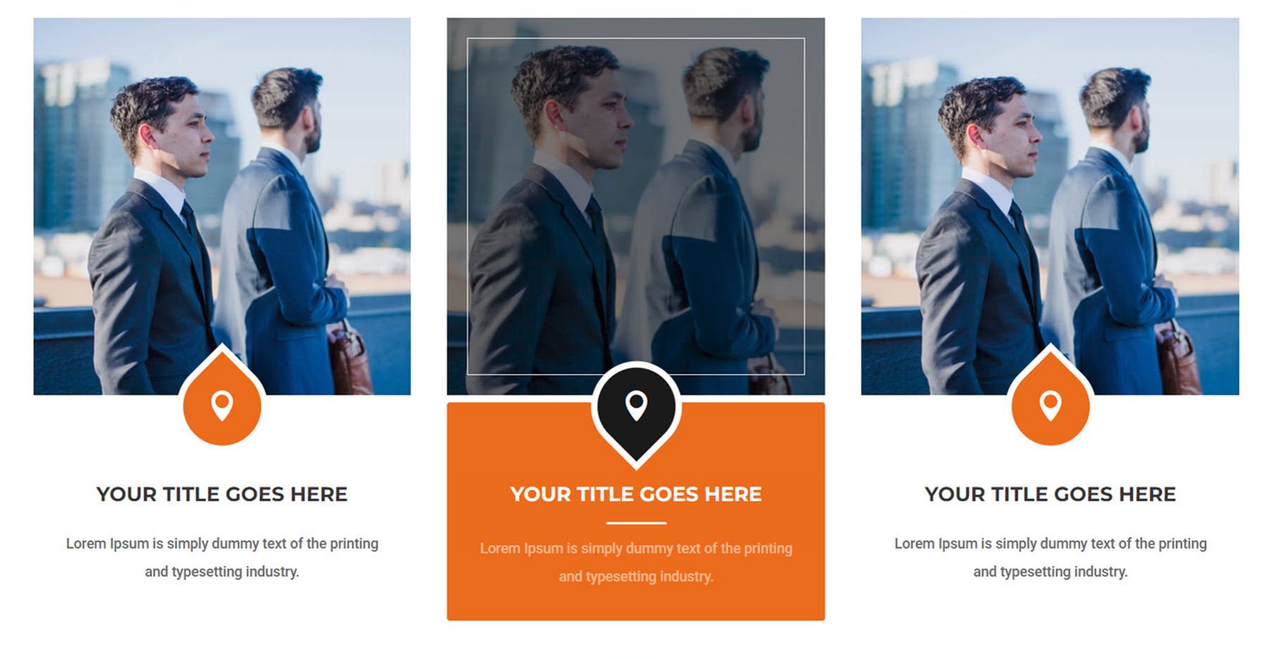
Layout 47 features an image, an icon, and text. On hover, a black overlay and white border are revealed over the image and the image zooms in at a slight angle. The icon container turns down and the background changes to black. Finally, the text background turns orange.
Skill Sections
There are a total of 50 skill sections.
Skill section layout 7 features a large image on the right and some text, a skill bar, and number counters on the left.
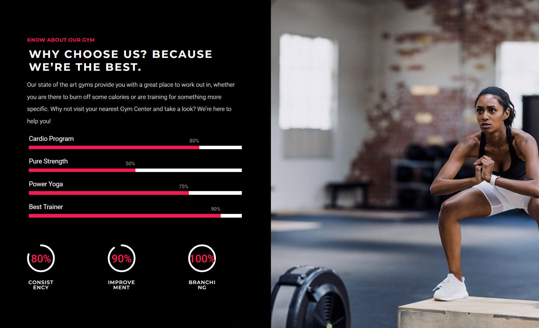
Skill section 17 features text, a skill bar, and two blurb sections with icons on the left. On the right are two images.
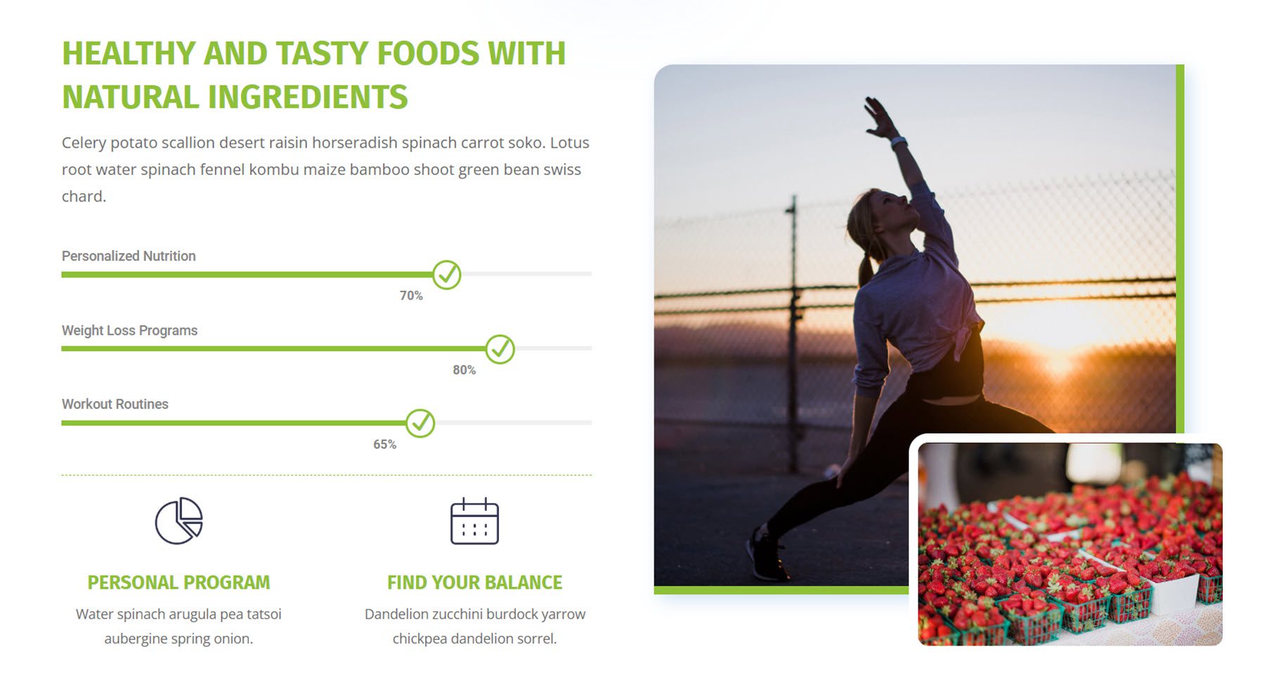
Skill layout 21 features an image, some text, and a button on the left. On the right are two more text sections, followed by the skill bar.
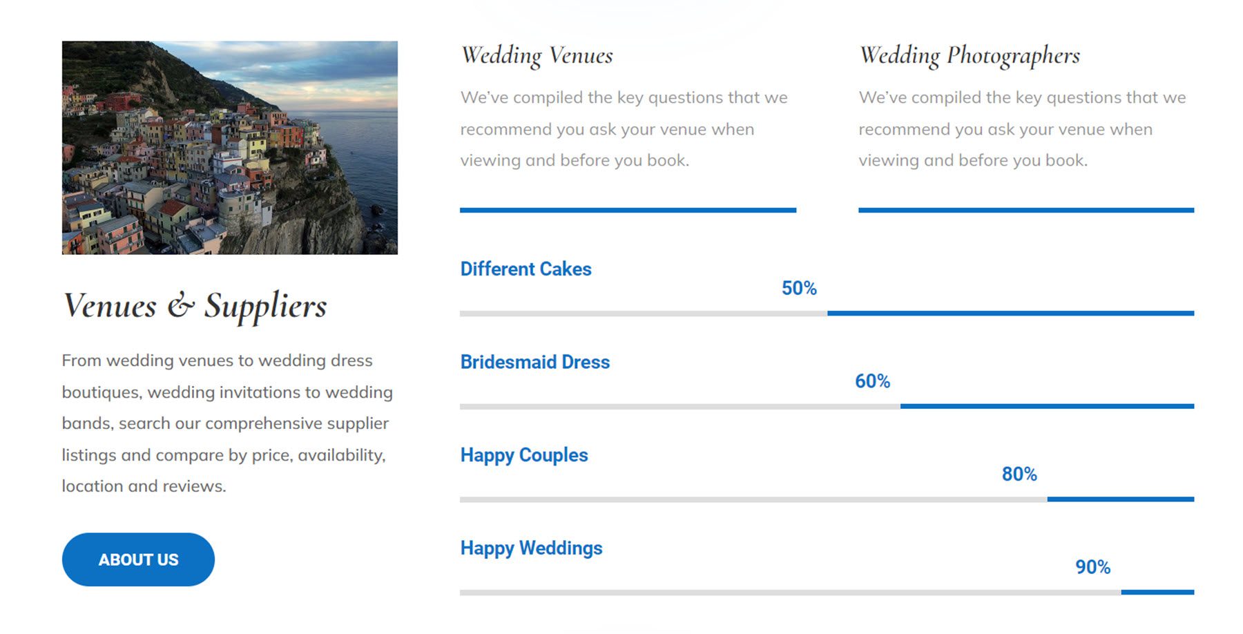
This is layout 38. It features an image with an overlaying text box on the left. On the right, you can find some heading text, body text, and skill bars with arrows.

Finally, there are 150 total button styles, with 100 regular button styles and 25 dual button styles.
This is regular button style 30. On hover, a pink background appears and the text color changes to white.
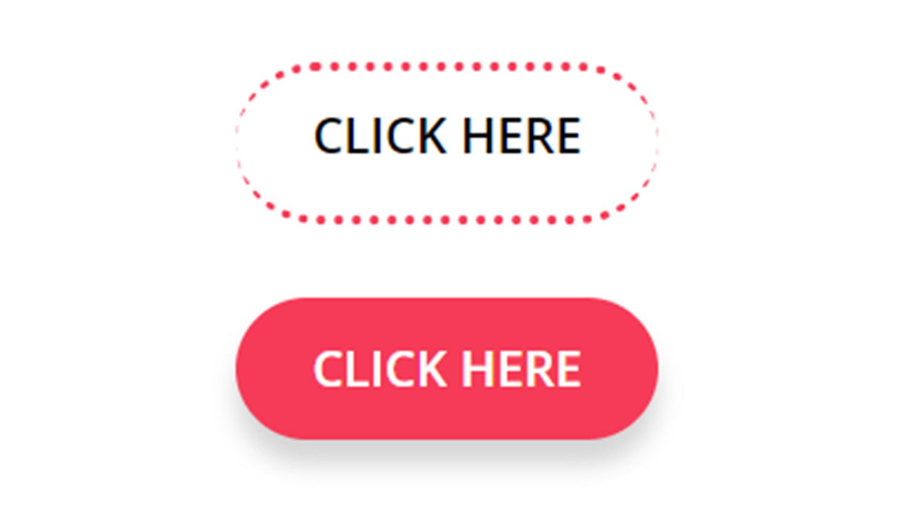
Regular button style 116 features a small pink box that expands on hover to fill the background of the button. The text also changes to pink on hover.
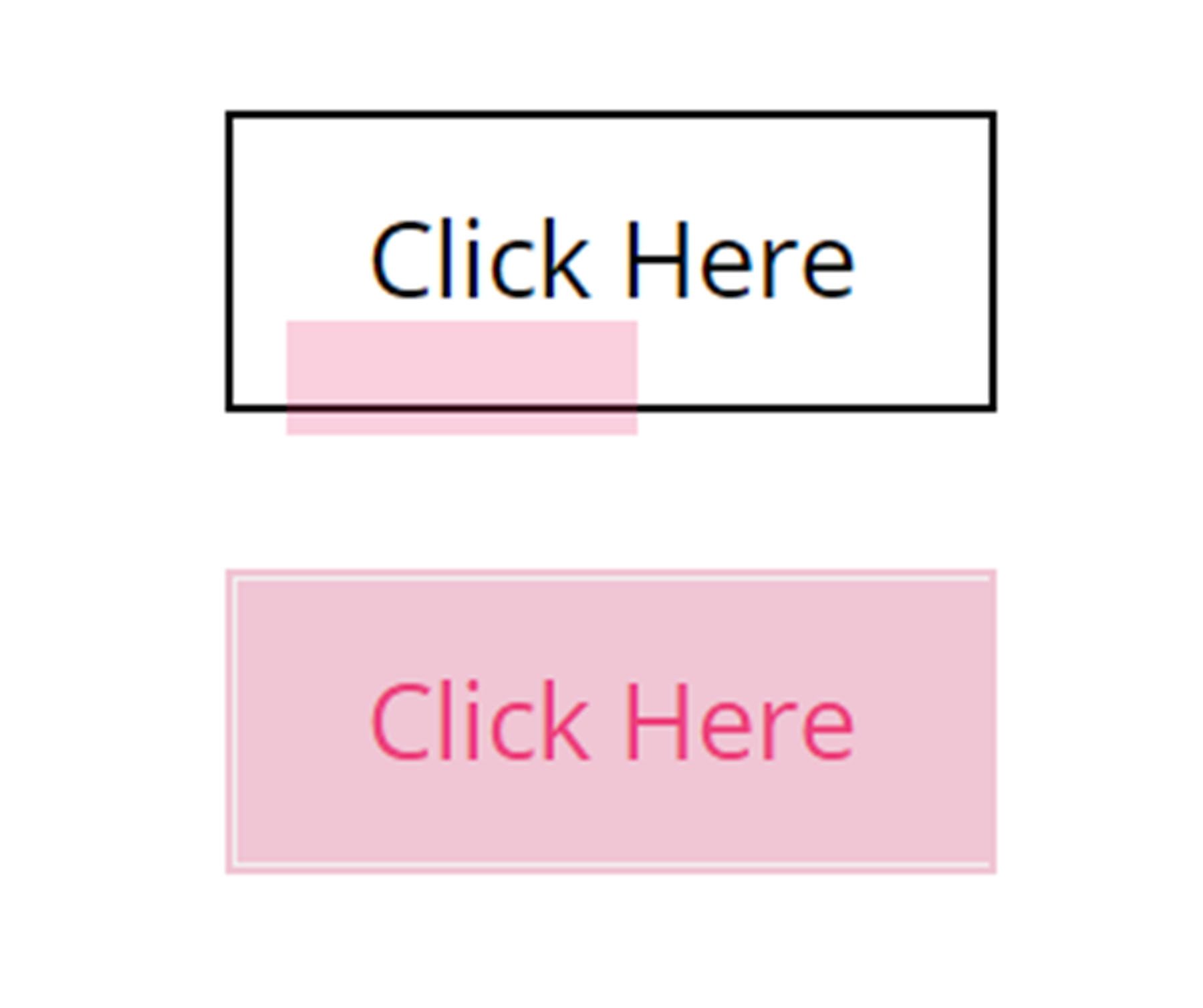
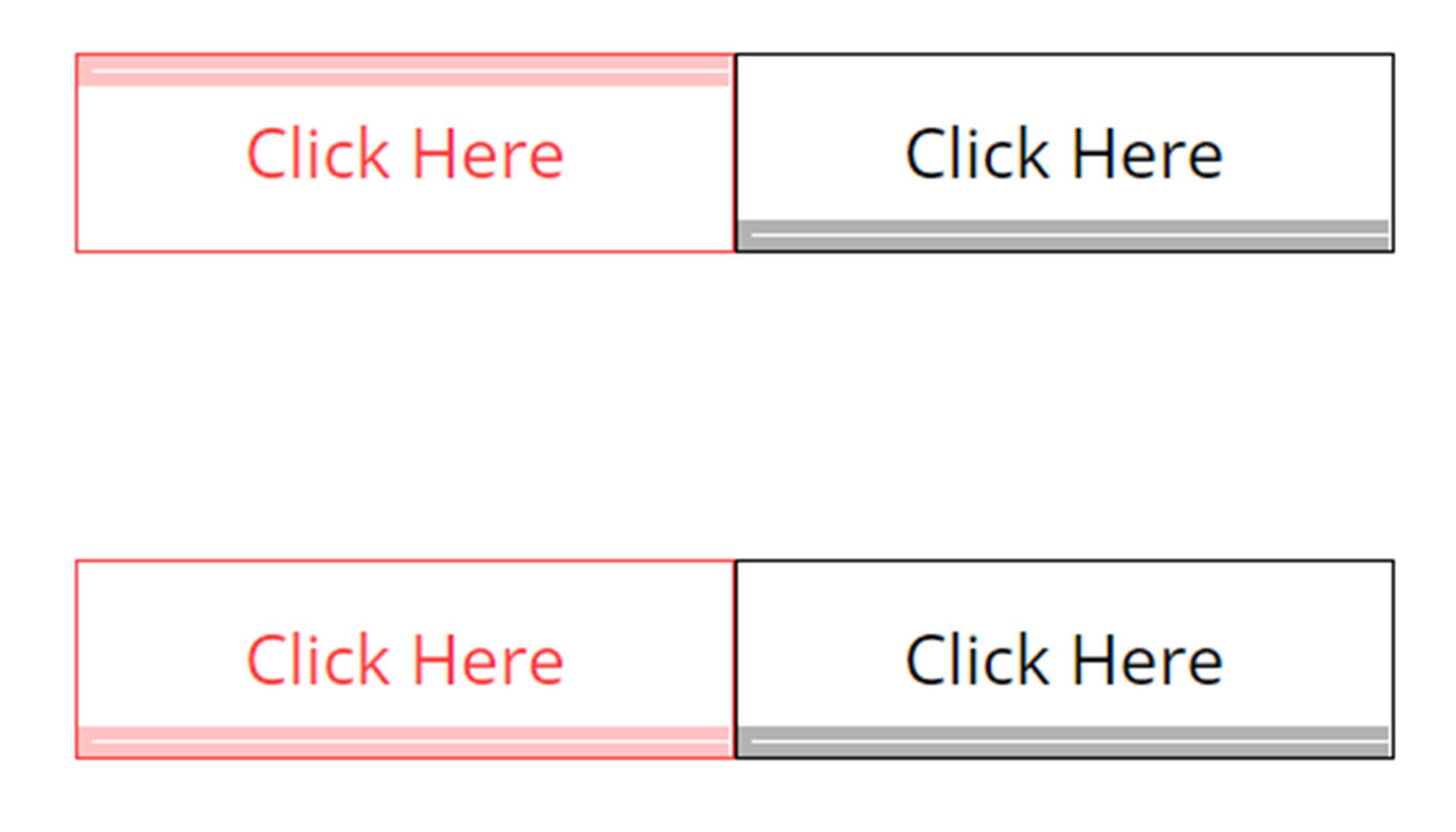
Dual button style 3 features a bar that moves to the top or bottom on hover.
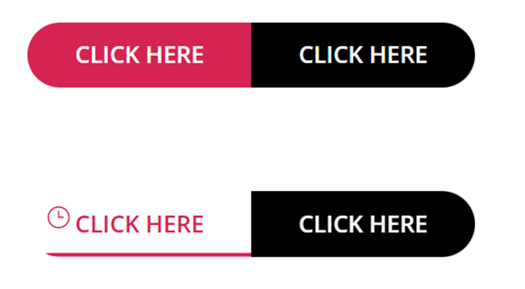
Dual button style 7 features a dark background that moves down on hover and becomes a bottom border. An icon is also revealed on hover.
Purchase The Ultimate Divi Module UI Kit
The Ultimate Divi Module UI Kit is available in the Divi Marketplace. It costs $49.59 for unlimited website usage and lifetime updates. The price also includes a 30-day money-back guarantee.
Final Thoughts
The Ultimate Divi Module UI Kit comes with an impressive number of layouts with a wide variety of styles and use cases. Everything is customizable with Divi’s options, and any of the layouts can be modified to fit the design of your next project. If you’re looking for an extensive layout pack that can help you save time with your next design, this product might be right for you. We would love to hear from you! Have you tried The Ultimate Divi Module UI Kit? Let us know what you think about it in the comments!



Leave A Reply