Welcome to Day 63 of our Divi 100 Marathon. Keep tuning in for 100 days in a row of awesome Divi resources as we count down to the amazing release of Divi 3.0 on the final day of the series!
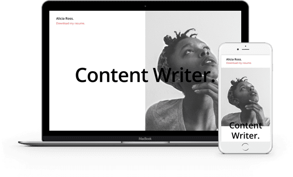
In this layout pack we’ve created three free, gorgeous layouts perfect for resume/cv pages. This pack is sure to be a big hit with anyone in academia, business, or of course anyone creating a single page resume website.
Downloading & Using The Resume Pages Layout Pack
To use the Free Divi Resume Pages Layout Pack on your own Divi website you will first need to download it using the button below. Next, locate the file divi-100-resume-pages-layout-pack.zip in your downloads folder and unzip it. Then, navigate in your WordPress admin to Divi > Divi Library and click the “Import & Export” button at the top of the page.
When the portability modal pops up go to the import tab. Click the “choose file” button and select the All.json file or any of the individual layouts you want. Then click the blue “Import Divi Builder Layout” button and wait for the import to complete.
Once the import has finished you will now have the ability to load your new Divi Resume Pages Layout Pack on any builder powered page by going to Load From Library > Add From Library.
Subscribe To Download For Free
The Resume Page Layouts
The cv/resume layouts we’ve created below can be adapted to any number of purposes or professions. Anyone from creative professional to business executive could easily put these to use.

Resume Page Layout 01
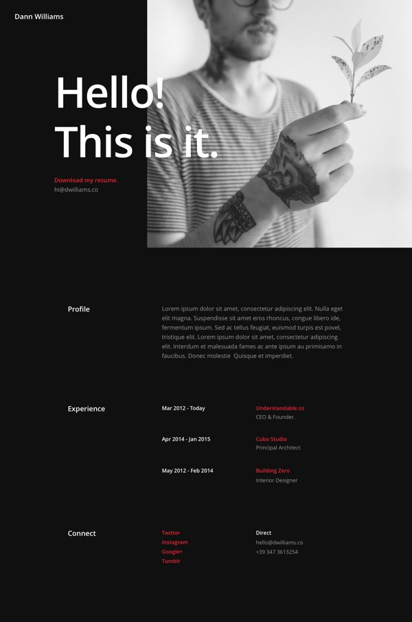
Resume Page Layout 02
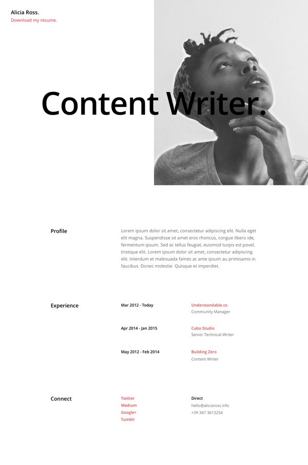
Resume Page Layout 03
Tomorrow: Learn How to Achieve 15 Different Section Divider Styles
Tomorrow Augustine Mak shows us how to create a wide variety of Divi section divider styles that make scrolling from section to section more interesting. See you then!
Be sure to subscribe to our email newsletter and YouTube channel so that you never miss a big announcement, useful tip, or Divi freebie!

Divi 100 Day 63
The Countdown To Divi 3.0
This post is part of our Divi 100 marathon. Follow along as we post free Divi resources for 100 days in a row! This 100-day countdown will end with the game-changing release of Divi 3.0, including our brand new visual editor built from the ground up using React. Divi 3.0 will change the way you build websites with the Divi Builder forever!
Let the countdown begin.



Hey guys, trying to download and unzip this layout (as I have almost every other one you’ve published), but it’s saying that the archive format is not supported, or that the file is broken. Any thoughts?
DIVI Rocks. It helped a lot. Thanks Elegant Themes.
This will be a handy layout pack. Resumes are important and often overlooked. Thanks!
Thanks for the feedback! Happy you have found these resources useful. 🙂
Wao. This is seriously amazing I am freelancer and this is very helpful to me.
Awesome! Glad you have found these resources useful. 🙂
Awesome looks great. Nor to sure how you can keep improving the Divi theme but I love it.
Another lovely pack. Will work well with freelancers too!
This is true, it works well with freelancers too 🙂
AWESOME!. cant wait divi 3.0
Happy you have found these resources useful! 🙂
Glad to see you back again Nathan, and once again a polished and professional presentation of a carefully thought-out video and a well designed Divi layout with excellent production values.
I don’t mean to be negative, and I thought it would get better in time, but it really wasn’t working out with Mak. He never quite figured out his own presentation style. Or maybe he did, and it just came across as amateur, compared to yours.
Anyway, that’s just one facet of what I want to write to you about, which is the general dumbing-down of website creation ~ and I guess, by inference too ~ the dumbing down of website creation presentation.
I highly applaud the 100 days idea. I have not seen it done elsewhere, and its not just a novel idea; its inspired. To have 100 days of build-up to the launch of version 3, is an exciting concept and has a lot of up-side, provided the quality can be maintained. Unfortunately, some of development ideas are getting less worthy, and along with the presentation style, which I already mentioned, means its starting to be somewhat of a disappointment. Which is a real shame.
To maintain a high quality build-up like this, for 100 days, was never going to be a walk in the park. And I can see that this was well-intentioned. However, there is a side-effect of pushing out so much content when it starts to fall below a certain level of competency. And that is, it becomes a turn off for the competent site designers who can take your product and make it sing ~ while you spend more and more of your time attracting and creating DIY cut and paste layouts for people who haven’t a clue.
What you end up with, is that ~ while you’re busy generating a support burden the size of Texas ~ the real designers are put-off by, and probably don’t have too many good things to say about your product. While all the while, the clueless think its great, tell all their friends, and sing your praises to the sky with friends and customers who know even less.
Now, its not my intention to be rude or offend anyone, though no doubt that’s how it comes across. But by not having enough quality content for 100 days, the net result you are actually achieving, is exactly the opposite of what I imagine you wanted to achieve, when you set out 63+ days ago. In the end, the only people who will use Divi will be those who don’t have the knowledge or ability to use anything else.
My hope is you can pull it back on track and keep the product from becoming yet another mass-market theme which everyone can buy, but 90% of purchasers haven’t a clue how to use it to produce a well designed, well thought out, and practical website solution.
Hi all,
The idea of producing a video series is to appeal to all users – that means some super polished features will get airtime but so will basic items like these resume templates.
Will it be off putting to a pro if there are some beginner topics mixed in? Heck no, they’ll just focus on the sparkly bits that interest them. And the same, will go for beginners. “Chew the meat, spit out the bones” as the saying goes.
Good on the ET team for taking up a monster challenge and providing content that appeals to all their users – this way you are building towards a theme that allows pros and beginners to “produce a well designed, well thought out, and practical website”.
Hmmm, I don’t like your reply…and I think that you are rude and are offending some people as you mention that 90% of the purchasers haven’t a clue how to use it..
But, I’m at the 10% side, right? 🙂
Terence, your post comes across as a bit more than rude. You’re assuming the only people benefitting from the designs in these content packs are those “clueless” amateur “designers”. Not the real thing, like you.
I’m one of the “clueless” you described in your post. I’ve learned more from these content pack layout designs and the css they contain than I have from any blog posts in the past 2 years as a Divi lifetime member.
Actually Terence, Mak is still with us and we think he’s doing a great job. Sorry to hear you’re disappointed with the quality of the Divi 100 Marathon posts. I understand where you’re coming from to a point, but we’re actually seeing the opposite effect you are describing. By all of the metrics we use to measure success (traffic, engagement, etc.) the series is getting more successful as it goes along, not less so. Granted, out of 100 blog posts in a row, not every single one of them is going to be a home run. We expected that.
I have to admit though, the series has been a challenge. About four people on our staff have been responsible for 90% of the content. One of whom is Mak. He came in brand new to our blog and YouTube channel right as we kicked this series off and he’s found a way to keep pace while learning the ins and outs of our company, learning (and then explaining) lots of new Divi related tutorials, and taking over certain aspects of our marketing.
If there has been a discrepancy in style or quality between different posts/videos within the series, that is ultimately my responsibility. And, as time allows, I’m taking steps to ensure our posts/videos maintain the highest quality possible while also staying consistent with each other. It’s a process to be sure, with many areas ripe for improvement. This is one of the reasons why we’ve begun contracting some of our very talented community members (like Melissa Love, Josh Hall, SJ James, and possibly others) to help us keep the quality level as high as we can and finish the series off strong. Then, after that, we plan to continue publishing one Divi-related blog post every day, indefinitely, alongside our more general WordPress content. Should be fun!
Hey Terence & Nathan,
I understand where Terence is coming from because. I hear my Development Professors talking about it all the time at University. I think a lot of experienced people in the industry think that because you’re pushing out so much pre-made template-ey things that the majority (WordPress users, Elegant Themes / Divi Users, Web Designers, Implementors etc) may end up just doing the “Set it & Forget it” method.
I am in the camp that see these packs as “Guides” of “What’s Possible” and “How It’s Made Possible”. Sure a good amount of people may end up just taking something and rolling with it without much thought or setup beyond what’s offered and that’s their choice.
I think for designers and developers who want something done fast due to time constraints that’s where these packs and this content REALLY shines! I can get a feel for how Divi can be changed and start implementing my own design changes without having to overhaul much code (or re-inventing the wheel so to speak).
I also think there’s also a discrepancy between the “Professionals” and “Amateurs”, I say this because I get the same rhetoric at College. Yes, in a perfect world we would design from paper, move to comp, and hand code everything and everything would be fast, immaculate, and take only a few days (or hours) to create all this. And client, community (web), Google, and everyone would be happy.
However, that’s not how things always work. As a freelance designer & developer I’ve had to take certain short cuts to save time and satisfy the client (within reason of course). And ultimately after a lot of testing and fiddling I am usually able to get the results I need in a fraction of the time as hand coding something. I.E. I get a working site, that looks beautiful, validates GREAT, and with a little extra tweaking, has a great page rank!
So long as the idea is solid, and you have a great framework to start, (i.e. these templates & packs). I think it provides a great jumping off point. It definitely satisfies many clients who need something quick, fast, and that works, flawlessly too I might add.
Even if the process for creation isn’t as “Professional” as some would like, I believe the end results of what we see here justify the means.
TLDR: Yes some people will just grab and go w/o much editing. But a great designer can use this, save time, money, and triple their investments / earnings.
P.S. I think you guys are doing a fantastic job. Please keep up the great work! ^^
I am a college student and love Divi! I want to get a lifetime subscription but wasn’t sure if you were going to have any deals? Will you ever discontinue the lifetime member license?
Go ahead!! You should buy it.
Hey David,
I too am a student and fortunately for me, I was able to save up enough Financial Aid to invest in the Lifetime Membership, and I can agree that it is a “life” saver, lol. I’m a Design student (emphasis in Front End Development), but often times I find that (in the Freelance world), clients need something quick and fast, as opposed to the lengthy development process one can take for a site.
So, I think that investing in Divi was a great choice for myself, sort of like buying Photoshop or Illustrator for Graphic Designers. Especially since I can get a relatively quick site up that looks amazing, different each time, and functions GREAT!
Considering what they have done in the past when they release DIVI 3.0 they give away 10 memberships. Then on Black Friday they will do like a 20% discount on all membership levels.
So you do have a small shot of saving some money if you do wait. I have seen a 10% discount though with like a newsletter signup though.
They are currently having a 10% off discount to that actually. Ask them for the link on their live chat. Cheers!
I’m not sure when our next deal will be. Possibly at the end of the series. Definitely for Black Friday. Good news though is that whenever you buy the lifetime membership you’re going to be getting a killer value 😉
Just in case this wasn’t obvious enough, I want to second what Nathan said; getting the lifetime membership was one of the smartest business decisions I’ve ever made, probably the smartest. 🙂
Can’t wait for tomorrow post! 😉
Awesome layouts indeed 🙂
Funny as I released one cv layout myself couple of weeks ago 🙂
Happy you have found these resources useful 🙂
demo, please =)
I’m sorry we don’t provide live demo for them, but you can easily get a full preview on the screenshot attached in the post. And you can always test them very quickly on your local wp installation. Thanks for your understanding 🙂
Great work regardless
Awesome Nathan. Thank you for these. I’m working on a resume page very soon. These will act as a good source of inspiration.
Hi there,
“This does not appear to be a WXR file, missing/invalid WXR version number”
Nice for a quick start, thanks!
Thanks Verdi! Happy you have found these resources useful 🙂
nice
Good to hear!