The portfolio page is one of the most important pages for anyone providing a service. It not only demonstrates the type of work you do, but also shows the visitor your level of expertise and clients that you’ve worked with. Portfolio pages can be designed many different ways. In this article we’ll look at 11 Divi websites with cool portfolio pages to help inspire you for your next Divi design.
Portfolio pages typically include the standard portfolio, filter portfolio, or full-width portfolio modules. However, there are other ways to display your portfolio. Some build the portfolio with elements such as images, blurbs, or galleries. Of course, this has to work well within the page’s layout. We’ll see examples of each.
I’ll show an image of the section I like and discuss what I liked about it. The websites are in no particular order. Hang around until the end for a few links to help you level up your own portfolio page using Divi.
1. Boon Creative
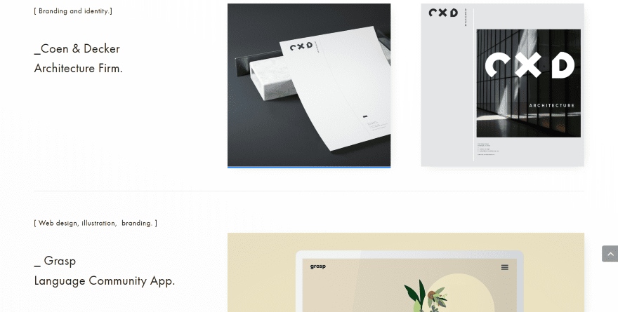
This site displays a list of services that open in toggles in the hero section followed by a full-width section to show a quote. The portfolio section shows the categories of the services, name of the client, and client description in the left, and images of the project on the right. Each of the portfolio items are separated by a thin divider. Examples of websites include links to view the live website.
2. roundpeg
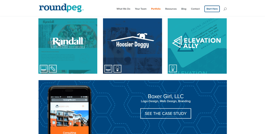
This site shows the portfolio items in three columns and includes a section in a single column. The three column sections place an overlay over the images of each project with the client’s logo in white. White line-drawn Icons in the bottom corners show the category for the project. The single column section shows an image of the project with text and a button over a patterned background. Under the third section it provides links to see more in each category.
3. Leo Whou Teng
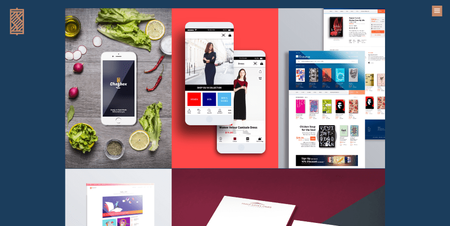
This page places the portfolio items in a multi-column layout with no space between the images. Hovering over any of them reveals a blue overlay over the image and a box at the bottom that shows the name and categories of the project. The portfolio includes two and three columns and alternates the layout. The images use different backgrounds and show the images of the projects on different types of devices. This site makes excellent use of color.
4. Studinger Media Graphics
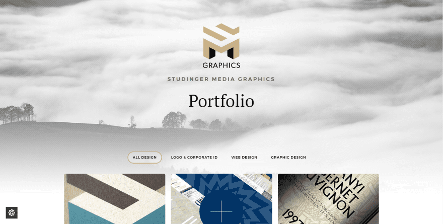
This site introduces the portfolio page with the company’s logo, name, and page title over an elegant background image that just barely shows through the overlay in monochrome. The portfolio section uses styled buttons for the filter and shows the projects in a three column grid. Hovering spins the image and provides a link. The page also includes a call to action, contact form, and a revealing footer with a QR code and social follow buttons that match the site’s branding.
5. Catherine Cliffe
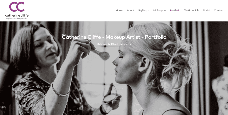
This portfolio page shows a full-screen image with title and description in an overlay in parallax. Scrolling reveals a text section with the name and location of the project and the names of the people involved. Following this is a gallery that includes images in full-screen and a three-column grid. Other projects follow a similar pattern with images shown within a two or three-column grid.
6. Super Divine Web Design
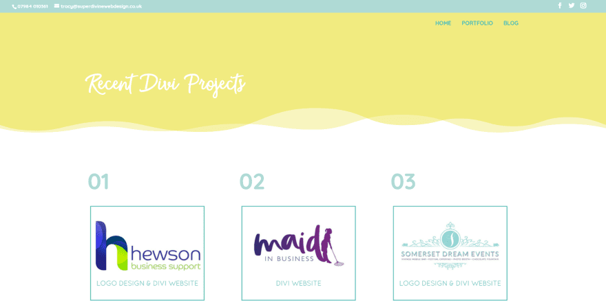
This one numbers each project and displays an image that includes the company’s logo and the services provided, the project’s title with a hand-written font, a short description of the project, and a button to see the project live. The title text, border, and button colors match the site’s branding. Following this is a CTA to an online booking app.
7. Get Web Design
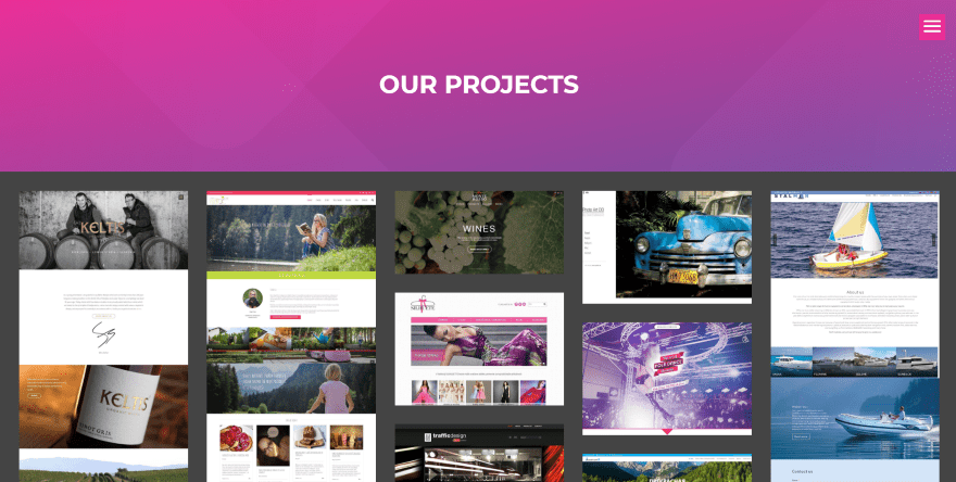
This portfolio page loads projects images similar to Pinterest. They’re displayed in a 4 or 5-column grid (depending on your screen size and zoom level). Hovering over any project reveals a magnifying glass. Clicking this opens the image in a lightbox. Many of the images are complete layouts of websites while others are the hero area.
8. Caporal Marketing Digital

This portfolio page displays a full-width image with title, tagline, and button with an interesting border that matches the site’s branded colors. Scrolling reveals the filtered portfolio in a three-column grid. The portfolio shows the client’s logos in monochrome which displays in color on hover. They also include the client’s name and service provided. The line on the left displays the names of the social networks in text that’s oriented sideways. They remain on screen on scroll.
9. The Mighty Fox
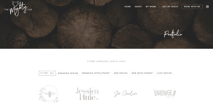
This page is introduced with a full-width background with a darkened overlay and an elegant font to display the page’s title. The filtered portfolio displays the client’s logos in monochrome. Hovering over any of the projects brings in an overlay from the direction the mouse came from. The overlay displays the company’s name and services provided along with a link to see the project live. This is followed by a CTA, a two-column section with a background image in parallax and a testimonial slider, social follow buttons, and an Instagram feed.
10. Waka
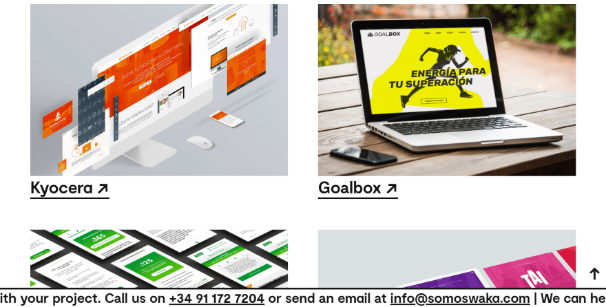
This one was developed for mobile first. The page is introduced with a large section with extra-large text that includes a title and description. On scroll and ticker appears at the bottom of the page and remains on the screen in this location. The cursor is changed to a large arrow and changes to a large hand when you hover over an image. The projects are displayed in two columns. The page also includes a list of services, contact form, and newsletter opt-in. The footer is revealed on scroll and displays video that shows through the cut-out section of text.
Ending Thoughts
That’s our look at 11 Divi websites with cool portfolio pages to help inspire you for your next Divi website. There are lots of articles here at the ET blog that focus specifically on portfolios or elements such as blurbs, images, or galleries.
Here are just a few:
- How to Use a Filterable Portfolio and Post Navigation to Organize Case Studies with Divi
- 3 Free Beautiful Project Page Layouts (& How to Build More with the Divi Builder)
- How to Use Divi Leads to Measure Your Portfolio Site’s Effectiveness
- How to Create a Minimal Portfolio Homepage with Divi
- Using Filters, Hero Sections, and CTA’s to Expand a Minimal Portfolio Homepage
- Free Divi Download: Homepage Portfolio Layout Pack
- Free Divi Download: Creative Single Page Portfolio Layout Pack
- Using Divi’s Fold Animation to Make Blurbs Bloom
- How to Add Advanced Hover Effects to Divi’s Blurb Module Using Hover.css
- 5 Fun Ways to Style Divi’s Blurb Module
- Creating a Grayscale to Color Gallery with the Divi Gallery Module
- How to Create a Unique Overlapping Effect with Background Images
- How to Use Divi’s New Filter Options to Beautify Your Images
We want to hear from you. Which of these websites with cool portfolio pages are your favorites? Let us know in the comments.
Featured Image via Graphic farm / shutterstock.com




Thanks so much for featuring my portfolio page Randy! Such a nice surprise this morning 🙂
All Designs are Awesome, but my persional Favourite is #9 (The Mighty Fox), Very simple and unique design. I will use this design for my future website. Thanks Divi Team.
I liked the Get Web Design approach. It took a format that everyone would be familiar with and then incorporated it into the page. The look also inspires you to click on the individual images.
I’m a writer and need viewers to be able to have the ability to click to enlarge and scroll through my portfolio samples in order to read the copy in an ad, brochure, web page, etc. I had to buy the Joomla portfolio plug-in to do this. A module with this capability would be first on my wish-list for Divi.
Thank u so much!
Hi there! I’m glad to found such a cool post with great work. One friend of mine, recommended me to visit the website with this post. Portfolio page it’s what I searched about.
Thanks for sharing these amazing divi sites with portfolio ideas.
Ideally I would like Divi to incorporate these portfolio ideas just like a good multi-purpose theme instead of having to use the visual builder to add one photo after another. What some of these portfolios miss out on is gallery navigation. There is no way you can move from one lightbox image to another. Hopefully after competition from Oxygen, Divi will add more features to their photo gallery and blog layouts.
+1 – Oxygen Builder is amazing!
Very interesting, I already pinned this to check out later. I am starting, and I need to work on my own portfolio and give it some “special” look, but was a little stuck with this. Here I can have some inspiration. 🙂
I don’t want to see webdesign agencies websites anymore. I want to see Divi Sites which are done by other users
you are getting inclined in a hermetic nest if you continue to show agency-websites, company-websites… that is boring!
World has far more diversity — and webdesign has not only commercial content!
Please try to think more outside the box….
Ditto!!
Guess no one was watching your reply.
Just like I would NEVER get to the portfolio page of the second site. The home page is generic copy with absolutely no visual spark and then they want me to sign up? Looks like several people worked on this site without anyone reading the copy.
Guys, the headline on the first should be “Boon Creative”, the name of the company – and they do great work. Please fix the headline before they see it!
Thanks Tim. I have no idea how that happened. My apologies to Boon Creative.
For real… ouch… It’s never too late to correct the mistake!!!
https://www.booncreative.co/work/ not Coon Creative!
*facepalm*