Divi is an excellent theme to build online stores. It integrates perfectly with WooCommerce and the shop module can be styled just like any Divi module. There are lots of online stores built with Divi to inspire you for your next Divi design. In this article we’ll look at 13 Divi websites that have amazing store designs.
I’m looking at the design of the shop module within the layout, individual product pages, overlays, use of images, colors, fonts, etc. I’ll show an image of the shop or product page and discuss what I liked about it. The websites are in no particular order. Hang around until the end for a few links to help you design your own amazing store designs.
1. Divi Keys
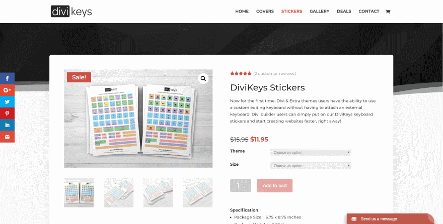
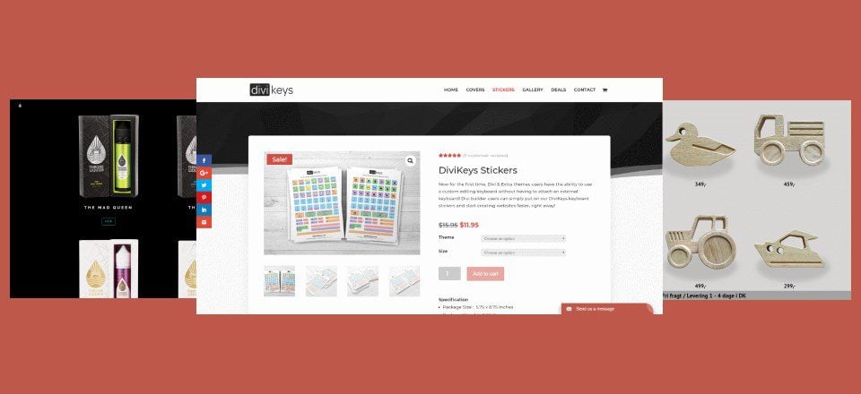
This one uses the Divi Builder to style the product pages, which place the products over a styled background with a boxed shadow. All of the product elements are styled with Divi including the text, buttons, sales badge, and reviews. Clicking on the featured image zooms the image inside its box while clicking the magnifier opens a full-screen gallery.
2. Throne Liquids
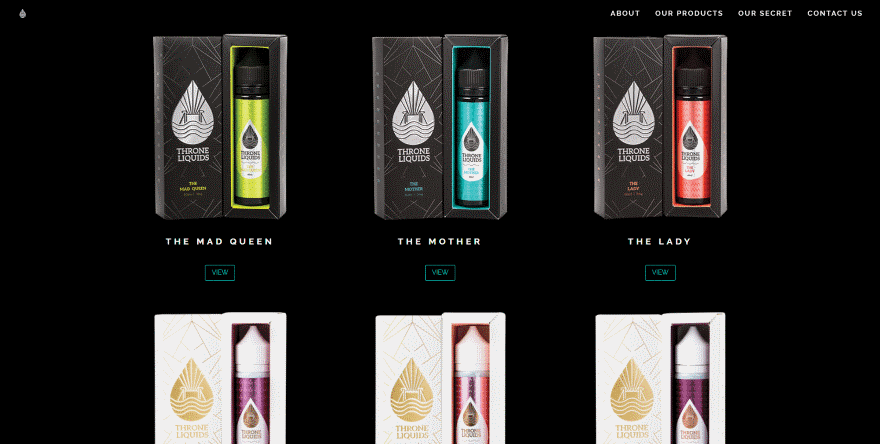
This shop module displays products over a black background. The product images also use a black background and blend perfectly. The products display the name in white and use a dark green button that matches the website’s styling. This site has one of the most unique product pages that I’ve seen. It shows an image of the product’s box, but then on scroll it reveals the product in parallax. As you continue to scroll the product’s description scrolls over the background with an overlay so you can still see the product under the text.
3. Kickbike
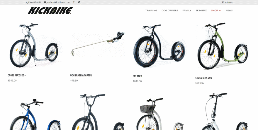
I want one. Okay, now that that’s out of the way… This shop page displays products in four columns that take the full width of the website. They include a red overlay icon that matches the fonts and highlights of the website. The product pages also display in full-width. I like the use of large images and clean product photography. I’m thinking maybe a Cross Max 20D+.
4. Tarte and Berry
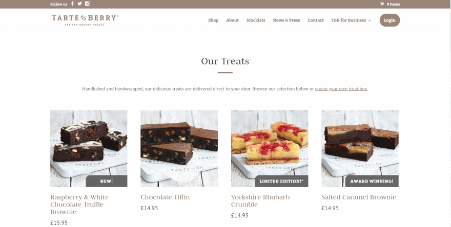
This one styles the fonts and overlays to match the website’s branding. The font styling even continues into the sale badge, which uses a darker background and a lighter color of the same font. The overlay displays a styled icon. The product page includes an interesting buy it now button with an animated icon and gradient hover effects.
5. In-Joy
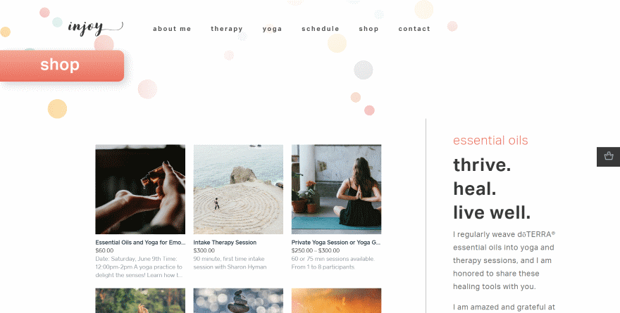
This shop module fits nicely with the page layout. It uses a faint blue overlay and opens the product within a popup on click, allowing you to see the product details, make selections, and add it to your cart without leaving the shop page.
6. Awesome Business Shop
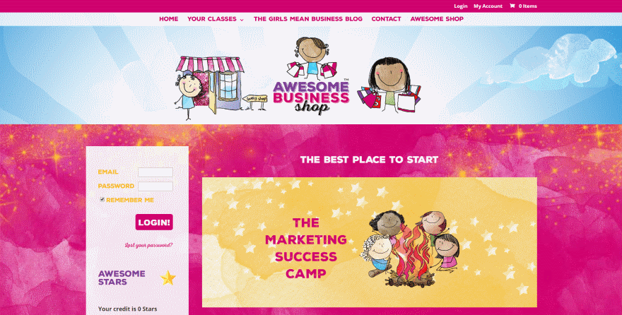
This one places the shop module over the parallax background. Many items have a featured image that matches the art style of the website. It also includes styled fonts and a matching overlay icon. The product pages also include the parallax background and styled fonts.
7. The Bro Basket
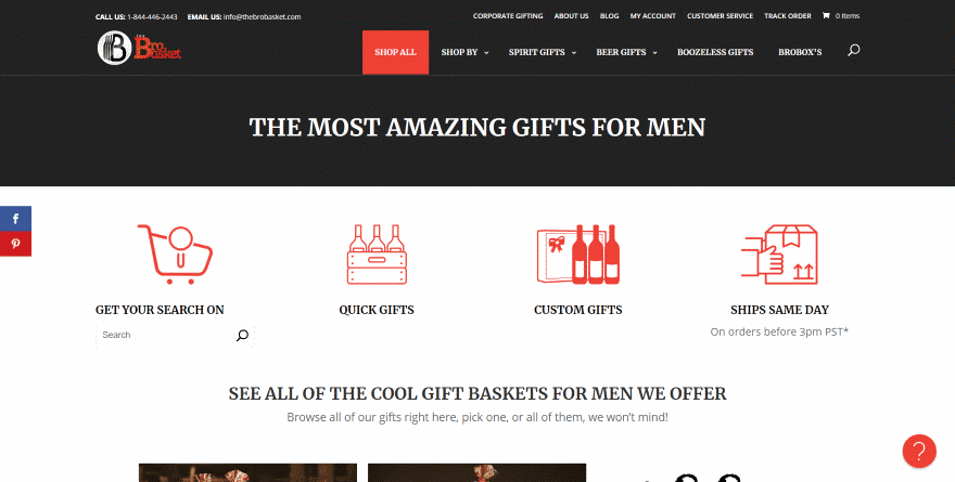
This shop page includes links to several categories using large icons and text. It also has a search feature. The product category pages include a styled sidebar that displays categories and search. The products include styled borders, a hover icon, text that changes color on hover, and a star ratings system. The product pages display in full-width.
8. Coco Cuscino
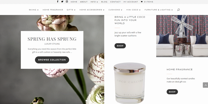
This layout includes lots of styled elements as links to shop categories. They include images, text, dividers, and buttons. The products include styled border and buttons. The individual pages display in full width and include box shadow for the product images, a styled divider, and a styled button.
9. Maison Flowers
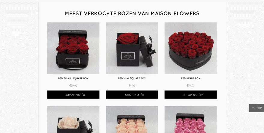
This one displays the shop module within a styled row with a boxed shadow effect. The text and buttons are styled black to match the company’s branding. The products use a slightly dark overlay with a unique rose icon. The product pages use gray styling for the highlights and also includes a styled shop module to display similar products.
10. Wooden Makings
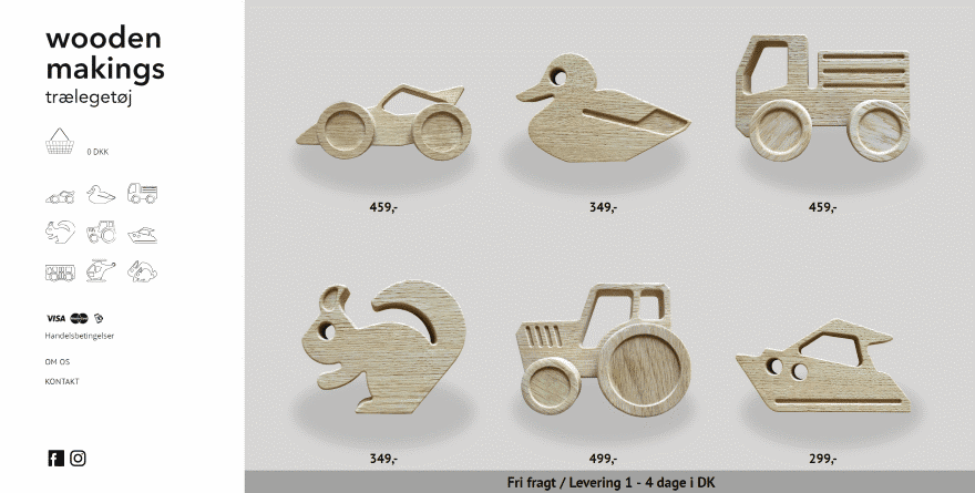
This one displays the products on the homepage as images with a shadow effect and a price. Hovering over the image zooms both the product and its shadow. Clicking on a product opens a product page with images in a slider and a description, and highlights the product’s icon in the menu to the left.
11. Aurora Suspended Fires
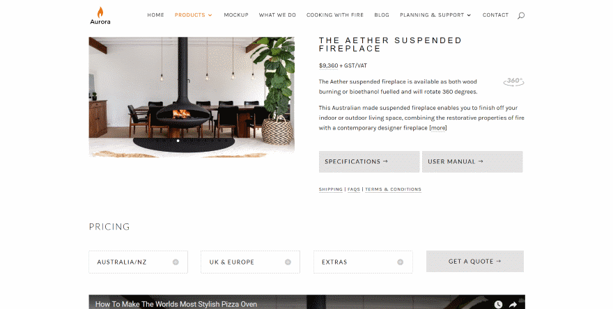
This one uses a clean design for the two-column shop module, which displays a large image over the title, text, and button for each item. The product page displays an image slider, all the expected text, styled buttons, toggles for the pricing information by country, embedded video, and another round of toggles for all the information about the product.
12. Squatty Potty
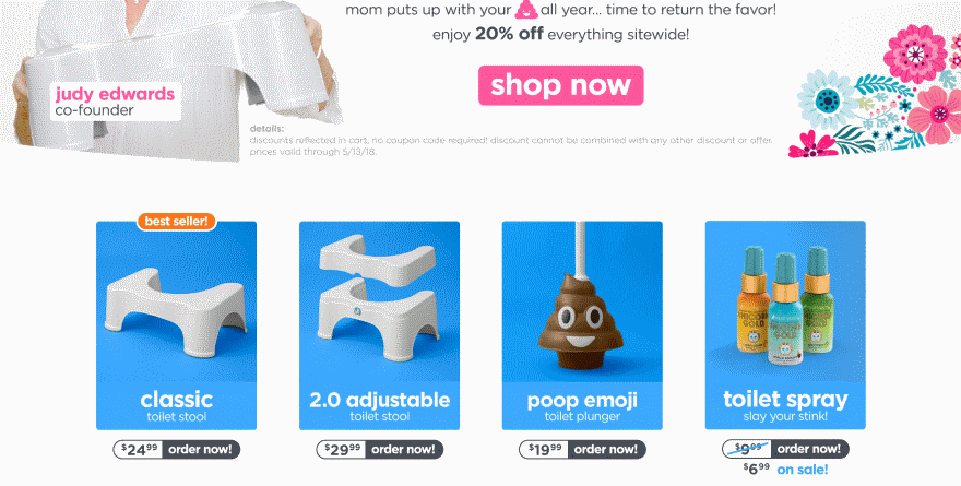
This shop module uses some interesting sales badges. The product images provide the color and include titles and an overlay. The sales badges are rounded buttons with the price and text. The product pages are full-width and include price and button styling. The product description area includes a slider powered by Pixlee.
13. Hipstyle Shop
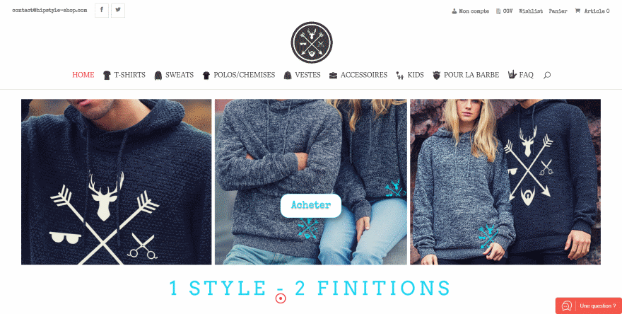
This one displays products and categories several different ways on the homepage starting with the slider in the hero section. Next is an alternating layout with a large image and text on one side for the category and a shop module on the other side displaying products in two columns. Next is a shop module displaying in four columns with a shadow effect for each product with a shopping button in the overlay. The product pages are in full width and include some interesting fonts.
Ending Thoughts
That’s our look at 13 Divi websites with amazing store designs to help inspire you for your next Divi website. For even more help with your Divi store designs there are lots of articles here at the ET blog. Here are just a few of the many articles in the blog:
- How to Add Vehicle Parts Search to Divi’s Auto Repair Layout Pack Shop Page
- How to Add Wholesale Options to Your Divi & WooCommerce Powered Shop
- How to Add Product Wishlists to Divi’s Cosmetics Shop Layout Pack
- How to Turn Your Shop into a Multi-Vendor Marketplace using the Divi Photo Marketplace Layout Pack
- How to Set up In-Store Pickups for Online Orders with Divi’s Free Coffee Shop Layout Pack & WooCommerce
- How to Integrate Your Etsy Shop into Your Divi Website
- 5 Beautiful Ways to Style Divi’s Shop Module
- How to Design Custom Account Pages for WooCommerce, EDD, Memberpress, and more with the Divi Builder
- How to Style a WooCommerce Product to Show Text Instead of an Icon on Hover in Divi
- Getting Started with Divi and WooCommerce
We want to hear from you. Which of these store designs are your favorites? Let us know in the comments.





Anyone know how they edited the product page with Divi Builder for the Divi Keys site?
Thanks, we need more article on Divi x WooCommerce.
I’m actually looking for an article on how to customize product’s page but can’t find it here.. In case you’re looking for some ideas for future posts…
Wow. Its a long list! More Divi user this time.
Thanks for your Store Designs review!
I got inspired by the nr. 5 In-Joy shop solution and took a closer look at their shop. Unfortunately, it is not build by Divi but is an iframes solution.
Nice selection! It’s very inspiring. Here’s another example of a nice store built on Divi -> dogeswag.com
what about sex shop layout pack?
It’s like with the blog archives though, you can’t style product category pages. Just the static pages. Why’s that never mentioned?
You can style the product category or blog archive pages, just copy the original file from either Divi or woocommerce plugin, add it to your child theme and add where you want to add global sections saved to the Divi library.
I’ve tried it but seems to be a little bit tricky
Very nice sites..Elegant Themes should give DIVI more woocommerce options……
The product page, cart and checkout page on the DiviKeys.com site… how on earth was that made? Its not at all something standard with Divi/Woocommerce as of today, is it?
BTW thank you for many great inspirational examples 🙂