The blog is one of my favorite features of a website. It can be difficult to design a blog that stands out from the crowd. Because of this we end up seeing a lot of blogs that use the default design. Fortunately, blog layouts and individual blog posts can be designed and styled with Divi. In this article we’ll look at 11 Divi websites that have cool blog layouts to help inspire you for your next Divi design.
I’m looking at the layout design, card design, use of images, colors, fonts, etc. I’ll show an image of the blog and discuss what I liked about it. The websites are in no particular order. Hang around until the end for a few links to help you design your own cool blog layouts.
1. Daisy and Bump
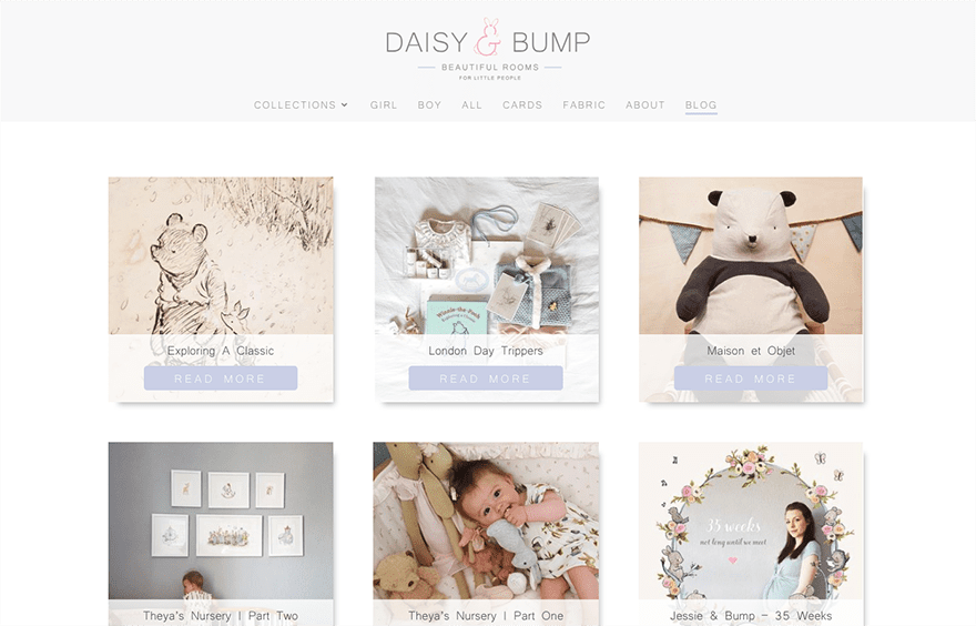
This one uses a three column layout with square cards for each of the blog posts. The cards include a shadow effect. The bottom of the card displays a small title and a large read more button in an overlay. The background for the read more button changes color on hover. All of the colors match the branding of the website. The blog posts also use a shadow effect and adds social buttons under the title. They have no distractions.
2. Military Vehicle
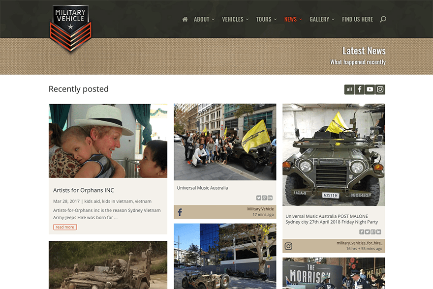
This one uses a three column layout with a styled card design to match the website. What I find interesting though is that the first column are posts from the blog, the middle column are posts from Instagram, and the right column are posts from Facebook. All three columns use the same styling and blend together perfectly while retaining their individual identity. Posts are short and include social feeds in the sidebar.
3. Skill Survey
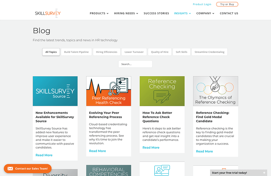
This one displays posts in four columns. It includes a filter which shuffles the cards on click to display the category you clicked on. I like the clean card design that only displays the image, title, excerpt, and read more text. The posts use the standard blog layout with sidebar, but adds social buttons at the top and related posts at the bottom.
4. Need Yesterday
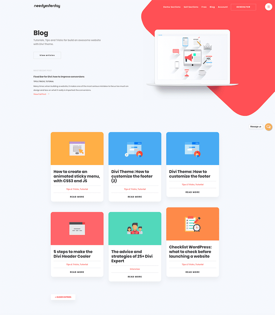
The cards in this three column layout include shadow effects, rounded corners, large title text, categories separated from the other text by lines above and below and printed in red, and read more text at the bottom. I love the flat image designs for the featured images. Each of the elements are clickable. The posts display the feature image in full-width with the title, categories, an overlapping author image, overlapping follow buttons, meta, sharing buttons, and the post in single column with no sidebar.
5. WP The Podcast
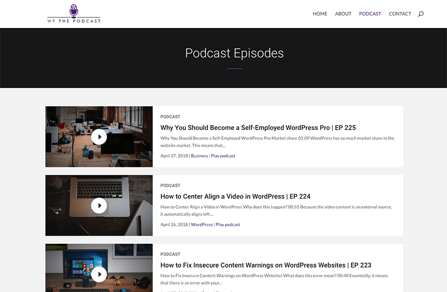
This blog focuses on a podcast rather than just text, but all of the blog elements are there. It places the posts in a single column with the featured image to the left and the category, title, excerpt, and meta to the right. Hovering anywhere on the card zooms the entire card. The posts themselves display the featured image to the left with an audio player to the right in full-width and then the text in a single column.
6. Createam
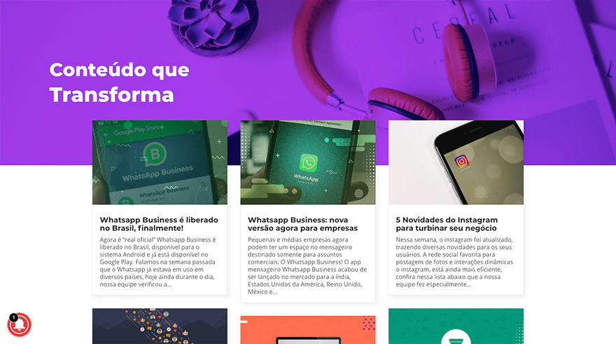
This layout displays posts in three columns with the first row overlapping the section above. The cards have a shadow effects and show the featured image, title in bold, and an excerpt. The posts show the featured image in full-width with the title and author’s name, followed by the text in either a single column or with a sidebar.
7. Les Anagnou
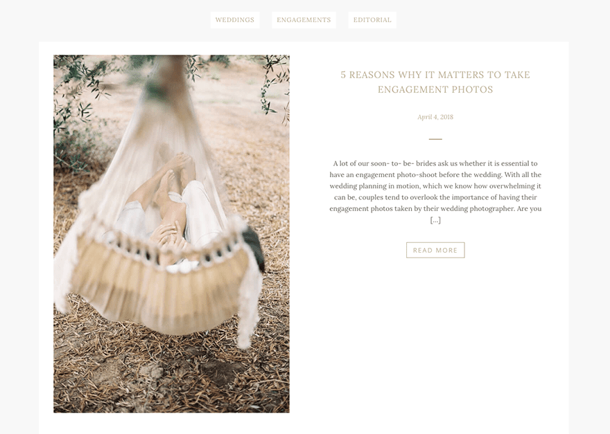
For this one the tall featured images slide in from the left side on scroll to sit next to the post title, date, a divider, excerpt, and read more button- which are all styled to match the website. Category buttons are placed at the top of the page. The posts use a boxed design with a large featured image. The text area overlaps the image and displays the title, divider, a quote, and the post followed by styled sharing buttons.
8. Airglow Digital
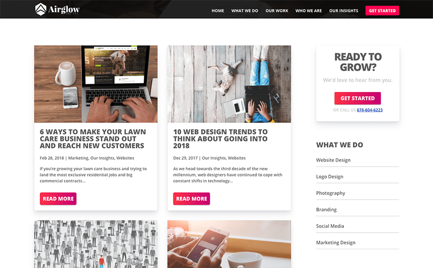
This one displays post cards in two columns with a sidebar. The cards use shadow effects and display the featured image, large and bold titles, meta, excerpt, and styled read more button to match the site’s styling. The posts display the featured image in full-screen with the title and meta, followed by the text and sidebar. The posts use large fonts for headers that stand out nicely.
9. ASBA Creative Studio
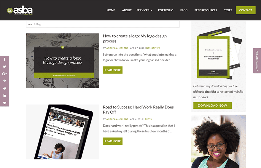
This blog has a search box above the posts and displays posts in a single column with a sidebar. The posts show the images to the left with the title, meta, short excerpt, and read more button to the right. The meta and button are styled to match the site’s branding. The posts follow the same layout design and add related posts and a nice CTA.
10. Design by Krista
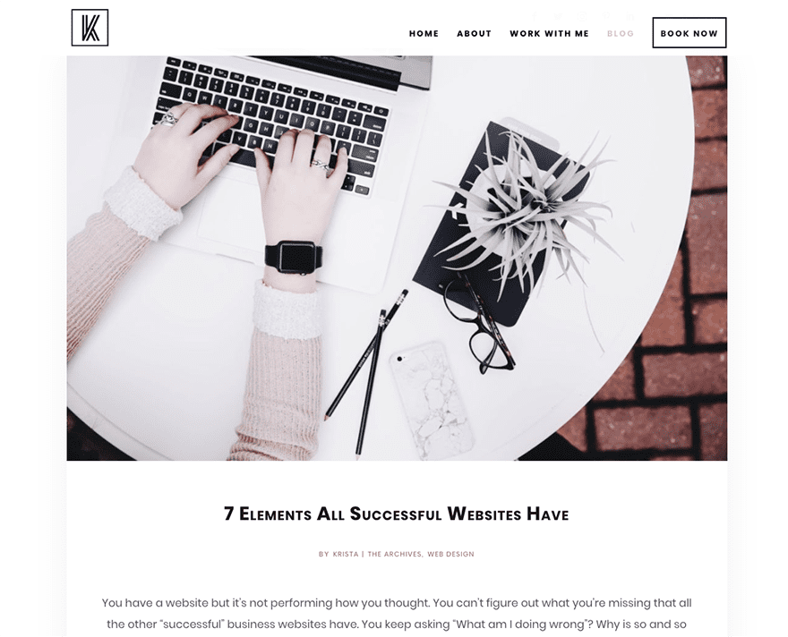
This blog displays post cards in a single column with large featured images above the posts, title, meta, excerpt, and a styled read more text. The cards use a shadow effect and the content is centered. The posts follow the same design and add related posts vertically. The posts have a box shadow effect. The minimal design is clean and easy to follow.
11. Acqua Strande
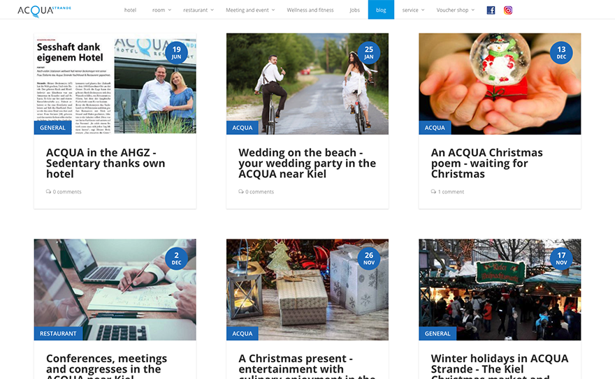
This blog uses the Divi 100 Article Cards plugin. The cards show the featured image with the date in the upper right corner and category in the bottom left corner, the title, and comment count. On hover the cards display a shadow effect and the title moves up to show an excerpt. The posts display an image and an overlapping section that includes the three latest blog posts. The content is placed within a boxed row with a dark background and light border over a tan background for the section, and includes alternating images with borders.
Ending Thoughts
That’s our look at 11 Divi websites with cool blog layouts to help inspire you for your next Divi website. For even more help with your Divi blog designs there are lots of articles here at the ET blog and some even have a few downloads. Here are just a few:
- How to Add Custom Templates and Design to Divi’s Blog Post Formats Part 1, Part 2, Part 3
- How to Style Your Divi Blog Page to Look Like Elegant Themes’ New Design
- How to Style Divi’s Single Post to Match the New Elegant Themes Post Design
- How to Create a Medium Style Blog with Divi
- How to Color Code Divi Blog Posts by Author
- Changing The Length of Your Divi Blog Post Excerpts
- How to Style Your Divi Blog Module Grid Cards (With 4 Examples)
- How to Insert Ads Above, Inside, and Below Your Divi Blog Post Content
- How to Add the “Last Updated” Date to Divi’s Blog Post Meta Data
- Tips for Designing Great Longform Content on WordPress
- Free Divi Blog Post Layout Pack Will Take Your Builder Powered Articles To The Next Level
We want to hear from you. Which of these blog layouts are your favorites? Let us know in the comments.



So how do we get these themes?
So… these are great, but how do we actually get them? The showcase of the Divi themes is super, but now I want to tailor airglow and have no idea how to!
Anyone able to help please?
Excellent article with awesome information. Helpful and effective.
I love all of your articles, here I got amazing solution for Divi theme.
Thanks!
Great, but how about implementing better headers and blog modules? It’s about time…
An easy approach for setting up a blog website on the go.
I also like to say, that site security is also must. Because hackers quite easily hack WordPress sites.
There are some very useful plugins for security. just need a search, on WordPress plugins directory.
Several of these are beautiful. But as with my comment about the new (lovely looking) author layout, they share the same restriction. As an author and publisher, I want to blog about books. And the images that I want to include are book jackets and front covers.
And yet every single Divi blog layout page I have ever seen uses landscape images. If you try and use a book jacket, then layouts either force the landscape view and cut off the top and bottom of the book cover, or the image becomes absolutely vast in order to conform to the blog layout image’s width setting.
Selling books is fine – you can almost always make product images portrait rather than landscape. But blog listings pages? Not a chance.
Divi is a wonderful theme – and these are all great blog layouts – but Divi’s blog layout options are just too limiting for authors or publishers. I’d love to see the flexibility of Divi extended to portrait images to accompany blog posts and blog layouts.
Really great blog layouts.
I liked need yesterday blog layout, the unique I thought one 🙂
Thanks! for sharing.
We love the Need Yesterday blog style, We will look to introduce this to our Baby Boutique website Itty Bitty Boutique.
We just use the stand Divi module which is okay but looking for something which will stand out and look appealing to our users
It is long overdue that Elegant Themes updates and give users more layout options for the Blog Module in Divi. Extra was a step in the right direction, but Divi is the flagship theme.
Thank you.
These are very inspirational. Thank you. Can you please tell me what plug-in was used for example #2 to be able to alternate social feeds in the 2 columns on the right?
Thank you for posting the different design options.
However, I would love to see Divi improve on this, giving us more options for the blog page. Especially the left featured image alignment blog style.
It’s very disappointing that many of us have requested this feature on Divi for years and it has been ignored over and over.
How many of those use the actual Divi Blog module for this? that’s the question.
Need Yesterday is definitely my favorite! I love the purple! The design is amazing…
Some of these sites are ‘painfully’ slow at loading!
Agree with many, the Divi Blog layout and grid is appalling, we’ve not used it for years, opting for Essential Grid where we style to match the sites.
One day, ET will stop filling the site with toys and address basic functionality like the more column options and blog layouts.
Let’s not even talk about the columns and the horrific layout framework. You could make that infinitely more flexible by eliminating the restrictive 4-column format and moving to a percentage-based structure like most modern layouts.
Nice to see what’s possible if you know your way around with custom CSS, but most Divi users are not.
It’s about time that Divi’s blog module gets an update so we have more design options for the blog module with the Divi builder. Why not add all blog specific modules from Extra into Divi? Including the tabbed feed, rating, author box and category builder.
I agree. I see so many of us asking for this exact update over the past few years and it has been ignored every time. Would be nice to hear they are at least working on it.
I completely agree with Eric’s, Alberto’s and Dave’s comments. Blogs are totally important to me and I don’t understand why the blog module is treated so carelessly by the DIVI developers. My support questions in the forum always had something to do with post-contributions…
I second this! The blog module has been neglected. Also, Divi should have a stronger integration with Woocommerce as well. I’m tired of the same ol tired look.
I would love to see some development in the blog modules as well.
How comes that most blog-designs are recipes from other people and not standard part of DIVI itself? Like those recipes from DiviSoup for example?
And yes, the world adores blogs with military vehicles, that’s exactly what the world needs now…
or did you choose this example because DIVI is a “killer tool” as well?
Very cool the filter of the number 3.
Can we implement the same in Divi blog module?
Thanks for the suggestions ..
Unfortunately, this post shows clearly that the impelling way of DIVI is the wrong one. Instead of giving the normal DIVI user simple but important new modules, DIVI tries to educate users more and more to “developers”.
When will finally come the multifunctional header, slider or blog module ..?
Personally, I’m disappointed because I can not really do much with the latest updates. And I’m not alone, that’s for sure!
Thank you
So true!
needyesterday’s main header menu is pretty great too with the images and call-out shaped dropdown. Anyone know how to do any of that?
Somehow my comment vanished obviously again, hmm.
We need the functionality from the Extratheme blog modules, they are hardly missing in Divi.
This is all great but we’re still(!) stuck with Divi’s basic archive and category layouts.
Nearly every website has a blog and our clients are crying out for blogs that completely match their site – not just the blog page!!!!
Stop with the fancy updates and fix this basic functionality. Extra has it!
I agree. Blog functionality and design is a massive weak point of Divi.
Totally agree… It’s a shame
Completely agree. ET has been ignoring this request from its users for years and still no movement of fixing it. Most of these designs would not be necessary, if we had the power of the Blog module in Extra. Instead of having to cobble together modification to the blog page, blog post, and other blog elements individually, we could simply focus on styling one module and save us time and effort.
I definitely agree with this…
Agreed!
I just have fallen love with these cool blog themes :
1. Need Yesterday,
2. Airglow Digital,
3. Createam
These are the best and clean design blog I have ever seen.
Hats of to the blogger who customized their’s blog in such awesome design.
How do I submit my blog?
What do you mean by submit?
Hey Randy…
I want to make something diferent with Single post layout with Divi.
There is a way to reach this with Divi builder?
Cheers from Mexico
Hi Max. Absolutely! There are plenty of other ways you can do it, but here’s my current method:
I create a layout and save it to my library. I use a post title module, text module where all my content will go, and then a CTA. I’ll usually place post navigation in there somewhere. Once I write my article I save it, copy the content, load the Divi Builder and my template from the library, and paste my content into the text module. You can add image modules or any other modules you want, but I just use the text module.
Does anyone else have a method they want to share?
Your method (also shown in some more recent tutorials, i.e. https://www.elegantthemes.com/blog/divi-resources/how-to-make-the-interior-design-layout-pack-social-media-ready-with-divi-monarch) means that you can’t change your blog post design/layout globally in the future, unless you use global sections, rows and/or modules. But it would be better if Divi implemented blog page design via the WP theme customizer settings to allow for global settings changes to take effect as part of WP core. The same applies to many other global settings missing, like the h1-h6 headings that should be able to be defined inside of the customizer and then just changed within individual modules on a need-basis. I believe ET are working on something but it has been taken quite some time for these essentials. I would also like to more easily design blog post pages and sections (listing the blog posts) with 1000 different design options, in conjunction with the customizer.
I am guilty of neglecting the blog design (I don’t have many clients with blogs). But these are inspiring designs. Colin’s Daisy and Bump ties particularly well with the subtle and whimsical branding/design of the entire site.
I haven’t tried Divi but the diversity of designs/layouts it’s capable of is awesome! They all look clean and professional. Really nice examples, guys. Keep up the great work.