Find It In The Divi Marketplace
DiviAgency is available in the Divi Marketplace! That means it has passed our review and has been found to meet our quality standards. You can visit GetWebDesign in the marketplace to see all of their available products. Products purchased from the Divi Marketplace come with unlimited website usage and a 30 day money back guarantee (just like Divi).
DiviAgency is a third-party child theme for Divi with a minimal but colorful design. Several pages are included that focus on services, making this a great choice for an agency. It includes illustrations in multiple formats, and you can color them to match your website. In this child theme overview, we’ll look at DiviAgency to help you decide if it’s the right Divi child theme for your needs.
Installing DiviAgency
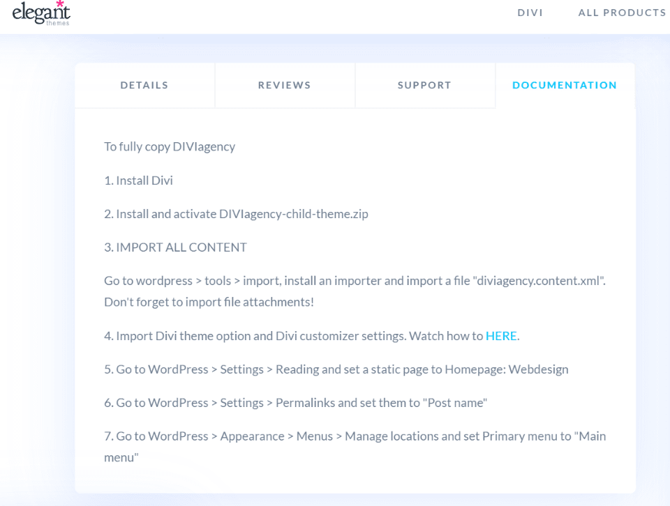
You’ll find the instructions to install DiviAgency in the Documentation tab for the product page in the Divi Marketplace. They’re also in the zipped supplement file. The child theme file can remain zipped, but you’ll need to unzip the supplement file to import the extra files.
Installation is a little more complicated than most Divi child themes. It’s not difficult, but it does require several steps. The main difference is you’ll have to import the demo content using the WordPress importer, the theme customizer, and the Divi theme options, and then set the home page, permalinks, and menus manually.
The instructions do step you through it with simple steps and it includes a video to show the steps. I found them easy to follow. It didn’t mention the theme builder, but the zipped file included a theme builder file, so I imported it as well. I recommend importing the Theme Builder file since it adds a sharp custom footer and sticky buttons to the side of the screen.
Pages
DivAgency adds several pages:
- Webdesign (home page)
- Blog
- Contact Us
- Graphic Design (service page)
- Portfolio
- Pricing
- Privacy Policy
- Successfully Sent
- Website Maintenance (service page)
Let’s look at some of the DiviAgency pages and features. The screenshots are from my test site with no modifications.
Webdesign
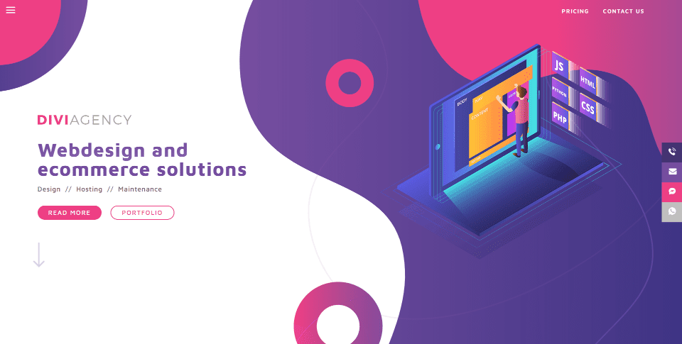
The Webdesign page is the home page. The first things you’ll notice are the colors, circular design, graphics, and sticky buttons. Many of the background elements and graphics use transitional settings to float or animate as the page loads or scrolls. Most pages include a version of this header.
A CTA on the left highlights the services. The Read More and Portfolio buttons have hover animations that change their colors to match others in the layout. An animated down arrow draws attention to scroll down. On the right is a graphic that matches the design of the layout. The background includes a pattern and circular graphics that are used throughout the design.
Blurbs
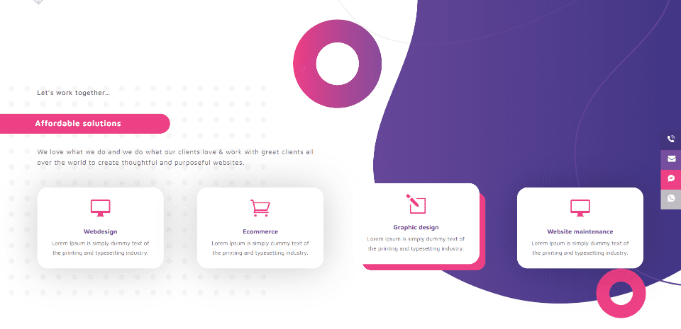
The next section includes styled blurbs to show the services. They have large icons and hover effects. In this example, I’m hovering over the third blurb, which removes the box shadow and displays a border on hover. The background patterns continue from the previous section to this one.
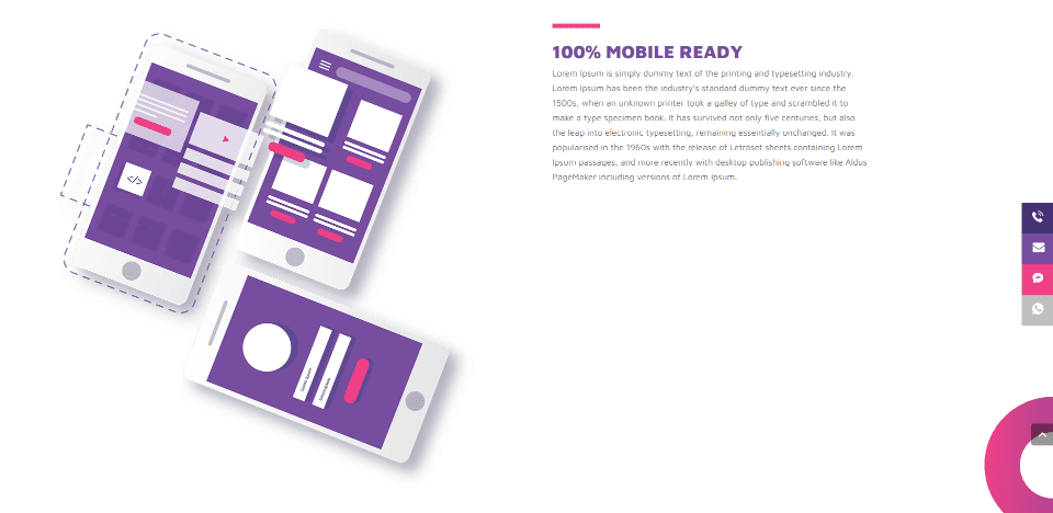
The third section shows graphics on one side and text on the other. This is great for highlighting a service. It has a clean background and displays a portion of a circular graphic.
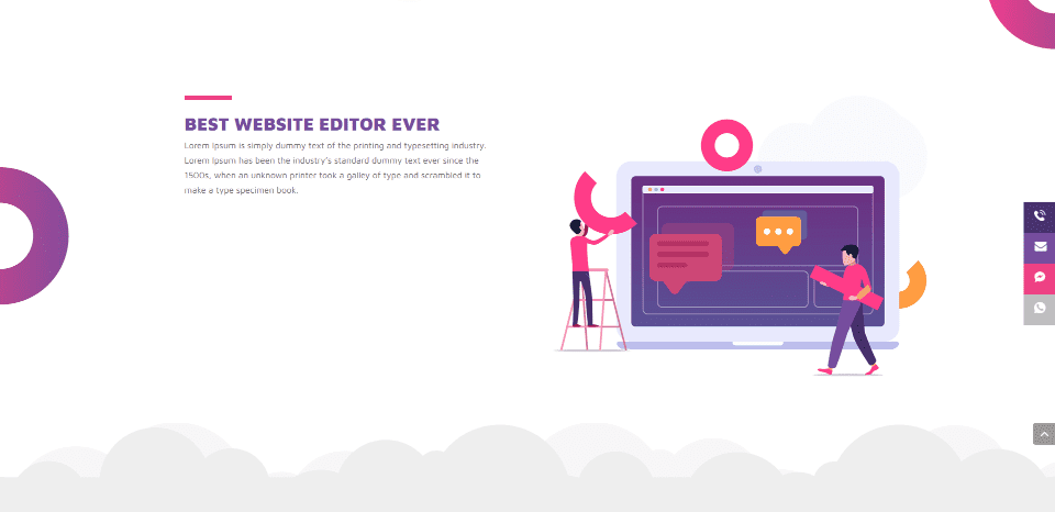
The next section is similar but uses an alternate layout from the previous section. The graphics fit with the rest of the design. Clouds divide this section from the next one.
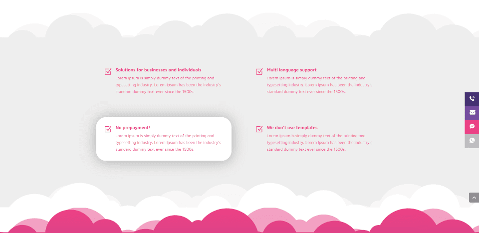
This section displays a set of blurbs over a gray background that blends into the next section. One of the blurbs is highlighted with a box shadow.
Services
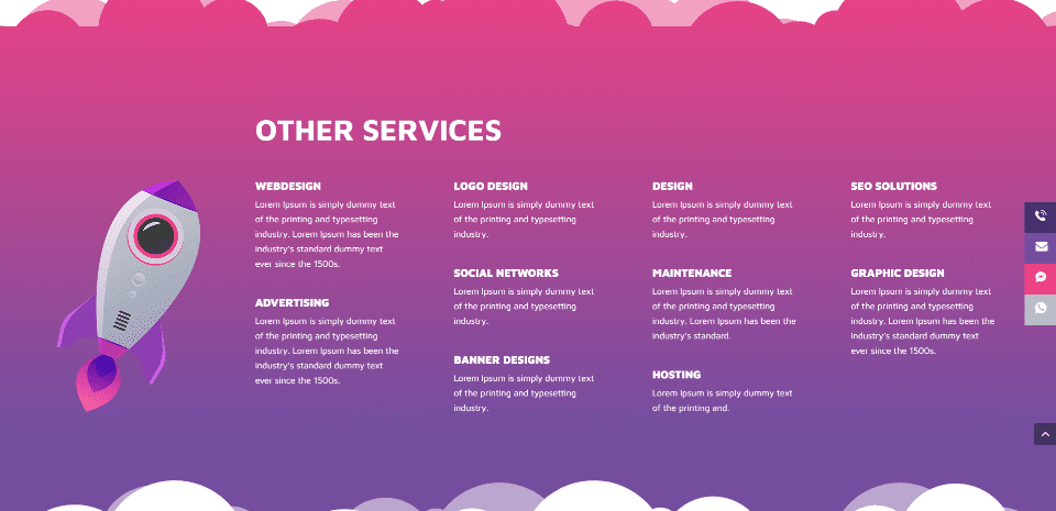
A section for other services displays a large graphic over a background gradient. The services have titles and short descriptions.
Testimonials
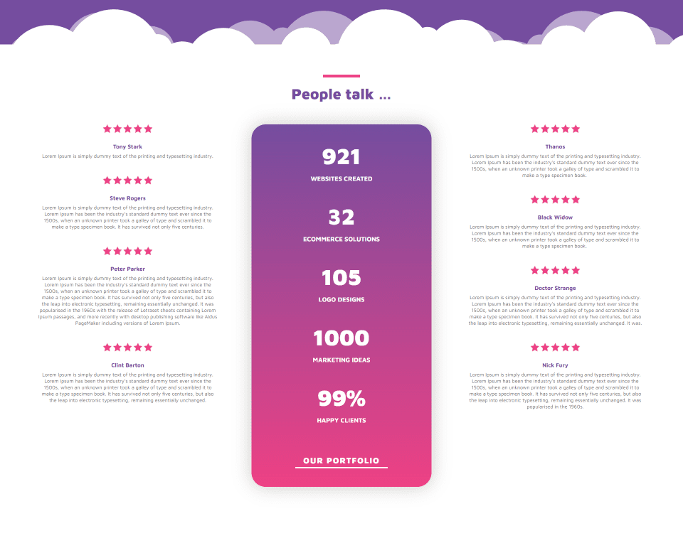
Testimonials are placed around a styled block of stats with number counters. The testimonials include a star rating.
Blog
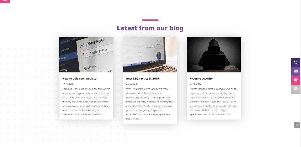
The blog section displays the latest blog posts over a styled background. These posts were added by the child theme.
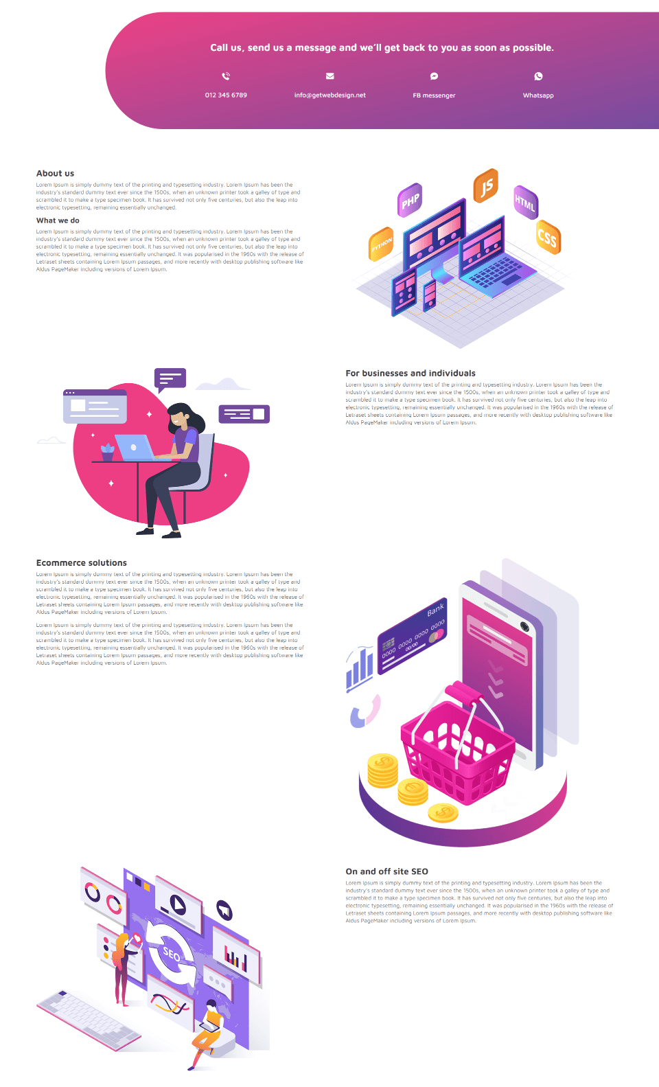
A large section with information provides clickable buttons in a styled row that match the sticky buttons. More information is placed within an alternating layout with large graphics. This is an excellent way to display information while keeping the layout clean and interesting.
Footer
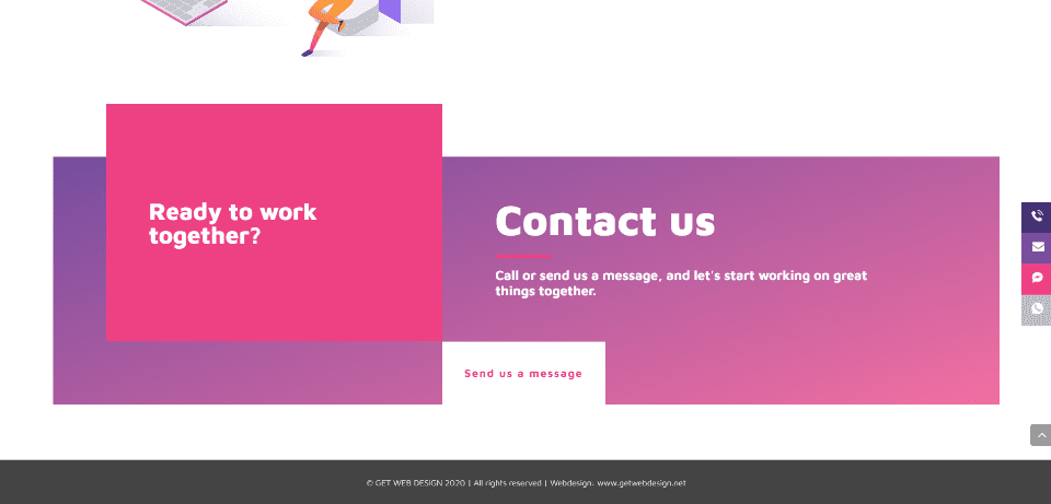
The footer is created with the Theme Builder. It includes several blocks of color and text as a CTA and a clickable button that’s linked to the contact page.
Graphic Design
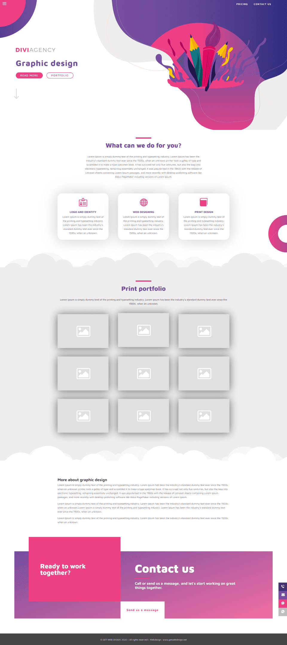
The Graphic Design page highlights a service. It includes a header and the footer that’s found on the other pages and includes a section to introduce the service using text and blurbs. Examples of work are displayed within a gallery with box shadows for each image.
Website Maintenance
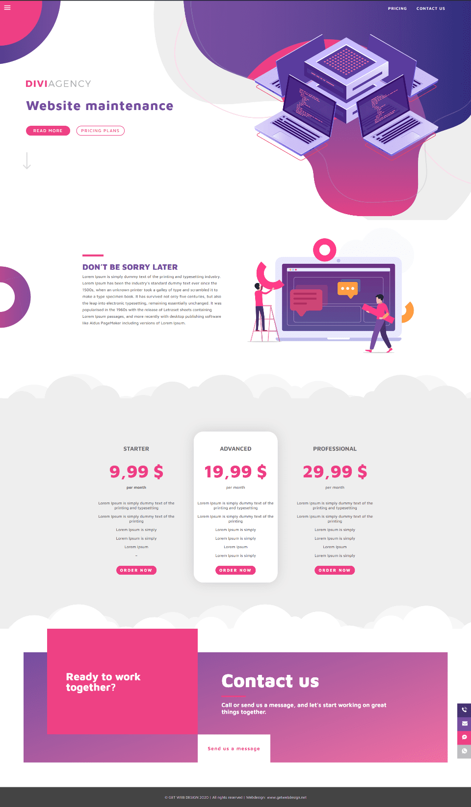
Website Maintenance is another service page. This one adds a pricing table to the header, footer, and introduction section. The pricing table is placed over a background with cloud dividers to stand apart. Two of the tables blend with the background while the center table uses a different color and a box shadow.
Portfolio
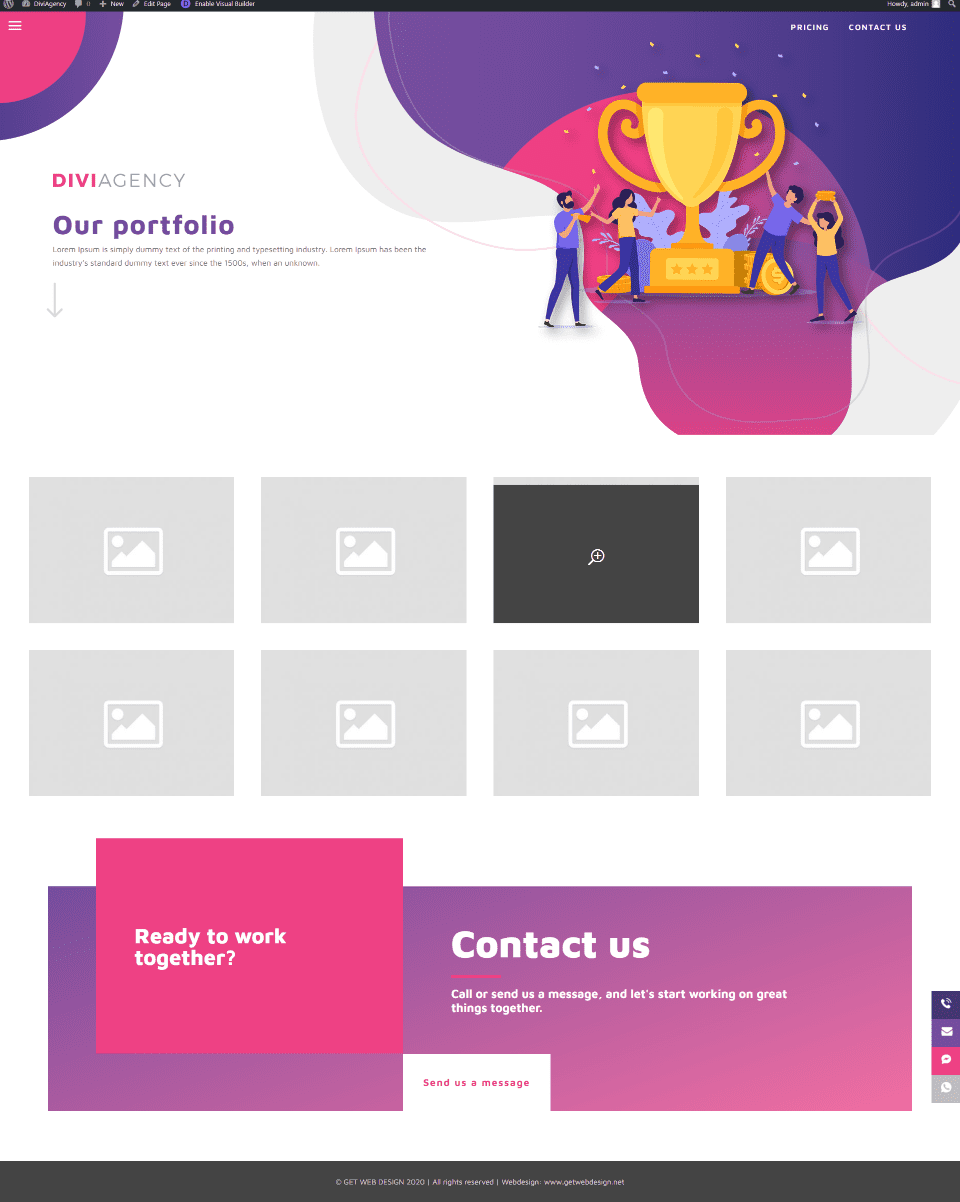
The portfolio page is simple but effective. It includes a header that matches the rest of the site, but with a unique illustration. It also uses the global footer. Work is displayed in a gallery.
Blog
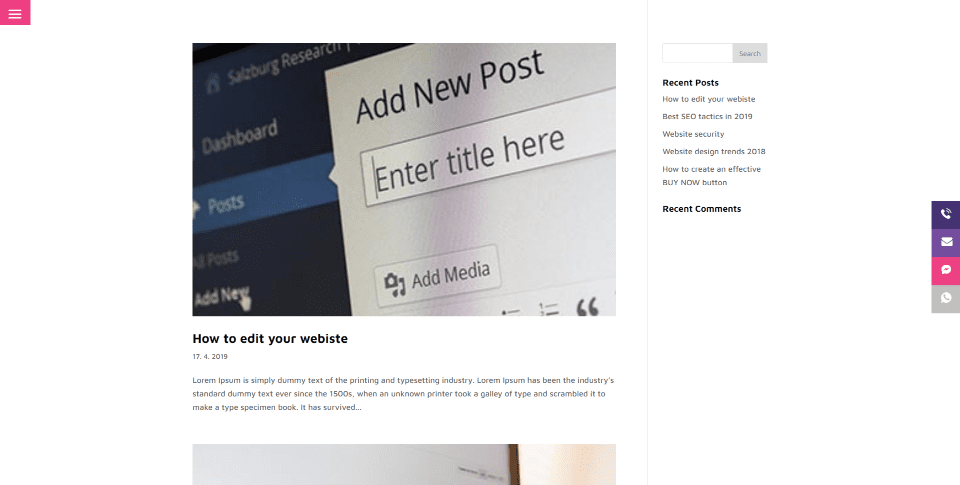
The blog is simple and clean. The blog page and the posts don’t include a header but they do include the global footer. The sidebar adds a search box, recent posts, and recent comments widgets.
Pricing
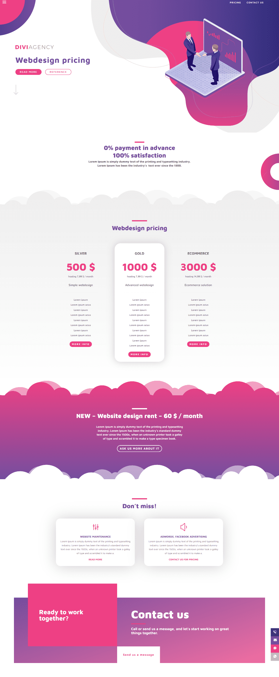
The Pricing page adds pricing tables, a CTA section with cloud dividers, and a section of blurbs that link to the main services.
Contact Us
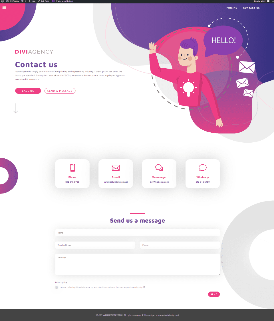
The Contact Us page includes a header but not the global footer. It adds blurbs for the contact information and a styled contact form that shows a red border on the left side of a field on hover.
Sticky Icons
![]()
The sticky buttons open on hover to reveal their content. Each button is clickable. This shows the phone icon.
Menu
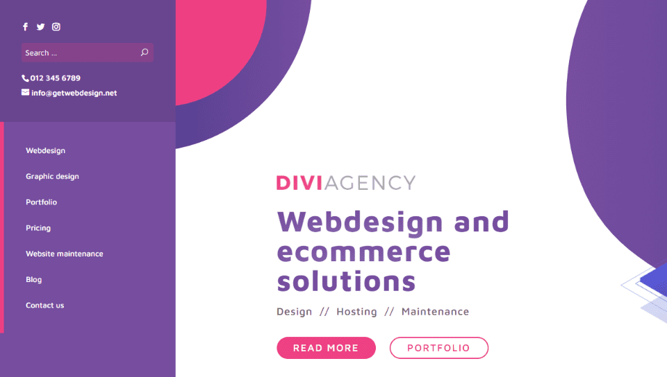
The menu uses the slide-in style and adds a hamburger icon. It opens from the left and includes a styled background in two sections. The top section displays social buttons, a search box, phone number, and email. The bottom section displays the color of the hamburger menu on the left edge and links to all the main pages. Everything is clickable except the phone number.
Theme Builder

Layouts for the Theme Builder add two custom footers. The first is global (as seen in green), so any change you make to this footer is reflected on every page that uses the global footer. The second is specified for the Contact Us page, so it overrides the global footer.
Global Footer
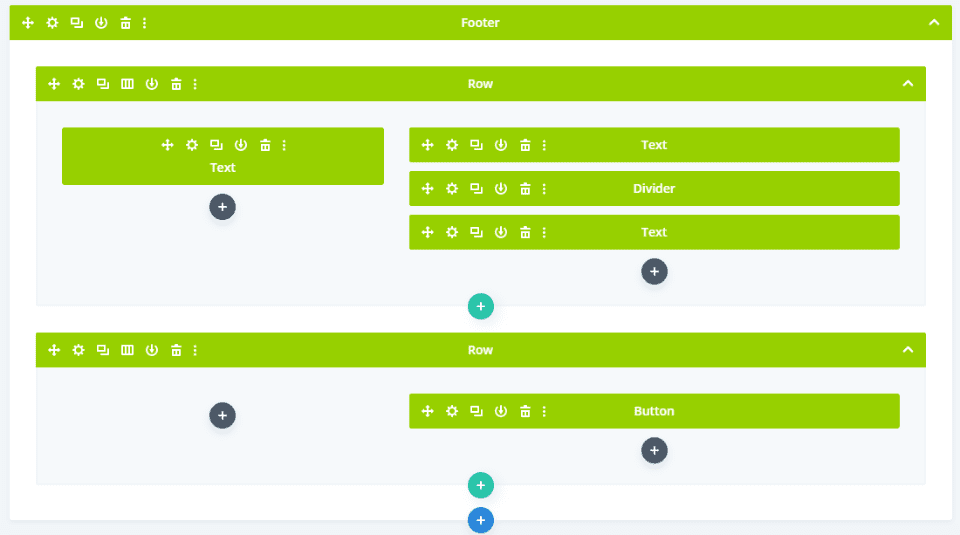
The first section of the global footer is extensive. It includes several two rows with text, a divider, and a button.

Here’s how the global header looks in the visual view within the Theme Builder.
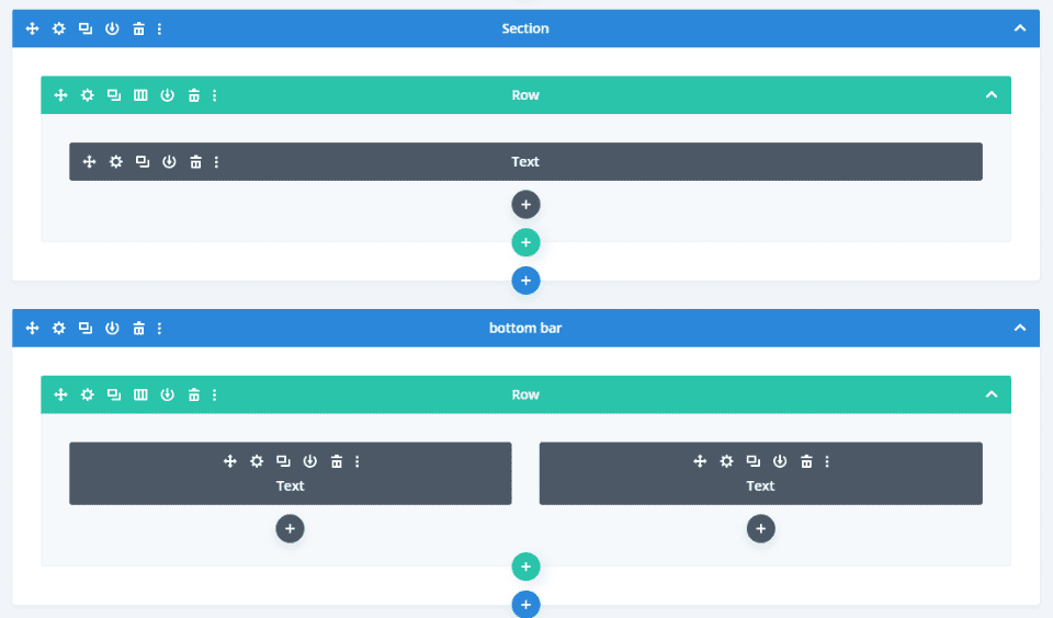
The next section is the bottom bar. This is where you’ll add your own text.

Here’s how it looks in the visual view.
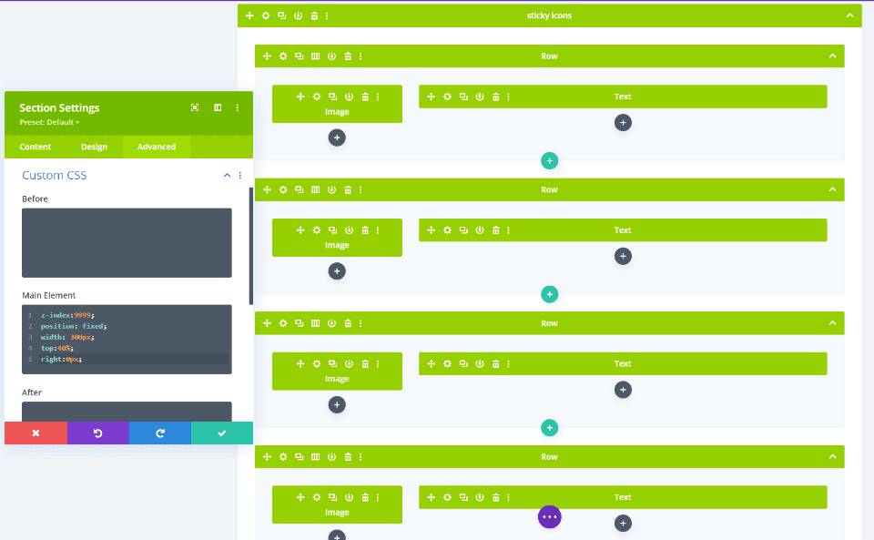
The Sticky Icons are created in the global footer. Each button contains an image and a text module. These elements are also global, so changing it here changes it everywhere that uses the global footer. It’s made sticky using custom CSS that’s already added to the section. You won’t need to handle the code.
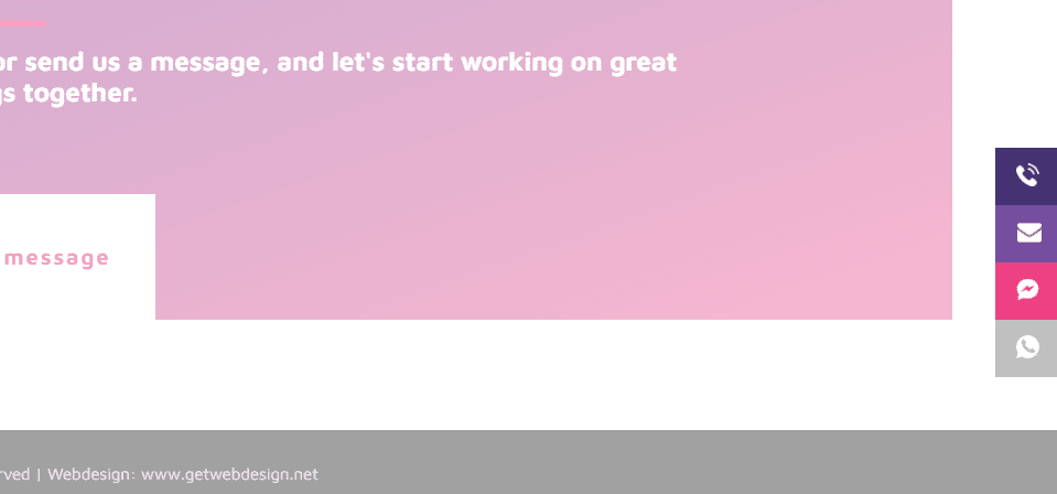
Here’s how it looks in the visual view. It sticks to the side but doesn’t show the text on hover in the builder, which is normal.
Contact Us Custom Footer
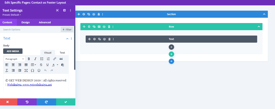
The Contact Us custom footer uses a text module to display a message with links. This is a good choice if you just want a simple footer. This one is not global by default.

Here’s how it looks in the visual view.
Divi Library
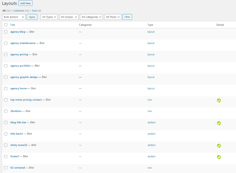
The layouts are added to the Divi Library. This makes them easy to use on other pages and with the Theme Builder. Several layouts are global.
Illustrations
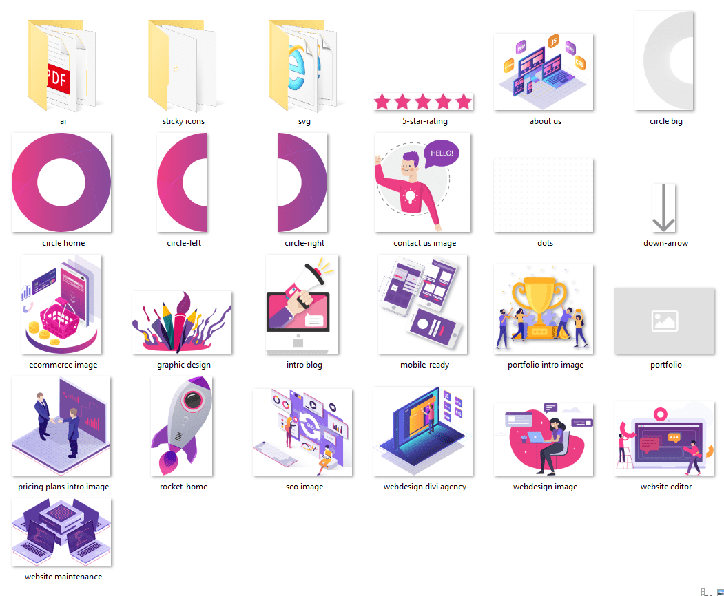
A folder in the child theme supplementary files includes illustrations in .png, .pdf, and .ai formats. They can be recolored to match your website. This example shows the PNG’s. They’re mostly the illustrations used as the graphical elements within the content on each page. A few are used for background patterns.
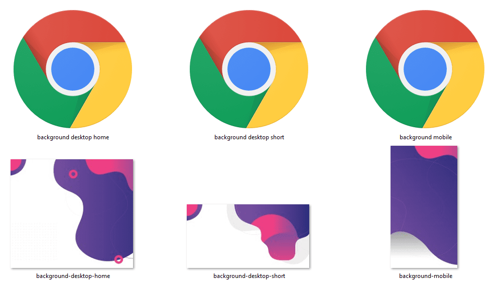
Here are the background elements. It provides elements for desktop and mobile. They’re provided as SVG’s and PNG’s. The SVG’s show the icon of the app you’d use to open it. In my case, that’s Chrome.
Where to Purchase DiviAgency
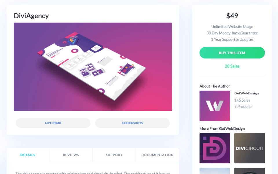
The DiviAgency child theme is available in the Divi Marketplace. It costs $49 and includes unlimited website usage and 1 year of support and updates.
Ending Thoughts
That’s our DiviAgency child theme overview. It’s a simple Divi child theme, but it has an elegant design that’s great for any type of website to show services. It does take a few extra steps to install, but it’s not difficult and the instructions are easy to follow. I love the colors and design of the layouts. The pages do focus on services, but it can be used for any type of website that needs a minimalistic design.
We want to hear from you. Have you tried the DiviAgency child theme for Divi? Let us know about your experience in the comments.
Featured Image via Sentavio / shutterstock.com


Simple but very powerful child theme! Thank you randy for sharing this.
Love the theme! If someone figures out how to close the hamburger menu, let me know. Definitely on the “need” list except for that oddball issue.
Good child theme, how is the hamburger menu closed?
nice looking theme. How are you supposed to close the menu once it’s opened?