DiviHvac is a child theme for Divi that’s designed with HVAC companies in mind. It comes with 12 main pages, a custom header and footer, a custom slide-in, CSS, bold colors, and more. In this article, we’ll take a look at the DiviHvac child theme to help you decide if it’s the right child theme for your needs.
- 1 Installing DiviHvac Child Theme
- 2 DiviHvac Pages
- 3 DiviHvac Child Theme Homepage
- 4 DiviHvac Child Theme About Us Page
- 5 DiviHvac Projects Page
- 6 DiviHvac Single Project Page
- 7 DiviHvac Services Page
- 8 DiviHvac Single Service Page
- 9 DiviHvac Blog Page
- 10 DiviHvac Blog Layout
- 11 DiviHvac FAQ Page
- 12 DiviHvac Child Theme Testimonials Page
- 13 DiviHvac Child Theme Coupons Page
- 14 DiviHvac Child Theme Contact Page
- 15 DiviHvac Child Theme Thank You Page
- 16 DiviHvac Theme Builder Layouts
- 17 Where to Purchase DiviHvac
- 18 Ending Thoughts
Installing DiviHvac Child Theme

Installation is done manually. This isn’t difficult to do and the documentation on the product page steps you through it. With Divi activated, upload and activate the DiviHvac child theme. Once it’s activated, you’ll need to unzip the extra file that came with the child theme and import them into the Theme Options, Theme Builder, Theme Customizer, and Divi Library. You’ll also need to create your menu and set your home page manually.
All of these steps are simple, but it does take a few minutes longer than if it were a one-click solution. The instructions are easy to follow and the files are labeled well, so this helps.
DiviHvac Pages
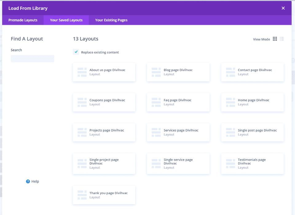
The DiviHvac child theme adds 13 layouts to create your pages. You’ll need to create them manually. They include images and place-holder images. We’ll look at a few of them.
DiviHvac Child Theme Homepage
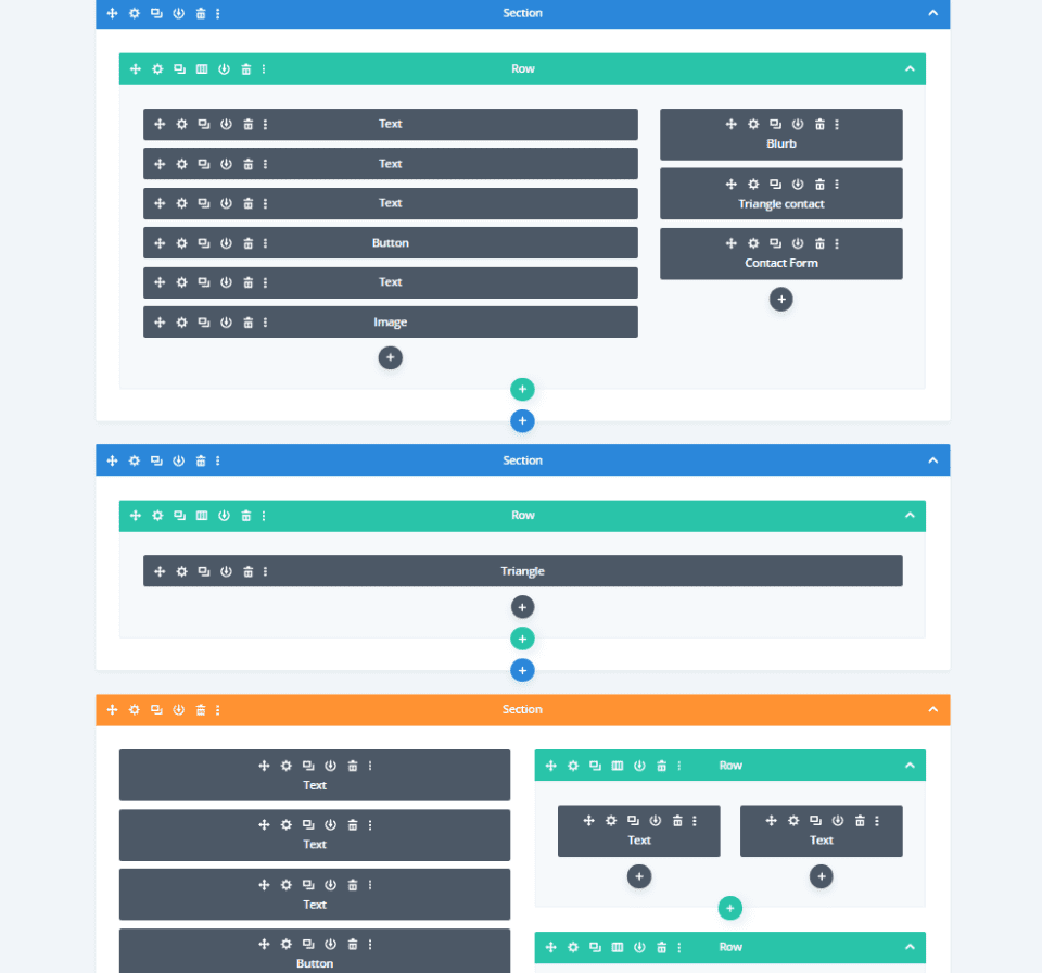
The DiviHvac homepage is complex and includes lots of modules to create an elegant design. The hero section includes a styled contact form as a CTA. Triangles are created with CSS in text modules.
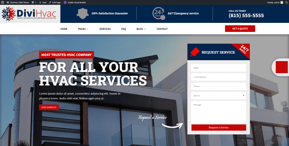
The layout has lots of bold red, white, and blue throughout. The hero section includes a full-screen background image, a message on the left with a button to see the services, and a contact form on the right to request services.
Services
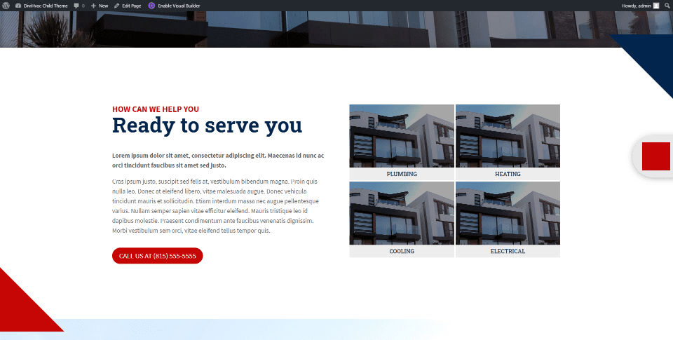
Services are shown with a detailed description and images as links to the services pages. The images include overlays that reveal the image on hover. This section includes triangle dividers in the corners created with CSS.
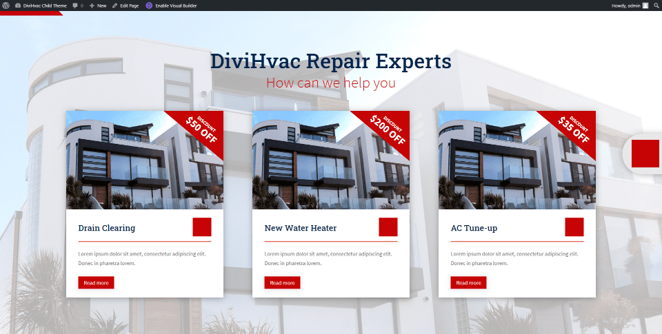
Specific services display as cards over a background image. The cards are created with images, text, dividers, and buttons. They include a triangle in the corner of the image to show a discount.
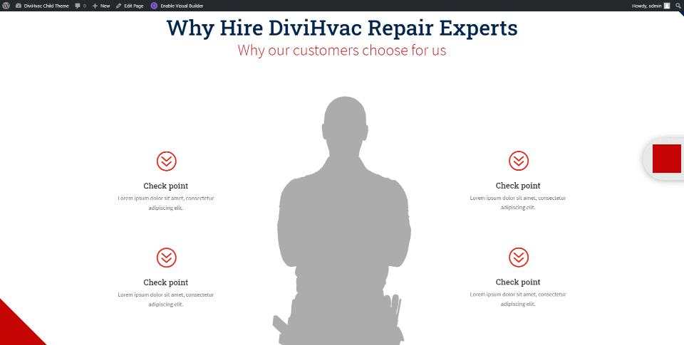
A section about the benefits of hiring the company shows information in bullet points with a placeholder for an image of a technician in the center. I like the use of color, typography, and whitespace in these layouts.
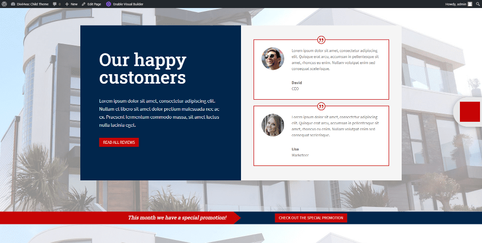
Testimonials appear next to a sharp CTA over a background image. They include a styled border to match the site. Under the testimonials is a slim CTA that links to a special promotion. The red and blue stand out well.
Projects
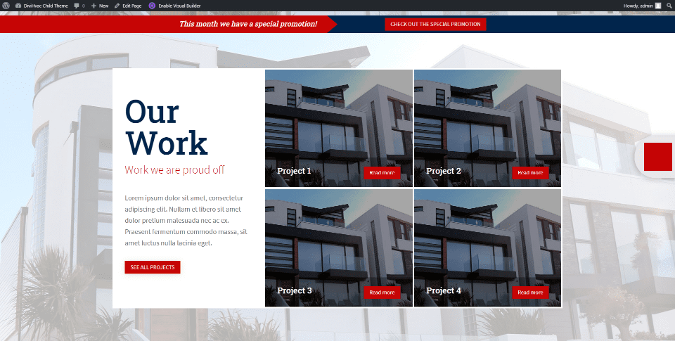
A section about past projects displays a full-screen background image with a link to the projects page and images in a grid with a button to see the project in the overlay.
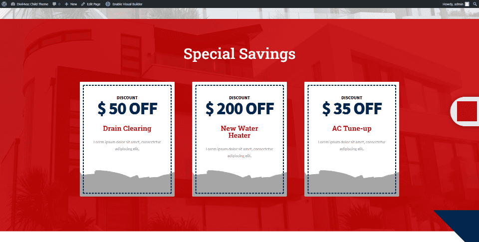
Coupons are displayed as cards with a background image. These are placed over a styled background with a red overlay. This is a great way to provide an incentive.
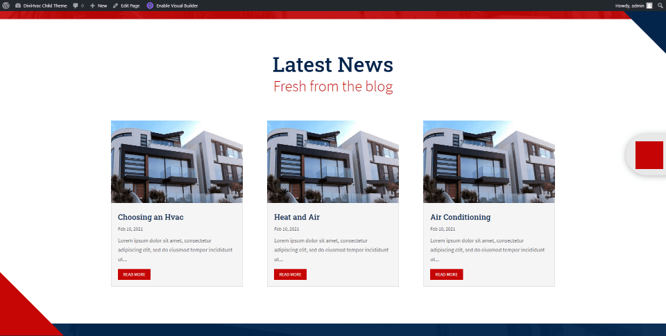
The blog section displays styled cards with triangles in the corners.
CTA
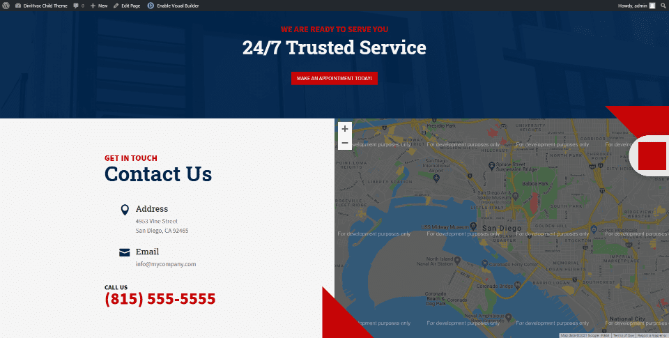
Next are a full-width CTA and a two-column section with contact information on one side and a map on the other. The map includes triangle corners.
DiviHvac Child Theme About Us Page
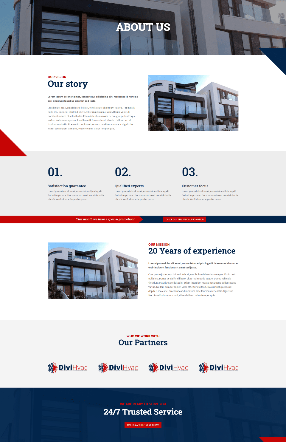
The About Us page uses several of the sections from the homepage. It adds a section about the company with an image on one side and text on the other. Numbered blurbs provide specific information. A mission statement matches the company information in an alternate layout. Client logos are placed in a fullwidth section with a title to stand out.
DiviHvac Projects Page
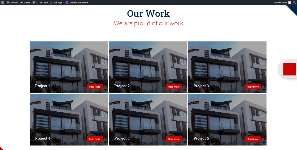
The standout section of the Projects page is the projects gallery. Text and buttons are styled to match the rest of the site, while the overlay is removed on hover.
DiviHvac Single Project Page
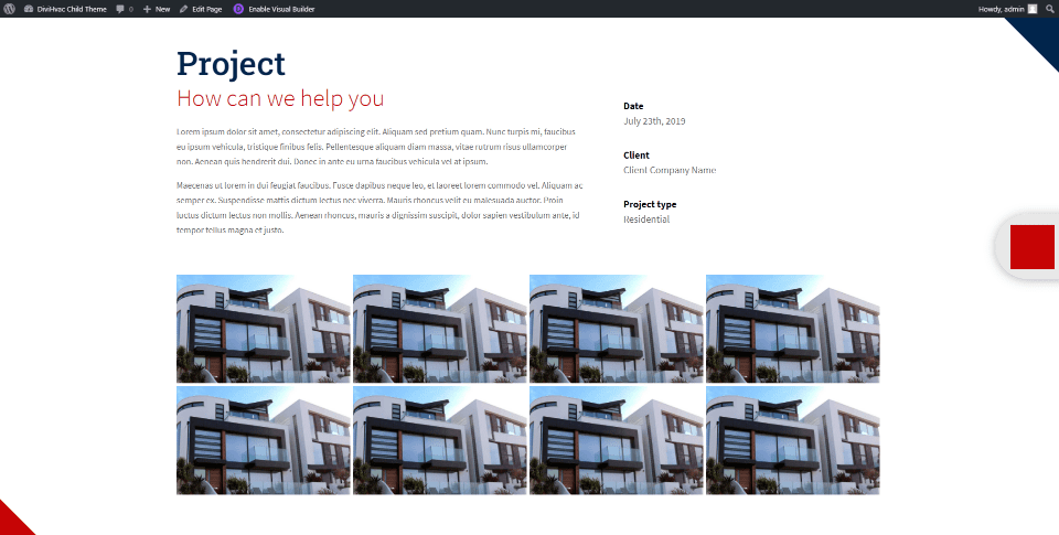
The Single Project page includes a section with information, stats, and images of the project. It also includes a CTA to make an appointment.
DiviHvac Services Page
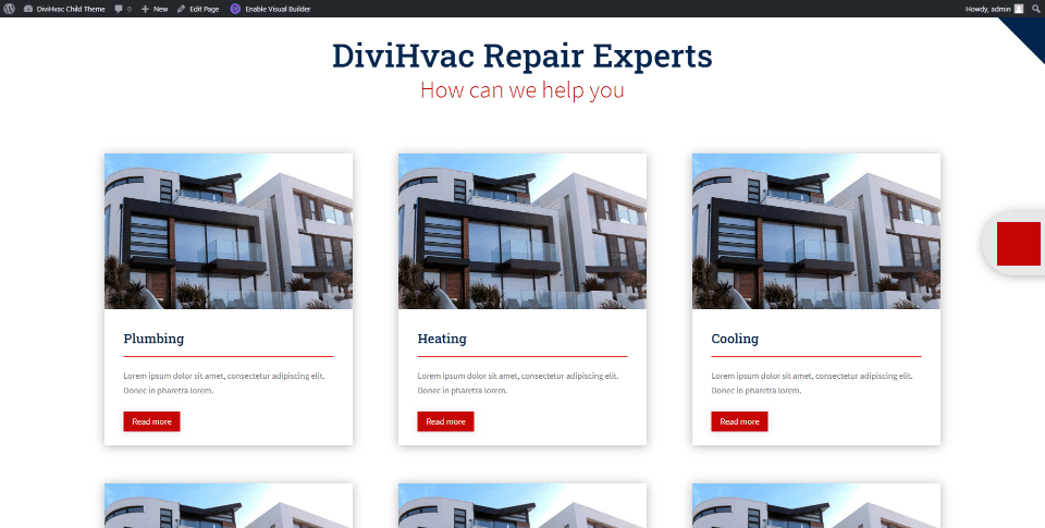
The Services page shows the services with cards made from an image, text, a divider, and button modules.
DiviHvac Single Service Page
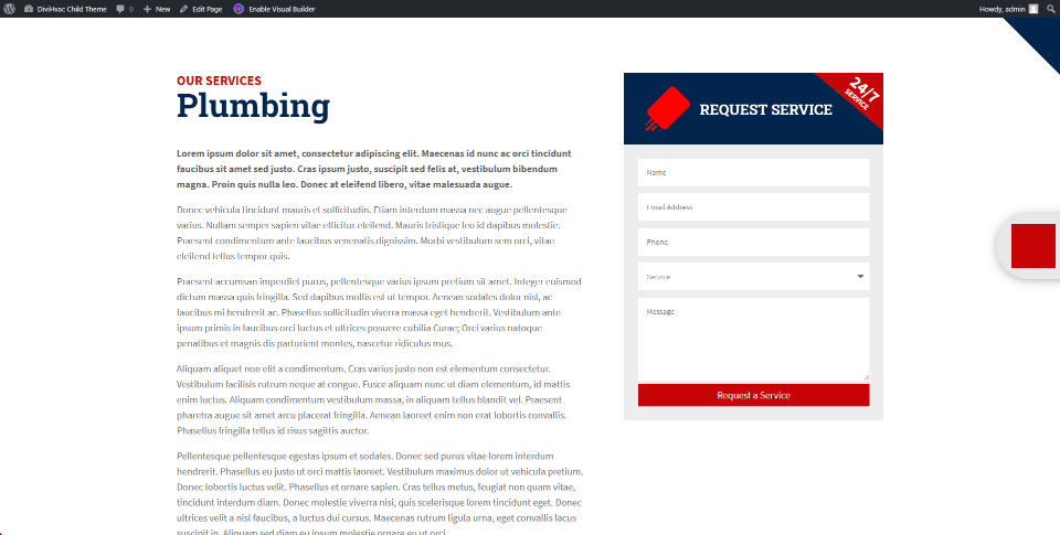
The Single Service page provides a content area for details about the services with a styled form to request the service.
DiviHvac Blog Page
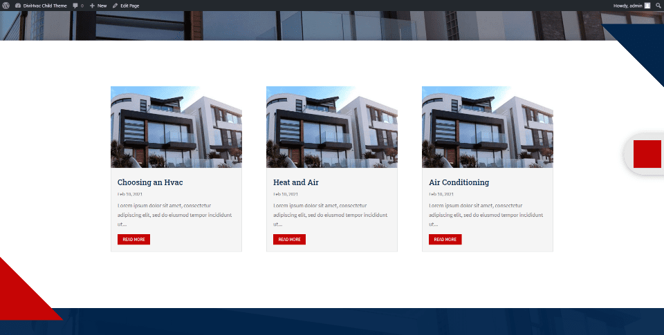
The Blog archives page displays blog posts as cards with the image, title, meta, excerpt, and a read more button.
DiviHvac Blog Layout
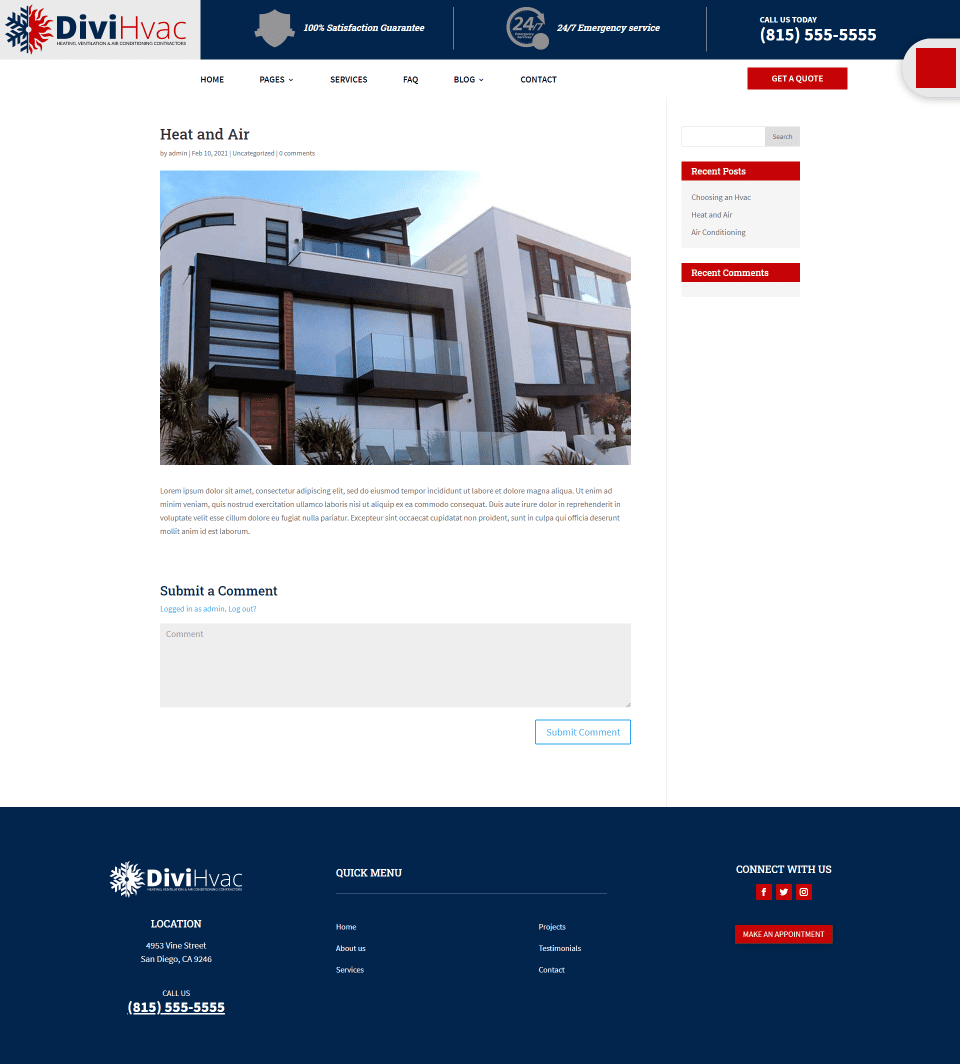
The Blog Post layout displays the title, meta, featured image, and content in a single column with a styled sidebar.
DiviHvac FAQ Page
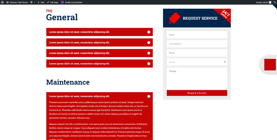
The FAQ page divides questions into topics. Questions are answered within toggles. This page also includes a request for service form.
DiviHvac Child Theme Testimonials Page
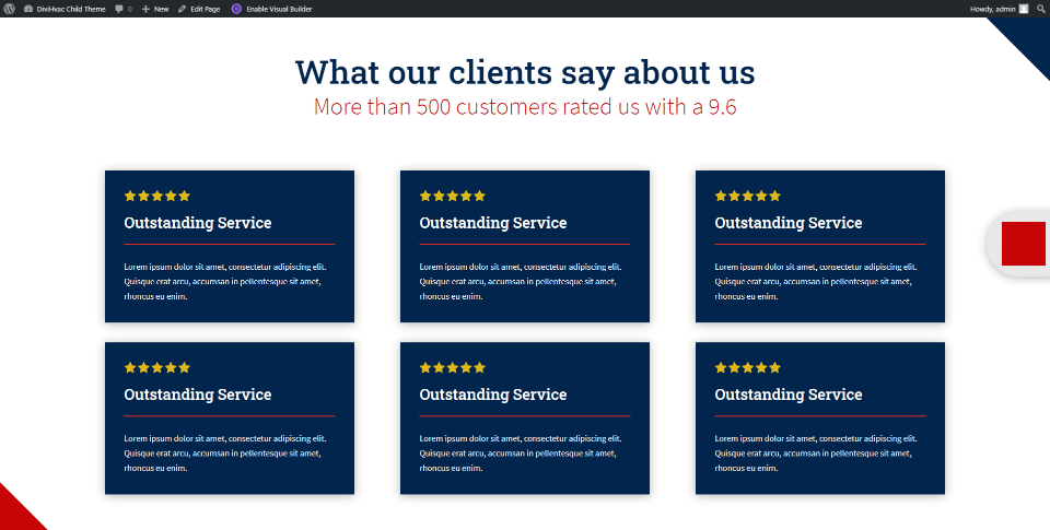
Testimonials are placed within cards that include dark blue background, star ratings, the title, divider, and text.
DiviHvac Child Theme Coupons Page
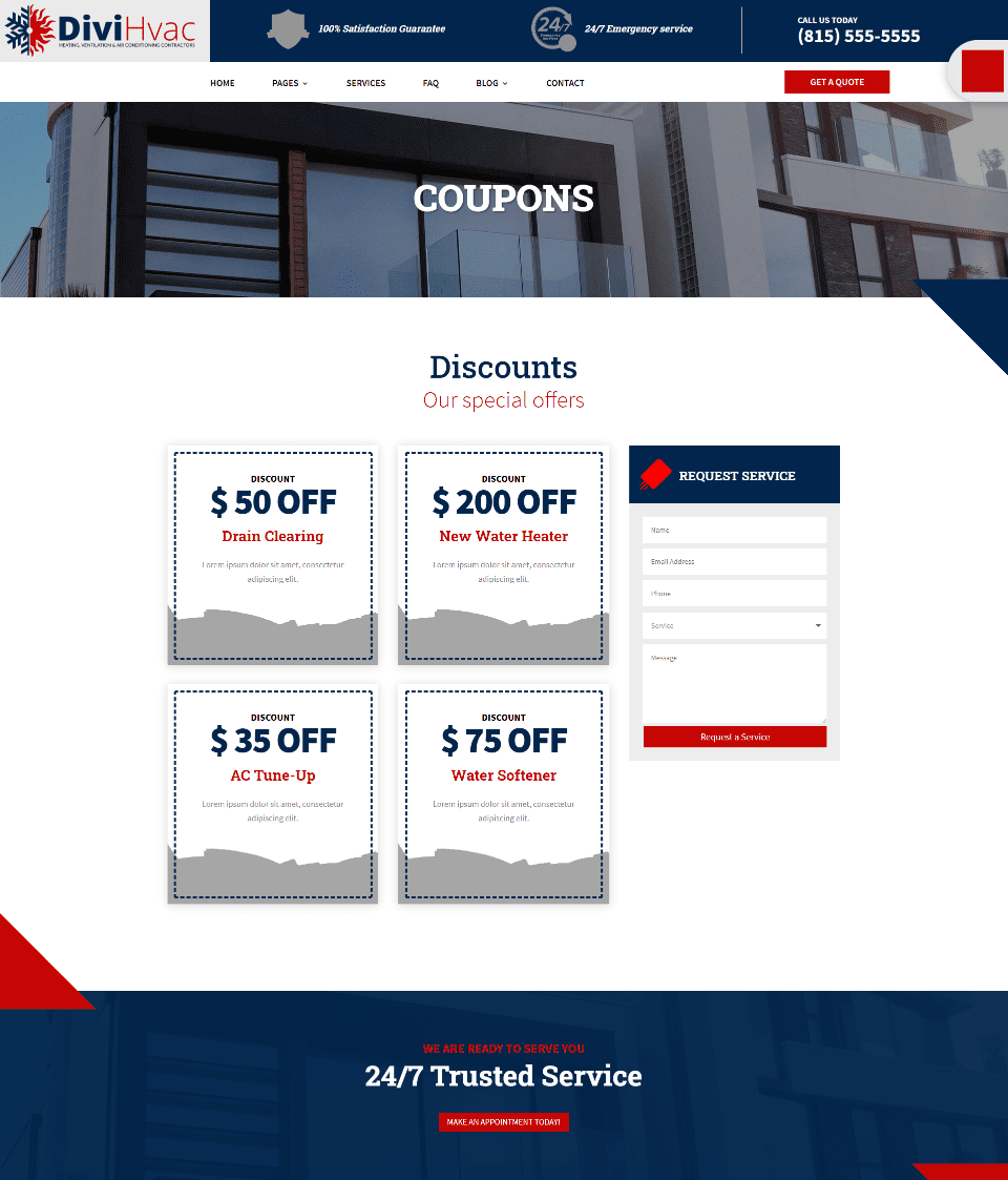
Along with the bold colors, the Coupons page is one of the things that makes this Divi child theme stand out. Coupons are provided as incentives. They’re created with multiple text modules and are easy to customize.
DiviHvac Child Theme Contact Page
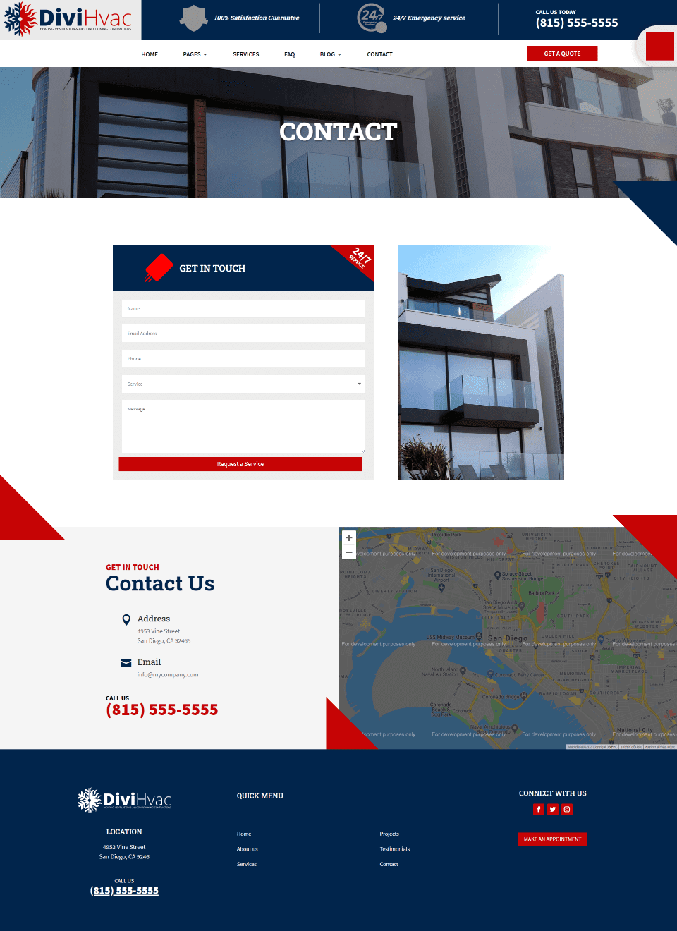
The Contact page includes a styled contact form next to an image followed by a row with contact information and a map.
DiviHvac Child Theme Thank You Page
 ;
;
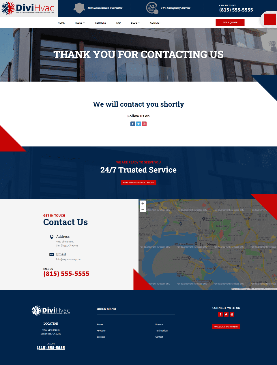
The Thank You page can be used as a redirected page providing a message to anyone using your contact forms. This is great for letting them know you’ve received their message and what to expect. The message is simple, and the design fits the rest of the website.
DiviHvac Theme Builder Layouts

Theme Builder layouts include global headers and footers, category pages, and a 404 page.
Header
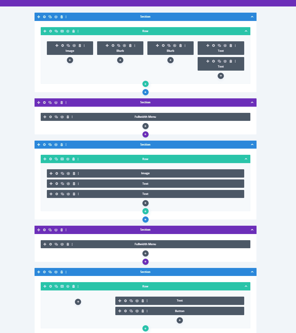
The global header includes multiple rows. The top row includes an image module for the logo, blurbs for information, and text for the phone number, followed by a fullwidth menu. This layout also provides a simpler menu for tablets and phones.

Here are the headers in the visual view. Those for mobile are at the bottom and are grayed out.
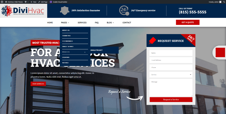
Here’s the menu on the frontend. It includes styling for the dropdown menu and a sticky button (Slide-in) that stays on the right of the screen. You can replace the square image with any image or icon you want.
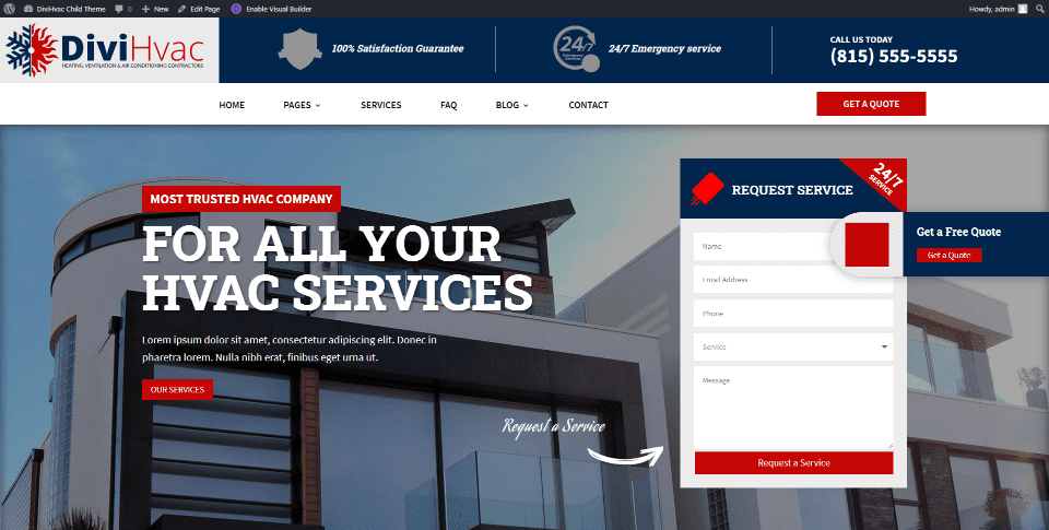
Here’s the Slide-in sticky button when you hover over it. It works as a CTA with a button and redirects to the Thank You page.
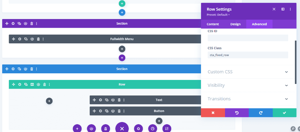
The Slide-in feature is a sticky button is created with a CSS class added to the row in the global header and text and bottom modules.
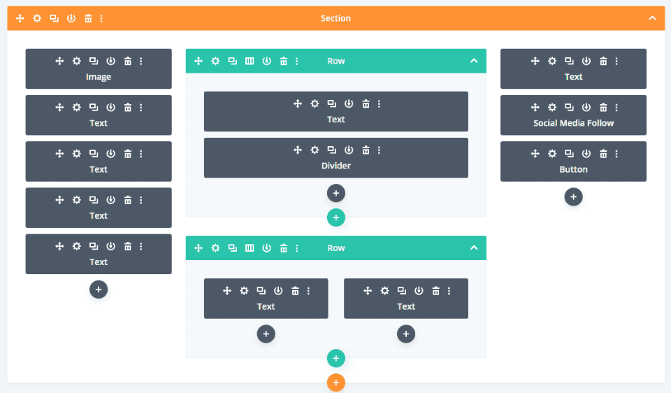
The global footer was built with a Specialty section and includes images, text, social follow, and a button in three rows.

Here’s how it looks in the visual view.
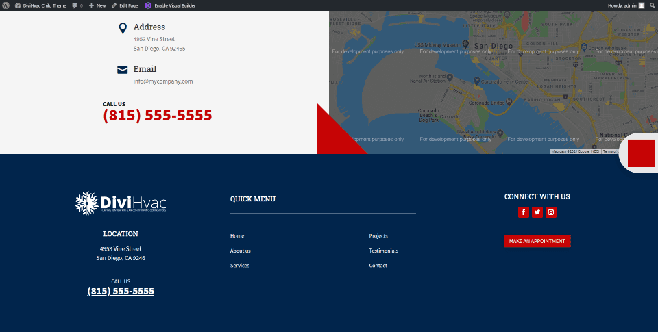
Here’s how it looks on the homepage.
404 Page
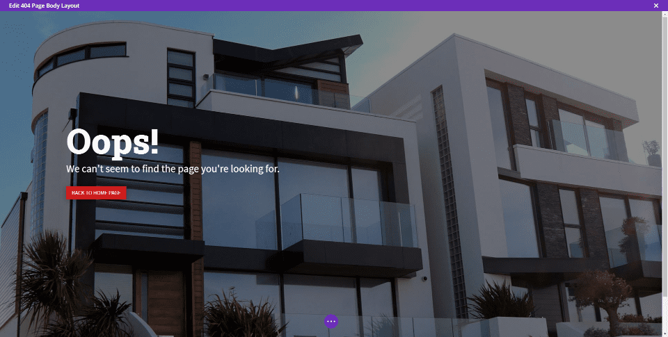
The 404 page was built with a fullwidth header. Here’s how it looks in the visual view. The page also includes the global header and footer.
Where to Purchase DiviHvac
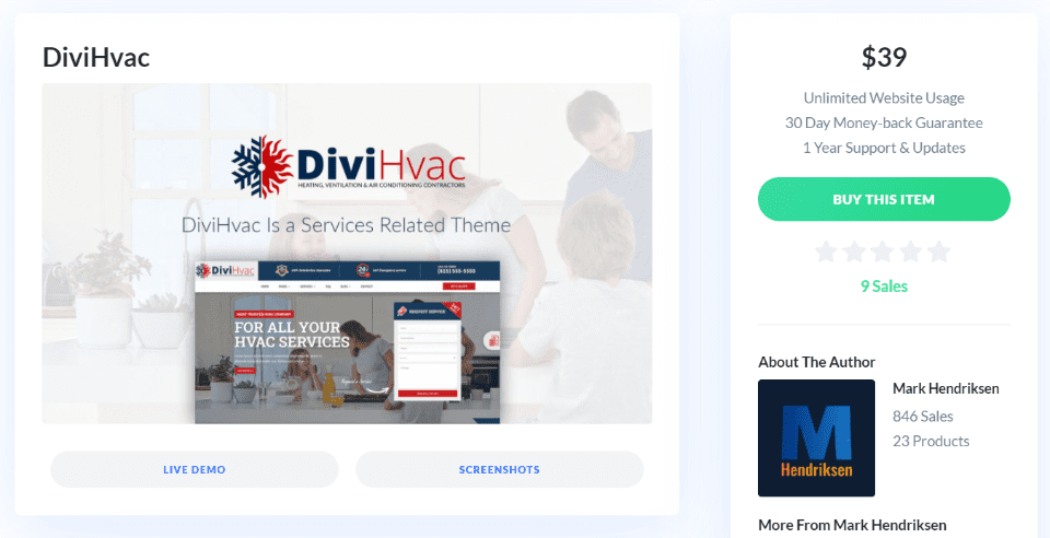
Mark Hendriksen’s DiviHvac child theme is available in the Divi Marketplace for $39. It includes unlimited website usage and 1 year of support and updates.
Ending Thoughts
That’s our look at the DiviHvac child theme from Mark Hendriksen. This theme has lots of pages to show your services and projects. Several pages, such as Coupons and Thank You, are unique. Bold red and blue styling makes the pages stand out while providing a professional look. Although it’s designed for HVAC companies that do installations and repairs, this design would work great for any type of contractor or repair website.
We want to hear from you. Have you tried the DiviHvac child theme? Let us know what you think about it in the comments.
Featured Image via Seahorse Vector / shutterstock.com


Thank you Randy for this overview of my DiviHvac child theme.