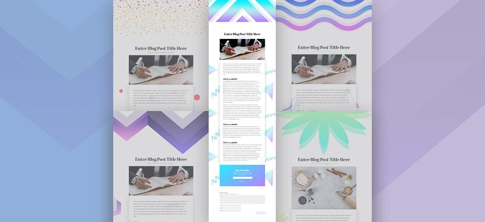
We’re here with another free Divi download! This time, we’re giving you a taste of 5 different vibrant background styles that you can use for blog posts on your website. You can easily combine these background styles on the same website to give a different look and feel to the various blog posts you publish. On top of offering you all these vibrant background styles for free, we’re also going to guide you through creating the blog post template which you can reuse for any blog post you create and publish on your website.
Let’s get to it!
Preview
Let’s start off by taking a look at the 5 different outcomes and the view on different screen sizes.

Download The Vibrant Background Styles for FREE
To lay your hands on the vibrant background styles, you will first need to download them using the button below. To gain access to the download you will need to subscribe to our newsletter by using the form below. As a new subscriber, you will receive even more Divi goodness and a free Divi Layout pack every Monday! If you’re already on the list, simply enter your email address below and click download. You will not be “resubscribed” or receive extra emails.
Color Palettes
For each one of the background styles, you can find a color palette below. We’ll refer to the color number throughout the tutorial so pick the background style and palette you want to create and go from there.
Palette #1

- Color #1: #886DFC
- Color #2: #7C56BD
- Color #3: #372C66
Palette #2

- Color #1: #42bcb2
- Color #2: #9CFEF0
- Color #3: #a8baf7
Palette #3

- Color #1: #96b2ff
- Color #2: #d999ff
- Color #3: #357ff4
Palette #4

- Color #1: #B981FF
- Color #2: #24EEFA
- Color #3: #be7bf2
Palette #5

- Color #1: #e02b20
- Color #2: #f6ff56
- Color #3: #db241e
Create New Post
Add Details & Enable Divi Builder
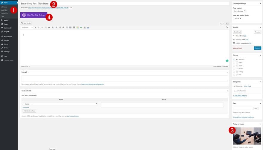
Let’s start from the beginning! Add a new page to your WordPress website, add your page title, upload a featured image and enable the Divi Builder.
Divi Page Settings
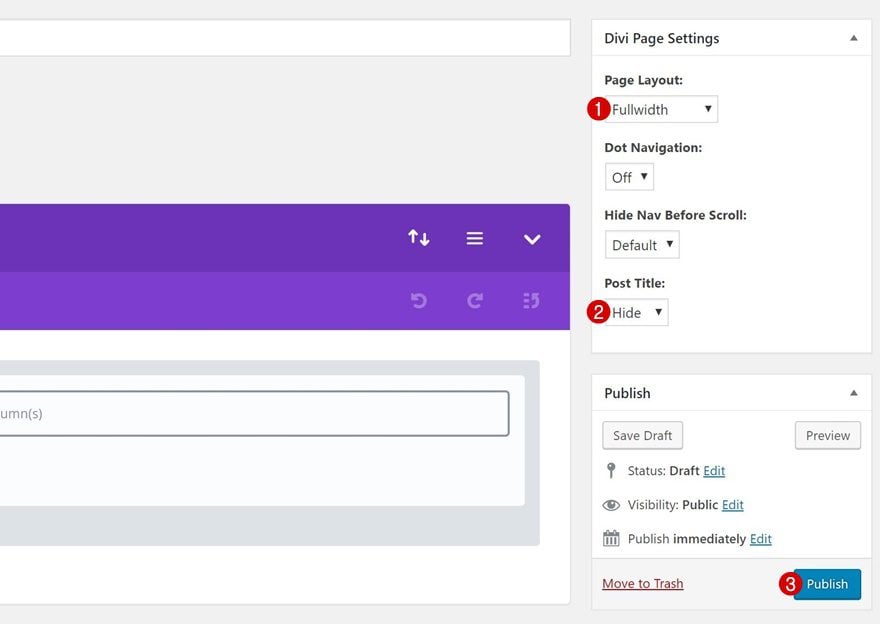
Before switching over to Visual Builder, make some changes to the Divi Page Settings box at the top right of the page you’re on. This will ensure you’re entirely working with Divi to create the blog post layout. If you plan on reusing the template on your website, you’ll have to remember to modify these settings every time you create a new blog post.
- Page Layout: Fullwidth
- Post Title: Hide
Switch Over to Visual Builder
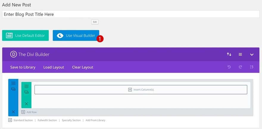
You can now switch over to Visual Builder.
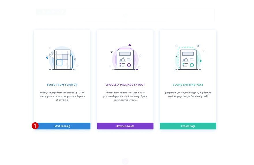
Once you do, three options will appear on your screen. Click on the blue button to start building from scratch.
Create Blog Post Design
Add Section #1
Background Image
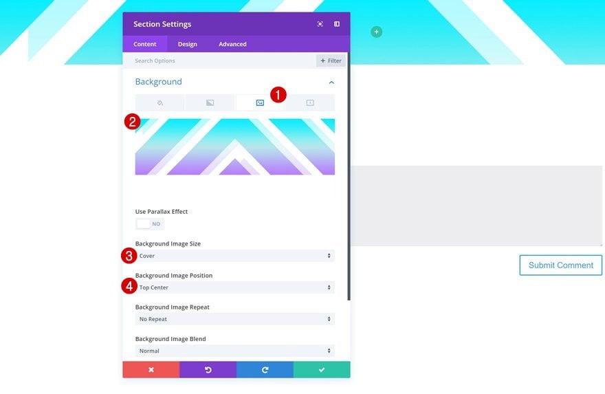
Let’s start creating the template! Start off with an empty section at the top. Open the section settings, go to the background settings and upload a background style of choice. You can find all 5 variations by going to the downloaded folder > Hero.
- Background Image Size: Cover
- Background Image Position: Top Center
Spacing
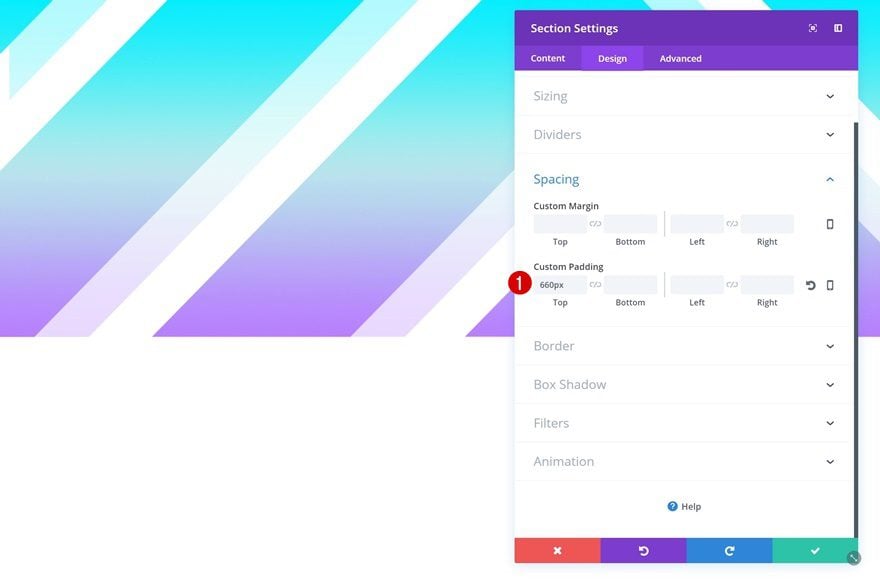
To allow the background image to show up completely, play around with the top padding of the section.
- Top Padding: 660px
Add Section #2
Spacing
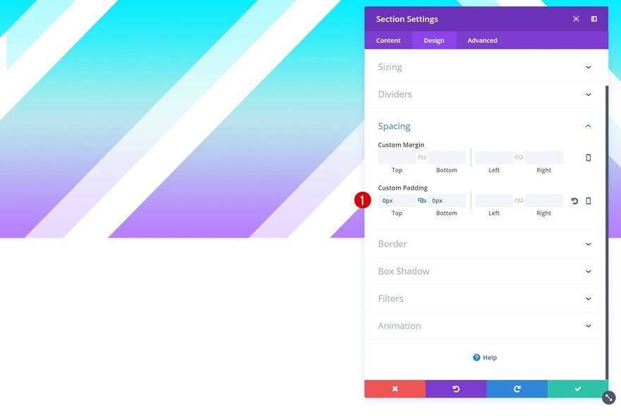
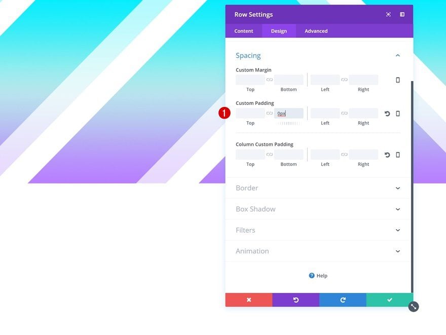
Right below the section you’ve just added, go ahead and add another one. Open the settings, go to the spacing settings and remove all the default custom padding.
- Top Padding: 0px
- Bottom Padding: 0px
Add New Row
Column Structure
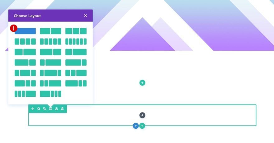
Continue by adding a new row to the section using the following column structure:
Spacing
Remove all the default padding at the bottom of the section next.
- Bottom Padding: 0px
Add Post Title Module
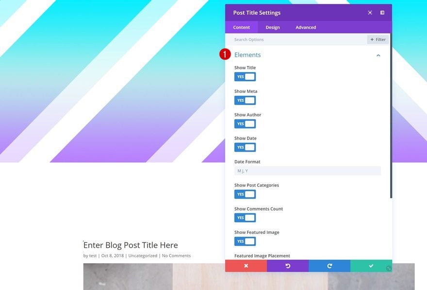
Elements
Time to start adding modules! In this row, we’ll only need a Post Title Module. After you’ve added one, choose the elements you want to show up.
Title Text Settings
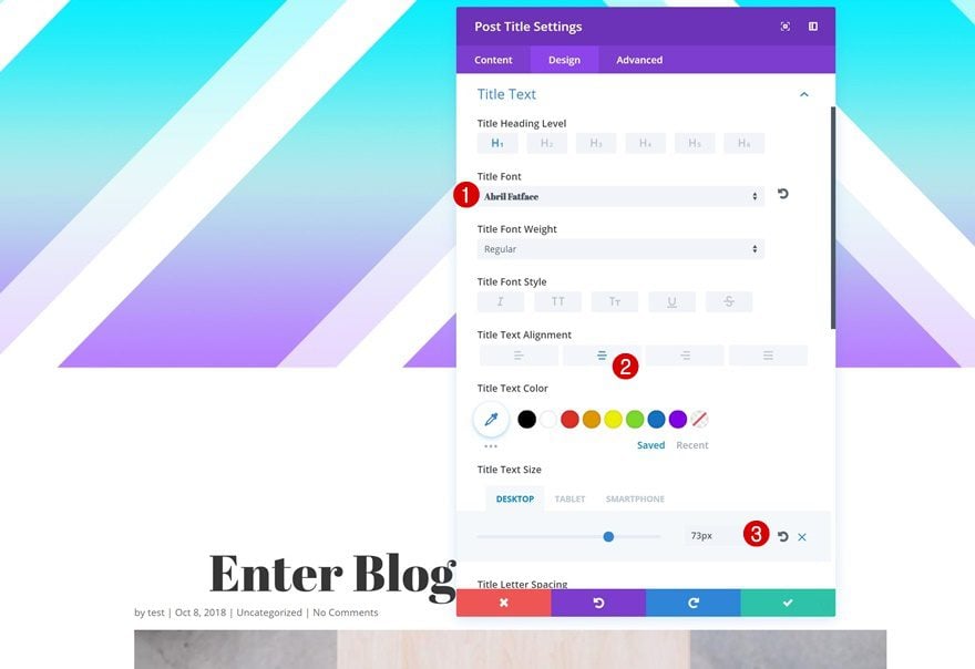
Then, go to the title text settings and make some changes.
- Title Font: Abril Fatface
- Title Text Alignment: Center
- Title Text Size: 73px (Desktop), 50px (Tablet), 40px (Phone)
Meta Text Settings
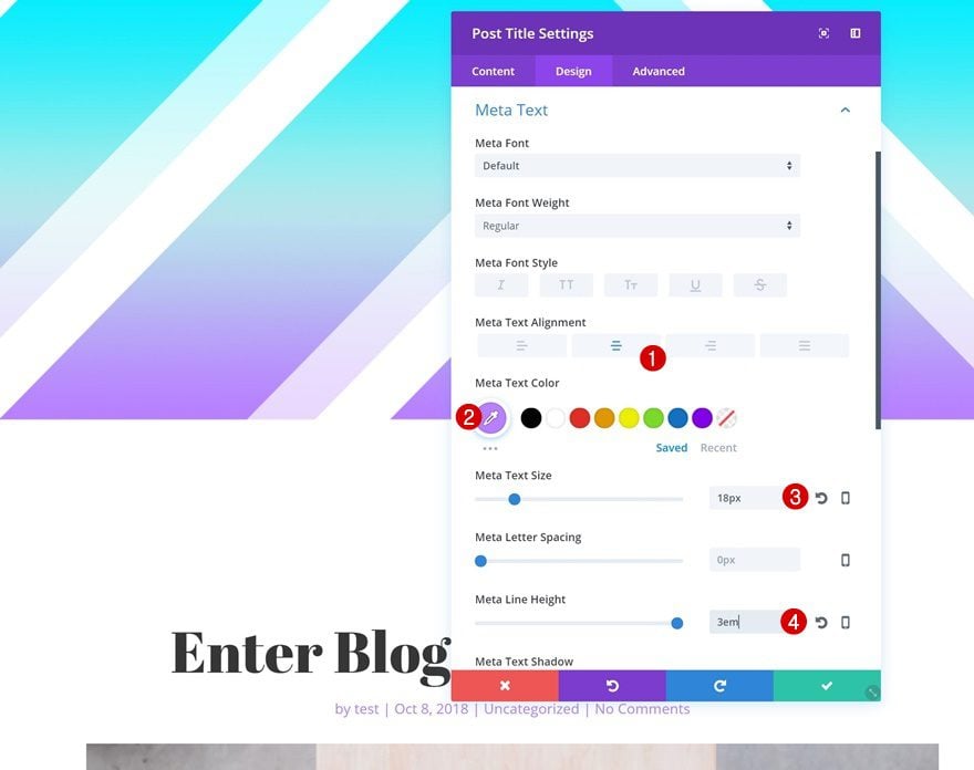
The meta text settings need to be modified as well.
- Meta Text Alignment: Center
- Meta Text Color: Color #1 (Find in Palette)
- Meta Text Size: 18px
- Meta Line Height: 3em
Add Section #3
Background Image
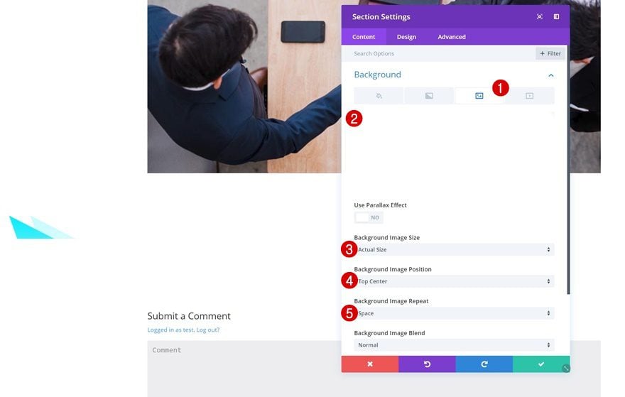
The last section on this page will contain the blog post content and CTA. Start off by uploading your background style of choice. You can find the variations by going to the downloaded folder > Body. Once you upload the background image, make some changes to the background settings.
- Background Image Size: Actual Size
- Background Image Position: Top Center
- Background Image Repeat: Space
Spacing
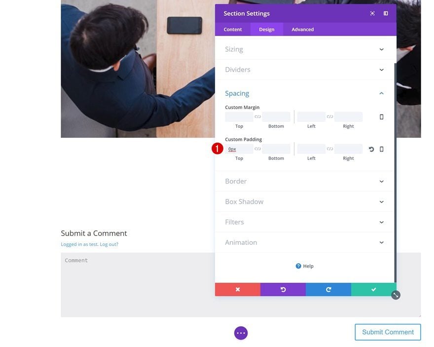
Remove all the default top padding of this section to get rid of all the whitespace between this section and the previous one.
- Top Padding: 0px
Add Row #1
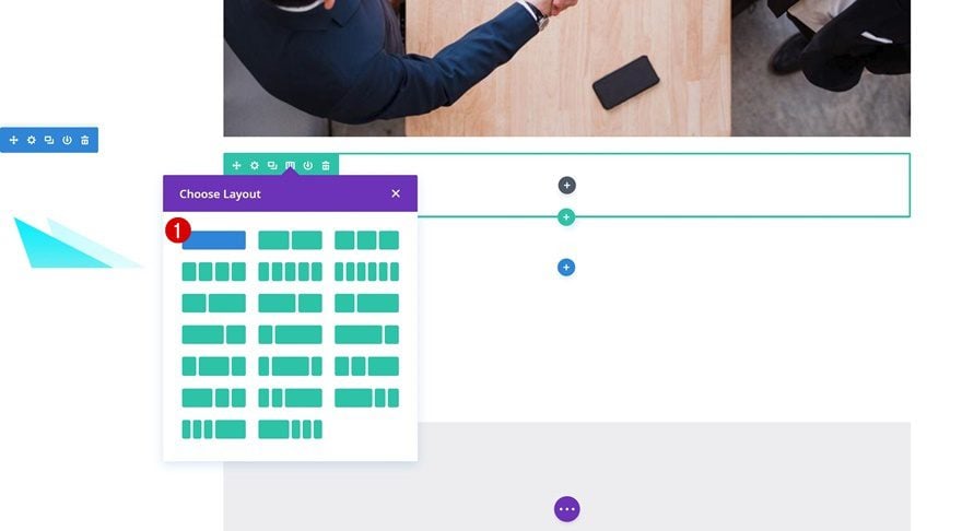
Column Structure
Continue by adding a new row to the section using the following column structure:
Background Color
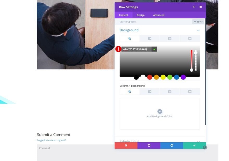
Add a slightly transparent background color to the row next.
- Background Color: rgba(255,255,255,0.86)
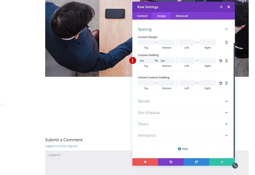
Spacing
Remove the default custom padding here as well.
- Top Padding: 0px
- Bottom Padding: 0px
Add Text Module
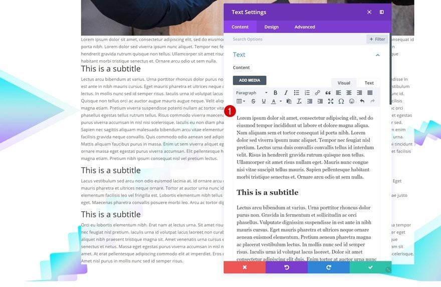
Add Content
Proceed by adding a Text Module to the row you’ve added. Here, you can add all of the blog post content you want and use the different text styles to get the desired outcome. In the print screen below, we are using headings and paragraphs.
Text Settings
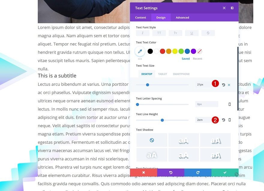
Go to the text settings and make some changes there.
- Text Size: 21px (Desktop), 18px (Tablet), 15px (Phone)
- Text Line Height: 2em
Heading Settings
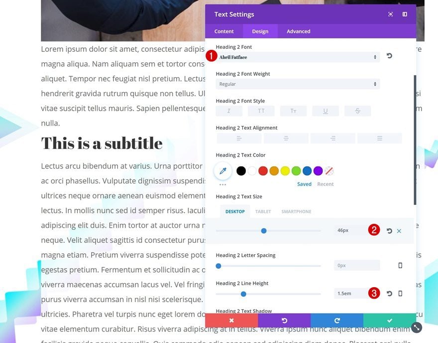
The heading text settings need to be modified as well.
- Heading Font: Abril Fatface
- Heading Text Size: 46px (Desktop), 40px (Tablet), 30px (Phone)
- Heading Line Height: 1.5em
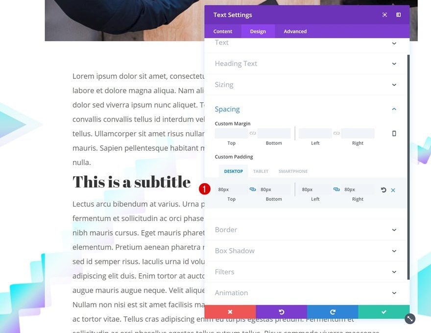
Spacing
Add some custom padding values next.
- Top Padding: 80px
- Bottom Padding: 80px
- Left Padding: 80px (Desktop), 40px (Tablet), 30px (Phone)
- Right Padding: 80px (Desktop), 40px (Tablet), 30px (Phone)
Box Shadow
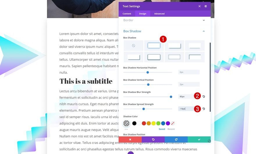
To finish off, add a subtle box shadow to the Text Module. This will bring some depth to the blog post template.
- Box Shadow Blur Strength: 80px
- Box Shadow Spread Strength: -14px
Add Row #2
Column Structure
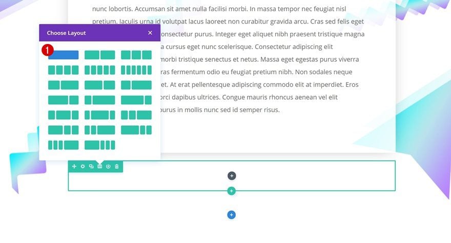
Continue by adding a new row right below the previous one using one column.
Spacing
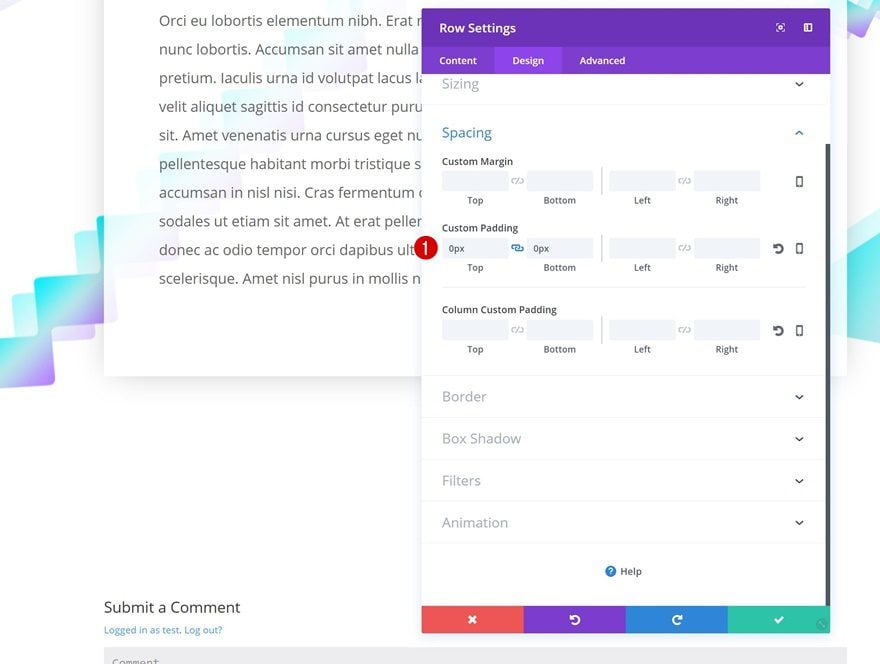
Remove all the default custom padding of this row as well.
- Top Padding: 0px
- Bottom Padding: 0px
Add Email Optin Module
Add Content
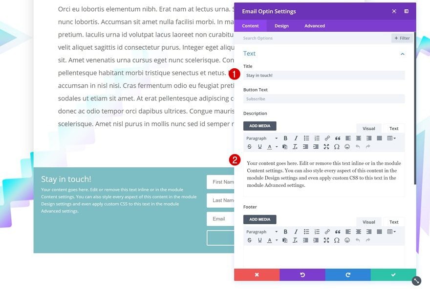
Then, add your CTA. We’re using an Email Optin Module. After you add it, modify the content.
Fields
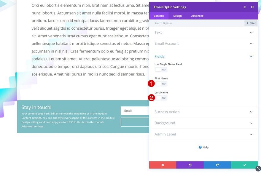
We’re only using the email address in this module so go ahead and disable the first name and last name in the fields settings.
Gradient Background
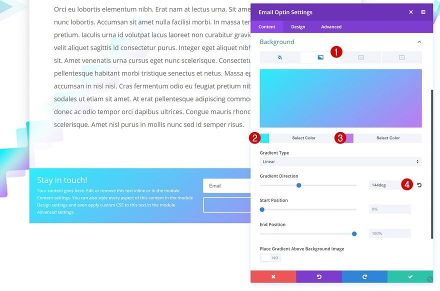
Continue by adding a gradient background to the Email Optin Module.
- Color 1: Color #2 (Find in Palette)
- Color 2: Color #3 (Find in Palette)
- Gradient Direction: 144deg
Layout
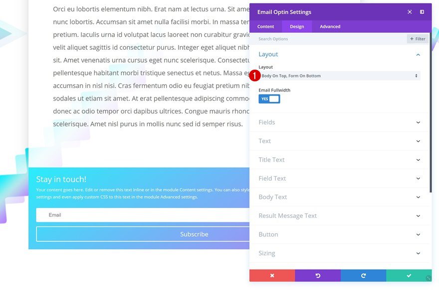
Then, change the layout of the module.
- Layout: Body On Top, Form On Bottom
Text Settings
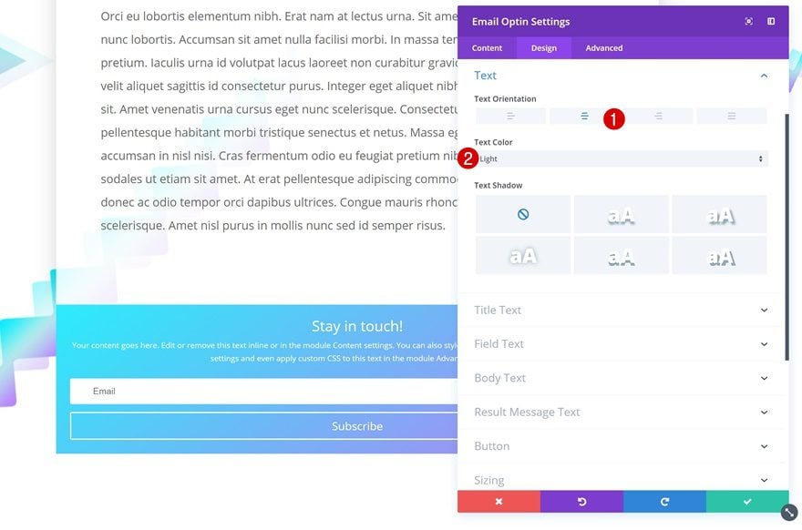
Change the text settings as well.
- Text Orientation: Center
- Text Color: Light
Title Text Settings
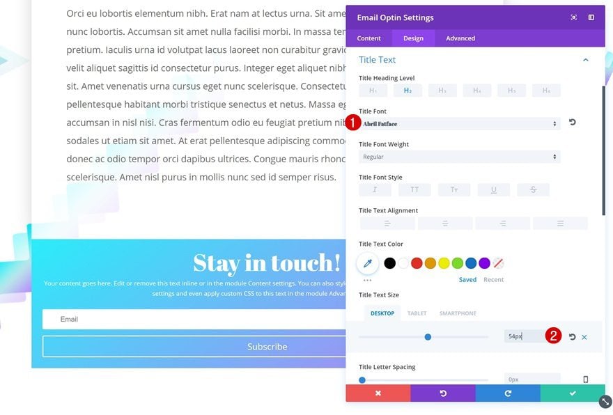
Next, open the title text settings and make some changes.
- Title Font: Abril Fatface
- Title Text Size: 54px (Desktop), 40px (Tablet), 35px (Phone)
Button Settings
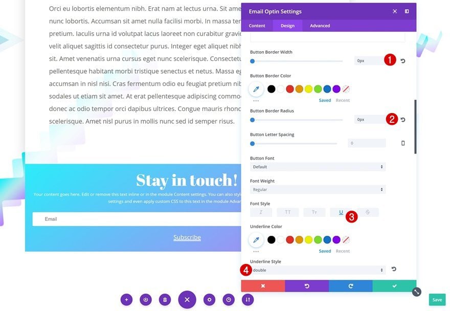
Modify the button appearance as well.
- Button Border Width: 0px
- Button Border Radius: 0px
- Font Style: Underline
- Underline Style: Double
Spacing
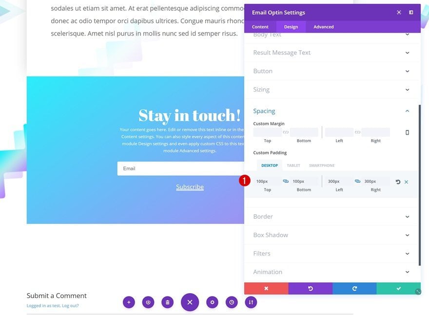
Lastly, use different custom padding values in the spacing settings of the Email Optin Module.
- Top Padding: 100px
- Bottom Padding: 100px
- Left Padding: 300px (Desktop), 50px (Tablet & Phone)
- Right Padding: 300px (Desktop), 50px (Tablet & Phone)
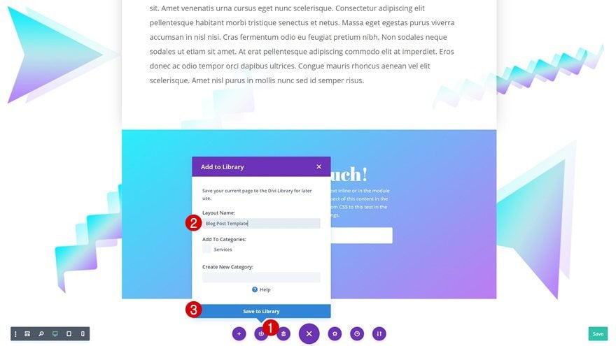
Save Layout in Divi Library for Reuse
The only thing left to do is save the layout in the Divi Library. That way, you can reuse it for other pages as well! You can also access blog posts as existing pages when creating a new page.
Preview
Now that we’ve gone through all the steps, let’s take a final look at the outcome we’ve created.

Final Thoughts
In this post, we’ve shared some stunning and vibrant background styles with you that you can download for free. On top of that, we’ve also guided you through creating the blog post template from scratch. Feel free to use these background styles for the blog post templates you design yourself. If you have any questions or suggestions, make sure you leave a comment in the comment section below!



This is great. Thank you. How do I turn this into a template now?
I am setting up my first blog, using WordPress and Divi. I saw your article from July 5, 2017, that seemed to offer good guidance. Is it still your most up-to-date advice? What about this current article? When I joined EG, I expected to find a Divi ready-made template suitable for my blog, but so far I have been disappointed at the available templates.
Hell yes! I love it when you guys give away stuff like this…You can count on me using these backgrounds.
It would be better if these were SVGs…
Forgot to mention, also thanks for doing so many
I really like these, Thank you so much Donjete 🙂
Well, that’s great, but the client will have to remember to modify these settings every time they create a new blog post. That’s a tall order!
Might be better to create a custom blog layout, no?
I don’t think they were created specifically for “the client” I’m sure they were created for Designers & Devs to use as inspiration so we can do it for the client! It’s impossible to create something that is suitable for “the client” ease of use, everybody’s website is different! As an idea you could create a template 🙂
Awesome design ideas! would love to try!
Thanks, Max! Definitely try them out 🙂