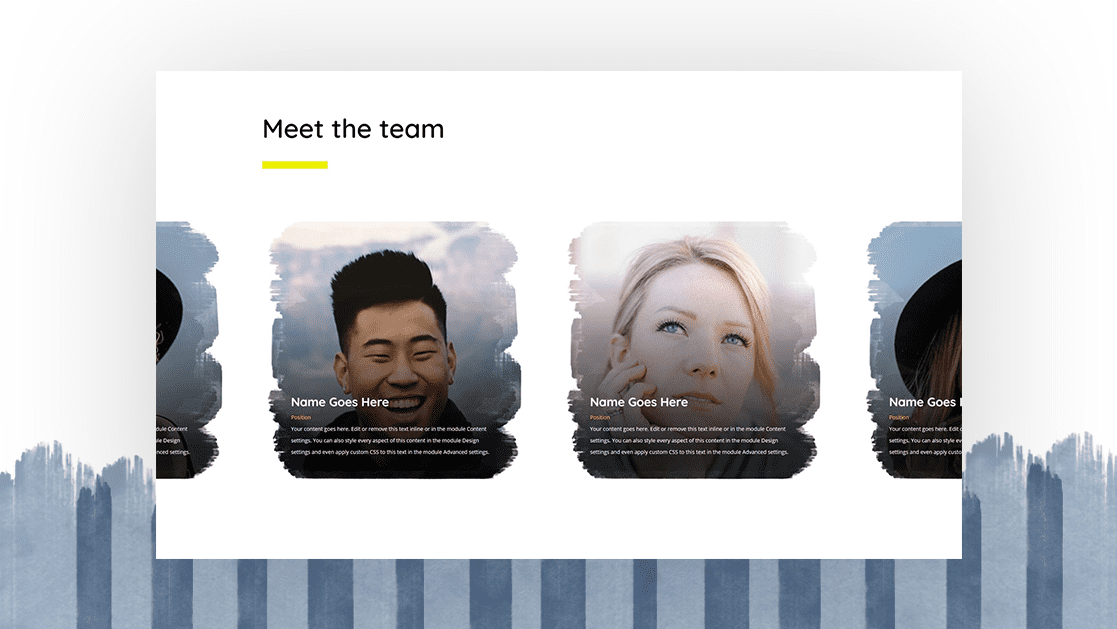
When setting up your about page, you’ll most likely want to feature your team members on there as well. By doing so, you allow visitors to connect with the people behind your company. If you’re looking for a way to animate your team member section on scroll, you’ll love this tutorial. We’ll recreate a beautiful self-scrolling team member carousel that moves as your visitors are scrolling down the page. You’ll be able to download the JSON file for free as well!
Let’s get to it.
- 1 Preview
- 2 Download The Team Member Carousel Layout for FREE
- 3 Download For Free
- 4 You have successfully subscribed. Please check your email address to confirm your subscription and get access to free weekly Divi layout packs!
- 5 Let’s Start Recreating!
- 6 Turn Row into Self-Scrolling Carousel
- 7 Preview
- 8 Final Thoughts
Preview
Before we dive into the tutorial, let’s take a quick look at the outcome across different screen sizes.
Desktop
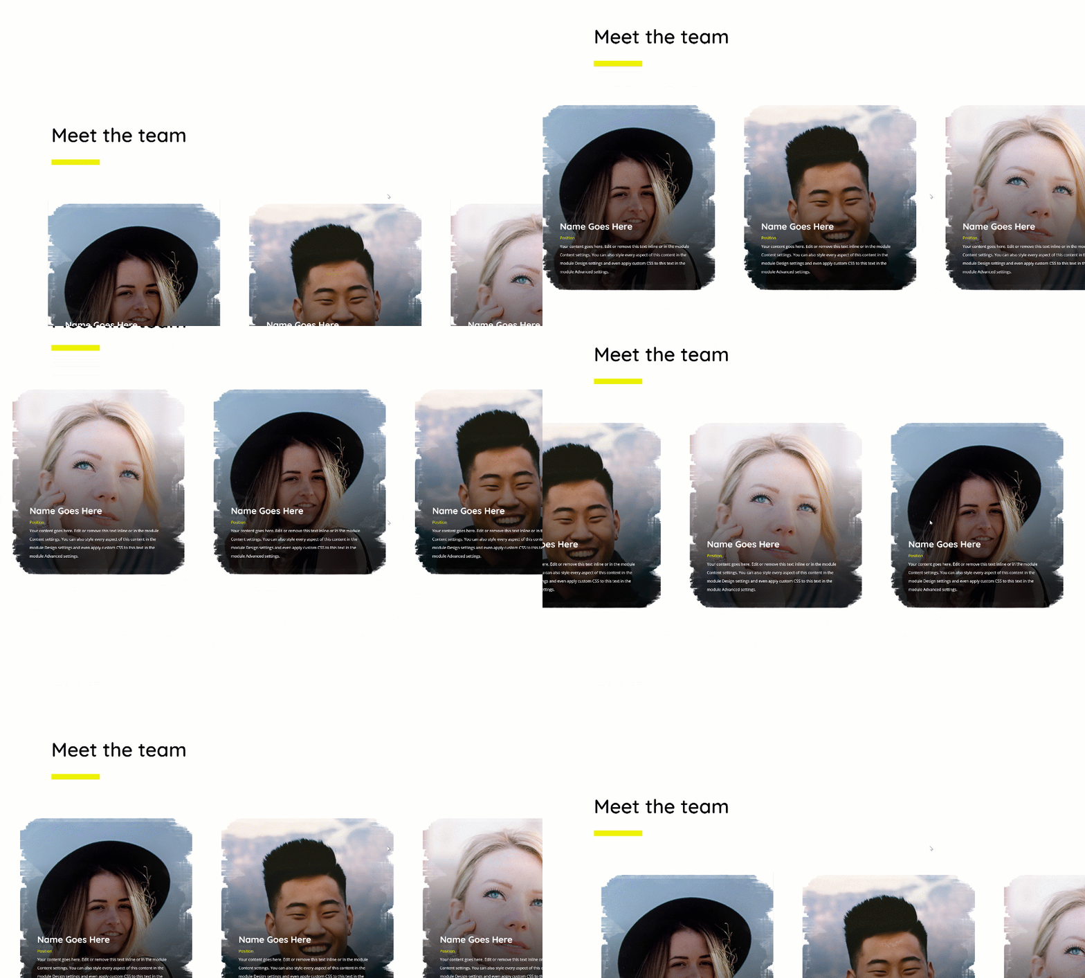
Mobile

Download The Team Member Carousel Layout for FREE
To lay your hands on the free team member carousel layout, you will first need to download it using the button below. To gain access to the download you will need to subscribe to our newsletter by using the form below. As a new subscriber, you will receive even more Divi goodness and a free Divi Layout pack every Monday! If you’re already on the list, simply enter your email address below and click download. You will not be “resubscribed” or receive extra emails.
Let’s Start Recreating!
Add New Section
Spacing
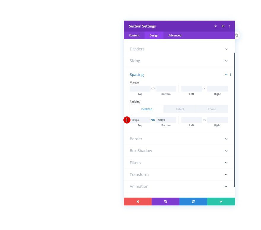
Start by adding a new regular section to the page you’re working on. Open the section settings and add some custom padding across different screen sizes.
- Top Padding: 200px (Desktop), 100px (Tablet & Phone)
- Bottom Padding: 200px (Desktop), 100px (Tablet & Phone)
Overflows
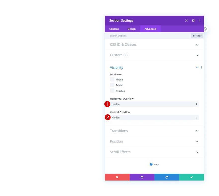
To make sure no horizontal scrollbar appears in our design, we’ll hide the section overflows in the advanced tab.
- Horizontal Overflow: Hidden
- Vertical Overflow: Hidden
Add Row #1
Column Structure
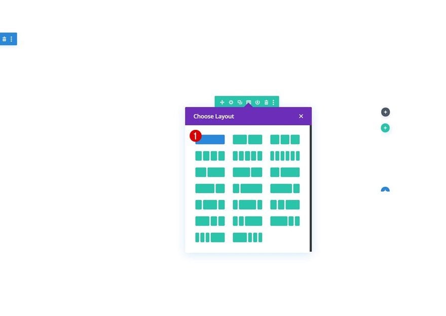
Continue by adding a new row to the section using the following column structure:
Sizing
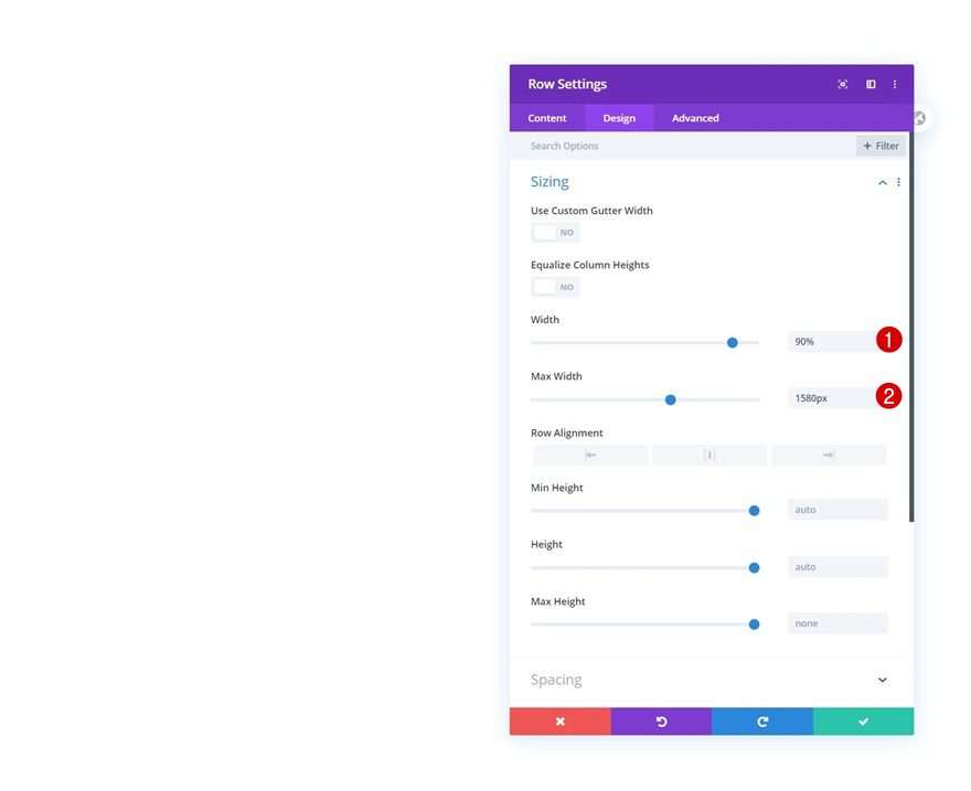
Without adding any modules yet, open the row settings, move on to the design tab and modify the width and max width in the sizing settings.
- Width: 90%
- Max Width: 1580px
Spacing
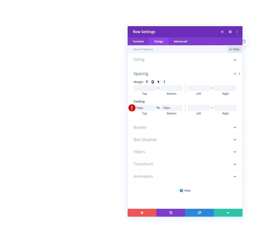
We’re adding some custom top and bottom padding too.
- Top Padding: 100px
- Bottom Padding: 100px
Add Text Module to Column
Add H2 Content
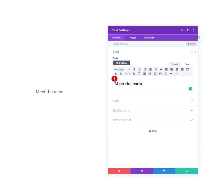
Time to add modules, starting with a first Text Module. Enter some H2 content of your choice.
H2 Text Settings
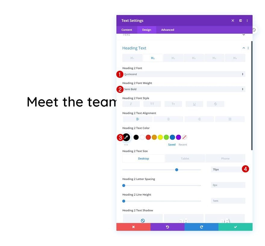
Move on to the module’s design tab and change the H2 text settings as follows:
- Heading 2 Font: Quicksand
- Heading 2 Font Weight: Semi Bold
- Heading 2 Text Color: #000000
- Heading 2 Text Size: 70px (Desktop), 50px (Tablet), 40px (Phone)
Add Divider Module to Column
Visibility
Then, add a Divider Module. Make sure the ‘Show Divider’ option is enabled.
- Show Divider: Yes
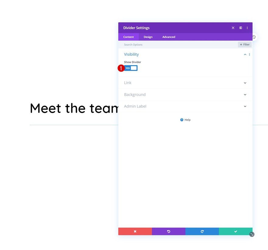
Line
Make some changes to the line settings next.
- Line Color: #edf000
- Line Style: Solid
- Line Position: Top
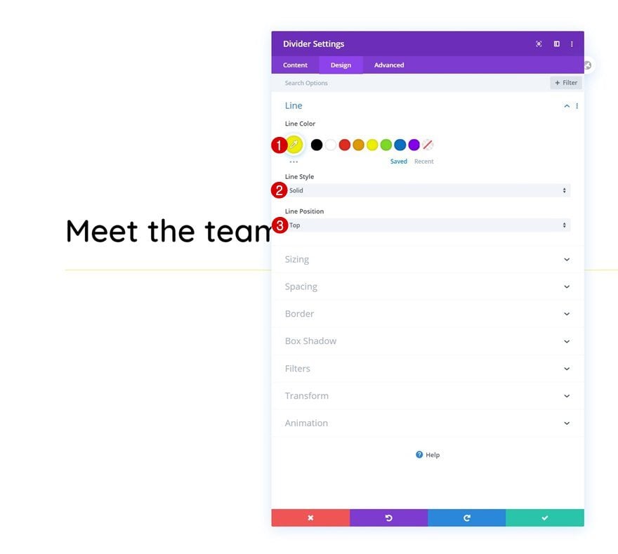
Sizing
And complete the module settings by changing the sizing settings accordingly:
- Divider Weight: 20px
- Width: 11%
- Module Alignment: Left
- Height: 20px
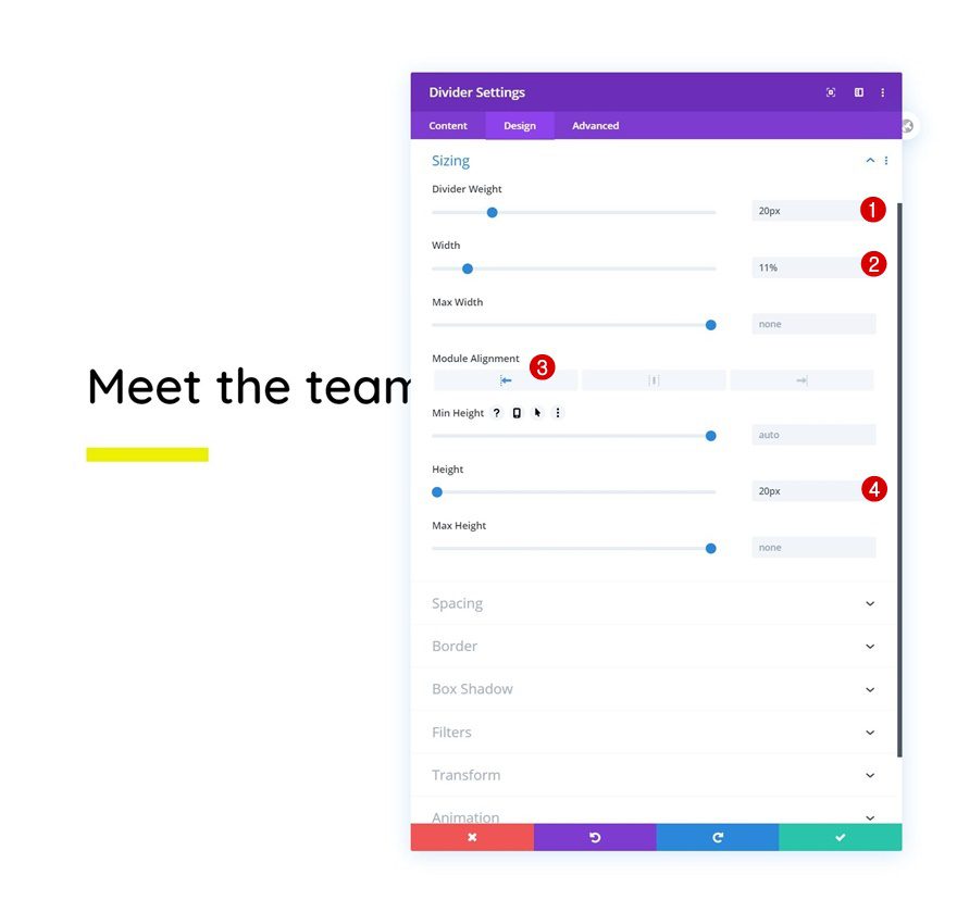
Add Row #2
Column Structure
On to the next row! Use the following column structure:
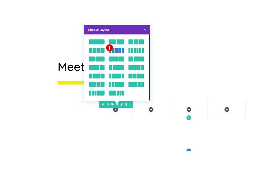
Sizing
Without adding any modules yet, open the row settings and modify the sizing settings as follows:
- Use Custom Gutter Width: Yes
- Gutter Width: 2
- Width: 100%
- Max Width: 100%
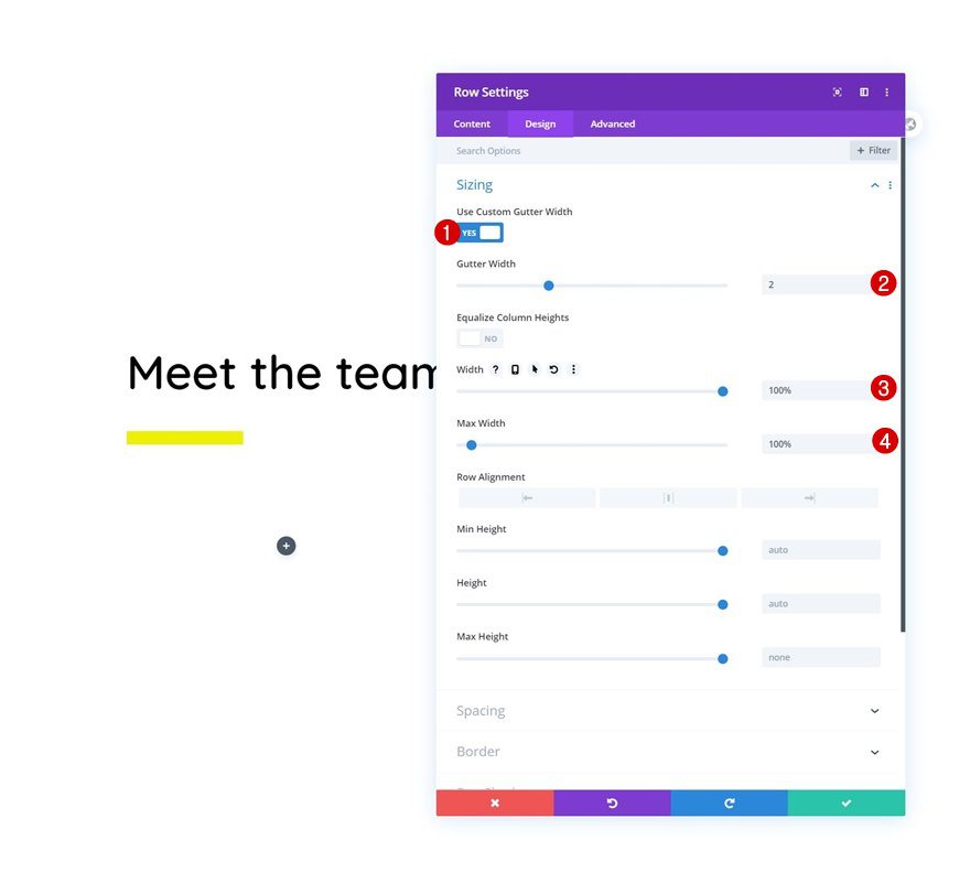
Spacing
Then, add some left and right padding on smaller screen sizes only.
- Left Padding: 5% (Tablet & Phone Only)
- Right Padding: 5% (Tablet & Phone Only)
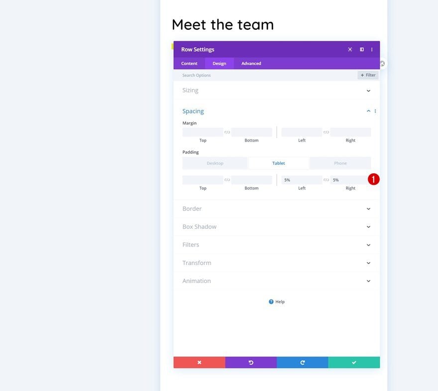
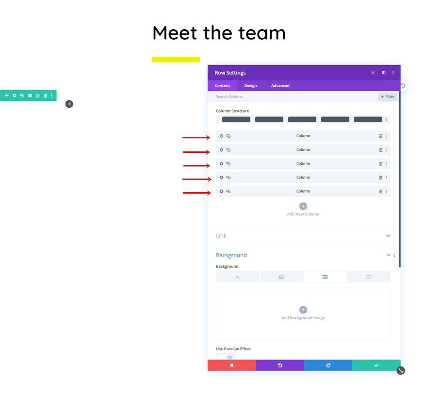
Column Settings (5x)
Now, in the next three steps of this tutorial, we’ll make some changes to the columns. Apply all three steps to each one of the columns in your row.
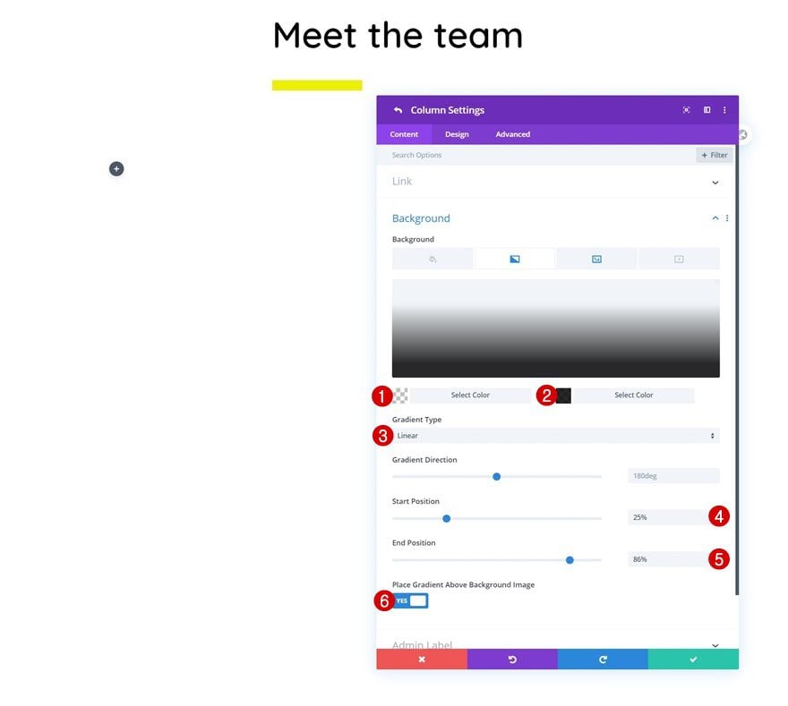
Gradient Background
First, add a gradient background to each column.
- Color 1: rgba(255,255,255,0)
- Color 2: rgba(0,0,0,0.84)
- Gradient Type: Linear
- Start Position: 25%
- End Position: 86%
- Place Gradient Above Background Image: Yes
Background Image
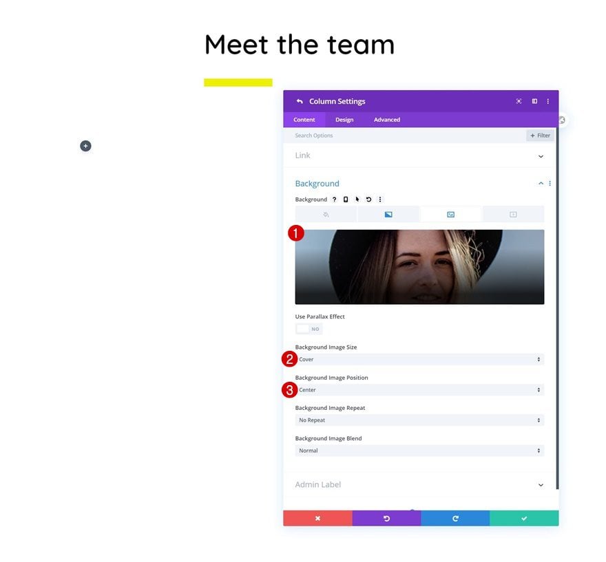
Then, upload a background image of your choice. This background image represents each team member so use a different image for each column.
- Background Image Size: Cover
- Background Image Position: Center
Main Element
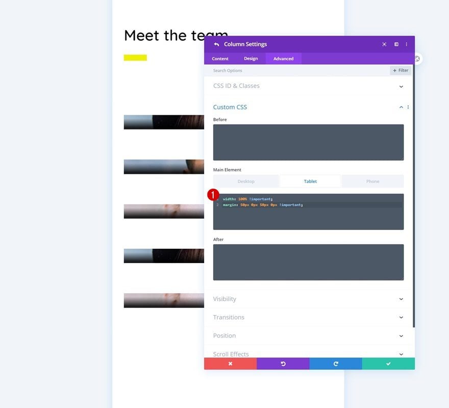
Complete the column settings by adding some custom CSS to the tablet’s main element of each column. These lines of CSS code will help us place the columns below each other on tablet, instead of having two next to each other.
width: 100% !important;
margin: 50px 0px 50px 0px !important;
Add Person Module to Column
Add Content
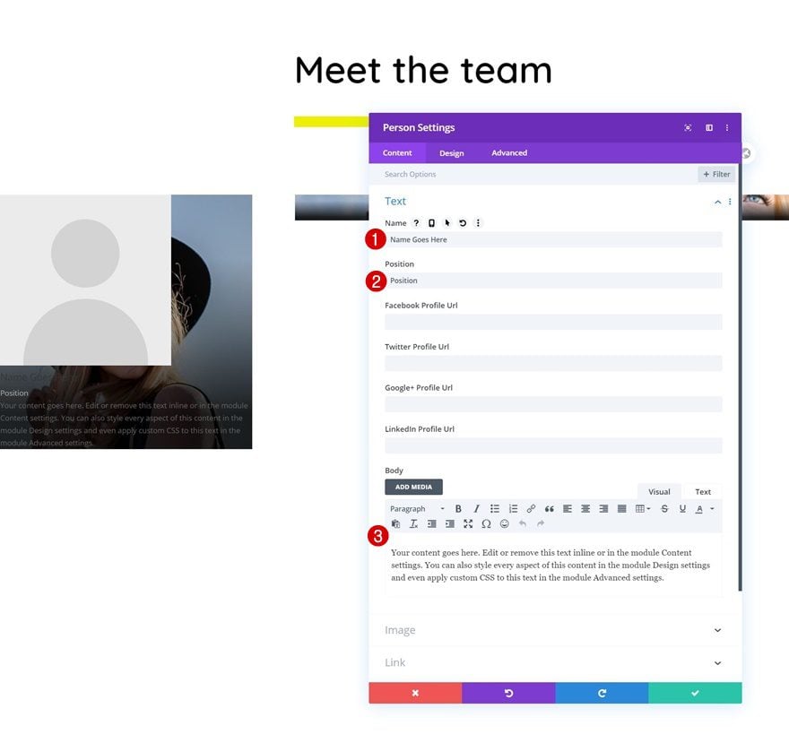
To share the team member info, we’ll use a Person Module. Add the first Person Module to column 1 and use some content of your choice.
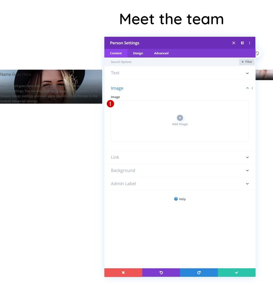
Remove Image
Then, remove the image. We’re using the column background image instead.
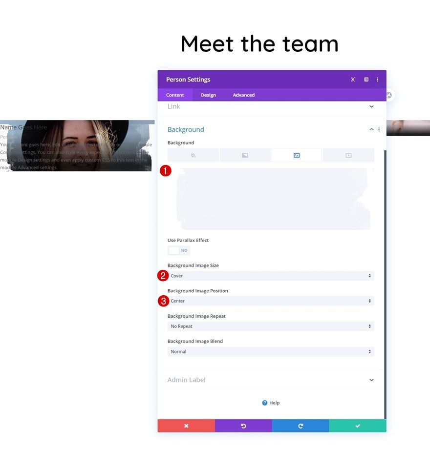
Background Image
We’ll then add an image overlay as the module’s background image. You can find the one we’re using by downloading the folder at the beginning of this tutorial.
- Background Image Size: Cover
- Background Image Position: Center
Title Text Settings
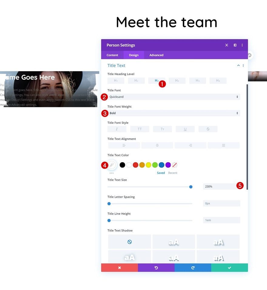
Move on to the module’s design tab and change the title text settings as follows:
- Title Heading Level: H3
- Title Font: Quicksand
- Title Font Weight: Bold
- Title Text Color: #ffffff
- Title Text Size: 230%
Body Text Settings
Modify the body text settings too.
- Body Font: Open Sans
- Body Text Color: #ffffff
- Body Line Height: 2.2em

Position Text Settings
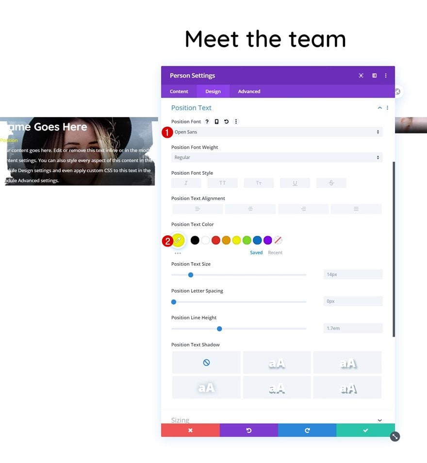
Then, make some changes to the position text settings.
- Position Font: Open Sans
- Position Text Color: #edf000
Spacing
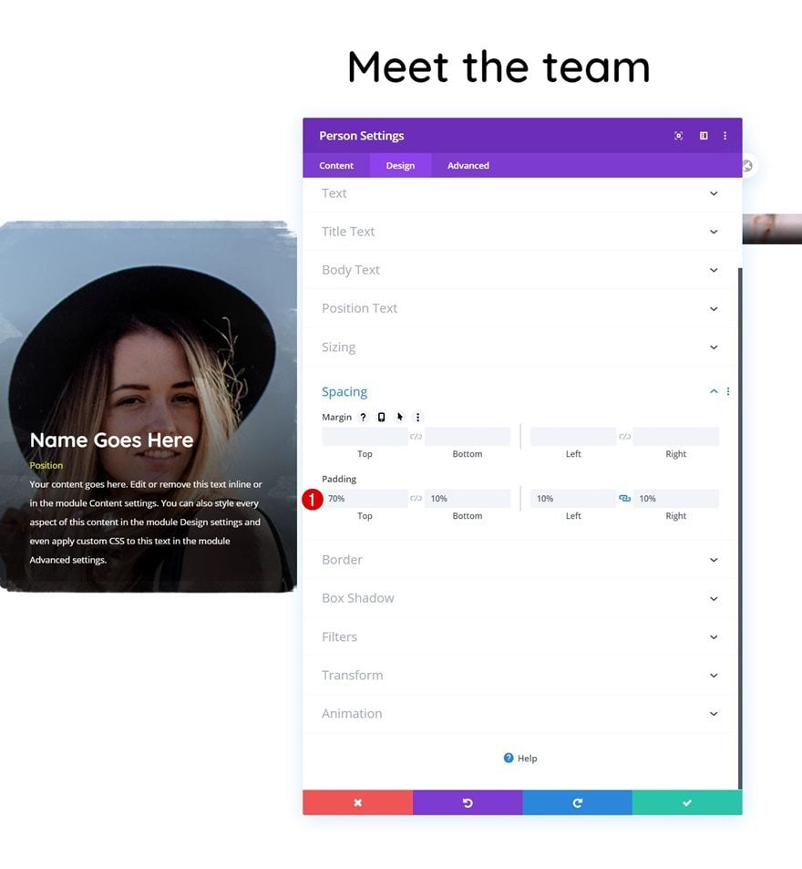
And complete the module settings by adding some custom padding values to the spacing settings.
- Top Padding: 70%
- Bottom Padding: 10%
- Left Padding: 10%
- Right Padding: 10%
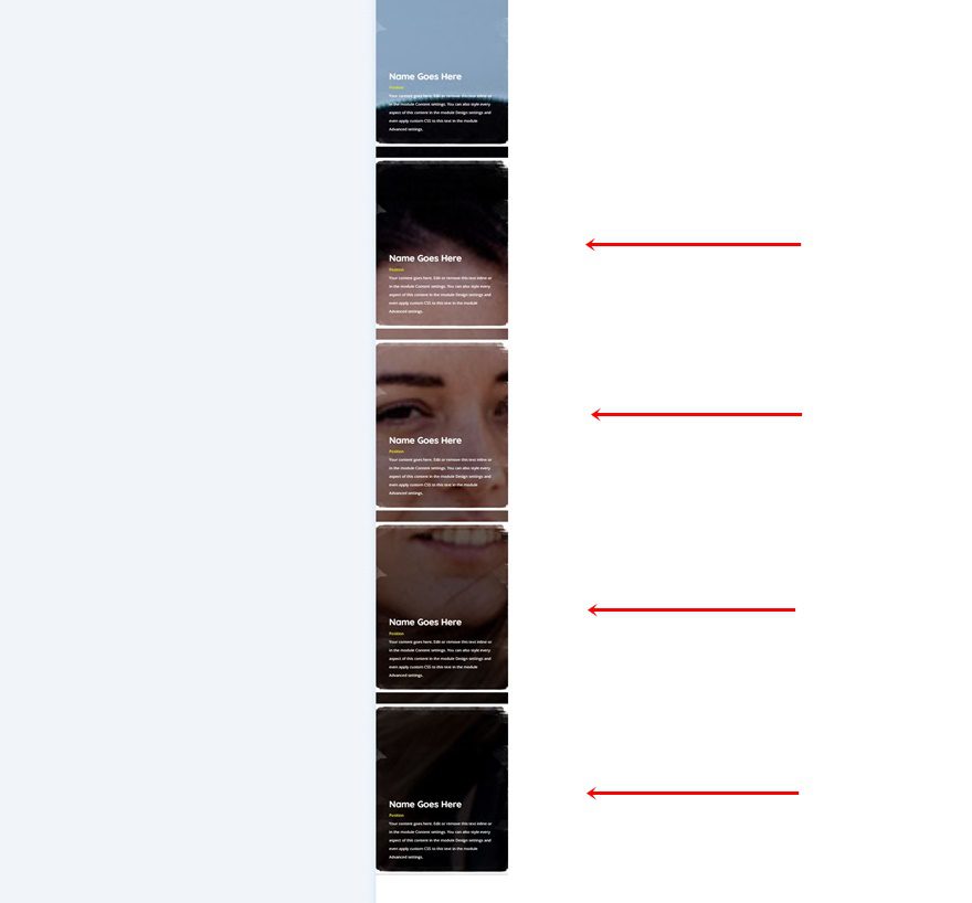
Clone Person Module 4x
Once you’ve completed the Person Module, you can clone the entire module four times.
Place Duplicates in Remaining Columns
Place the duplicate modules in the four remaining columns of the row. Make sure you change the content as well.
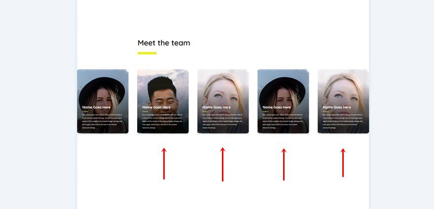
Turn Row into Self-Scrolling Carousel
Modify Row #2 Sizing
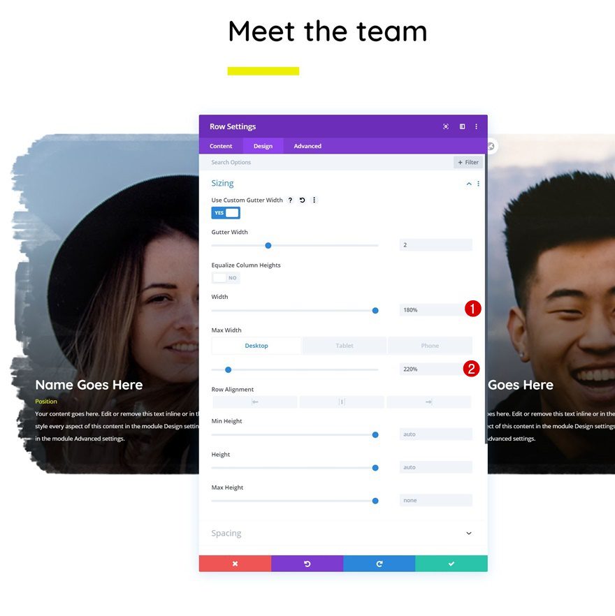
Now, to turn this row into a self-scrolling team member carousel, we’ll need to reopen the row settings and change the width and max width in the sizing settings.
- Width: 180%
- Max Width: 220% (Desktop), 100% (Tablet & Phone)
Add Row #2 Horizontal Motion
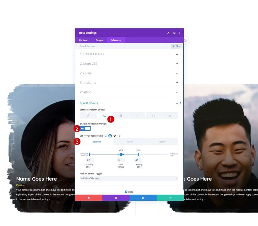
Complete the row settings by adding some horizontal motion to the scroll effect settings in the advanced tab and you’re done!
- Enable Horizontal Motion: Yes
- Starting Offset:
- Desktop: 2.5
- Tablet & Phone: 0
- Mid Offset: 0 (at 40%)
- Ending Offset:
- Desktop: -25 (at 62%)
- Tablet & Phone: 0
- Motion Effect Trigger: Middle of Element
Preview
Now that we’ve gone through all the steps, let’s take a final look at the outcome across different screen sizes.
Desktop

Mobile

Final Thoughts
In this post, we’ve shown you how to get creative with Divi’s built-in scroll effects. More specifically, we’ve recreated a beautiful self-scrolling team member carousel. As visitors scroll down the page, a different part of the carousel appears. You were able to download the JSON file for free as well! If you have any questions or suggestions, feel free to leave a comment in the comment section below.
If you’re eager to learn more about Divi and get more Divi freebies, make sure you subscribe to our email newsletter and YouTube channel so you’ll always be one of the first people to know and get benefits from this free content.




Please add native slider (Carousel)
we are tired of using buggy third parties carousel
Many thxxxx
I’m with Angelo, seems really clunky to me
ET’s almost daily scroll effect tutorial. Come on Guy’s we need speed…
oh thank you so much, this amazing carousel with full of features.
+1
Well, apparently everybody’s happy about it, it seems that is the most implemented effect ever created…..(never seen a smooth example of scrolling, all of them jerky and visually unappealing….but hey, what do I know, I’m in the minority).