Welcome to Day 77 of our Divi 100 Marathon. Keep tuning in for 100 days in a row of awesome Divi resources as we count down to the amazing release of Divi 3.0 on the final day of the series!

In today’s post we’re giving away a layout pack containing three new Divi Landing Pages, originally designed with the Wireframe Kit Vol. 1, and then finalized with content. The goal here is to show what’s possible with the new wireframe kits (while giving even more great layouts away, of course!).
- 1 Downloading & Using The Free Divi Landing Pages Layout Pack Built with Wireframe Kit Vol. 1
- 2 Subscribe To Download For Free
- 3 Download For Free
- 4 You have successfully subscribed. Please check your email address to confirm your subscription and get access to free weekly Divi layout packs!
- 5 Divi Landing Pages Built From Wireframe Kit Vol. 1
- 6 Tomorrow: Learn How to Add Creative Divi Section Backgrounds with CSS
- 7 Divi 100 Day 77
- 8 The Countdown To Divi 3.0
Downloading & Using The Free Divi Landing Pages Layout Pack Built with Wireframe Kit Vol. 1
To use the Free Divi Landing Pages Wireframe Kit on your own Divi website you will first need to download it using the button below. Next, locate the file divi-100-landing-pages-wireframe-kit.zip in your downloads folder and unzip it. Then, navigate in your WordPress admin to Divi > Divi Library and click the “Import & Export” button at the top of the page.
When the portability modal pops up go to the import tab. Click the “choose file” button and select the All.json file or any of the individual files you want. Then click the blue “Import Divi Builder Layout” button and wait for the import to complete.
Once the import has finished you will now have the ability to load your new Divi Landing Pages Wireframe Kit on any builder powered page by going to Load From Library > Add From Library.
Subscribe To Download For Free
Divi Landing Pages Built From Wireframe Kit Vol. 1
The three stunning landing pages contained in this layout pack were originally created with the Wireframe Kit Vol. 1 and then finished in unique ways. We hope you enjoy these freebies and find within them some inspiration for how you can get even more great layouts out of our wireframe kits.
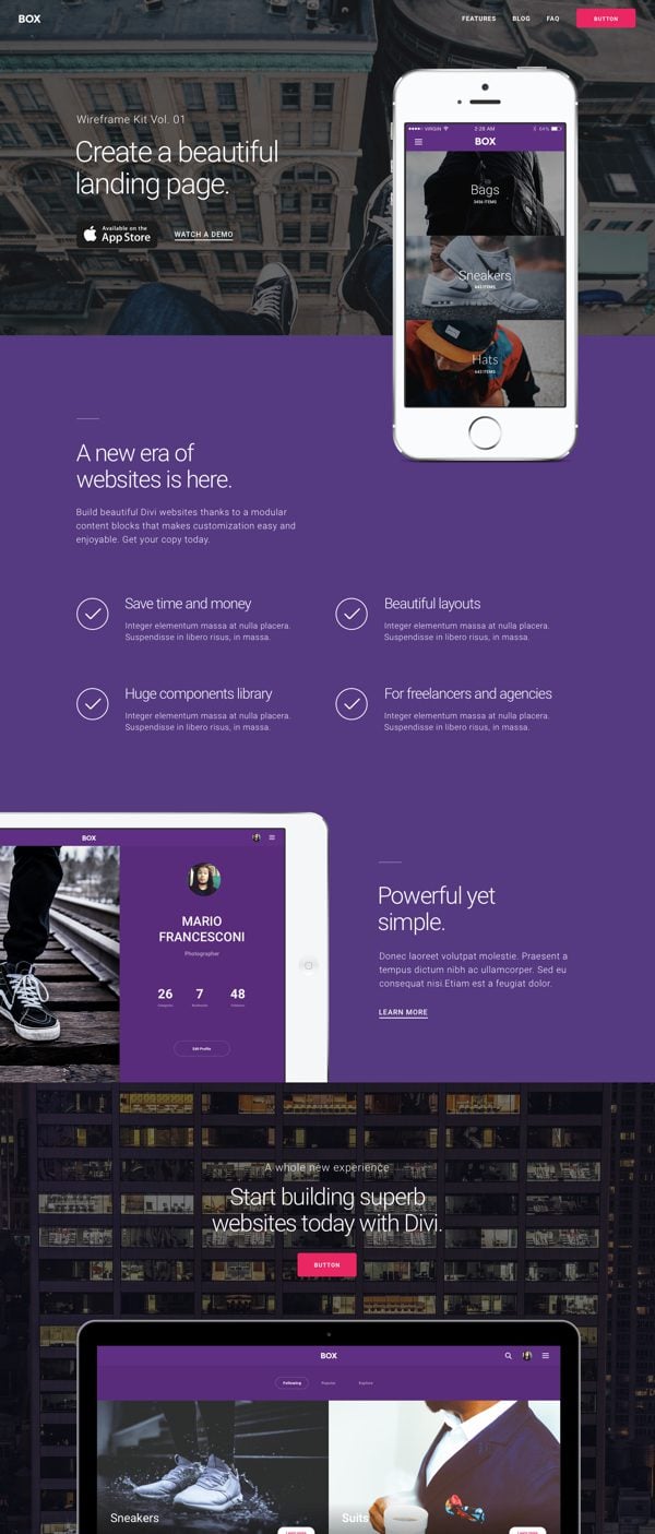
Landing Page Layout 01

Landing Page Layout 02

Landing Page Layout 03
Tomorrow: Learn How to Add Creative Divi Section Backgrounds with CSS
In tomorrow’s post Nathan is going to show you how to add Divi section backgrounds with CSS. This method is great for anyone short of images, but it also ensures that whatever you’re designing is going to look great no matter what device someone is viewing it on.
Be sure to subscribe to our email newsletter and YouTube channel so that you never miss a big announcement, useful tip, or Divi freebie!

Divi 100 Day 77
The Countdown To Divi 3.0
This post is part of our Divi 100 marathon. Follow along as we post free Divi resources for 100 days in a row! This 100-day countdown will end with the game-changing release of Divi 3.0, including our brand new visual editor built from the ground up using React. Divi 3.0 will change the way you build websites with the Divi Builder forever!
Let the countdown begin.



Beautiful! LAYOUT 1: Having trouble finding the main image… the one with the sneakers out the window of the building… where is it in the Divi layout? Want to replace.
cheers
Where can I find the documentation how to add a button in the header menu as in the layout 1 example?
Did you get any response from Augustine or Mario on this elsewhere?
Thank you Augustine, these look great!
I’m stuck with a thought though, you might be able to shed light on it.
The wireframe kit (WKIT) is a collection of pre-made layouts/modules right?
You mention in the title that these layouts are built with WKIT. How does this save time? The kit seems an extra layer. Or does it do something the builder cannot by default?
Hope this makes sense.
Hi Verdi, just like you I was stuck with the same thought as soon as they started talking about ‘wireframe kits’ and I also did not see any difference to standard layouts comprising a collection of modules, apart from the fact that no images or backgrounds were used. In fact, there does not seem to be any other difference to layouts or modules created and shared by anyone else.
Someone mentioned earlier (in the comments thread of day 65) that:
“all 30 modules are forcing Roboto Light. It would be MUCH better if they were left as “default” so we don’t need to manually change the font on every text module in every section every time.”
Yet there was no response from the ET team. I can’t comment as I have not used the wireframe kits yet. What is your experience with regard to this?
Hey Verdi, these layout pages are based on the wireframe kit sections. In fact, if you observe each section, you can easily recognize all the sections presented in the Wireframe Vol.1
I didn’t change anything from them, they are simply customized with custom colors and photos. So, you can easily re-create a full page without too much effort.
This save time for sure because you’ve too choose only the sections you need, then focus on the choosing of colors/images and content and there you are! 🙂
Thank you for explaining Mario!
This does make me wish for a future where this ‘flow’ is integrated. Same goes for all the (CSS) tips and tricks here on the ET blog. The more I see, the more I;m impressed with everything you can do with Divi, but also the more I wish these options where just built in.
Also makes me think about the modules with certain settings, you’d wish where in every module. Ofter you have to find a CSS solution for a setting that’s already present in another module (but can’t be used for your purpose.
Which all comes back to the biggest need of all: Being able to truly separate content from design when working with Global modules.
Am I making any sense?
Great Job, I will use this theme for my landing page.
Awesome! Glad you have found these resources useful.
Brilliant work guys.
Love the layouts.
We will be using these new layouts on a lot of new projects coming up.
Awesome! I’m glad to hear that 🙂
Hope all these downloads will come in one big package on the last day cause I can hardly keep up! 🙂
I hope so also
How do you change the text on the button in the contact form from “submit” to “start free trial”?
Very nice I can see a touch of Italian style 😉
Thanks Emanuele 🙂
Awesome as always! Thanks Mak and the ET crew!
Hey great layouts! How did you get the transparent nav bar across the top with the call to action button?
After loading your template, this section is not included.
thanks
I would like to know this too!
Mine’s just sitting at the following forever…
Import estimated time remaining: 1min
Mine too. I made the changes to the php.ini file to this:
upload_max_filesize = 50M
post_max_size = 50M
memory_limit = 256M ; Maximum amount of memory a script may consume (64MB)
max_execution_time = 300
and still not wanting to Import #1, the other two imported fine after making the changes.
Unfortunately, none of these suggestions worked, including disabling all other plugins. Still couldn’t import them.
This one could help too:
http://www.wpbeginner.com/wp-tutorials/how-to-increase-the-maximum-file-upload-size-in-wordpress/
Hi Mike,
I had the same problem, this solved it for me:
https://docs.woocommerce.com/document/increasing-the-wordpress-memory-limit/
Also see the conversation I had with ET support on this matter:
https://www.elegantthemes.com/forum/viewtopic.php?f=187&t=564225
Hope this helps you
Unfortunately, none of these suggestions worked, including disabling all other plugins. Still couldn’t import them.
Hi Mike,
Die you increase both PHP Mem limit AND upload limit on your (shared) server. Ask your host to help you if needed. For (plus the addition to .htaccess and wp-config file) me it solved the problem.
Hope this helps you.
I think these look great, thanks for the inspiration.
Thanks for the wondering landing page layout. I can’t wait to check them out. Please keep posting such awesome stuff. I look forward for the next.
I’m a big fan of Divi, Nick and team are rocking with the 100 days of awesome stuff. Thanks for publishing this landing page pack. I can’t wait to check them out.
So good to hear! 🙂
Thank you for the awesome layouts !
For some gorgeous colors & Star icon too. 🙂
Glad you enjoyed it! ?
They are so beautiful! Thank you. For the menu result do we have to tweak them manually to achieve that design? Always when I import a layout, my menu style remains the same. And another thing: it’s the second time I’m having trouble with Safari browser not rendering the website it properly. Could it be a Divi issue?
I got error… unable to unzip. The archive is broken…
Me too..
Sorry, just to be clear – I mean the ‘wireframe’ software, not the website design software (which is Divi of course).
http://www.elegantthemes.com/blog/divi-resources/free-divi-download-the-new-multipurpose-wireframe-kit-vol-1
http://www.elegantthemes.com/blog/divi-resources/free-divi-download-multipurpose-wireframe-ui-kit-vol-2
It’s just Divi.
Or are you asking something different?
I have never used ‘wireframes’ for designing pages, BUT now I will!
It looks like an extremely powerful way to build sites.
I want to try building some of these myself, so could you tell us:
1) what software you used to create these examples (or you recommend) and
2) give us a brief demo of how you created one of these examples (or a new one 😉 )
Much thanks guys for taking the time and effort to show us how to get the most out of your products!!!!
Dean
Great stuff..
I like layout no. 1 and will use it on my next project.
Thanks!
Great just great!!! I love all the work you have done so far tank you ET you’r the best
Great Stuff – will definately be able to use these.
Hello,
your landing pages are really beautiful! Is it possible somehow to add content or a button that shows up a bit delayed?
Thanks
Jay
Beautiful and very helpful. Thank you. I was about to start designing a landing page.
Thanks Augustine! These are some nice layouts and they show great ways to use the wire-frame kits. I especially like layout 01.
Thank you +1
Awesome landing pages. Thanks!
These are awesome! It would be great if you could create a walk-through demonstrating how you achieved these layouts starting with the wireframe components.
Thanks,
Scott
Hey Scott! Your idea sounds good, but I want to invite you to observe each section, and then compare the layout with the Wireframe Vol. 1 sections. In fact, you can easily recognize all the sections presented in the Wireframe Vol.1
I didn’t change anything from them, they are simply customized with custom colors and photos. So, you can easily re-create a full page without too much effort 🙂
+1
+1 as well.
+1 too!
+1 .. that would be awesome
+1
+1