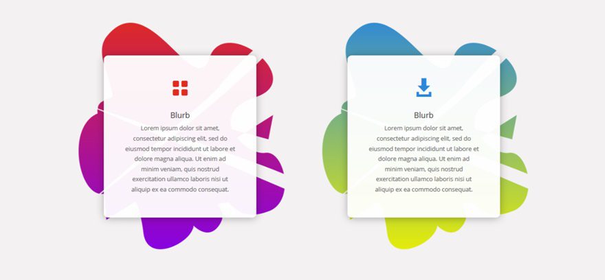
Combining asymmetrically curved background with vibrant gradient colors is a design trend that grew in 2017 and keeps existing and growing in 2018. To help you follow that trend seamlessly in 2018, we’ve created five different background images that you can use on 1/2 column backgrounds in combination with column gradient backgrounds.
Further down this post, you will be able to download these background images including the Photoshop file for free and use them for your next projects. Note that these background images are aimed explicitly at 1/2 column backgrounds and will fulfill their purpose in that specific situation only. If you want to make them apply to other column structures, you will need to change the image dimensions of each image within the Photoshop file.
- 1 Result
- 2 Download This Tutorial’s Files
- 3 Download For Free
- 4 You have successfully subscribed. Please check your email address to confirm your subscription and get access to free weekly Divi layout packs!
- 5 Download & Use 5 Asymmetrically Curved 1/2 Column Backgrounds with Divi
- 6 Recreate Section
- 7 Result
- 8 Final Thoughts
Result
Before we dive into the tutorial, let’s take a look at the entire result and the 1/2 column background images you will be able to download for free in the next part of this post.
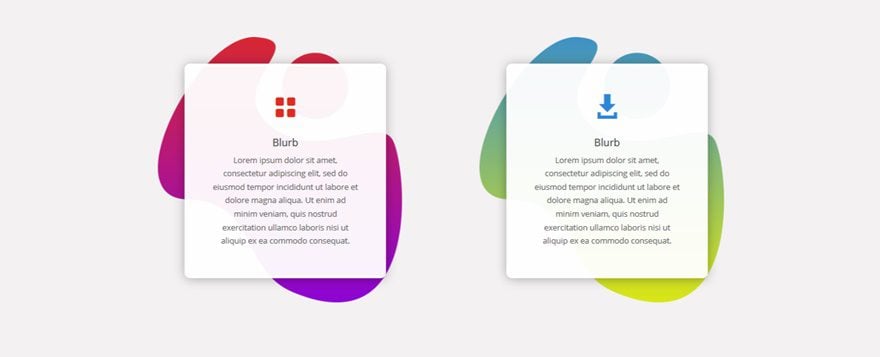
1/2 Column Background 1
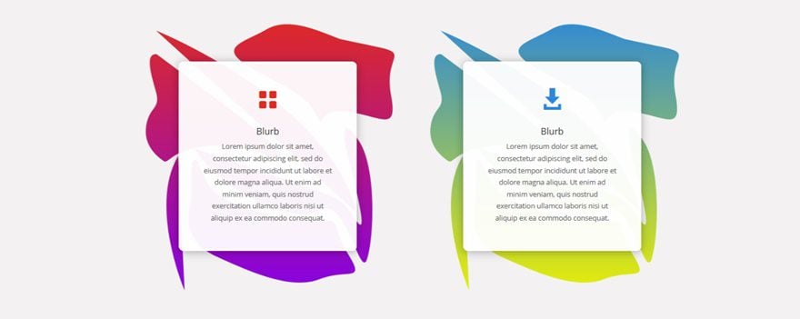
1/2 Column Background 2
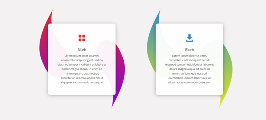
1/2 Column Background 3
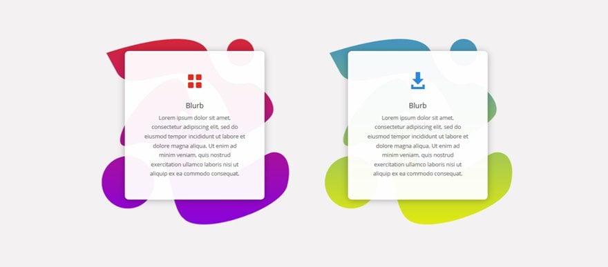
1/2 Column Background 4
1/2 Column Background 5
Download This Tutorial’s Files
To lay your hands on the free images & Photoshop files, you will first need to download it using the button below. To gain access to the download you will need to subscribe to our newsletter by using the form below. As a new subscriber you will receive even more Divi goodness and a free Divi Layout pack every Monday! If you’re already on the list, simply enter your email address below and click download. You will not be “resubscribed” or receive extra emails.
Download & Use 5 Asymmetrically Curved 1/2 Column Backgrounds with Divi
Subscribe To Our Youtube Channel
Recreate Section
Section Settings
Background Color
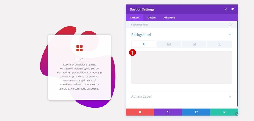
Before adding the 1/2 column background images, you’ll need to add a standard section to an existing or new page. Once you do, add ‘#f3f2f2’ as the background color of the section.
Add a New Row
Column Structure
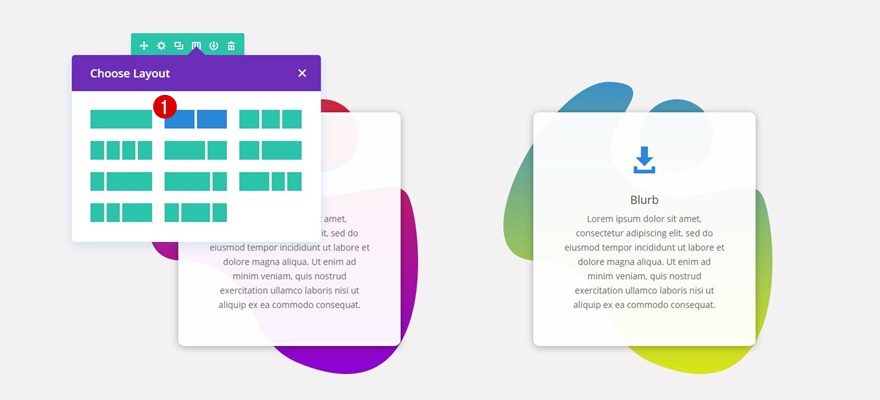
Continue by adding a row with two equal columns to the section you’ve just created.
Column 1 Gradient Background
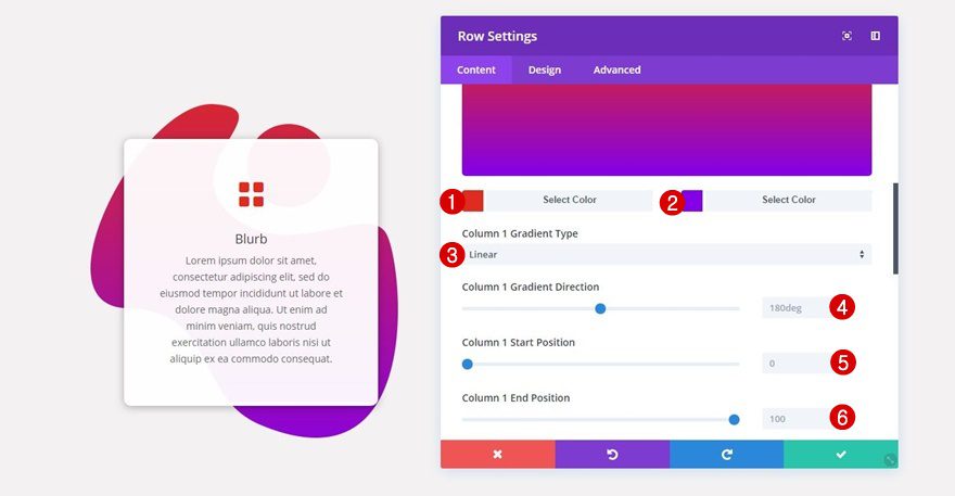
Then, open your row settings and add the following gradient background (or any other gradient background you’d wish to use) to the first column:
- First Color: #e02b20
- Second Color: #8300e9
- Column 1 Gradient Type: Linear
- Column 1 Gradient Direction: 180deg
- Column 1 Start Position: 0
- Column 1 End Position: 100
Column 1 Background Image
Next, go ahead and locate whichever one of the 1/2 column background images you want to use in the folder you’ve downloaded at the beginning of this post and add it as your background image along with the following settings:
- Column 1 Background Image Size: Cover
- Column 1 Background Image Position: Center
- Column 1 Background Image Repeat: Repeat
- Column 1 Background Image Blend: Normal
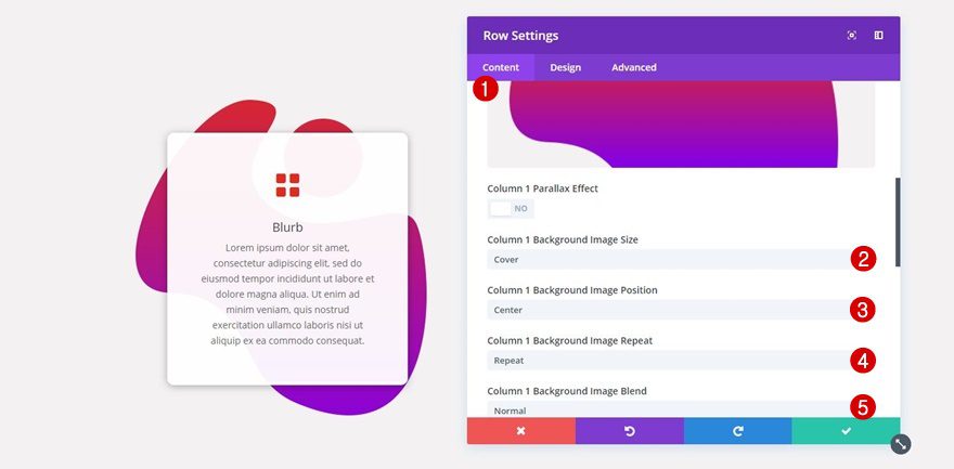
Column 2 Gradient Background
Scroll down and add a gradient background to the second column of your row as well (again, this could be another gradient background that matches your color palette as well):
- First Color: #2b87da
- Second Color: #edf000
- Column 2 Gradient Type: Linear
- Column 2 Gradient Direction: 180deg
- Column 2 Start Position: 0
- Column 2 End Position: 100
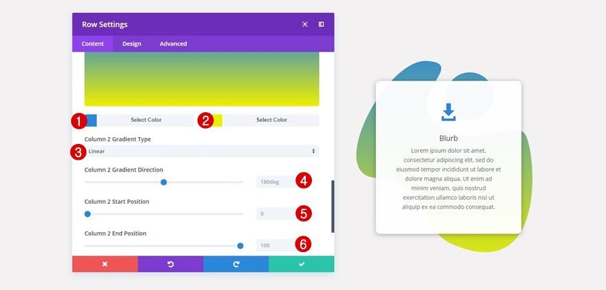
Column 2 Background Image
Add the 1/2 column background image of choice to the second column as well while using the same options as you did for the first column.
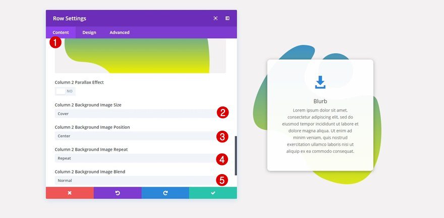
Add Custom Padding to Tablet for Each Column
To make sure the column backgrounds look good on tablet as well, apply some extra custom padding of ’50px’ to the top and bottom of each column (on the tablet only).
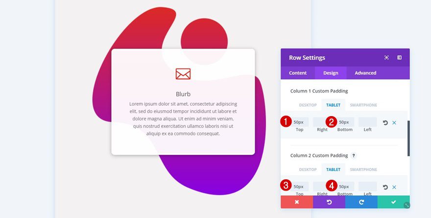
Add a Blurb Module to the First Column
Choose an Icon
Next, add a Blurb Module to your first column, enable the ‘Use Icon’ option and select an icon of choice.
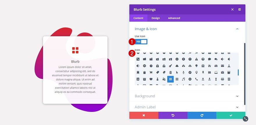
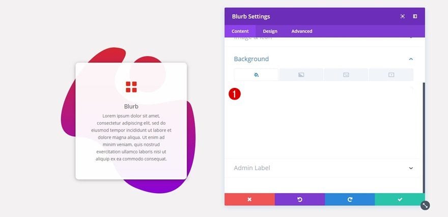
Background Color
Then, open the Background subcategory and add ‘rgba(255,255,255,0.95)’ as your blurb background color. This slightly transparent white color will allow your gradient background to shine through your Blurb Module without affecting the readability of your content.
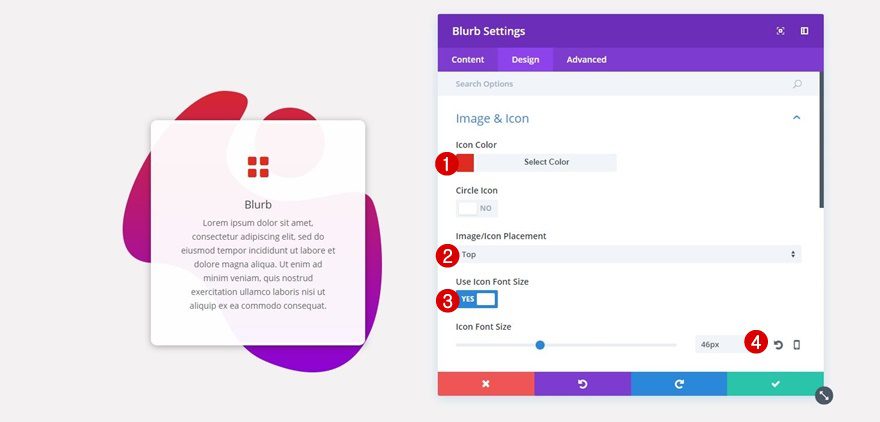
Icon Settings
Move on to the Design tab and apply the following settings to the Image & Icon subcategory:
- Icon Color: #e02b20
- Image/Icon Placement: Top
- Use Icon Font Size: Yes
- Icon Font Size: 46px
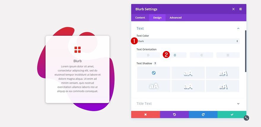
Text Settings
Then, open the Text subcategory next and make sure the following settings apply:
- Text Color: Dark
- Tet Orientation: Center
Sizing
Scroll down the Design tab, open the Sizing subcategory and use the following settings for it:
- Width: 70%
- Module Alignment: Center
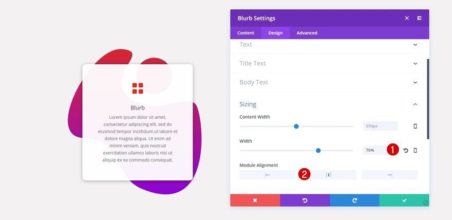
Spacing
Then, open the Spacing subcategory and use the following custom margin and padding for your Blurb Module:
- Top Margin: 100px
- Bottom Margin: 100px
- Top Padding: 50px
- Right Padding: 50px
- Bottom Padding: 50px
- Left Padding: 50px
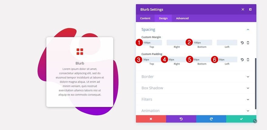
Border Settings
Continue by opening the Border subcategory and add ’10px’ to each one of your Blurb Module’s corners:
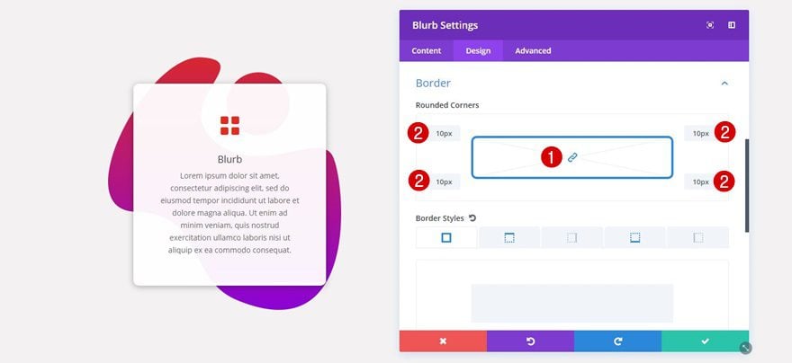
While still being in the Border subcategory, use the following border style for the top and bottom:
- Border Width: 5px
- Border Color: #FFFFFF
- Border Style: Solid
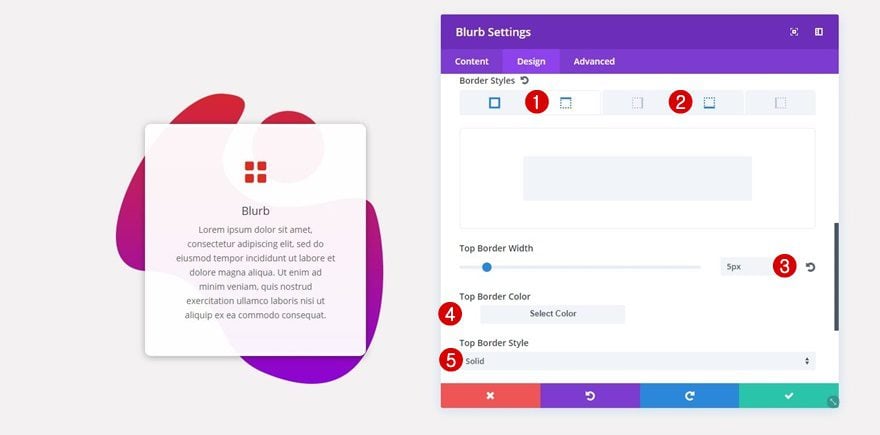
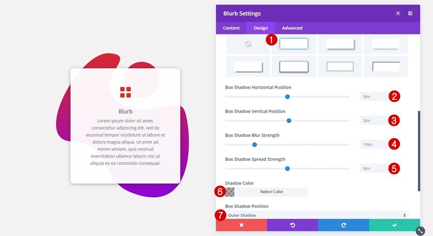
Box Shadow
Lastly, apply the following box shadow to your Blurb Module as well:
- Box Shadow Horizontal Position: 0px
- Box Shadow Vertical Position: 2px
- Box Shadow Blur Strength: 18px
- Box Shadow Spread Strength: 0px
- Shadow Color: rgba(0,0,0,0.3)
- Box Shadow Position: Outer Shadow
Clone Blurb Module & Place in Second Column
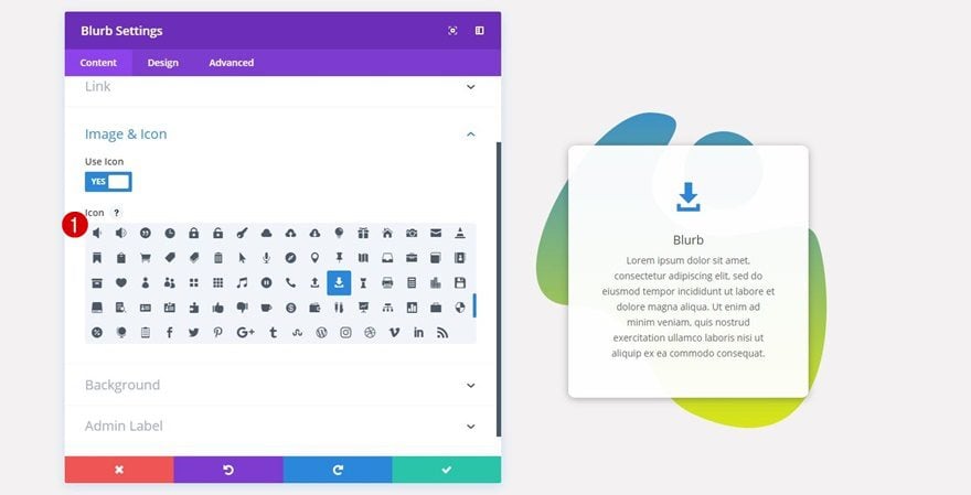
Change Icon
Now that you’ve finished the Blurb Module, you can save yourself some time, clone it and place it in the second column as well. The first thing you’ll need to do is choose a different icon that matches the content you’re sharing.
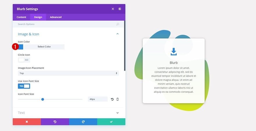
Change Icon Color
Change the color of your icon into a color that matches your column gradient background as well. In this case, the new icon color is ‘#2b87da’.
Try Using the ‘Luminosity’ Blend Mode
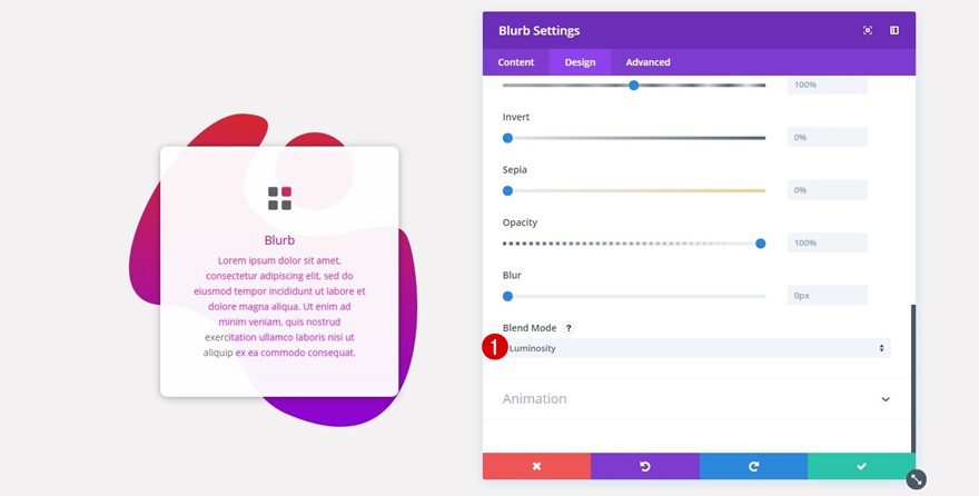
Blend Mode of Blurb Module
To top it off, you can also use ‘Luminosity’ as the Blend Mode of your Blurb Module to make the gradient background colors shine through the icon and text.
Mobile Version Tweak
Result
Phones have a more limited screen size than tablets and desktops. That’s why we’ll need to make small modifications to the row that appears on mobile. Before we show you what to do precisely, let’s take a look at the difference.
Before
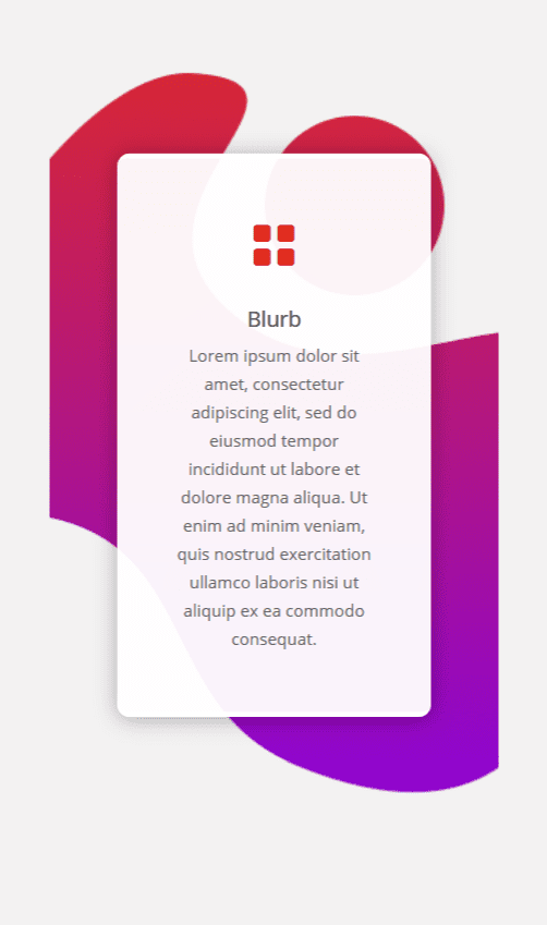
After
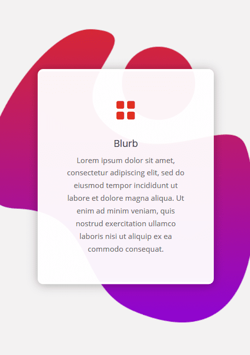
Clone Row
Now, to make the mobile version look as good as it does on desktop and tablet, start by cloning the row you’ve created.
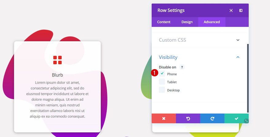
Change Visibility of Desktop & Tablet Row
Then, open the row for desktop and tablet, go to the Advanced tab and disable the row on phone.
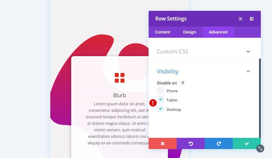
Change Visibility of Mobile Row
Likewise, you’ll need to disable the row for mobile on tablet and desktop.
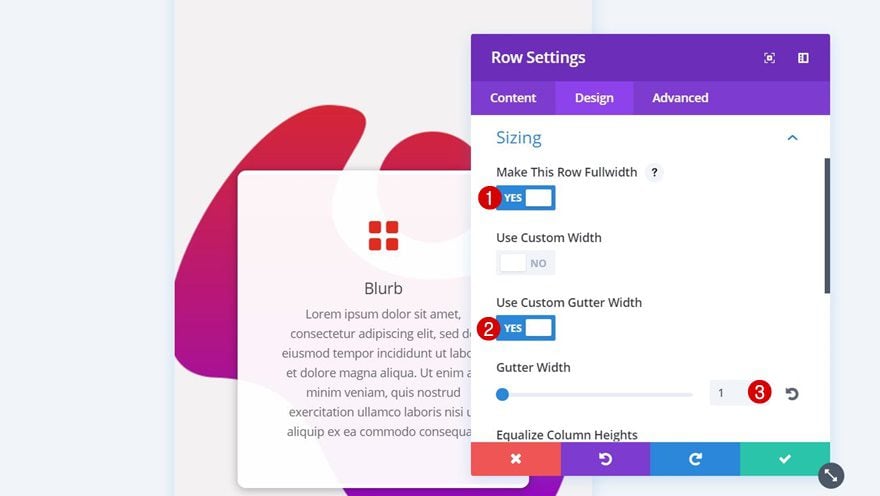
Change Sizing of Row
And to make the column background images look good on mobile, go to the Design tab, open the Sizing subcategory and use the following settings:
- Make This Row Fullwidth: Yes
- Use Custom Gutter Width: Yes
- Gutter Width: 1
Result
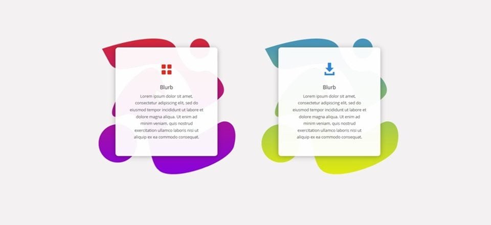
Now that we’ve gone through all of the steps, let’s take a final look at the stunning result you can achieve by using the five different 1/2 column background images on your website in combination with a Blurb Module.
1/2 Column Background 1

1/2 Column Background 2

1/2 Column Background 3

1/2 Column Background 4

1/2 Column Background 5

Final Thoughts
In this post, we’ve shared 5 different 1/2 column background images that you can use for your next projects. You can download these background images for free at the beginning of this post and use them without any restrictions. These asymmetrically curved background images in combination with gradient backgrounds are a design trend that grew in 2017 and continues growing in 2018. If you have any questions or suggestions; make sure you leave a comment in the comment section below!



Can anyone help please?
Starting with the tutorial above at:
“Add a New Row
Column Structure.
Continue by adding a row with two equal columns to the section you’ve just created.”
I can do this, adding two 1/2 columns.
At this step:
“Column 1 Gradient Background”
The problem starts. There is no way to select and style a column, there is only a “+ Insert Module(s)” in each of the half columns.
How can I style the background for the column? (It is not selectable).
Here is a screenshot of what I see: https://www.dropbox.com/s/mtinnfz6itxjd2v/blurb-tutorial.png?dl=0
hi. I do the same. but there is a glitch. The picture in the background is not shown completely. climbs right and left. why?
the picture is cropped to the right and left
It’s very nice and creative. Well explained. Thank you for the effort.
You’re welcome, thanks for your comment Sreeni! 🙂
Hello!
Good tutorial, very good. I will apply this to my website too.
But, this only covers 1/2 column and telling to adjust the background image size to fit other column sizes.
Can you tell me what size images should be to fit the other column sizes?
Glad you like it, Ted! Haven’t tried making them fit other column types but I think the smaller a column gets, the more background color in height the images will need.
Just to get notifications!
Maybe the video is clear in explaining the steps (I don’t have time to watch), but this blog — and your other tutorials — are anything but helpful. Why don’t you create a tutorial the way it’s supposed to be made: show the steps building up from nothing to the end result. Instead, you show the settings for every step, on top of the end result? If you’d do it the right way, people can see what they should be seeing after completing each step if they follow the tutorial.
Thanks for your feedback, Roland. I’ll keep that in mind for future tutorials 🙂
That is a great tutorial. Thanks Donjete
You’re welcome, Ray! 🙂
This is without a doubt one of the best tutorials I’ve ever seen. Great explanations, the pace is just right, easily understandable and Charming presenter.
Can’t tell you how many tutorials I’ve dropped midstream! This is Great! Thanks…
Thanks for your awesome feedback, Bill!! 🙂
I do love that you read and answer every reply! (Hint to the rest of you!)
Always nice to connect with the community, Randy 🙂
Donjete,
Thank you for the video tutorials you do and for making this available. You’re a good teacher and a great example to follow.
You’re oh-so-welcome, Joan!! 🙂
Interesting idea. So the background image you are adding to this, is actually a white png acting as a mask to create the shape? I like this!
Yep, using the same color as the section for the image background color and a transparent shape to make background colors that are set in Divi come through 🙂 thank you for your comment, Jamie!
Thanks Donjete. You are a great teacher. You made a complex topic so easy to follow step by step. This is very useful and your video instruction is very helpful.
Glad you feel that way, David!
That’s really fun, thanks 🙂
You’re welcome!!
Great tutorial, great design. Thank you so much!
You’re absolutely welcome, Alfred 🙂
I really appreciate these tutorials. I am a novice (and not very creative) and would have no grasp of the power of Divi if it were not for these articles. I see things on the Web and wonder how in the world they do that, not knowing I own a tool that can easily do it!
I also appreciate the free downloads and see how they save people a lot of time. But if I am ever going to understand Divi I must walk through these tutorials step by step, and l-e-a-r-n. So thanks very much.
That’s exactly what these tutorials are for, to learn 🙂 thanks for your comment, Gene!
Thumb up. Great tutorial. Thanks!
Glad you like it, Fabian!
Is there any limit to the creativity at ET?
Great work!!
The sky is the limit! Thanks Richard 🙂
That’s really fun. You have opened a new possibility.
I hope this gets noted: I GREATLY appreciate that you provide the modules for download. That is HUGE for playing with these ideas. Thank you. ET should make files available for all tutorials they post—even when prepared by 3rd parties.
I have 1 question. The Visual Builder gives me nightmares when I create separate mobiles sections. Any work flow suggestions?
Great to hear your feedback, Chris! 🙂 Whenever I struggle with a module for one or another reason, I switch over to Wireframe View to open the settings and switch back to the real-time builder right away
Thank you! I appreciate the tip. I’ll try it.
looks good if you just have to go for that style.
Thanks, Richard 🙂
That was the best video tutorial on Divi I’ve seen yet.. really clear fast and extremely helpful to see how to accomplish the design. I hope she does more of these.. Thank you!
Thanks for these kind and motivating words 🙂
Interesting idea. Always enjoy seeing this kind of Divi content. Keep it coming. ?
Thank you, Britt! 🙂