Today, we are excited to share another free layout with the awesome Divi community. This new layout is entirely dedicated to the popular baseball sport. You can use it in all kinds of situations that revolve around baseball.
Primarily and in most cases, you can use this freebie to make a website for a baseball team or sports club. The layout reflects a certain sense of unity and community which is treasured in a sports team.
Besides that, it also shows that the baseball team, or sports club in general, is dedicated to the sport they’re practicing and the professionalism that comes along with it.
The Baseball Layout
Being part of a baseball team and club is all about contributing to the bigger picture and automatically to the team. Every player has his or her own role in making sure everyone gets the best out of themselves.
Using real-life images, and preferably pictures of the team, throughout the page can empower a team and show the atmosphere and team feeling to the visitors of the website.
The team spirit and personal development that you show on your website will attract new players to the teams of your baseball sports club. In most cases, that’s the goal attached to having a website; attracting new team players and making sure you keep the current ones.
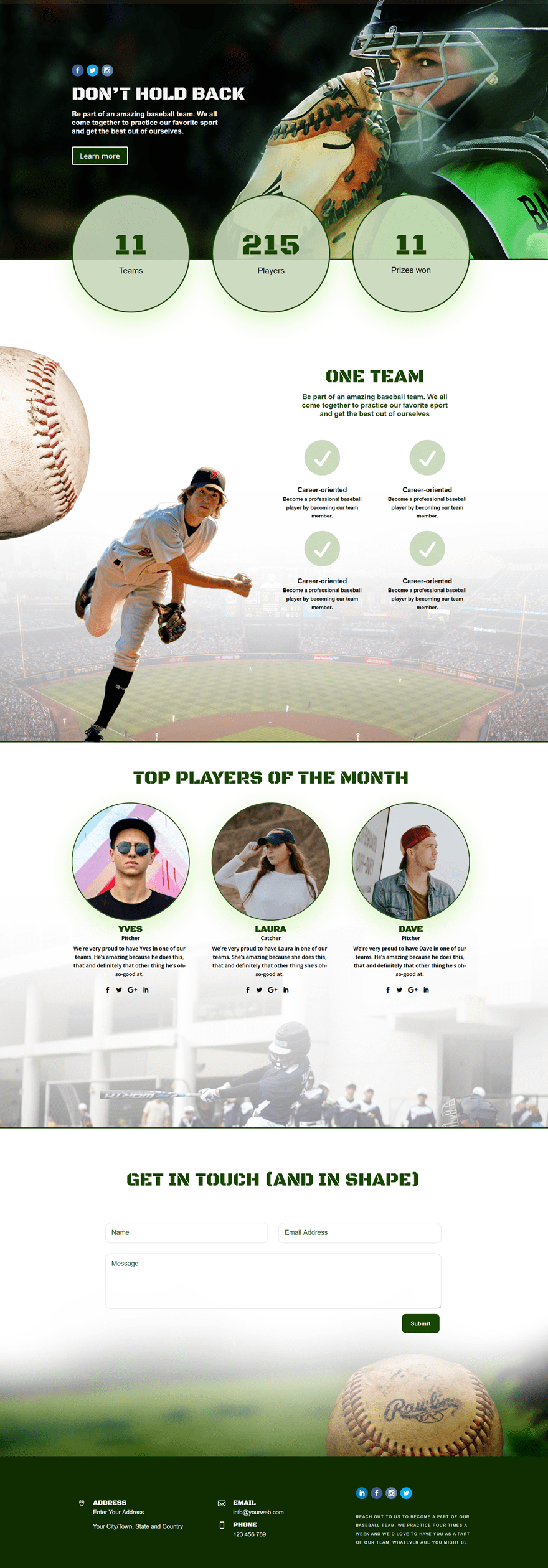
Let’s have a close look at how the free baseball layout looks like:
Download the Baseball Layout
Now that we’ve shown you how the layout looks like, it’s time to start using it! If you want to try it out yourself and start building a complete website with it, start the download in the form below. The only thing you’ll need to do is enter your email address and you’ll see a download link appear immediately after.
By entering your email address, you will subscribe to our newsletter. You’ll get informed about new, interesting and Divi-related posts on our blog and you’ll be one of the first to get Divi freebies that you can use right away!
If you’re already subscribed to our newsletter; don’t worry, entering your email address will not cause you to “resubscribe” or get additional emails. It will just make the download available to you.
What’s in the ZIP?
The ZIP file you receive after having entered your email address contains the following files:
- baseball-master-layout.json – importing this file will add the full layout and all of the individual sections of the baseball layout to your Divi Library.
- baseball-full-layout.json – this is just the full baseball layout.
- sections folder – this folder contains all of the JSON files for the seven individual sections of the baseball layout.
Setting up the Baseball Layout
Subscribe To Our Youtube Channel
When you have located the downloaded zipped folder, you can go ahead and unzip it. You’ll find the files mentioned above. Depending on which sections you want to use, you can upload them into your Divi library.
Go to Divi > Divi Library > Import & Export > Import > Select the baseball master file
Continue by adding a new page to your website. Activate the Divi Builder and access the Divi Library on your page by going to:
Divi Library (the “+” symbol on the frontend) > Add From Library > select the baseball layout
After having selected the Baseball layout for your page, you’ll see that the layout will pop up on the page in the Divi Builder.
The layout’s purpose is to use it as a homepage. If you want people to land on this page when they visit your website directly, don’t forget to set it as your front page in your WordPress settings.
Go to Settings > Reading > Front page > Select the page you recently created
Get Started with the Layout
The layout you just downloaded (or are planning on downloading) contains 6 parts that we’re going to guide you through in this post. As usual, we start off with a hero section and finish with a footer.
The Hero Section

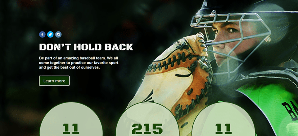
The hero section looks pretty straight forward. We’ve used a background image that reflects the emotions most baseball members have; focused, determined and ready. The high-quality image you show in your hero section will immediately have an impact on the overall website feeling. The more professional the image is, the more professional the baseball team or sports club will look like right away from the beginning.
Furthermore, we included the most important parts of the hero section, such as a CTA and a catchy headline. We’ve also added the social media follow buttons to encourage visitors to visit these pages as well.
Social media channels usually represent the community feeling more than a website does. Many people value that community feeling a lot and it’s often the reason why they choose to join a particular team.
The Number Counter Section

Next, we have the Number Counter section. We’ve chosen to make the hero section and this section overlap to create that extra effect. Change the numbers by considering the things you’re most proud of on your baseball team.
Here you have some inspiration on what questions you can answer with the Number Counter section:
- How many players do you have?
- How many teams does your baseball sports club have?
- How any prizes have your teams won?
- How long does a person averagely stay in your sports club?
- How many times a year do you organize team buildings?
- How many times a week do you train?
About Section
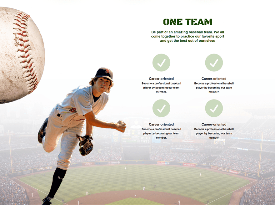
In this section, you can clearly see the power of images. It looks like the guy is throwing the ball right into your screen. This, again, reminds visitors on your website what the ultimate goal of your baseball team or sports club is. The focus is on the sport and that’s clearly shown in this part of the website. The blurbs give away 4 important parts of being a team player, whereas the stadium background shows what a possible future for a team player can look like.
The layout on mobile and tablet looks similar yet different. The only image used on mobile and tablet is the baseball. Similar to desktop, the baseball covers half the screen of your mobile phone or tablet–creating an interactive design for your homepage. You can decide how much you like the baseball to show up by playing around with the margins in the Spacing subcategory of the Design tab.
Top Players Section

People like to socialize and associate themselves with other people. If you include a ‘top players of the month’ part on your website, you automatically show what kind of players you have. This visuality can make it easier for potential team players to associate themselves with your team and the team players that are already on the team. It’s also an excellent way to show appreciation and engage with your team members on a regular basis.
In this section, we used the same type of background as we did in the previous section. Including these images gives that extra visuality. As you can also notice, we added some padding to the bottom of the Person Modules that represent the top players. We did this to make sure the Person Modules don’t cover up the background image completely.
Contact Form Section
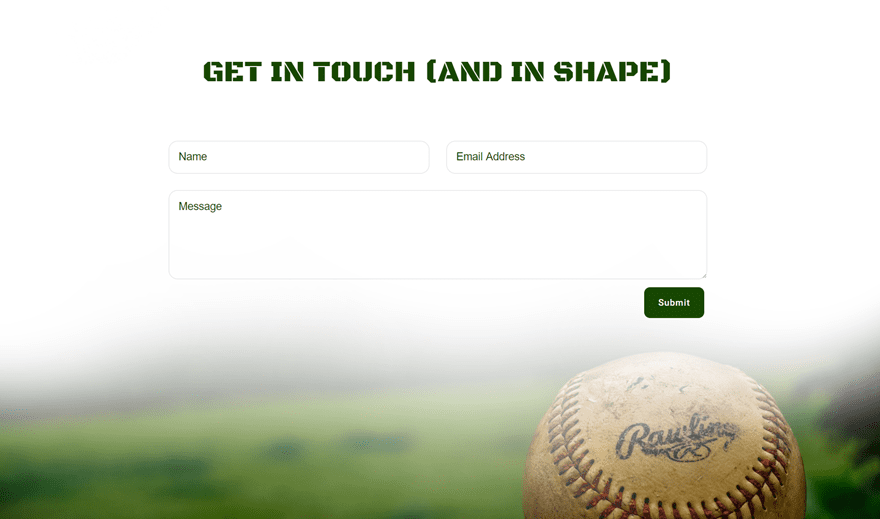
Having a contact form on your website is crucial. It helps you start a conversation with the people in your audience. And, again, we used a similar type of background for this section.

Last but not least, we included a footer. The footer gives people the important information that they may need such as; address, email and phone number.
Wrapping Up
We hope you like this layout and that it’ll help you start building websites for baseball teams or sports club. We recommend using the style, font families, font styles and colors that we’ve used in this layout throughout the other pages of the website.
Any remarks or questions are welcome in the comment section below. I’ll be standby and I’ll try to answer all of your questions as helpfully as I can. On top of that, if you have any suggestion on tutorials you’d like to see for Divi, shoot!
If you’re eager to learn more about Divi and get more Divi freebies, make sure you subscribe to our email newsletter and YouTube channel so you’ll always be one of the first people to know and get benefits from this free content.



Sois impresionantes muy activos en vuestro Blog y ademas un contenido espectacular cada día me siento mas feliz de haber comprado la plantilla divi
Awesome little layout. Thanks.
I run a baseball blog – not a page like this. Anyone know of any good baseball blog themes?
Thank!
Wow, thank you ET. Thank you, Donjete. DIVI is the best thing that has ever happened to wordpress developers.
Excellent layout. Great job! Can’t wait to put my hands on it.
Really awesome!!!
Baseball is one of my favourite hobby, but it’s not easy to find who want to play it seriously