The Duriza Divi child theme is a multi-purpose child theme designed with service companies in mind. It includes 12 pages, a custom slider with icon triggers, and a sidebar submenu to link your services together. In this article, we’ll take a close look at Duriza to help you decide if it’s the right Divi child theme for your needs.
- 1 Installing Duriza Divi Child Theme
- 2 Duriza Divi Child Theme Home Page
- 3 Duriza Divi Child Theme About Us Page
- 4 Duriza Divi Child Theme Services Page
- 5 Duriza Divi Child Theme Single Service Page
- 6 Duriza Divi Child Theme Testimonials Page
- 7 Duriza Divi Child Theme Projects Page
- 8 Duriza Divi Child Theme Single Project Page
- 9 Duriza Divi Child Theme Blog Page
- 10 Duriza Divi Child Theme Single Post
- 11 Duriza Divi Child Theme Contact Page
- 12 Duriza Theme Builder Layouts
- 13 Where to Purchase the Duriza Divi Child Theme
- 14 Ending Thoughts
Installing Duriza Divi Child Theme

Installation is simple, but there are several steps to follow. Install and activate the Duriza Divi child theme as you would any theme. First, with Divi activated, upload and activate the theme. Installing the demo content for Duriza is done manually. Fortunately, the instructions are simple and clear.
Next, you’ll need to upload the settings for the Theme Options, Theme Builder, Theme Customizer, and the Divi Library. These files are provided in a supplementary zipped file. The files are labeled so they’re easy to identify. Finally, you’ll need to create the home page and any other pages you want using the layouts in the library and add them to the menu.
Documentation provides information on adding images to the grid, adding arrows to the dropdown and side menus, creating a side menu, changing colors, and creating a blog post using the library layout.
All of this is easier than it sounds and the instructions are easy to follow. It does take a little bit of time, though.
Duriza Divi Child Theme Home Page
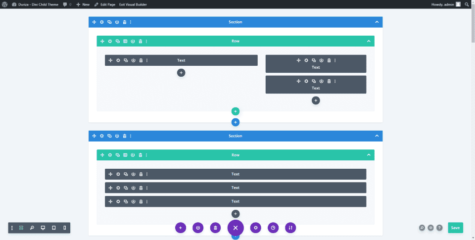
The Duriza home page was built with lots of text modules, blurbs, buttons, slides, dividers, and a contact form. We’ll look at each of the sections from the home page. The other pages use similar designs. Every page includes light green highlights.
Duriza Home Page Hero Section
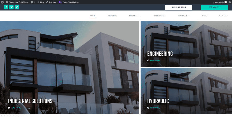
The hero section displays the header and large images that link to pages. The header is created in the theme builder. The images are placed in a multi-column layout with a large image on one side and two smaller images in a stack on the other side. Their dark overlays brighten on hover. Overlays include titles and a link to read more.
Duriza home Page Services Section
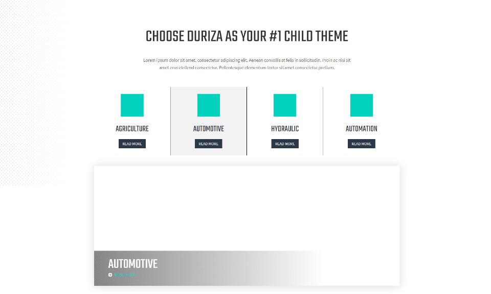
The services section introduces the services with a large title and short description. Services are shown in 4 columns with blurbs that include the image, title, and a button. Under this, services are highlighted with slides in a single column with the title at the bottom. Slides include a box shadow. The background includes a dot pattern on the left. Documentation shows how to add your images.
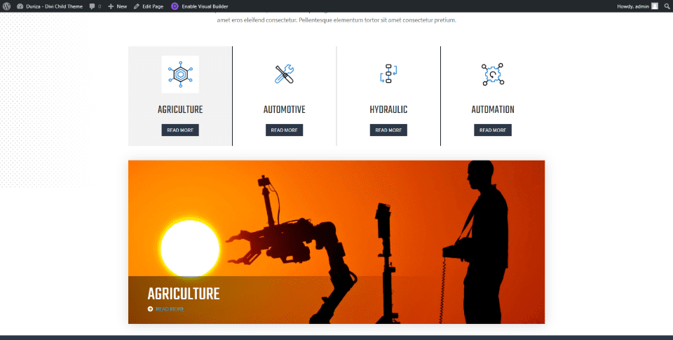
The slide that shows corresponds to the slide that you’re hovering over. CSS is already added to the rows to accomplish this, but you’ll need to add the image URLs to the CSS stylesheet as I’ve done in the example above. Images are preloaded so they appear instantly on hover using a transition effect.
For an example of how to use the slide, I’ve added image icons from other Divi layouts and images from Unsplash. Images preload so they appear quickly on hover. The instructions step you through this. If the images don’t show up when you refresh the page, I recommend clearing your cache. This is one of the sections that stand out the most.
Duriza Home Page About Section
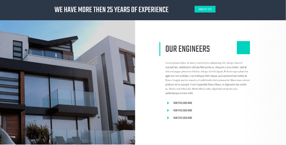
Information about the company and team members displays a full-width message with a button to see the About Us page. Information displays in a double-column layout with a large image on one side and team member titles on the other. The dotted background pattern appears in this section on the right.
Duriza Home Page Projects Section
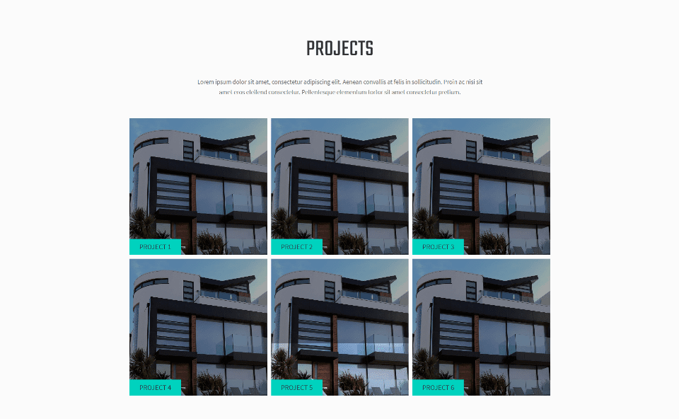
Projects display in a three-column grid with an introduction and hover animations that lighten the overlay.
Duriza Home Page Testimonials Section
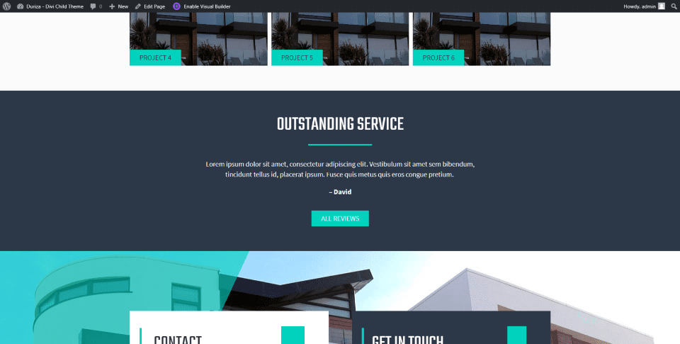
Text modules, a divider, and a button create the testimonial section. As this example shows, displays a title, a short testimonial, and a button that links to the testimonials page. The dark gray background stands out from the other sections. The green highlights work well with the dark gray.
Duriza Home Page Contact Section
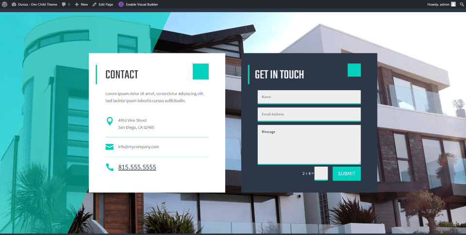
The contact section includes two boxes placed over a full-screen background with an overlay that covers the left edge. Contact information displays in the first box with text and icons over a white background. A contact form displays over a dark gray background that matches the testimonial section. Both boxes include green highlights.
Duriza Divi Child Theme About Us Page
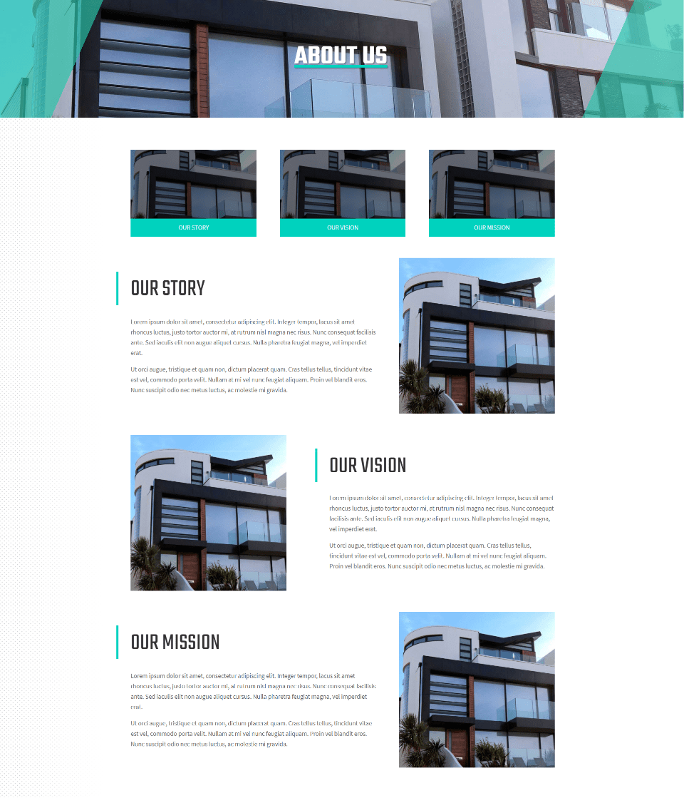
The Duriza Divi child theme About Page introduces the page with a full-width header that includes an image with a styled overlay for the sides. Images display links that scroll down to the rows for the story, vision, and mission. These rows display an image and text in an alternating layout. The page also includes the contact section from the home page.
Duriza Divi Child Theme Services Page
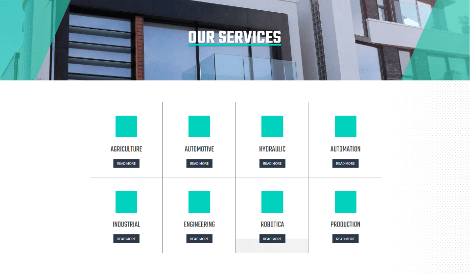
The Duriza Divi child theme Services page displays services within blurbs in a grid. Buttons link to the individual service pages. This page also includes the contact section from the home page.
Duriza Divi Child Theme Single Service Page
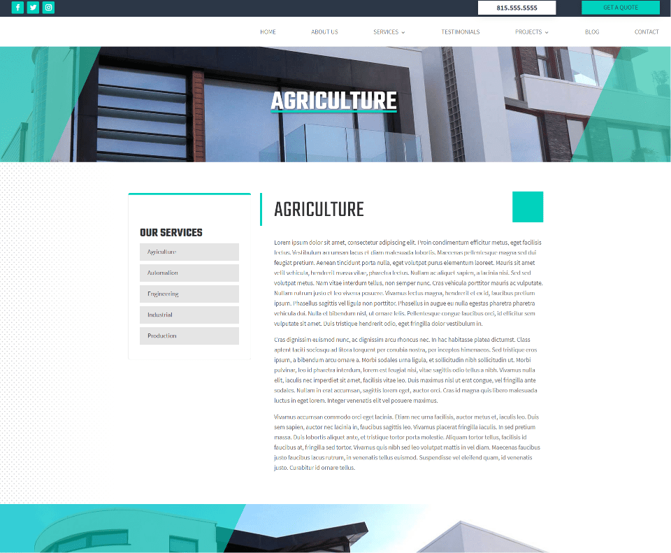
Single service pages show information about the service in a single column with a styled menu on the left. This menu is added with a sidebar module that displays a custom widget that you’ll create. Hover animations in the menu change the background of the page name to green.
Duriza Divi Child Theme Testimonials Page
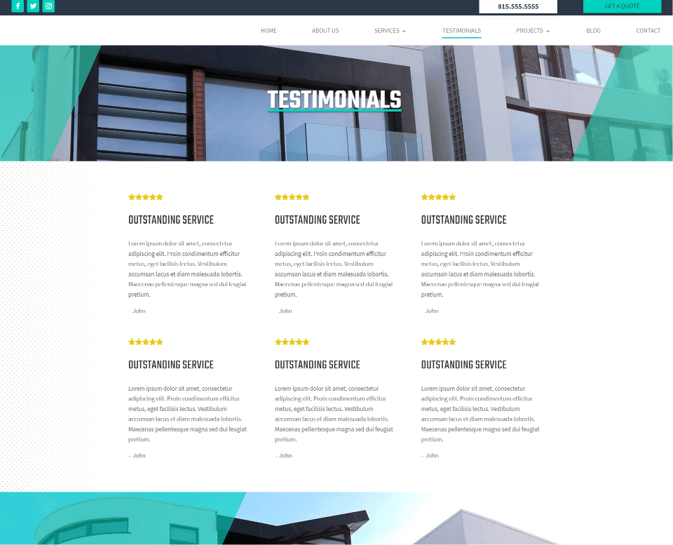
The Duriza Divi child theme Testimonials page displays testimonials created with text modules in a three-column section. As seen in this example, they include a star rating, title, details, and the name.
Duriza Divi Child Theme Projects Page
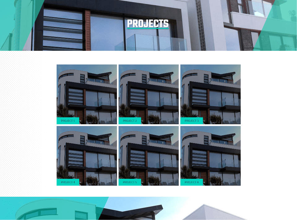
Duriza Divi child theme Projects page display projects in a three-column grid with text modules. Images are dark until you hover over them.
Duriza Divi Child Theme Single Project Page
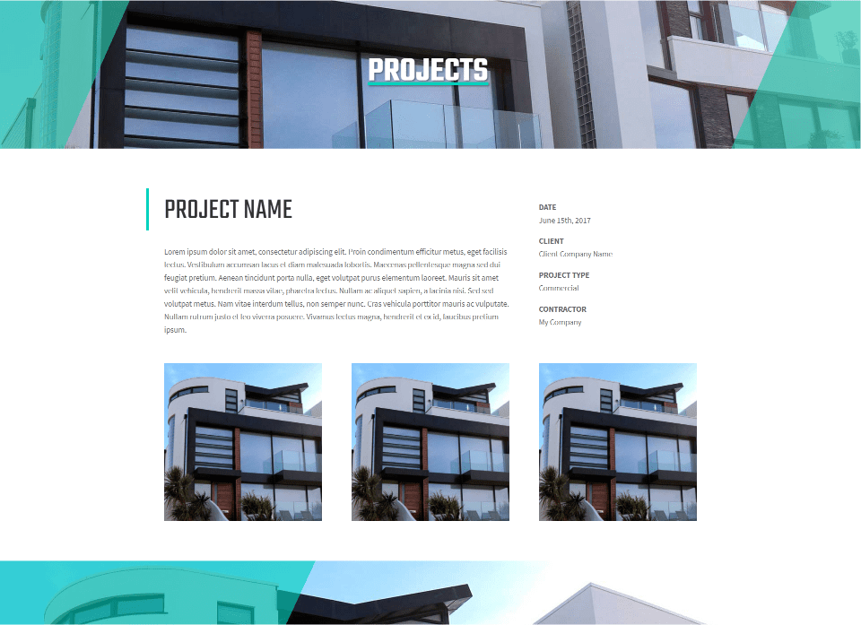
The Duriza Divi child theme single project page displays the project’s title above a description with the date, client, type, and contractor information in a list on the right. Images of the project appear below this.
Duriza Divi Child Theme Blog Page
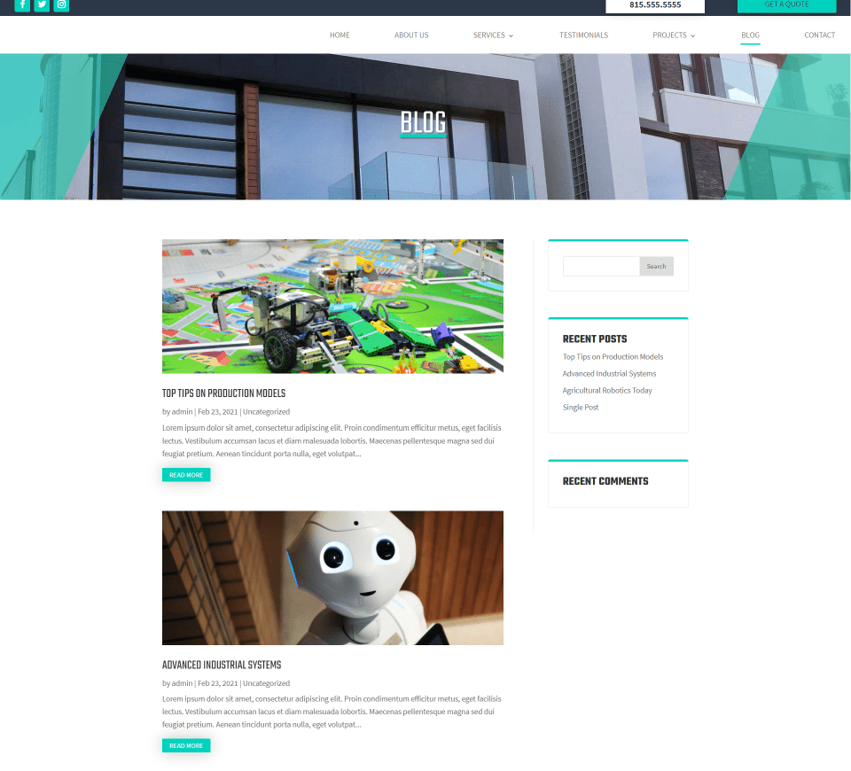
The Duriza Divi child theme Blog page displays posts in a single column with a right sidebar. Posts show the featured image, title, excerpt, and a styled read more button. Widgets in the sidebar have a styled top border that matches the site and a faint border on the other three sides. The header introduces the page. A green overlay appears over the images on hover.
Duriza Divi Child Theme Single Post
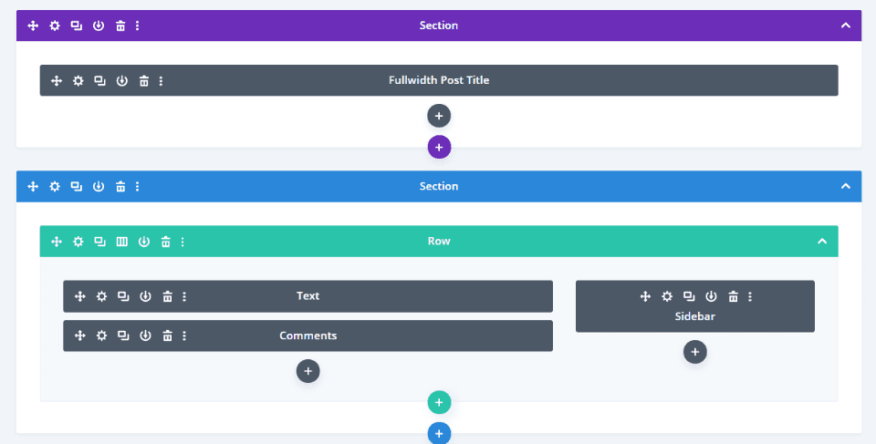
Blog posts are built with the Divi Builder and include a fullwidth post title, text, comments, and a right sidebar.
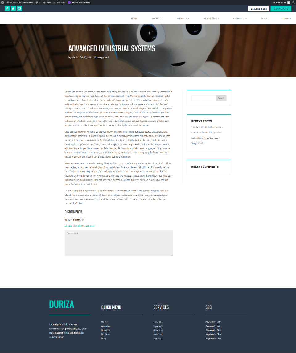
Here’s how the design looks on the frontend. I’ve set up the Divi page to show in fullwidth and to not display the title. This allows it to only show the header, footer, and modules.
Duriza Divi Child Theme Contact Page
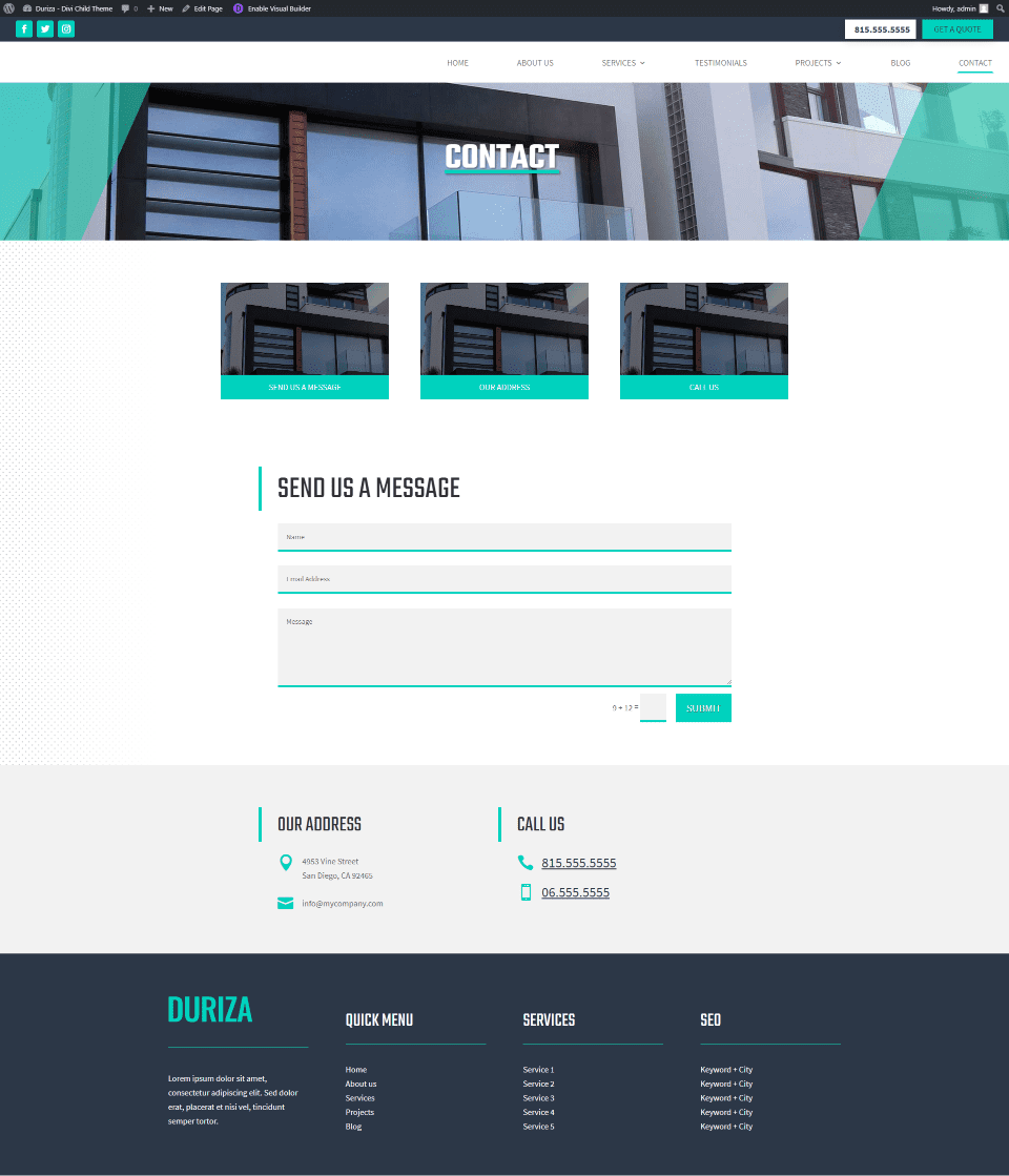
The Duriza Divi child theme Contact page displays images with links that scroll to the proper contact information when clicked. Styling for the contact form matches the rest of the site with a green border at the bottom of each field.
Duriza Theme Builder Layouts

The Theme Builder layouts for the Duriza Divi child theme include global a header and footer for the default template, a custom layout for all the category pages, and a custom layout for the 404 page.
Duriza Header
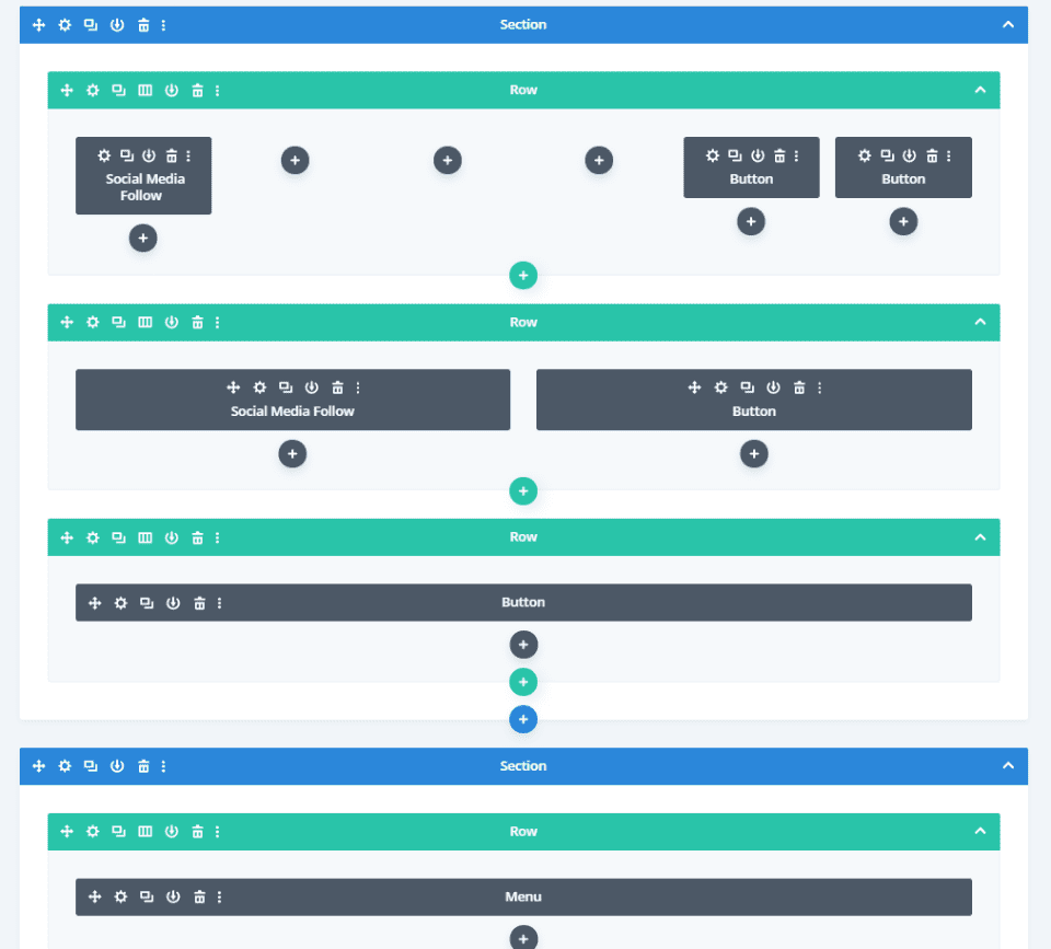
The header includes two sections with social media and two buttons in the top section and a menu in the bottom section. The top section has two rows: one for desktops and one for phones and tablets.

The Visual Builder shows both top rows so you can work on them. Since the phone number is a button, it’s clickable.
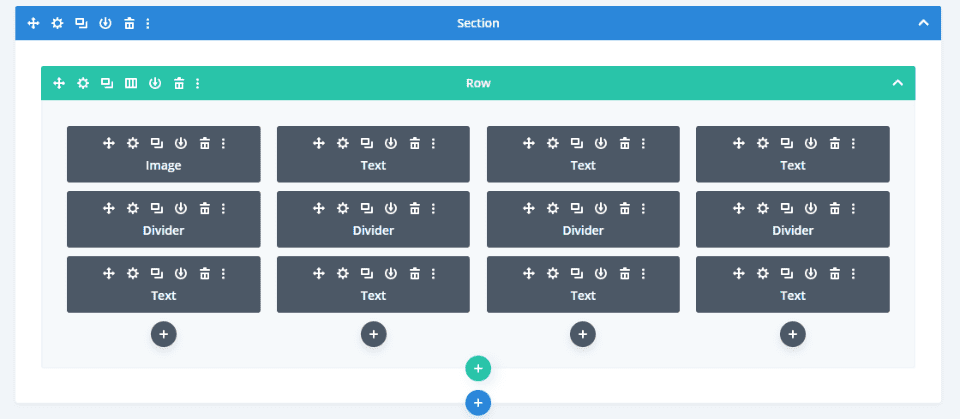
Duriza’s footer looks like widgets, but it’s made with text and divider modules instead.

As a result, the footer lists of links that include the logo, headers, and styled dividers that would not be easy to do with just widgets.
Duriza All Category Pages
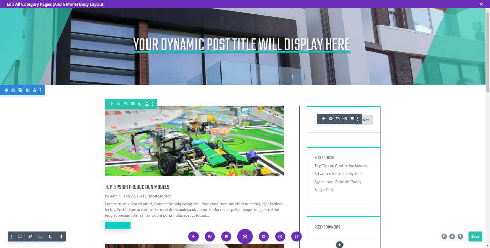
The All Category Pages template is the same as the blog page. It includes a fullwidth header, blog, and sidebar modules.
Duriza 404 Page
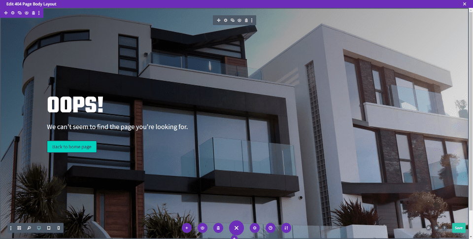
The body portion of Duriza’s 404 page is created with a fullwidth header module. It displays a full-screen background image with a message and button in the overlay.
Where to Purchase the Duriza Divi Child Theme

Purchase the Duriza Divi child theme in the Divi Marketplace for $39. As always, Duriza includes unlimited website usage and update and support for 1 year.
Ending Thoughts
That’s our look at the Duriza Divi child theme. Even though it’s a multi-purpose child theme, the custom slides to show services on the home page and the custom sub menu on the individual services pages make it an excellent choice for a services website. The 12 pages give you plenty of pages to show your services and projects. Styling is simple and clean, giving the child theme an elegant design.
We want to hear from you. Have you tried the Duriza Divi child theme? Let us know what you think about it in the comments below.
Featured Image via BRO.vector / shutterstock.com


Love this new theme Divi & Love the choice of photos, did you find them off our Expect Best Pexels account?
we took them in sandbanks.
keep up the good work.
Thank you Randy for the overview of my child theme