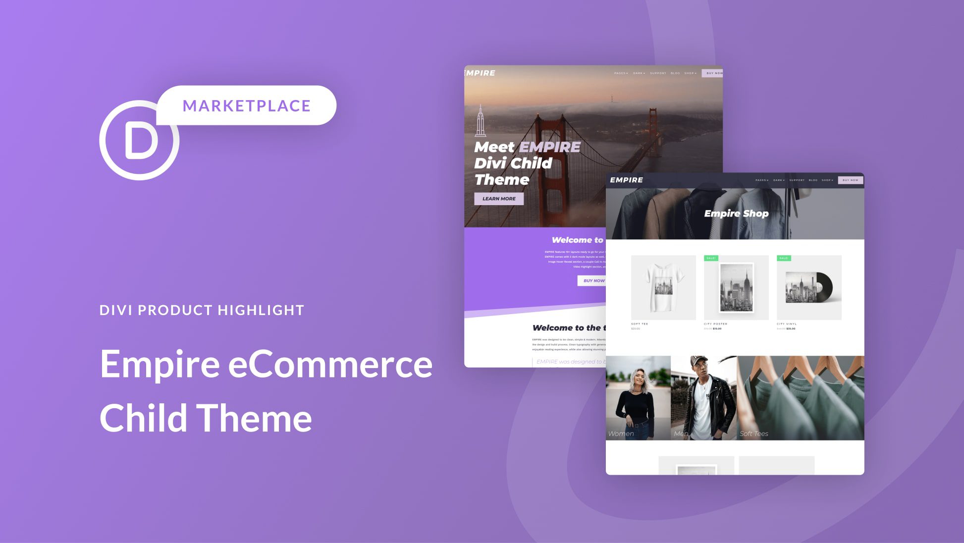
The Empire Child Theme is a Woocommerce-based eCommerce website theme for online stores. It uses Divi as its main theme. The design is clean and modern with beautiful typography and impactful images. The child theme comes with 10+ pages and 3 dark mode pages. In this post, we’ll take a look at the Empire Divi child theme to help you decide if it’s the right Divi child theme for you.
Let’s get started!
- 1 Installing Empire Divi Child Theme
-
2
Empire Divi Child Theme Pages
- 2.1 Empire Divi Child Theme Homepage
- 2.2 Empire Divi Child Theme Interior Page
- 2.3 Empire Divi Child Theme Services Page
- 2.4 Empire Divi Child Theme Team Page
- 2.5 Empire Divi Child Theme Contact Page
- 2.6 Empire Divi Child Theme Blog Page
- 2.7 Empire Divi Child Theme Blog Post
- 2.8 Empire Divi Child Theme Shop
- 2.9 Empire Divi Child Theme Product Page
- 2.10 Empire Divi Child Theme Cart Page
- 2.11 Empire Divi Child Theme Header
- 2.12 Empire Divi Child Theme Footer
- 2.13 Empire Divi Child Theme Video Tutorials
- 3 Where to Purchase the Empire Divi Child Theme
- 4 Final Thoughts
Installing Empire Divi Child Theme
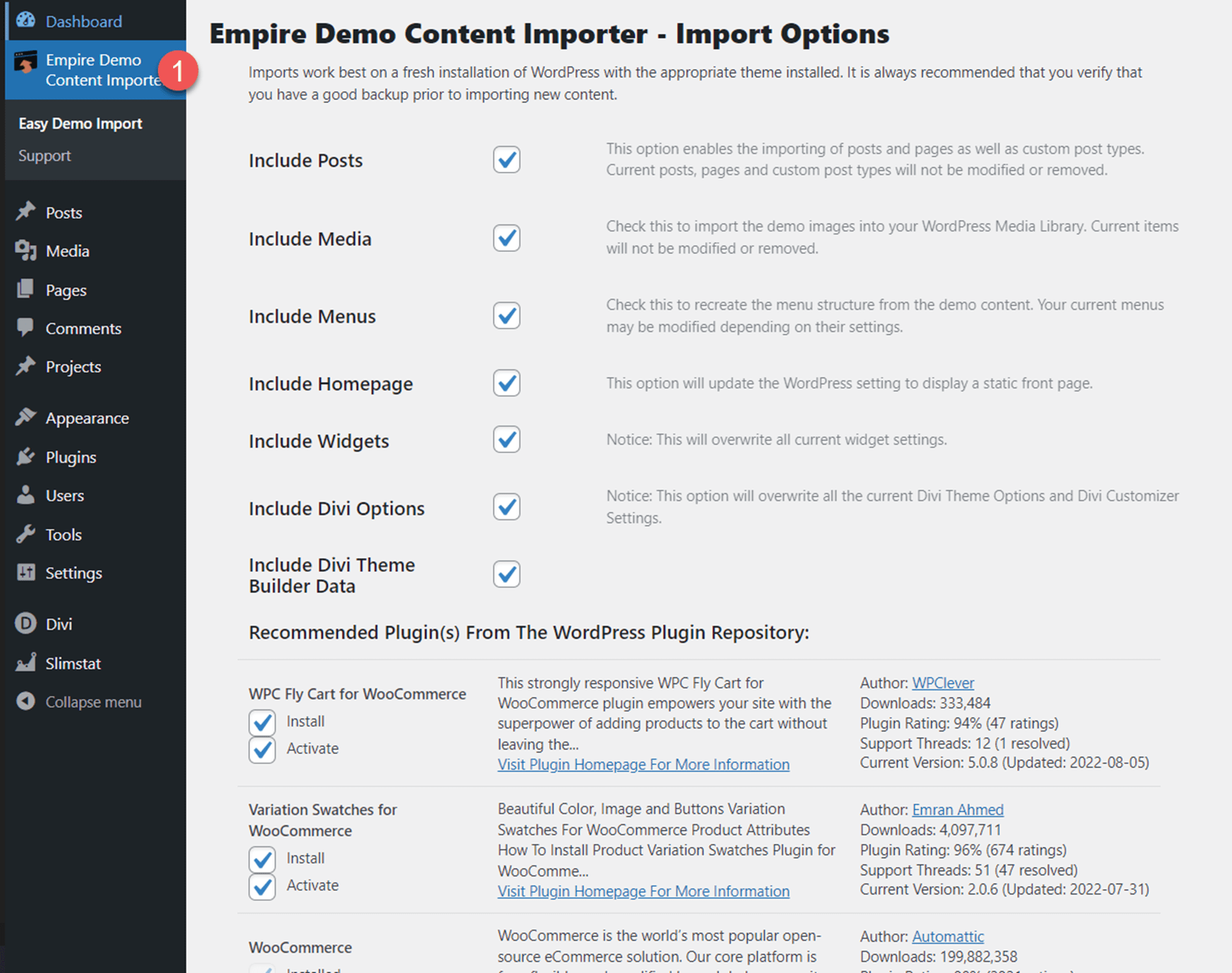
Installing the Empire Divi Child Theme is simple and straightforward. First, upload the theme to your WordPress website, then activate the theme.

Once the theme is activated, you will see a new tab in your WordPress dashboard called “Empire Demo Content Importer”. Select the Easy Demo Import tab and start the import. This will automatically import the layouts to your website and install the recommended plugins.
Empire Divi Child Theme Pages
Empire comes with 10+ layouts and 3 dark mode layouts. We’ll go through each page and discuss the designs.
Empire Divi Child Theme Homepage
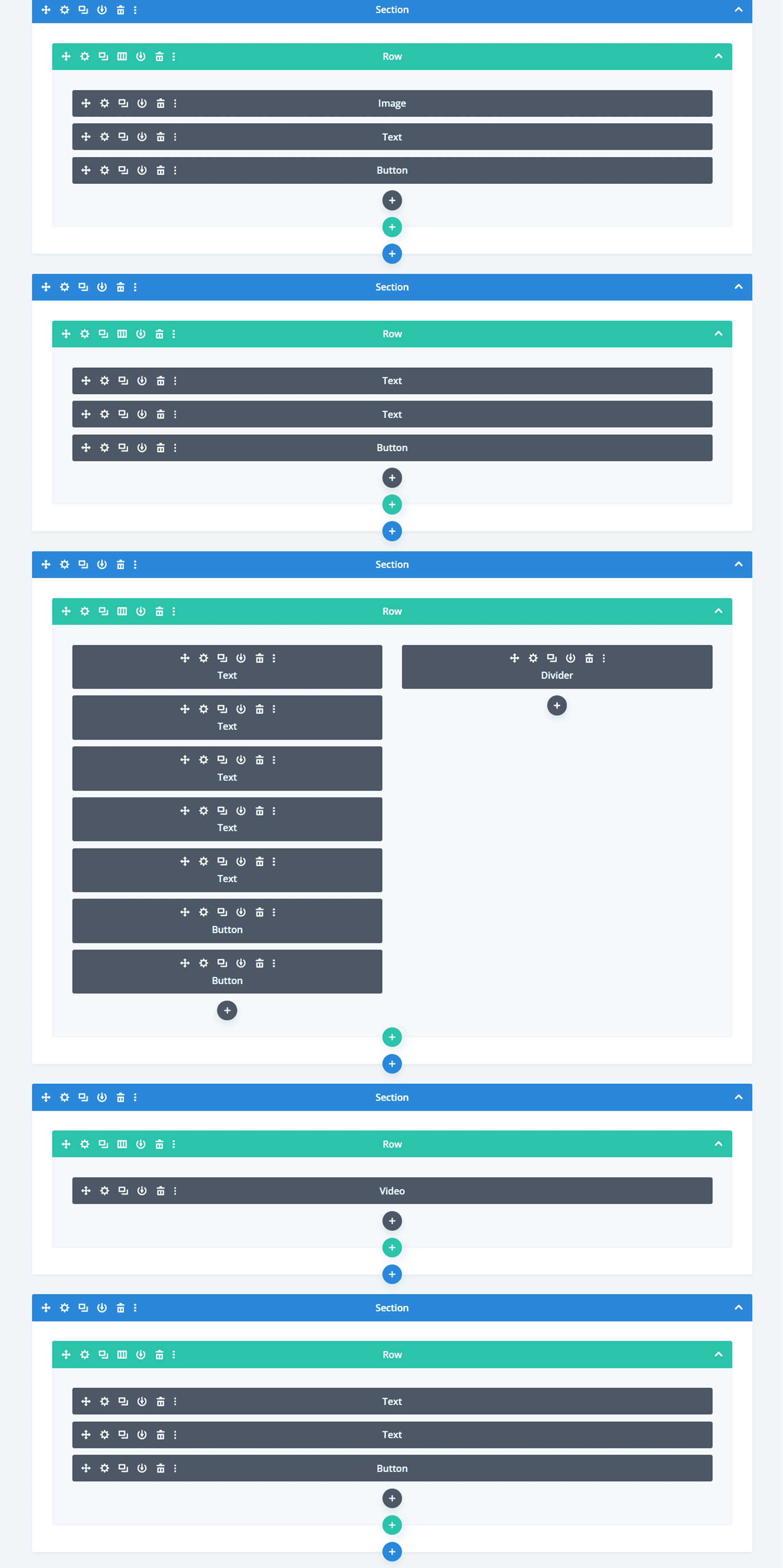
Let’s take a look at the Empire Divi child theme homepage layout. The homepage includes a header, CTA sections, videos, images, number counters, and much more. Throughout the page, there are loading animations, hover effects, and parallax image effects to achieve an eye-catching, engaging website design. Let’s take a look at each section on the home page.
Hero
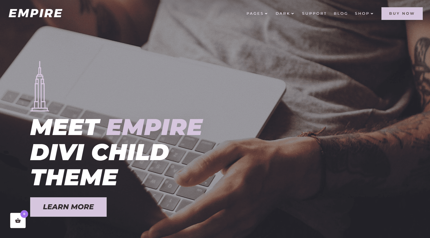
The hero section is the first component on the home page. It features some text and a button. The logo and menu are at the top of this section, and the menu is sticky at the top as you scroll down the page.
CTA Section
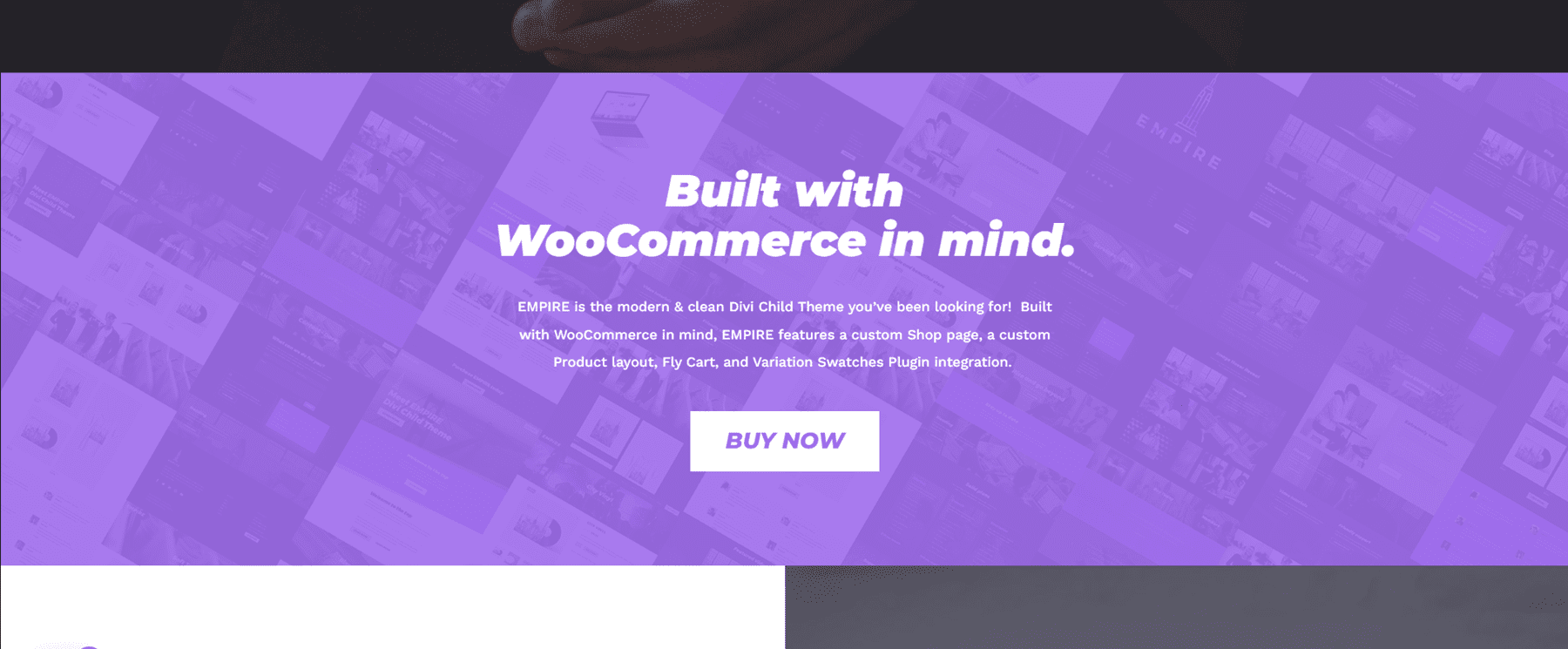
This call to action section has a title and some text content below. It also has a button to prompt users to action.
Services
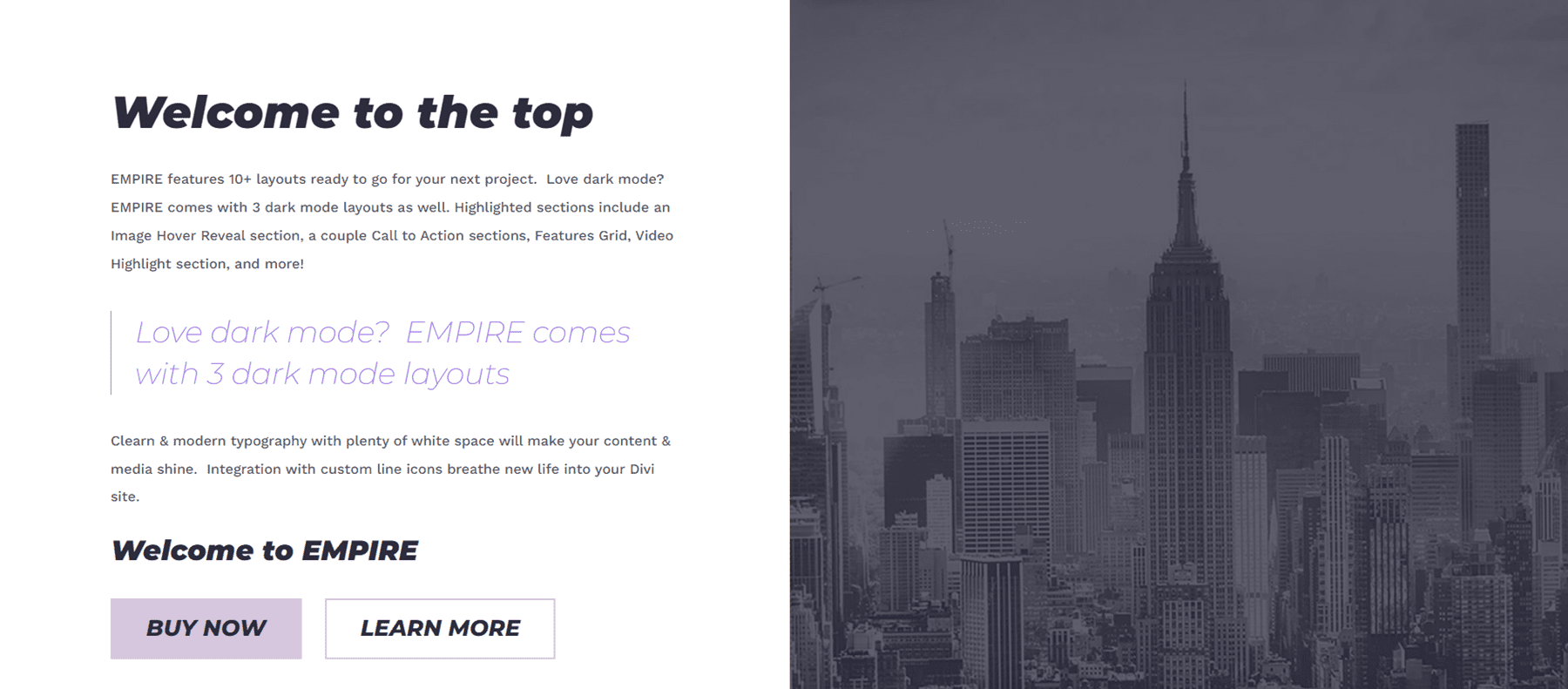
This section features text on the left side and an image on the right. The text on the left is formatted to fit the theme so all you need to do is replace it with your own content. There is a quote section to highlight some text as well. This section also has two buttons.
Video
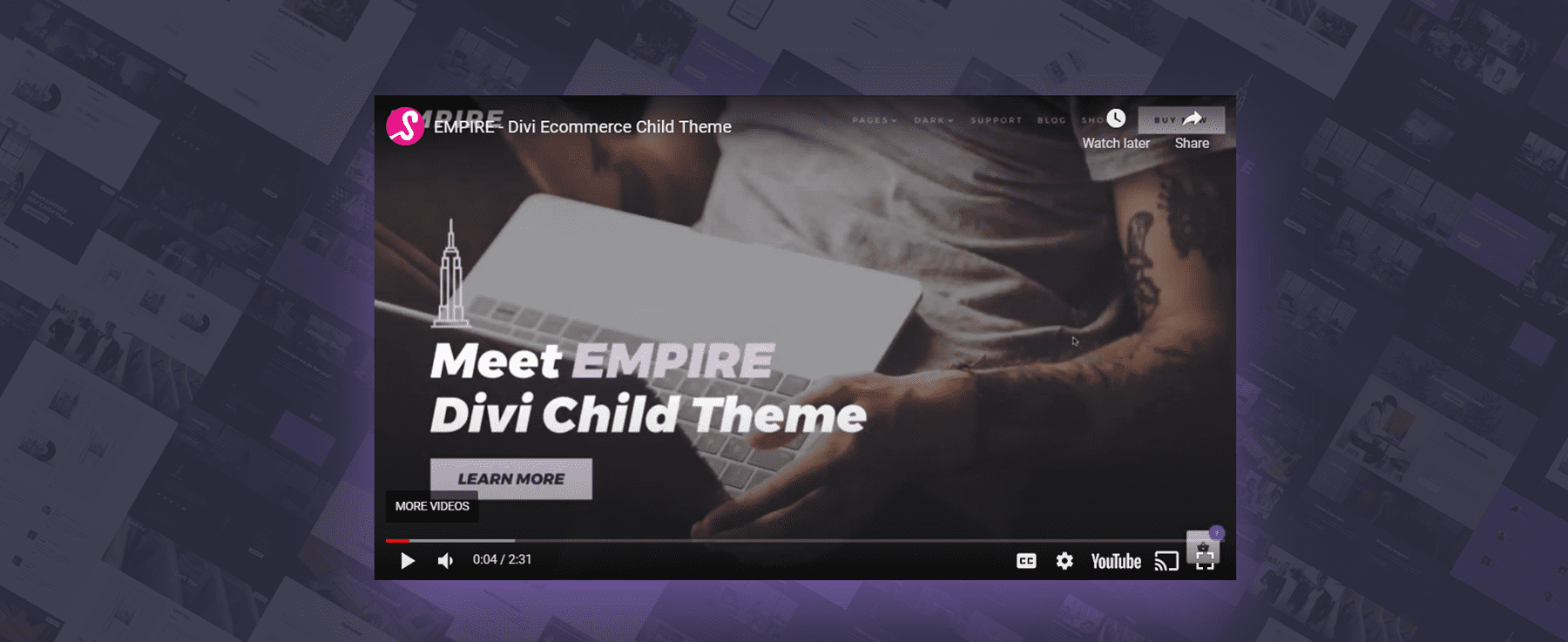
The video section has a purple overlay when you hover over it, highlighting the video in a unique way. There is an image background to this section as well.
CTA Section
Another call to action here, with some stylized text on an image background and a button below.

Features
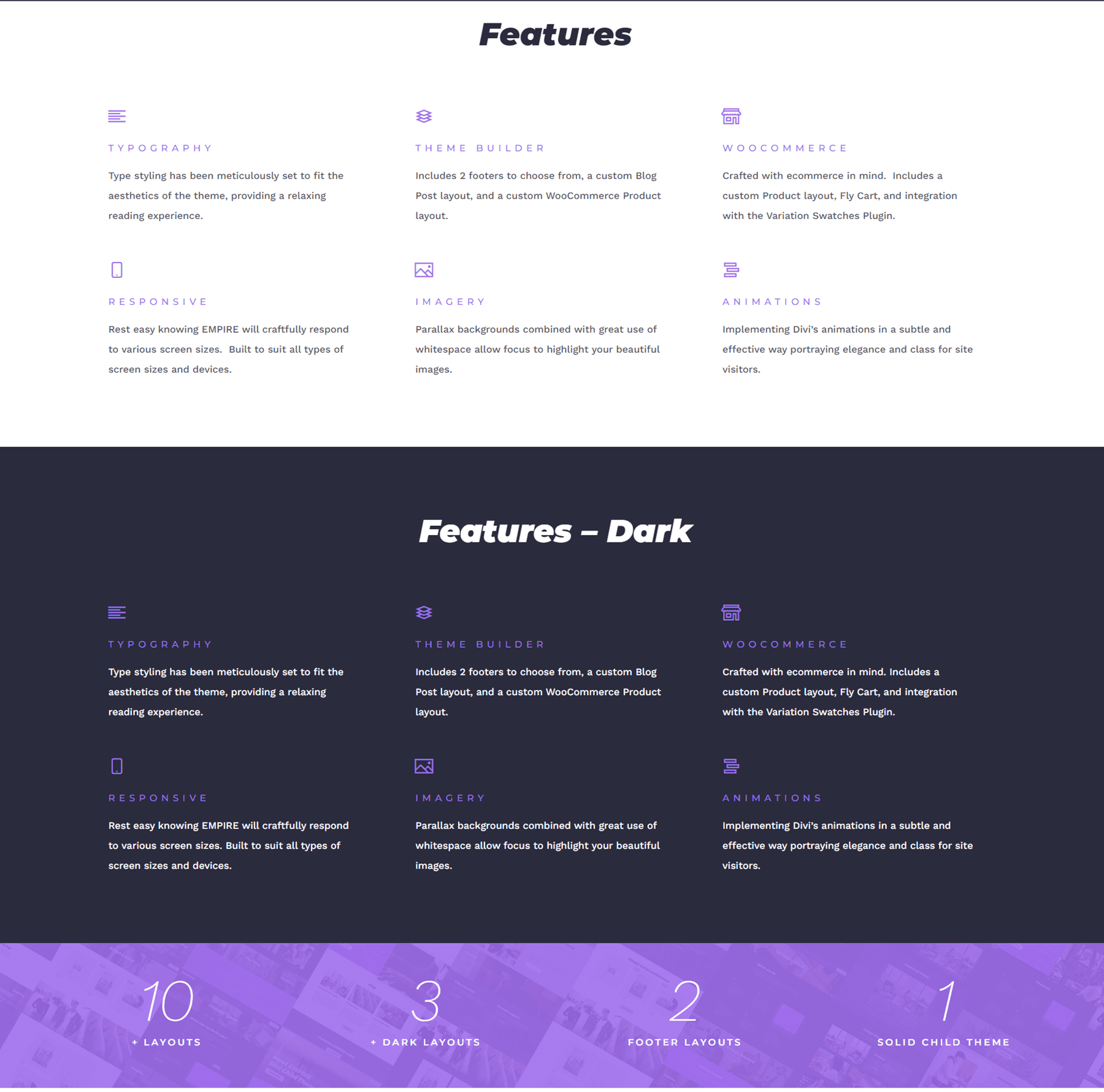
The features section has two versions: a light and a dark version. These sections can be used to show off your services or offerings, and highlight what makes your business unique. Below this section, there are four number counter modules that count as you scroll to the section.
CTA with Video Background
This section is a call to action with a video background and a dark overlay. It is an eye-catching design to draw your website visitor’s attention.

Image Layout
The next section is a simple grid image layout with some text and a button in the top left corner.

Text and Video
In this section, there is some featured text with a repeating background video below.
Image Hover Reveal
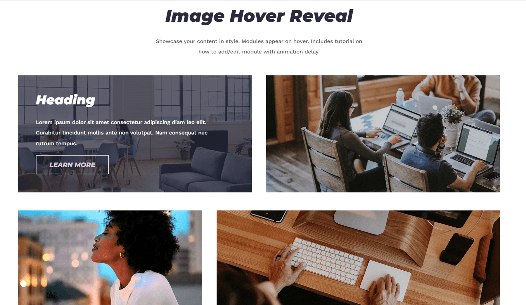
This is one of the more unique sections in the Empire Divi child theme. There are many images in a grid layout. When you hover over any of the images, text appears with an animation delay with an overlay background.
Video Layouts
Here are three more video section layouts. The first section has a full-width video preview. When you hover over the video, there is a purple overlay.

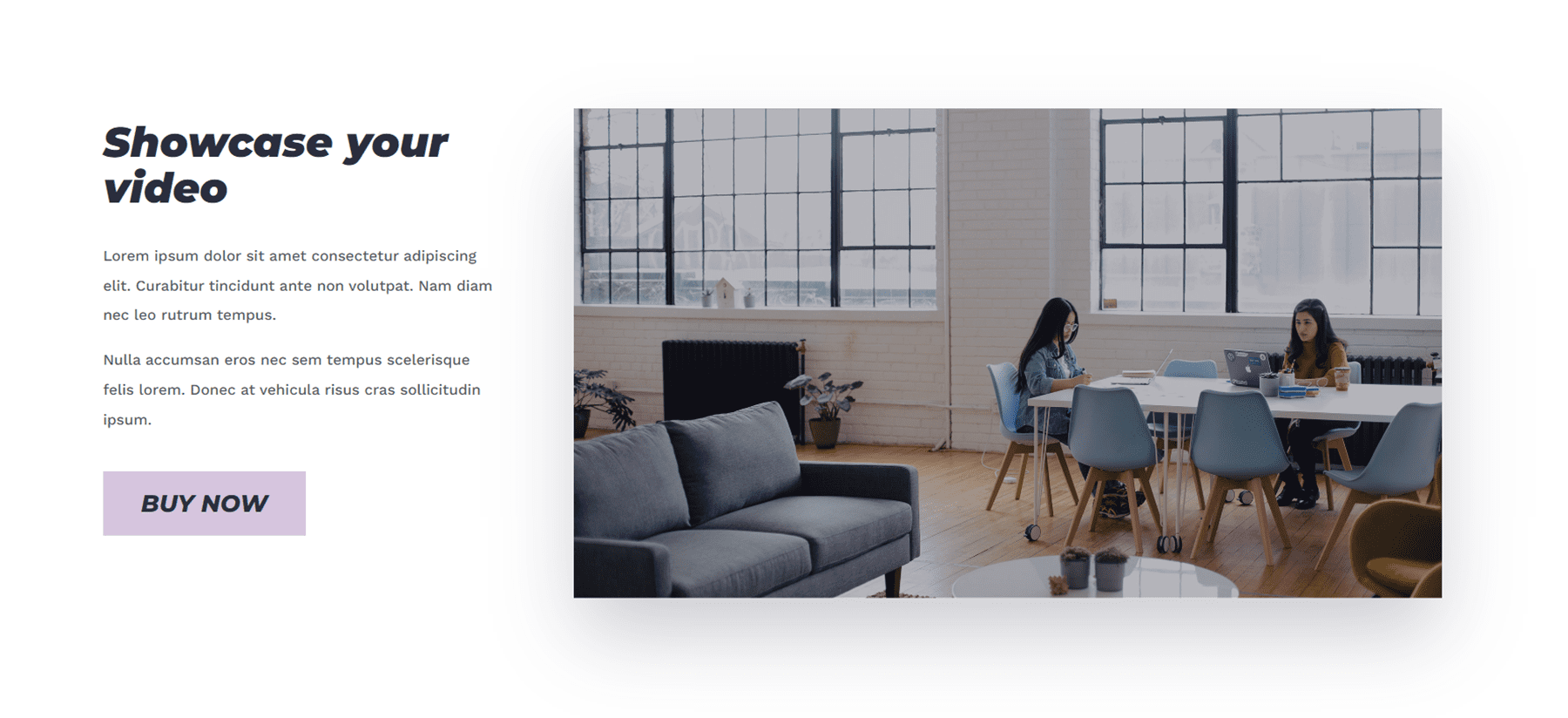
The second video section includes some text on the left side as well as a button. When you hover over the video, there is a purple overlay.
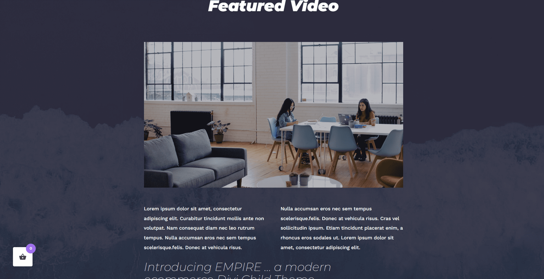
The third video section is on an image background with a dark overlay and has space for some text below. Like the others, this one also has a purple overlay on hover.
Testimonials
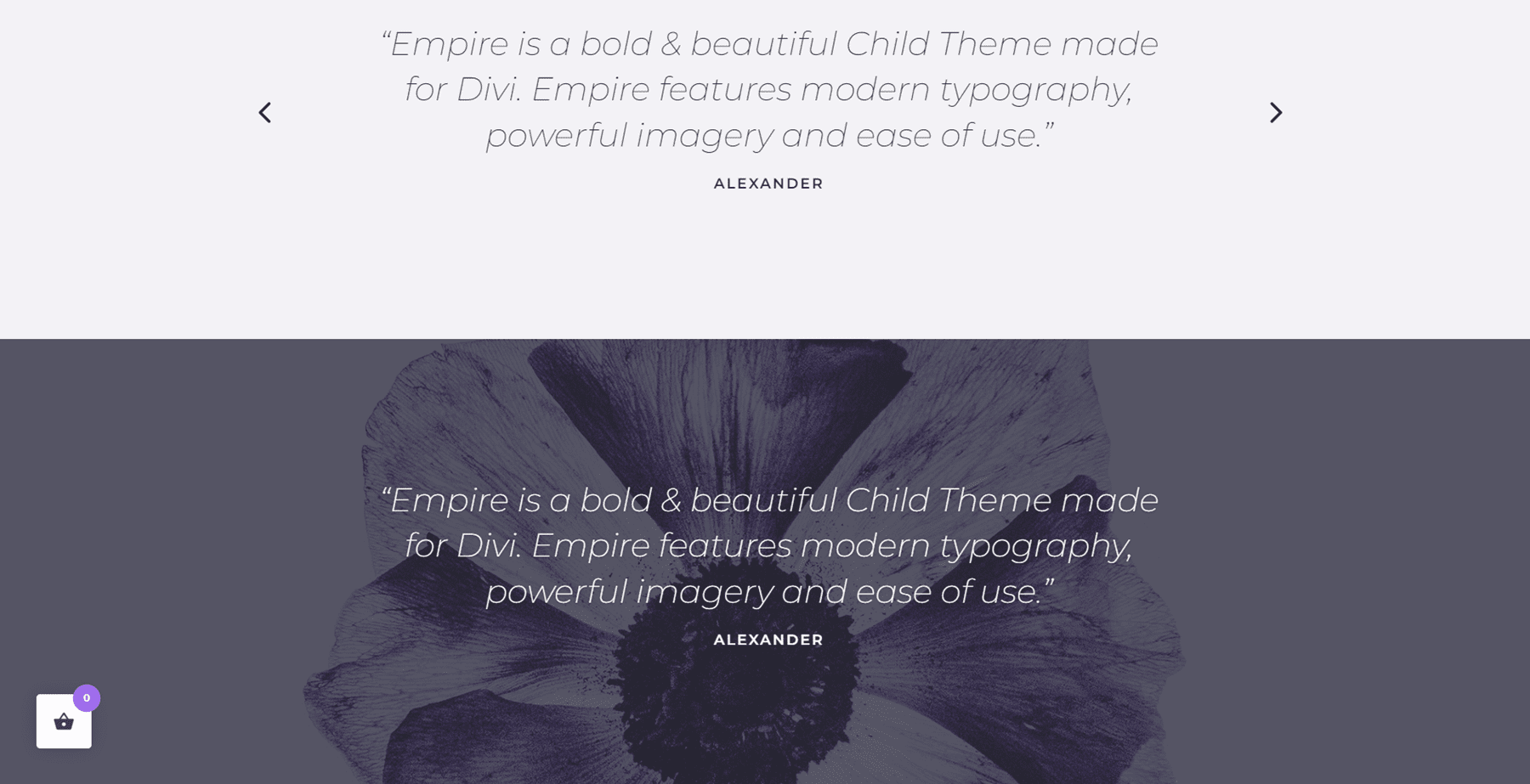
There are two designs for a testimonial section, one light and one dark. Both are testimonial sliders so that you can showcase multiple testimonials.
This is another simple text and image section with a fullwidth parallax image above. There is also a button below the text in this section.
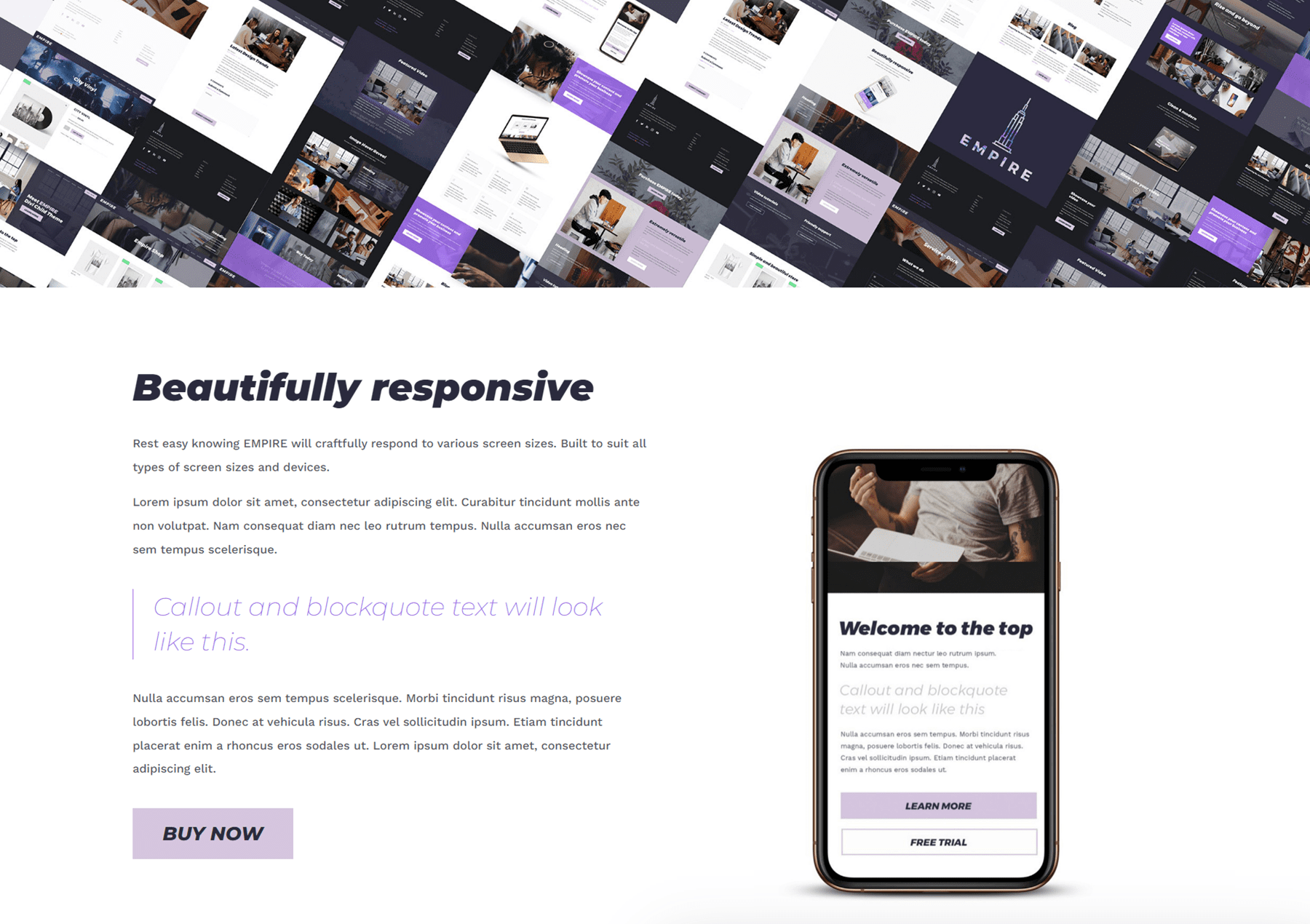
CTA Section
Here is another CTA section. It features two images, one of them with a purple overlay and some text, and a button.

Blurbs
This section features a large image and six blurbs with an icon and some text. You can use this section to highlight some of your features or offerings.
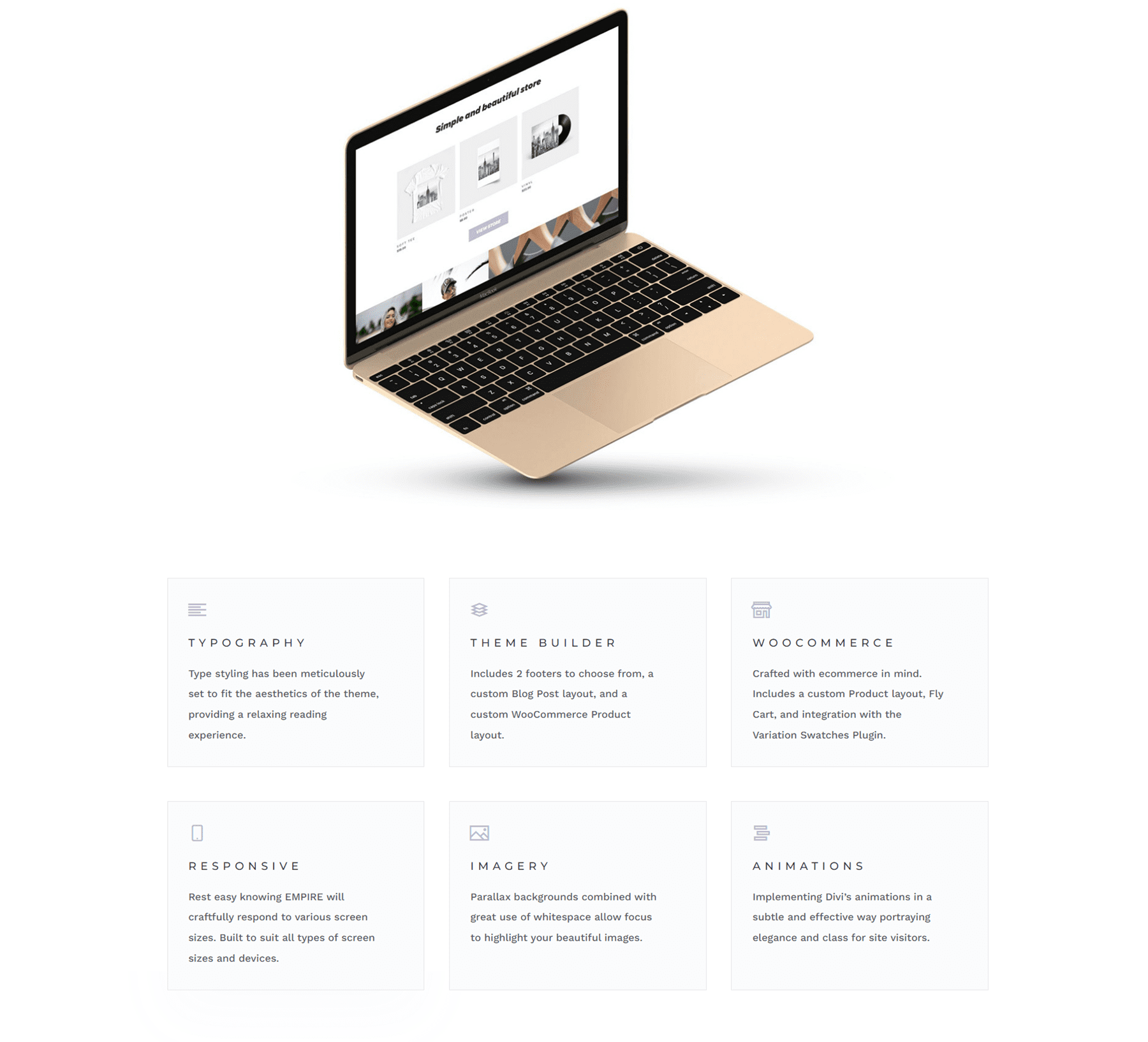
CTA Section
Another CTA section, featuring a heading and a button. The background image has a parallax effect.

Video and Text
Here you have a background video that plays automatically as well as some text.
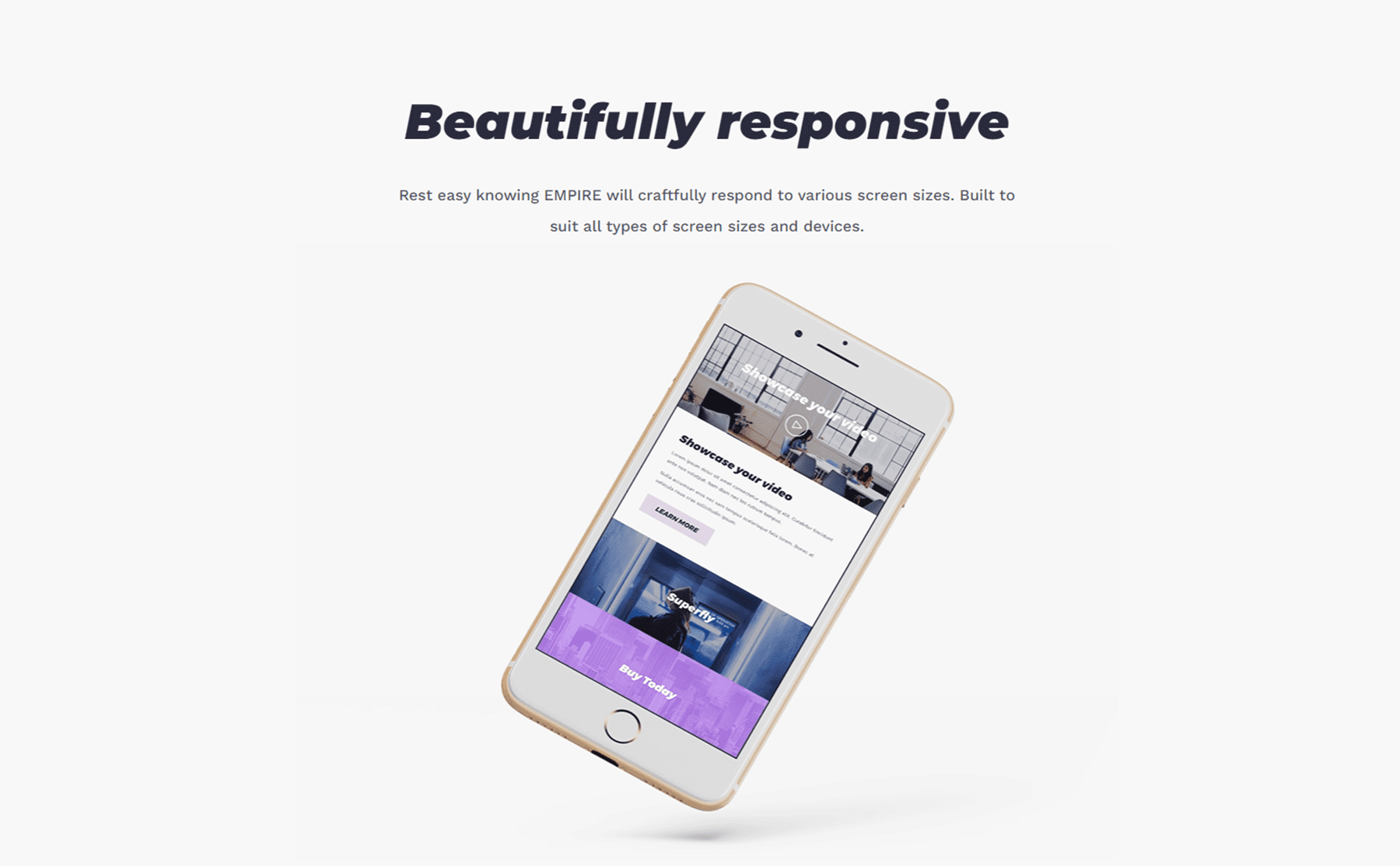
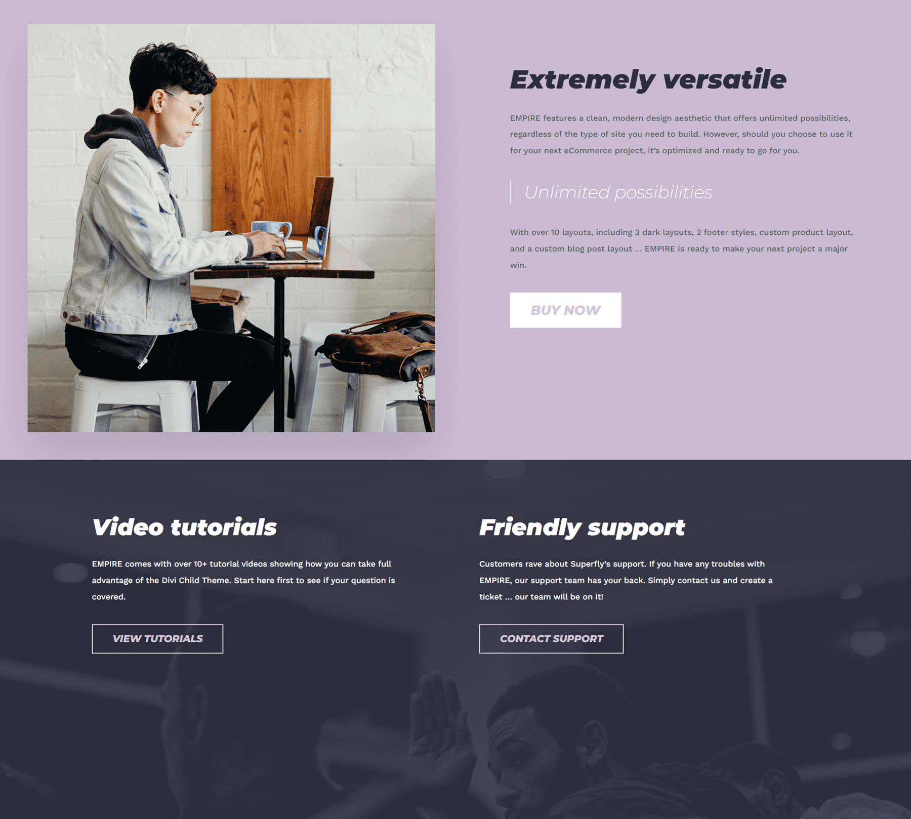
Image and Text
Here are some more layouts with text, images, and buttons. The section below has an image background with an overlay.

Store
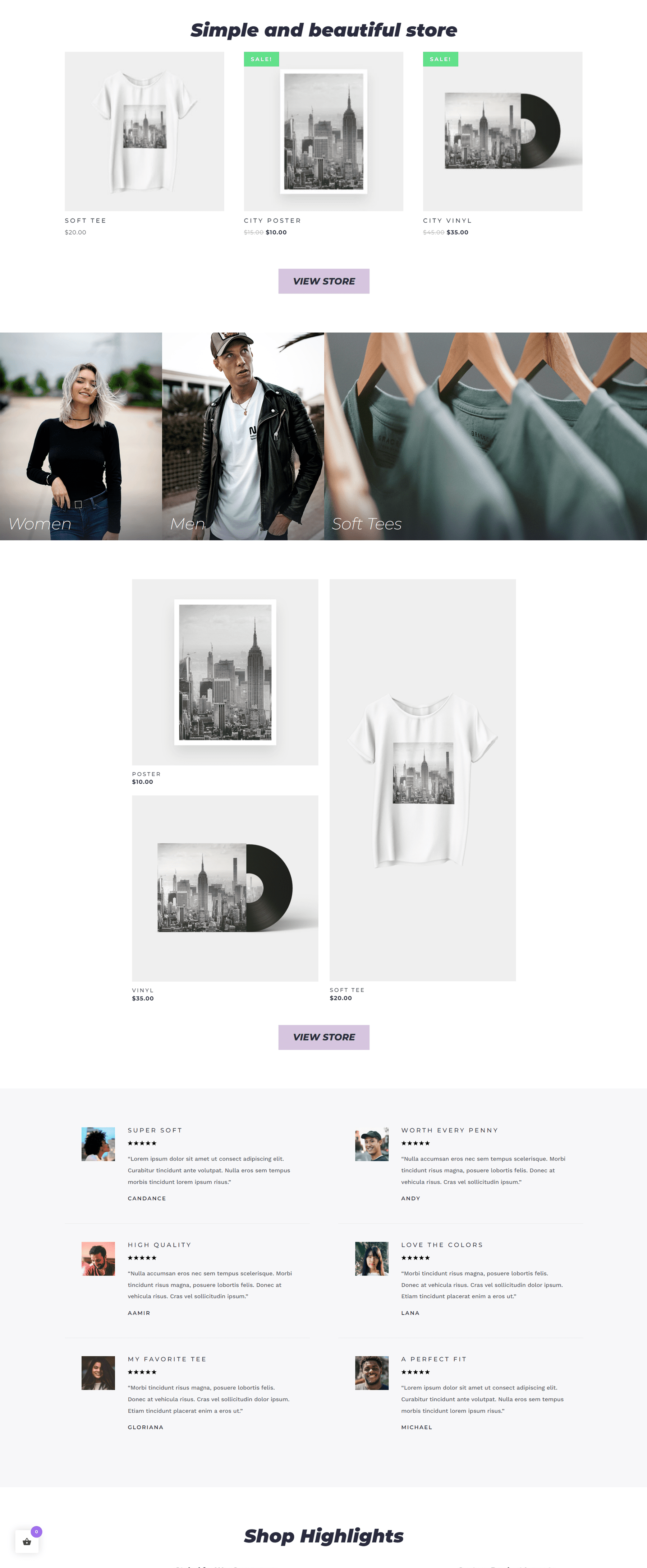
The store layout section includes a section for some featured products with a button to go to the store. There are images that link to product categories, as well as some more featured products below. Finally, there is a section to display customer reviews.
Blog
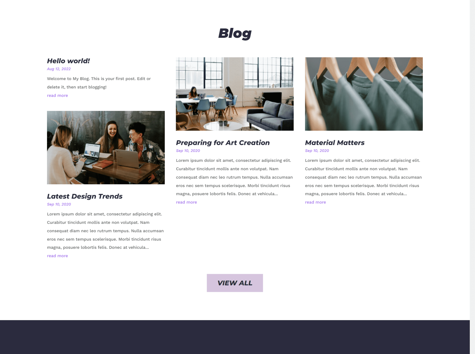
The blog section has some recent posts displayed with a link to view the full blog. Each post also has a featured image.
Empire Divi Child Theme Home Page Variations
Empire comes with a couple of homepage variations. There is a dark mode, which has darker backgrounds for most of the sections.
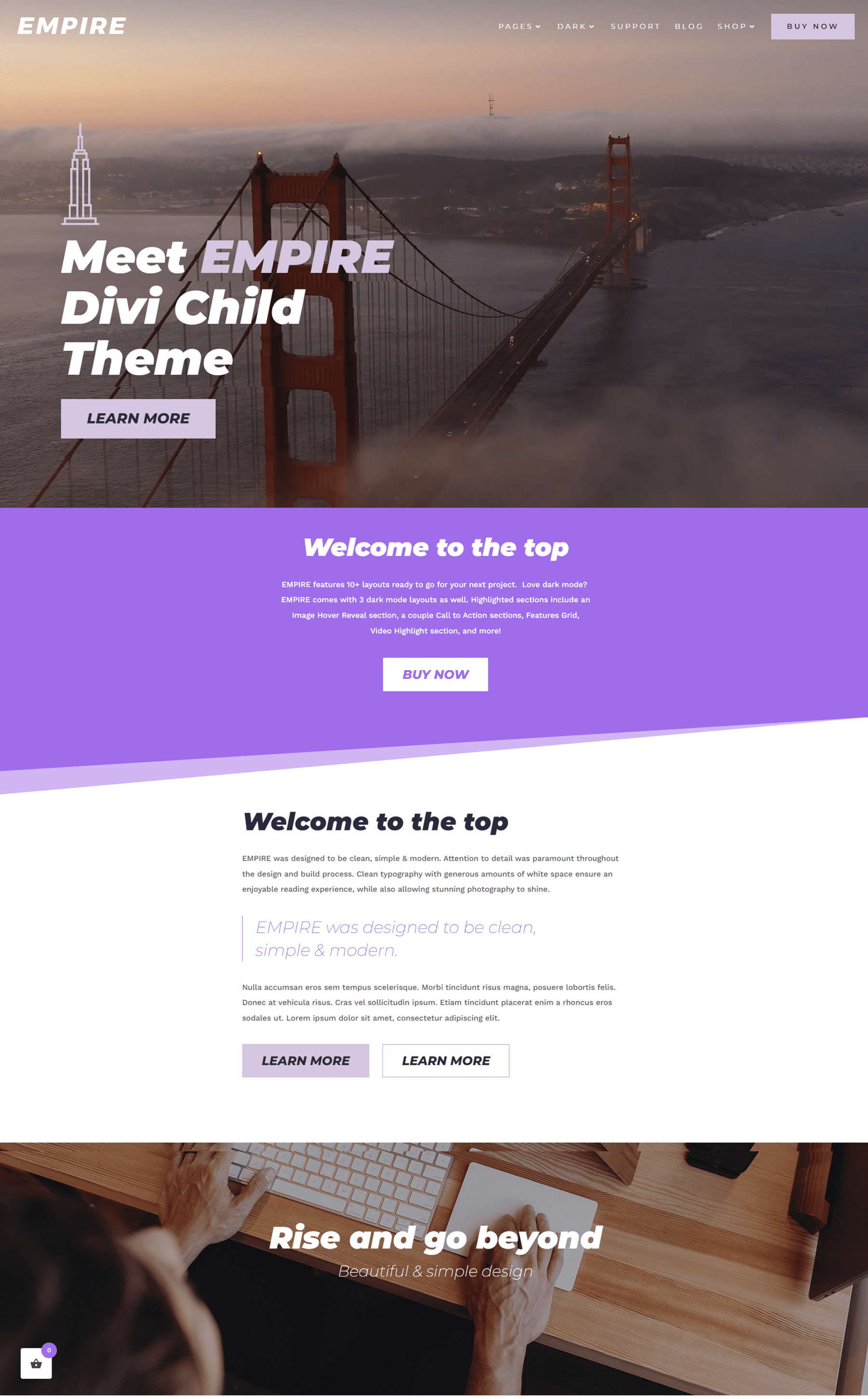
There is also a homepage variation with a video header. The rest of the content on this page is variations of the layouts we covered above.

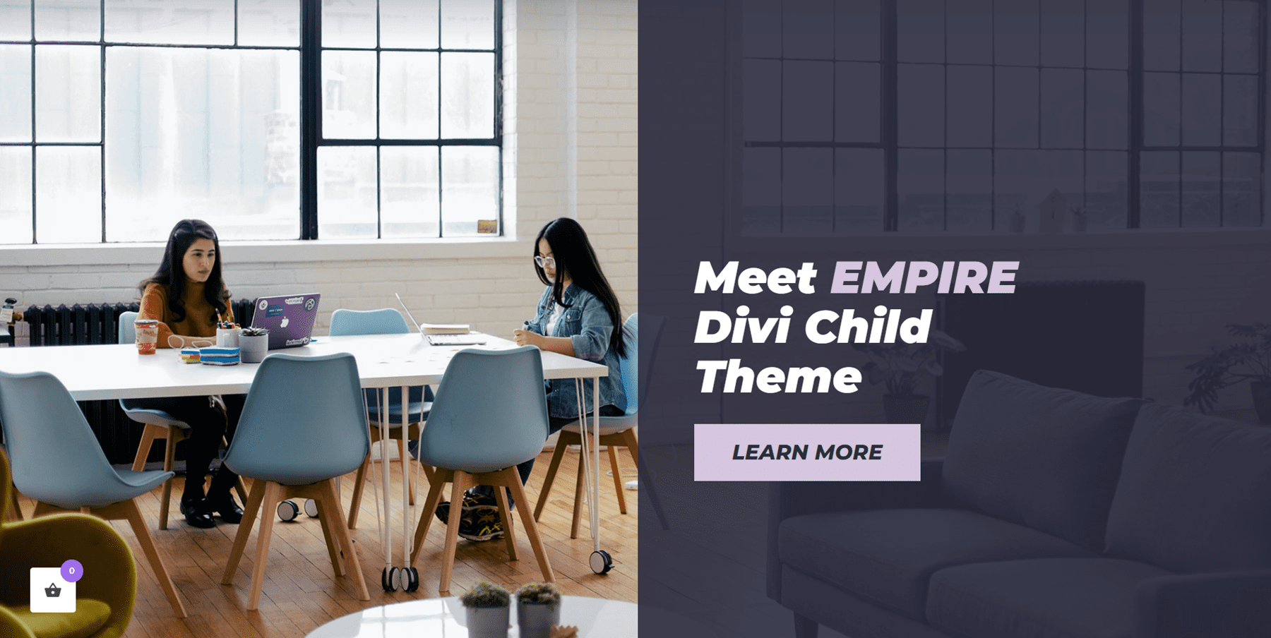
The other homepage variation features a split header with a transparent overlay on the right side with the header text and a button. Like the other variation, the rest of the layouts on this page are variations of the layouts already covered.
Empire Divi Child Theme Interior Page
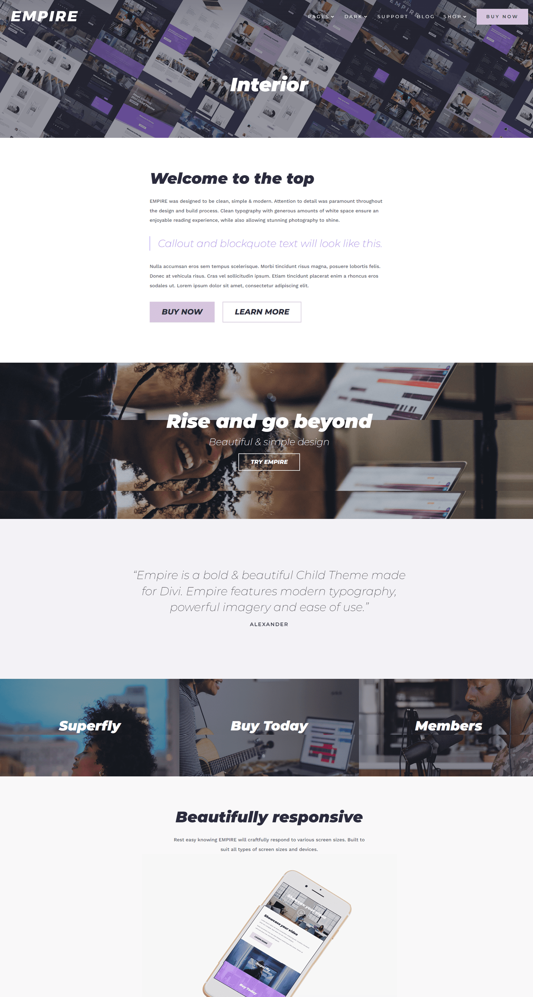
The interior page is one of the premade layouts that comes with the Empire Divi child theme. It features a header with an image background, a section for text with some buttons, a couple of CTA sections, a testimonial section, and some images which are used as buttons to guide the user to another page.
Empire Divi Child Theme Services Page
The services page is set up so that you can highlight your service offerings with little blurbs.
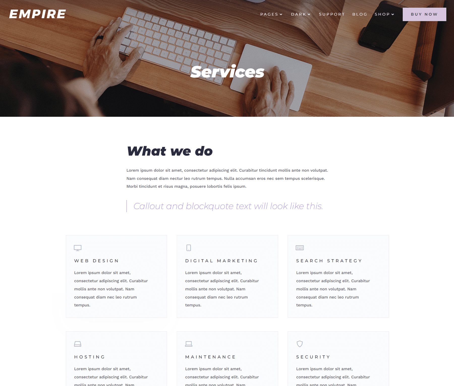
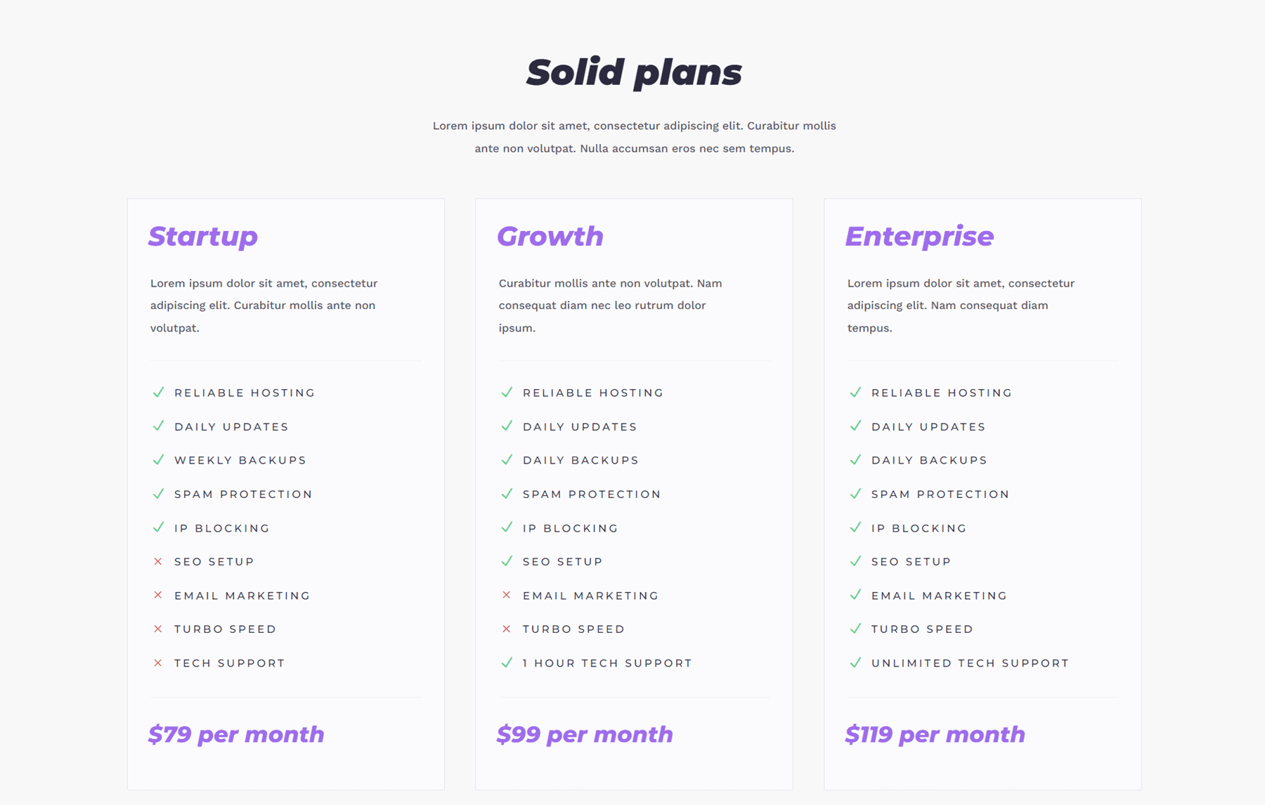
The page includes some text, a services display with icons, CTAs, and a pricing table.
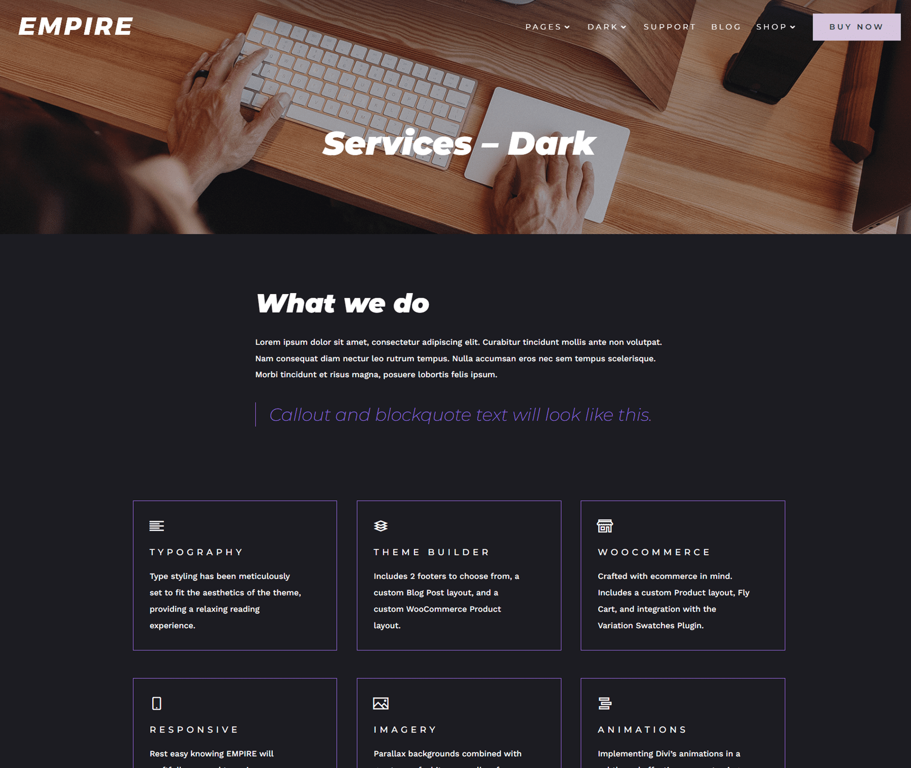
The services page also has a dark mode variation, pictured above.
Empire Divi Child Theme Team Page
The team page features large images for all of your team members. For each team member, their name and title are listed and there is space for a short bio. Below, their email address and social media links are listed.

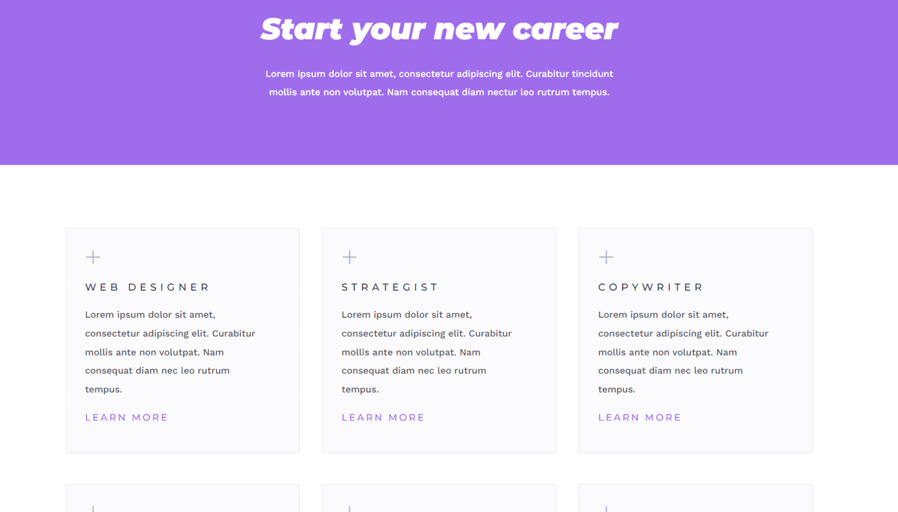
Also on this page is a section to highlight any open roles you might have.
Empire Divi Child Theme Contact Page
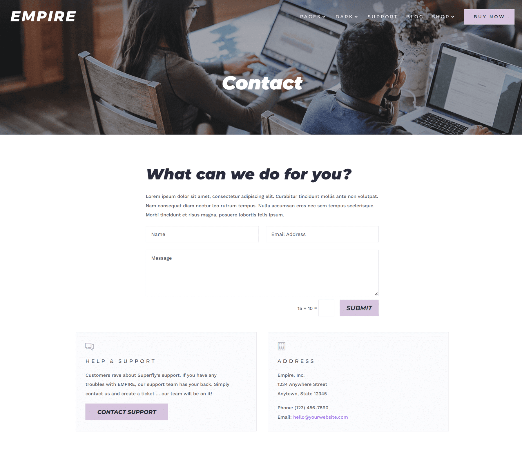
The contact page is fairly simple, with a short blurb of text and a contact form, as well as information for help and support and the address.
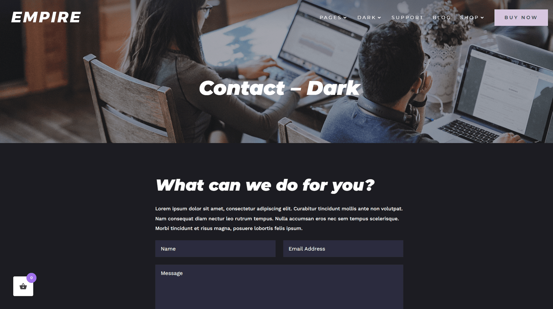
There is a dark mode version of the contact page as well.
Empire Divi Child Theme Blog Page
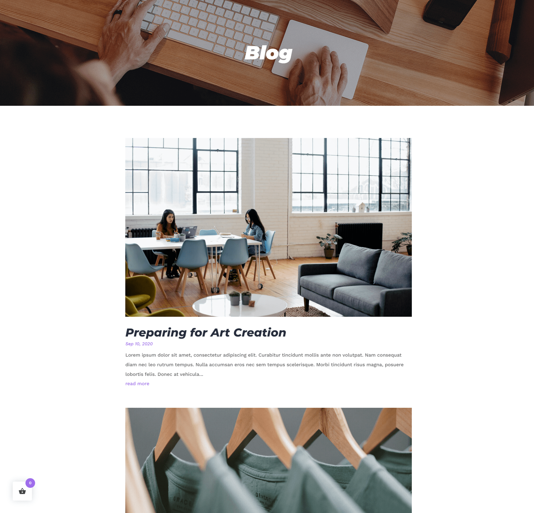
The blog page for this theme is very simple, with a large image showcasing the featured image, and the post title, date, and excerpt below.
Empire Divi Child Theme Blog Post
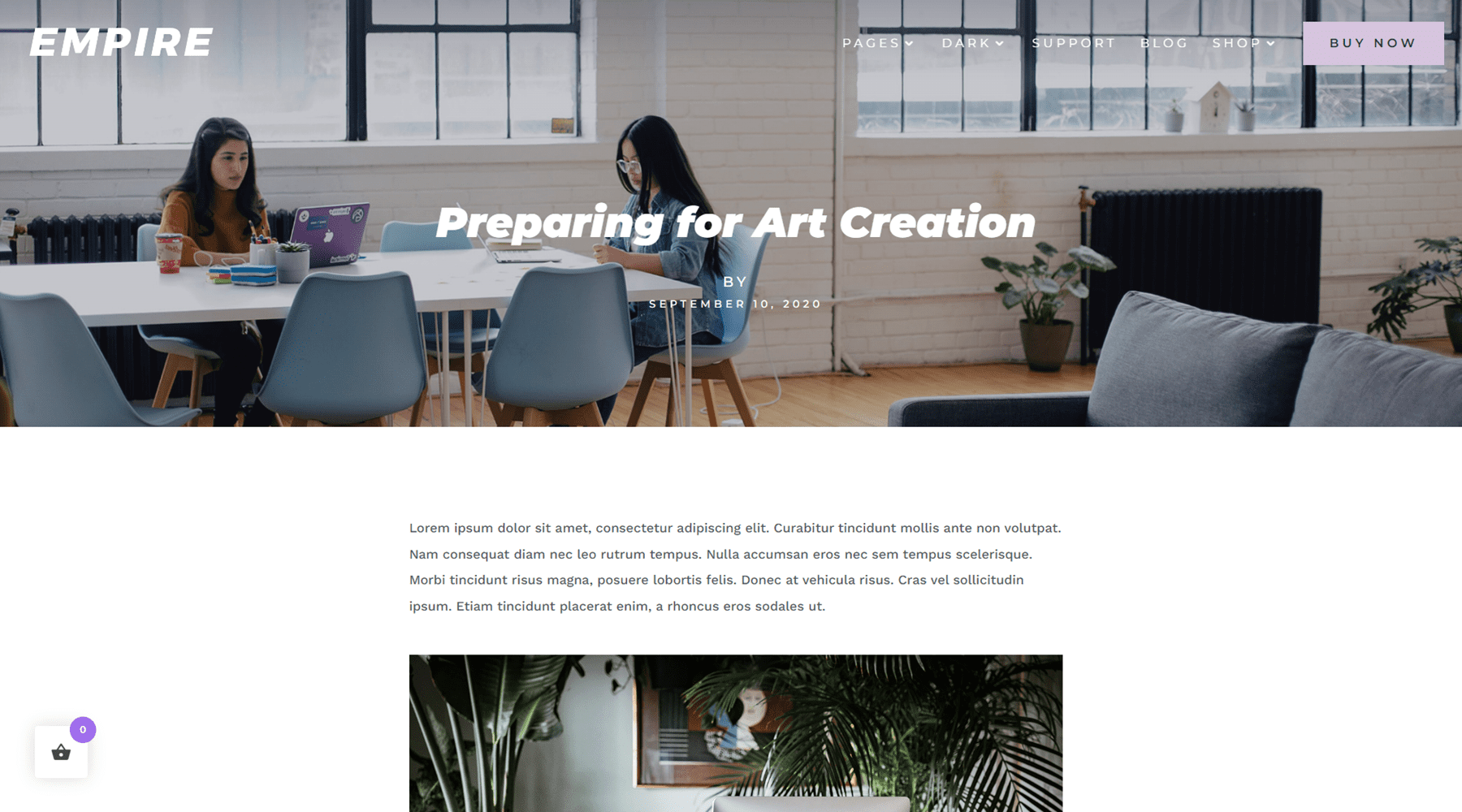
The blog post page is also a simple design, with the featured image set at the very top with the menu bar as well as the title, author, and date listed over the image.
Empire Divi Child Theme Shop
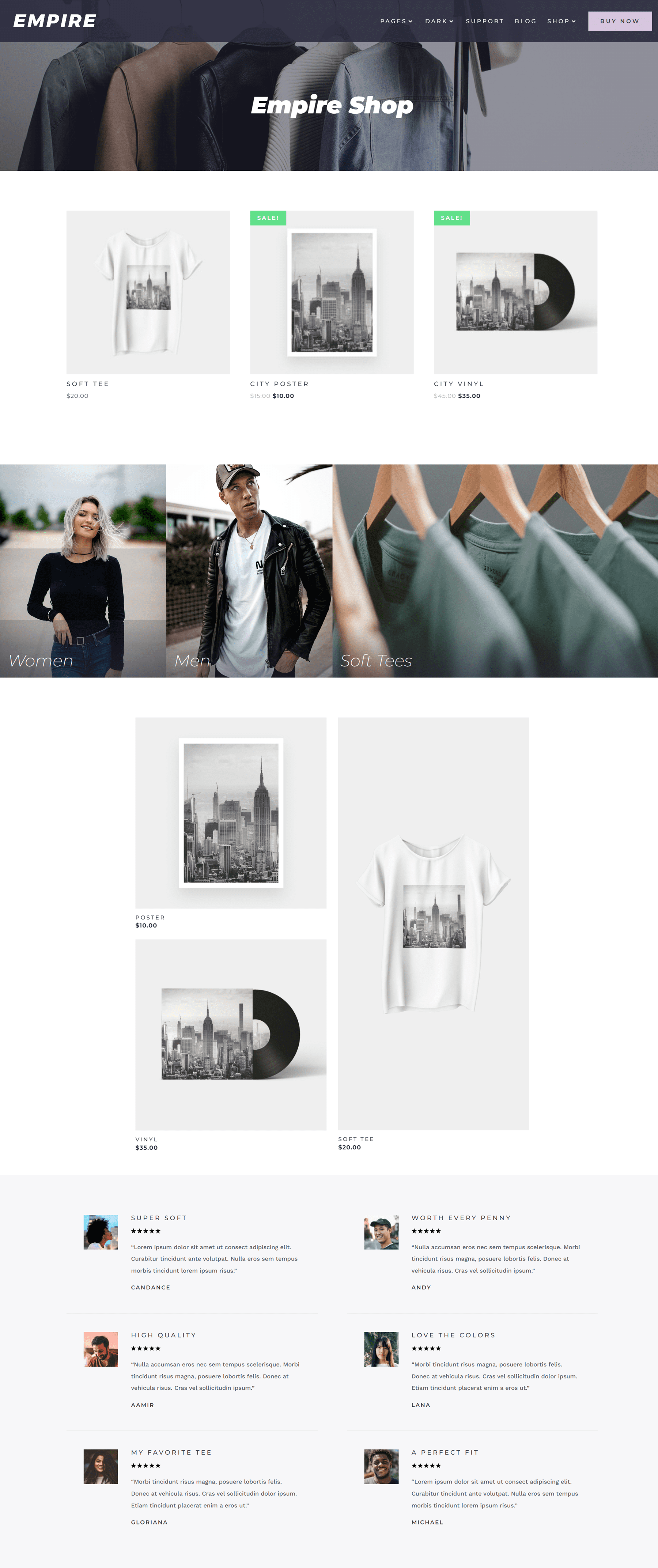
Empire is an eCommerce-focused theme that uses WooCommerce. The shop page features an image header, some featured products, a link to open a shop category, and reviews.
Empire Divi Child Theme Product Page
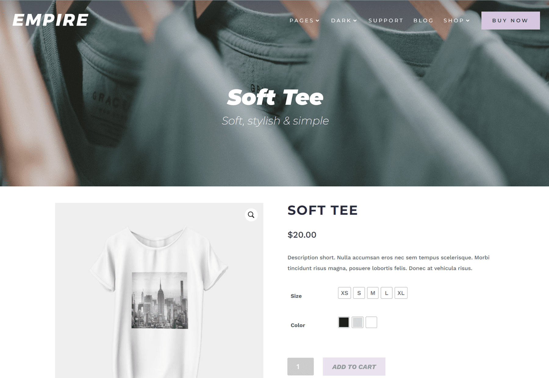
The product page has an image header with the product title and subtitle. Then you have your product, with photos on the left-hand side. On hover, you can zoom in to see the product photos up close. On the right side is the product information including the product name, price, description, size, color, and a button to add to the cart.
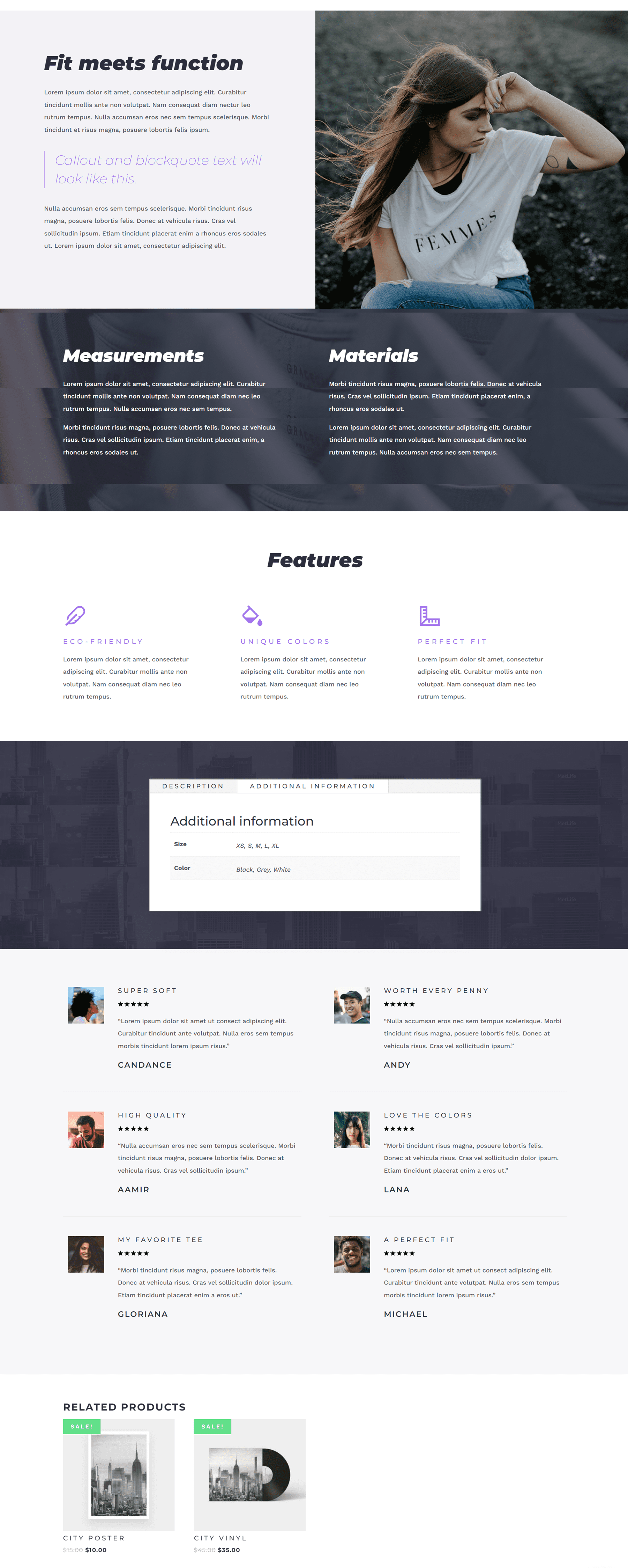
Below this section, there are some modules where you can display additional photos, descriptions, information about the measurements and materials, features, and reviews. At the bottom of the page, you can find related products.
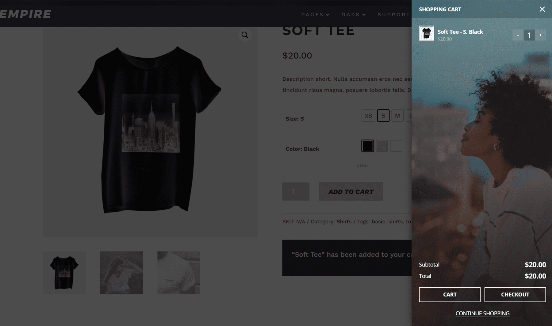
When you add a product to your cart, the shopping cart sidebar appears where you can see the products in your cart, see your total cost, and choose to open the cart, go to checkout, or continue shopping. While this window is open, the rest of the website is faded with a black overlay.
Empire Divi Child Theme Cart Page
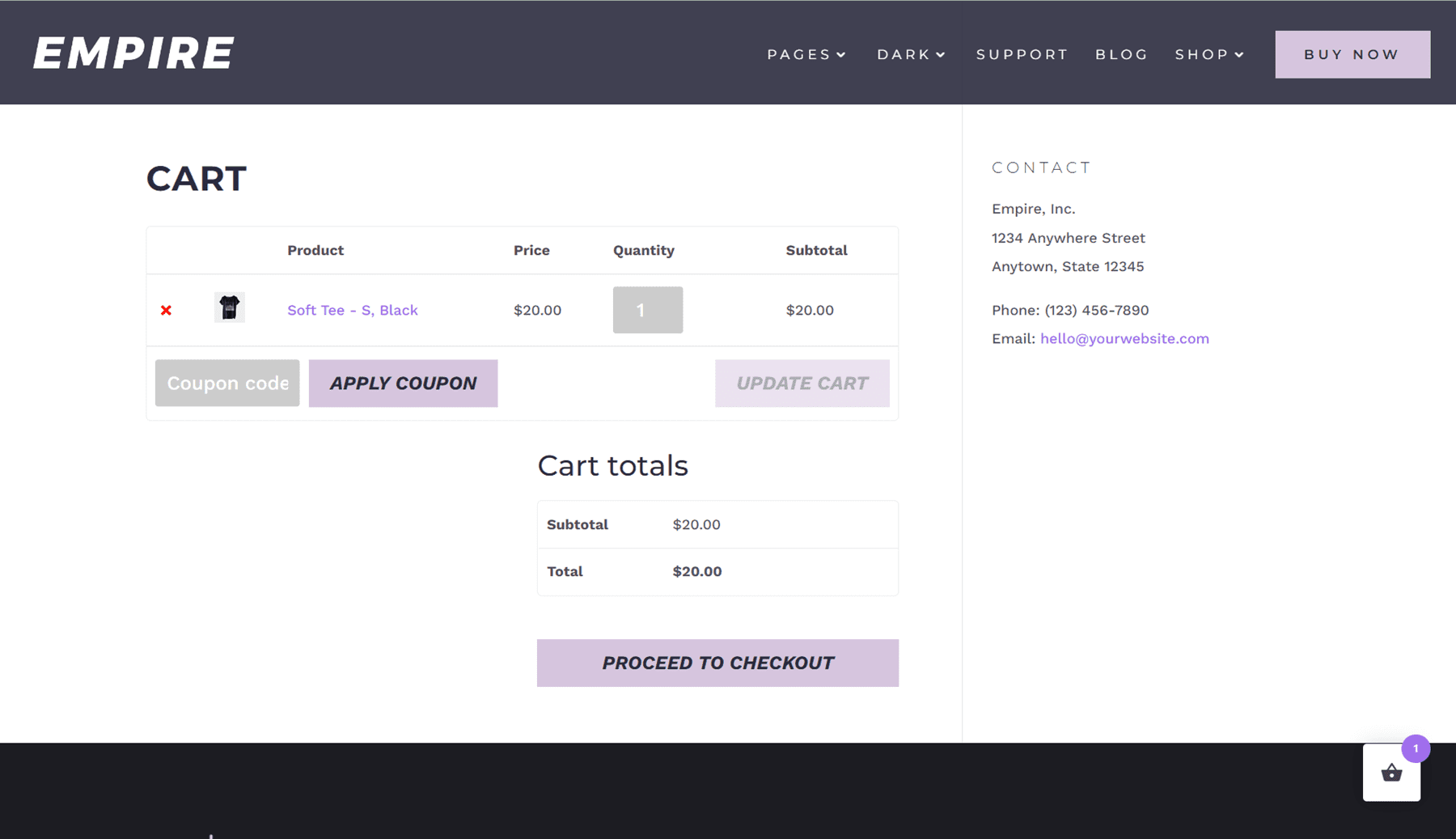
The cart page is fairly standard and lists the content of the cart, a place to enter a coupon code, the cart total, and a button to proceed to checkout. Contact information is listed on the right side.
Empire Divi Child Theme Header
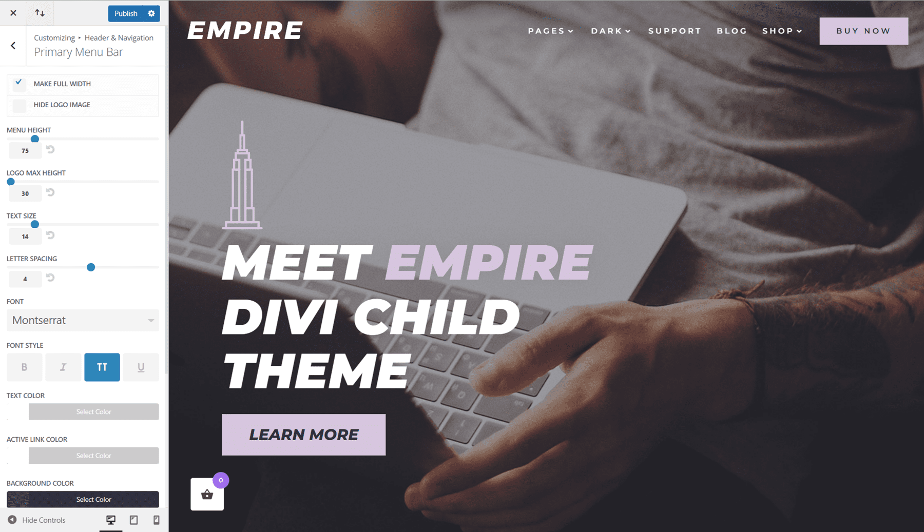
The header for the Empire Divi child theme is built with the WordPress menu customizer. The menu consists of a logo on the left, menu items with some drop-down options, and a call to action button on the right.
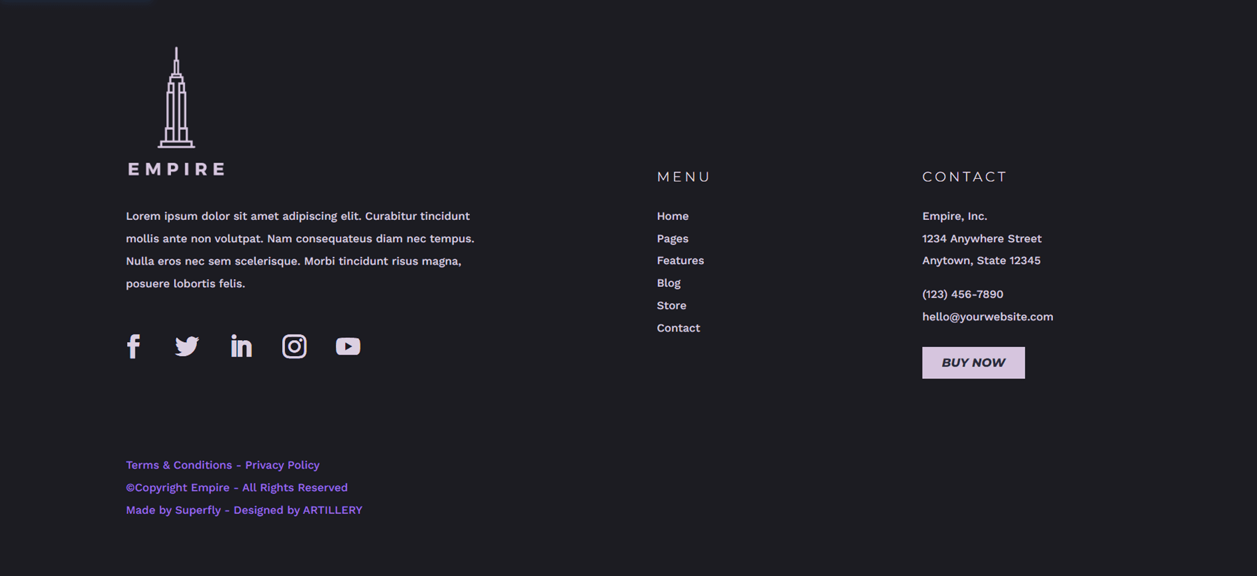
The footer for the Empire Divi child theme is built with the Divi Theme Builder.
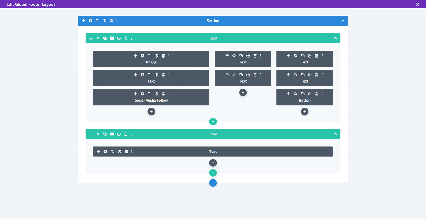
The footer consists of a logo and a text area for a short description. It also includes a section for social media icons, copyright information, and links to legal pages. In the middle, there is a menu section, and on the right, there is the contact information and a call-to-action button.
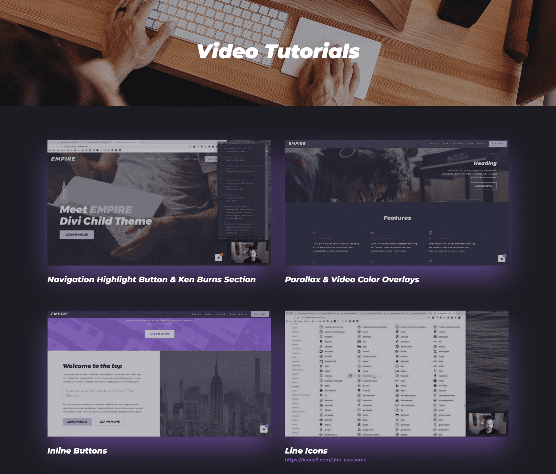
Empire Divi Child Theme Video Tutorials
The Empire Divi child theme also comes with a page of 13 video tutorials. This is a very helpful resource so that you can learn how to further customize the child theme.
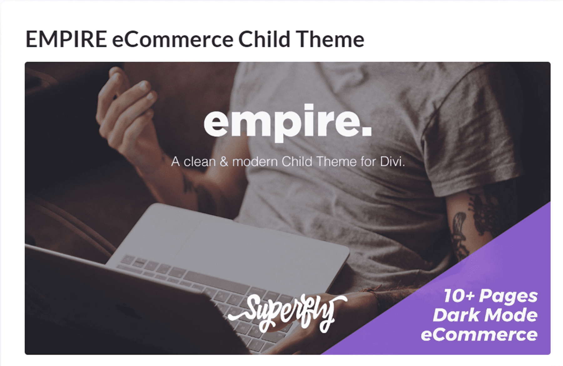
Where to Purchase the Empire Divi Child Theme
The Empire Divi child theme is available in the Divi Marketplace for $59. It includes unlimited website usage and one year of support and updates.
Final Thoughts
The Empire Divi Child Theme is a great child theme to use if you need an eCommerce website with lots of content layout options for you to use. It has a simple but elegant design and uses different motion effects throughout the site to draw your attention and highlight content on the page. The installation is quick and easy, so the only setup required is to replace the content with your own and set up your WooCommerce shop. Overall, I would recommend this theme for anyone who wants to set up an eCommerce website with Divi without having to design the website from scratch.
We would love to hear from you! Have you tried the Empire Divi Child Theme? Let us know what you think about it in the comments!



Thanks for the insight into the Empire template/theme.
I think it would great if Elegant Themes released some more optimisations to DIVI for conversions focused stores using WooCommrce and some layouts to complement this. Think Shoptimizer or Astra’s latest Woocommerce updates.