

Great design tools give you control over every aspect of your website. Whether it’s nailing the perfect padding or ensuring text scales flawlessly across devices, every detail matters. Divi has been a trusty companion for designers for years, offering a solid foundation for building professional websites. Divi 5 takes it further, introducing a feature called Advanced Units.
Advanced Units in Divi 5 help improve how you build websites. From the dynamic calculations of calc() to the fluid scaling of clamp(), a full range of CSS units like vw and rem, and the flexibility of CSS variables. In this post, we’ll dive deep into Advanced Units, how to use them in the Visual Builder, and why they’re necessary for every Divi user. Whether you’re fine-tuning layouts or dreaming up bold new designs, Advanced Units provide even more control over your design’s responsiveness.
Let’s dive in.
What Are Advanced Units In Divi 5?
Advanced Units in Divi 5 lets you control design elements with its multi-functional unit field. It’s a single, powerful input field that accepts the full spectrum of CSS units, functions, and variables.
It’s a small change in the Visual Builder that supports all CSS units with new support for fit-content, unset, calc(), clamp(), and CSS variables.
Advanced Units free you from the constraints of static values. You don’t have to guess fixed pixel sizes or wrestle with breakpoints to make things fit like you want them. Without leaving the Visual Builder, you can build layouts that flex and scale effortlessly — with fluid typography, adaptive spacing, and viewport-aware designs. It’s not just about more options; it’s about smarter, more scalable creativity.
Exploring Advanced Units In Divi 5
Divi 5’s Advanced Units feature offers various design options, each with unique ways to shape layouts. Let’s examine the key players and see how they work.
CSS Units In Divi 5
Advanced Units open up a full palette of CSS units, far beyond pixels and percentages. Take viewport width (vw), for example — set a section’s width to 80vw, and it will always take up 80% of the viewport width (horizontally), scaling perfectly from desktop to mobile.
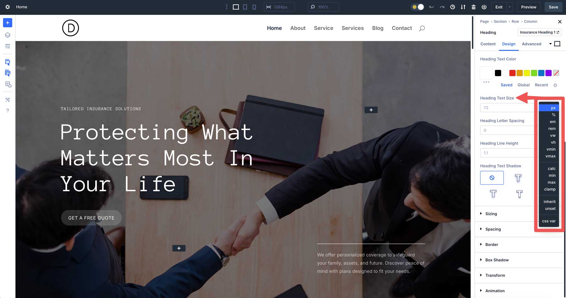
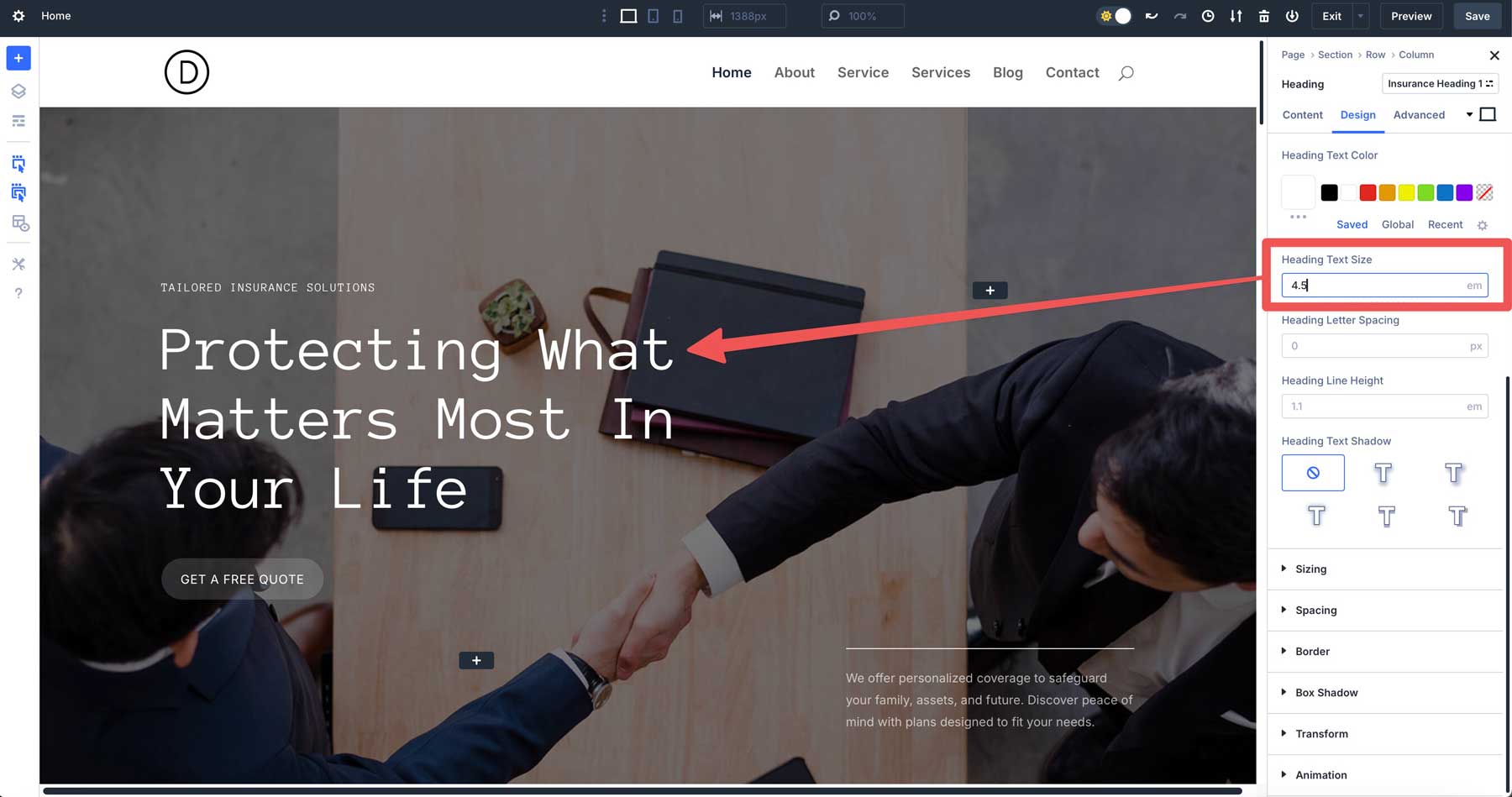
Root em (rem) ties sizes to the site’s root font size — idea for consistent typography, like 4.5rem for a heading.
You can also try fit-content, which sizes an element based on its content. For example, using fit-content for a header’s width can ensure it adapts perfectly. You can add fit-content to the width field in a row to keep the header compact and proportional, avoiding excessive space or overflow while maintaining a polished look.
These units adapt to screen sizes and contexts, giving layouts that feel alive rather than locked in place.
Calc() Is A Dynamic Calculator
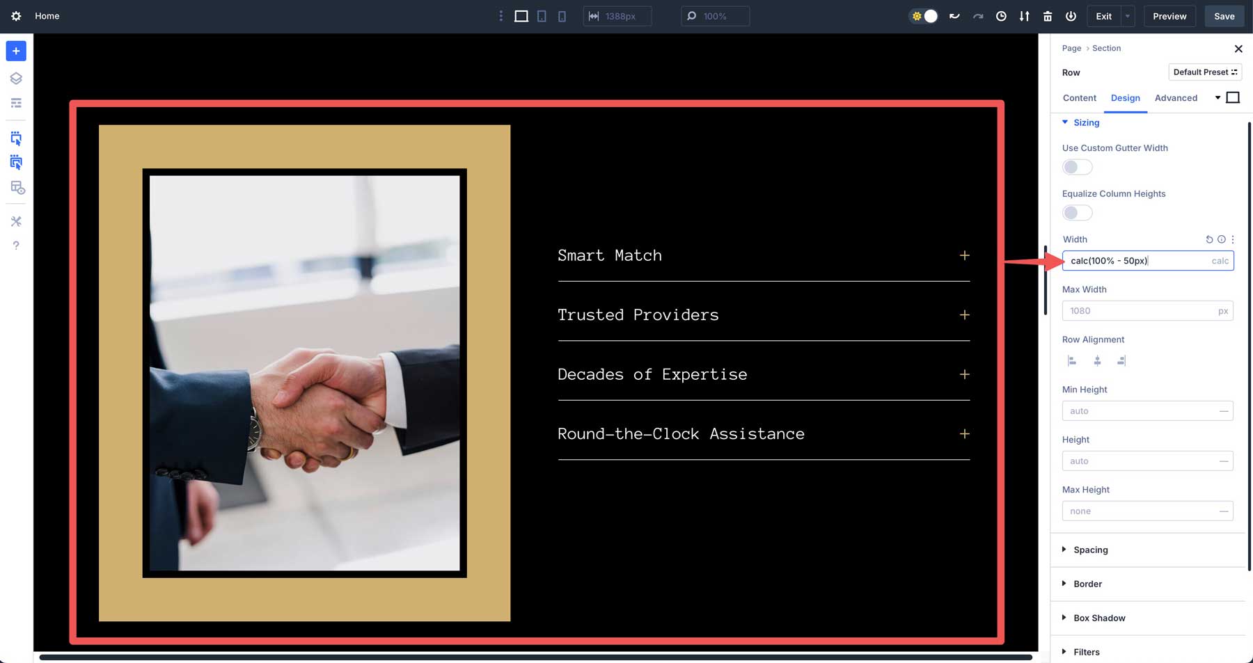
The cacl() function is like a mini calculator built into Divi. It lets you mix units with operations — addition, subtraction, multiplication, and division — for dynamic results. A classic example is calc(100% – 50px), which sets the width of a section to 100% and subtracts 50 pixels. If your element is centrally aligned, 25px from both sides gets reduced.
You can use calc() for responsive spacing, like setting a section or row’s width to leave perfect gutters on each side. Calc() adjusts on the fly as the viewport changes, ensuring your design stays balanced without making manual tweaks.
Clamp() For Fluid Control
The clamp() function helps you control sizes that adjust smoothly across screen sizes. It uses three values: a minimum size, a preferred size, and a maximum size. A good example is clamp(36px, 4vw, 48px).
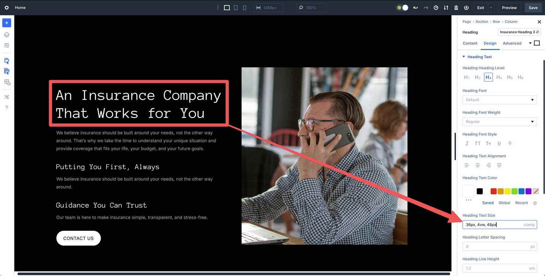
This means the size starts at 36px, increases based on 4% of the viewport width, but never goes above 48px. It’s great for text, like a Heading module that looks good on both small phones and large screens. Clamp() ensures your design stays balanced and readable no matter the device.
CSS Variables For Global Flexibility
CSS variables (or custom properties) let you define reusable values, like –font-size:5em, in Divi’s Theme Options or the page settings CSS field. When adding CSS variables in Divi 5, be sure to enclose them in the parent element like this:
:root {
--font-size:5em;
}
Once defined, you can drop var(–font-size) into a heading’s text size field to apply it.
It’s a time-saver that keeps your design consistent and editable on the fly.
Unitless Values
Divi 5’s Advanced Units also include initial, unset, and auto values. The initial property resets a CSS property to its default value as defined by the CSS specification. For example, settings color: initial on a paragraph reverts it to black, ignoring any custom or inherited style. Unset clears a property back to its natural state, acting like initial for non-inherited properties or reverting to inherited values when applicable. Meanwhile, auto lets the browser decide a value based on context, such as a section’s height stretching to fit its content.
How Advanced Units Work In Divi 5
Advanced Units in Divi 5 bring a new level of control directly into the Visual Builder, making it easy to create responsive, dynamic designs. You can instantly type in any CSS unit, function, or variable — like vw, calc(), or clamp() — and see results. Here’s how Advanced Units work in Divi.
Responsive Section Width With Calc()
Let’s say you want a section that spans 80% of the viewport’s height but removes some padding from the top and bottom. Navigate to the section’s design tab, locate the height field, and add calc(80vh – 60px) into the field.
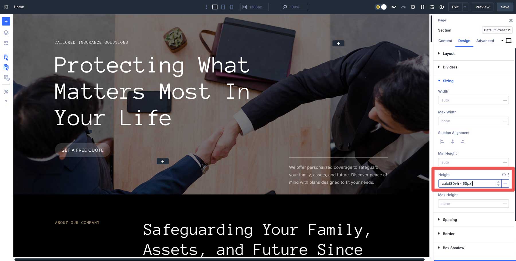
This calculation allows the section to scale fluidly with the viewport, maintaining 80% of the viewport height while subtracting 30px from the top and bottom.
Fluid Typography With Clamp()
Clamp() can be useful if you need headings that grow with the screen size but stay readable. In a Heading module’s design tab, set the Heading Text Size to clamp(52px, 2vw, 36px).
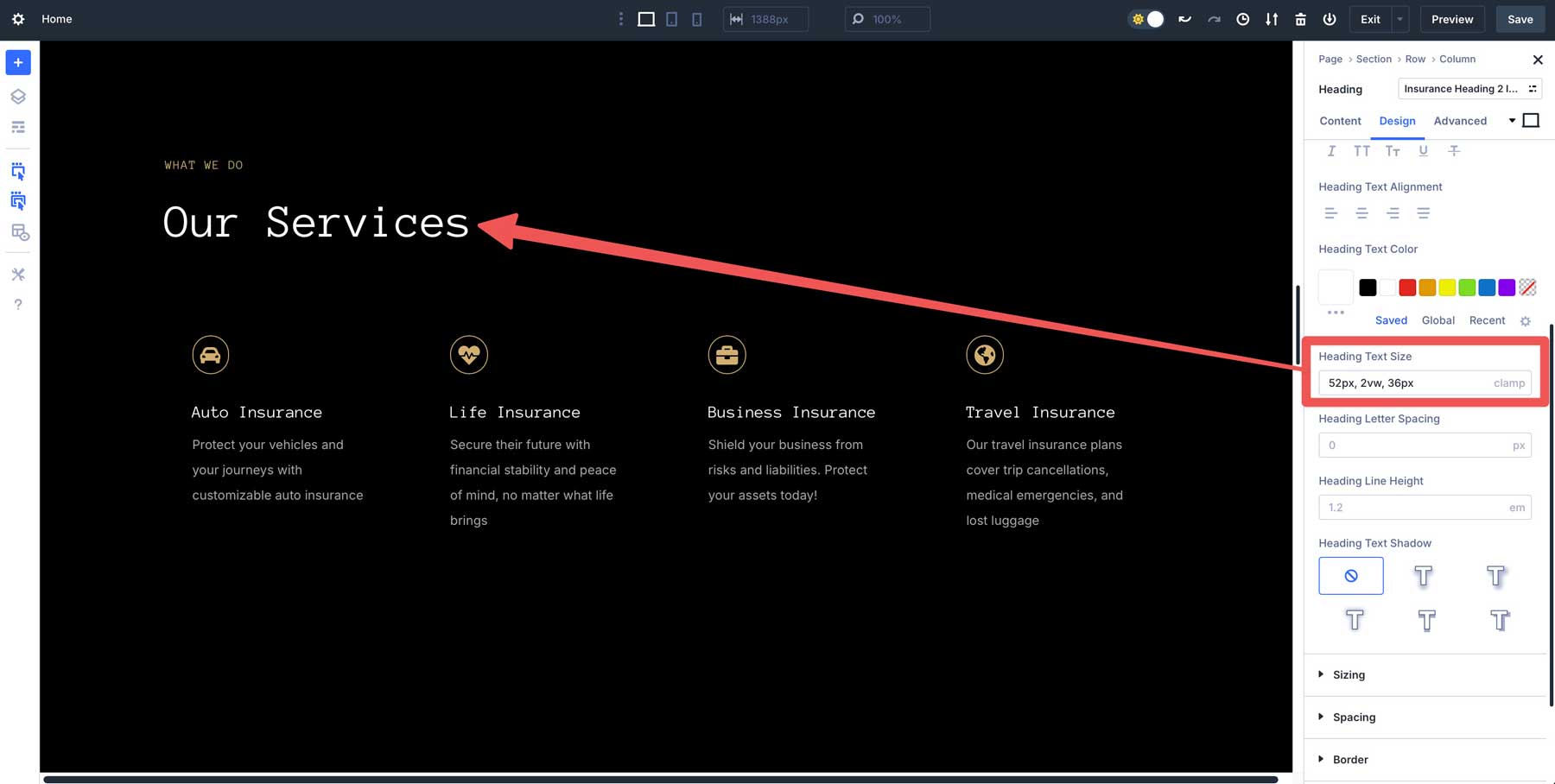
This sets the text at 52px, scales up based on 2% of the viewport width, and caps the size at 36px — effortlessly delivering responsive, balanced typography.
Variable-Driven Font Sizes
Divi 5’s CSS variables are a great way to get uniformity in spacing, text, and other areas. You can set variables once and then use them repeatedly throughout your designs simply by adding them to a module, column, row, or section unit field. For example, let’s say you want consistent heading sizes without manually setting them or using an Option Group Preset to define them.
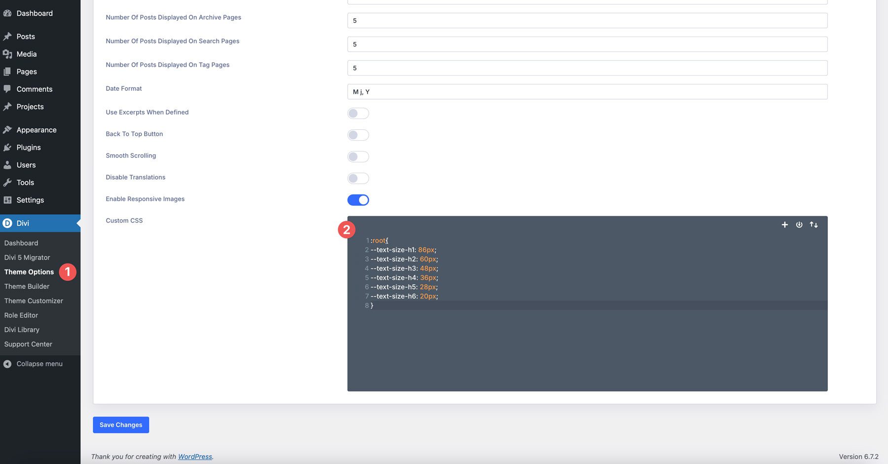
You could add the following in Theme Options or Page settings, under Advanced > Custom CSS:
:root{
--text-size-h1: 86px;
--text-size-h2: 60px;
--text-size-h3: 48px;
--text-size-h4: 36px;
--text-size-h5: 28px;
--text-size-h6: 20px;
}
From there, simply add a variable to the Heading Text Size in any Heading module. For example, for this heading in our hero section, we simply add var(–text-size-h1). Divi will recognize it as a variable and assign the appropriate style to your heading.
Best Practices For Advanced Units
To get the most out of Advanced Units in Divi 5, a thoughtful approach can save time and ensure your designs shine. Here are some best practices to guide you:
Start Simple
If you’re new to using CSS functions and variables, ease in with familiar units like pixels (px) or percentages (%), then experiment with calc() for basic dynamic adjustments. For instance, try calc(100% – 40px) for a section width before diving into clamp() or CSS variables. This builds confidence without overwhelming you early on.
Leverage Variables For Common Styles
Define CSS variables in Theme Options for site-wide consistency. For example, setting –gutter: 30px lets you reuse that spacing across sections, rows, and modules. CSS variables can also be good for setting a uniform text size for all your headings. One edit updates everything, speeding up the design process and keeping your design cohesive.
Test Responsiveness
Divi’s Responsive View System is a great way to design your design across multiple screen sizes. After applying units like vw or clamp(), toggle between desktop, tablet, and mobile view to ensure your layout adapts smoothly. A heading set to clamp(20px, 3vw, 40px) might look perfect on a desktop but may need adjusting for smaller screens, so test it to be sure.
Don’t Get Too Complicated
Although you can nest functions like calc(clamp(20px, 5vw, 50px) – 10px), you should stick to simple formulas, at least while you are learning. Excessive complexity can slow performance and make troubleshooting harder when things don’t appear as they should. Stick to clean, purposeful calculations to make life easier.
Why Advanced Units Elevate Divi 5
Advanced Units are great for streamlining the design process. Here are some of the key advantages that come with this new feature:
- Creative Freedom: Mixing units, functions, and variables unlocks layouts that were more time-consuming to achieve in previous versions of Divi. Simple formulas allow you to adjust heights, widths, font sizes, and more. This flexibility lets you build better and execute faster, all within the Visual Builder.
- Better Responsive Designs: Advanced Units shift Divi toward fluid designs that adapt effortlessly. Using vw or clamp() ensures your site feels natural on any device, reducing the need for manual overrides and delivering a polished experience.
- It’s Future-Proof: Advanced Units align with Divi 5’s mission to modernize the Visual Builder for today’s web. By embracing the full power of CSS, Divi 5 equips you with the tools necessary to build modern websites. It’s not just about keeping up; it’s about staying ahead of the curve with tools that mirror what professional developers use.
Download The Latest Divi 5 Alpha
Advanced Units is a helpful feature that has recently been added to Divi 5. From the precision of calc() to the fluidity of clamp() and the efficiency of CSS variables, these tools make spacing, sizing, and scalability more intuitive than ever. Whether you’ve been using Divi for years or just discovered it, you can build responsive, dynamic websites with less effort.
Ready to see it yourself? Download Divi 5 Alpha now and start experimenting with Advanced Units. Play with vw and vh for viewport spacing, test clamp() for typography, or set up variables to rethink how you build. It’s a chance to push your designs further and discover what’s possible.


Thank you for this detailed article.
Thank you Donjete!
Well explained!