

Get ready to drastically improve the way you build websites. Divi 5 has an exciting new feature, Customizable Breakpoints, which gives you incredible control over your site’s responsiveness. With Divi 5‘s new Customizable Breakpoints, you can create a seamless experience across all devices. Whether you’re designing for a massive desktop display or the smallest mobile screen, Divi 5 helps ensure your website looks pixel-perfect every time.
In this post, we’ll cover everything you need to know about this new feature and show you how to use it!
Check out the following video to see the new feature in action. 👇
Understanding Divi’s Customizable Breakpoints
Breakpoints are a fundamental aspect of responsive design. They act as thresholds where your site’s content reorganizes itself to ensure optimal user experience, whether someone is browsing on a smartphone, tablet, or desktop.
Subscribe To Our Youtube Channel
Divi 5’s breakpoints have been significantly improved, offering more flexibility and control than previous versions of Divi. Customizing up to seven breakpoints allows you to fine-tune your site’s responsiveness to accommodate a wider range of devices and screen sizes.
What Is A Breakpoint?
A breakpoint is a specific screen width at which your website’s design adapts to provide an optimal viewing experience across different devices. Breakpoints help ensure your content remains readable, visually appealing, and easy to navigate, regardless of screen size.
Responsive websites are designed using CSS media queries, which allow different styles to be applied when a screen reaches a particular width. When a visitor’s screen size crosses a defined breakpoint, the website automatically adjusts its layout, fonts, spacing, or other design elements to maintain usability.
With more breakpoints in Divi 5, you can limit the need for CSS media queries to define breakpoints for other devices.
How Many Breakpoints Should I Use?
The number of breakpoints depends on your audience’s device usage. Users access websites on various screen sizes, from small smartphones to ultra-wide desktop screens. Traditionally, web designers have used three standard breakpoints – desktop, tablet, and mobile – but Divi 5 expands this capability, allowing up to 7 customizable breakpoints for greater flexibility.
Will Enabling More Breakpoints Slow Down My Site?
No, enabling more breakpoints in Divi 5 will not slow down your websites. Unlike older methods of handling responsive design, Divi 5’s new framework is optimized for performance, ensuring that additional breakpoints do not add unnecessary load to your site.
Are Breakpoints Enabled On A Website Or Page Level?
Breakpoints in Divi 5 are enabled and applied at the website level, not on a per-page basis. Once you enable and customize breakpoints, they will affect the entire website, ensuring a consistent, responsive design across all pages. Any change you make to breakpoints will universally adjust how your site responds to different screen sizes rather than being limited to individual pages.
How Customizable Breakpoints Work In Divi
Divi 5’s highly flexible and intuitive system is perfect for managing breakpoints, giving you greater control over your website’s responsive design. Unlike previous versions, Divi 5 allows you to customize up to 7 breakpoints, ensuring your site looks perfect on every device. This system is designed to be user-friendly while offering advanced options for those who need them.
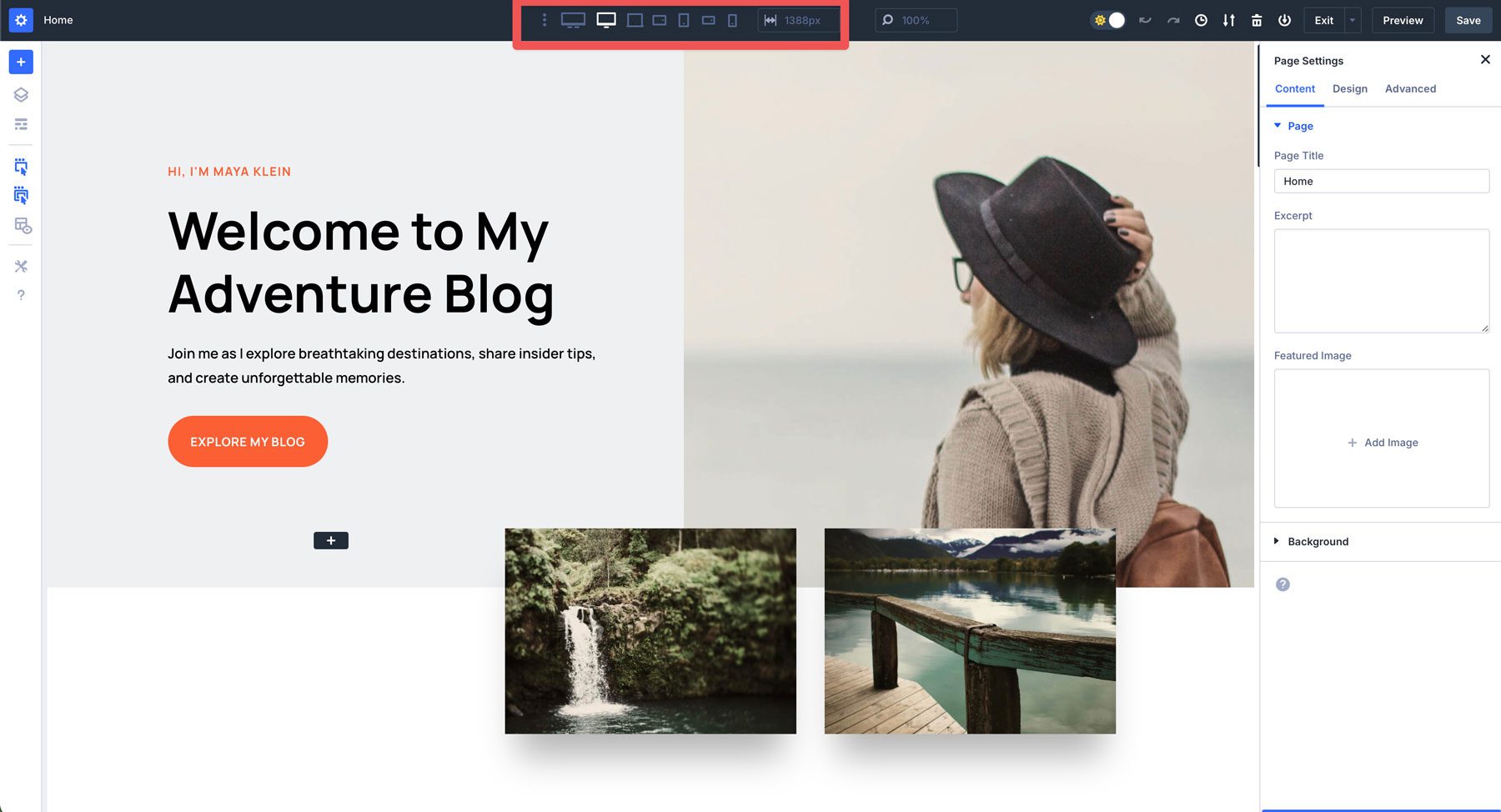
Where To Find Breakpoints
In Divi 5, breakpoints are integrated into your page settings, making them easy to locate and customize. You can access them directly within the Visual Builder, ensuring a streamlined workflow.
How To Enable Breakpoints
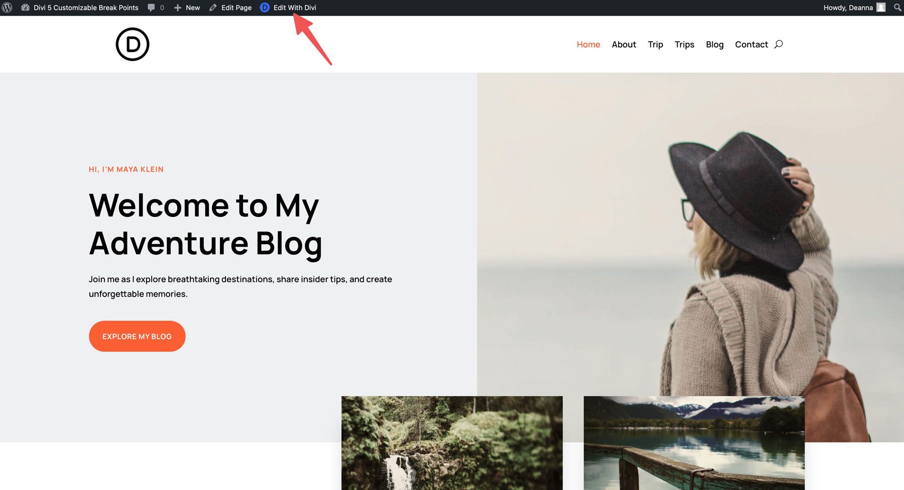
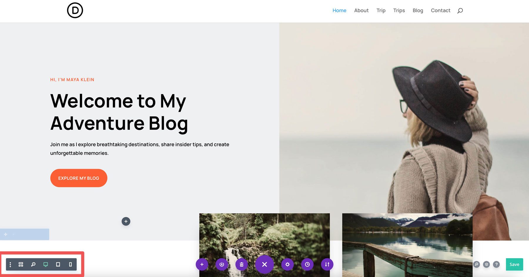
Open the page you want to edit and activate the Visual Builder by clicking Edit With Divi.
Click the ellipsis menu (three dots) located in the Visual Builder’s main taskbar.
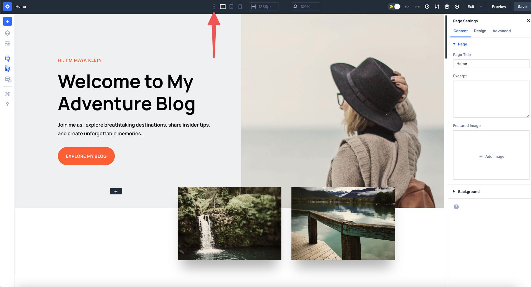
Inside the settings, you’ll find a series of toggle switches that allow you to enable or disable breakpoints as needed.
Once activated, each breakpoint will be visible in the taskbar, allowing you to make changes throughout your design without clicking responsive controls in individual rows or modules to adjust settings.
Should You Use Standard Breakpoints Or Your Own?
Divi 5’s standard breakpoints are designed to cover the most common screen sizes, including phones, tablets, and desktops. These predefined breakpoints are more than sufficient for many designers, as they cater to most users and devices.
However, there are scenarios where creating custom breakpoints can be beneficial. For instance, if you want to accommodate ultra-wide monitors, foldable smartphones, or smaller tablets, custom breakpoints can help you alter your design for these use cases.
Using Custom Breakpoints in Divi 5
Customizing responsive breakpoints is useful for addressing design quirks or content display issues on less common devices or screen resolutions. They can also help improve website performance by loading only the necessary styles for a given screen size, reducing page load times.
Thankfully, Divi 5 makes it incredibly easy to customize these responsive breakpoints with a few clicks.
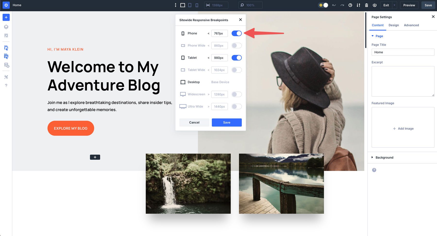
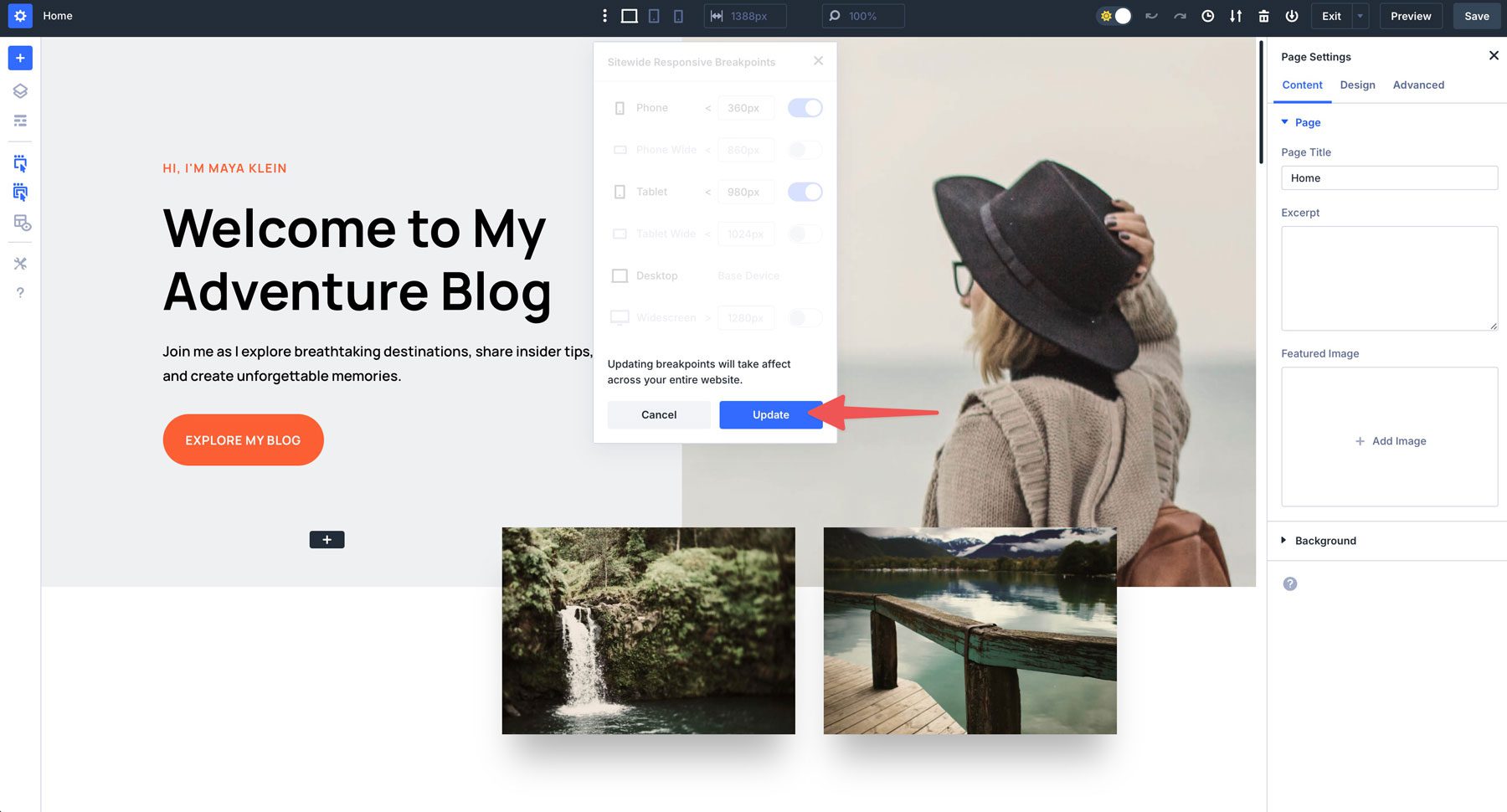
With the responsive device settings open, set the phone breakpoint to your desired width, and then repeat the steps for other devices. Since we want to make the site accessible for smaller devices, we’ll set the number to 360px for phones. Once you’ve added the desired pixels, click the Save button to continue.
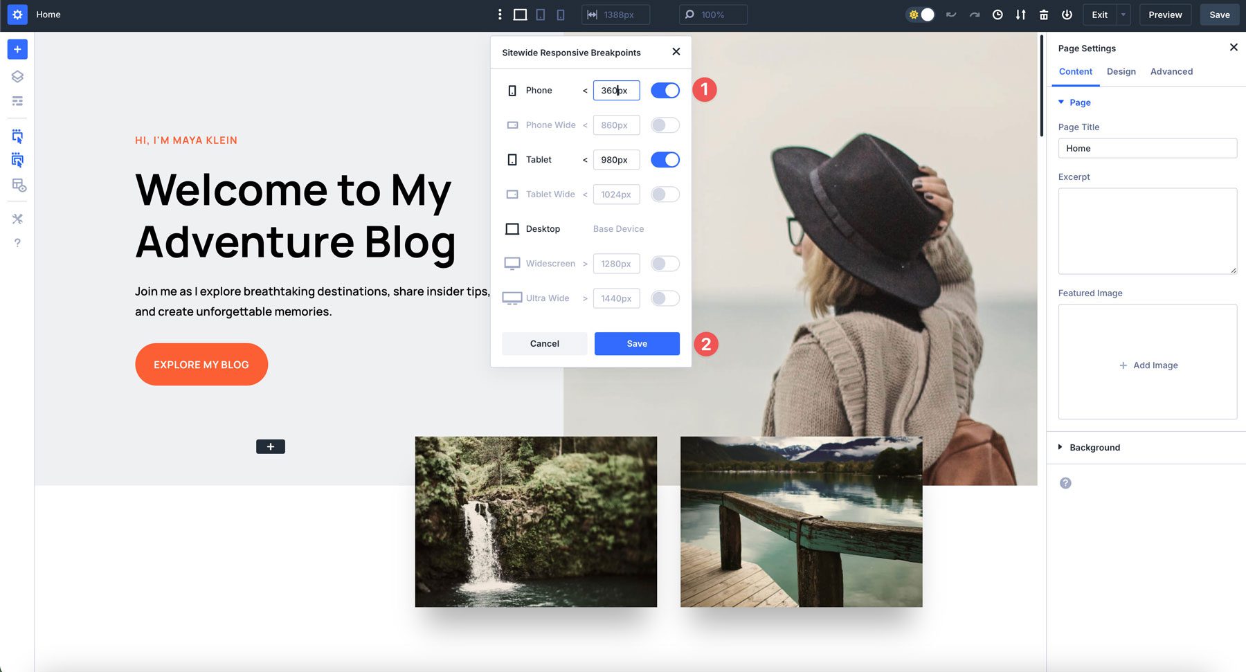
Divi 5 will let you know you’re about to adjust your website’s breakpoints. Click the Update button to confirm the change.
We’ll add the following breakpoints for the remaining screen sizes:
These breakpoints cover a range of devices to ensure your website covers most screen sizes and use cases:
- Phone: 767px covers most smartphone screen sizes, including older models like iPhone 8 or Samsung G7.
- Phone Wide: 860px covers most phone screens in landscape mode, including iPhone 14 Pro (and above) and modern Android devices.
- Tablet: 980px is good for most tablet screens in portrait mode, including all iPads.
- Tablet Wide: 1024px is standard for landscape view in most iPads and Samsung tablets.
- Widescreen: 1280px is a good width for most smaller laptops (Windows or MacOS), including MacBook Air, MacBook Pro 13″, and comparable Windows devices.
- Ultrawide: 2560px covers larger desktop screens, such as MacBook Pro 15″ and 16″ laptops, iMacs, and standard high-definition monitors.
Customizing Your Responsive Design Inside Presets
One of Divi 5’s most powerful aspects is how its customizable breakpoints integrate seamlessly with presets. This allows you to create a responsive design across your entire website with minimal effort. A perfect example is modifying the H1 preset of a starter site to ensure all H1s look perfect at every screen size.
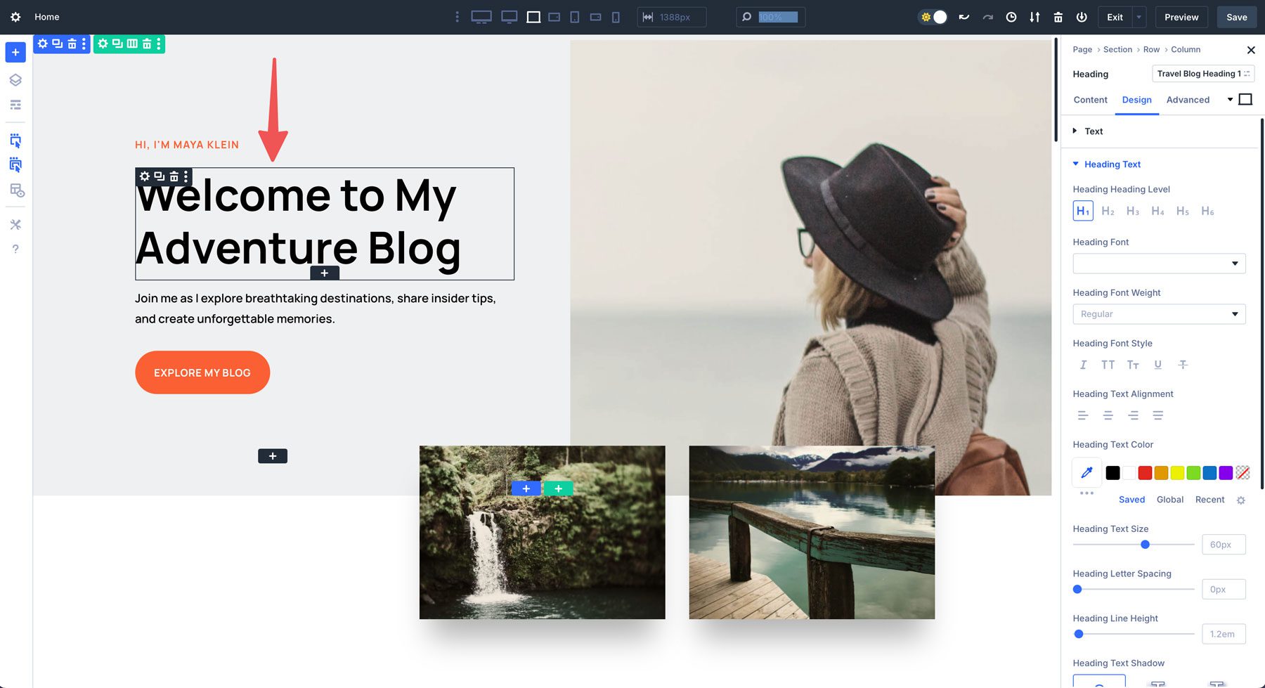
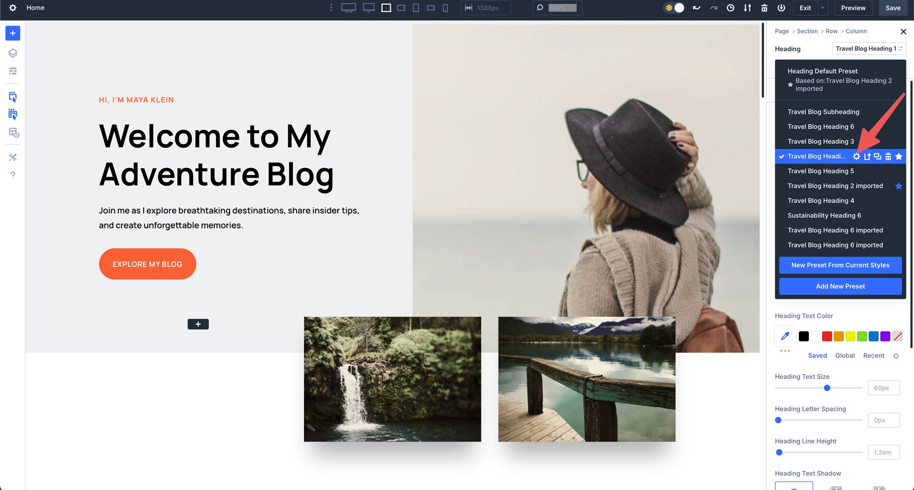
Start by clicking anywhere within the H1 in the hero section to bring up its settings.
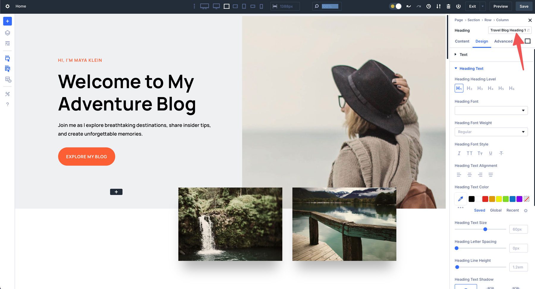
Next, click the heading presets field in the module’s header.
A preset list will appear. Locate the preset that has a blue check mark next to it.
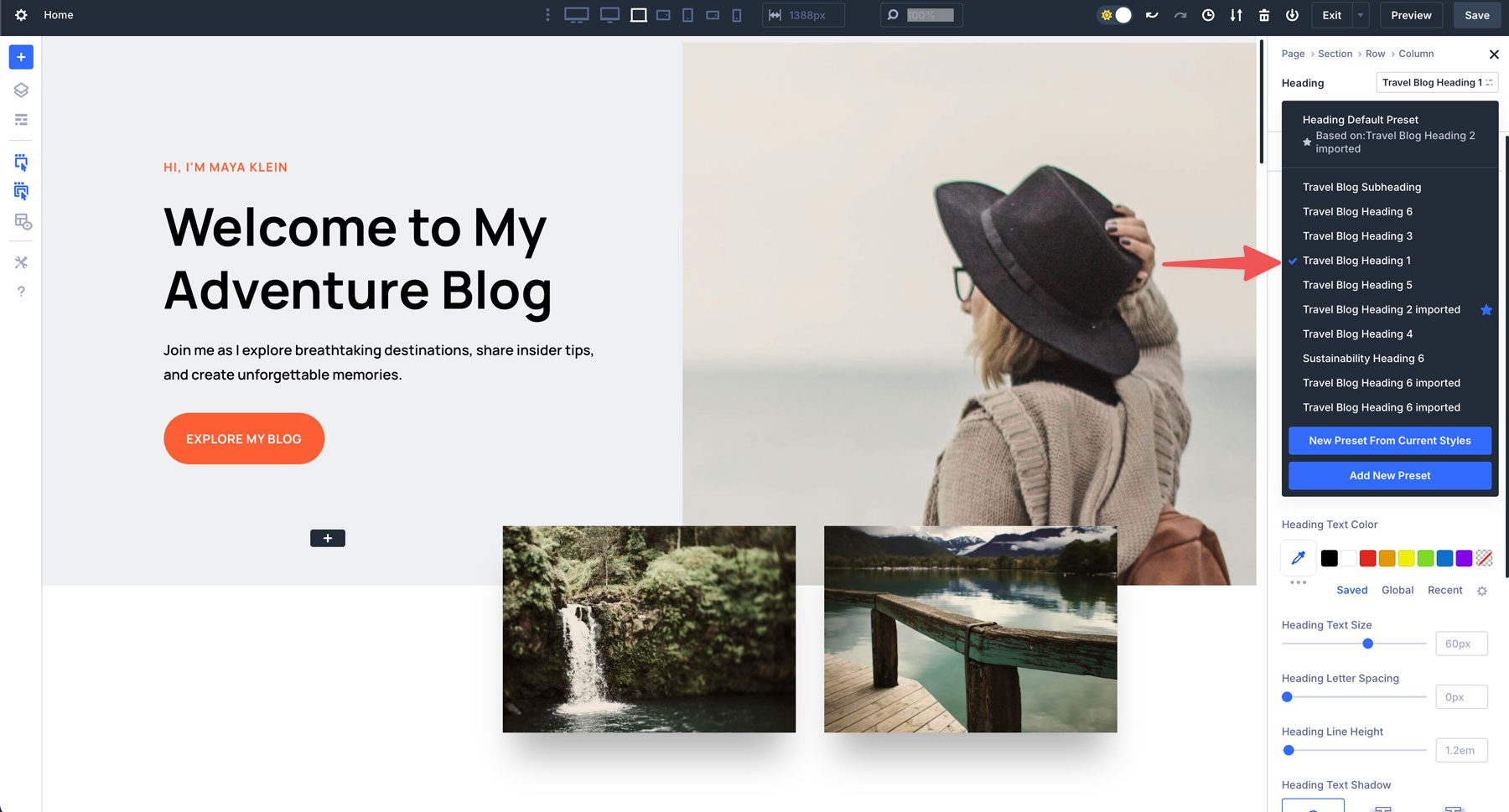
Hover over the active preset to reveal its settings. Click the settings icon to edit it.
Click the design tab and then adjust the heading text size to the desired size.
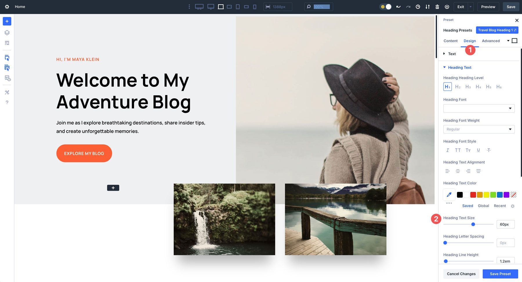
Keep the preset settings open and click the next screen size in the Divi 5 taskbar to adjust the heading’s size.
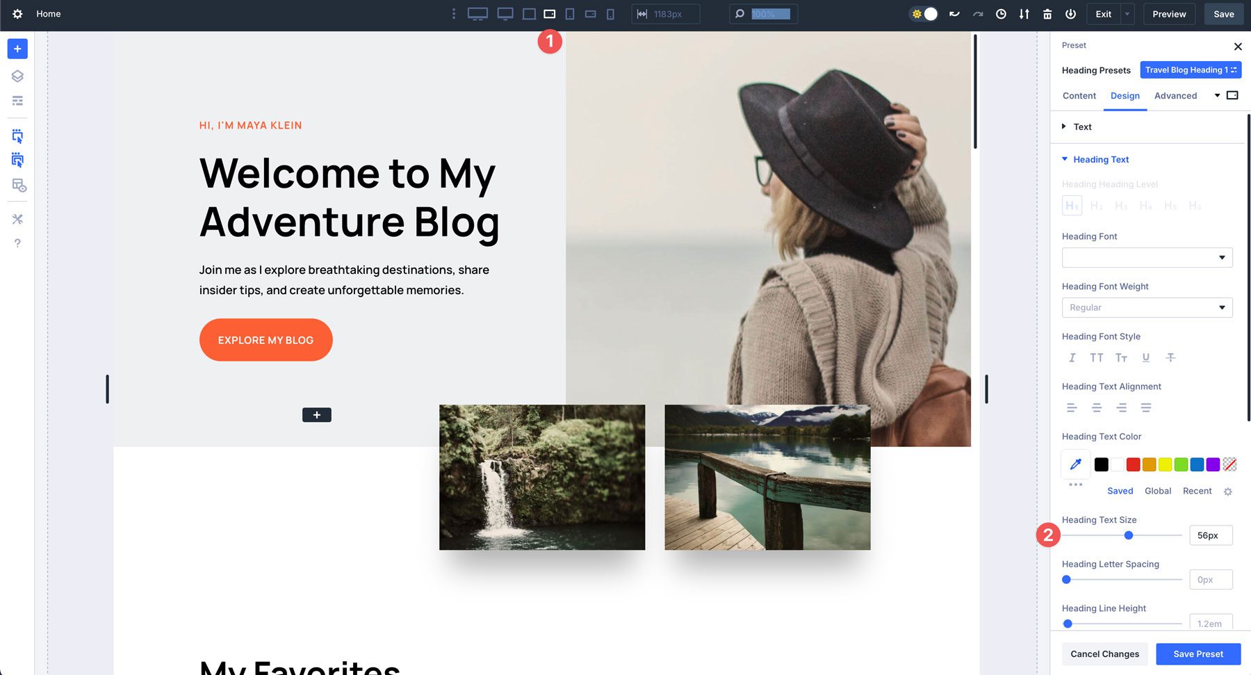
Repeat the steps above to adjust the heading presets for the remaining screen sizes. Once you’ve completed this, click the Save Preset button.
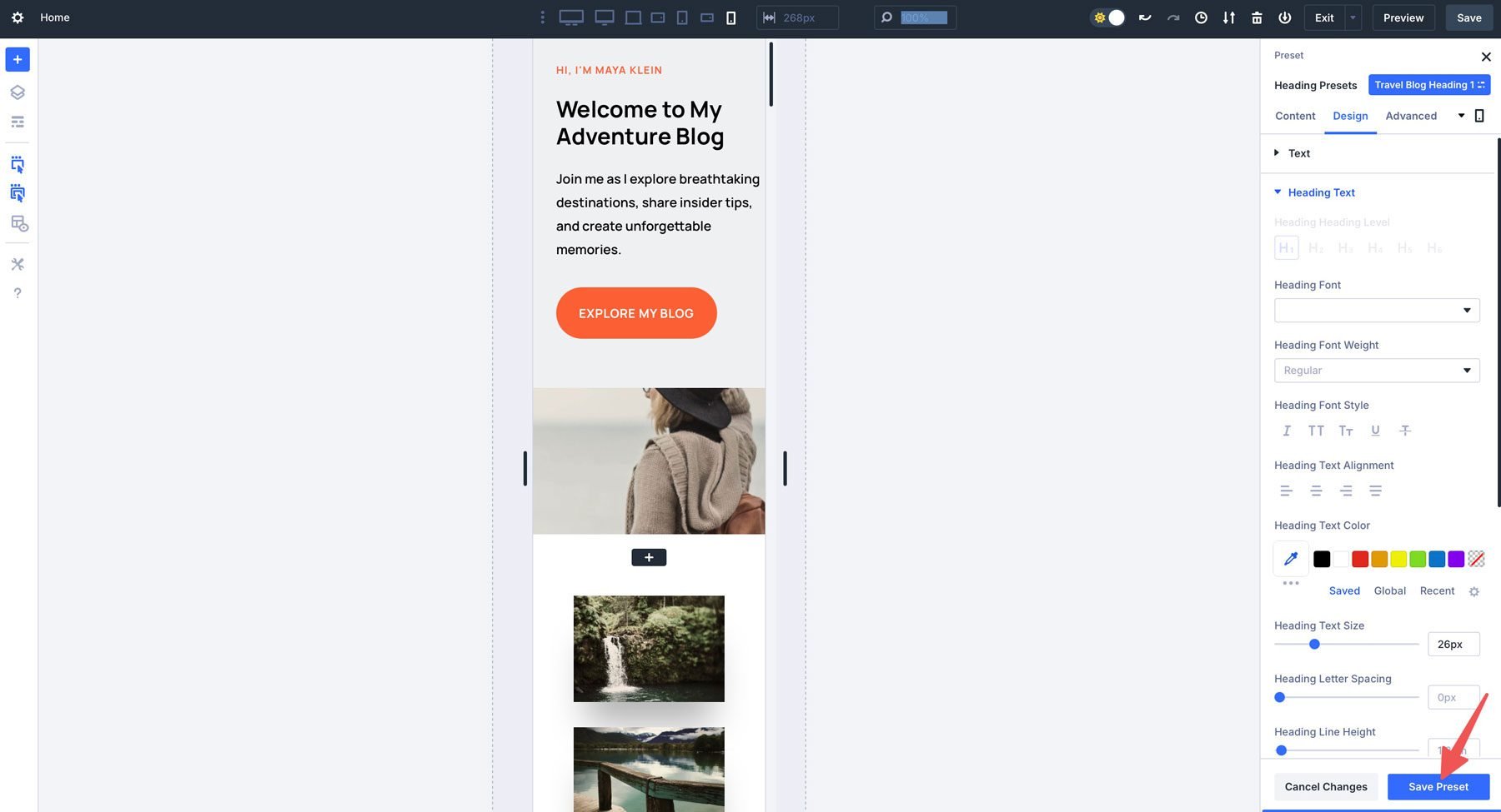
When you swap breakpoints, the size changes will be reflected in the heading preset.
Responsive Editing In Divi 4 vs Divi 5
Divi has always been a leader in responsive design, but Divi 5 takes it to a whole new level. While Divi 4 provided a solid foundation for creating responsive websites, Divi 5 brings features that make responsive editing more intuitive, flexible, and powerful than ever before. Here’s a closer look at how Divi 5 improves upon Divi 4’s capabilities.
Effortless Transition Between Breakpoints
In Divi 4, switching between breakpoints is pretty straightforward but involves more time and isn’t as smooth as the transition you can find in Divi 5.
Divi 5 improves this workflow with a smoother, more intuitive interface. Now, you can instantly transition between breakpoints, previewing your design as you adjust, without lag. This new version of Divi allows you to make design changes on the fly based on which breakpoint you are viewing. There’s no more switching between modes or constant toggling. This seamless experience saves time and ensures a more cohesive and polished design across every breakpoint.
From 3 to 7 Breakpoints
Divi 4 supports 3 different breakpoints; these can be found in Divi 5 as well.
- Desktop: 981px and above
- Tablet: < 980px
- Mobile: < 767px
While these breakpoints cover the basics, they sometimes fall short when accommodating the variety of devices and screen sizes used by modern audiences. Designers may sometimes need CSS media queries to target different screen sizes, especially for ultra-wide monitors or smaller mobile devices.
Divi 5 has addressed this limitation by expanding the number of breakpoints to 7 customizable options, making targeting a larger number of devices easier.
- Phone: < 767px
- Phone Wide: < 860px
- Tablet: < 980px
- Tablet Wide: < 1024px
- Desktop: > 981px
- Widescreen: > 1280px
- Ultra Wide: > 1440px
This increased flexibility allows you to fine-tune your design for a broader range of devices, ensuring your site looks perfect on everything from compact smartphones to large, high-resolution monitors. For instance, you can now create a dedicated tablet breakpoint in landscape mode or optimize your site for ultra-wide screens used in professional settings.
Edit For Any Device On Any Device
In Divi 4, reducing the size of your browser window or increasing the width of the docked settings panel would unwantedly trigger responsive breakpoints. Using the builder on small devices or within a small browser window would trap you in the tablet or phone breakpoints.
In Divi 5, the size of your design scales down proportionally when a breakpoint’s width is larger than the width of your canvas. You can design for ultra-wide monitors, even on a small desktop or tablet.
When you switch to a specific breakpoint, you always remain in that breakpoint and get a realistic preview of your design at that size.
Try Divi 5 Today
With customizable breakpoints, you can now fine-tune your website’s responsiveness to fit different screen sizes better. Whether you’re designing for ultra-wide desktops or wide mobile screens, Divi 5 puts control in your hands.
Can I Use Divi 5 On My Website Already?
You can use Divi 5 on your website, but its availability depends on your use case. Divi 5 is currently in the Public Alpha phase, which means it’s still being actively developed and refined. While it’s not yet recommended for all production environments, there are specific scenarios where you can start using it without issues.
Use Divi 5 On Local & Staging Sites
Divi 5 is currently available for local and staging environments, allowing users to safely test its new features without affecting their live websites. Since Divi 5 is still in the Public Alpha phase, this approach ensures that users can experiment with Divi 5’s improvements, report bugs, and provide feedback while maintaining the stability of their production sites.
You Can Safely Use Divi 5 On NEW Production Websites
Divi 5 is stable and ready to launch brand-new websites. If you’re starting from scratch, you can fully take advantage of its fast performance, modular framework, and future-proof technology without worrying about backward compatibility issues. However, a thorough testing phase is essential for existing sites that rely on extensive third-party integrations before migrating. At this point, we still don’t recommend converting existing websites to Divi 5.
Divi 5 Is Forever Included In Your Lifetime Membership
Divi 5’s customizable breakpoints empower designers to create responsive websites with greater precision. Whether you’re refining an existing layout or building a site from scratch, these new tools give you the flexibility to craft pixel-perfect experiences for every screen size.
One of the best parts of Divi 5 is that it’ll be forever included in your Divi membership (at no additional cost). If you upgrade to a Divi lifetime membership today, you’ll gain access (and updates) to Divi 5 for a one-time fee and benefit from this evolving product for years to come.


You’ve done an amazing job on the new interface for Divi 5! Do we have a timeframe for rollout yet? While everything looks great, we can’t use it for new builds just yet because we rely on essential features like carousels etc, and Divi Marketplace suppliers aren’t releasing upgrades until Divi 5 is officially launched. This will cause further delays—have you considered the impact? Rather than adding new features, the focus should be on getting it released as soon as possible.