In today’s post, we’re going to share some awesome web design websites that are built with Divi. When it comes to web design websites, the bar is set high. Which is pretty logical. Almost all the websites that exist are made by the person or company behind these web design websites. Showing how creative you can get on your own website, will already help convince your visitors and leads that you’re the person or company they want to collab with.
Let’s take a look at 14 different web design websites, built with Divi, from all over the world that do a pretty good job at interacting with their visitors and putting their message out there.
1. Geekpoint
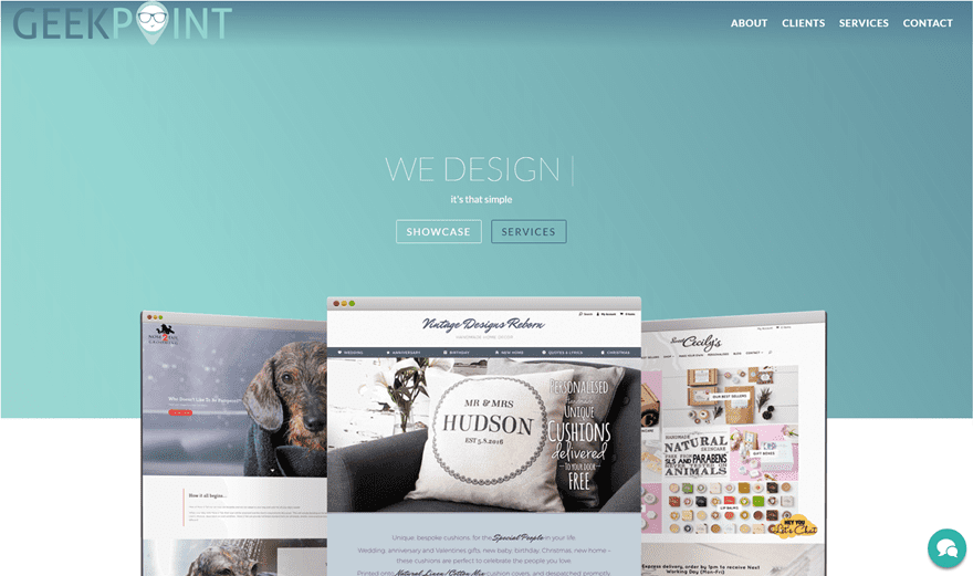
The first website made with Divi we’d like to put in the highlight is Geekpoint, a creative web design agency located in Yorkshire. The Geekpoint website is a one-pager that doesn’t miss any of the elements a website with multiple pages would offer. They made sure they have everything needed on their one-pager which makes people not even wonder why the website doesn’t have multiple pages. They immediately start with one of the most important things a business website has to do; share previous work. They chose the most valuable designs out of their portfolio and showed them exquisitely and noticeably.
2. Webulle

The next web design website we want to show you is Webulle, a web design agency located in France. We already knew that the French have a great sense of style, and that sense of style isn’t missing from Webulle’s website either. The hero section immediately draws our attention. They’ve added a nice animation that makes it hard for any visitor not to engage and read what’s written in the hero section. But they didn’t just leave it like that, they continued the same style they handled in the hero section and made sure their whole website is in the same style.
3. Wgorilla
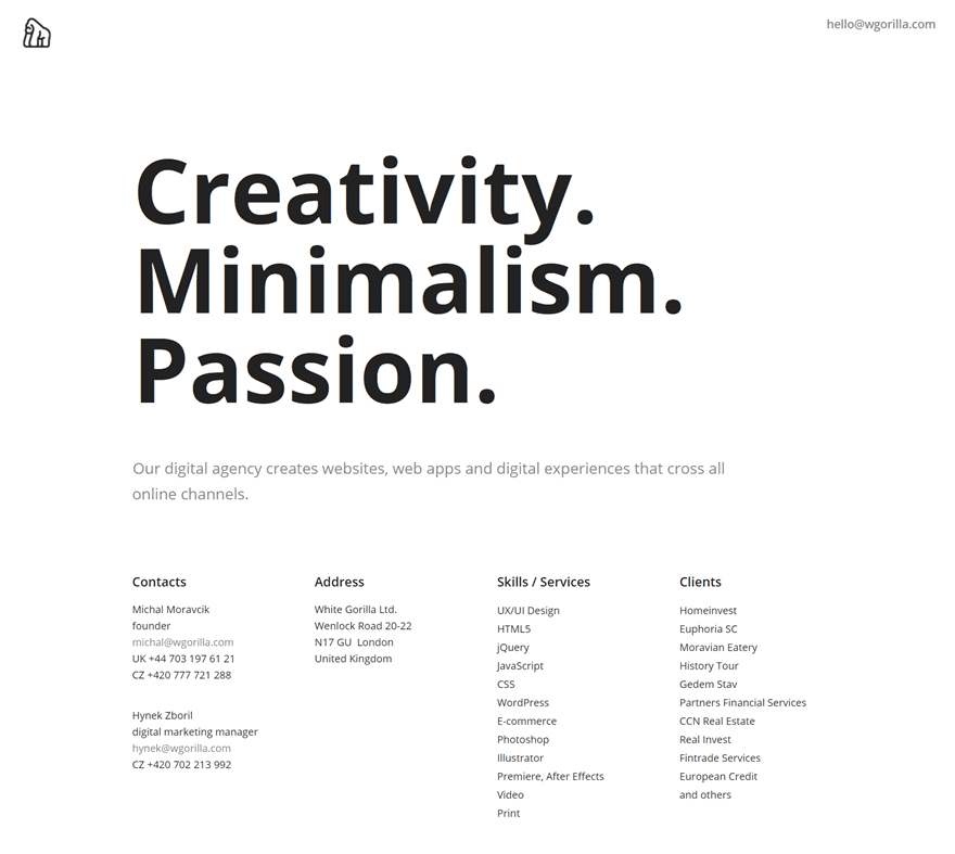
The next website in the row is Wgorilla. From the moment you enter the website, you’ll immediately see the difference between this website and other websites. The website is extremely minimalistic and helps Wgorilla prove their focus; creativity, minimalism and passion. Their own website shows their ability to think out of the box and deliver a website that most visitors have not seen before. All the needed info is present on the website. They cut to the chase and make it easy for people to get in touch right away. Of course, creating this kind of website is risky. You’ll probably have an equal balance between people that like it and people that don’t.
4. Fus & Schuss
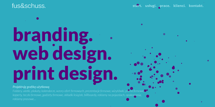
The next website we want to show you is Fus & Schuss. This Polish website is full of colors. Every color was deliberately chosen and matches the total look and feel Fus & Schuss wants to represent on their website. With their attractive and animated hero section, they immediately manage to draw the visitor’s attention. This website is a one-pager and is definitely one that’s thought out well. They provide their visitors with all the essential information they need. From services to previous work and more. On top of that, they’ve done a great job at showing the core of their business without overloading their visitors with too much content.
5. Motion Edge Design
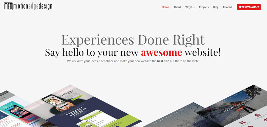
The fifth website in the list is Motion Edge Design. This website is very modern and one of the very nice things that break the modern touch of the website is the font family. With their subtle color use for background and text colors, they succeed at putting the focus where they want it: on the websites they create. They limit the amount of written content they use and let the web designs they make speak for themselves. With all the needed pages within reach, this website shows all their visitors and leads the example of a beautiful and results-oriented website.
6. Webdesign 101 Berlin
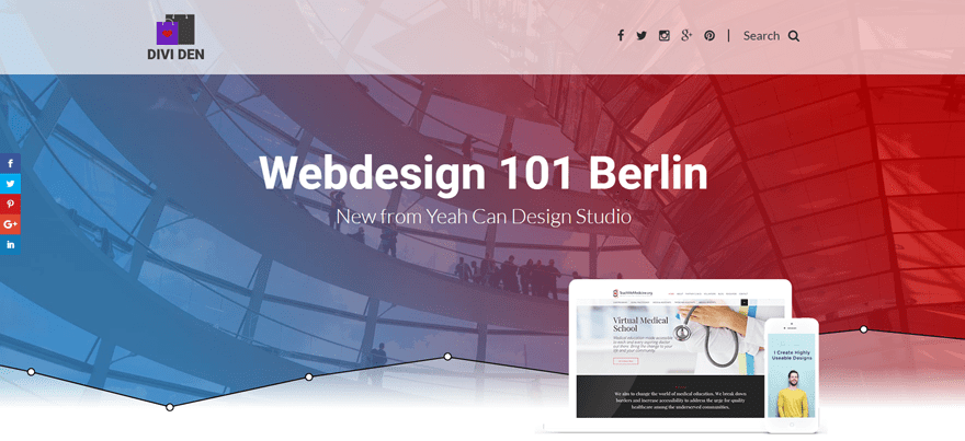
Another website worth taking a look at is Webdesign 101 Berlin. This website immediately gives you the feeling that they know what they’re doing. This one-page homepage lets you easily navigate through the different benefits the design studio offers. They’ve found a great way to integrate their web design services with the other stuff they offer as well. A few of those other things are tutorials and Divi freebies; they clearly give to get.
7. Shafaq O. Designs
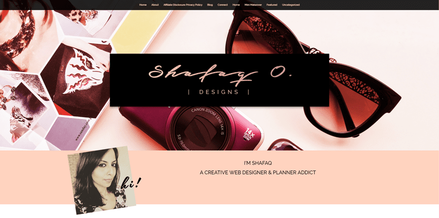
An elegant design we encourage you to take a look at is Shafaq O. Designs. Shafaq did a pretty good job at representing her own services and skills within a website that matches the work she delivers. Most of the previous work she has done reflects the same elegance as her own thought-through website. With all the different pages on her website, she shows consistency in style and manages to put her message and skills out there.
8. Chelius Designs
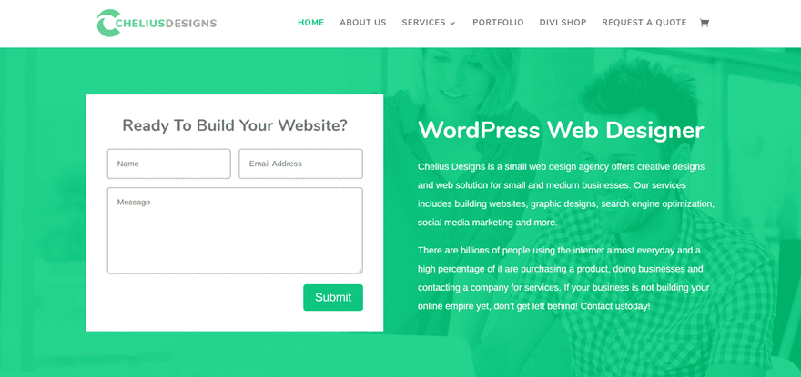
Moving on, we’re going to take a look at Chelius Designs, a website with a very clean and fresh look. This layout is pretty straightforward and shows how simplicity can bring added value to any website. With a contact form in their hero image, they immediately stimulate their visitors and leads to take the next step towards building a website and getting in touch.
9. Pink by Puck
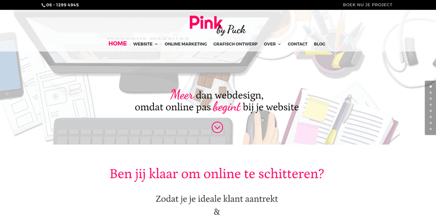
Or what about the brightness and color touches the Pink by Puck website offers? This Dutch web design website shows personality and engages their visitors and leads by putting the focus on the most important things on their website, the client testimonials being one of them. With the different font families and colors, they emphasize the message they’re trying to deliver.
10. B3multimedia
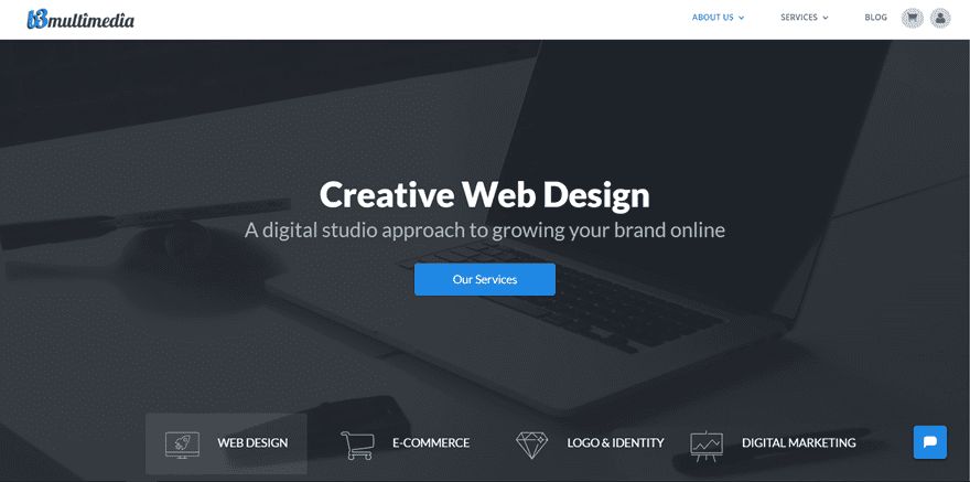
Then we have B3multimedia that offers web design services as well. Instead of telling people what they’re able to do, they prefer showing them at first glance. With their great and high-definition visuals, B3multimedia shows how creative they can get. And more importantly; the added value they can bring to your company if you decide to collab with them.
11. Seoocity

Another web design website that has elegance is Seoocity. They found a great balance between offering content and keeping the website clean and to the point. One of the great aspects of this website is the fullscreen menu that motivates you to go through all the pages and explore what their services and story are about.
12. Open Studio
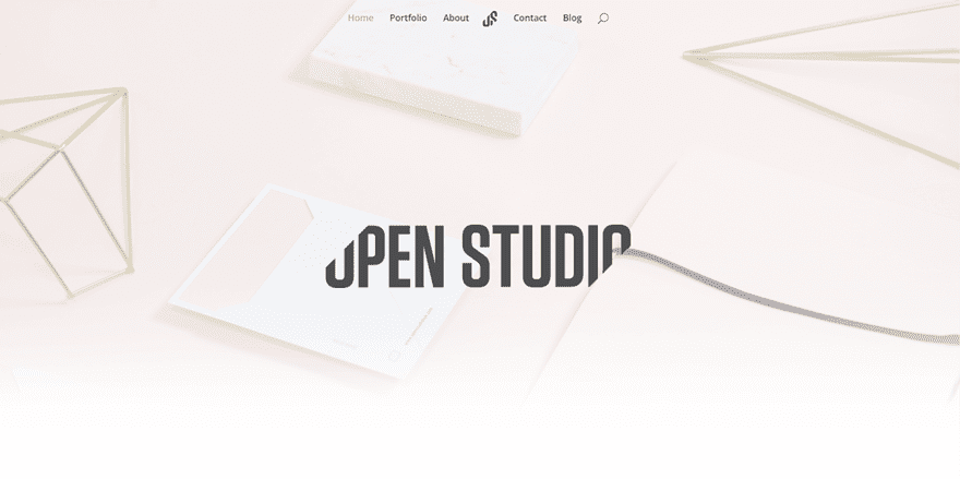
The thirteenth website that looks great is Open Studio. The soft colors used on this website help Open Studio put a focus on the services they offer. This light feeling reflects a certain serenity and confidence that’s expected from any web design studio. With their obvious but simple calls to action, they get visitor’s and lead’s attention but don’t overwhelm them.
13. Carol.no Webdesign
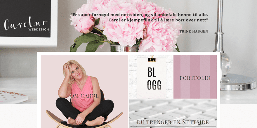
The last web design website, Carol.no webdesign, is pretty different in comparison with the other ones we’ve handled. The different pages this website shares with the visitors are visually and beautifully represented. The focus of the website is clearly on the person behind the website, giving visitors a familiar face they can relate with. Besides that, the website definitely shows elegance and feminity all the way.
Wrapping up
The web design websites we’ve shown in this post show how creative you can get with Divi if you’re creating a web design website. For web designers starting their own business, providing your own website with that advanced look and feel can bring a lot of added value. If you have any questions or suggestions, make sure you leave a comment in the comment section below!
Be sure to subscribe to our email newsletter and YouTube channel so that you never miss a big announcement, useful tip, or Divi freebie!
Featured Image by NikVector / shutterstock.com


Thank you for sharing my website Chelius Designs! Great list. Cheers…
These themes are really fantastic. we will be more proficient after reading all about these themes. And off course DIVI themes is the best.
Hi,
Does Divi support Hebrew or writing from right to left?
Can I add Hebrew fonts from Google Font to the site?
Webdesign 101 Berlin goes to a site selling divi stuff. How is that awesome?
Hey, Great exemple !
Just a question, for the Webulle example number 2, every pages are on the same page but how you connect each with the menu ?
Thx for the answer
Hello Donjete,
Thank you for featuring my site and for the compliments. It’s all Divi and I can’t thank ET enough for the amazing builder.
All the best.
What surprises me is that majority fail to provide contact details other than a web form.
Why would I do business with an organisation that hides its location.
Hi. Can we build newspaper/magazine style with Divi?
All these are really creative designs Master piece. I have a favorite in these the third one.
Shafiq O. Designs has the most unusual (and best) blog preview design I’ve ever seen. Can this be done on Divi itself, or is a plug-in needed -and if so, which one?
Hi Jim! Thank you for your kind words. As Richard mentioned, its the Divi Article card addon, it came out during the 100 day Divi freebies marathon.
The website does list the DIVI Article card plugin being used which is free.
All these websites built with Divi are really awesome. Geek Point is great, Webulle is wonderful, Motion Edge Design is mind blowing. But, I have a question about Webulle. Is the animation in the hero section created by any feature of Divi?
This is not a HERO section at all. Thew website uses the Revolution slider with a video used as the background. They also use the particle effects add on to get all the flash you see as well.
How can I enter/submit my work if can be featured in such lists? eg: my own site layout.
Yes you can
Some of those examples are really great, but many are very classic, using classic modules, stock imagery etc without much thought. I would expect more extreme examples, like (also done with Divi): scaryposter.com, hariscizmic.com, downloadsoho.com or even a funny spoof-site like flintspringtap.com. No stock imagery, no hipster themes…
Soo… Are you just promoting your own work? LOL
Hi Donjete 🙂 a great selection of web page designs made with DIVI, salu2 and thanks from Asturias