Business consulting is as popular as ever and is growing every day. With that growth comes the need for new websites. Fortunately there are several websites of business consultants that were built with Divi to provide design inspiration for your next business consultant project. In this article we will take a look at 10 examples of business consultant websites built with Divi to help spark the imagination of any Divi designer.
Whether the business consultant provides services such as on-site training, courses, workshops, personal coaching, business strategy, planning, leadership, employee training, etc., these sites can help with inspiration for your next design. They’re in no particular order.
1. James Robbins
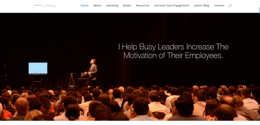
James Robbins includes a hand-written logo and full-screen image with tagline. Scrolling reveals an information section with testimonials, categorized information with bullets, images, video, and CTA’s. Following this includes a full-width image with company quote, blurbs of services, and CTA’s. The pages display text and images using multiple layouts. The images do a great job of creating the setting to help potential clients get the idea of services that are provided.
2. More Sales Advisors

More Sales Advisors includes a full-width image slider with CTA, an about section that covers the services provided, an about section with link to About page, and a full-screen image with overlay in parallax about the owner. Throughout the homepage are slim sections with business quotes and stats. The About page provides company info in sections with each section in a different color. The Services page provides information within toggles. The site makes great use of color and the quote sections stand out without taking over the design.
3. Andreas Dittes

Andreas Dittes uses a full-screen slider with CTA’s followed by a testimonial section, a Mentioned In The Media section with media logos, a contact button, and a footer with links. The Projects page displays projects in a grid. The Books page display book covers, descriptions, and links. The site is simple and uses an elegant font.
4. Pamela McCauley Bush
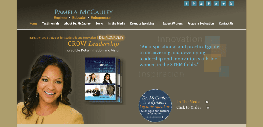
Pamela McCauley Bush uses a boxed design with an image, quote, and CTA on-screen. Scrolling displays an About section with button and embedded video, a Recent News section with image and text, an awards section with an image and text with link to the full story, a three-column section with text links to the blog and various articles, and a resources section with links. The various pages display information within bullets and include images, creating page-layouts that are easy to follow. The site makes great use of color branding.
5. Arndts Business Club
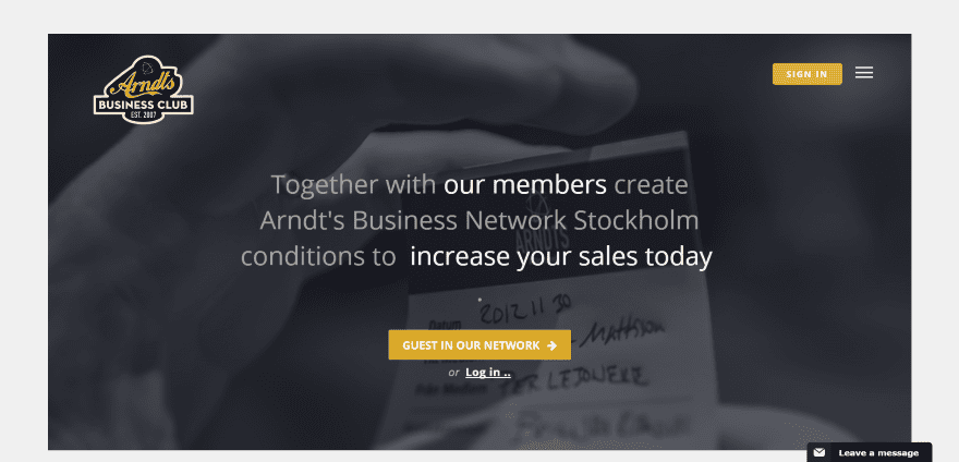
Arndts Business Club has a boxed design. The homepage includes a full-screen image with CTA overlay, a mobile-style right-side menu with label, pages in a grid, a nice calendar system animated CTA for each of the events, alternating images with text that have branded colors as backgrounds and horizontal module separators, sign-up form, and custom footer with links to pages. A button to leave a message remains on the screen but out of the way. The site is clean and easy to follow.
6. Hill Consulting

Hill Consulting uses a one-page design that includes a full-screen background with overlay in parallax with a hamburger icon for the full-screen menu and dot navigation. Scrolling displays a section with company information, a larger company information section, and several sections that answer, what, who, how, clients, media, and contact that includes full-screen sections with images and taglines in parallax between each of the sections. The site makes great use of parallax and monochrome images.
7. Niklas Modig
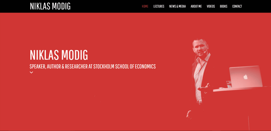
Niklas Modig displays a full-screen image in bold red color and a tagline with down-arrow. Scrolling reveals a section with newsletter signup, a two-column section with image collage and information with CTA’s, a styled testimonial section with an image collage in the background, a CTA, personal quote, embedded video, a section with information about the various courses, a styled blog section, and a large custom footer with embedded tweets and a contact form. The pages use image headers, sections as titles, and lots of images and text with multiple layouts. The site makes excellent use of branded color and the image collages give it a unique look.
8. On Point Coaching
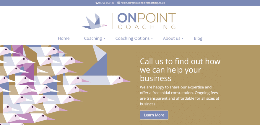
On Point Coaching uses a large logo and a full-width image with post slider. Following this is a two-column About section with CTA, another section shows company and client goals, a testimonial, information about the process, a section in parallax that discusses measuring success, several sections with testimonials and services, information about a specialized group for clients to join, and information about the owner followed by a personal quote and contact information. The various sections use branded colors and images. The site makes excellent use of color and the sparing use of parallax is effective.
9. Collaborate Consulting
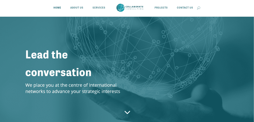
Collaborate Consulting uses a full-screen image with tagline, an About section with title that stands to one side, a three-column section with an image and information with links, a section highlighting the ideal client followed by a section with icons for the sectors that are served, a large section with testimonial, and a contact section. The pages use the same text layout with the title to one side. The site uses elegant colors and layouts and makes great use of images and background patterns.
10. Alison Crabb
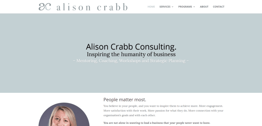
Alison Crabb displays a message with tagline and an About section with image and contact button. Following this is a section describing the services using text and a chart, a CTA with free download, a quote from John Maxwell, testimonials, and a contact section. The services pages follow the same design and add text sections highlighting the services and benefits. Quotes are used throughout the site. The site makes excellent use of color and has one of the more interesting CTA designs and free offer.
Final Thoughts
These 10 examples of business consultant websites built with Divi are good examples to show that Divi can be used to create any type of consulting agency website. Whether the site is a simple brochure or a large site with blog, courses, and workshops, it can be built with Divi.
These sites a great for providing ideas for layouts, branded colors, images, animations, video, CTA’s, navigation, and more. These websites are sure to inspire you for your next business consultant website design.
What are some of your favorite elements of these Divi business consultant websites? Let us know in the comments below!
Featured Image via nanmulti / shutterstock.com


I think i could do a lot better then most of these sites. For starters in your number one pick they dident clean up the footer and left Elegant themes powered by wordpress right in the bottom.
Hi, friends. I really like Divi builder. It makes web design a visual art; and more if you know CSS. I like the web page #5; It has a button at the left side of hamburger menu. How I can do it on Divi? I really want to know it.
Also, How a I can personalize the Comments sections as you did it here in your blog? Thanks in advance.
I think divi is a perfect multipurpose wordpress theme.It’s a clean & easy to user wordpress theme for blogger & Business site.I have been using this theme on my client site since 2010.I like Collaborate Consulting website design.they did a excellent job 🙂 Thanks for the consulting website samples.
Some really great stuff here that does a great job showing the diversity of what Divi can do. I had my site on Divi….but when a huge potential client actually looked at our source code and saw Divi was what we were using – they did not think we were “qualified” for the project. So we moved off to a custom website because we did not want that to happen again……which leaves me bummed because we liked how quickly we could build out pages with Divi. We will still use it for some of our clients though! Thanks for sharing these examples!
Hi Randy – Many thanks for this post. I have a site that I’m starting to build for a financial services client tomorrow and a couple of these sutes have given me some ideas for it 🙂 Appreciated!
Great round-up. In a more minimalistic style, I invite you to check out my brand new boutique consultancy’s website, also built with Divi: http://www.callmefred.com
not bad looking I like it.
Great overview Randy, very inspirational. My vote goes to #6, Hill Consulting. Fantastic how those photos are integrated in the background.
Great write up. Curious, how do we get in touch with you to submit some Divi website examples?
I’ve been experimenting with Divi since its first release. It’s became my favorite theme, would call it even a framework.
Last year we converted our own business website into Divi. It simply is a wonderfull theme.
I love divi and using this theme for many websites. I always recommend this for others. Very clean and user friendly functionality.
Love the Google circular style portrait used by Alison Crabb. How can I do that with portrait image on my divi website?
James you can make use of CSS clipping masks in the person module’s advanced css for the image, the only downside is that some browsers do not support clipping masks yet.
There’s a nice guide right here on ET (https://www.elegantthemes.com/blog/divi-resources/5-ways-to-get-creative-with-divis-person-module) and if you want to use a custom clipping shape you can go to http://bennettfeely.com/clippy/ to generate a custom css clipping mask.
The correct way to do the actual clipping of the photo in an image editor, e.g. Photoshop, or to use online vector/bitmap editors, e.g. Gravit (https://gravit.io). If you do shape your image using a clipping mask in an editor you can export the final clipped image as a PNG with a transparent background.
Here’s a guide in their help section showing you how to clip an image to a shape.
https://gravit.io/documentation/Ny24EqU2x/Clip
Thank you so much Theuns!This is great information for a divi and web design newbie such as myself
Glad I could help 🙂
James, I was able to do that by simply cropping my image in a circle, setting the transparency and saving as a png file. Image element on the left, text element on the right. There are other ways using CSS and more complications but this was easy and took 5 minutes.
What program or app did you use Chris?
How do you create the telephone number and email address bar at the top of no. 8?
That bar is the Secondary Menu Bar from the Header & Navigation section of the customiser.
You enter your details in the Header Elements area, then style it with Secondary Menu Bar.