Every industry needs top-notch web designs and the fashion industry is no different. Fashion is one of the most popular topics online and there are plenty of websites for readers to browse. The fashion industry is always looking for the latest trend and they need a powerful platform to show off those trends. Fortunately, Divi has what it takes to build any kind of fashion website.
Here’s the list of 10 examples of fashion websites made with Divi. Some are stores, some are studios, some are blogs, some are magazines, and all are about fashion. These are great for inspiration on page layouts, use of color, the use of images, fonts, and much more. They’re in no particular order. Stick around to the end for a bonus site that has a cool feature that I couldn’t leave out.
1. Trishia Grace
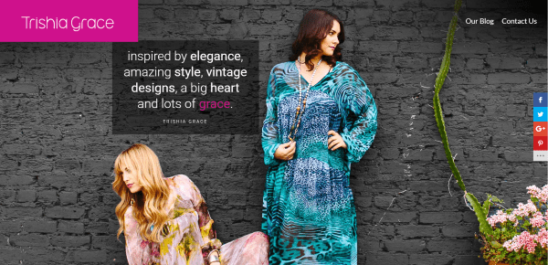
Trishia Grace is a fashion designer in West Hollywood that developed a lifestyle brand of clothing that is both sexy and functional. This is the website for her studio and collection of vintage slips, slip dresses, and negligees that have been hand-dyed with vibrant colors and interesting patterns. They’re styled to match other articles of clothing including shoes and are designed for casual and evening wear. The site was designed by Insomnis with collaboration of Bottom Line Marketing.
The site features lots of parallax and an elegant Instagram gallery with hover animation that displays social icons, title, hashtags, and the number of likes. The styled email opt-in form integrates within the background image. It includes an elegant footer with a background pattern and social follow icons. The contact form includes a link to Google Maps.
I like how this website combines elegance with simplicity. It has a simple menu with only a link to the blog and contact form. The logo stays in place even though the menu is transparent until scroll. It also has a nicely styled section separation using a logo and branded colors. Image overlays also follow the branded colors.
2. Ofia
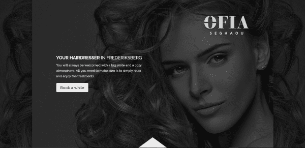
Ofia is the website for a hair salon in Frederiksberg, Denmark. Ofia’s hair styles are based on current fashion trends rather than tradition and are matched to their client’s hair type and face shape. Clients choose them for their creative eye. The website was designed by WKH.
The website has a one-page design with CSS section dividers, parallax, photos of the salon, bios of the team, Facebook and Instagram follows, a contact form, and Google Map.
The site has a clean design with no navigation system. The testimonials are placed within a small slider that looks elegant next to a large image. The salon images are placed in a slider with parallax. The team bios have a two-column section with alternating images and text, giving the layout a clean look. The social follow section splits an image between dark and light for Instagram and Facebook with a cellphone crossing the two halves of the image.
3. María and Donato
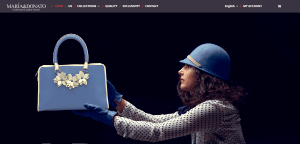
María and Donato artistically crafts men’s and women’s leather bags with quality, design, and soul. The women’s collection includes seven exclusive handbags that range from small to large. For men they have the M&D Weekender – a bag that looks similar to a duffle bag with a compartment in the bottom for shoes. All bags are limited editions of 999 units. They’re hand made in Spain from the highest quality of materials.
The site includes a simple landing page, an about page, two pages for collections: one for women and one for men, a page describing quality and craftsmanship, a page describing exclusivity, and a contact page that includes an FAQ. The content is available in English and Spanish.
I love the look of the images in the headers. The site makes great use of full-width images, alternating images with text, parallax, and embedded video to show the products. The full-width pages make great use of color.
4. Oxétte
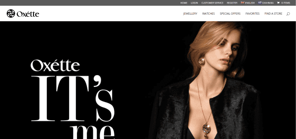
Oxétte is a brand from Athens, Greece, by Perideo S.A that manufactures, distributes, and sells jewelry, watches, and fashion accessories worldwide. Oxétte’s designs focus on bringing a balance between current fashion trends and art on a global scale. The site was designed by Visual Matrix Studios.
The site displays both English and Greek that features fashionable jewelry and watches. Browse sales, add items to your favorites list, and describe why the list is special to you, and buy from the site or search for a brick-and-mortar store to see the items in person.
The home page displays a full-width image followed by a tiled gallery of videos and images with links to the various categories in the shop. A store locator shows a global map with pins for every location that sells Oxétte’s products (which you can emulate by using an interactive map plugin). All of the colors work together nicely.
5. Curto
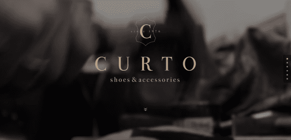
Curto is a shoe-making husband and wife team in Brig, Switzerland, that makes fashionable shoes, bags, and accessories such as wallets and belts, under 12 different brands. Their shop has been in business since 2000. Their products are free of pollutants and toxins. The website was designed by Pierre Biege.
The homepage is a one-page design with a full-screen video, a section about the company, an image slider that shows off the products, links to the product collections, information about the workshop, and location information. Each of the collections are shown in galleries.
The one-page design is elegant and the visuals show off the products beautifully with full-screen photos and product galleries. The galleries make excellent use of images to show the product collections. I love the use of color in the images.
6. BOsjoeman
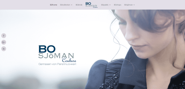
BOsjoeman, from Hamburg Germany, creates stylish dresses, coats, shirts, vests, and more in many shapes, and sizes. There are several collections for a range of occasions including business, casual, and weddings. The clothing line is found in several shops around Hamburg.
The website includes elegant overlapping images, section separators, multiple galleries, and lots of parallax. Each collection is displayed with elegant imagery. It includes a custom blog and multiple blog post designs with full-width images and either a product or post slider.
I like the way they’ve designed their product pages with layered photo and post sliders over parallax. Multiple designs are used throughout the pages and posts that work together so it never feels like you’ve left the website.
7. HERNEWTRIBE
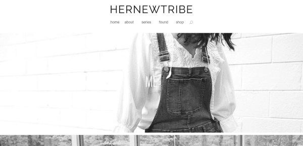
HERNEWTRIBE is a fashion blog from Stephanie Duncan of Portland, Oregon. Her blog includes personal style shots along with content from everyday life. Stephanie not only shares what inspires her but shows why, giving her own insights and thoughts on fashion. The website was designed by Jason Cyr Design.
The blog includes lots of full-screen photography to show off fashion in real world settings. The blog also includes a little bit of art and photography, and lots of links to Pinterest and Instagram. The shop displays products in a four-column layout with border styling. The product images link to various stores online where her readers can purchase them.
I like the homepage design with its full-screen images that link to various categories. The blog posts include several large images of the products in use in everyday settings, with a short write-up of her thoughts about the products. Each post includes plenty of links to similar products and inspiration.
8. sarah oliver handbags
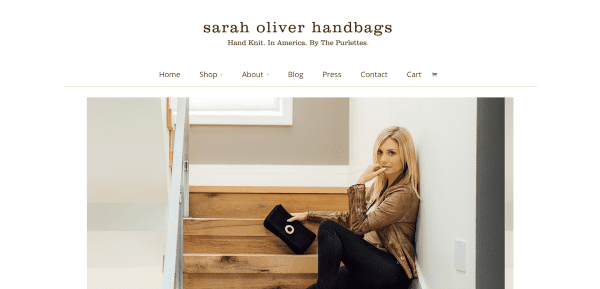
sarah oliver handbags are hand knit in America by senior citizens with an average age of 88 years old. Sarah Oliver and her knitting team, who call themselves the Purlettes +1, create handbags deigned by Sarah. They produce several collections and designs that can be bought both in stores and online. The website was designed by Fusion Creative Works.
The site includes a simple homepage with links to the shop, the contact page, and a page about the Purlettes. The shop uses WooCommerce and includes multiple categories. The blog includes lots of articles with each one focusing on one of the knitters. The site also includes a page about press coverage.
This website has a more extensive About section than most and spends as much time on the team members, including a video, than on the founder. The blog’s focus on the workers gives the products that human element that many companies miss. The store is easy to navigate and shows off the various collections and categories.
9. I Am Italian
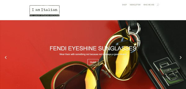
I Am Italian is a luxury eyewear magazine with a focus on sunglasses and other products that are made in Italy. The magazine covers fashion trends, previews, art, celebrities and the glasses they wear, specific brands, beauty, events, and lots more.
The homepage includes a full-with slider, a post slider within a menu, and posts within the many categories covered by the magazine. The site is powered by WooCommere. The shop link opens an external store page. Each of the categories open to blog posts for that category. The posts themselves cover the topic in detail with lots of photos and links. Many include videos.
I like the full-width menu structure under the main slider. It includes two full-width menu strips with a small full-width post slider in between. I also like the blog category section. It labels the categories and shows the last two posts in each category – giving the website a nice magazine look.
10. The Desire
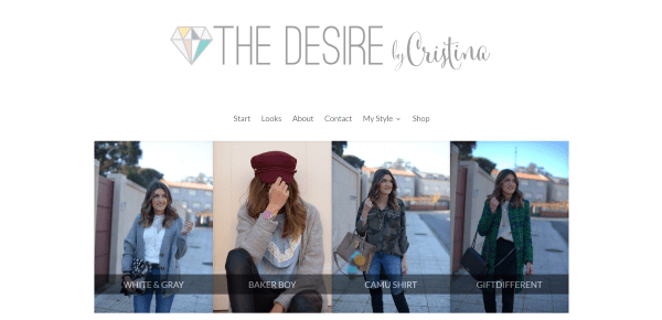
The Desire was founded by Cristina Castro, who has shared her insights on her fashion blog since 2013. She shows lots of photos of her daily looks. Cristina has collaborated with many brands in the fashion industry including Designer vintage Loreal, Dayaday, Lowlita&you, Tous, Shein, Romwe, Steve Madden, Liujo, Evax, Lays, Vila Clothes, and more. The website was designed by LovelyLemon.
The homepage includes links to the latest posts followed by full-width post snippets, links to social networks, and a gallery. A page called Looks displays galleries by year so you can see how the fashion trends have changed over the years. A category called My Style shows lots of different styles including working look, lady, casual, special occasions, 70’s, and boho. Shop takes you to The Desire Shop – an external site that’s also made with Divi.
The homepage is clean with a strong focus on imagery. The back-to-top button is a large light-green circle with a diamond icon. Images show an overlay on hover with a large pin it button within the same large circle and diamond. The Looks page displays blog posts as a gallery. My style works the same as Looks, but with a focus on categories rather than dates.
Bonus: Susie O’s
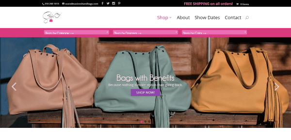
Susie O’s is a handbag shopping site that has a unique sorting tool to help in shopping for handbags. This is a slim menu that sits just under the main navigation and has three dropdown boxes so you can shop by category, designer, or color. The menu stays on the screen on all pages where it’s easy to see and use.
Final Thoughts
These 10 examples of fashion websites created with Divi go to show that Divi can do fashion. These sites can help you with ideas for colors, the use of images and video, navigation, sliders, shops, layouts, sidebars, animations, etc. If fashion websites are your thing, or if you need inspiration for any topic related to fashion, these 10 websites are sure to have something for you. Take a look, make notes of what you like, and apply the ideas to your own creations.
What are some of your favorite elements of these Divi fashion sites? Let us know in the comments below!
Featured Image by totallypic / shutterstock.com



Great examples to know about Divi fashion..it really very inspiring and always they will find a new fashion…above collections really awesome…
How does the Tricia Grace site display her Instagram posts. Divi module or plugin? Looks good.
Hi we designed the site… and used this plugin https://codecanyon.net/item/instagram-portfolio-wordpress-plugin/11353958
Instagram Portfolio – WordPress Plugin over at themeforest is a solid match.
Very nice examples of what can be achieved with Divi.
Dang! Inspiring is right. Love the hero image layout on BOsjoeman, especially. Thanks for the excitement boost for the new year!
I need a layout for knitters, a layout with focus on wool, knitting and long stories!
I’ll keep an eye out for one.
I love Trishia Grace. They have a very beautiful design.