Some of the most intriguing website designs are from Real Estate. Maybe it’s the large images of luxurious homes, or possibly the unique functionality of the search features. Either way, Real Estate is popular among Divi developers because it can handle every need and is fully compatible with IDX/MLS property systems.
This article lists 16 examples of Real Estate websites using Divi. Some show their available listings with a simple contact form while others are powered by a complete property platform. I’ve even included short-term rentals as well, such as vacation spots, just because. They are a great way to get inspiration for layout design, color, imagery, navigation, fonts, and more. The websites are in no particular order.
- 1 1. The Retreat
- 2 2. SplitTube
- 3 3. Room Space
- 4 4. La Vida Dulce
- 5 5. LEU Real Estate
- 6 6. NB Leasing
- 7 7. Summit NWA
- 8 8. De Wijn Gaard Kortrijk
- 9 9. Grubb Campbell Real Estate
- 10 10. The Becket Team
- 11 11. Choice One Real Estate
- 12 12. Tampa Real Estate Insider
- 13 13. Flagship Properties
- 14 14. Aussie Living Homes
- 15 15. Link House and Land
- 16 16. Vanishing Point
- 17 Final Thoughts
1. The Retreat
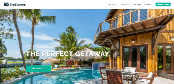
The Retreat includes a curtain menu without animation and a Call the Action (CTA), a full-screen image slider with two CTA’s and dot navigation, a tabbed section with text and photos of the villa and the area, links to the gallery and floor plans, another CTA and information section, and a stylized footer with a background pattern, email signup form, vertical social links, menu, and contact info. The reservation system includes a calendar to show availability and a signup form for booking.
2. SplitTube
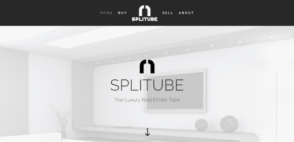
SplitTube includes a centered menu, full-screen image with true parallax and overlay, full-screen video, a simple but large section about the company with CTA’s, a stylized about section with alternating images that includes both buy and sell buttons, a social follow strip and footer matching the header. The properties page show images and information in a grid, while the individual properties pages show larger images, more detailed information, a professional video, map, and inquiry form. The search lets you select the features you’re looking for from dropdown boxes and then runs a search for those features.
3. Room Space
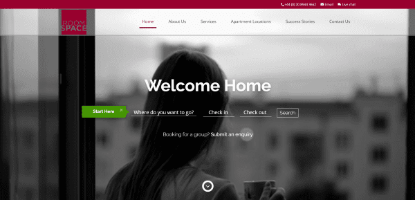
Room Space features a full-screen video with transparent menu and property search overlay, an about section, a contact section overlaying an image slider, member associations with logos, testimonials, and award badges. The search feature includes location and a calendar for check in and out dates. The Apartment Locations page includes stylized maps that fit the website’s branding and links to the locations. The location pages include a nice property gallery with information and enquiry CTA.
4. La Vida Dulce

La Vida Dulce has a full-screen animated background with floating elements. Scrolling brings up the menu, an about section with contact link, full-screen image in parallax, another about section with a link to the gallery, and more parallax backgrounds and links. The gallery includes a full-width image over a thumbnail strip. The Accommodations page lists the rooms and features. I love the photography in this website.
5. LEU Real Estate
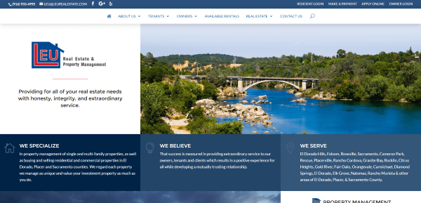
LEU Real Estate places their company info front and center followed by property management links and contact info, a testimonial, and embedded Facebook posts. It includes login links in the top menu. The primary menu includes a homes for sale page with property detail cards. The individual property pages display the images with details and a tabbed section with more information powered by IDX.
6. NB Leasing
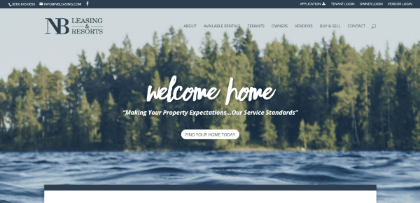
NB Leasing features a full-screen image with CTA overlay, company information in an overlapping section, location images, services with toggles, contact form, and map. It includes login links in the top menu. Listings are displayed with PropertyBoss Property Management Software and include galleries and property information. Tenants can pay through the site. The blurred backgrounds surrounding the boxed layout creates an interesting visual.
7. Summit NWA
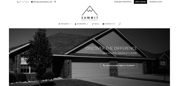
Summit NWA includes an image slider with CTA, links to property locations, a section with contact form, testimonial, and FAQ, an about section, and a blog post section. The For Rent link in the menu goes to a property search page powered by PropertyBoss Property Management Software, allowing you to search based on selections from dropdown boxes. The Available Properties lists the properties with images and detailed information. Customers can log in using the links in the top menu. Aside from branding it doesn’t have a lot of color, but it is simple to use and easy to navigate.
8. De Wijn Gaard Kortrijk
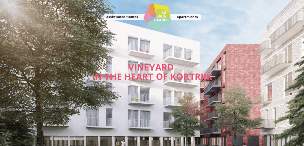
De Wijn Gaard Kortrijk includes a full-screen image with parallax that includes a section with pentagon cutouts to reveal the image underneath, information with CTA, location information, a unique measuring system to help potential residents make their decision, a parallax section with multiple overlays and CTA’s, and a contact form. The Apartments page includes information about the various apartments placed within an alternating image/text grid. The pentagon design is used throughout the site creating an interesting visual to break up the sections.
9. Grubb Campbell Real Estate

Grubb Campbell Real Estate is one of the more unique designs on this list. It includes a masonry grid with horizontal menu. The grid includes images and links to the various pages. Scrolling reveals an about section with testimonials, a masonry grid of the available properties with address shown on hover, and a link to the contact page. The property search uses multiple realtor tools including IDX. The properties pages display images, video, details, and galleries. The listings grid approach is beautiful and fits perfectly into the unique design.
10. The Becket Team
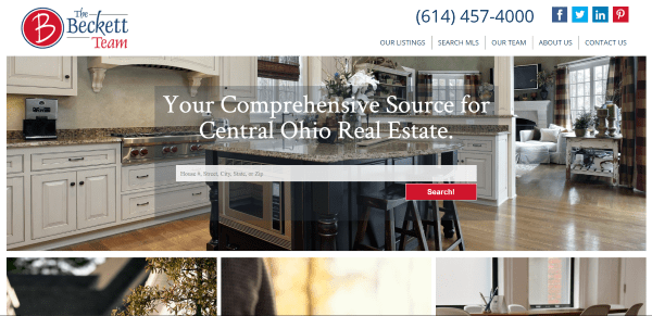
The Becket Team places a listings search in an overlay over a full-width background, followed by images with links to pages for listings, search, and agents. A four-column grid provides links to buying information. It uses MLS to display and search listings, which provides a map with multiple pins and result details appearing in the sidebar (on a non-Divi page). The team page displays images with toggles to see the bio’s. I find the menu design to be one of the most interesting on this list with its full height logo, phone number with social links, and menu link separators.
11. Choice One Real Estate
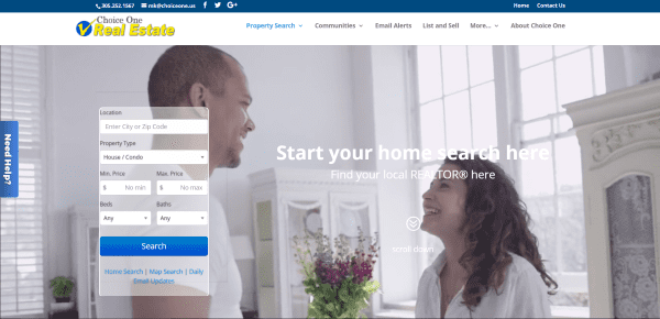
Choice One Real Estate includes a full-screen video background with property search prominently placed on the homepage. Scrolling reveals a menu strip, a post slider, a Real Estate IDX property search map powered by iHomefinder, a listings slider, CTA, about, a property search using dropdown boxes, blog section, and custom footer. This site includes a complete IDX integration to display multiple search features, listings, agent list, and makes great use of branding.
12. Tampa Real Estate Insider
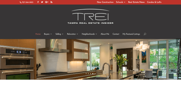
Tampa Real Estate Insider is a Real Estate magazine which includes a larger than normal menu with full-width image slider, links in the top menu, blog posts, testimonials, and large custom footer. Even though it’s primarily a blog it does show featured listings which are displayed in the sidebar along with a property search. Properties are displayed using IDX. This one is interesting in how it integrates IDX within a blog. It also makes great use of branded colors.
13. Flagship Properties
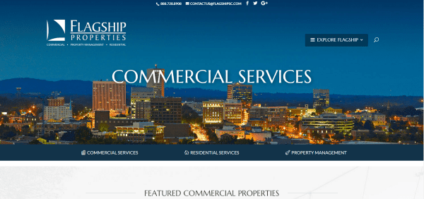
Flagship Properties displays a full-width image with an interesting mega menu and a menu under the header that remains on screen after scroll. Scrolling reveals property cards and a property search powered by IDX, a CTA and about section, an agent details strip, and a section with links to the blog, sales stats, and contact info. The various pages faintly display an image in the background that gives the pages a touch of texture. This one uses white along with bold reds and blues as highlights, giving a hint of the American flag in their branding.
14. Aussie Living Homes
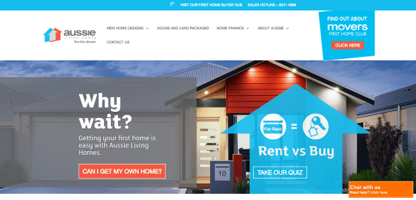
Aussie Living Homes includes a CTA in the menu and a link in the top menu, a full-width image with CTA’s, links to articles, a section with article search and links to the latest articles, a social follow strip with icons, and a large footer with links and contact info. The Display Homes page shows the homes in a grid with links to another site built with Divi: Link House and Land, and VHG site.
15. Link House and Land
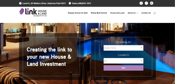
Link House and Land is one of the many VGH Realty sites (which are powered by Divi). This site uses a CTA overlay in parallax, a link to available homes, an about section, links to the various properties within blurbs, and an email opt-in form. The site includes a home search and images with hover animation that show icons for the home’s features. Homes are displayed in a slider with details and a map.
16. Vanishing Point
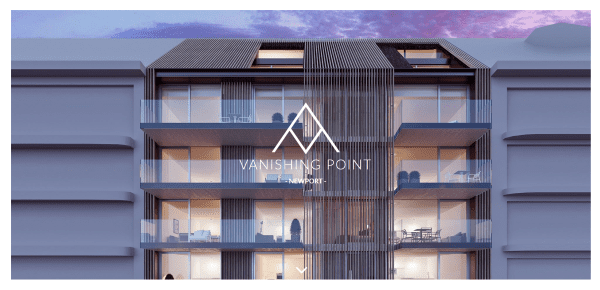
Vanishing Point is a one-page design that includes a full-screen parallax header, branded map section, sections detailing the architect and developer, a parallax section that matches the logo, info about the project, lots of images of the area that display in modal windows, and a contact section that’s revealed through parallax. This site makes interesting use of parallax.
Final Thoughts
These 16 examples of Real Estate websites using Divi go to show that Divi can be used to create interesting designs for any type of Real Estate website, whether it’s just a simple brochure or a site with IDX/MLS listings. These sites are great for providing ideas for layouts, colors, the use of images and videos, animations, navigation, and more. These websites are sure to inspire you for your next Real Estate design. For full functionality, consider these top real estate plugins alongside of Divi.
What are some of your favorite elements of these Divi Real Estate sites? Let us know in the comments below!
Featured Image via Linor R / shutterstock.com


Great themes. I use WordPress but I like these more!
I just finished a real estate site of my own. It was both my first Divi site and my first WordPress site, so a bit of a learning curve. haha
There are some nice touches on these sites that I’ll use as inspiration for my next project. Thanks!
Your theme is great to make beautiful website I am customer form last 4 years.
Hi
Any Divi child theme for a real estate agent I could buy ?
I had a look but I had no luck.
Tia
Divi+Easy Property Listings Plugin is the perfect match !!
Awesome!
This is art! Love every piece!
Wow these are getting good. Thanks for pumping these lists out Randy. I noticed that a bunch of them are done by Property Boss Solutions. They’re really killin it with Divi!
Thanks Michael, love me some Divi!
Thanks Michael! PBS is doing a great job!
NEB Leasing listings look horrible on an iPadThe designer needs to rework the css to pick up divi’ limited media queries . Even the menu wraps
Horrible? The WHOLE WEBSITE looks horrible because on an ipad the nav is/was messed up… wow…tough crowd…I fixed it though…thanks for pointing it out.
Great article! I would like to know which is the most recommended plugin for managing and searching properties. Thanks.
Great article! I would like to know which is the most recommended plugin for managing and searching properties. Thanks.
I’m currently building a DIVI site for a realtor client, so this article was a godsend of inspiration. My favorite one is the first. Great list Randy.
I’m going for a fullscreen video with a search bar overlay on the top. I’d appreciate any tips from anyone here who’s done a DIVI real estate site.
And is there a tutorial here on how to make that menu CTA? It looks great on any site.
I have the same goal for my client, to have a search bar over a video. Would love to see a tutorial. Thanks for this blog, very helpful!
Do any of these have templates?