Like most businesses education providers need websites that are well-designed and provide potential students everything they need to know about a school or course. This means there are lots of education websites on the Internet to help give you inspiration for your own designs, and like most fields, some of those websites are built with Divi.
Here’s the list of 17 examples of educational websites made with Divi. Some are brochures giving information about a school while others provide classes online. They range from large schools and many instructors to single courses with one instructor. They are a great way to get inspiration for layout design, navigation, color, imagery, fonts, and more. The websites are in no particular order.
- 1 1. Silcoates School
- 2 2. IQTrace
- 3 3. Accrington Academy
- 4 4. College of Hair Design
- 5 5. Crompton House
- 6 6. Italian Cooking School
- 7 7. New School of Finance
- 8 8. Clever Copywriting School
- 9 9. Engage Live
- 10 10. E3 Preparatory and Leadership Academy
- 11 11. Windsor Bergen Academy
- 12 12. Gamma Music Institute
- 13 13. Windsor Prep High School
- 14 14. School of Stitch
- 15 15. Levenshulme High
- 16 16. Digital Strategy School
- 17 Final Thoughts
1. Silcoates School

Silcoates School features a full-screen slider complete with video. A message bar across the top includes a link to register by email. This is followed by a large menu with branded colors and links to the various schools. Navigation includes links to admission, calendar, and academic information. Also included are multiple blogs, galleries of the classes with students, and more. The online courses are provided through Moodle.
2. IQTrace

IQTrace has a clean homepage design that includes parallax, transparent overlays, several calls to action, social proof, school information, and a contact section. A page called Governance Board using a Person module to display images with social network links and a login so you can watched their board meetings online. The Students and Parents page has a login for the students, shows the benefits of the school, and shows parent testimonials. The Enroll page provides all of the enrollment information. News and Events is a blog. Each of the pages follow the same clean design of the homepage.
3. Accrington Academy
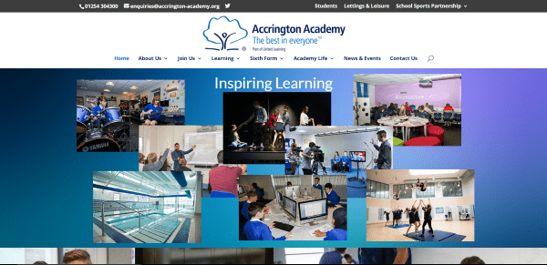
Accrington Academy includes multiple links with a dropdown menu within the top menu header element section. It includes a slider with vertical scrolling animations, a CTA, information about the school using multiple colored overlays over a parallax background, blog posts, a calendar, a newsletter opt-in, Twitter posts, and more. The Calendar uses the EventON plugin and details the events per day. When you click a day it shows an image, more details about the event, the address, and a Google Map with directions.
4. College of Hair Design
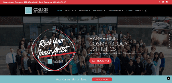
College of Hair Design makes excellent use of color and includes a slider with CTA’s, a section that summarizes the courses with links and start dates, a section with blog posts and a contact form, testimonials, videos, and lots of links in the footer. A message bar with a CTA remains at the bottom of the screen. The message bar can be dismissed by clicking the x. Navigation includes lots of about pages, links to the various programs, enrollment information, information about the services, a blog, and contact page.
5. Crompton House
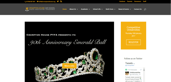
Crompton House features a clean design with a menu in the top information bar and a sidebar on the homepage. It includes a large image with CTA, information with images, downloads, and a masonry blog section in a grid which includes sliding animations on hover. The sidebar includes a CTA, the latest tweets, and an events calendar that shows more information on hover with a link to see the larger version of the calendar, which is powered by All in One Event Calendar. The website includes lots of detailed pages about the courses, academics, school life, events, and more.
6. Italian Cooking School
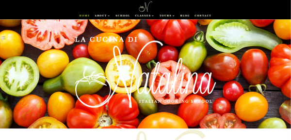
Italian Cooking School includes a full-width image with text in parallax, followed by an about section with social follow icons, a section for tours and classes, testimonials, blog posts, and a contact form. The School page provides information about the kitchen using text and images. The Classes page shows upcoming classes with detailed information, images, and a registration button and gift certificate button powered by WooCommerce. The Tours page provides an itinerary and purchasing information. The colors and fonts give it an elegant look.
7. New School of Finance
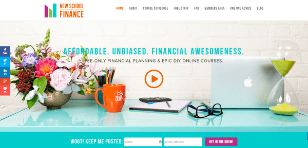
New School of Finance includes a full-width hero image with a video that plays on click. This is followed by a slim newsletter opt-in form, a section about the school, featured courses, a full-screen slider for testimonials, about the instructor, and another newsletter form. The site makes great use of color and large images of the instructor and students. The course catalog page design displays interesting imagery with course details and CTA’s.
8. Clever Copywriting School
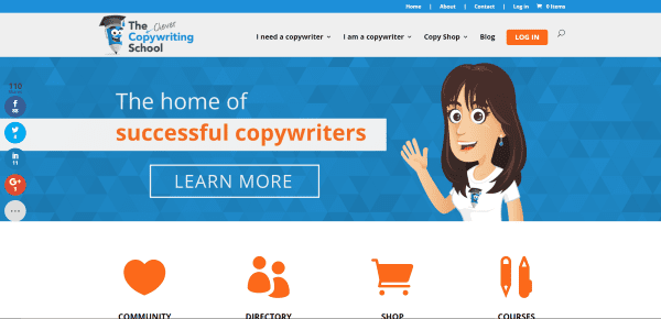
Clever Copywriting School makes great use of icons and blurbs for site-navigation. The homepage includes a hero image with CTA, large icon navigation, information with a video and CTA, resources, CTA’s and testimonials, and blog posts. The courses page displays images with links to the courses as WooCommerce products.
9. Engage Live
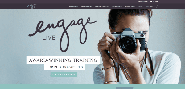
Engage Live includes an elegant homepage with hero image and CTA, a video of a featured class with a link to sign up, email opt-in, class carousel created with WooCommerce, testimonial slider, blog posts, and more CTA’s followed by a list of sponsors. The Workshops page uses EventON to create a sharp calendar that opens to display the event details complete with full-width images and videos. The Online Classes page displays the courses as WooCommerce products. The Directory page includes a full-width search box with categories in a dropdown box and a keyword search along with categories displayed as galleries.
10. E3 Preparatory and Leadership Academy
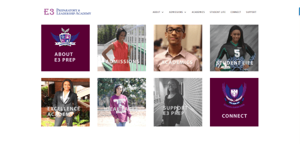
E3 Preparatory and Leadership Academy uses a simple and clean design. The homepage shows images with links to the various pages about the school, admissions, courses, student life, and more, followed by social icons and contact info. The pages retain the clean look and add elements such as parallax and accordions for course information. The accordions help contain the vast amount of information about the courses and keep navigation to a minimum.
11. Windsor Bergen Academy
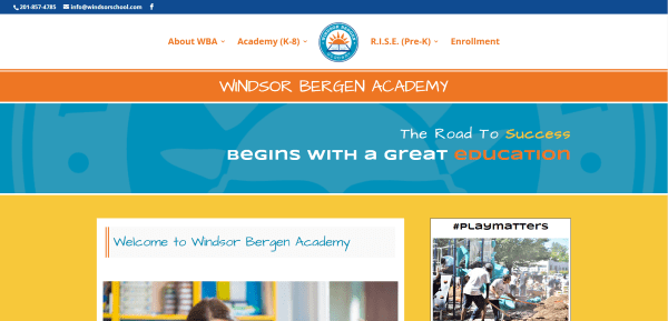
Windsor Bergen Academy uses a bright color palette to appeal to their primary audience. The color palette is used consistently throughout the website along with appropriate images and artwork. The homepage uses All in one Event Calendar to provide information about important dates. Links to the various classes and school information is provided in a mega menu.
12. Gamma Music Institute

Gamma Music Institute has a homepage that uses lots of parallax and includes a full-screen image, a slider, a gallery with links to the various courses, several CTA’s, and a contact and follow section. The courses pages give detailed information about the course, the instructor, costs, dates, etc. The Teachers page uses text modules and images to provide information about the instructors. The Contact page includes an FAQ with accordions. This site makes great use of color to suit the topic.
13. Windsor Prep High School

Windsor Prep High School has a clean design that fits in well with academics. Menu items are added to the top information bar. The homepage includes a hero image, introduction to the school, the All in One Event Calendar to provide information about important dates, icon links to the main pages, alternating images with text to provide information and CTA’s, a contact form, and a full-width Google map. The design makes good use of red and cream throughout the website.
14. School of Stitch
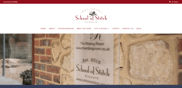
School of Stitch uses a hero image followed by a large email opt-in and their story with images and a link to the team page. The EventOn calendar plugin creates an interactive calendar of their courses – showing the date, description, images, maps, etc. WooCommerce is used to purchase the courses. Contact Form 7 was used to create an interesting form with images and icons. The site uses red, blue, white, and tan to create an elegant palette.
15. Levenshulme High
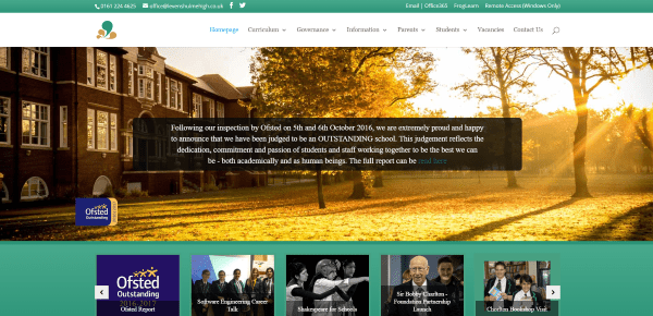
Levenshulme High uses a clean design that includes video backgrounds, post sliders, images with links to various pages, information from the head teacher with a calendar, parallax, and more. It uses links in the top menu. The course description pages are clean and detailed. The vacancies page uses a nice search feature with keywords and location, and checkboxes to filter the results.
16. Digital Strategy School

Digital Strategy School includes an interesting color palette, filters, and course information within the hero image. The homepage also shows the benefits, a CTA, course descriptions, testimonials, social proof, and lots of success stories. It uses different designs to show off the various testimonials and success stories. The Success Stories page uses block quotes and images to create testimonials. Clicking on one takes you to their alumni success story. This website places everything you need to know on the homepage in order to maintain a design with minimal navigation.
Final Thoughts
These 17 examples of education websites created with Divi go to show that Divi can be used to create great sites for any type of educational need, whether it’s large schools, online classes, or single courses. These sites a great for providing ideas for layouts, colors, navigation, use of images and video, animations, etc. If you need design inspiration for an education website, these are sure to have something to help.
What are some of your favorite elements of these Divi education sites? Let us know in the comments below!
Featured Image via Serhiy Smirnov / shutterstock.com


Would love to see examples of Divi and LifterLMS.
Anyone? Sensei and Divi integrations?
It would be nice to have the templates for these sites that you highlight so that we can remake similar sites, pages, sections, etc. that we like.
It doesn’t do much good to show off something to us that we cannot necessarily reproduce without the knowledge of how to do it.
If we had the knowledge of how to do it, then we wouldn’t need to highlight those sites.
Thanks for this Divi.. I’ve been longing for this. I can get started pitching colleges around me…. I’ve got inspired.
Do you have one of these artlcles planned with Museum Sites done with Divi? I could really use some inspiration
I’m totally love divi. Divi rocks!!!
Curious about the menu on the Accrington and School of Stitch sites. I like how the logo stands above the menu and is centered. I don’t see this option available anywhere when I’ve tried to customize my menu. Is it done through CSS? Or am I missing something?
Hi that’s achieved through the theme customizer from header & navigation section open header format and select centered and then goto fixed navigation and check the hide logo image .
Yeah ! Divi theme is Lovely. Divi theme’s features are very good which attracts the most. Thanks for providing the examples.
Well done! Great design!
Would love to use Divi with Sensei and WooCommerce. Anyone know if A. Sensei would be compatible? and B. How to integrate it with Divi? I know it’s not merely a matter of adding the plugin.
I want to use two boxes for commenting in two different div,any good resources over this about how can I do it perfectly for a responsive website.
I want to use divi as my website for selling online courses, anyone know a free or cheap plugin (yearly fee if any but not monthly) to use for the actual courses themselves, once someone has completed a section I want a X to turn to a tick or something similar so they can see their progress?
Learnpress, LearnDash, Sensei.
Just know that building an LMS (Learning Management System) is an incredibly complex process. Be prepared to spend a few hundred hours if you’re building it out yourself.
Hi Randy
I agree Divi is very adaptable and I can’t think of any sector where it could not be used.
Thanks for featuring two school websites that I built with Divi namely Accrington Academy and Crompton House Academy.
These were very large projects some 200 plus pages each and I certainly used the tools Divi provides to help with the work flow such as templates and library items.
The main areas were Divi excelled for me were the subject pages in both sites. The other advantage for the Accrington site was the ability to put in place three brand styles on the one site using templates and global library items. The main school, sixth form and the schools sports partnership sections are all styled differently.
To add to your list and show a different sector I recently built a primary school website with Divi http://parkprimary.org a fun site very colourful with all year groups have their own colour theme chosen by the teacher and pupils.
I am trying to specialise in school websites so I am currently looking for my next client so thanks for the endorsement of my work .
Just a really quick observation. over half of the sites using a Copyright claim are showing a past year… How good would it be to be able to set the year Automagically? ie, in customiser
You can easily do that by editing the footer.php file and finding the line that references the footer info and changing it to:
Copyright © Company Name | All Rights Reserved.
The “echo date” will automatically pull the current year.
Really good Samples.
But was interesting to hear about the compatibility of the Divi with these plug-ins like LifterLMS, LearnDash, Good LMS – Learning Management System WP Plugin, LearnPress – WordPress LMS Plugin, WP Courseware by Fly and other Plugins.
It would be interesting – a detailed analysis!
I would like this too.
Hi Randy, great article. I’ve just upgraded our Company’s educational website using Divi. It still needs a few tweeks but I think it meets the design standard of the ones on your list. Social media is relevant for our students so having easy links to these is a must. Also, we show case our student’s achievements so having gallery items and easy to build projects to make sliders is one of my favourites.
Kind regards