Fitness is one of the most popular industries on the Web. Every fitness company, from large gyms to personal trainers, needs a well-designed website. This means there are lots of fitness websites out there to help give you inspiration. Some of those fitness websites are built with Divi.
Here’s the list of 10 examples of fitness websites made with Divi. Some include stores selling gear and supplements, and some are blogs with articles and advice. Some are brochures giving information about a facility, while others tell about services provided by personal trainers. All are about fitness and all were built with Divi. These are great for inspiration for page design, use of color and images, choice of fonts, and much more. The websites are in no particular order. At the end there may be a bonus or two.
1. The London Method
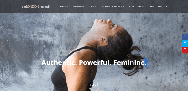
The London Method is the website of a studio in England that teaches a specific type of workout that includes the original work of Lotte Berk. The exercises are taught by Lotte’s daughter, Esther Fairfax, creating an artistic workout regime that covers fitness, lifestyle, and philosophy. The website was created by Bottom Line Marketing.
The website includes an elaborate homepage, multiple about pages that describe the classes and trainers, a page called The Moves that shows several video demos, a studio page with general information and instructor bios, class schedule with purchasing information, a blog that focuses on the students and exercises, a link to a separate shop for clothing and accessories, and login and account pages.
The website makes excellent use of color and design and is a good showcase of what can be done with Divi. It uses lots of transparency and parallax with images and information about results of the classes. It also includes Instagram galleries with elegant overlays to match the branding.
2. StrengthHQ
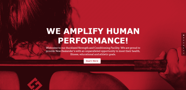
StrengthHQ is a strength and conditioning facility in New Zealand. They use the best coaches and equipment to give Strength HQ members the best training and learning experience possible. Services include personal training, bootcamps, Pilates, and an Olympic weight lifting club. The website was developed by Fuel Media.
The website includes a homepage, about page, a page about the team, services, news, and contact. Their homepage has a clean layout with a large hero image and call to action, sign-up form, information about the facility, testimonials, and contact information.
I like the bold use of red and the colors in their overlays. They make good use of parallax. Multiple CTA’s are well-placed on their homepage that work seamlessly with the rest of the content. I like that the map doesn’t zoom automatically. The services use WooCommerce to display the courses, descriptions, and schedule.
3. Workhouse Malton
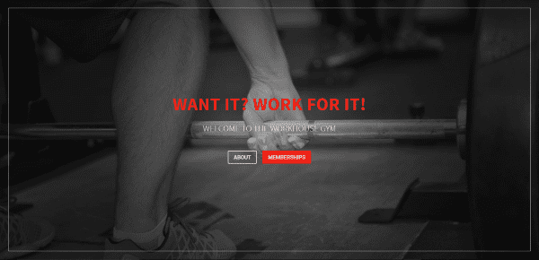
Workhouse Malton is the website of Workhouse Gym in Malton, UK. They cater to personal goals and offer personal training, classes, and multiple training programs. They also provide open gym use and claim to have the best selection of free weights in the area of Ryedale. The website was designed by GeekPoint.
The website uses a single-page design with a hero image and CTA, and about section, photos of the facility with descriptions of the types of training that’s available, a testimonial slider, another CTA, class descriptions, information about the coaches, prices, a newsletter form, opening times, a contact form, and a map.
I especially like the sections with photos of the facility. The sections include multiple layouts and the photos use various filters including monochrome, color, and sepia. I also like the section showing the opening times. It includes a monochrome photo of the equipment with text over a red overlay in parallax.
4. Mijn Personal Trainer
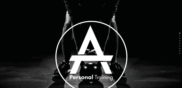
Mijn Personal Trainer is the website of Ayhan Tac, a personal trainer and lifestyle coach in Antwerp. He provides lessons at a location of your choice so you don’t have to go to a specific gym. His training programs focus on developing both your body and your lifestyle to meet your goals. Courses include weight loss, building muscle, conditioning, general fitness, and specific muscle groups. The site was designed by Web Solutions.
The website is a one-page design using WooCommerce to display course descriptions and pricing. The page starts with a hero image and includes a CTA, about the coach, about the courses, testimonials, pricing, and contact information.
The website has a clean design with good use of parallax as section dividers where appropriate. I like the way the site uses WooCommerce to show course descriptions. The testimonials section shows some stats in the form of drops of sweat, released endorphins, calories burned, and muscle building in kg. This is a great way to highlight the benefits and validates social proof of the testimonials.
5. MVMNT
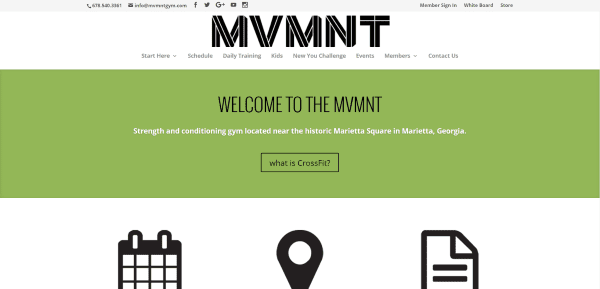
MVMNT (not to be confused with TMNT) is a strength and conditioning (MoVeMeNT) gym in Marietta, Georgia. They specialize in Cross Fit, Kettlebell, strength training for USA powerlifting, Olympic weightlifting, and self-defense. The website was made by Jason Cyr Design.
The website includes a homepage, a Start Here page with a mega menu to all of the training information, a class schedule page, a daily training blog, information about kids’ classes, the New You 6 week challenge class, an events calendar, a member’s page, and a contact page.
The site uses a lean homepage with clear CTA icons to guide you through the site. It also includes a parallax section with a photo of the gym and a text overlay describing their thrive philosophy. The store takes you to a separate website where you can sign up for classes and view the schedule.
6. How to Beast
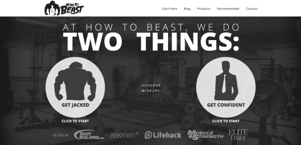
How to Beast is the website of David de las Morenas – a personal trainer, certified strength coach, and author. The website includes lots of articles and downloads to help men get fit, built confidence, and create a workout routine to suit their goals.
The website includes a simple homepage, an about page that tells David’s story, a blog with lots of tips, a products page that includes links to his books and courses, a list of recommended products, and a contact page.
The homepage gives readers two choices of personal goals, which then takes them to articles about those goals. The blog articles cover a range of topics including fitness, nutrition, and lifestyle philosophy. The articles are well-written but the language can be offensive.
7. CyKlus
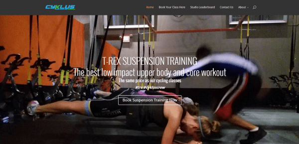
CyKlus is a fitness training center in Vancouver with a range of exercises and a strong focuses on indoor cycling using stationary bikes. The bikes allow the riders to adjust their resistance levels. Some even include heart rate monitors and power meters to help trainees meet their goals. Indoor cycling is low impact, so riders don’t damage their knees and joints as much as they would with aerobics and running.
The website includes a homepage, and scheduling and booking page powered by MindBody and Spivi, a leaderboard, a contact page, and multiple about pages. It includes a link to an external store, information about the instructors and courses, pricing, information about the equipment, why ride, and a blog.
The homepage is simple with a hero image, a Google 360 degree tour of the studio, links to instructor bios, and several CTA’s. What makes this one stand out is their integration with MindBody/Spivi and the blog. The blog gives tips on using the stationary cycles and how to get the best out of the Spivi system to track your progress.
8. Body Meet Bride

Body Meet Bride is the website of Mirinda – a trainer, coach, nutritionist, and yoga teacher that helps women get healthy and fit for their wedding and beyond. She uses education, nutrition, exercise, and positive support to help make bride-to-be’s their healthiest and happiest while remaining realistic. The website was designed by April Smith.
The website includes a homepage, about page, a commitments page that discusses the benefits and courses, testimonials, a blog with lots of tips on health and fitness, and a contact page.
When I think of fitness I don’t think of weddings, but this website combines the two topics seamlessly because it discusses them where they meet. I love the styling for the newsletter sing-up form. The website includes a hero image, an elegant CTA, an introduction, elegant links to the various pages, testimonials, and links to specific blog posts.
9. Bostin Loyd
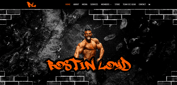
Bostin Loyd is a bodybuilder and trainer that provides online coaching to help clients prepare for bodybuilding competition or whatever their goals might be. Courses vary by the number of weeks and what’s included. Most conversations take place through email but there are add-on’s available such as texting and phone consultations that get higher priority. The website was built by Pietras Creative.
The website includes a small homepage, an about page telling Bostin’s story, a media page with a video and competition photos, a services page powered by WooCommerce, a members area with forum and support, a WooCommerce store, an official gear page, and a contact page.
The website is simple, clean, and consistent. The styling makes great use of color with black and orange branding. The member’s area is a small social network. It even allows members to upload their own videos to show their competitions.
10. KB Fitness
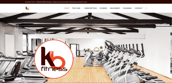
KB Fitness is a fitness center in the Kremlin-Bicêtre, France. They have lots of courses including dance, Pilates, strength training, and cardio. They provide personal coaching and nutrition advice. Coaching is included with the subscription.
The website includes a homepage with multiple sections including a hero image, testimonials, daily advice, CTA, news, contact information, links with information about the machines and rooms, the various courses, a contact form, and more. Other pages include The Club with a gallery and information about the machines, Subscription which shows their courses and prices, Courses with more detail about each one, a machinery gallery with detailed specs, an interactive calendar, and a contact page with full-width map.
My favorite element is how they use the bar counters on the courses page. Each course shows an image, category, duration, calories burned, and then a bar counter shows the intensity of the course. Under the bar counter is a detailed description with benefits and a link to the course schedule. I also like how they’ve included the opening hours in the top menu bar.
Bonus List – Even More Fitness Websites Built with Divi
Here’s a quick list with a few more fitness websites that were built with Divi that I couldn’t leave off the list:
- Fluid Movement – a training facility in Sydney, Australia that offers personal and group training, resistance training, and indoor and outdoor training. Classes include Muay Thai and boxing.
- HealthWorks Fitness Centre – a training facility in West Yorkshire, UK. The gym is divided into a strength and conditioning room large free weights, power racks, a Crosscore 180, and bodybuilding and conditioning machines.
- Perfect Fit – a personal trainer in Tannum Sands and the wider Gladstone region of Australia that focuses on fitness and weight loss without dieting.
- Sally Parkes Yoga – a yoga trainer based in Sussex, UK, and also providing services throughout the UK, Spain, and Dubai. There are multiple classes in yoga including one for pregnancy.
Final Thoughts
These 10 examples of fitness websites created with Divi go to show that Divi can be used to create great sites for any type of fitness need, whether it’s gyms, blogs, or personal trainers. These sites a great for providing ideas for layouts, colors, navigation, sliders, shops, use of images and video, animations, etc. If you need inspiration for any topic related to fitness, these websites are sure to have something to help. Take a look, make notes of what you like, see how you could improve on them, and apply the ideas to your own designs.
What are some of your favorite elements of these Divi fitness sites? Let us know in the comments below!
Featured Image by theromb / shutterstock.com


I am running a yoga studio and would love to see any of your posts featuring great yoga studio websites built on “eleganthemes”. Thanks in advance.
Great list!
Can anyone recommend a booking plugin for fitness centres? Bookly looks impressive but seems to be geared towards appointment with time intervals. We would need to sell courses/classes and memberships. Almost more of an events plugin with payment Stripe/Paypal. Unlike traditional events it would be multiple days per week over a certain amount of time on a recurring schedule (eg. Mon, Wed, Fri for a month.) with an automatic subscription renewal. Does this exist? Thanks!
Well, my favorite is Body Meet Bride. It will be because I’m going to get married … haha thanks for your time
Amazing list! I am still making my way through it, but #3 has me thinking. You mentioned the top of the page uses a hero image and CTA. How do I test this in the Divi builder?
I am looking and I know I have image and CTA modules, but I’m not seeing how I can achieve this look. I would love to have something like that on my site.
Thanks again for this list!
Every time you get a chance, you’re linking to David de las Morenas’ website. I understand it’s a big website and all, but honestly, it is not all that much to look at. He’s using plain contact forms, he’s using an e-mail sign-up where the button isn’t aligned with the input field for the e-mail, and so on…
Nothing here has been customized, this is the plainest of plain Divi pages with a couple of useful plugins. Nothing against the guy, I read some of his contents and I receive his newsletters. Most of it is pretty decent, but his website is not much to look at and every time you list him as an oh-so-great reference for Divi websites, I feel like I’m being fed some bs here…
Hello Randy, Nice examples of fitness sites, can you please write an article on best blogging examples using Divi, Thanks in advance .
This list is really impressive. We did use to Divi to build a fitness website for one of our clients and the result was terrific!
Hi,
One of my client want to create website similar like – StrengthHQ
But he want to add some extra features using ACF Plugin (advance Custom Filed).
Can you suggest me that DIVI theme support Advance Custom Field ?
Thanks
Kavin
Really useful ideas, just about to start a website for a trampoline fitness gym. Love DIVI and have been a convert for over a year now.
Any chance we can get a tutorial video on how the London Method site achieved that level of paralax in DIVI? Also maybe one on the customization of the footer bar to include the links. Did they have to go and edit the footer.php function? It is a shame that with such a beautiful platform like the ones you guys created that we need to change the php file every site.
The first part is either a fixed background on a section and just transparent rows top and bottom, will go play later to try it. the second part is true paralax. The footer is nothing special. The last bar is the actual footer, the rows on-top of it is just normal sections and rows, use chrome, inspect and follow the code
Very, very nice. Love the work and quite inspiring indeed.
Please come with examples for real estate developer business. Longing for it.
What a great list. I’ve been working with my client TopTrainer to build their website in Divi too! We love it.
I loved The London Method… does anybody knows if the “Instagram Fullwidth Gallery” at home is automatic, integrated and if is Divi native or if it’s a plugin (and which one)?
Hi there we designed and built The London Method. We used this plug-in for the Instagram feed… https://codecanyon.net/item/instagram-portfolio-wordpress-plugin/11353958
🙂
Hi, i am trying to do this on my page but i cant figure out how to put the plug in into one of my sections?
These are great – thank you! I was especially interested in taking a peek at a few since I just finished designing a site which uses divi for my husband’s private yoga lessons business.
Thank you for including one of my websites in your article!!
You’re welcome Ryan!