One of the most important industries is healthcare. It will always be around and healthcare providers will always need websites to display their services and provide important information. There are a lot of topics within healthcare – from doctor’s offices, to therapeutic spas, and everything in-between. If you’re a Divi designer looking for inspiration you’re in luck – this article lists 14 examples of healthcare sites using Divi.
These sites can help with inspiration for layout design, colors, fonts, images, navigation, event calendars, and more. They include clinics, doctor’s offices, dentistry’s, nursing homes, spas, and even a few that specialize in educational and research. The websites are in no particular order.
- 1 1. Nampa Smiles
- 2 2. Liberation Acne Clinic
- 3 3. Classic Way Family Practice
- 4 4. Toothsmith Dental Surgery
- 5 5. Kemmet Dental Design
- 6 6. Hillcrest Periodontics
- 7 7. WhiteGlove Health
- 8 8. MBC Nursing
- 9 9. Cedar Haven
- 10 10. Collabria Care
- 11 11. Ovarian Cancer Institute
- 12 12. DC Dental Clinical
- 13 13. Zero Gravity Floatation SPA
- 14 14. Cure for MND Foundation
- 15 Final Thoughts
1. Nampa Smiles
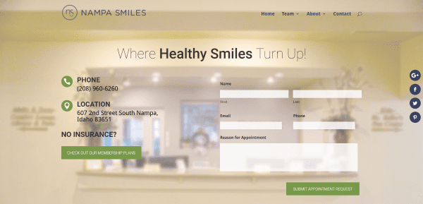
Nampa Smiles includes a full-screen image with contact info, contact form, and membership plans link in parallax. A team section displays the team members in person modules with links to more info about each one. The next section provides information about sedation in dentistry followed by testimonials, a contact CTA, a financial policy with link, and client reviews. The membership plan is powered by WooCommerce. The site makes great use of blurred backgrounds and color.
2. Liberation Acne Clinic
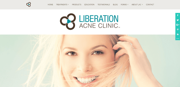
Liberation Acne Clinic displays the logo in its own header under the menu followed by a full-width image, a section with tagline, blurbs with links for more info about the treatments and products, testimonials with before and after images, an about section, a section with social icons, a contact form, and a map. Some of the information and products pages are powered by WooCommerce. Some of the products provide product information with Amazon links. These pages in particular have an interesting design to showcase the products. The site uses lots of icons and colors for the backgrounds and makes them work together nicely.
3. Classic Way Family Practice
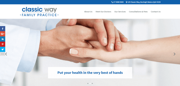
Classic Way Family Practice has a one-page design that includes a full-width image with parallax, a small CTA section with an interesting textured background created with an image and blue overlay, an about section with CTA’s, another blue section with tagline, a section about the staff that includes images, bio, toggle for more detail, and a button that takes you to a different website to book an appointment with that staff member. A list of services are displayed over a parallax background and are accompanied by relevant icons. A section with hours is displayed over the blue background in parallax while the next section covers fees, followed by a CTA, a map that only scrolls when you want it to, contact info, and accreditation seal.
4. Toothsmith Dental Surgery
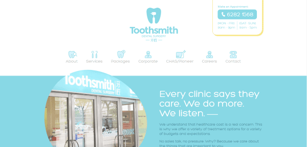
Toothsmit Dental Surgery displays a large menu with logo and hours above the page-links which include icons that match the branded colors. A full-width section shows off the building within a stylized cutout and info about the company. The next section shows the available packages with images and text with links, a list of services with link, and a custom footer with contact info, hours, and a clickable phone number. The site is simple while remaining elegant. It makes excellent use of color, icons, and borders.
5. Kemmet Dental Design
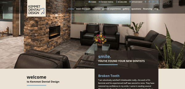
Kemmet Denta Design displays a full-with image of the waiting room with an overlapping block. Each of the sections follows this pattern using an interesting mix of color. The next section includes a welcome message with a block of testimonials, an image followed by services with links alongside a block with video, an image followed by team members, a tour of the office with video and an image gallery, and a footer with embedded social feeds and contact info. The top menu includes links with icons. The color and design style is continued throughout the site.
6. Hillcrest Periodontics
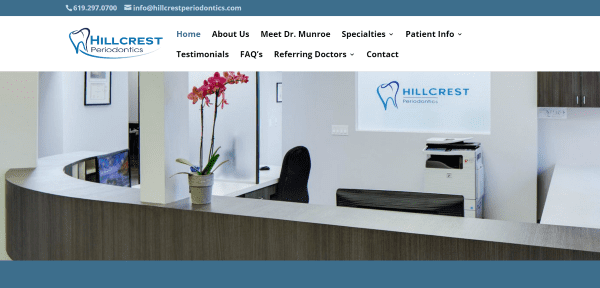
Hillcrest Periodontics has a personal touch by using a full-width image of their office followed by a simple section with their contact info and office hours. Following this is a section about the Dr. with contact CTA, a section about the business practices, a section with social follow and membership links, and a full-width image of the staff. The About Us page includes information about the staff members as well as large images of the dentist’s office. The site is simple but effective.
7. WhiteGlove Health
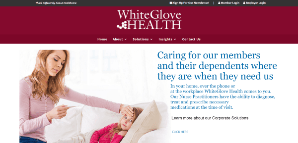
WhiteGlove Health includes a large menu, a full-screen slider with transition effects, an about section, a login area for members and staff, a services overview with large icons and links for more information, a section about the team, a statistics section for proof of value, and a large footer with links and social icons. The Value Based Care page includes large sections with alternating text and images with a CTA for each one. The Chronic Condition Management page displays information in tabs and bar charts. The Downloads page includes PDF’s within tabs. This site makes excellent use of color and layout.
8. MBC Nursing
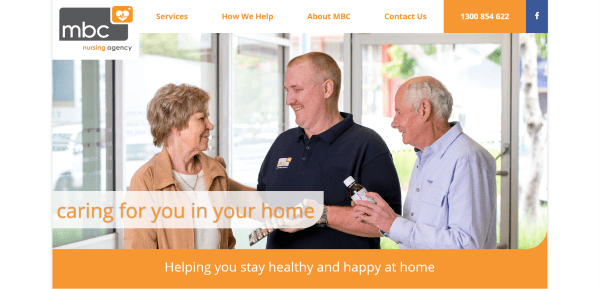
MBC Nursing has a one-page boxed design with an overlapping logo in the menu. It displays an image with CSS section separation, a bullet list of services, an about section that highlights the benefits, an about section that describes the staff’s qualifications with a contact link, a CTA, and a contact form. It’s a simple site that makes great use of color branding.
9. Cedar Haven
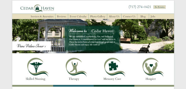
Cedar Haven is a boxed design with image slider, large clickable icons for the primary services, an about section with downloadable resources, links to reviews and a video tour, and a custom footer with links and quality badge. The Services pages include a short description, bullet points, an image, reviews, and CTA. The FAQ page uses accordions while the photo gallery displays multiple galleries with page numbers. It’s a simple site with clean design and nice color-matching.
10. Collabria Care
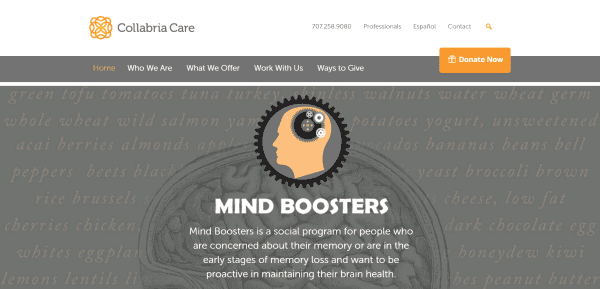
Collabria Care has both a regular and full-width menu with overlapping donate button, a full-screen slider, buttons to choose the type of service you’re interested in, information about services with links, blurbs discussing the various resources, testimonials, a section with resources displayed over a parallax background, a contact form, newsletter subscription form, popular topics, images of sponsors, and a custom footer with links. WooCommerce is used to accept donations. Events are displayed using the All-in-One Event Calendar plugin. Even though the site has lots of pages its design is easy to follow.
11. Ovarian Cancer Institute

Ovarian Cancer Institute has a clean design with CTA in the menu. The homepage includes a full-width image slider, and about section, a section with large CTA icons, a 3-column section with blog posts and a sidebar with links to pages, social follow buttons, and an event calendar using the EventOn plugin. Following this is a full-width section highlighting their major partners and a footer with social follow icons, a newsletter button, and a donate button. The various pages follow the same design as the blog section with sidebar. The Events page also uses EventOn. The site makes elegant use of color.
12. DC Dental Clinical

DC Dental Clinical includes a full-width slier, a post slider with courses and events selections, a faculty slider with hover effects showing their names and a link to view all faculty members, an about section, and a custom footer that includes contact info and accreditation. The Events and Courses pages include a search feature with filters chosen from dropdown boxes and responsive interactive table. Products are displayed using WooCommerce. The site makes great use of color and fonts.
13. Zero Gravity Floatation SPA

Zero Gravity Floatation SPA uses a full-screen image in parallax with CTA, a three-column section with text and alternating background colors, a section with full-screen image in parallax and alternating text with transparent overlays, an about section with CTA and three-column text and icons, a two-column info section with tabs, a contact section, full-width map, and post slider with hover animation. The More page displays information in accordions. Pricing is displayed using WooCommerce. The site make good use of icons and color.
14. Cure for MND Foundation
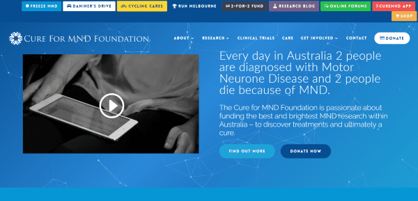
Cure for MND Foundation includes a full-width header with video and information with CTA over an animated particle background. The top menu includes text within colored boxes. It includes a CTA with fade transition effects, an about section with textured background, event info, a four-column section with links to pages, a donation section powered by WooCommerce, an information slider, events cards provided by EventOn, a fancy alternating CTA section with hover animation, integrated social feeds, a sign-up form, and a custom footer with social share and follow buttons. It has lots of fancy features but none of them bog the site down or get in the way of the design.
Final Thoughts
These 14 examples of healthcare websites using Divi go to show that Divi can be used to create interesting designs for any type of healthcare website, whether it’s just a simple brochure or a site with events and pricing.
These sites a great for providing ideas for layouts, colors, use of images, video, animations, navigation, calendars, and more. These websites are sure to inspire you for your next healthcare design.
What are some of your favorite elements of these Divi healthcare sites? Let us know in the comments below!
Featured Image via Elena3567 / shutterstock.com





I loved Kemmet Denta Design , how do you design an overlapping block?
We have a tutorial on that! https://www.elegantthemes.com/blog/divi-resources/how-to-create-a-divi-overlapping-logo
Hello .. I’m impressed by the menus I’m seeing … things I did not know were possible with Divi.
How can I learn more about these fantastic menues?
Thank you so much for including our website. All our hard work validated!
There is a ‘Scroll Down’ item on the Zero Gravity top image using the Divi standard double down arrow icon.
Anyone know how they got the scroll down to work?
Tried a couple tutorials to achieve this effect lately, but haven’t found one that works with current versions of Divi.
Which site are you asking about?
really like the Zero Gravity parallax image of the person in tree pose with the alternating blocks of white text on black background.
gives me all sorts of ideas! 🙂
Thanks so much for featuring our site (Cedar Haven Healthcare Center)!! We love Divi!
excellent examples – thanks
wow, Toothsmith. No surprise coming from DOERS. Great examples of healthcare websites using Divi.
These examples are fabulous. Thank you for the writing.
It would be nice to publish similar articles but for EXTRA theme 🙂