Photography is a popular field, and like many fields, requires a well-designed website to show work to potential clients. Photography websites need a heavy focus on images, galleries, and portfolios. Some even need pricing tables and WooCommerce integration. Fortunately there are lots of photography websites built with Divi to inspire ideas. To help with that inspiration, this article lists 16 examples of photography websites built with Divi.
Most are brochure-type websites with a focus on portfolios and services. Others include products while others provide related services. Most use their blogs to show their photoshoots. Others use their blogs for blogging and include photography tips. Most focus on wedding photography but they also provide other photography services. All are great for sparking the imagination. They’re in no particular order.
- 1 1. Paul Summerfield Photography
- 2 2. Megan Kelsey Photography
- 3 3. Jasper Van de Gein Fotografie
- 4 4. Hannah Hall Photography
- 5 5. Eddie Judd Photography
- 6 6. Jeebs Media
- 7 7. Wayne La
- 8 8. Elizabeth Fogarty Photography
- 9 9. Lane Weddings
- 10 10. Eden Photography
- 11 11. Yvette Craig
- 12 12. Lorraine Claire
- 13 13. Brett Florens
- 14 14. Jordanna Marston
- 15 15. Sarah Lauren Photography
- 16 Final Thoughts
1. Paul Summerfield Photography
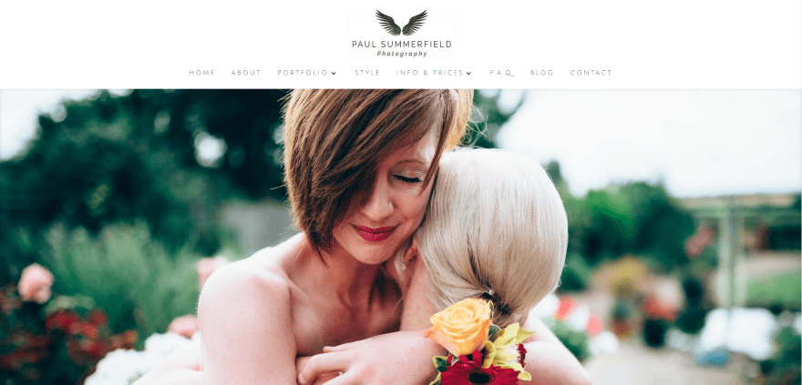
Paul Summerfield Photography displays a full-screen image slider followed by a business tagline and quote, a small text section with numbered links to pages, an about section with text and image, links to the portfolio with alternating text and images, a blog section, a testimonial slider section in parallax, and a footer with contact info. The portfolio is displayed with a gallery in a grid layout. A contact form is used for booking. The Blog includes a grid design with categories above the blog section. The posts are used as galleries.
2. Megan Kelsey Photography
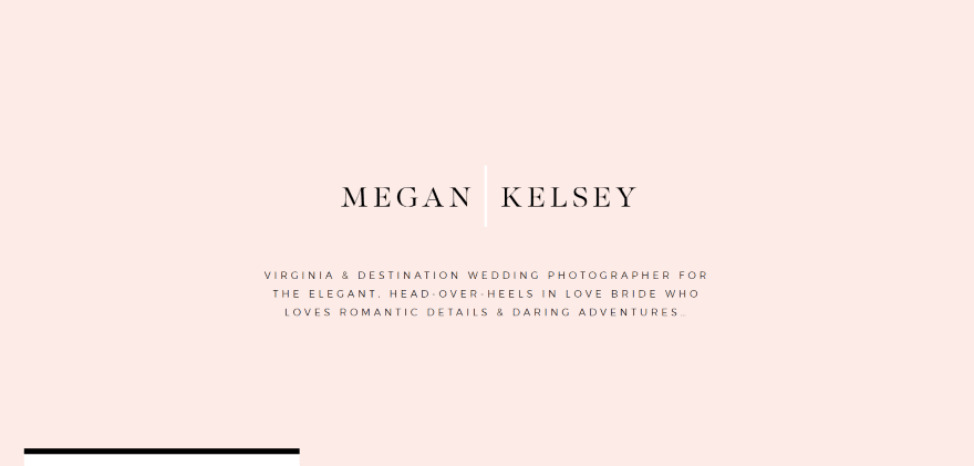
Megan Kelsey Photography displays a full-screen image with logo, tagline, and soothing background. The top of the menu can be seen in this image. The menu is a block that overlaps the first two sections. Following this is a large image, an about section in two columns with text and an elegant welcome message written in a hand-written style font, an interesting image collage with CTA (call to action), a full-screen testimonial with background pattern, a full-screen post slider with post excerpt overlapping the image (using Master Slider), and a custom footer with tagline and logo. The blog is highly styled and matches the elegance of the site. This site uses interesting layouts, colors, and fonts.
3. Jasper Van de Gein Fotografie
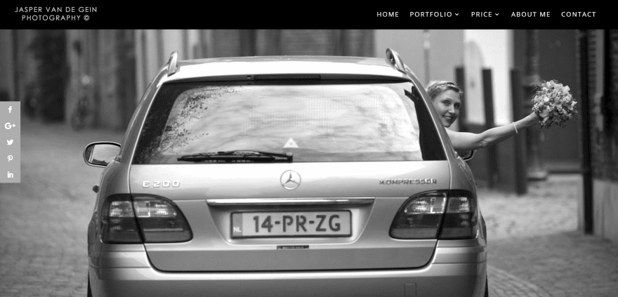
Jasper Van de Gein Fotografie is a one-page design that includes a full-screen image slider, a blurb section showing services and CTA, an about section, several sections with image galleries that display images in multiple sizes and layouts, pricing tables with booking, shooting info, and contact form. The site makes interesting use of image layouts.
4. Hannah Hall Photography
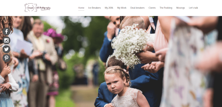
Hannah Hall Photography includes a full-screen image slider, a two-column about section with text and photo, a full-width image with testimonial slider overlay, a section showing award badges, a two-column portfolio, integrated Instagram feeds, and footer with contact info. The blog page uses an elegant font.
5. Eddie Judd Photography
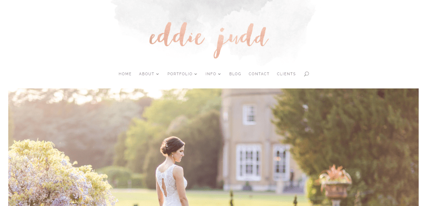
Eddie Judd Photography displays a full-screen image slider, an overlapping emblem that’s used within other sections, an image section with links to various pages, a highly styled section with the latest blog post with an elegant background image, a section with media logos, and a section with an Instagram feed. The blog is elegantly styled. The site makes great use of elegant fonts and colors.
6. Jeebs Media
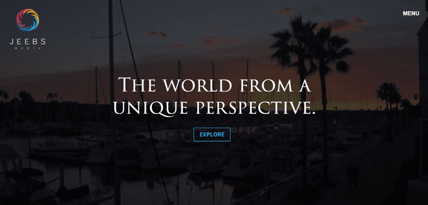
Jeebs Media displays a full-screen video background with tagline overlay, an animated logo, full-screen menu, and CTA. The pages use full-width images and integrated Instagram sliders. The portfolio uses hover effects to display the topics. Photos are shown in lightbox galleries and use a load more feature (using an AJAX grid). The site uses high contrast and saturation to set the mood.
7. Wayne La
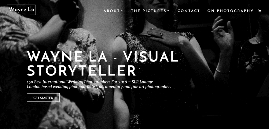
Wayne La uses a full-screen image with tagline and CTA in an overlay. Scrolling reveals a two-column about section with an image and text, a full-screen image in parallax showing work that’s coming soon, an article section with CSS hover effects, an embedded video, an about section with link to the portfolio, a full-screen image with testimonial slider in parallax, a blog grid section, a full-screen image with contact form, links to specific articles, and a footer with Instagram feeds.
8. Elizabeth Fogarty Photography
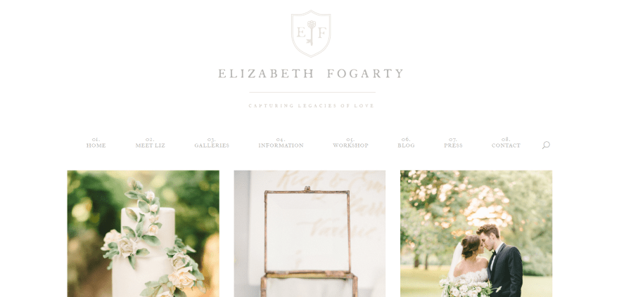
Elizabeth Fogarty Photography uses a simple homepage that displays an extra-large logo with numbered menu followed by three sample images. The menu includes hover effects. The Galleries page displays the topics, which then displays the images within an image slider. The Blog page is styled to match the rest of the site. The site makes interesting use of white with fonts that read as silver.
9. Lane Weddings
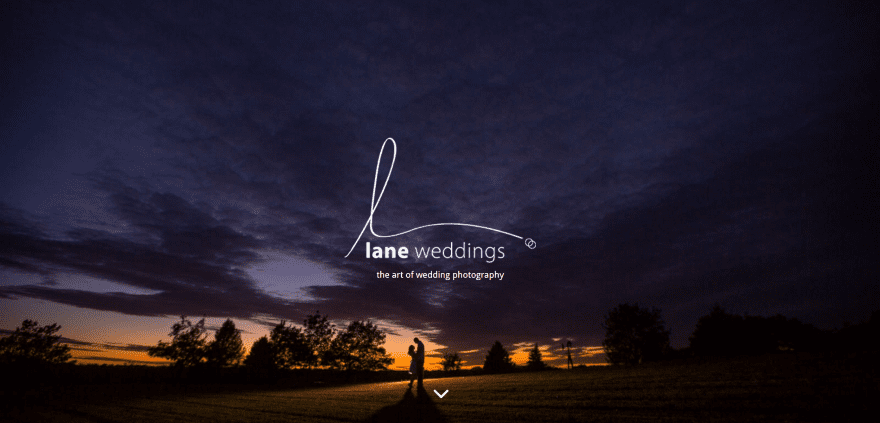
Lane Weddings displays a full-screen image with a menu that’s revealed on scroll. Numbered icons provide links to pages. Following this is an about section, a blog grid with multiple layouts using hover animation, and a load button. The Blog page displays this same grid. The Portfolio page displays thumbnails. The images are displayed using the Galleria plugin.
10. Eden Photography
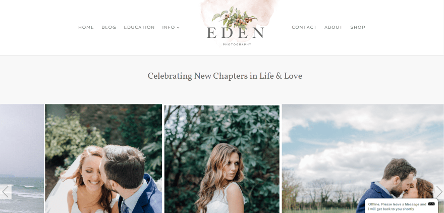
Eden Photography displays a tagline followed by an image carousel that’s constantly scrolling until you hover over an image. Scrolling reveals an information section, a section with icons and links to pages, an about section, a full-screen testimonial in parallax, a featured gallery, a quote as an overlay, and a contact and follow section using an interesting background image (matching the logo) that’s sized perfectly to go behind the form and buttons. Galleries are displayed within a grid. The Shop is powered by WooCommerce. Blog elements are styled to match the site.
11. Yvette Craig
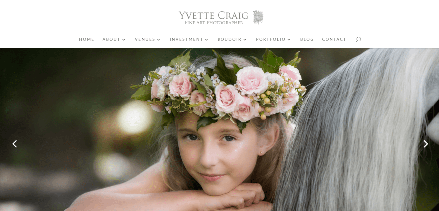
Yvette Craig displays a full-screen image slider, an icon section with links to pages, an about section, featured venues displayed in an alternating grid with images and links, a testimonial section includes an image and link to an article, an FAQ section provides answers in toggles, the latest posts are shown in a blog section, another testimonial is shown in full-screen parallax followed by a contact form and images using SnapWidget. This site uses more white-space between the sections than most, giving the layout more breathing-room.
12. Lorraine Claire
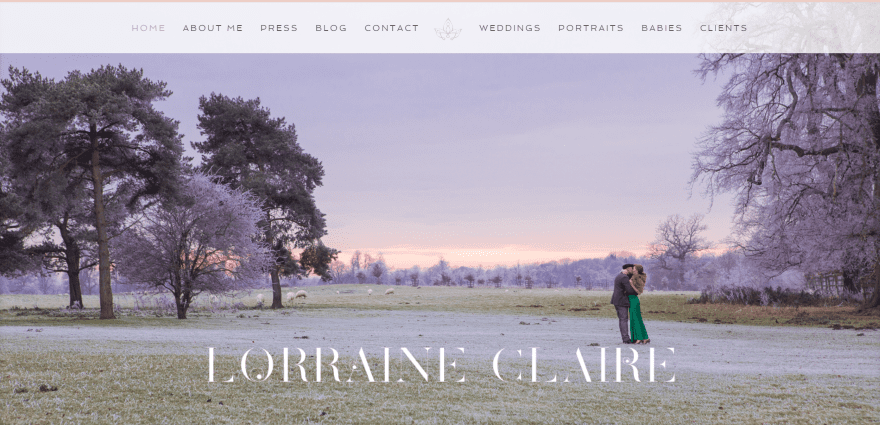
Lorraine Claire displays a full-screen image slider, a section with numbered links to pages, a personal quote in a transparent overlay over an image, a styled blog section with icon, and social follow buttons. The portfolio pages display full-width images, text, images in the sidebar, links to PDF’s, and FAQ’s in toggles. The text layout is elegant and uses drop-caps. The Blog page displays the latest posts in a styled slider. The blog posts are used as image galleries and display large images with multiple grid layouts.
13. Brett Florens
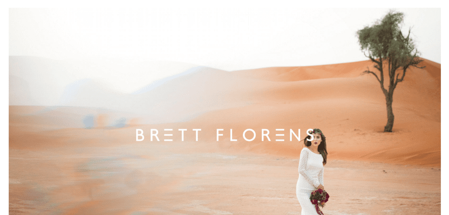
Brett Florens uses a full-screen image slider with a menu that’s revealed on scroll. Following this is an elegant tagline, an about section that uses a numbered system to show information with CTA’s, a portfolio with alternating images and text, a CTA, a blog section, and a contact form over an image. The information section uses elegant image effects and styling. The Blog page displays a three-column information section with search, about, and categories. The portfolio displays images in a carousel. The site makes excellent use of soft color and styling.
14. Jordanna Marston
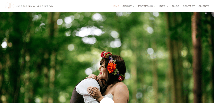
Jordanna Marston displays a full-screen post slider with overlapping logo between the slider and about section. Following this is a tagline in full-screen parallax, a portfolio with hover effects, another full-screen tagline in parallax, a blog section, a full-screen CTA in parallax, a section showing media icons, and an Instagram feed. The portfolios display images in a carousel. The Blog page displays an image and a block with categories as a header, and a post grid with the titles over the images and hover effects. The blog includes sidebar styling.
15. Sarah Lauren Photography
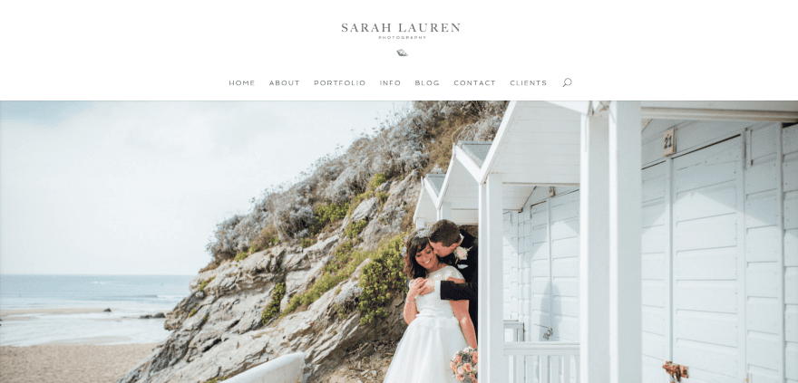
Sarah Lauren Photography uses a one-page design (except for blog) displaying a full-screen image slider, numbered section with icons and links to pages, an about section, a portfolio section displayed in a multi-layout grid, an info section with links, a blog section, and a contact form. The portfolio displays images in a slider. The Blog page uses a full-width image, a two-column blog grid, and a styled sidebar.
Final Thoughts
These 16 examples of photography websites built with Divi go to show that Divi can be used to create elegant designs for any type of photography website. These sites a great for providing ideas for layouts, fonts, colors, galleries, portfolios, blogs, pricing tables, shops, and more. These websites are sure to spark your imagination for your next Divi photography design.
What are some of your favorite elements of these Divi photography sites? Let us know in the comments below!
Featured Image via art-sonik / shutterstock.com




Nice selection of sites if you’re a wedding photographer, but they seem to be all the same, and not particularly suited to any other type of photography. I think we need a new list with everything BUT wedding shooters. I plan to upgrade my site shortly using DIVI (I already am, but it needs some work) and this would’ve been helpful.
I was hoping to see something other than wedding photography websites. 🙁
Check mine out, built with DIVI and integrated with WooCommerce. I love this theme, it is my go to for any project. https://allanpudlitzke.com
On this site http://www.jaspervandegeinfotografie.nl/ how did they get the photo gallery to spread across the entire width of the page. I have messed with the gutter settings and fullwidth area and can not seem to duplicate it. If any one can help, please comment. Thanks
I also use Divi for my photography website, is trully a game changer.
great work!
Divi is certainly improving overall (and I have been a big fan since 2.0) but its image handling still makes it hard work to develop a good PHOTO website with it. You’ll need one of Melissa Love’s child themes, or a whole lot of time and patience to customise the CSS to make it behave in the way you want.
You will also need a few plugins – a responsive grid gallery and a fullscreen lightbox at a minimum, and probably a better slider too. And unless all your images are the same dimensions (or at least the same ratio) then working with Divi is very frustrating (example: a recent Divi update has ‘upset’ old thumbnail galleries that have a mixture of portrait and landscape oriented photos).
I see some of these Divi sites also use a third-party Instagram plugin to add extra variety to the rather plain Divi options of image display.
Been a semi-pro photographer for the last 10 years. Can’t say I was very impressed with any of these sites as “Photography” sites. I use Divi for my blog which is great. WordPress just does not make it easy to create an actual “Photography” type of website. WordPress simply falls way short compared to sites devoted to photography. It is king of the written content, not images.
reat Projects, Great ideas for upcoming tutorials, elagantt themes.
Lots of great inspiration and eye candy on this list, and so exciting to see the site I designed for Megan!
Nice to see these websites. Just to mention they are all Weddings photographers and most of these websites looks identical. I would have love to see different kinds of photographers and designs.
These are so beautiful! I love Divi. This is so inspirational, that you can literally achieve anything with Divi! Megan and Jordanna’s are my fav’s from this list! Loving that most were created with Melissa’s templates from the Design Space – GORGEOUS 🙂
Good info !
How can i make a blog like https://laneweddings.com/blog/ with the divi theme?
Great to see these great webdesigns! Even better to see the website that I made for Jasper van de Gein (number 3) mentioned here. 🙂
Good ideas for designing. However, first content, then design. I’m disappointed with the quality of the some of the pictures. It doesn’t make sense to put a full-width photo to a website if the quality of the picture is mediocre.
thanks.
I just saw some of the sites that built with Extra theme.
the homepage of theme don’t have canonical tag!
even they use blog feed in their homepage and don’t have canonical.
I check your extra theme…same thing
http://elegantthemes.com/preview/Extra/blog-feed/page/2/
even checking your blog feed demo
all pages canonical to first blog feed page
isn’t that a problem?
effect on seo I think. is there a fix?
Great to see a few of mine on here. Divi works so well for photographers.
How do you as a child theme developer solve the the integration of vertical images into Divi galleries? I for one finally decided to use a third party plugin for my site, since I wanted a masonry layout. But maybe you have a different and better approach? Curious for your answer…
Hey Axel,
Care to share which plugin? 🙂
Thanks for putting this all together, Randy. It’s always great to see what other people are doing with DIVI – especially other photographers. Although I was a bit surprised that out of 16 websites you’ve selected, 15 of them are wedding photographers. There must be more to photography than that!
Nice selection of websites. But they all seem to be wedding/portrait photography examples.
One of the best Divi websites I’ve seen is from a travel and landscape photographer at http://www.explosiveaperture.com – I definitely recommend checking what he’s done with Divi …and his amazing images!
Thanks for that link. I would rather photograph anything than weddings. I’m an artist photographer and do a lot of travel photography so I like his layout. I don’t understand the emphasis on wedding photography.
BTW I am looking for the DIVI portfolio websites link. I’m a member and can’t find a link to them. I’m trying to set up a new photo site and could use the help but Divi’s blog doesn’t have links to things without giving them a new email address each time.
I meant the Divi portflio layout link, not the websites link.
As both photographer and web designer it’s great to see how people have really customized their sites to show off their work, brand and personalities.
I never imagined that only wedding photograpers are photographers;= )
Isn’t this focus too narrow?
Very true. The title should have been 16 examples of wedding photography… A similar article without any wedding sites is useful.
I completely agree with you point of view. I would have appreciated to see some examples of other genres.
I agree.
I came here to make the same comment. Was a little disappointed to just see wedding photographers.
Strange, I had the same remark when looking this selection of nice sites.
I’m a photographer … but I never shoot weddings.
My specialty : concerts.
Best regards
Pascal
Excuse my English, I’m just French
I agree totally. Commercial and advertising photographers, editorial, travel and brochure photographers have websites too, with different needs and demographics to satisfy.
Wow, this is one of my favorite selection of DIVI website!
now i have the idea.. Nice sites.
It looks like the problem with vertical images of the grid gallery has not yet been resolved. This is a very useful site for photographers. How about you develop the option to leave the gallery similar to the shutterstock?
I have had multiple photography clients, and it can be a challenge to make a great photography website. Hopefully, this can serve as inspiration for those serving photographers like myself! Thanks for the great article, Randy.
Nice inspiration and sites. I’m also a photographer who has used Divi as my theme, it works perfectly.
Nice website Jonas!
Love looking through these! I’ve used Elegant themes for years and the new Divi has been a game changer. I built my photography website with Divi as well.
Nice website Jennifer! I love the look of your potfolios and blog!
Great and Creative Designs