The Internet is a great tool for job hunting. There are lots of staffing services websites out there to help job seekers in practically any industry. Considering how easy it is to add a job board to a WordPress website, I expect to see even more websites for staffing services. Fortunately, there are lots of examples of staffing services websites built with Divi to help with inspiration.
Staffing services often need job boards, forms for uploading files, courses, articles about job searching, CTA’s (call to action), navigation structures with CTA’s, membership areas, and more. In this article we’ll look at 10 staffing services websites built with Divi to help inspire you for your next Divi website. The websites are in no particular order.
1. Marinkraft
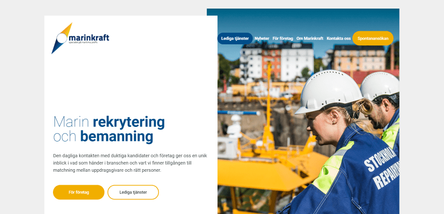
Marinkraft displays a 2-column slider with CTA. The menu includes a CTA to see the open positions. Following this is a full-screen background video with blurbs. A job list displays links to job openings with map location and job description. Testimonials are displayed in a full-screen slider followed by client logos. The site includes an Instagram feed, staff listings with images and contact info for each person, and company contact info.
2. Arielle Careers
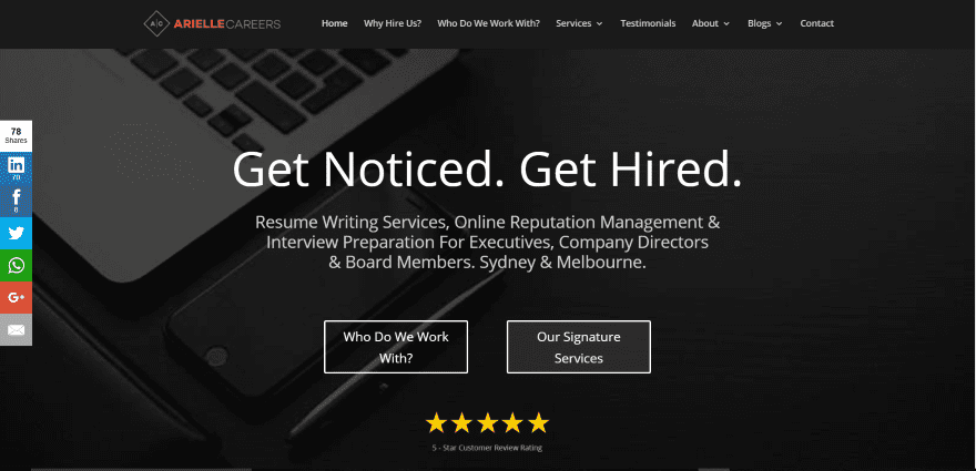
Arielle Careers displays a CTA front and center with tagline, description of services, links to services, and their ratings. Scrolling reveals links to pages displayed with images in a 4-column grid, client logos, and a 3-column blog grid. Rather than having job postings, the site provides career coaching and contains articles that focus on job searching, creating your resume, interviewing tips, etc. The site contains two blogs: one for the job search and one for succeeding at work.
3. Jobport
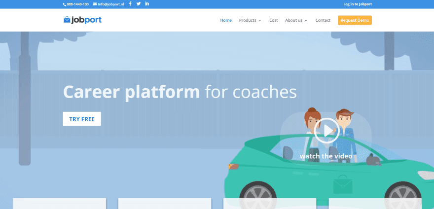
Jobport uses a full-screen image with tagline, CTA, and a link to a video. Following this is a set of blurbs with hover animation, a styled blog feed, email form, full-width CTA, and client logos. This is a job search membership site that requires a subscription and includes access to the search engine, a career test, online job hunting stats, e-learning, and a VIP area. The site makes great use of pricing tables, toggles, blurbs, and many other Divi modules. The menu includes a CTA.
4. Imaging Community Exchange
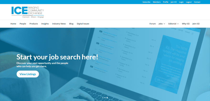
Imaging Community Exchange uses a full-width slider with tagline and CTA. The layout has a magazine design with 3 columns. The sidebars show links, featured jobs, categories, top headlines, latest news, blog feed, from the forum, etc. The content area displays a featured post and feeds from several categories. The job search displays listings in a grid using the WP Job Board plugin.
5. Escape the City
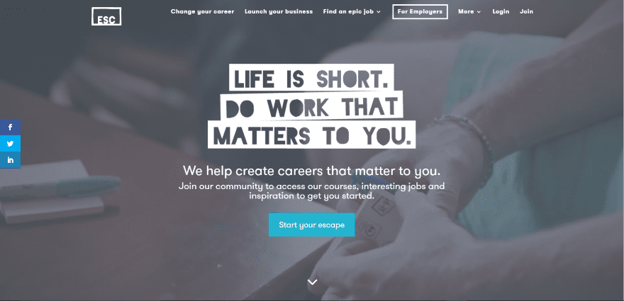
Escape the City displays a full-screen video with styled tagline, about info, and CTA. The video plays as you start to scroll. Scrolling reveals three blurbs with links as navigation based on your goals. Following this is a double-column section with links to courses, a full-screen education CTA in parallax, an about section with stats, a full-screen sign-up CTA, media logos for press coverage, a quote slider, and more.
6. Inplace Personnel
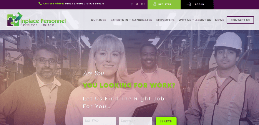
Inplace Personnel includes a full-screen slider with tagline and job search. Following this is a full-width section with 2 job CTA’s, a 3-column section providing links to pages, a simple about section with text, a multi-layout section with images that provide links to pages, several blurbs, client icons, registration CTA, and lots more. The links and images include hover animation. The secondary and primary menus both include CTA’s. The job search is powered by WP Job Board and includes a job subscription feature.
7. GTR Staffing
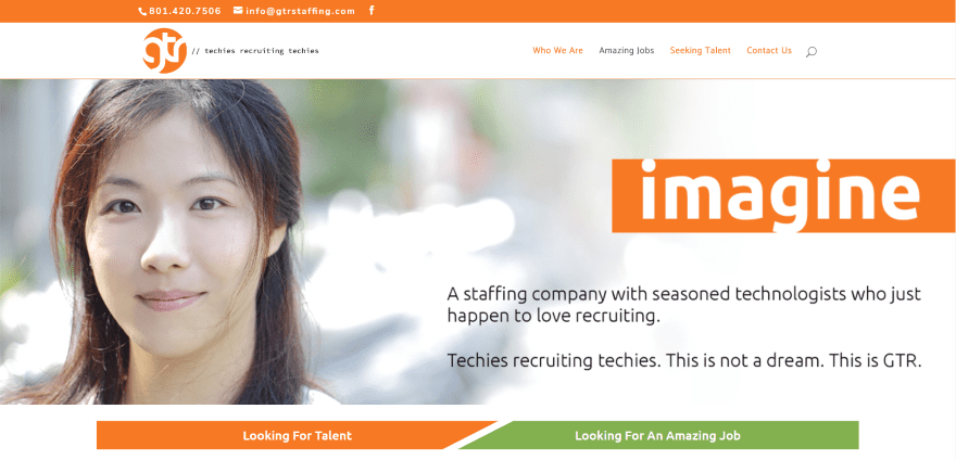
GTR Staffing displays a full-screen image with tagline and about information. Under the image is an interesting set of styled buttons so you can navigate based on your purpose for using the site. A list of services are displayed within bullets with icons. Testimonials are displayed within a slider. Topics are displayed in a 3-column grid and include hover animation. Client icons continuously scroll across the screen within their section. The job search is powered by WP Job Manager. The job search link in the menu stays a different color from the other links.
8. RnR Staffing
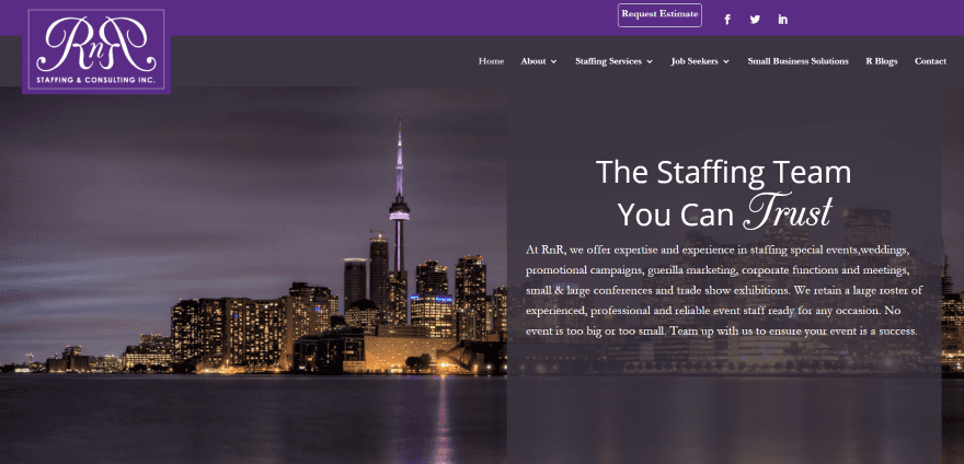
RnR Staffing includes a full-screen image with tagline and information on one side within an overlay. The menu includes a CTA and overlapping logo. Scrolling reveals images with split screen overlays in parallax to describe services. Job titles are displayed within tabs. The application page uses a form with file upload capability powered by Gravity Forms. The site makes excellent use of color, typography, and parallax.
9. New G Consulting
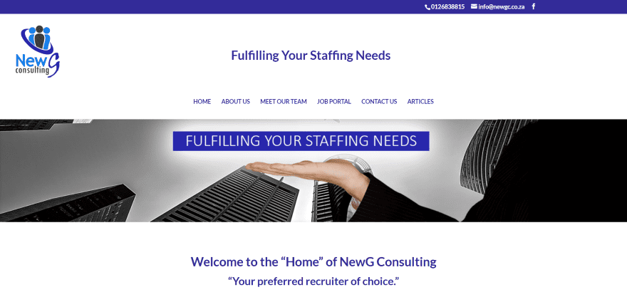
New G Consulting uses an extra-large header and a full-width slider with taglines. Following this are links to pages with images and hover animation, a full-width section of blurbs, and contact form. Company information is provided within tabs. The job portal is powered by Simple Job Board and displays vacancies with description and apply button. The blog page uses a styled background and hover animation.
10. My Purple Squirrels
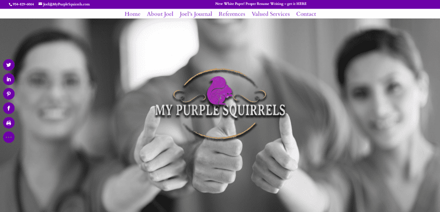
My Purple Squirrels is unique in that it’s the site of a recruiting agent that provides services, negotiates salaries, and gets jobs for you. It’s a one-page design that has a full-screen image with logo in parallax. Following this is an about section, a styled blog section in parallax, styled testimonials in parallax, blurbs for services that reveal the information on hover, and a styled contact form. The site makes great use of purple and parallax.
Final Thoughts
Divi is a great platform to build any type of website a staffing service could need. Whether it needs a job board, form for uploading resumes, training courses to help job seekers land their dream job, a sharp blog filled with detailed articles and job searching tips, navigation, services, etc., These 10 websites are sure to have something to help inspire you for your next staffing services website.
We want to hear from you. What do you like the most about these staffing services websites built with Divi? Let us know in the comments.
Featured Image via Nadia Buravleva / shutterstock.com


Parallax is v cool.
ICE’s site looks engaging. Some great design here. I would personally like to see some great blogs with Divi
#2 and #3 are my favorite ones. And I wonder if you will be doing Extra theme showcase sometime, too?
How did RNR make the overlapping logo. Very nice !!!
Ops, 6. Inplace Personnel Image just came so late!
Thx again,
Andy
Thanks for the good insight!
6. Inplace Personnel Image is missing! 😉
Andy
I like ICE too, how do i make my menu look like that?
I wanna know how does ICE separate their menu bars with the logo like that? Looks good and I’ve always wanted to separate the menus in Divi but couldn’t figure out how!
Apparently, a bit of css does the trick on the menu items:
#top-menu li:nth-last-child(4) {float: right;}
Change numbers according to the menu items
You could do the same thing by using:
#top-menu li:nth-child(n+8) {
float: right;
}
😉