Welcome to Day 56 of our Divi 100 Marathon. Keep tuning in for 100 days in a row of awesome Divi resources as we count down to the amazing release of Divi 3.0 on the final day of the series!
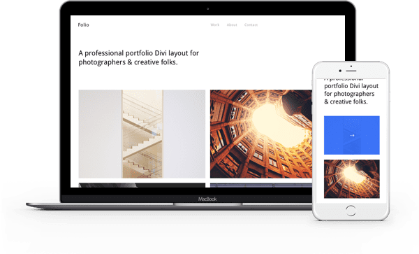
In this free Divi Layout Pack we’ve created a set of five portfolio style home pages. They’re perfect for photographers, illustrators, or anyone else looking to put the focus on their body of creative work right away.
- 1 Downloading & Using The Homepage Portfolio Layout Pack
- 2 Subscribe To Download For Free
- 3 Download For Free
- 4 The Homepage Portfolio Layouts
- 5 Homepage Portfolio Layout 01
- 6 Homepage Portfolio Layout 02
- 7 Homepage Portfolio Layout 03
- 8 Homepage Portfolio Layout 04
- 9 Homepage Portfolio Layout 05
- 10 Tomorrow: Learn how to use the Divi CTA Module to Create a Responsive Image Grid
- 11 Divi 100 Day 56
- 12 The Countdown To Divi 3.0
Downloading & Using The Homepage Portfolio Layout Pack
To use the Free Divi Homepage Portfolio Layout Pack on your own Divi website you will first need to download it using the button below. Next, locate the file divi-100-homepage-porfolio-layout-pack.zip in your downloads folder and unzip it. Then, navigate in your WordPress admin to Divi > Divi Library and click the “Import & Export” button at the top of the page.
When the portability modal pops up go to the import tab. Click the “choose file” button and select the All.json file or any one of the individual portfolio layouts you would like. Then click the blue “Import Divi Builder Layout” button and wait for the import to complete.
Once the import has finished you will now have the ability to load your new Divi Homepage Portfolio Layout(s) on any builder powered page by going to Load From Library > Add From Library.
Subscribe To Download For Free
The Homepage Portfolio Layouts
The layouts within the Divi Homepage Portfolio Layout Pack do not use the portfolio module or projects custom post type. Instead they take an alternate approach by repurposing the standard image and text modules to create beautiful, self-contained portfolios. These layouts can live on their own or you can choose to link the images to full projects–the choice is yours!
You may also notice that in the images below, we have paired these layouts with the “blank” page template and creative “header” or “menu” created with text modules. You can choose to do likewise or place the layouts within standard pages as you see fit.
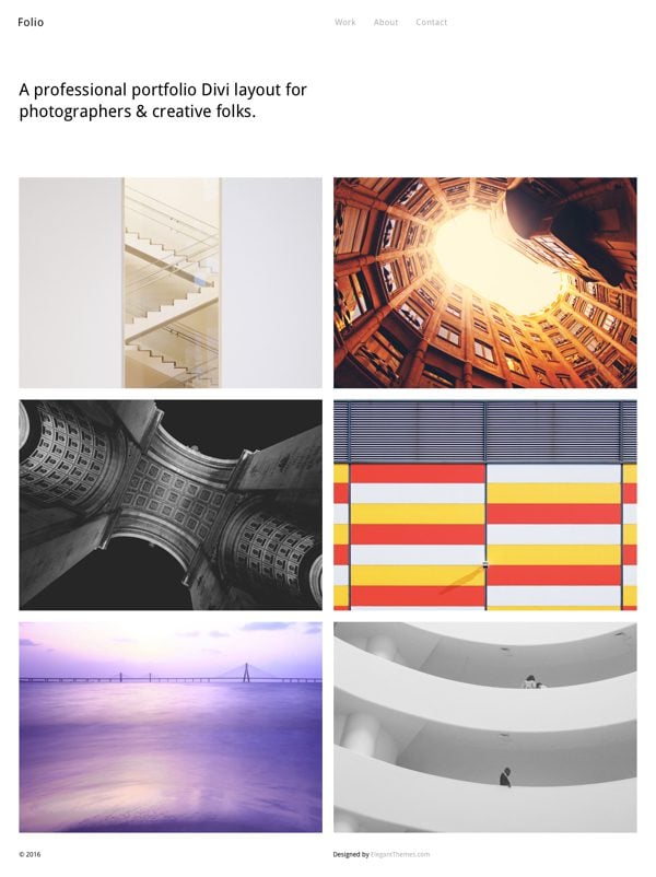
Homepage Portfolio Layout 01
Layout 01 is intended to be very clean and minimal. It’s been paired with the “blank” page template and a white minimal text module “menu” up top (as well as something similar for the footer). This limits the amount of elements on the page and keeps the focus on the images we’re trying to showcase.
Homepage Portfolio Layout 02
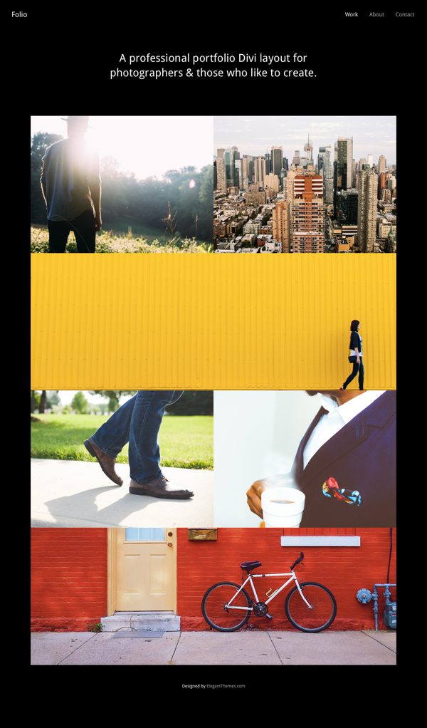
In Layout 02 we go from clean white to dark black. As is the case with all of these layouts, the images still take center stage. This time with no gutters and a close grid/collage style applied.
Homepage Portfolio Layout 03
In Layout 03 the images in our grid dominate the page while also conforming to an appealing “staggered” column aesthetic. A very striking look.
Homepage Portfolio Layout 04
In Layout 04 we have a lovely header and three, two column rows with their gutters removed. This is a nice twist on the “closed grid” that we explored in a few of the other layouts where we let things breathe a bit–but not too much.
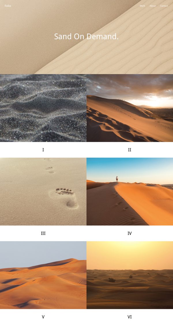
Homepage Portfolio Layout 05
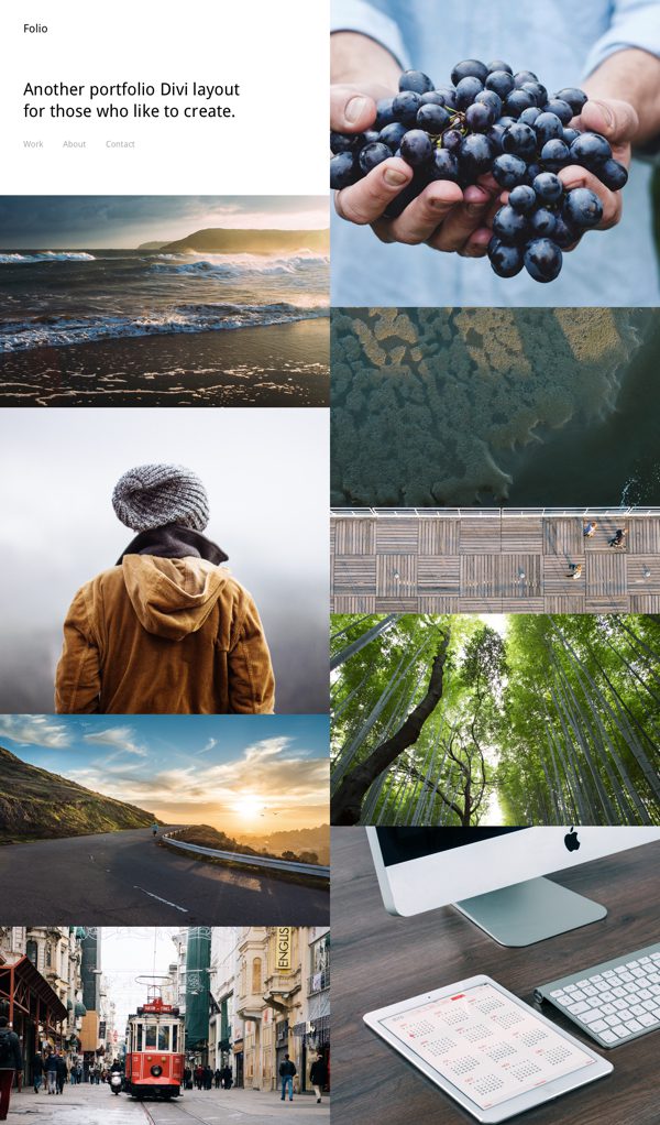
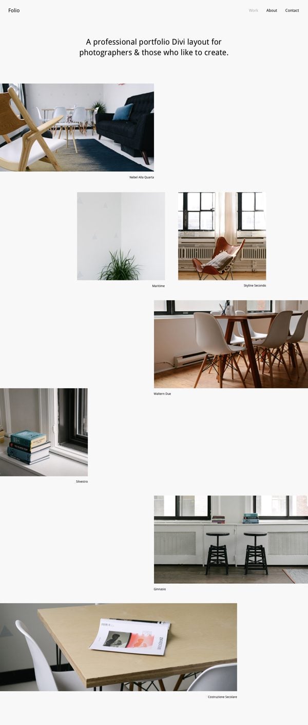
In Layout 05 we’ve created a “loose” or “open” collage. The complete opposite of the tight, closed grids above. This layout lets each image stand surrounded by whitespace with irregular (but ultimately balanced) positions relative to the other images.
Tomorrow: Learn how to use the Divi CTA Module to Create a Responsive Image Grid
Tomorrow we will be sharing another tutorial by community member and blog contributor Melissa Love. In this tutorial she will be showing you how to use the Call to Action Module to create a responsive image grid with overlaid buttons. See you then!
Be sure to subscribe to our email newsletter and YouTube channel so that you never miss a big announcement, useful tip, or Divi freebie!

Divi 100 Day 56
The Countdown To Divi 3.0
This post is part of our Divi 100 marathon. Follow along as we post free Divi resources for 100 days in a row! This 100-day countdown will end with the game-changing release of Divi 3.0, including our brand new visual editor built from the ground up using React. Divi 3.0 will change the way you build websites with the Divi Builder forever!
Let the countdown begin.



Thank you so much fol those valuable resources 🙂
Awesome layouts – thank you very much 🙂
Hi Mario, thx for this beautiful layout pack!
One question: Could you or someone from the Divi creative team create some cool buddypress/bbpress skins for the Divi 100 Marathon? This would be awesome…
Cheers, Ro
thanks for sharing this amazing article i have been following your tips
Thank you so much for the new layouts. Love Elegant themes.
Hey guys, this looks great but my website crashes every single time that I try to import the 10+ mb files in the Divi Library.
Is there any other way to install them?
Can I upload the json files through an FTP?
Agree here – I mentioned before, perhaps using placeholder or smaller images would free up some space and allow for after imports.
Alternatively, FTP upload would be nice but I don’t think that’s possible with how Divi imports the JSON. ET? Mario? Thoughts on this?
Yum!
Ver nice!!
I would love to see something similar for a videographer 🙂
Very nice. Could we have some innovative layout packs for woocommerce shops please.. Divi is fantastic theme and suitable for most of the projects but i still think for ecommerce site there should be more divi features, modules and styles to jazz up shops and product pages.
Love all these layouts and the images are beautiful – but perhaps they can just call to lower resolution photos, or image placeholder services? These JSON files are pretty big and I’d guess they’d import much faster with smaller image sizes. Thanks!
Sexy stuff outside of the normal Divi structure. Love it 🙂
Thanks for these fabulous resources. Appreciate the work you’re putting into this 100 days of Divi. Cheers!
Hi, very nice. Testing some layouts. Thank you!
Very clean and beautiful, as usual 🙂
I prefer Layouts 02 and 03.
Just popped in to say thank you for all the resources ET has provided for Divi! 🙂
Looks good.
I was hoping this topic would be about the (filterable) portfolio. On my web-site I want to show our projects as a portfolio. Can I use some of these trick in that module presenting in a filterable way?
Thanks,
Great, thanks! This one really works for me.
i am looking forward to a free divi homepage for a shop
Love these new divi extras……thanks so much for sharing these with us. I have downloaded them all to add to my library.
Leslie baird
Very nice. Thank you.
I’m using something similar to layout 2 on my own site.
Lovely – thanks!
Thanks for the daily inspiration and even some implementation!