Welcome to Day 72 of our Divi 100 Marathon. Keep tuning in for 100 days in a row of awesome Divi resources as we count down to the amazing release of Divi 3.0 on the final day of the series!
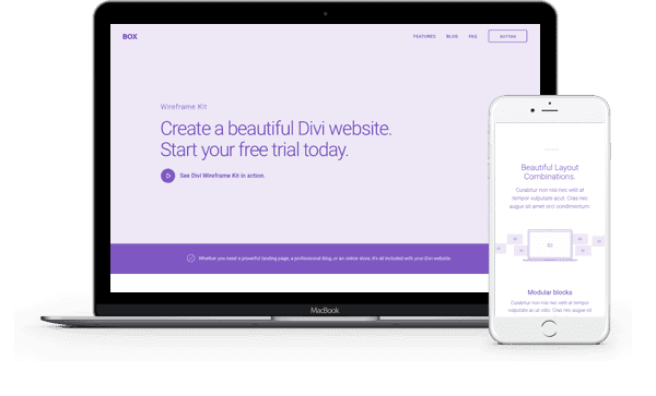
Today we have the sequel to one of the most popular layout kits of the Divi 100 Marathon. Volume 2 of the Multipurpose Wireframe UI Kit provides a big boost to the variety of high-fidelity wireframes you’re now able to create with Divi.
- 1 Downloading & Using The Wireframe UI Kit Vol. 2
- 2 Subscribe To Download For Free
- 3 Download For Free
- 4 The Wireframe Kit Vol. 2
- 5 The Wireframe Kit Vol. 2–Layout Example 01
- 6 The Wireframe Kit Vol. 2–Layout Example 02
- 7 The Wireframe Kit Vol. 2–Individual Sections
- 8 Tomorrow: Nick Accepts Applications for the Divi 3.0 Beta
- 9 Divi 100 Day 72
- 10 The Countdown To Divi 3.0
Downloading & Using The Wireframe UI Kit Vol. 2
To use the Free Divi Multipurpose Wireframe UI Kit Vol. 2 on your own Divi website you will first need to download it using the button below. Next, locate the file divi-100-wireframe-kit-volume-2-pack.zip in your downloads folder and unzip it. Then, navigate in your WordPress admin to Divi > Divi Library and click the “Import & Export” button at the top of the page.
When the portability modal pops up go to the import tab. Click the “choose file” button and select the All.json file or any of the individual layouts you want. Then click the blue “Import Divi Builder Layout” button and wait for the import to complete.
Once the import has finished you will now have the ability to load your new Divi Multipurpose Wireframe UI Kit Vol. 2 on any builder powered page by going to Load From Library > Add From Library. You can also load the individual sections by using the Load From Library option in the in-line section controls.
Subscribe To Download For Free
The Wireframe Kit Vol. 2
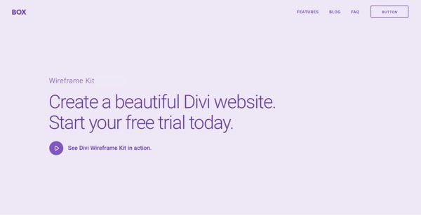
As was the case with the first wireframe UI kit, this kit provides both designers and developers with a powerful set of tools for creating interactive prototypes they can show to clients in a fraction of the time someone else might be able to create a static wireframe. And because of how easy Divi and this kit are to use, it’s value goes beyond people creating Divi websites. Even developers creating custom web apps or other types of websites may find that using Divi for the initial prototype is the best (and fastest) way forward.
The Wireframe Kit Vol. 2–Layout Example 01
There are seemingly endless layout possibilities you can create with this kit but we wanted to make sure to show at least one or two. This first layout features some amazing hero sections and calls to action.

Divi Wireframe UI Kit Vol. 2–Layout Example 01
The Wireframe Kit Vol. 2–Layout Example 02
In this layout example you’ll notice a few new elements: the new info bar section and the section including the toggle module.

Divi Wireframe UI Kit Vol. 2–Layout Example 02
The Wireframe Kit Vol. 2–Individual Sections
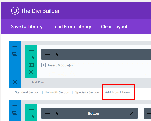
One of the great things about these kits is that not only do you get all of the elements in one master layout that you can mix, match, and alter–but you can insert individual sections by themselves into any layout using the inline “Add From Library” control within the builder section settings. This time around we’ve adding more hero sections, calls to action, features sections, and much more.

Hero Section 01
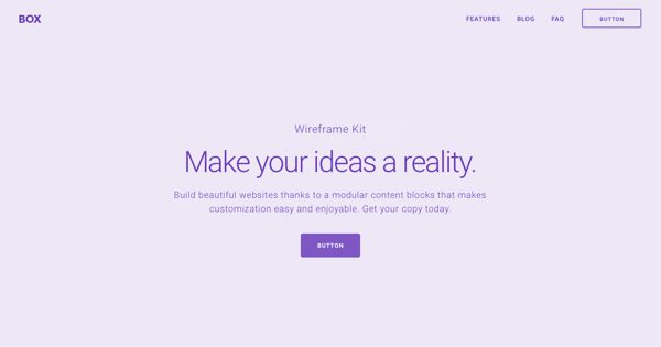
Hero Section 02
Infobar Section
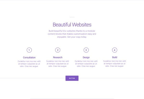
Content Section
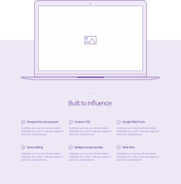
Features Section 01
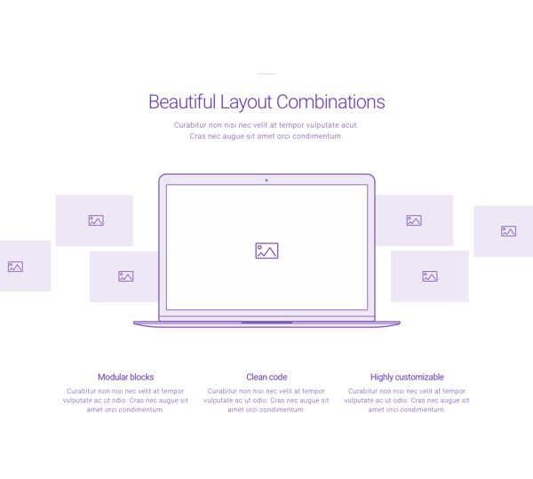
Features Section 02
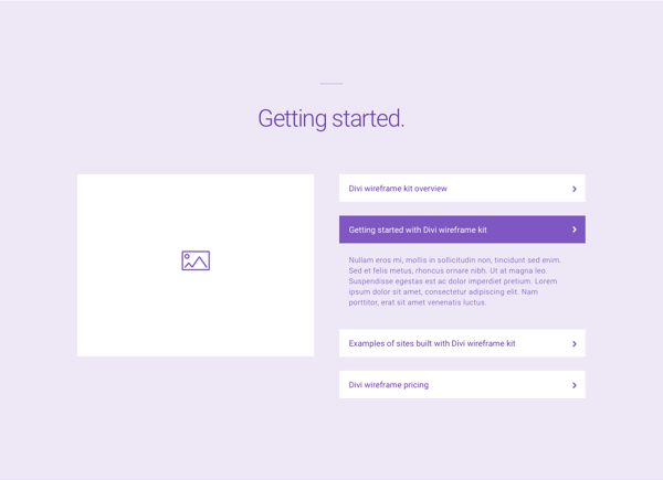
Features Section 03
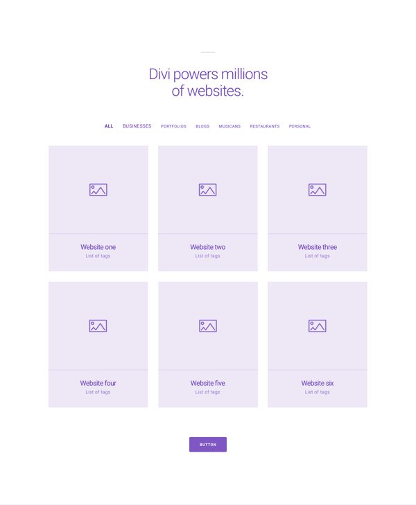
Portfolio Section
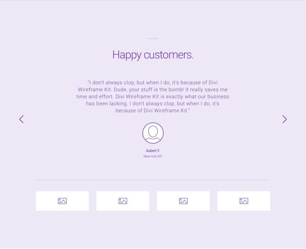
Testimonials Section
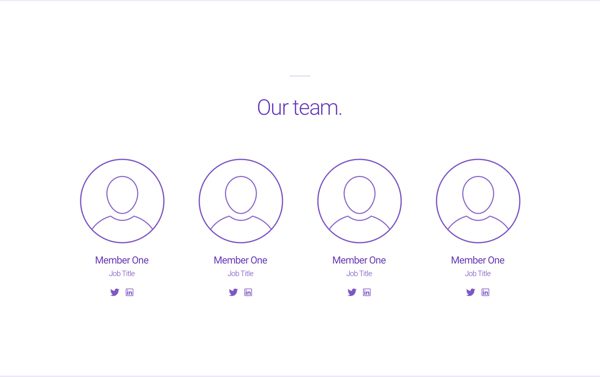
Team Section

Pricing Table Section
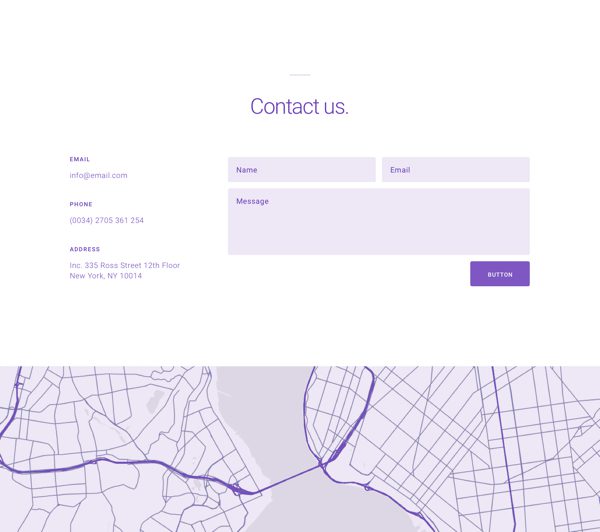
Contact Section

Call to Action Section 01
Call to Action Section 02
Call to Action Section 03
Call to Action Section 04
Call to Action Section 05
Tomorrow: Nick Accepts Applications for the Divi 3.0 Beta
In tomorrow’s post Nick will be opening up our Divi 3.0 beta to new applicants. We’d like to add a pretty large chunk of new users to our beta testing group so if you’re interested make sure to check out tomorrow’s blog post and follow the instructions provided to make in into the group. See you there!
Be sure to subscribe to our email newsletter and YouTube channel so that you never miss a big announcement, useful tip, or Divi freebie!

Divi 100 Day 72
The Countdown To Divi 3.0
This post is part of our Divi 100 marathon. Follow along as we post free Divi resources for 100 days in a row! This 100-day countdown will end with the game-changing release of Divi 3.0, including our brand new visual editor built from the ground up using React. Divi 3.0 will change the way you build websites with the Divi Builder forever!
Let the countdown begin.



Hi,
can i add a picture from Divi or wordpress inside the tablet of “Call to Action Section 04”? Otherwise how i should do it?
Thanks!
The call to action button style, placement colors and overall scheme is just is really eye catching and unique. Keep up!! Want more like these.
The forms appear different with misaligned button is there any css line for this?
Guys
Once Divi is of the hook you should really redesign your own page. I suggest Divi, cause is its easy to use :-).
No but really, having all downloads including that great stuff out of the blog posts at one spot, would be awesome and helpful finding it.
And why is the update pluging still not on the list of plugins?
http://www.elegantthemes.com/blog/theme-changesbug-fixes/automatic-theme-updates
This is the best training on all that you can do with Divi that I have every seen. I’m learning so much, it’s unbelievable. THANK YOU! Try as I might, I cannot find the Features 02 section — the one with the horizontal slider coming across the laptop screen… can you help me? I’ve looked in the singles section, the All, the wireframe kit, all of it. Aaagh! Please?
do all.zip upload and install the entire layout and look for the section you want … If you install only the sections is missing
Seems that the call to action section 4 text is missing some CSS. The submit button shows up below the form field instead of to the right like in the sample show.
This is true! and Also some names wrong section!
These are really Great Shares.
I hope to see some similar for the other themes such as the Extra and Shop Style.
Keep up the great work!
Geee, one more pack so soon. Great!
thx Mario
Beautiful work as always Mario
Suggestion: in order for this to be truly fast and efficient I think layout thumbs in the library would be a real winner. Sure you could open the preview of the wireframe elements in other tabs to gander what they look like. However, thumbs would be intuitively smarter than relying on element title descriptions and memory… guess the bottleneck is that thumbs take up more memory and thus they may impact speed – but still…? 🙂
Know something similar has been suggested previously elsewhere in regards to the Divi library – and really think the same logic applied to modules etc would be a huge leap forward for Divi in terms of creational speed and usability…
my bad – would submit general comment – hit the wrong reply 🙂
Did you fix the problem with broken(?) file Mario~?
It works all wonderfully after having re-downloaded/re-imported…
Thanks for awesome kit !
good morning,
super nice layout ….
I love divi. 😉
I have a small question on this layout, a section ‘HAPPY CUSTOMERS’ slider shows no Arrows …
but on the module general settings Arrows: Arrows show
and also you can see the Arrows in the picture of the layout of your blog …
How can I fix this?
Thanks in advance and good day
Taia
Awesome..
Hello, I haven’t downloaded the pack yet but I am wondering in what is this kit different from the already example layouts included with Divi (except the pink color ?). Thanks.
These 100 days are flying by, looking forward to using these wireframes!
Awesome stuff guys.
You are making it easier and easier for us to help our clients build elegant websites.
All you need to do is download the JSON file and import into your Divi library or page,right?
Regards
Masha
Hi,
I’m super excited for the Divi 3.0. I’ve been on the Studiopress bandwagon for a couple of years now but now I’m ready to embrace something like Divi to save time and have more options.
I would like to start reading the documentation on how to se Divi and I am wondering if all the documentation will change with 3.0? I don’t want to start training on how to use it now and find out the info will be outdated. thanks
Awesome, once again. These Layout Packs have all been excellent!
Hi Mario,
Love the new layout pack, but I’m having some of the same problems others are having with the images not loading. Here is the path of one of the missing images.
http://localhost:8888/wp/wp-content/uploads/2016/08/031.png
What should I do.
PS: Another idea for upcoming Divi day. Can you do some things with Divi and WooCommerce?
Thanks!
Thank you Mario, this is like sent from heaven, I actually might need to use it sooner than I thought!
🙂
LOL 🙂 – Happy you have found these resources useful, I hope you can get something that works with it! All the best for your project 🙂
Unfortunately, re-importing the All.json file did not resolve the missing images. Also, I renamed the Volume 1 sections so that Vol 2 won’t overwrite them.
Thanks for your feedback Jim B! Seems we’ve uploaded a broken file. We’re uploading the new fixed one, right now. I invite you to check in the next hours.
Thanks in advance for your patience,
Mario
You guys keep releasing stuff faster than I can use it 🙂
LOL 🙂 – Thanks for your feedback!
I think you forgot to change all the image urls from localhost:8888 before publishing…
Ditto..
Hey Benny, thanks for your feedback! This sounds weird. Please try to re-import the All.json file on your Divi Library. This should work as expected. Because It might happen as a temporary malfunction of the import/export. Anyway if you got other problems just let us know. Thanks
the file that i downloaded contains references to localhost:8888
Hi,
Same thing here, Images not working in vol2 but in vol1 that was some thing smooth to install layouts and pictures all in one click very nice.
Kindly fix it then re-upload with many thanks for your great work in this one and vol1 too.
BTW is it allowed to use any images from your blog and site offers in my own commercial website as I’m using developer account here to sell WordPress design services on my website, I would like to use the animated GIF’s and themes and layouts,, etc.
Thanks.
Sorry, seems we’ve uploaded a broken file. We’re uploading the new fixed one, right now. I invite you to check in the next hours.
Thanks in advance for your patience,
Mario
yeah i did that, still get localhost for images.
https://infinit.io/_/ZNhHVYD
there are 74 references to localhost in All.json
What happened to all the comments from people and Mario’s replies…?
You will lose a lot of credibility if you simply delete comments with no reason.
Assuming you will even allow this to stand…!
I posted a question about whether I should start reading the documentation now or wait for 3.0 updated documentation and that post is now gone as well! Maybe it’s some type of technical glitch because I can’t think of any reason they would have intentionally deleted my post.
Now it’s back…very weird.
Hi Pat, I see all the comments there, did you found some discrepancy?
We’re a note used to delete comments (with no reason especially 🙂 )
I loved this update, but it does not work ….
The pictures do not show me, I get the broken icon.
I tried to return to resubirlo but still does not work. I also believe that I have followed all the steps in the tutorial video.
Thanks in advance
Sorry, seems we’ve uploaded a broken file. We’re uploading the new fixed one, right now. I invite you to check in the next hours.
Thanks in advance for your patience,
Mario
I’ve uploaded the Wireframe UI Kit Vol. 2 to my site (I had already uploaded Vol.1 without any problem), but all the images in Vol. 2 are missing.
Hey George, thanks for your feedback! This sounds weird. Please try to re-import the All.json file on your Divi Library. This should work as expected. Anyway if you got other problems just let us know. Thank you 🙂
Benny is right. I found the link below for one of the image URLs: http://localhost:8888/wp/wp-content/uploads/2016/08/031.png
This may be a silly question, but is there a way to load layouts from the library to the bottom of the page. For example, I’ve added Vol 1 to a page. I’d like to add Vol 2 layouts below Vol 1, but that doesn’t seem possible. The default is for new layouts to be added to the top of a page.
Same here – the path for images is wrong, showing this for example, for one of the missing images –
http://localhost:8888/wp/wp-content/uploads/2016/08/01.png
hi thanks for the wireframe, but i try to import the file all.json and no imports the images.
Sorry, seems we’ve uploaded a broken file. We’re uploading the new fixed one, right now. I invite you to check in the next hours.
Thanks in advance for your patience,
Mario
This kit looks amazing and I love it. However, it’s just an advert for ET/Divi. Could we not have this with Lorem Ipsum text instead? At least then it would be something useable I can actually show my clients.
@Mark – You sound pretty ungrateful about the whole thing. You can always edit it yourself.
Or……you could just make your own if you’re not happy with it.
Which one is quicker?
+1 IMHO, people seem to forget, or seem to not realize, how fantastic Divi was, is, and will become. It will probably never build a website automatically, which seems to be the natural extension of so many people asking for so many features, many of them really not needed. I don’t need an image that flips around when the Client hovers over it! I love Divi!
Hey Mark thanks for your feedback! The text should be editable as you desire, considering they are just simple text modules.
Currently we’ve used this fake content in order to show a “potentially realistic scenario”. Something that we suggest everyone to do during their wireframe/prototype steps. In order to get a more real feeling during the initial tests.
Anyway, I got that you would prefer have “Lorem Ipsum” text-content as default. So, we’ll meditate on it 🙂
This was what I was describing, Mario.
As a marketer what Mario has done with the text is much better!! Because it guides us to think about our text.
Lorem Ipsum will have zero relevancy to your clients ….so you will have to change it anyways.
great stuff – when I preview – I am missing images. Any idea?
in the infobar – I just see a white box with a broken image and 02
Sorry, seems we’ve uploaded a broken file. We’re uploading the new fixed one, right now. I invite you to check in the next hours.
Thanks in advance for your patience,
Mario
Love all the modules you’re giving away – truly cool stuff!
One tiny suggestion… if you could please include screen shots of each example in the download folder. That would be big time saver. Thanks.
I agree
Thanks for your feedback, we’ll take a note on it!
Images are missing after import. Any idea what went wrong?
Hey Marco, sounds weird. Please try to re-import the All.json file on your Divi Library. This should work as expected. Anyway if you got other problems just let us know. Thank you 🙂
Marco is correct, and the images are all showing as broken (missing) after import, even during the preview –
Looking closer, I can see that the path for images is wrong, showing this for example, for one of the missing ones –
http://localhost:8888/wp/wp-content/uploads/2016/08/01.png
Nice freebies for sure, but Wireframes these are not…!
These are predefined section layouts and even an example page layout but just done in a light blue colour to mimic a Wireframe system appearance.
They don’t speed up your design, if anything they slow you down because they override the default site font and that all has to be changed if you decide to use a section on the build.
A much better giveaway would be all of the shapes used for the sections, rows, modules etc as objects that we could use in Photoshop, Illustrator or other applications that uses layers for us to mock up our pages in true Wireframe style.
Hey Pat, thanks for your feedback!
As reported on the first post:
It’s a multipurpose wireframe layout kit that you can use to create high-fidelity wireframe prototypes with Divi.
This will allow your clients to get a better idea of what their final website will look like even before all of their content is in.
Once they’ve signed off on the design and their content is in then all you’ll have to do is add their content directly to the layout as it is, change the colors and other styles, and you’ll be well on your way to a final client site.
This kit can even be useful to designers and developers not using Divi for their final product. With this high-fidelity layout kit you can still take advantage of Divi’s incredible speed and ease of use to build out prototypes that your clients can view and give feedback on before diving into your custom work.
Thanks Mario! I’m really enjoying these wire frame kits!
Awesome! Glad you have found these resources useful Randy 🙂
Hello Mario.
Looking the video I saw you displaying the details of the wireframe in the arrow at up-left corner and then changing texts.
So,I’am wondering, Mario, if we can do that and build the actual website from the wireframe wright away.
Being more clear:
– Can we make a wireframe and continue from it with the actual website over the wireframe?
– Or, do we need to re-build the site apart from the wireframe?
Interesting questions.
If is so, it is really powerful !
Anders
Hey Anders, The video has been recorded by the big Mak!
Anyway, the initial idea that brought us to create these kits is related with the fact that you can use it to start designing a new website. So you can easily continue from it with the actual website over the wireframe 🙂
Mario, this doesn’t exactly answer Anders’ question which is: How do we get from “wireframe” to finished product? Can the WF be modified to be “real” or do we have to recreate the wireframe in parallel using “real” Divi modules and sections?
Randy, I’ve been building a website using the Wireframe Kit, and have been replacing dummy text, images, colors with my own using the same modules from the Kit. It’s the same workflow as any other imported layout.
To streamline the process, simply look at the dummy images in your Media Library (the ones you’re using from the Kit), and jot down their dimensions.
Open your photo editing program and work with your images until they match the dummy dimensions. Replace the images in relevant modules and you’re all set. Animations, etc. are still in tact.
Apologies for using the term “dummy” so often. I don’t want to give off the wrong impression, there’s nothing dumb about these Kits! =)
Hey. It looks cool. I’ve got a great idea. Subject many sites associated with the business. Do something radically different. Build as an example a site associated with shamanism in South America. The shamans of the Amazon, huts, ayahuasca rituals.
I’m even willing to use the site with reference to the elegant theme.
Maxim – you could build that, save to your library, download and then post for everyone else!
I absolutely love the wireframe kits! One problem I have is the Divi language all over the fill text. If I’m going to show it to a client, then I’d rather it be vaguer and just focused on showcasing the layouts.
Overall, I’m very happy with where Divi is heading and can’t wait for 9/7/16!
Kenny, that was my initial feeling also, but honestly, these two kits are so nimble and easy to implement that changing the dummy text to something relevant for your client is now where you can focus your energy.
Your new dummy text might actually help them envision the final product, offer ideas, and get the creative juices flowing for content if they’ve yet to finalize copy.
I’ve already half-built a website with Wireframe Kit 1, and I plan to build the rest with Wireframe Kit 2.
Gorgeous stuff, thanks a ton Mario!!
Hey Kenny, what do you mean with ” I have is the Divi language all over the fill text”? Anyway I’m glad you like it 🙂
I’m speaking about the title fill text that talks about Divi and its features. For example: “Create a beautiful Divi website. Start your free trial today.” on the screenshot just below the featured image on this post.
I see your point of view, anyway the text should be editable as you desire, considering they are just simple text modules.
Currently we’ve used this fake content in order to show a “potentially realistic scenario”. Something that we suggest everyone to do during their wireframe/prototype steps. In order to get a more real feeling during the initial tests.
Thanks a lot guys. You have made such a wonderful wireframe. More than ever It has made my life easier making presentations to clients.
Happy you have found these resources useful 🙂
ELEGANTTHEMES ROCKS! I’m in love with all the new wire-frame designs!
I’m glad to hear that 🙂
Guys, truly loving this whole new direction!!!!.
I installed the page with all sections and noticed all the images are localhost only — so not showing.
http://demo.bizskool.nl/multipurpose-wireframe-ui-kit-vol-2/
Yeah same :/ If you look on the video for the zip file all is 980kb and when you download from here it’s only 280kb… Can we get a fix for this Elegant Themes pretty please!
Hey Rob, please try to re-import the All.json file. It should work as expected, with all the images shown up. Thanks 🙂
Yup, I did and it fixed it beautifully. Thanks!
thanks! it helps a lot… a suggestion to consider: it will be nice if we can have a preview of each block at the library, saves a bunch of time…
I support Alejandro’s suggestion. Having a way to preview the blocks will be great.
Chistian, obviously you didn’t see the video and didn’t see my comment either:
” Yes you can. Is obvious that you didn’t see the video. Please look at the video and you’ll know how to do it.
: ) ”
Anders.
Yes, it’s a nice feature we’re working on. Currently you can see only the preview from the “section” once you imported it on the builder.
Thank you all for your feedback! 🙂
Anders, it’s obvious that you didn’t see the video either… you can preview the sections whilst in the library but when you are actually using them in building a page and you go to add them you then have to remember what all the various sections look like…Good luck with that!
🙂
That’s exactly what I meant, Pat, it’s like it appears in the video. You can preview the section. I never said it’s wysiwyg, like Divi 3.0 will be. Read well.
Thanks for your insight.
🙂
Yes you can. Is obvious that you didn’t see the video. Please look at the video and you’ll know.
: )
Excellent stuff..
Are all these addons going to be included the Divi 3.0 update?
You’ll be able to download them whenever you need, but they will not included directly on Divi 3.0 – Thanks 🙂
Thanks 🙂
Woo Hooo only 28 more days!
Yeah! 🙂
I am absolutely loving these wireframe kits! They help with creative layout ideas for my website redesign and speed things up tremendously. Thanks so much! Can’t wait for 3.0! 🙂
So good to hear! 🙂
What he said ^^
Great looking wireframes.
Thank you!
Awesome! Glad you have found these resources useful 🙂