Hey Divi Nation! Thanks for joining us for the next installment of our weekly Divi Design Initiative; where each week, we give away a brand new Layout Pack for Divi.
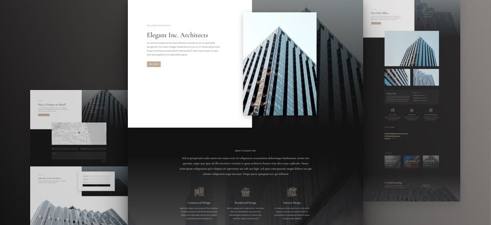
This week Kenny and his team have created an Architecture Firm Layout Pack with eight different layouts. The overall style of this layout pack is a combination of sobriety, mysteriousness, and elegance. Setting up a website using this layout pack is easy, fast and allows you to still modify everything according to your own website’s needs.

Landing Page Design

Home Page Design
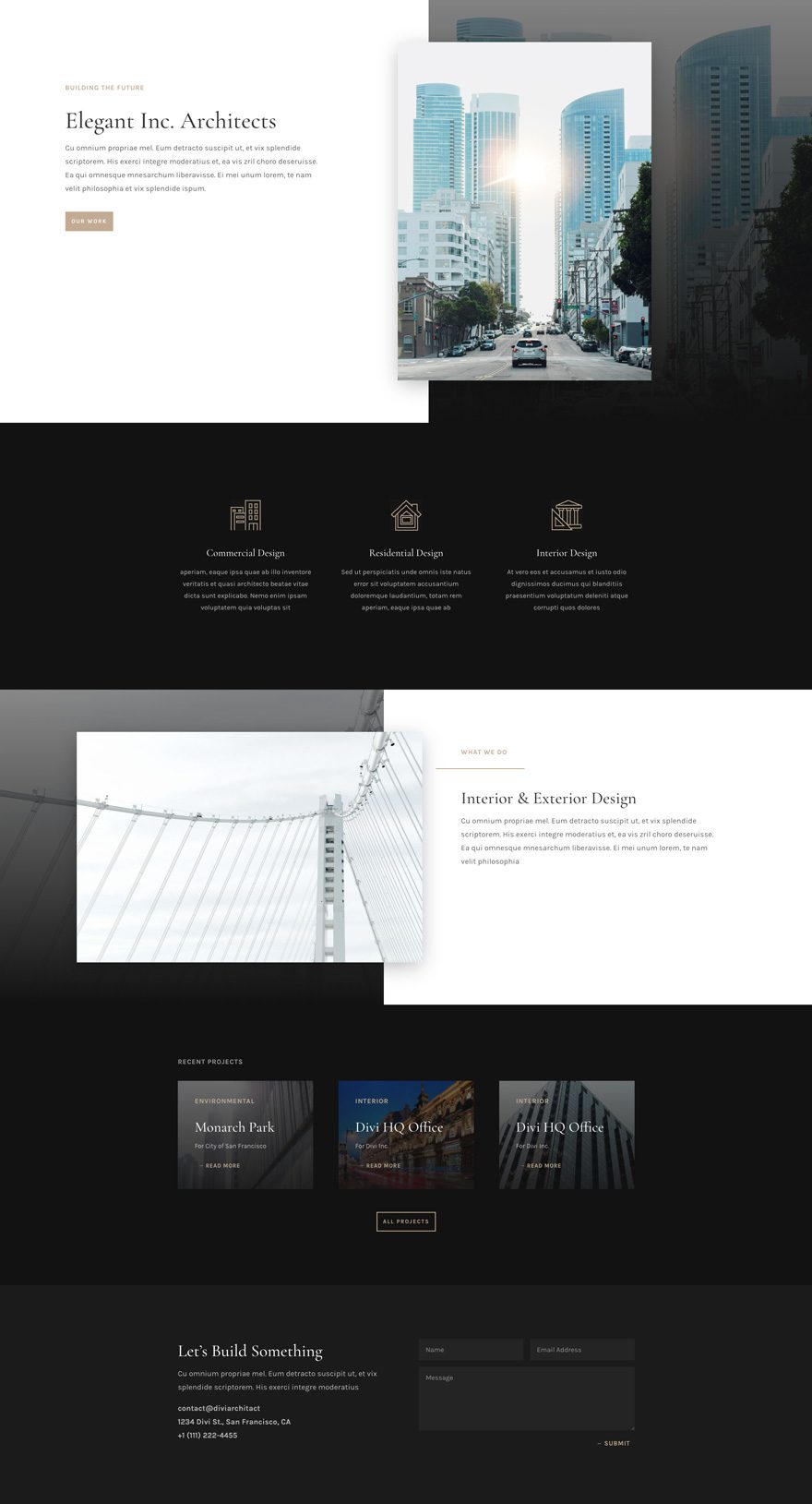
About Page Design
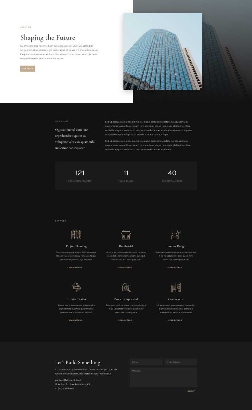
Contact Page Design
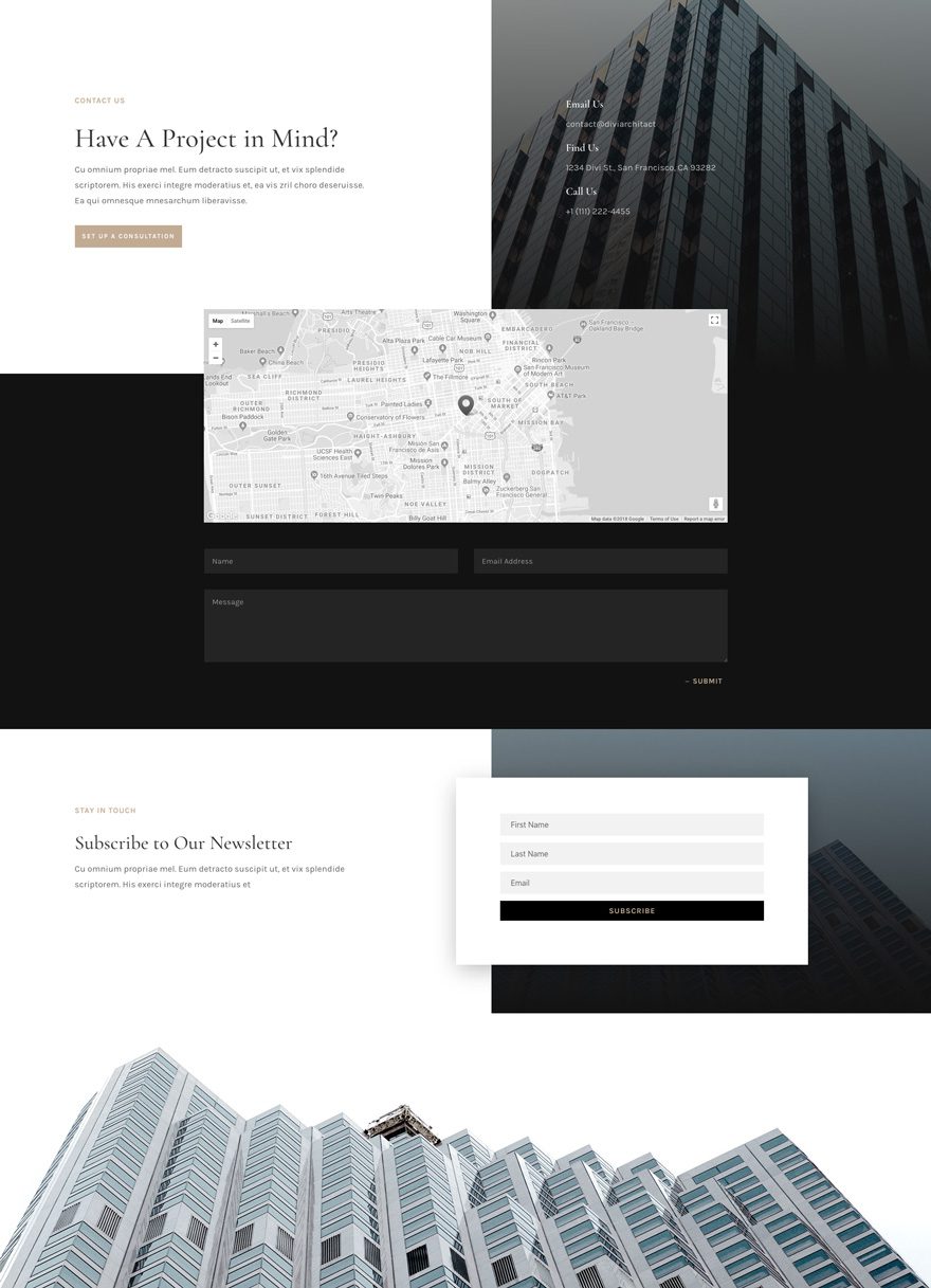
Portfolio Page Design
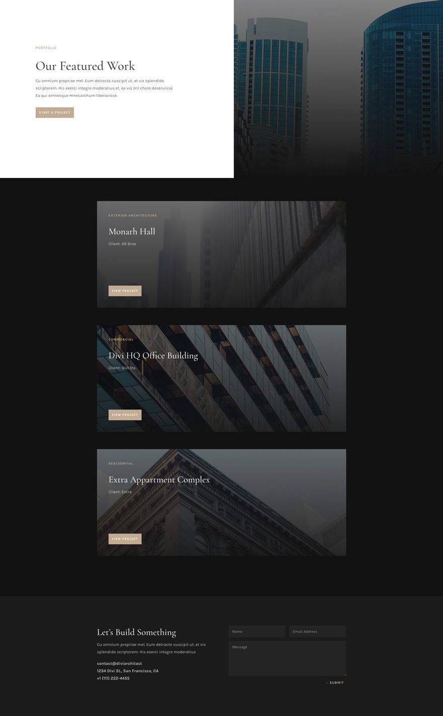
Project Page Design
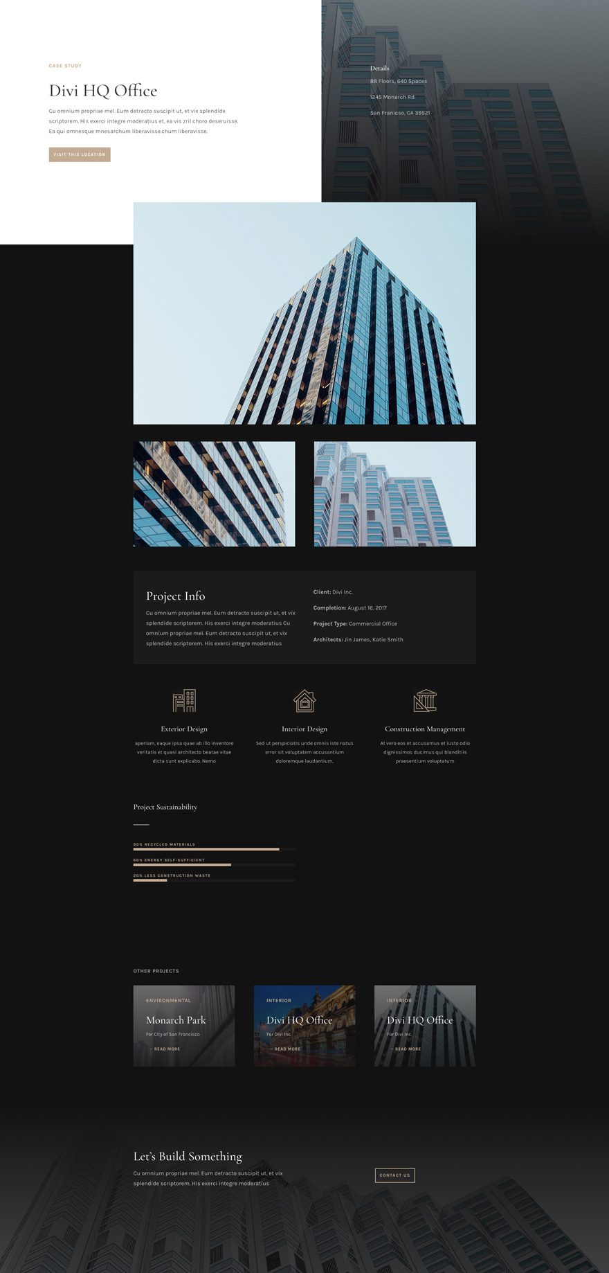
Services Page Design
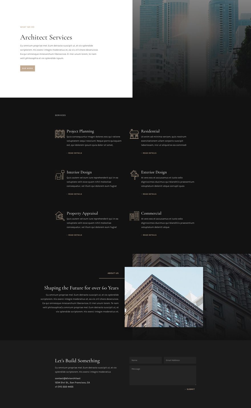
Team Page Design
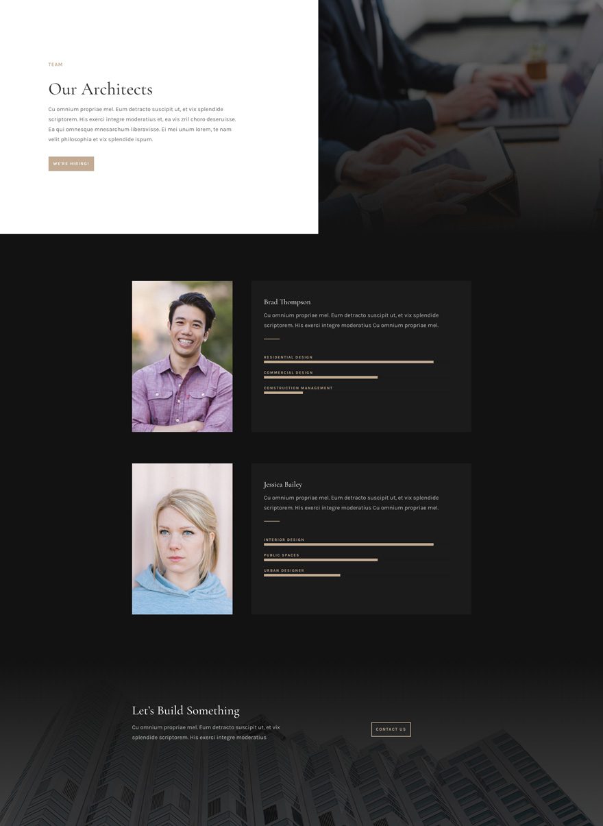
Key Features
The Architecture Firm Layout Pack’s design represents the architecture industry perfectly. There’s a seamless style combination of sobriety, mysteriousness, and elegance. And with free high-quality images within reach, your highly-professional and visually-appealing architecture firm website will be up and running in no time.
Live Demos
Click the links below to see a live demo for each of the layouts included in the pack.
- Architecture Firm Landing Page (live demo)
- Architecture Firm Homepage (live demo)
- Architecture Firm About Page (live demo)
- Architecture Firm Contact Page (live demo)
- Architecture Firm Portfolio Page (live demo)
- Architecture Firm Project Page (live demo)
- Architecture Firm Services Page (live demo)
- Architecture Firm Team Page (live demo)
Access This Layout Right Now
Directly from Your Divi Builder
Subscribe To Our Youtube Channel
Since Version 3.0.99 of Divi, you can find and import any of the layouts included in this pack (along with ALL of Divi’s Premade Layout packs) directly from the Divi Builder. They are already waiting for you.
To access your new layout, simply activate the Visual Builder when editing a page and look for the “Load From Library” icon in the page settings bar (it looks like a plus symbol). Click this icon to launch the Load From Library popup. Under the Premade Layouts tab, you can easily find the new layout by scrolling through the list of layout packs. Once you find the Architecture Firm Layout Pack, click on it. You will see all the individual layouts included in the pack. Select the layout you want for to use and then click the “Use This Layout” button.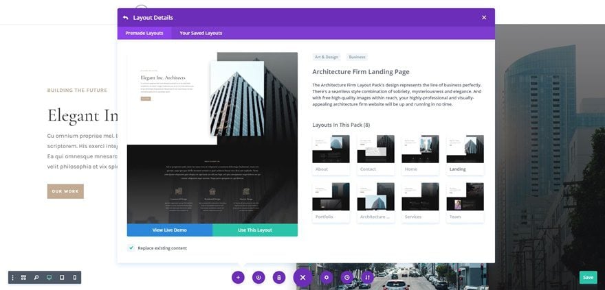
Authentication Required
Before you can download Premade Layouts from the Divi Library you must authenticate your Elegant Themes Subscription. If you have already activated updates for Divi under Divi > Theme Options > Updates, you have already authenticated your subscription and will have access to the layouts without a problem. If not, when you click to import a layout to your page, you will be prompted to enter your Elegant Themes Membership Username and API Key.
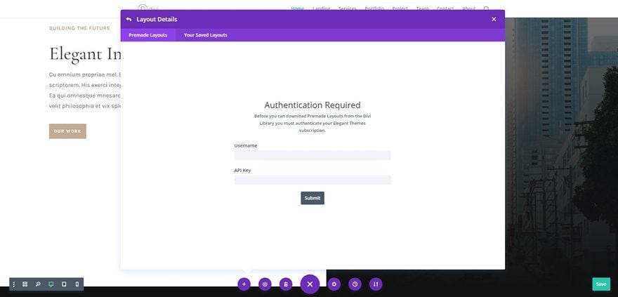
After you enter the Username and API Key, you will gain immediate access to the layouts. You can find your API Key under your members area on the Elegant Themes site.
No Licensing Restrictions
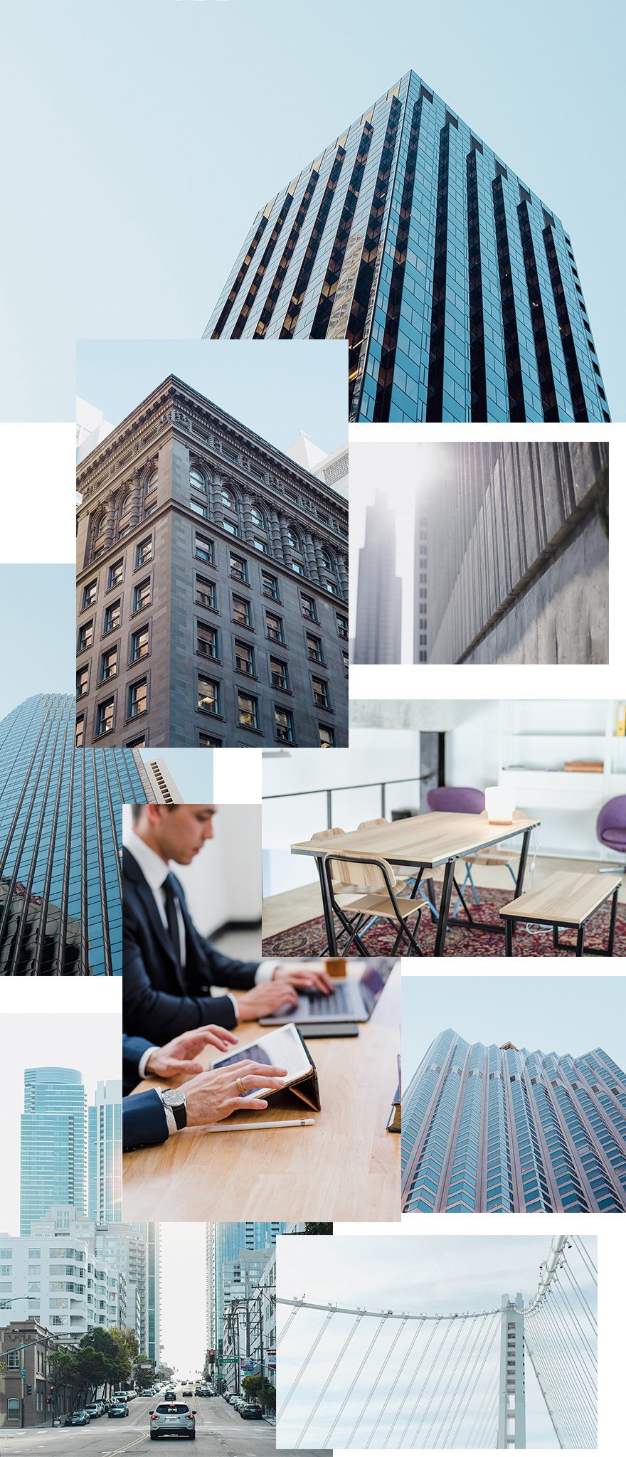
The photos included with these layouts have no licensing restrictions. This means you can use them in all of your commercial projects without having to worry about paying licensing fees or attributing the photographer. Use them in your commercial websites, sell them within your Divi child themes, include them in your own Divi layout packs or just use them on your blog. We know how challenging it can be to find good photos and how confusing and scary the licensing that governs those photos can be. We want to fix that problem for our users.
Download the Full Res Image Assets
But Wait…There’s More!
We hope you enjoy this layout pack. And to help ensure that you do, we’ll be doing a live stream on our Facebook page this Tuesday at 3pm EST to create a stunning process page using Divi’s Architecture Firm Layout Pack.
See you there!



Could we get the images used for the blogs also? Those look pretty sick too. Its missing in almost all layout packs.
Hi DIVI Layout Team
please stop producing redundant work!
1. the contact details need to get changed on every single page, which is the cause of mistakes which could get avoided by pulling all that data which occurs on every single page simply from a page in DIVI settings called “Contact Data” simply add a new Tab there and a form so it can be filled out with all necessary data so that the mail would be sending afterwards to the corrcet address, would contain the correct address on every page and besides that also would have all geodata present on all pages where the contact data appears if it will be needed there i.e. if a map shoulod get inserted.
All that job could be easily be done in 5 Minutes by filling out the form and for us here it took now nearly 30 Minutes to find all places where that data appears, to open up the forms, which will risk that design parts get deleted! and of course, we had to check every single page afterward again and correct certain errors.
2. As said already above I can only repeat what was already said, please use flexible and dynamical content parts instead of mockup parts which won’t work in any other custom setting which is not with your images.
3. I agree completely with TIM that on any landing page there needs to be a call to action button! That would be linked to the contact form which I just described above in point one!
Kind regards
Andi
One more addition we just realized. You have a newsletter sign up but that is not working with your newsletter plugin – why not? Simply get that functionality into the theme layout you provide especially as it also would help to promote your plugins!
If it’s working instantly then perhaps we missed something out and it would be nice to get a short tutorial on how to get it working. Thanks!
Andi
Thank you for the layout. I’ve noticed that the landing pages in these layouts are really just long home pages. Far too much content and no calls-to-action (except for the contact form in the footer).
It would be great to see some landing page layouts that are designed with the purpose of capturing leads or sales.
Another beautiful layout pack. Great job Donjete, great job Elegant Themes.
Let me be clear: I really appreciate your work and I’m a great fan of DIVI. But I’m not sure if this new trend of DIVI layouts is really functional. For example this one is not so impressive, nor “inspiring”. It works reasonable well with the stock images but that makes it really difficult to customise it with the real “architecture firm” projects, and anyway the final result probably would not be really good. Also for an architecture studio that should be supposed to have it’s own style and personality it would probably result in a very cheap, off the shelf template. I don’t know. I’m puzzled. I’m afraid that all this work would result in a huge collection of poor templates. I would have preferred lower frequency but more quality and most of all, more Inspiring Design. My 2 cents.
Massimo,
I agree with you, both on being a fan and being concerned about the direction of the layouts being offered.
My job as a designer is to learn my client’s wants and needs and then express them in a manner that represents their business and achieves their goals. What I’m seeing currently from ET is (no disrespect meant here) retreads of other designs and layouts using stock elements (yes, I know it’s original work but it’s STILL STOCK.
I would NEVER use one of these designs as is just because, well, that’s not what I should be doing. I’m not hawking beer or brats at the ball park: “Hey, get yer red-hot websites here!”
I’m afraid these designs are for folks who are trying to “churn out” product. Which results in look-alike sites. Yes, there are BILLIONS of sites in existence already, so what if a few look alike?. But, that’s not who I am as a designer for my clients. I don’t want avant garde, either. I want readable, functional sites that sell their products quickly and easily to people who want to buy them. Or who WILL want to buy them after they read the copy on the site, look at the pictures, and watch the videos.
Of COURSE I want to use good looking elements and concepts in my Divi designs and THAT’s what I need, not finished sites into which I just replace pictures and words and go out and be a salesman for the most recent Volvo.
So, for me, and perhaps for Massimo, what I’d prefer are new and clever design elements that are interchangeable and adjustable to use in MY designs. Show me how to BEST overlap images. Give me interesting headers and sections. And no, I don’t want 12″ of code to insert. That’s not why I use Divi. It does have to be basically done for me with only a few tweaks and adjustments here and there.
But most of all, I want elements to use on smartphones. I am seeing a de-evolution of design based on the limited physical characteristics of cell phones. All these wonderful desktop sites ET promotes and produces, turn into a scrolling stack of pictures and words on a phone, which I find boring and offensive. This is where Divi could REALLY shine, helping us to create good and interesting designs for those damn little handheld devices!
Just a point of information here. And yes, this is a hobby horse of min: Desktop designs exist in space. Smartphone designs exist in time. I can scan my eyes around the monitor on a desktop but I have to wait until the visuals move on a phone. It’s just like planners exist in space and cell phone apps exist in time. So designing desktop layouts is an exercise in functional art; designing smartphone layouts is an exercise in logistics and sequencing.
Since I HAVE TO design for the HH device, I want the best and easiest results I can get. Right now, Divi functions first as a desktop art machine and secondly as a poor dispenser of sequential information for handheld devices. (Why do I have to look at grayed-out desktop images in the Visual Builder as I scroll down while trying to adjust the spacing on the elements for my #$%^@ smartphone presentation?)
So thanks for all your work. But I don’t think it’s as valuable to us as you think it is.
I’m not leaving Divi and I promote it as often as I can. I just want to add my thoughts to Massimo’s and hope you all take this as an opportunity to really differentiate ET.
It just looks like a dark version of the 20 before it with buildings instead of people. I’m not really digging these premade layouts at all. There isn’t a lot of variance in them and they just overload the system with cookie cutter appearance. On the other hand, when you actually pay attention to what it is that ET is doing here, you will see that the search engines are being dominated and bombarded with posts like this making it virtually impossible to search for certain things if you are looking for a solution to any problem that exists within the Divi theme. Maybe that’s just my opinion, but it is completely provable as well. I personally like quality over quantity and I just don’t see that being achieved in these premade layouts.
Lovely. Any chance you guys will put together a few new layouts for Extra?
I was wondering which day these second ones would come out. NOTE: You might want to look over the template and the wording in the first 2 paragraphs now that it’s two per week. 🙂 Also, can you confirm the live stream will be on Tuesday? (just thinking since the one from Monday is always on Tuesday)
Beautiful, loving the daily posts showing what Divi can do. Looking forward to Divi’s future!