Hey Divi Nation! Thanks for joining us for the next installment of our weekly Divi Design Initiative; where each week, we give away brand new, free Layout Packs for Divi.
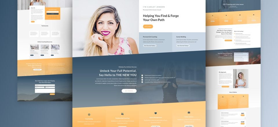
For the second layout pack of this week, Kenny and his team have created a professional Life Coach Layout Pack with 6 unique layouts. This layout pack is perfect for life coaches who want to create a website that allows them to connect with their potential clients.

Landing Page Design

Home Page Design
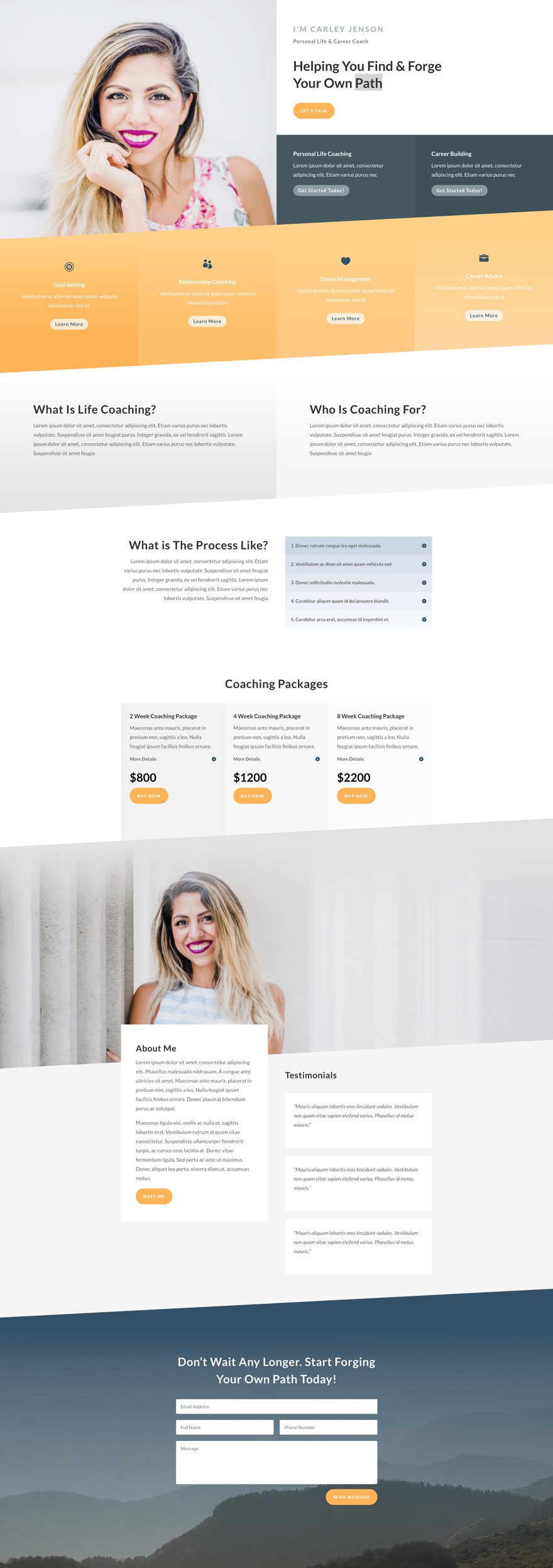
About Page Design
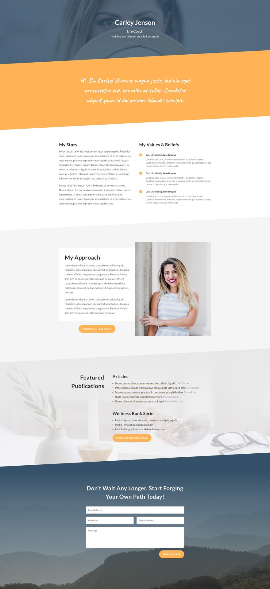
Blog Page Design
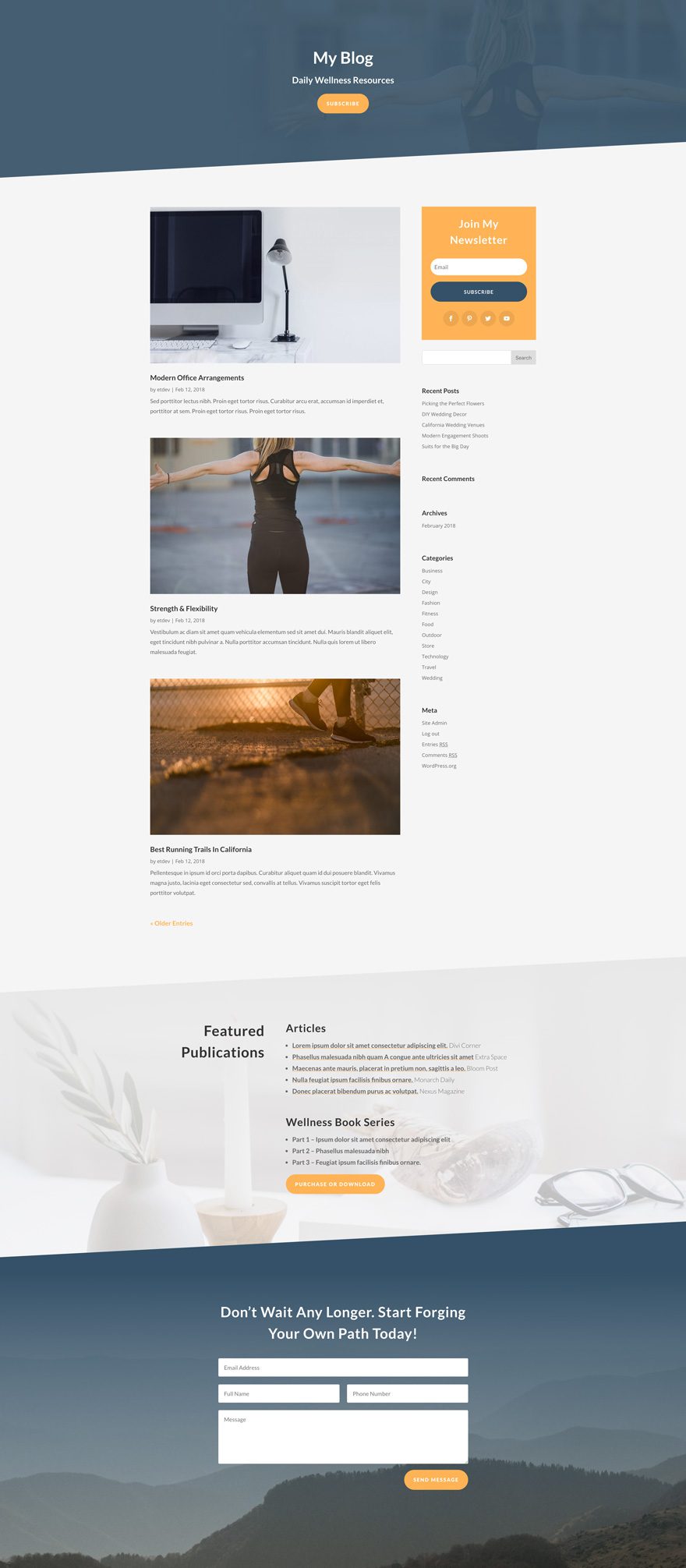
Contact Page Design
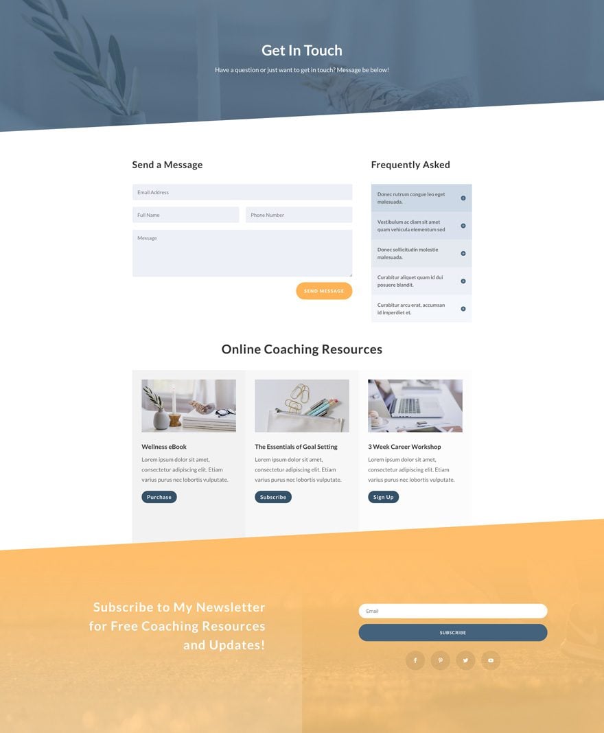
Coaching Page Design
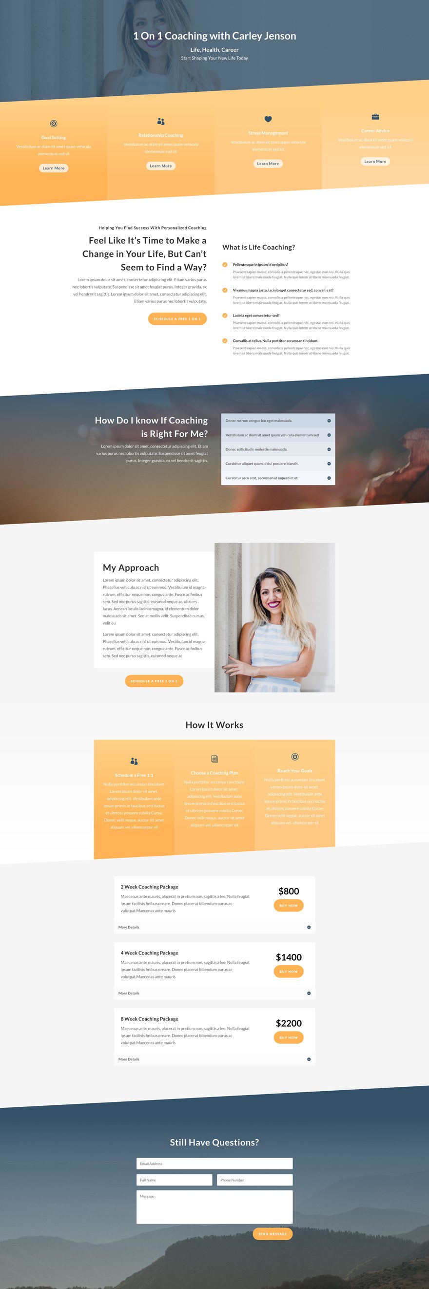
Key Features
The Life Coach Layout Pack contains 6 different layouts and everything you need to set up a website that empowers your business. The design elements in this layout pack are both professional and gorgeous. Within each one of the layouts, you can find a stunning diagonal structure that’ll amaze your visitors and prospects.
Live Demos
Click the links below to see a live demo for each of the layouts included in the pack.
- Life Coach Landing Page (live demo)
- Life Coach Homepage (live demo)
- Life Coach About Page (live demo)
- Life Coach Contact Page (live demo)
- Life Coach Blog Page (live demo)
- Life Coach Coaching Page (live demo)
Access This Layout Right Now
Directly from Your Divi Builder
Subscribe To Our Youtube Channel
Since Version 3.0.99 of Divi, you can find and import any of the layouts included in this pack (along with ALL of Divi’s Premade Layout packs) directly from the Divi Builder. They are already waiting for you.
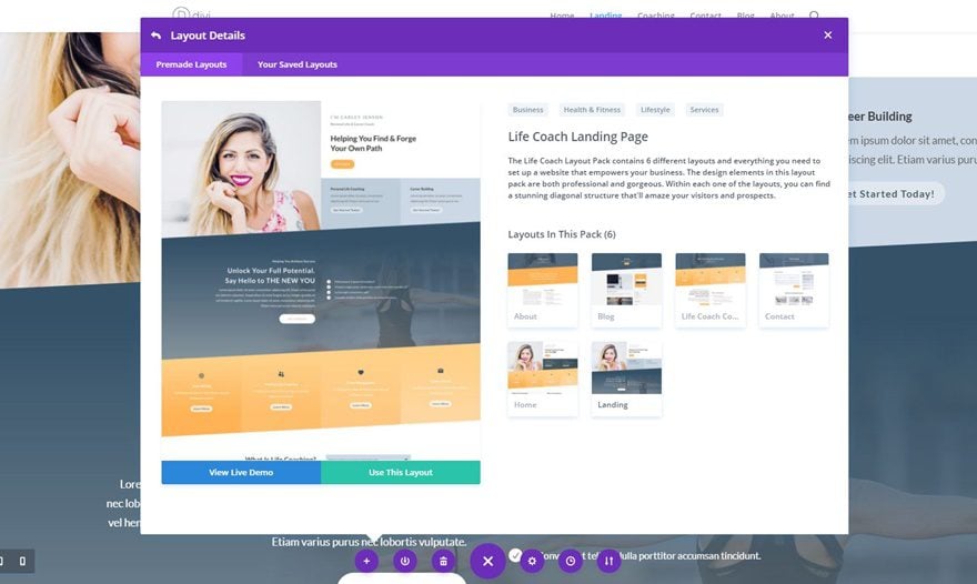
To access your new layout, simply activate the Visual Builder when editing a page and look for the “Load From Library” icon in the page settings bar (it looks like a plus symbol). Click this icon to launch the Load From Library popup. Under the Premade Layouts tab, you can easily find the new layout by scrolling through the list of layout packs. Once you find the Life Coach Layout Pack, click on it. You will see all the individual layouts included in the pack. Select the layout you want for to use and then click the “Use This Layout” button.
Authentication Required
Before you can download Premade Layouts from the Divi Library you must authenticate your Elegant Themes Subscription. If you have already activated updates for Divi under Divi > Theme Options > Updates, you have already authenticated your subscription and will have access to the layouts without a problem. If not, when you click to import a layout to your page, you will be prompted to enter your Elegant Themes Membership Username and API Key.
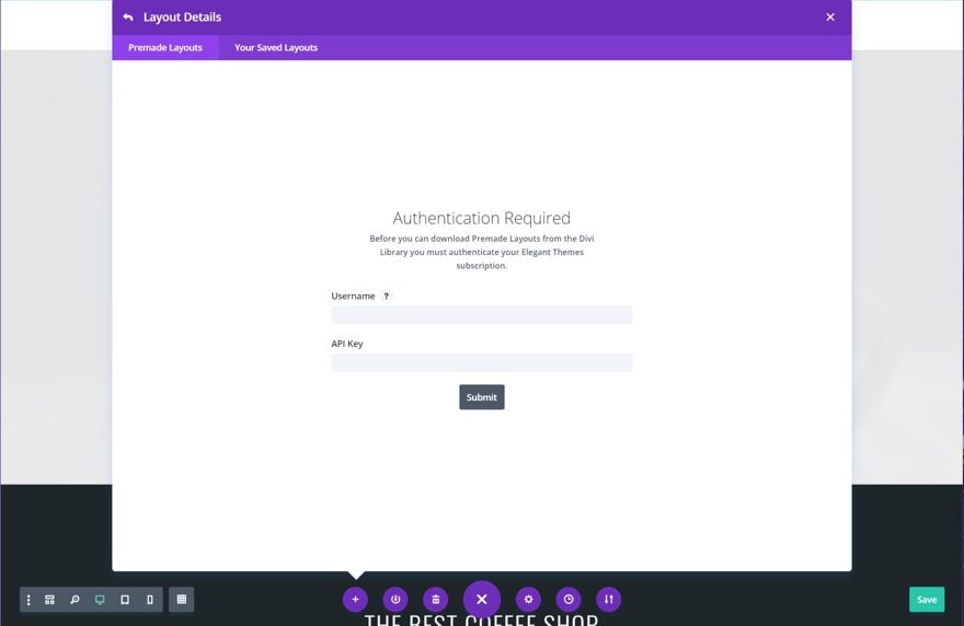
After you enter the Username and API Key, you will gain immediate access to the layouts. You can find your API Key under your members area on the Elegant Themes site.
No Licensing Restrictions
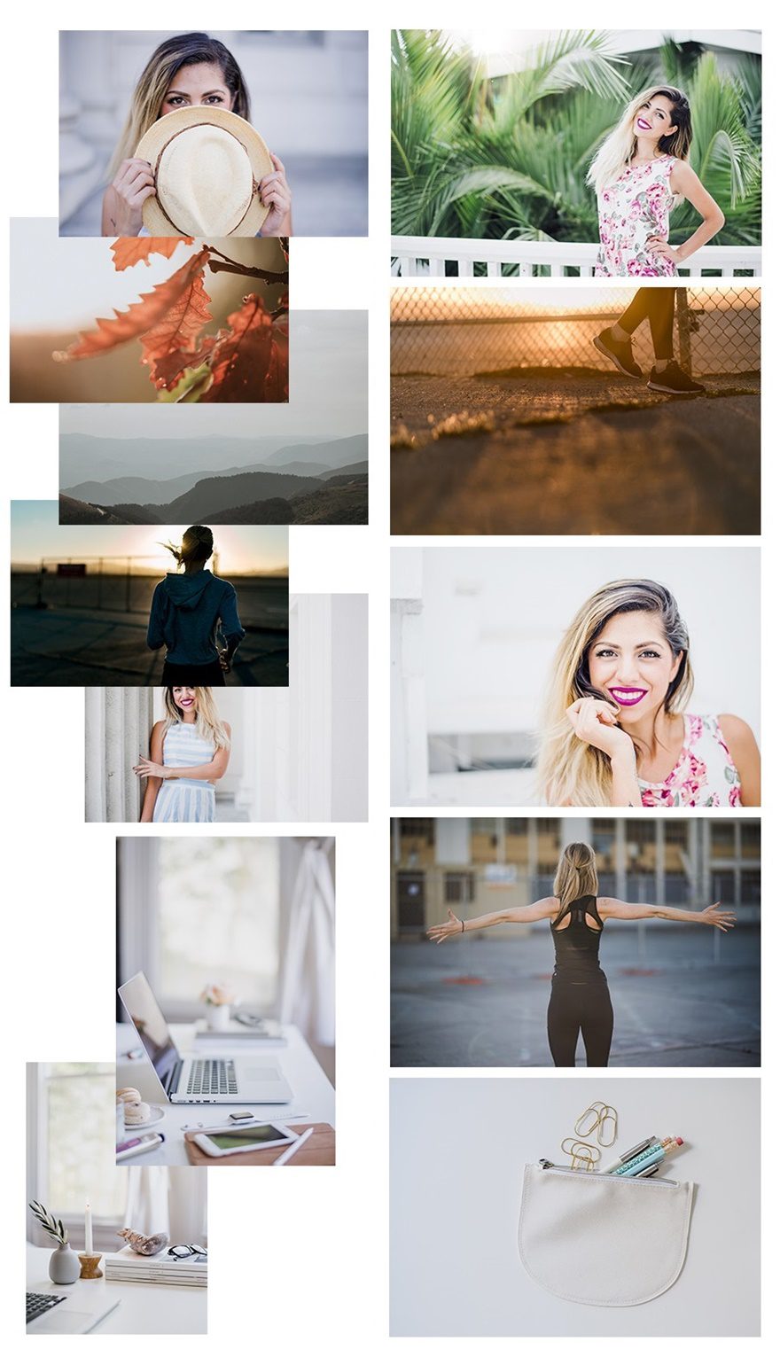
The photos included with these layouts have no licensing restrictions. This means you can use them in all of your commercial projects without having to worry about paying licensing fees or attributing the photographer. Use them in your commercial websites, sell them within your Divi child themes, include them in your own Divi layout packs or just use them on your blog. We know how challenging it can be to find good photos and how confusing and scary the licensing that governs those photos can be. We want to fix that problem for our users.
Download the Full Res Image Assets
New Layout Packs Every Week!
We hope you enjoy this layout pack. We look forward to hearing your opinions in the comment section below. Make sure you check out next week’s layout packs as well. We publish one on Monday and the other on Friday!



Hi,
Nice layout pack, facing some problems though –
Tried to delete a unnecessary section,
problem – the diagonals behave badly.
How to solve?
website under construction
Found it myself 🙂
this is an extremely interesting manual for this layout-pack.
https://www.elegantthemes.com/blog/divi-resources/how-to-recreate-elegant-themes-section-divider-examples-with-divi
I’m busy adapting the pages,
and solving the issues with the dividers <3
Newbie question, if anyone would be so kind as to point me in the right direction?
How do I change the colour of the “peach” coloured band? I’d love to get this to match my branding colour(s)
Especially with the blend/gradient effect as it seems each of the 4 text blocks are separate (as you’d expect) from each other and there some of the “band” outside of the columns. So, trying to apply a gradient (which I have worked out) is super hard to get the gradient stretching across the entire band.
I added the layout using the DIVI Building to a new page. However, the font, font color and some of the styling looks different than the demo. How can add layout same style settings? Or how can I get the style settings?
Like someone asked earlier, how do you change the images? Can’t find a way to replace the top image of the landing page. Thanks!
Edit your page in the back-end,
open the settings of the RED part (module)
in content / background / column 1
you will find the picture
What do you mean “in the back end”?
I just started building a new website. There was no content there yet. So tips from other people did not help.
I still have no idea how to replace the pictures with my own.
Best layout in a while! How do I make the header transparent and overlay the top image though?
Thanks for this, just what I was looking for!
This is awesome, but I don’t get the option to look at the premade layouts like in the video. Can you tell me how I can get those?
Nice, but we need better ones than this if you guys are able to.
Thanks
Beautiful design. But I really hope that Elegant Themes can solve the divider bug soon, causing lines below the dividers. It’s been around for months now.
This is how the live demo looks in Chrome on my Mac: https://imgur.com/a/snPLdb0
Hello,
Can it at all be possible to replace photos of the model with my personal photos?
I like this layout.
Hello,
I like this Coaching layout and I am considering using most of the layout packs to build my coaching website.
Question: Could I possibly replace the photos of the model with photos of myself?
Yes of course, you can customize anything about the layouts and swap out any or all of the photos that come with them.
Am I the only one here that find these templates boring? 90% of the “style” is achieved only with use of stock images, the first thing that should be changed, and that makes very difficult (if not impossible at all) to customise them. The overall look&feel is almost the same, with very few exceptions.
I mean they are good for amateur websites. But the WordPress repository is already full of free themes, I think people here is (should be) a little bit more “pro”.
I would really like to encourage the Elegantthemes staff to use DIVI in a more creative way.
Actually all these layouts don’t do a good job to show the versatility of DIVI.
Many many many years ago, when I joined Elegantthemes for the first time, I was amazed by the overall quality and originality of their themes. Long before DIVI. And DIVI has been a milestone and definitely changed the way I work today. Now think if the “themes” area of this site, were full only of these layouts…
That’s interesting. Subjectivity at play here.
While you may find this boring, I think ET is doing a great job with the resources they have via the builder. Especially with this one, there are a lot of subtle elements sprinkled throughout that differentiate itself from other page builders and other Divi design packs.
I also think they are using the builder to the maximum of its capabilities which is apparent when you try to recreate this exact layout with any other builder or even an older version of Divi.
Lastly, I’m fairly sure (100%) you don’t HAVE TO use these layouts if you find them boring.
I don’t know what you think are “pro” sites, but these layouts are way above average even compared to many websites built by “professionals.”
So… although I agree that ET (and designers in general) should always try to improve and push the limits of what they can do, but I wholeheartedly disagree with your sentiment on the overall level of design provided by ET.
It’s great that we have different opinions, huh?
PS. The “stock” images are.. a. supposed to BE stock, because it’s a demo layout, and b. come directly from ET so it’s not like the images are found on pexels or anything.
PPS. MY OPINION: I like what ET is doing with their layouts, and I think the layouts start off great in the proofing stage, but it’s really hard to take control of everything in the builder, and unfortunately, the responsiveness suffers due to the limitations of the builder. However, the desktop version looks great.
Hi, do you add those layouts to the “Premade layouts” inside Divi or do we have to search the blog and download them ?
Thanks for your answer
They are right there in your premed layouts in the Divi theme / plugin 🙂
This is one that will be immediately usable out of the box! Love that you switched out the persona as well… Pretty easy to do, but still better than using the same person images over and over. Couple of votes for future editions: Solar Installer, Music Instructor, Instagram Influencer & Webinar. Thanks again!
Hmmmmm this design is not sitting well with me. I give you guys two thumbs up for trying something different other than the normal design style…Keep up the great work ET Team!
Clearly I’m missing something. I like the layout but I’m having trouble figuring out which module the images are (the top one and the About Me one). I’ve tried opening up each of the modules and I don’t see any that are images.
Instead of loading it as new page, load it directly into your existing page.
Remember to UNCHECK the “Replace existing content” box in the lower left corner below the main image window of the layouts before you click on “Use this layout”.
Once done it will add the new page content below the existing content on your page. Now delete everything you don’t want and then drag the remaining section where you want it to go. You may have to adjust some setting to make it fit your layout but that’s about all. And don’t forget to delete all the images you don’t expect to use that went into your media gallery when you added the new page.
Looks good! But I noticed some glitchy horizontal lines that appear in the top section of the “Get In Touch” page of the demo when scrolling.
Three in a row that are actually pretty nice…good job ET!
Very nice design, colors match perfectly.
Question for my fellow Diviers,
If I want to use just a single section from this layout on a site which is already built, what’s the easiest work flow?
Say I want to use the About Me section only.
Right now, I create a new page, load the layout, then export the section, delete the page, then import the exported section into the desired page.
That seems too clunky. Is there a better way?
Chris
Hey Chris,
I hope this helps. If you want to use even one element of one page of a layout pack to an existing page, here’s what I do:
1. From the existing page editor, add the chosen layout pack page (say the About page).
2. The whole thing is added on your existing page after the last section you constructed.
3. Delete and/or rearrange sections as you like.
4. Modify new sections to fit.
Thank you! That helps a lot!
What I would do. Go to the page you’ve already built and click on “LOAD LAYOUT”. Choose the page from the layouts and add it to your existing page. This will add the about me page below everything currently on your page. Then delete everything you don’t want and then reposition the remaining section where you want it. You may have to adjust your Spacing etc depending on how you have it set when you added the new section.
NOTE: when you are adding content in this way where there is existing content REMEMBER to UNCHECK the box that says “Replace Existing Content”. It’s located in the lower left corner below the main window layout.
Remember too that when you added the About Us page it also added its related images to your Media gallery as well. I usually delete them if I don’t intend to use them.
Thank you! I did not realize I could load a layout without destroying what is there already.
I do wish we could access these layouts by section—but that’s not too important if ET would label the pieces. For the sake of basic development, each section should be labeled, right?
Hi
Can design some layaout for web hosting companies or cloud computing companies. For sale share hosting, domains, ssl certificates and any other related product and services.