Welcome to Day 95 of our Divi 100 Marathon. Keep tuning in for 100 days in a row of awesome Divi resources as we count down to the amazing release of Divi 3.0 on the final day of the series!
One of my favorite features in the Divi theme is layouts. Being able to import/export a whole page or just a single module makes a web designer’s job so much easier. In today’s post I am happy to share a layout I created that can be used for a small brick-and-mortar business.
A main purpose of a small business website is to provide general information about the business, showing their services, the location and contact details. The call to action is also very important. When people access your website the call to action will “guide” them to where your client needs them. For business without an online shop the main call to action will be to have customers contact them or to visit their premises.
In this layout, I have included 4 custom pages that can be used for most small business, giving them a good foundation for their online presence. You can easily expand the layouts by cloning rows or sections; giving you more services or additional testimonials for example.
Enjoy!
- 1 Downloading & Using the Free Small Business Divi Layout Pack by Olga Summerhayes
- 2 Subscribe To Download For Free
- 3 Download For Free
- 4 You have successfully subscribed. Please check your email address to confirm your subscription and get access to free weekly Divi layout packs!
- 5 The Small Business Divi Layout Pack by Olga Summerhayes
- 6 Tomorrow: Learn Five Fun New Ways to Style Divi’s Blurb Module
- 7 Divi 100 Day 95
- 8 The Countdown To Divi 3.0
Downloading & Using the Free Small Business Divi Layout Pack by Olga Summerhayes
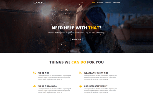
To use the Free Small Business Divi Layout Pack by Olga Summerhayes on your own Divi website you will first need to download it using the button below. Next, locate the file divi-100-small-business-layout-pack-by-olga-summerhayes.zip in your downloads folder and unzip it. Then, navigate in your WordPress admin to Divi > Divi Library and click the “Import & Export” button at the top of the page.
When the portability modal pops up go to the import tab. Click the “choose file” button and select the All.json file or any one of the individual layouts you would like. Then click the blue “Import Divi Builder Layout” button and wait for the import to complete.
Once the import has finished you will now have the ability to load your new Divi Small Business Layout(s) on any builder powered page by going to Load From Library > Add From Library.
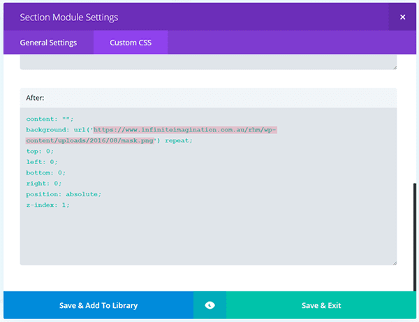
There is however, one additional thing you will need to do if you want to get your version to look exactly like mine. The background images in the hero sections of this layout pack have a textured overlay. The css code for this overlay is already added in the section. To activate it, all you need to do is the following:
Step 1: Locate the image file texture.png in your unzipped layout pack’s folder. Upload this file to your Media Library and then copy the image URL.
Step 2: Open the page with the hero section you’d like to add the textured overlay to. In the page builder open the Section Module Settings of that section and go to the Custom CSS tab. Scroll down to the field “After”. You will see the css code for the overlay already in there. All you have to do now is replace the URL I have in there with your texture image URL.
Subscribe To Download For Free
The Small Business Divi Layout Pack by Olga Summerhayes
This Small Business layout pack includes 4 pages: Home, Services, About and Contact. I have used the Construction industry as an example. You can modify this layout pack to suit different types of business simply by replacing images and text. To make this layout reflect your business branding you will need to replace the yellow coloured fonts and icons with your own brand colours and fonts etc.
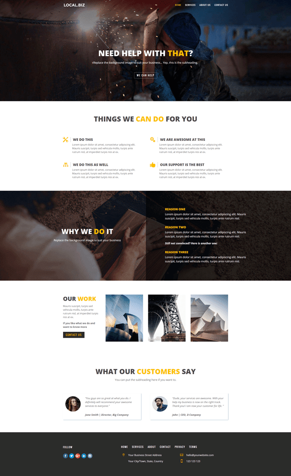
Divi Small Business Home Page
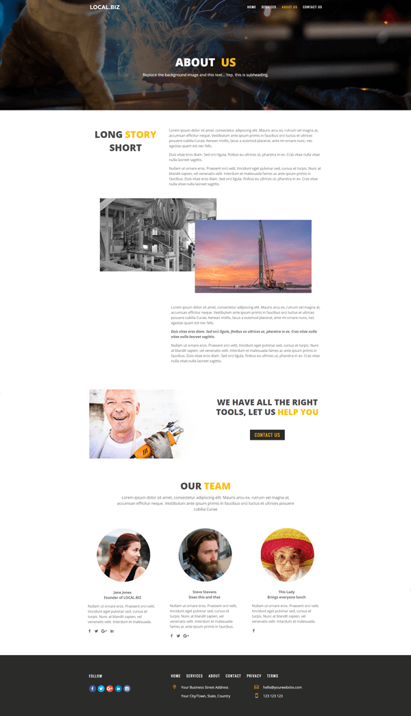
Divi Small Business About Page
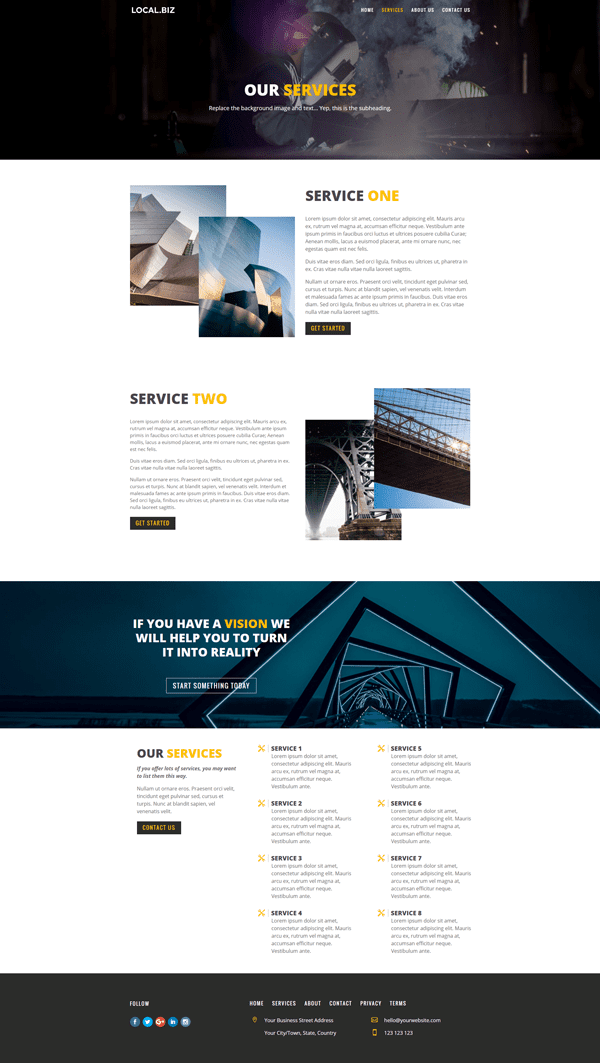
Divi Small Business Services Page
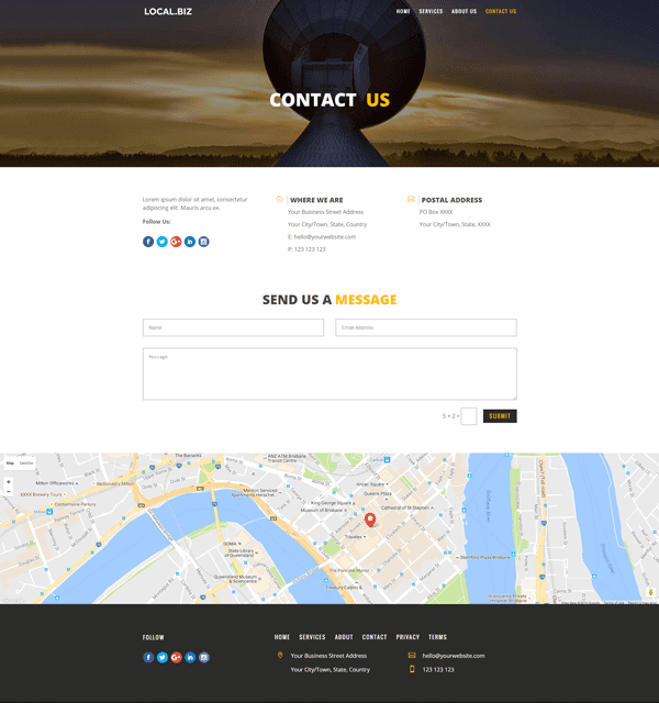
Divi Small Business Contact Page
To see the demo of this layout pack, click here.
Tomorrow: Learn Five Fun New Ways to Style Divi’s Blurb Module
In tomorrow’s post Josh Hall will be showing you five fun new ways to style Divi’s blurb module. This is a versatile module that you can use in a wide variety of instances. With this post you’ll be equipped to keep things interesting each time you do. See you there!
Be sure to subscribe to our email newsletter and YouTube channel so that you never miss a big announcement, useful tip, or Divi freebie!

Divi 100 Day 95
The Countdown To Divi 3.0
This post is part of our Divi 100 marathon. Follow along as we post free Divi resources for 100 days in a row! This 100-day countdown will end with the game-changing release of Divi 3.0, including our brand new visual editor built from the ground up using React. Divi 3.0 will change the way you build websites with the Divi Builder forever!
Let the countdown begin.



Does anyone know how to get the transparent overlay to work on the Hero section?
There seems to be something about the Hero section that is blocking the basic transparency from working.
The textured overlay puts diagonal lines over my Hero section, I’d rather a simple 50% opaque transparent black overlay instead.
Does anyone know how to achieve this?
Is a theme very clear and professional. I will used for my new website. Great Job Olga Thanks for share
Thanks for your great design!!! This is exact what i want. I am new in wordpress.
anybody can say me how do i link one section to another section, I mean when i click home or about then will show me this home or about section.
i can’t do it, anybody can help me please?
Hi everybody
This is a great layout, so good job to Olga.
I have however run into a minor issue. The texture overlay works perfectly once the layout is loaded, even though I haven’t uploaded the texture.png-file to my media library (which really isn’t a problem). But, I would like to apply a transparent overlay to the image/video in the hero section and I can’t get this to work in any way. Has anyone the same issue or a CSS to solve it.
Thanks in advance!
Did you figure out how to do this?
No matter what I try I can’t get a simple transparent overlay onto the Hero section.
Hi Olga,
I absolutely love your layout. Is it possible if I would like to add a blog page and a shop page?
Please advise.
Kind regards,
This is awesome. I ca use it for my client right?
Thanks Olga!
The menu you have in the footer is just text. Does Divi have a way of putting the menu there?
Thanks, Olga 🙂
I think I am doing something wrong. I am new to all this, but I was able to upload another page layouts just fine. I am uploading the All.json and then when I try and go to a page and upload it, they are not in the library, but the other layouts from the 100 are.
Am I just doing something wrong?
When they upload I see file s#1- #8
thank you for this awesome resource.
I’ve encountered a problem I’m not sure where its coming from.
All the buttons in the blurbs add the number “9” to the button label. The character isn’t in the button label field, but it always appears if there is a label.
any ideas?
also, all the icons available for the button (in the pop modal dialogue) have what appears to be extra characters. I think its related.
Emilio
I have the same problem, and I was able to get rid of it by turning off custom styles for button in Advanced Design Settings
Thanks for your reply Olga. Sorry, couldn’t get back to you sooner.
I’m still seeing the white background of the menu over the header images on my site and not the nice transparency of the menu you have accomplished. Could you have another look? Thanks.
Beautiful layout. Thank you!
There is one problem I have though. From the demo images I think the logo and nav are on top of the hero image. For me though the logo and nav is above the hero image on a white background (safari, firefox). Running Divi 3.0.5.
Anyone else has this problem?
Just saw the solution within the comment section. Please disregard my earlier comment. Great work, thank you!
This layout pack look awesome!
Sadly I am not able to import it because Divi tells me that “this shouldn’t be uploaded in this context”.
Any ideas to fix that?
Beautiful layout Olga. When I install your layout pack though, many of the images don’t display even thought I see them both in the media library and in the builder modules. They even appear when I’m viewing the page in the awesome new Visual Builder mode but disappear as soon as I exit that mode. Any ideas?
Great theme. Would be great if you had some blog templates for the theme also. Are there any plans for this?
This is awesome. Thank you so much for sharing!
Great post and your absolutely correct in your depiction of how difficult it is to find small business grant information online. I started researching small business grants over a year ago and in November 2012, I published an ebook on Amazon.com entitled, “Small Business Micro-Grants: Funding Start-Ups Unconventionally”. In this ebook, I discuss a number of small business grant programs and business competitions (with cash prizes). I’ve also discovered some other innovative grassroots funding options and I included these in the ebook as well.
Hi Jey. I am sorry to hear you are having some issues with this layout. I am not sure what is causing it, but my suggestion would be to clear the website and browser cache and see if it makes a difference.
Hi Olga,
Thanks! I’ve solved it. I succeeded with the new Divi 3.0 visual builder.
One question though. How can I change the word ‘submit’ on the contactpage in another language?
Hope you can help me out.
Thank you
Hi Jey.
Glad to hear you were able to fix it.
The contact form button should translate to your language when you change the site language in Settings > General > Site Language > choose your language > Save Changes.
Hi Olga,
It looks awesome! One question. I can not change anything on you ‘Services’ page. I’ve loaded it changed colour, nothing happens on the frond end. I even copied a module 3 times, but it isn’t shown.
Can you help me out?
Thanks in Advance!
Thanks, especially like the textured overlay. However, I can’t get that work on my test site. Replaced the mask.png with the link to the texture.png file like you explained but for some reason it’s not working. What am I doing wrong?
Hi Garret. When I click on your link I can see the textured overlay on your site over the background images. So I guess you already found the solution. If not, please email me and hopefully I will be able to help.
Are you planning on adding a restaurant menu as a module to the builder.
That would be really handy for restaurant websites.
Thanks
This is fantastic!!! image overlay that what I was looking for! THANK YOU!
the only think I changed is a use of overlay image.
Instead of uploaded image link I use online service image to base64.
for example http://www.dailycoding.com/Utils/Converter/ImageToBase64.aspx
This “stores” image in CSS. It will speedup page load. Because only CSS accessed no need to access image file.
(be ware in my example used different overly image)
content: “”;
background: url(data:image/png;base64,iVBORw0KGgoAAAANSUhEUgAAABQAAAAUCAMAAAC6V+0/AAAABlBMVEUAAAAAAAClZ7nPAAAAAnRSTlNThXrXtAAAAAASSURBVHgBY2DEArGCgVI5qhIAV/gAZQ+MArcAAAAASUVORK5CYII=) repeat;
top: 0;
left: 0;
bottom: 0;
right: 0;
position: absolute;
z-index: 1;
Beautiful layout.
Why when I implement it, the banner stays below the logo and not under like in the design you show?
Thanks
Hi Timna
I am glad you like the layout and using it. The navigation is not the part of the layout as it is set in the Theme Customizer and not in the page. You can get the navigation to look like the demo by applying these steps:
Go to Divi > Theme Customizer > Header & Navigation > Primary Menu Bar > Change the “Background Color” to rgba(0,0,0,0)
Then go to Divi > Theme Customizer > Fixed Navigation Settings > Change Primary Menu Background Colour to rgba(0,0,0,0.84).
Kind Regards.
Very Nice Layout Olga.
Great job done by you guys , really help full .
Big thanks to Olga!!
Question: How would I go about staging this in its own directory with it own logo and munus like you’ve done in your example?
Hi Michael.
You can get the navigation to look like the demo by applying these steps:
Go to Divi > Theme Customizer > Header & Navigation > Primary Menu Bar > Change the “Background Color” to rgba(0,0,0,0)
Then go to: Fixed Navigation Settings > Change Primary Menu Background Colour to rgba(0,0,0,0.84).
Hope it helps.
Hi to all, can`t see menu original, is include on the layout?, i do something wrong?, please a clue. Thanks to all.
Hi Francisco.
The navigation is not the part of the layout as it is set in the Theme Customizer and not in the page. You can get the navigation to look like the demo by applying these steps:
Go to Divi > Theme Customizer > Header & Navigation > Primary Menu Bar > Change the “Background Color” to rgba(0,0,0,0)
Then go to Divi > Theme Customizer > Fixed Navigation Settings > Change Primary Menu Background Colour to rgba(0,0,0,0.84).
I the demo I used the font “Oswald” and white font colour, but you can pick the one that suit you.
Hi all,
My customizer menu does not have a Header & Navigation option. It only has the following:
Active theme Divi child
Site Identity
Colours
Header Image
Background image
Menus
Widgets
Static front page
Please help
Excellent, thank you for sharing with this community.
Simple and effective!
Nice theme!
Thanks Olga
Thanks Olga, you have made a nice job. Hope I also can build using Divi. Have tested a couple of similar but Divi is maybe more easy to work with.
Great job Olga, this is a incredible layout!.
But i have a problem: how I can make transparent the menu?, I imported the invididual pages and I have no header styles.
Thank you very much again for your layout and your help.
Hi Jose. Thank you for your kind words.
The navigation is not the part of the layout but you can get it to look like the demo by applying these steps:
Go to Divi > Theme Customizer > Header & Navigation > Primary Menu Bar > Change the “Background Color” to rgba(0,0,0,0)
Then go to Divi > Theme Customizer > Header & Navigation > Fixed Navigation Settings > Change Primary Menu Background Colour to rgba(0,0,0,0.84).
In the demo I used the font “Oswald” and white font colour, you can pick the one that suit you.
Beautiful layout with the magical margin -60px~*
Hi Olga
Thanks so much for the pack…I really like how clean they look.
I’m new to Divi, but you made the starting point so much easier.
I have already put them to good use on one of mysites (plrgolf.com)
Thanks for making them available
Cheers
Steve
Thanks Olga, this pack is really nice.
We are a new Elegant Themes customer but we are really enjoying the blog posts such as these. Thanks!
Morning this is a great layout! Very useful for anyproject!
So beautiful Olga, very useful to a non techie. Thank you 🙂
Very nice, thank you!
Awesome!
Thank you very much Olga
Great Job @Olga !
Although it’s nothing complicated, can you also upload the Theme Customizer settings? Seems like this is an overlooked import feature that Divi offers 🙂
I second that. I must be missing something. When I imported the layouts, my header shows about the hero image and not within. Love the layouts!
Thank you so much, I was just looking for a small business design. One thing: my header does not show the hero image, but the other images (chrome, firefox).
@Gudrun
I’m also with this problem. But I broke my head and figured out how to do this.
To leave the menu with this transparent style, you simply select a color transparency in the Layout settings, and automatically when the Divi identify that there is a transparent color on header background it will remove the padding top.
To do this go to the Divi menu> Theme Customization> Header & Navigation.
This menu will have the Primary Menu Bar option.
Here you can define a completely transparent color in the Background Color option by moving the second column of color control for maximum transparency.
To make a color appear after you scroll down the page, you can go a previous level and access the Fixed Navigation Settings section and change the color for a semitransparent tone in Primary Menu Background Color option
This is the effect we have on the subject of demonstration.
Thanks, I have helped.
Wow thanks
You helped me solve this very same problem.
Awesome! Can you *please* do a tutorial on creating advanced Parallax effects?
Im having issues uploading this (the same as another free layout for testimonials)
Ive unzipped it, but when i click upload can only select one file (not the whole folder)
Ive tried uploading it to Divi zipped, but keep getting an upload error.
Im bought Divi 2, have current wordpress updates and am using Chrome as my browser
Any suggestions or help??
“When the portability modal pops up go to the import tab. Click the “choose file” button and select the All.json file or any one of the individual portfolio layouts you would like. Then click the blue “Import Divi Builder Layout” button and wait for the import to complete.”
Bree, you can import each page layout individually, or select all.jason. That will import all layouts in one swoop.
Hi Bree. You can only import one .json file at a time. The file with the name “Small Business Layout – All.json” – contains all four page layouts in one file. So if you upload that one file, you already will have the whole layout pack installed on your website. The other files contain one page layout each. For example file “Small Business Layout – Home.json” – only contains Home page layout.
Good job my friend!
Really nice layouts that compliment each other.
I love the use of the png overlay to add a texture. I also really like the behaviour of the overlapping images on the Services page.
I’m going to take a peek now at how you do this and yet still make them behave on a smaller viewport! 😉
Keep up the good work.
Now…. back to my own template creation, it might be ready for Divi 4.0 !………
JA
Oh great! I can’t wait for Divi 4 to see your creation 🙂
Beautiful, simple and professional layout can use in all kind of biz. Thanks Olga
A question here, offtopic. Anyone could help me or tell me how could I put a video inside a computer/phone/tablet Image?
Really like it. Thanks for the great quality work.
Here we are at the last few days of a great series of new tools for this terrific Theme. Now a request for another time: What about an author website. It could cover fiction, non-fiction and articles. I’m particularly interested in a way to give someone who give me their email address, a chapter or two of a book. Their book of choice. Do you have any ideas on how to do that?
This is amazing. Thank you very much. Please keep the posts/layouts like these coming!
Great stuff, Olga. I think you did a very good job setting your design apart from the square look and feel we see so frequently around here. Nicely showcases Divi’s versatility. And yours, of course.
Nice work, Sharing is caring 🙂
One thing..! If layout had partial URL instead of Full then there may be no need to change that. Just upload folder need to be taken care of.
-V
fantastic , love it! would it be a tricky thing to replace the subheader pictures at the top with a looping video?
Within row module you can upload MP4 video as a background, remove that image from there and you are done 🙂
-V
nice layout..
These layouts are really awesome! Very clean – the info is immediately available. Me likies! Thanks!
Nicely Done! Thank you Olga!!
VEry well made. Great share, always appreciated.
Awesome Layout
Thx Olga
Very nice work indeed, this is simple, elegant and functional.
Learned a new trick too – using the after custom css to apply overlays. Cool.
Interested to reverse engineer this one to better understand how she’s injecting the span tags to utilize two diff colours in module titles.
The design on this is outstanding!! Great job Olga!!
Thanks, that means a lot coming from someone with your skills.
Absolutely awesone!
Thanks Olga
Hello! Thank you for this design!
There is a typo on the pixabay.com (it’s written pixablay) reference: “All photos courtesy of the generous authors on Unsplash.com and Pixablay.com”
Cheers,
Gustavo.
Perfect timing Olga – was just looking for something like this. Very nice layout – simple, clean, and to the point. Perfect for my contracting clients. Thanks again for your contribution – greatly appreciated.
Cheers!
Cool. I’m glad you can use it straight away.
Wow. This is a beautiful layout pack Olga. Keep up the great work and thank you for sharing it with the community 🙂
I’m glad you like it. Thanks for your kind words Geno.
Wonderful layout pack. Thank you for generously sharing your beautiful design with us! 🙂
Absolutely awesome! And with the new front end editor less than a week away this layout will become a VERY useful asset. Thank you for sharing.
Agreed! This will be very smooth to customize with the new editor.
Great gift from you there, Olga. Thanks a bunch!
Impressive design Olga, great use of colors in the text.
Awesome layout!! Thanks a bunch.
Great job Olga, thank you.
Awesome! Thanks!
Absolutely beautiful layouts Olga… thank you so much for sharing!!! Clean and very easy on the eyes… gorgeous! 😉
That is so nice to hear. Thank you Janet.
Same bug than on other layouts, they are not working properly on Firefox.
Section “Why we do it” :
http://imgur.com/a/vb4e8
Thank you Guilamu for pointing out the issue, and thanks Mario for finding good solution for this. To fix the padding issue on Firefox for “Why we do it” section open the Row Module Settings > Advanced Design Settings > Scroll down to “Column 2 padding” and change the padding values for desktop: top padding to 9vh and bottom padding to 9vh. This should fix it.
I just encountered this problem using your layout. Thanks for the fix.
guilamu
go to the section and if there is a value in the top & bottom margin with a % sign change it to vh this will make it work
I had this same issue and the below link answers the question
http://stackoverflow.com/questions/33502702/flex-elements-ignore-percent-padding-in-firefox
The is present is all of the layouts that come out which use split screen I feel and it was Andrei Nahaev from ET support that sorted it out for me
Beware that vertical % padding is based on element width. 5vw maybe?
Thanks for this solution Mario. And thanks for thoughtful layouts Olga & ET.
People still use Firefox? Who knew…..
…the delicate sarcasm of someone not using a particular browser anymore – how very interesting… also – good for you that you managed to download and install chrome! Cheers 🙂
As designers/developers shouldn’t we all be testing our sites in all relevant browsers? As far as I know Firefox still has 15% use as of Jan 2016. I know I wouldn’t like to “chase away” 15% of my visitors just because of my personal preference for a particular browser.
Mario, thanks for pointing out the fix!
I build in Firefox as a rule. At least testing Chrome and Safari usually goes without a problem.
Nice job Olga! Wonderful gift to the Divi community. #FirstClass
Thanks Olga, this looks amazing! Thanks for sharing…
Great job Olga, this is a fantastic layout!
Thank you very much David.
Thank you for sharing and for the work you put in to make this pack. Appreciated by all!
Ed
Brilliant work, thanks Olga
Trust Olga! this is professional business layout. Looks clean, modern and easy to understand. Bravo. Thanks a million!
Divi Framework takes the lead this year!
Thanks a lot bb.
Fantastic!! Definitely getting this pack. Thank you.
Thanks alot Olga, very generous of you to do this.
You are welcome El Ames. I hope you find them useful.
The quality of images on Unsplash is amazing. Not sure to understand what’s the goal of all these new free images sites but it’s good for us.
I think the whole idea is to create enough traffic so that one day… one of the “big guys” like istockphoto or adobe (are they all one now?) buys them out so they can be their own competition. I think that’s how it works.
Not sure about that Janet. Unsplash was a “small project” created by Crew. Unsplash is used as a driving force to generate traffic to Crew.co which is where they make their profit.
Thanks Olga! These are beautiful layouts. I can’t wIt to use them ?.
Thank you Tammy.
Very nice design. Thanks for sharing
Nice!
Finally something not tech related, would be nice to have more basic business layouts to use/give some inspiration.
Thanks
Nicely done! 🙂
Wow! This layout looks so good
Thanks Olga 🙂
Thanks Chathura. I’m glad you like it.
Very very nice!!!