In today’s tutorial, we’re going to share some tips on how to design a good hero image/section. The tips that will be shared can help you create effective hero sections for your own website or a client’s website.
In general, there are a lot of different ways to style a hero image and the way you style it usually depends on what the website is about. That’s why we’ll handle some general design tips that apply to all kinds of websites and which everyone should know.
After having a look at the different tips, we’re also going to share an example hero section that lives up to the tips and we’ll show you how to recreate this example with Divi as your website builder.
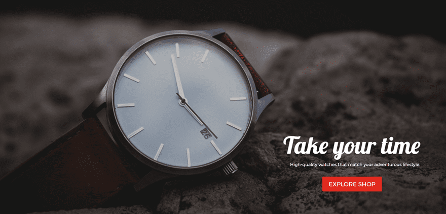
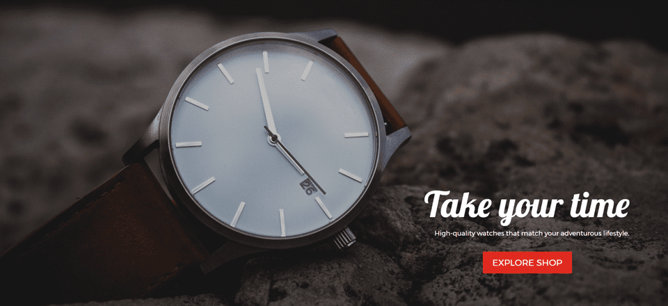
The example we’ll be showing you how to make, step by step, looks like this:
Choosing The Right Image
When designing a website, and a hero image in particular, it’s all about going back to the basics. You should take into account that the hero section will be the first thing people will see and experience when they’re visiting your website. It’ll influence their behavior and determine what feelings they link to your website.
Relevancy
To start off, find an image that is in line with what your website is about. It’s the first thing they’ll see on your website and associate your website with.
To find relevancy ask yourself two questions:
- What main added value does my product/service/website offer?
- What kind of image reflects that added value?
It always comes down to what your visitors would like to see and how easily they can understand the whole picture. People tend to visualize everything; even a company or business. That’s why you should be the one that gives them a relevant hero image from the beginning of their stay.
Some of the most common hero images styles base themselves on one (or more) of the following things:
- Product (showcasing a product as an image)
- Context (showcasing an image that tells a story along with the content provided)
- Emotion (using emotional triggers, such as people who smile)
- Action (using an image that expresses a certain action linked to what your website is about)
Choose one of these focuses and try to tell the message in the best and most creative way possible. Look if you can find free images that are relevant enough, and if not, buy stock photos or try making your own.
The more company-related your hero image is, the better. That’s why making your own images in a professional way is usually the most recommendable thing to do. But in cases where resources lack, stock images or free images can also be sufficient.
High-Quality
Another factor that is really important in making the right choice for your hero image is the quality. It’s self-obvious, but you’d be surprised to see how many websites do not live up to it.
You want it to look as professional as possible because you want that quality to be associated with the services or products you represent on your website.
We recommend using an image with a minimum width of 1920px, as mentioned in our ultimate guide to using images within Divi.
Consider Fullscreen Mode
Using the hero image in a hero section that is in fullscreen mode is also frequently used. By making your hero section fullscreen, you have the opportunity to engage with your audience on a more profound level. You’re putting more focus on what’s being provided in the hero section so it should really be worth it.
If you’re considering making a fullscreen hero section, make sure it’s the best part of your website since it’ll be the part of your website where you get the most interaction. By engaging with them in an early stage of their visit, you increase the chances of interacting with them throughout the rest of the website. Likewise, if a fullscreen hero section isn’t worth it, it can discourage people to continue their stay on your website.
To Center or Not to Center

Most people can agree on the fact that symmetry is very appealing to the eye. Yet, we see it so much around the web that we might not think of it as special anymore. You can do a lot of beautiful things even when you don’t center.
But, if you don’t want to take the risk, you can always fall back on centering all the content you’re creating for your hero section, including making the hero image symmetric.
Create Contrast

The hero image usually contains three things: the image itself, the content and the CTA. You want each one of them to play their own role in the experience each visitor has so they need to have a sense of harmony between them. That’s why it’s important to create a certain balance with the use of colors. Adding a color or gradient overlay to the image usually does the job.
Since the new background design options became available with the Divi builder, creating contrast has become really easy. You can play around with the colors that are being used in your background image to create the best possible color and contrast combination for your hero section but we’ll get back to that when we’re recreating the hero section below.
Try a Video Background Instead
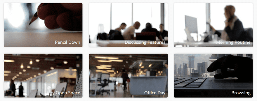
If you would like to give that extra life to your website, you can also consider using a video instead of an image. When choosing a video for the hero section, the same tips as for images apply.
You can find different videos online that may match the website you’re creating, or you can create your own. Coverr is a website that provides videos that can be used for hero sections in particular. They provide their audience with different types of short videos that are excellent for building websites without a lot of resources.
They upload 7 new videos every Monday and the videos they share are free to use–even for commercial purposes.
CTA That Makes a Difference
A great hero image and section always end up having a purpose. That purpose is most commonly an interaction between the visitor and person or company behind the website. You want to get to know your visitors and hopefully; turn them into a loyal visitor or a lead.
To make sure you actually reach that goal and fulfill the purpose, a good CTA may come in handy. When designing a CTA, there are also things to take into account. You want to increase the effectiveness of your CTA and make sure the hero image delivers the results it was intended to deliver.
When designing a CTA, take the following things into account:
- Make sure the CTA is one of the first things people notice (through color and contrast)
- Think through the CTA copy you’re using. You want it to be persuasive
- Make sure that what follows after clicking on the CTA is worth it (give added value to get results)
Let’s Start Creating (Desktop)

Now that we’ve gone over the general tips regarding hero images, it’s time to put it into practice. The example we made is product-oriented, but we included other factors as well (such as context).
We made sure there is enough contrast, a good CTA, a high-quality image and although we used a standard section instead of a fullwidth section, we manually adjusted the Spacing subcategories to make sure the hero section appears to be fullscreen on desktops.
Choose a Section
Choose between a fullwidth section or a regular section. Because the standard section is more flexible, we’re going to choose for a standard section and turn it into a hero section that matches our needs.
Background Options
The image that will be represented in our hero section is a product, but we’ve also made use of context and emotion. You can see that the environment in which the picture was taken can be related to adventure. We’re also using emotion through the content provided in the hero image.
You’re telling people to ‘take their time’ while living their adventurous lifestyle. You’re also telling them it’s okay to pursue the things they want most in life and that this certain watch is the ideal final touch for this journey.
The image used in this example comes from Unsplash. Choose whatever image you want to use as a background image and open the settings of the section you’re working on. Within the Content tab, you’ll find the Background Subcategory. Start by adding the background image.
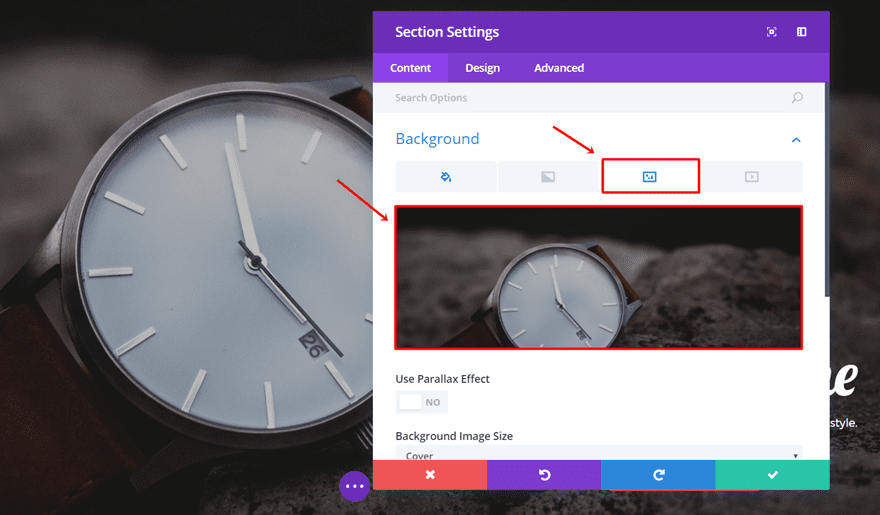
Next, we want to put a color overlay on the image we’re using. This goes back to the ‘Create Contrast’ tip we discussed above. We’ll add a certain darkness to the image to create a better balance with the Text Modules and Button Module we’ll be using.
In most cases, a gray overlay color is used. It’s the most standard color to use as an overlay which will not change the image’s colors all that much. The color code we’ve used is ‘#BFBFBF’.
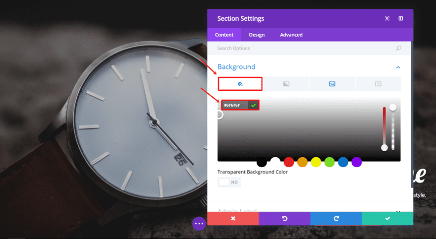
Next, go back to the background image and apply Background Image Blend. In this case, we’ll use ‘Multiply’. Change the Background Image Position to ‘Top Left’ as well.
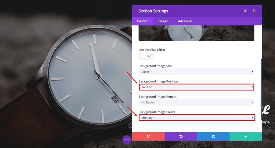
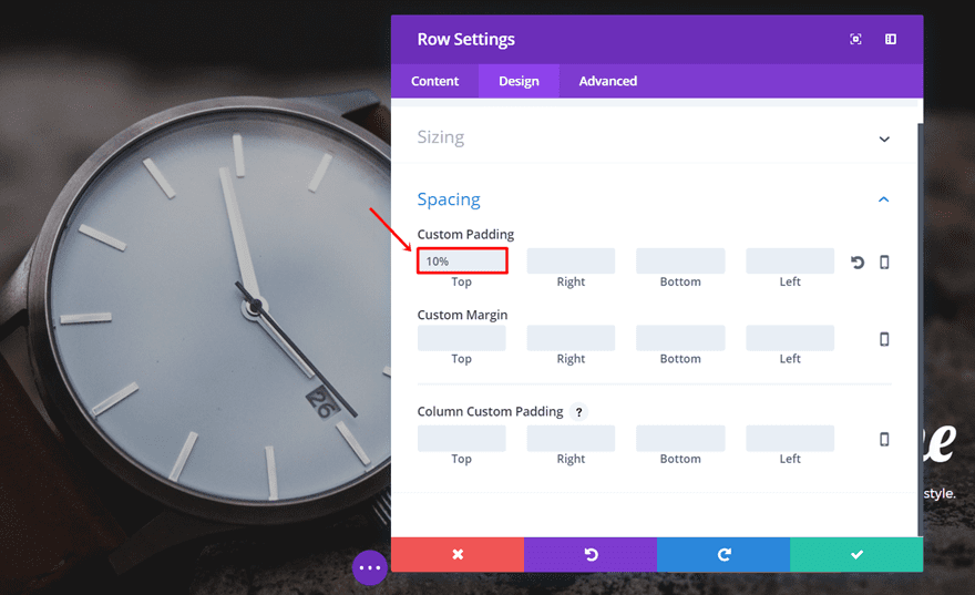
Row Settings
Moving on, we’re going to add a fullwidth row to the section we’ve created. Open the settings and add ‘10%’ to the top padding in the Spacing subcategory of the Design tab.
Next, go to the Advanced tab and disable the row for phone and tablet in the Visibility subcategory.
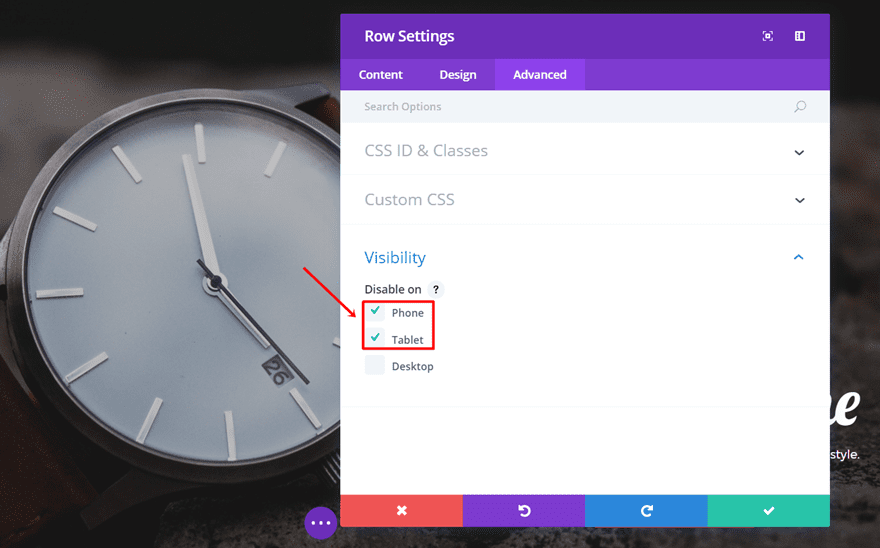
First Text Module
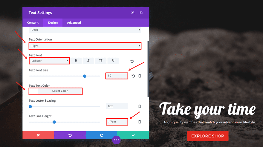
After that, we’re going to add the first Text Module. Open the settings and type down the title you want to use in the content box within the Content tab. Move on to the Design tab and make the following modifications to the Text subcategory:
- Text Orientation: Right
- Text Font: Lobster
- Text Font Size: 80
- Text Font Color: #FFFFFF
- Text Line Height: 1.7em
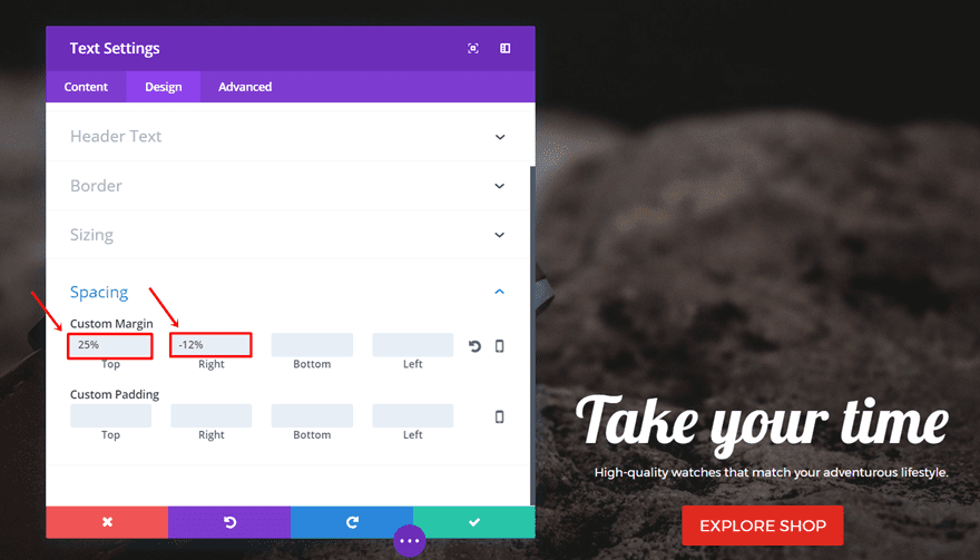
Scroll down the same tab, add ‘25%’ to the Top Margin and ‘-12%’ to the Right Margin in the Spacing subcategory.
Second Text Module
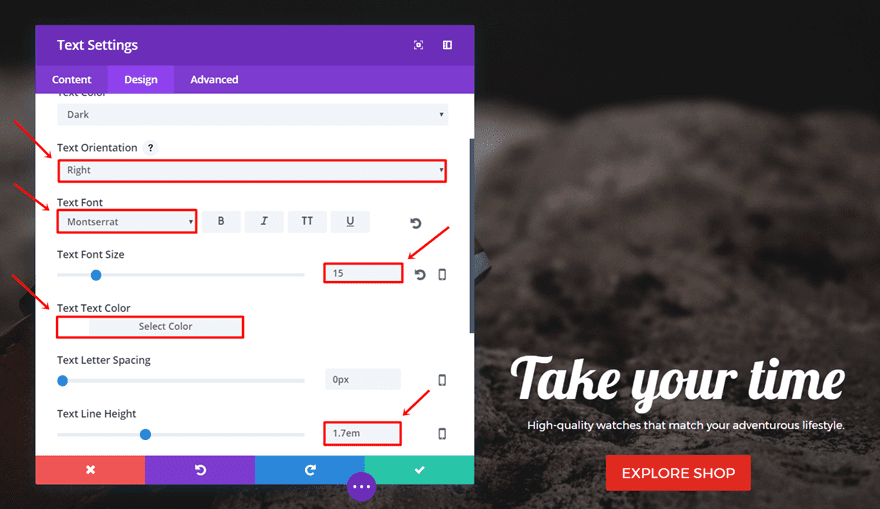
Add another Text Module, type down the text in the content box and go to the Design tab. In the Text subcategory, apply the following changes:
- Text Orientation: Right
- Text Font: Montserrat
- Text Font Size: 15
- Text Font Color: #FFFFFF
- Text Line Height: 1.7em
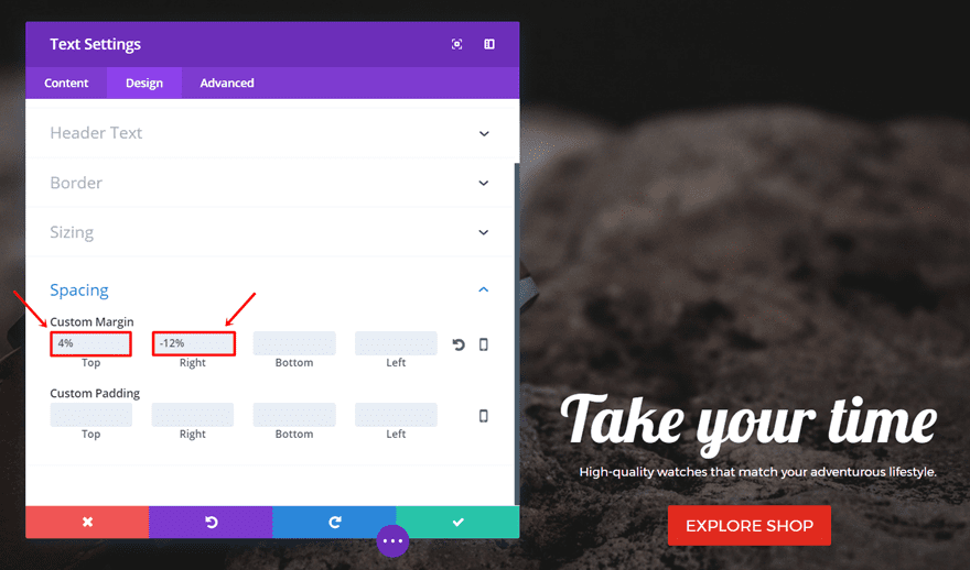
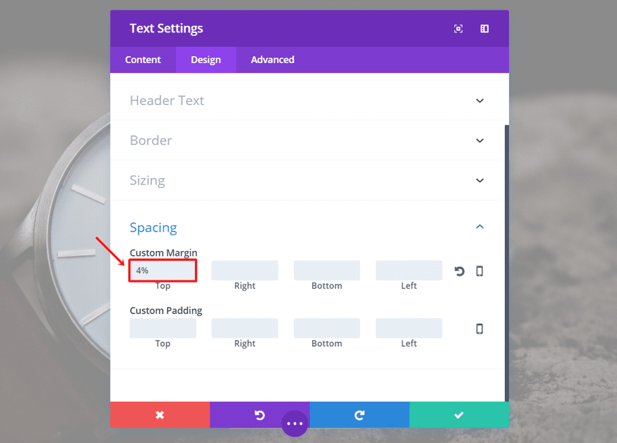
Scroll down the same tab and add ‘4%’ to the Top Margin and ‘-12%’ to the Right Margin in the Spacing subcategory.
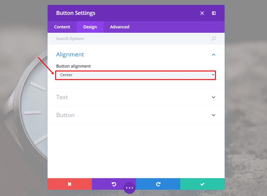
Continue by adding a Button Module and typing down the button text. Next, go to the Design tab and change the Button Alignment to ‘Right’.
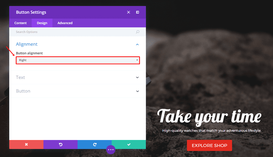
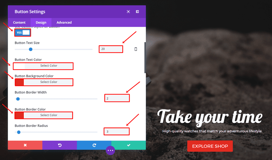
Scroll down the same tab and make the following modifications to the Button subcategory:
- Use Custom Styles For Button: Yes
- Button Text Size: 20
- Button Text Color: #FFFFFF
- Button Background Color: #E02B20
- Button Border Width: 2
- Button Border Color: #E02B20
- Button Border Radius: 3
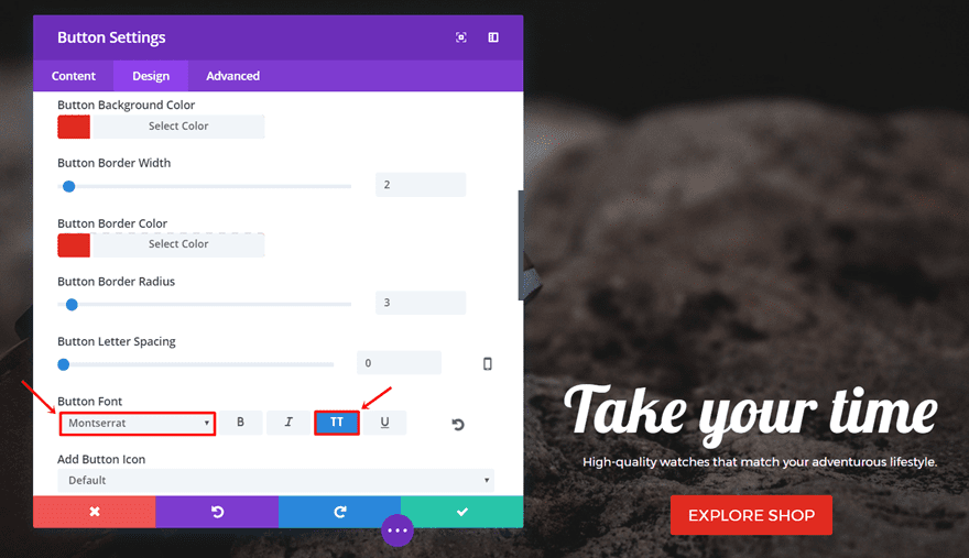
- Button Font: Montserrat
- Button Font Style: Capital
Mobile & Tablet Version
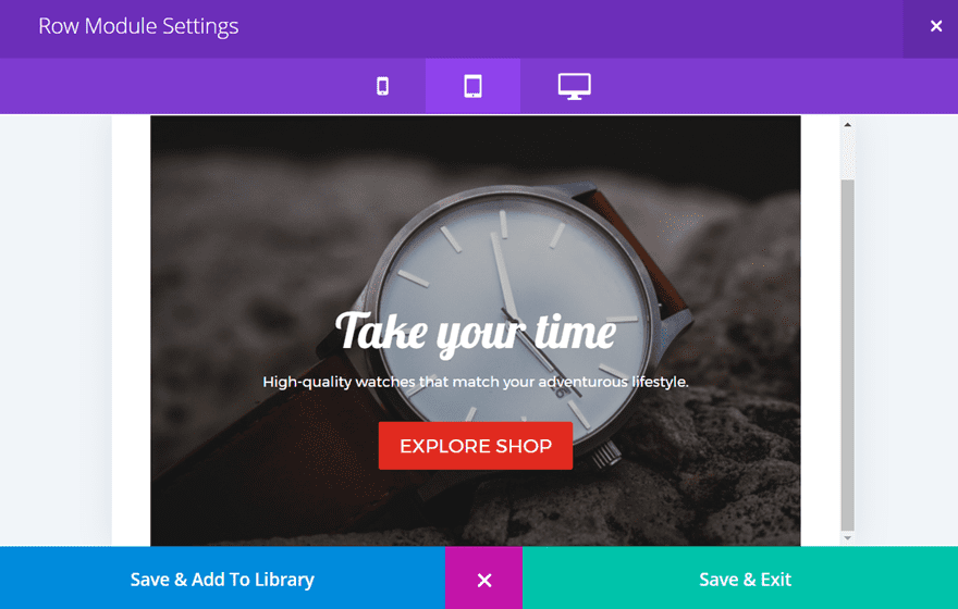
When creating a hero image for a desktop screen, there are a lot more possibilities. For phones and tablets, on the other hand, you somehow have to find a way to make everything look good in a simple way.
We’re going to make everything centralized when someone visits your website with phone or tablet. Go ahead and clone the row we made for desktop and place it in the same section.
Section Settings
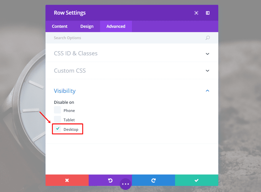
Open the settings of your sections and disable the section for desktop in the Visibility subcategory of the Advanced tab.
First Text Module
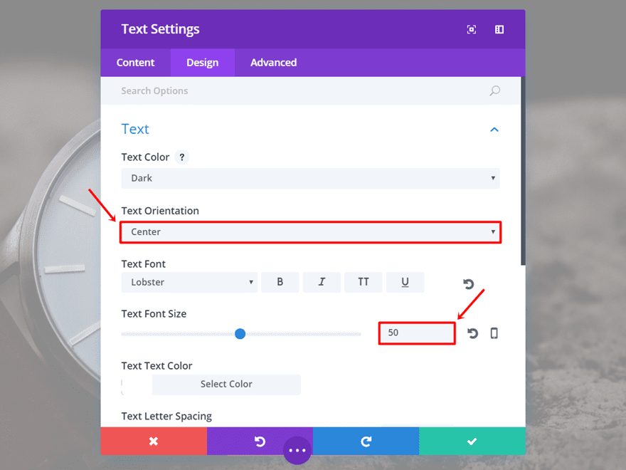
Go to the Design tab and make the following changes to the Text subcategory:
- Text Orientation: Center
- Font Size: 50
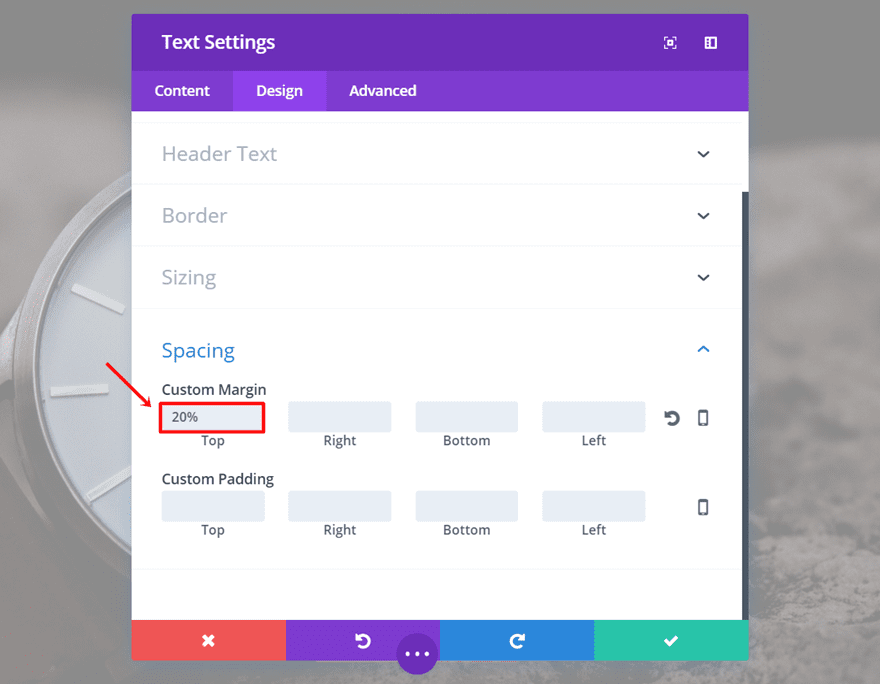
Scroll down the same tab, erase the right margin and change the Top Margin to ‘20%’.
Second Text Module
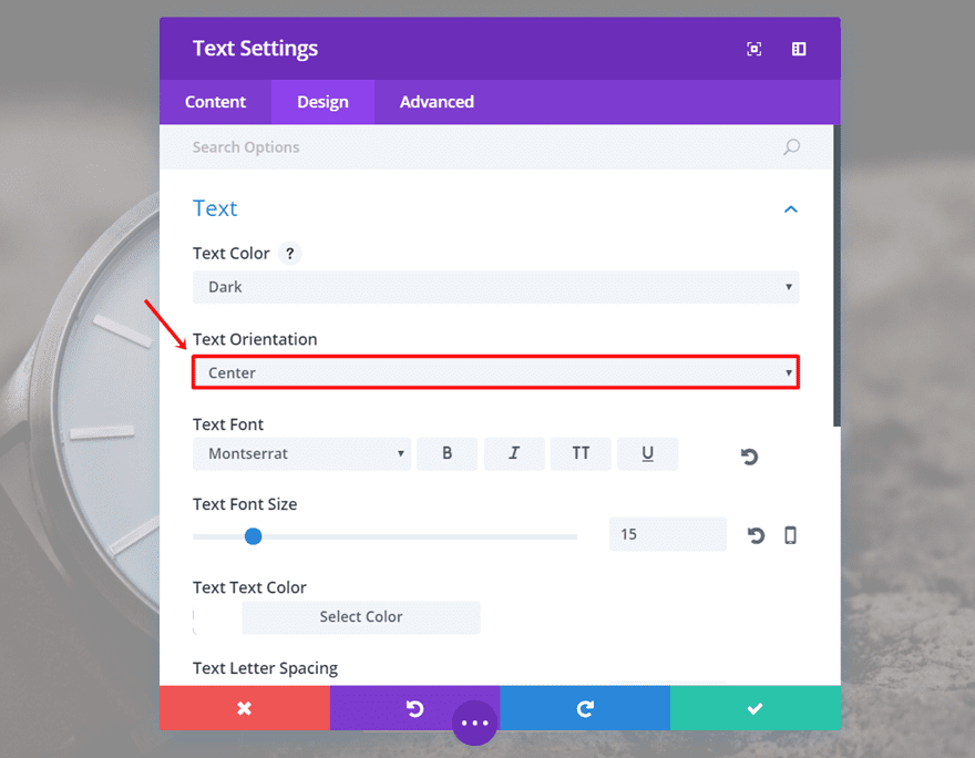
Within the Design tab of the second Text Module, change the Text Orientation to ‘Center’.
Scroll down the same tab, erase the Right Margin and keep the Top Margin.
Last but not least, open the Button Module and change the Button Alignment to ‘Center’ as well.
Final Thoughts
In this post, we went over some design tips you should take into account when creating a hero image/section. We also shared a hero section example that follows those tips. If you have any questions regarding this topic or if you have suggestions, make sure you leave a comment in the comment section below!
Be sure to subscribe to our email newsletter and YouTube channel so that you never miss a big announcement, useful tip, or Divi freebie!



I found your divi designing tips very reassuring and incredibly common-sense-useful! Loved this post and I’m definitely pinning it to share! Thanks for the great read and awesome tips!
Hello Donjete,
In your guide, the following is stated in reference to setting up a fullwidth row:
“Moving on, we’re going to add a fullwidth row to the section we’ve created. Open the settings and add ‘10%’ to the top padding in the Spacing subcategory of the Design tab.”
At first, it appeared to me that the second sentence is the means of achieving the objective stated in the first sentence. However, my own supposition does not make sense because under the Design tab there is Make This Row Fullwidth option. If this is the case, then what is achieved by setting the Top field of the Custom Padding to 10%?
Thank you
Great post. I would also like to know the answer to RDN’s question above about full section vs. standard section
Thank you Donjete! Outstanding post!
My question is regarding the approach of taking a standard section and setting it up as a full screen section. Could you please elaborate on why is it preferable to make manual adjustments to a standard section, rather than to use a fullwidth section in the full-screen mode?
Also, by what specific settings the full-screen effect is achieved? Is it by certain Spacing of Text modules? If possible, what settings provide that effect?
Thank you
Can you do both the desktop and mobile versions of this setup at the same time? I’m having trouble with that part.
Yes, you just have to make two different rows in the same section and disable each row accordingly. By following the post step by step, you should be able to do that!
This worked great on the desktop but the mobile doesn’t seem to work. I think there may be a problem with the settings? Please contact me
Great tutorial! And your example is so suggestive! Perfect! Thank you!
You’re welcome, Jordan!
Designing for both desktop and mobiles is something to consider and the Divi visibility options allow you to do do just great.
I used to think that having 2 options on my Divi builder for 1 section of the website (1 for desktop and 1 for tablet and mobile) was a messy way of doing things, but I’m pretty convinced it’s not after reading this, thanks.
Glad we could convince you!
I love this tutorial. Thank you.
Could someone explain the margin settings? Why is the first “Top” margin setting 25%? 25% of what? I wish someone would make a map or set of maps that showed the default positions (margins) and show nested object at their 0 points so we could digest what a 25% top is. For example, why does a top 25% put it at near the bottom of the hero image?
Thank you again,
Chris
25% of its container.