It’s no secret that creating great long-form content contributes to better search engine rankings. However, this strategy can easily backfire if the material is hard to consume or navigate, thus creating a poor user experience. That’s where in-page navigation comes in. Thankfully, Divi comes with a set of native features and modules to help you guide your readers through such content.
In this article, we’ll first explain why you should consider using in-page navigation, and then show you three ways you can implement it using Divi. Let’s get started!
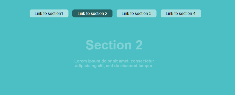
Upper tabs are an example of in-page navigation. Each tab represents a link to a particular section on the page.
In-page navigation is essential in two main scenarios: long-form content in general, and one-page websites in particular. As the landscape has shifted towards long-form content in the last few years, proper structuring and organization of that content has become more important than ever. Attention spans are declining, and if people have to trudge through too much information to get to what they’re looking for, chances are you’ll lose them.
In-page navigation enables you to present your content in a much more digestible way, increasing the likelihood of your visitor sticking around to explore more of your content. This can help to improve the overall user experience, reduce bounce rates, and hopefully result in an increased number of conversions.
One popular in-page navigation method (which we covered extensively in an earlier post) is to use anchor text hyperlinks that link to internal elements on the same page. However, Divi offers several other excellent ways to help guide your users through your long-form content. We’re going to introduce you to three of these options and show you how to implement them.
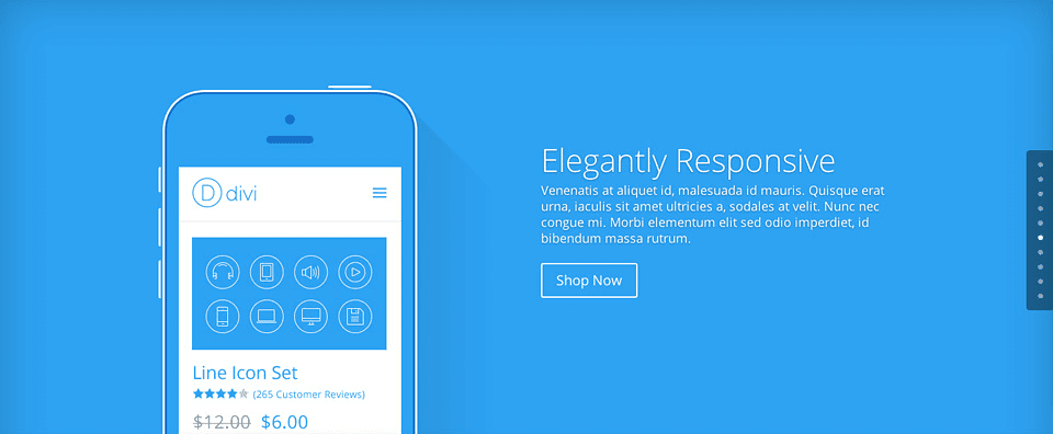
As you can see from the image example above, once enabled, the dot navigation feature appears in the form of a dotted menu on the side of your page. Each dot represents a section on that specific page, which means your visitor is constantly aware of which point they’re at. It also makes it a breeze to jump to any section by clicking on the corresponding dot, eliminating the need to scroll through heaps of content.
You can easily enable dot navigation within any post or page. First, make sure that you’re using the Divi Builder, and if not, enable it by clicking the purple Use The Divi Builder button.

In the upper right corner, under Divi Post Settings (or Divi Page Settings if you’re in a page), open up the Dot Navigation drop-down menu and choose On.

You’re all set! Dot navigation should now appear on your post when you preview it. As you add more sections, corresponding dots will be automatically added to the menu.
Once you’ve enabled dot navigation, you might want to check out this video with tips for styling your menu.
2. Separate Content Using the Tabs Module
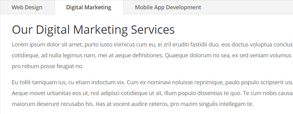
Utilizing tabs can be a great way to separate chunks of content, and you can create them using the Divi Tabs module. Only content under an active tab (the tab they just clicked on) will be visible to your visitors. This minimizes the chance of visitors being overwhelmed with the amount of material, and enables them to explore it at their own pace by clicking on each tab and consuming its content separately.
One example of a good use for tabs is when you want to display different services on the same page. For example, if you’re a digital agency offering web design, digital marketing, and branding services, you can create a tab for each. This negates the need for the user to scroll down to the relevant service, offering an improved overall experience.
To insert a Tabs module, in the Divi Builder, select Insert Column(s) and choose how many columns you’d like to add. (Note that you only need one Tabs module to create a set of side-by-side tabs.)
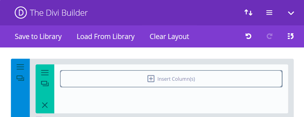
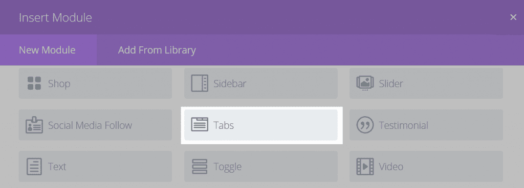
Now click Insert Module(s), and choose Tabs.
You’ll arrive at the module’s settings screen, where you can click Add New Tab.

This will bring you to the individual tab settings screen. Here you should enter your title and content, then click Save.
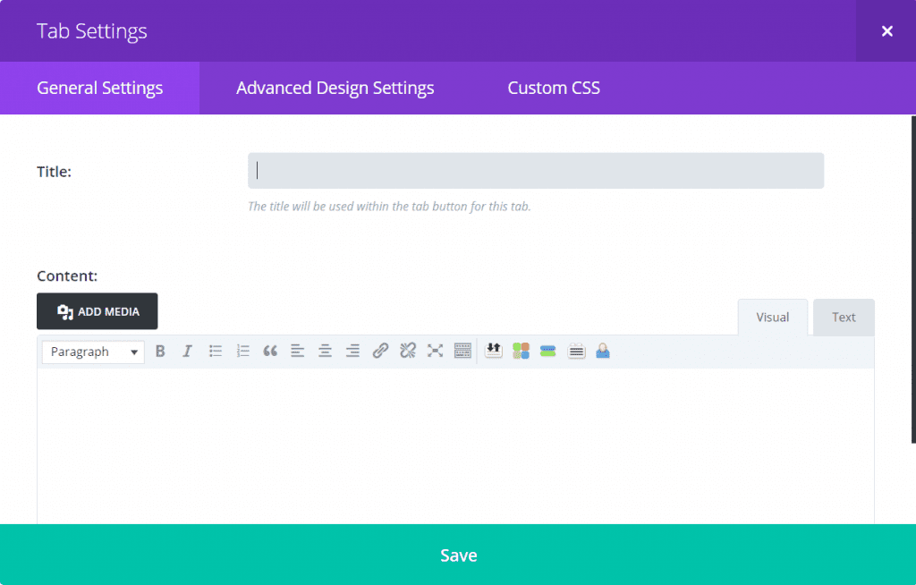
You’ve now finished creating your first tab. You can repeat this process until you’ve added all the required tabs and their content.
3. Insert Accordions or Toggles

Accordions are very similar to tabs, with the major difference being that content appears in a vertical list. Whenever you click an accordion element, any other expanded element collapses and the content of the clicked element is displayed.
Toggles are also similar in nature, except that clicking a toggle element will not collapse others. Instead, the content of all selected toggles will be displayed simultaneously.
A popular place to use these elements is in FAQ pages. They’re convenient because people can view all of the questions at once, and only expand the answers relevant to them. Both accordions and toggles can be easily added in Divi using the Accordion module and Toggle module respectively.
Inserting an accordion in Divi is similar to adding tabs, since you can add multiple items in each module. Follow the steps for inserting a module above, except this time, select Accordion instead of Tabs.

In the resulting settings screen, click Add New Item.

In the following screen, enter your title and content, and hit Save. You can then repeat this for each item in your accordion.
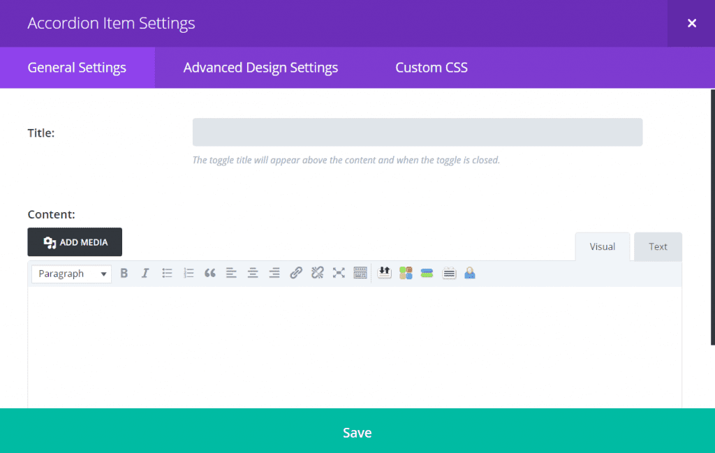
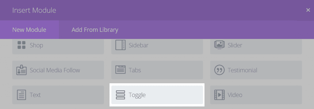
Creating a set of toggles in Divi is also similar to adding tabs, but the major difference here is that you’ll be creating a new Toggle module for each row of content. To insert the first toggle, after clicking Insert Module(s), select Toggle.
You’ll now be presented with the module settings screen where you can add the title, choose a default state (whether the toggle should be open or closed by default when the visitor first lands on your page), and insert your content. When you’re done, click Save and Exit.
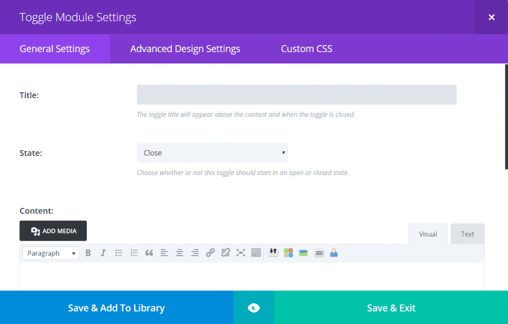
To add the next module, click Insert Module(s) below the first, and again select Toggle and enter the appropriate details. Continue adding modules until your set of toggles is complete.
Conclusion
Researching and writing long-form content that provides value to your reader is often a resource-intensive task. Consequently, it’s very frustrating to put in all that effort only to have your content abandoned halfway through because of poor structure and usability.
In this article, we’ve covered why you might want to consider in-page navigation for your content and offered three different ways to approach it using Divi. Let’s recap those methods quickly:
- Enable dot navigation on your posts and pages.
- Separate content using the Tabs module.
- Insert accordions or toggles using the Accordion module or Toggle module.
Do you have any tips for guiding visitors through long webpages? Share them with us in the comments section below!
Article thumbnail image by Graphic farm / shutterstock.com


This was very clear and honest. Thank you so much for the information, it really opened my eyes to some things I hadn’t thought about before.
Is there another way to add anchor text so that you can link to a different section within the page? I’d like to be able to link to an entire divi section.
Oops. Didn’t realise the HTML would render!
Should read:
…your link will look something like:
a href=”#section ID”
If you’re linking from a different page…
Hi! Check out this video for some tips on how to do that: https://www.youtube.com/watch?v=_Uob36vvYTs.
Thanks for this post. its something I’ve been researching this week!
Is there any other option similar to WP pagination for long posts that breaks the long post up into smaller pages?
SEO consultant is saying that will count in Google as multiple pages being read (even though its all one long page) and decrease our bounce rate.
Or, do you know if using either of the above Divi modules will also appear to Google as the user accessing multiple pages for the long content?
Thanks!
Hi John, thanks for your comment! Drop us a line directly and we’ll do our best to help you out: https://www.elegantthemes.com/contact/.
hi,
i am using divi builder and trying to insert column from the library. But it is not inserting it. Can you please tell me how i am able to add the column via Divi.
Hi Mohit! It’s hard to diagnose the problem without knowing your exact setup. We’d recommend posting in the forums (https://www.elegantthemes.com/forum/) to see if another user can help.
Thank you for helping me with my problem, this article really helped me progress to get better
You’re welcome! 🙂