Not long ago I created and gave away our first Free Extra Category Layout Pack. The response was great and so I’ve begun work on my next one: an Extra Category Layout for a video blog. In the process of creating it I realized that something I did on the demo site might be something the community would also like to know how to do. How to add a logo to Extra’s secondary menu (and hide the primary menu altogether).
Concept & Inspiration
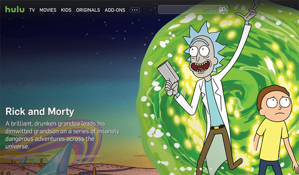
I got the idea when looking for interesting video websites to draw on for inspiration. I really liked how the hulu website had a really unobtrusive, minimal menu at the top of their page and then got visitors right into their content–which is what everyone wants anyways!
I quickly realized that with just a little tinkering I could have a very similar look on Extra. Here’s how!
Preparing Your Design Elements
For this tutorial you will likely need a smaller version of your logo. The dimensions I have used in my example are 190px by 25px. You may even choose to go smaller than that depending on your logo and what it looks like at different scales.
Once you’ve created this version of your logo you will want to upload it to your website so you have easy access to it later.
The first thing you will want to do is hide your primary menu. Navigate in your WordPress admin to Extra > Theme Options and scroll down the general tab until you get to the custom CSS panel.
Copy and paste the following css there:
#main-header {
display: none;
}

#main-header-wrapper {
display: none;
}
Click the green “Save Changes” button and refresh the frontend of your website. If all of your other settings are still set to default, your header will now likely look like this.
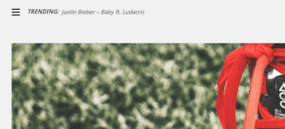
Next, go to Theme Customizer > Header & Navigation Settings > Header Elements Settings and un-tick the box next to “show trending bar”. Click the blue “Save & Publish” button before exiting the Theme Customizer.
It’s now time to create your actual menu by going to Appearance > Menus. To get started, click the blue link text “create a new menu”.
Name the menu whatever you would like and be sure to tick the check box at the bottom of the screen under “Menu Settings” so that this menu will be displayed as the secondary menu.
Now you can populate your menu with all of the links you want to display there. In my example I have added all of my categories there.
Finally, add a custom link.
In the URL field simply put the homepage domain of your website. This will, after all, become your “home” button. Then, in the Navigation Label field place the following line of HTML.
<span><img src="YOUR LOGO IMAGE LINK"></span>
Replace the text “YOUR LOGO IMAGE LINK” with the link to your logo image file from the media library. If you’re unsure how to get that link, go to Media > Library and click on your logo image.
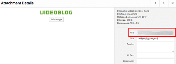
When the Attachment Details modal pops up you will see the URL in the URL field. Copy it and paste it into the indicated space in the HTML code above.
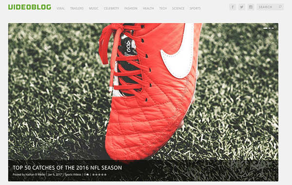
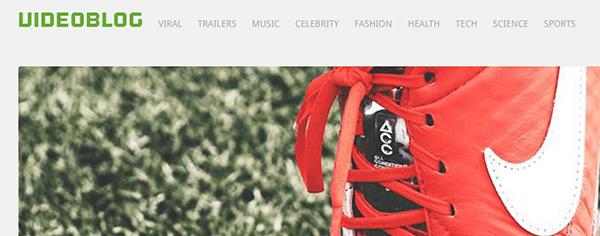
When your custom link is complete, save your menu and refresh the frontend of your website. You should now have a slim, minimal header with your logo placed inside Extra’s secondary menu.
What Other Extra Tutorials Are You Interested In?
I know that there are a ton of passionate Extra users in our community with all kinds of Extra specific tutorial and freebie requests. This is your chance to ask and have them added to our content production queue! Let us know in the comments below what you’d like us to cover in the future and I’d be happy to write it down and then write it up in a future post.



I would like to request more tutorials on how to customize the header section. What I would need is for the secondary navigation to contain two kinds of links (internal: aligned to the left and external: aligned to the right). The search box and social icons should be in the same row as/next to the logo (aligned to the right). The main navigation links that are displayed (on desktop) to the right of the logo should instead be in a separate row underneath the logo.
Any help you can provide is greatly appreciated!
Maybe I’m doing it the hard way by adding CSS and I just can’t find the menu options for it, but I changed all my social icons to have colour instead of being grayed out until you hover over them. I just think they are more inviting that way. I also added colour to the star ratings and small comment bubbles.
I would love a good translation tutorial on Extra. As we now have quiet some issues with translating to dutch; Also maybe is it is nice to combine skills and let users translate and share those translations i am up for Dutch.
Hi, great post. I would love to see more backend information on how to achieve different styled posts, such as those saved in the live demo posts for Extra.
It would also be very helpful to learn how to remove the “Designed by Elegant Themes | Powered by WordPress” text stuck on the bottom bar. I know the Divi theme makes it very straightforward how to alter this text, but Extra doesn’t seem to offer a simple solution.
Thanks for your work!
Hi Nathan!
I do have a specific request for an Extra tutorial – we talked about this at WordCamp US at the museum!
I’d like to be able to make the Extra primary menu have an “Inline Centered” logo style, like Divi has in its settings. I still haven’t had any success figuring that one out!
Thanks for all your great content!
Gregg Davis
Thank you for share. best tutorial. previously I have problems with this. but now, already missed
Nice to see an Extra post… yes please do more like this 😀
thank you, great post.
Hello,
I want the last navigation point as an CTA.
Other Background, Color etc.
For instance the Hootsuite Website
This Divi Quick Tip should help. Even though it’s for Divi you should be able to do it in Extra too. https://www.youtube.com/watch?v=IxIQkbCVs_g
Amazing article
Your latest add logo information helpful in my project.
Thanks for sharing this great tutorials.
Hi, my logo is going on the right side of the page, how can I get it to go on the far right like in your example or what I’m I doing wrong?
Sorry, I meant far left.
Excellent post,
What type of font do you have in the logo?
Thank you!
That is a blog called Outage.
Excellent and a solution I was needing.
I’m interested in submenus with images
Thank you.
I would encourage you to check out the Extra documentation. This is one of the coolest things about Extra.
https://www.elegantthemes.com/gallery/extra/documentation/header-options/
Go to about 3:50 in the video.
Can this process [logo added to secondary menu] be used in the Divi theme too?
Thanks so much for all the great tutorials.
Yep!
Great. Thanks again.
Hey Nathon,
You write a great tutorial again for Extra lovers.Thanks.
I want to ask you how we can decrease the height of Slider on Home Page.
Its take almost whole screen.
See my blog http://www.dynamikskills.com
Thanks for Help in Advance!
Funny you should request that! I was just trying to figure that out yesterday and found that the height of the slider is determined by the image size defined in the theme. I’m working on figuring out a work-around for this. Will publish my findings.
Thanks, Nathan
It’s really amazing, i will be grateful and awaiting when you publish your findings.
Try navigating to the custom css tab of the featured post slider in Extra. In the text box for “Post Entry” enter this css:
max-height: 450px;
Excellent tutorial!
I wasn’t aware you can paste HTML in the Navigation Label field, so this is a nice tip.
Also great to see tutorials about Extra – we want more!
Possible idea: how to use the Posts Carousel and the Featured Posts Slider, not only in category pages, using the category builder, but on any page?
Or more generally: a tutorial on using the category builder, and what you can achieve with it, because I feel a little sketchy in this area…
Thanks!
Thanks Yuda! I’ll see what I can do on those. I can say however that the category builder and the page/post builder are two different things. They cannot be used together on the same page. That said, we can definitely explore more use-cases for the category builder as it’s incredibly powerful.
The impossibility of using the category and page builders on the same page is really a big drawback! I want to set up a magazine-style blog in which I also want to offer permanent information and services. How should get around this? Write a blog post and then link to a page in the post? Any other suggestions…? I’m sure I’m not the only one wanting to achieve this!
You can use the ads, code, and image modules to make offerings on your category pages for your services.