If you’re looking for a way to highlight your email optin box, you’ll love this post. We’ll show you, step by step, how to add motion to your email optin box. The motion email optin box appears and disappears as visitors are scrolling down the page. By doing this, chances are high that the email optin box will catch your visitors’ attention, which will hopefully result in a higher conversion rate. You’ll be able to download the JSON file for free as well!
Let’s get to it.
- 1 Preview
- 2 Download The Motion Email Optin Box Layout for FREE
- 3 Download For Free
- 4 You have successfully subscribed. Please check your email address to confirm your subscription and get access to free weekly Divi layout packs!
- 5 1. Upload Web Freelancer Landing Page Layout to New Page
- 6 2. Create Left Email Optin Box
- 7 3. Place Email Optin Box on the Right
- 8 Preview
- 9 Final Thoughts
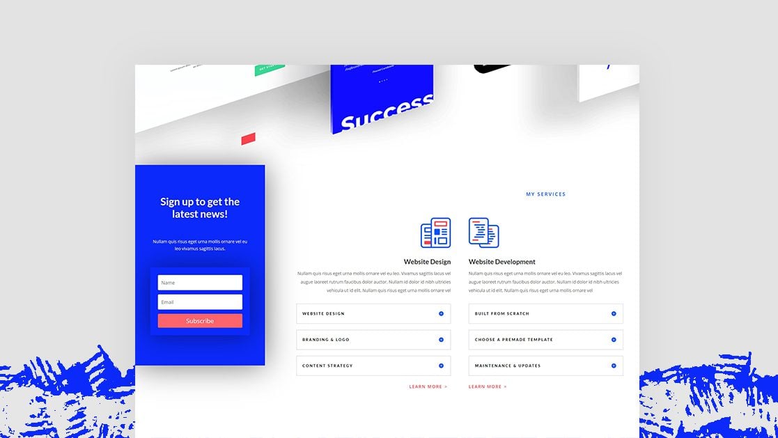
Preview
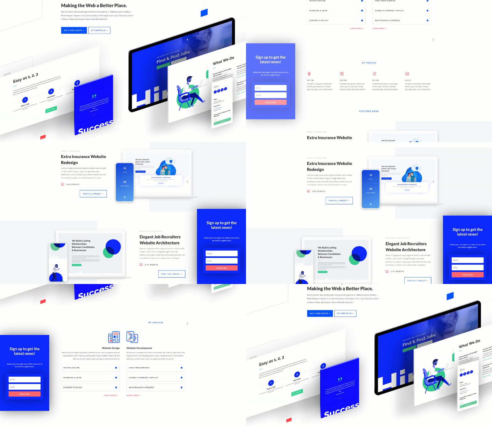
Before we dive into the tutorial, let’s take a quick look at the outcome. This tutorial works best on larger screen sizes. On smaller screen sizes, we’ll disable the entire motion email optin box so it doesn’t overlap any existing page content.
Download The Motion Email Optin Box Layout for FREE
To lay your hands on the free motion email optin box, you will first need to download it using the button below. To gain access to the download you will need to subscribe to our newsletter by using the form below. As a new subscriber, you will receive even more Divi goodness and a free Divi Layout pack every Monday! If you’re already on the list, simply enter your email address below and click download. You will not be “resubscribed” or receive extra emails.
1. Upload Web Freelancer Landing Page Layout to New Page
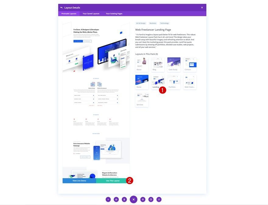
To recreate this tutorial, we’ll use the Web Freelance Landing Page which you can find in your premade layouts.
Hide Page Overflows
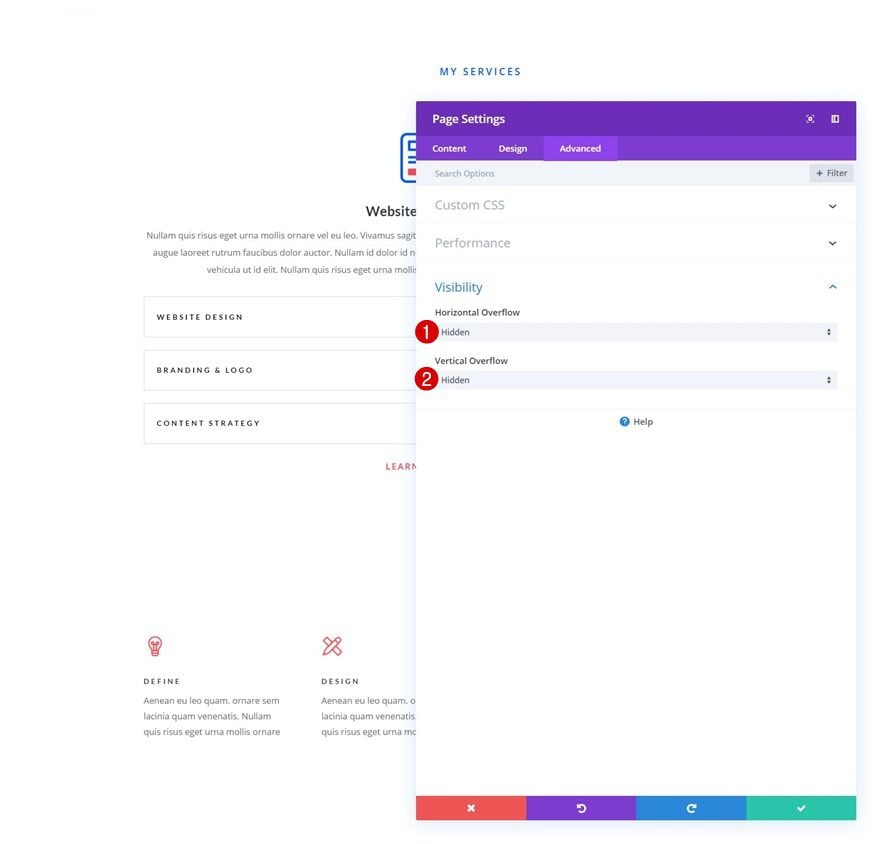
Once you’ve uploaded the layout, open the page settings and hide the overflows in the advanced tab. This will help ensure that no horizontal scroll bar appears throughout the scrolling process.
- Horizontal Overflow: Hidden
- Vertical Overflow: Hidden
2. Create Left Email Optin Box
Add New Row to Bottom of Section
Column Structure
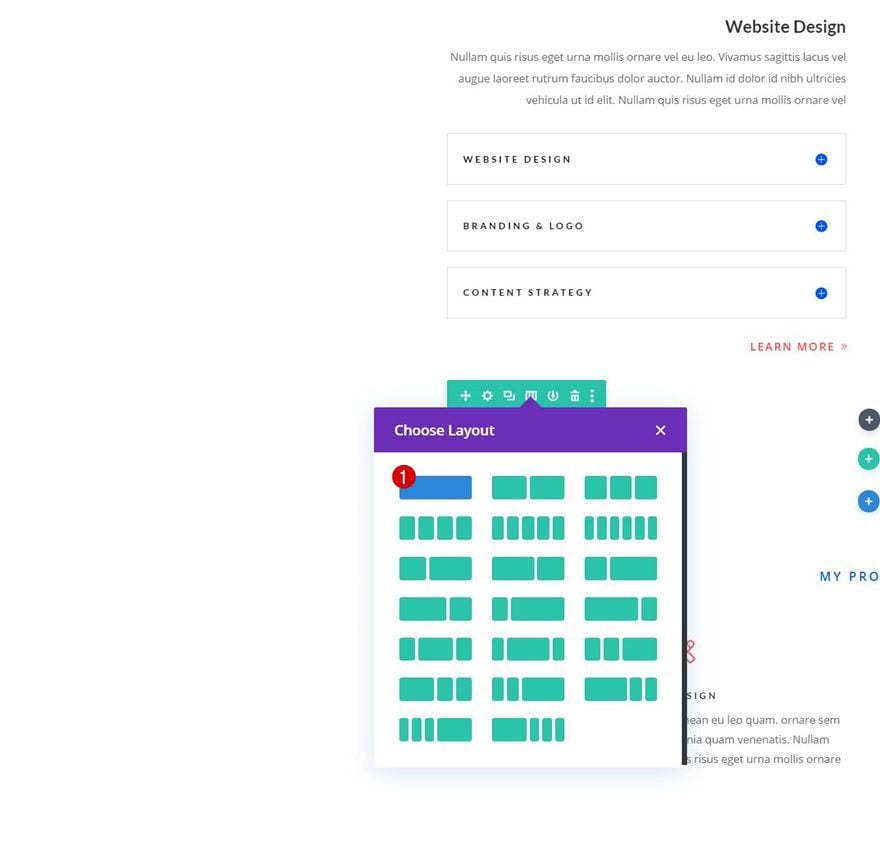
Time to create the motion email optin box on the left side of the page! To do that, add a new row to the bottom of a section of your choice. Use the following column structure:
Sizing
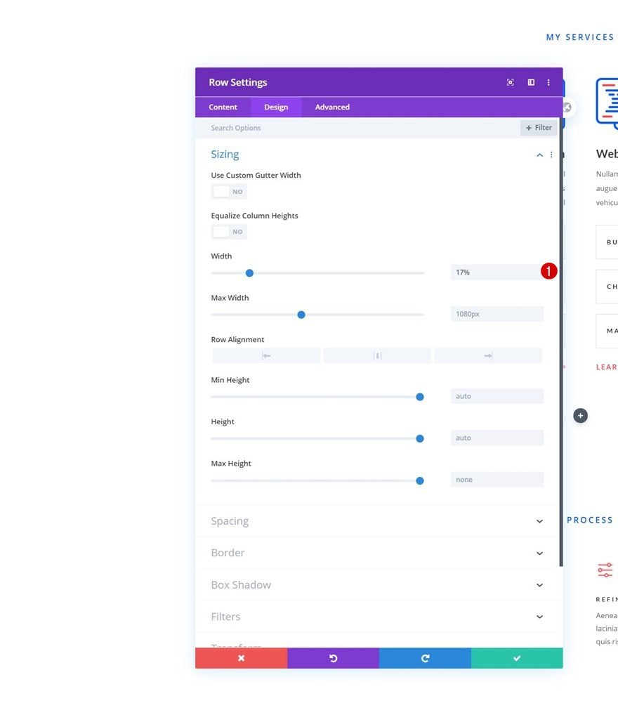
Without adding any modules yet, open the row settings and modify the row’s width.
- Width: 17%
Spacing
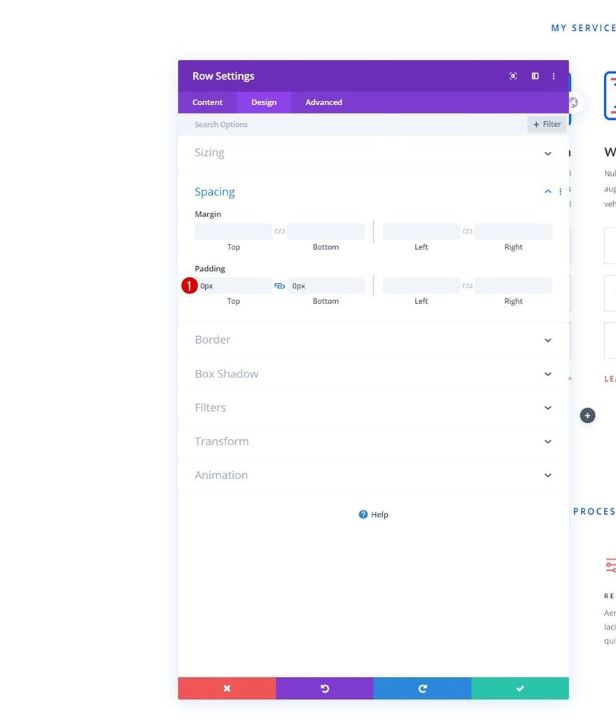
Remove all default top and bottom padding too.
- Top Padding: 0px
- Bottom Padding: 0px
Hide on Tablet & Phone
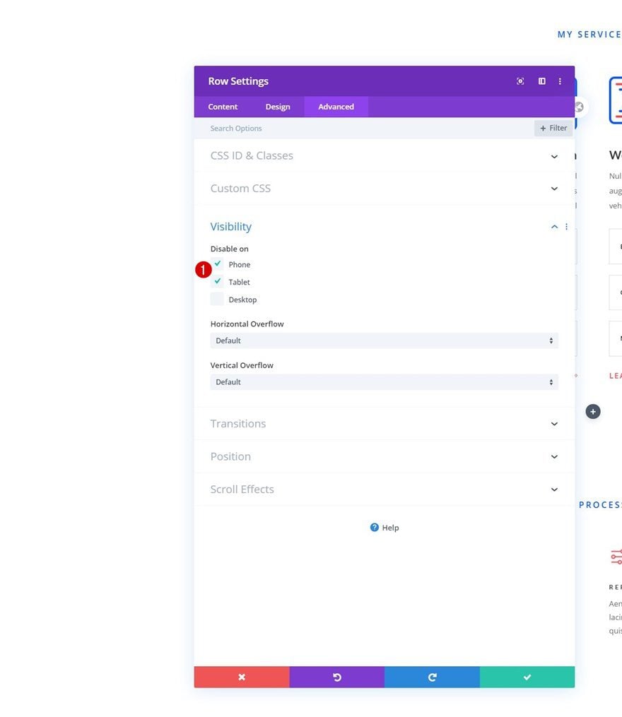
Then, hide the entire row on smaller screen sizes in the advanced tab. The reason we’re doing this is that we don’t want the email optin box to overlap existing page content.
Z Index
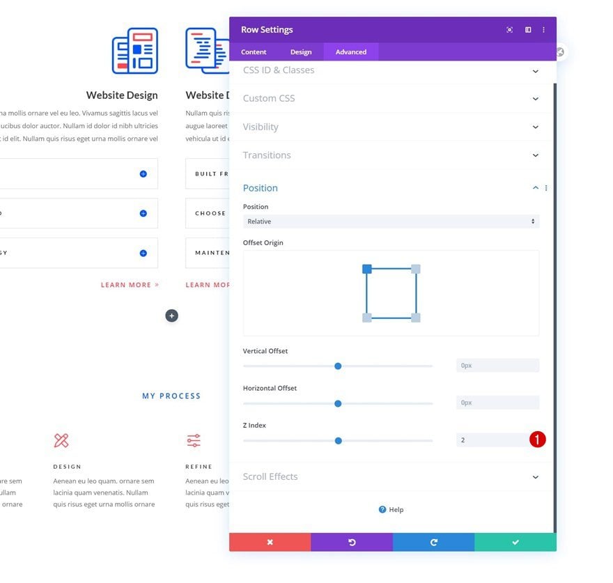
Complete the row settings by increasing the z index.
- Z Index: 2
Column Settings
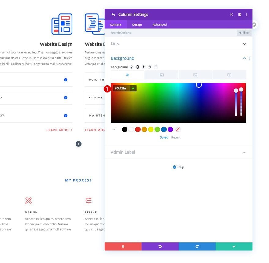
Background Color
Then, open the column settings and use a background color of your choice.
- Background Color: #0b29fa
Spacing
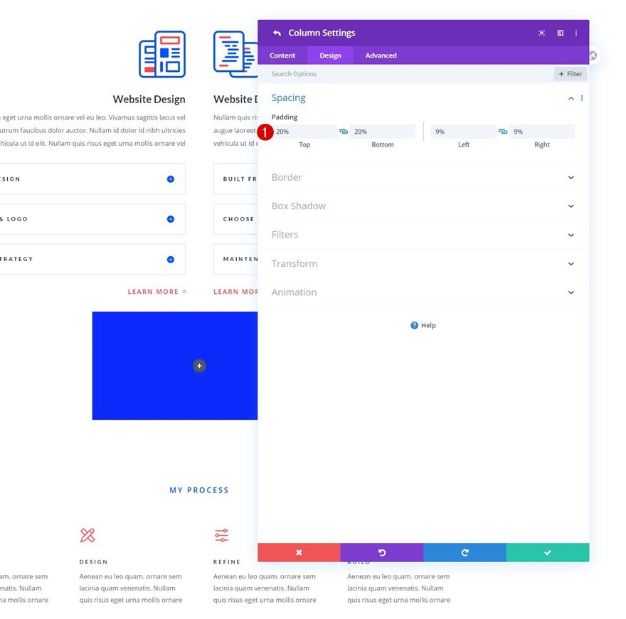
Modify the padding values next.
- Top Padding: 20%
- Bottom Padding: 20%
- Left Padding: 9%
- Right Padding: 9%
Add Text Module #1 to Column
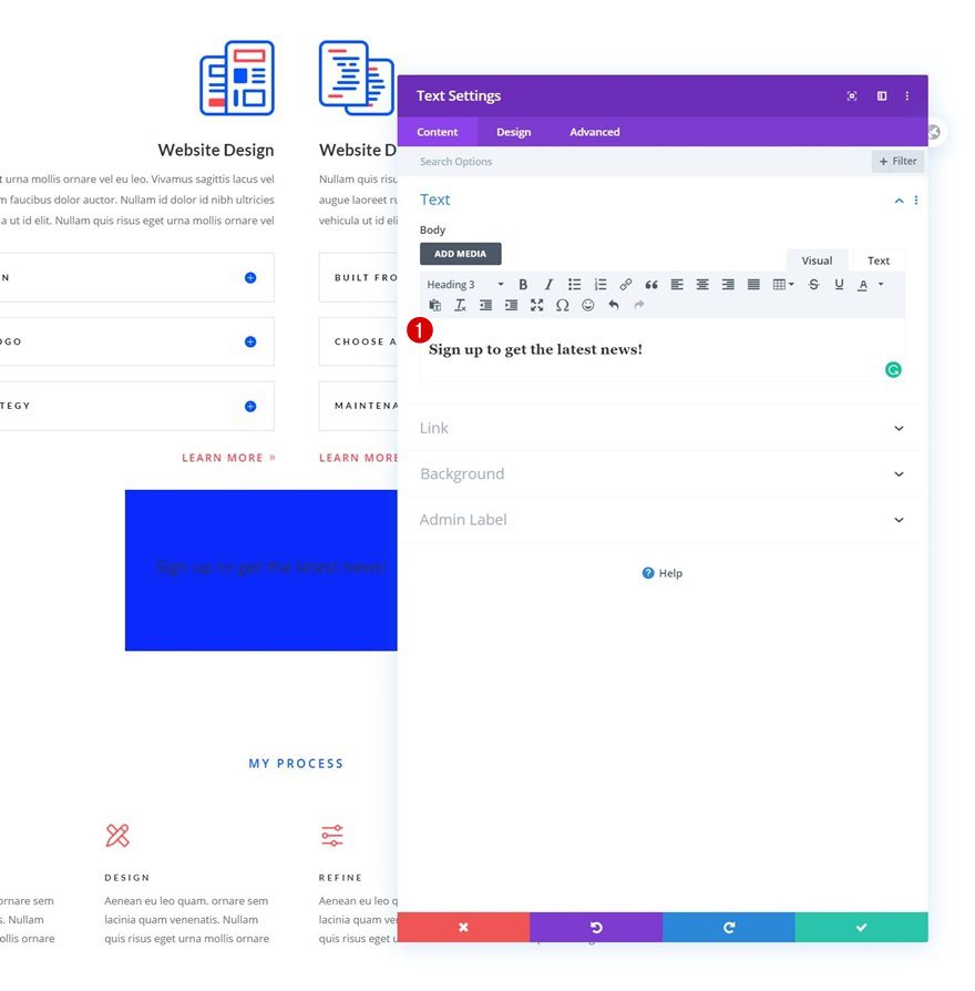
Add H3 Content
Time to add modules, starting with a first Text Module containing H3 content.
H3 Text Settings
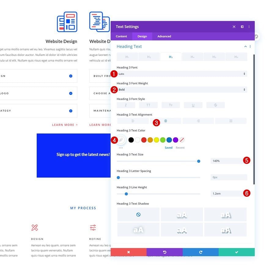
Modify the module’s H3 text settings accordingly:
- Heading 3 Font: Lato
- Heading 3 Font Weight: Bold
- Heading 3 Text Alignment: Center
- Heading 3 Text Color: #ffffff
- Heading 3 Text Size: 140%
- Heading 3 Line Height: 1.2em
Add Text Module #2 to Column
Add Content
Add another Text Module right below the previous one with some description content of your choice.
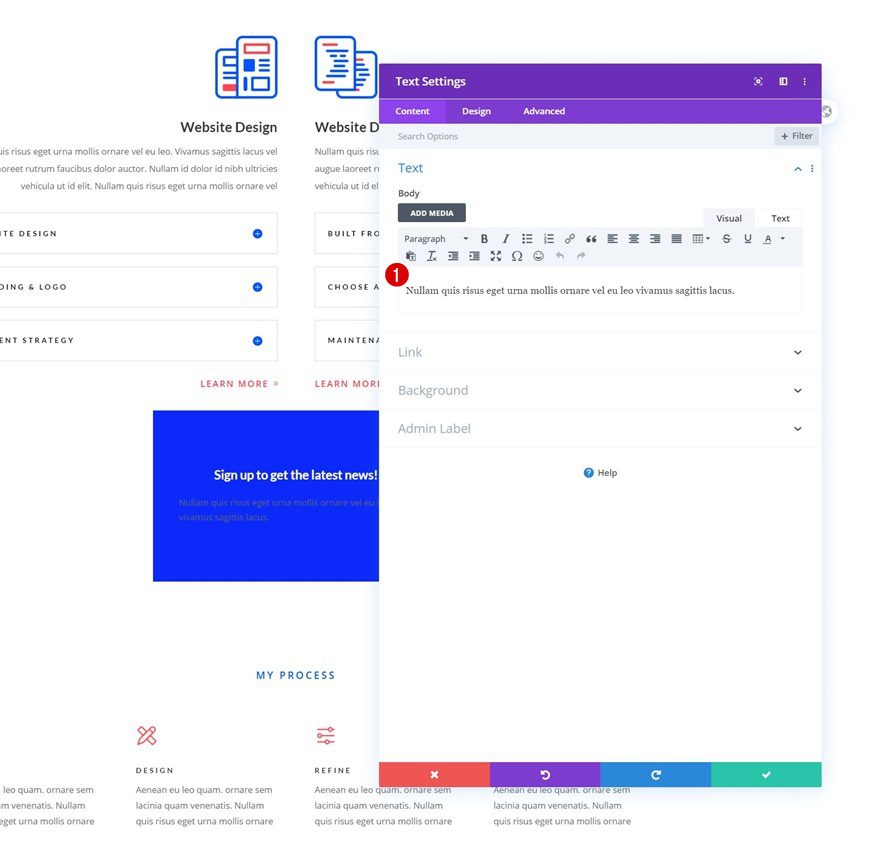
Text Settings
Modify the module’s text settings as follows:
- Text Color: #ffffff
- Text Size: 100%
- Text Alignment: Center
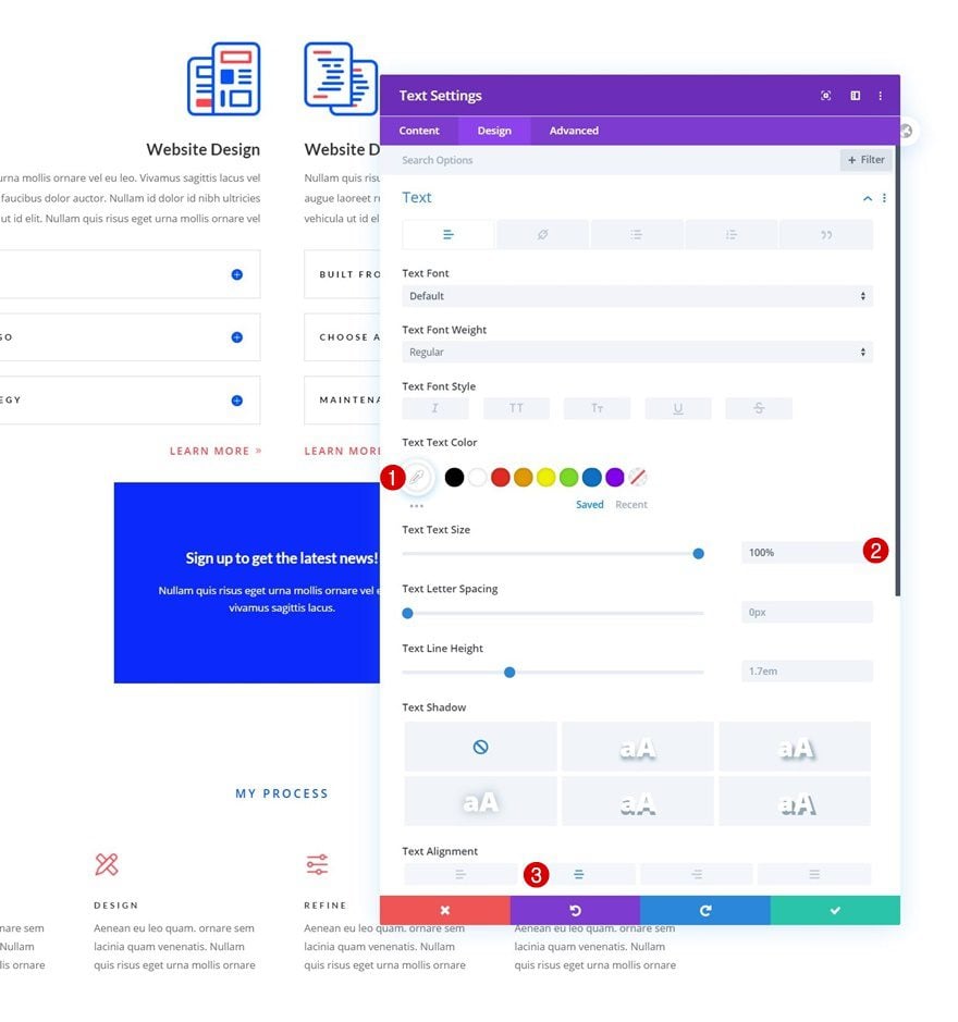
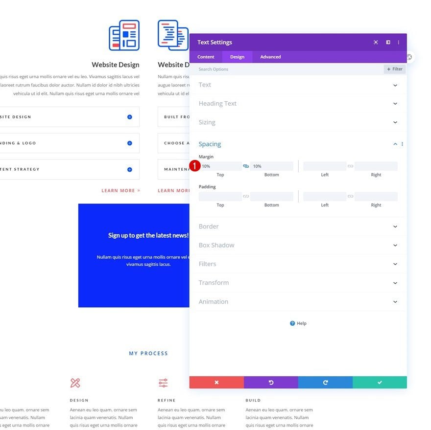
Spacing
Add some custom top and bottom margin too.
- Top Margin: 10%
- Bottom Margin: 10%
Add Email Optin Module to Column
Leave Content Boxes Empty
The next and last module we need in this column is an Email Optin Module. Leave the title and body content boxes empty. In the previous steps of this tutorial, we’ve used regular Text Modules to show our title and description.
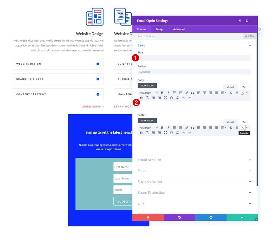
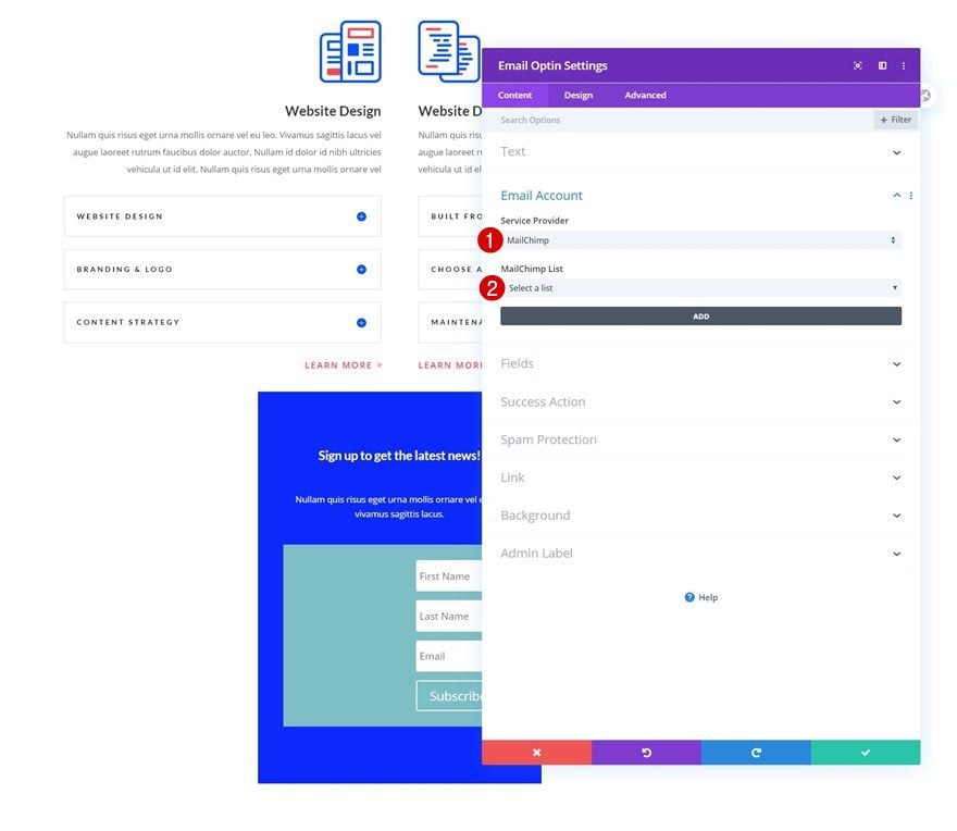
Connect Email Account
Continue by connecting your email account.
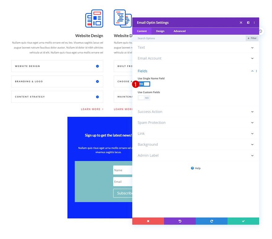
Fields
We’re using a single name field too.
- Use Single Name Field: Yes
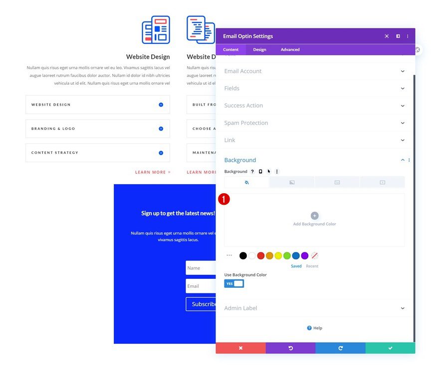
Remove Background Color
Then, remove the background color.
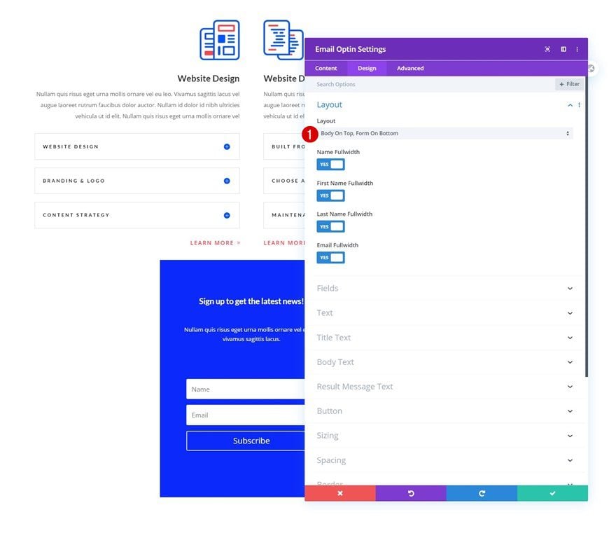
Layout
Move on to the design tab and change the layout next.
- Layout: Body On Top, Form On Bottom
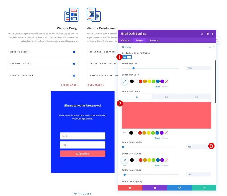
Button Settings
Continue by styling the button.
- Use Custom Styles For Button: Yes
- Button Background Color: #ff646c
- Button Border Width: 0px
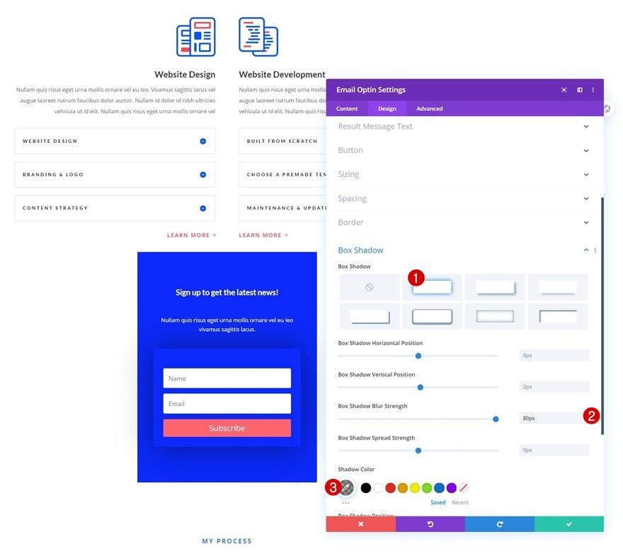
Box Shadow
And complete the module settings by adding a subtle box shadow to the Email Optin Module.
- Box Shadow Blur Strength: 80px
- Shadow Color: rgba(0,0,0,0.45)
Reposition Row
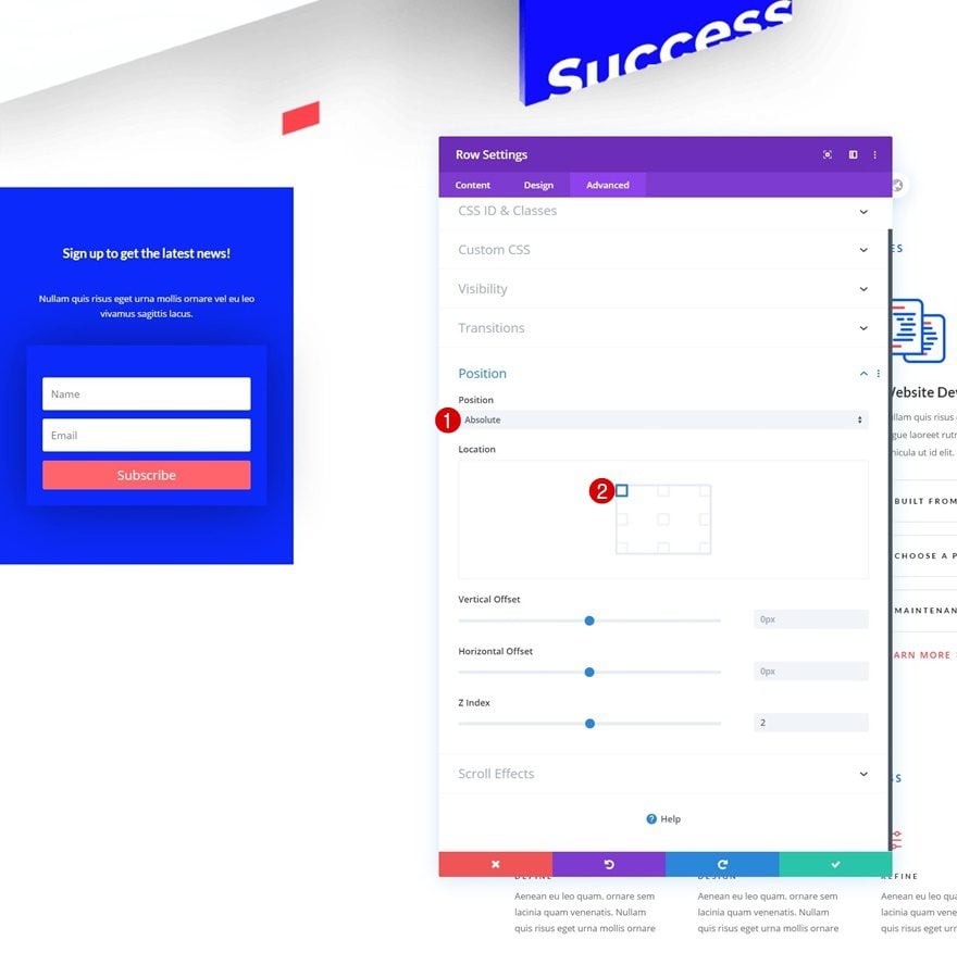
Once you’ve completed all modules in the row’s column, you can open the row settings once again and reposition the entire row as follows:
- Position: Absolute
- Location: Top Left
Add Row Scroll Effects
Vertical Motion
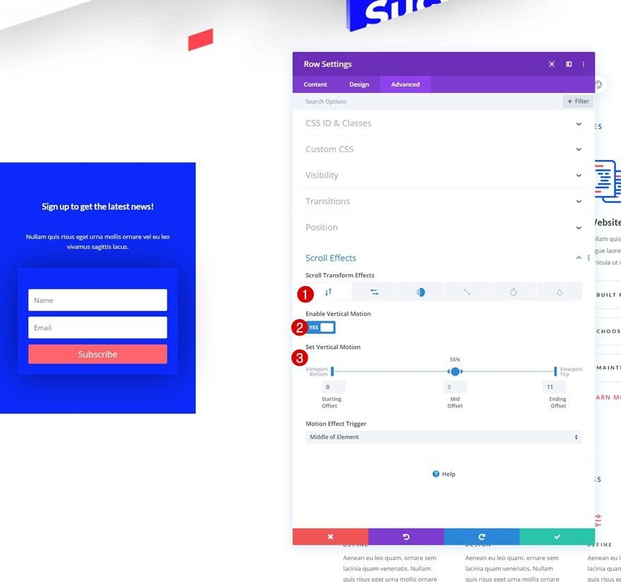
Then, navigate to the row’s scroll effects and add some vertical motion:
- Enable Vertical Motion: Yes
- Starting Offset: 0
- Mid Offset: 0 (at 55%)
- Ending Offset: 11
- Motion Effect Trigger: Middle of Element
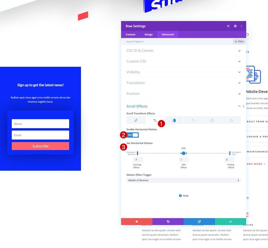
Horizontal Motion
Add some horizontal motion next.
- Enable Horizontal Motion: Yes
- Starting Offset: -7
- Mid Offset: 0 (at 50%)
- Ending Offset: 0
- Motion Effect Trigger: Middle of Element
Fading In and Out
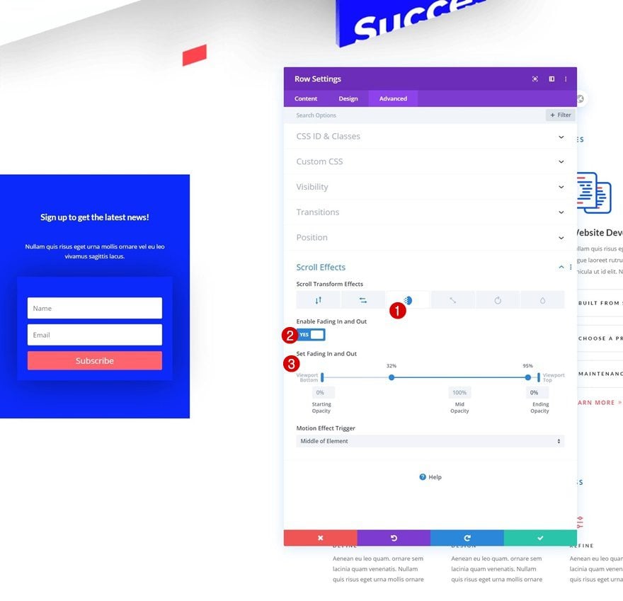
And complete the scroll effects by adding a fading in and out effect too.
- Enable Fading In and Out: Yes
- Starting Opacity: 0%
- Mid Opacity: 100% (from 32% to 95%)
- Ending Opacity: 0%
- Motion Effect Trigger: Middle of Element
3. Place Email Optin Box on the Right
Reposition Row
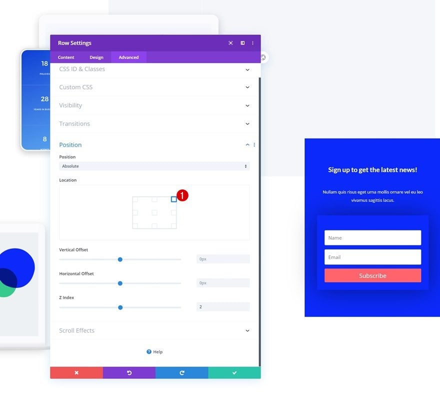
To create the same effect, but on the right instead, open the row settings and change the position as follows:
- Location: Top Right
Modify Row Horizontal Motion
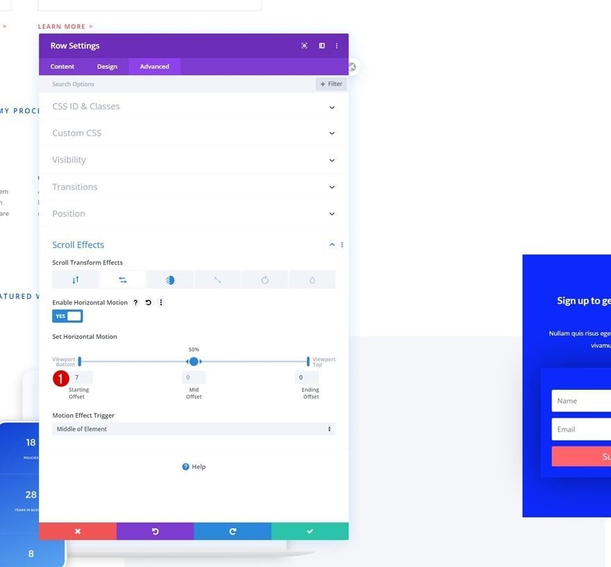
Then, go to the scroll effects and modify the starting offset in the horizontal motion and you’re done!
- Starting Offset: 7
Preview
Now that we’ve gone through all the steps, let’s take a final look at the outcome.

Final Thoughts
In this post, we’ve shown you how to get creative with Divi’s scroll effects. More specifically, we’ve created a motion email optin box that slides out while visitors are scrolling down the page. The effect we’ve obtained is smooth and allows you to draw attention to your email optin box in a subtle way. You were able to download the JSON file for free as well! If you have any questions, feel free to leave a comment in the comment section below.
If you’re eager to learn more about Divi and get more Divi freebies, make sure you subscribe to our email newsletter and YouTube channel so you’ll always be one of the first people to know and get benefits from this free content.



You disabled this on mobile. Is there a version/adaptation for phones?
I have images that go edge to edge. Is there a way to use this technique and have the popup stay on TOP of that content as you scroll down?