Adding a scroll triggered popup to your blog posts seems like a really smart thing to do. You may have seen them before when reading other blogs. As the user scrolls to a certain point of the post (usually the end), a box containing some call to action suddenly appears. The whole purpose of a scroll triggered popup is to present a targeted call to action to visitors at the exact moment you want them to see it on the page. In short, it is a great tool for boosting conversions or gaining qualified leads. Because of this, many conversion boosting plugins (like our very own Bloom or like Optin Monster) allow you to do this very same thing.
In this tutorial, we will show you how to add a scroll triggered popup to your blog posts in Divi from scratch, without a plugin. To do this we will be using the Divi Theme Builder to design a popup that features a related post by category and also a popup that includes an email optin. The scroll triggering will be accomplished using a small snippet of jQuery.
Let’s get started!
Sneak Peek
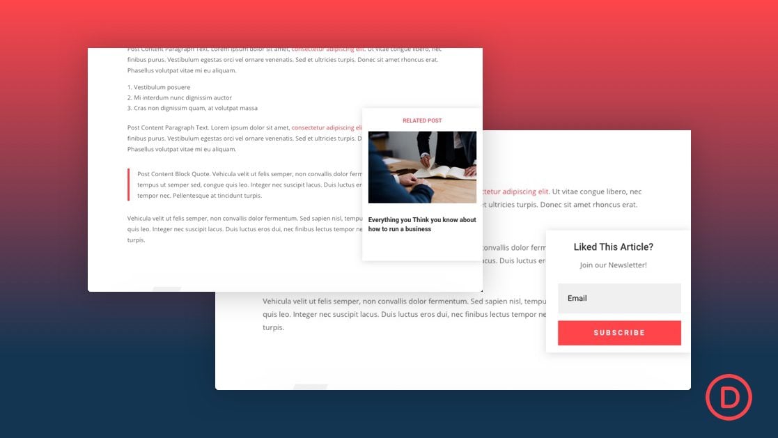
Here is a quick look at the scroll triggered popups we will be creating.
We’ll create on popup to reveal a related post (by category) as seen below.
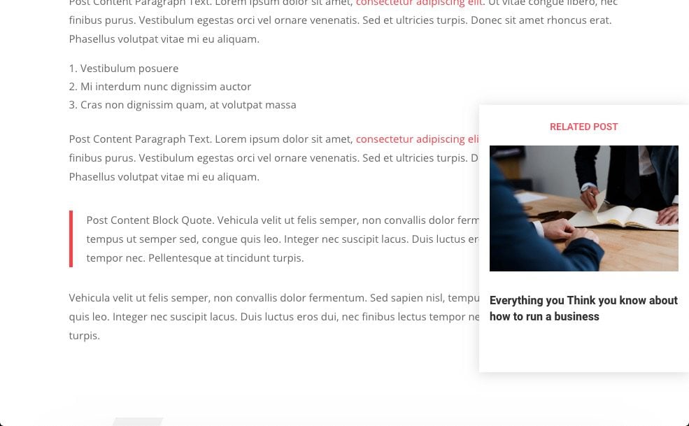
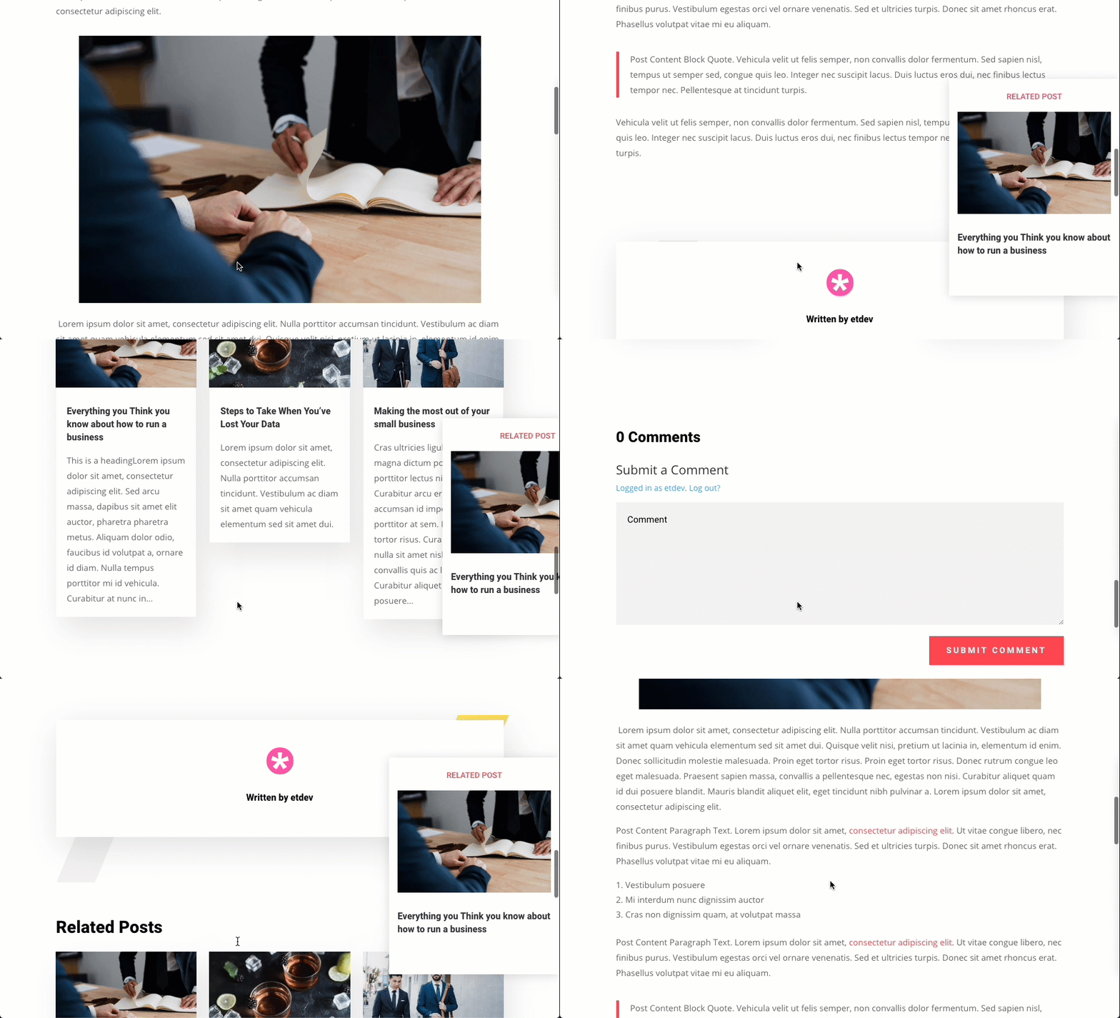
And we’ll also show you how to add an email optin to the popup as well as seen here.
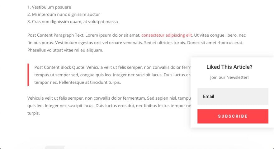
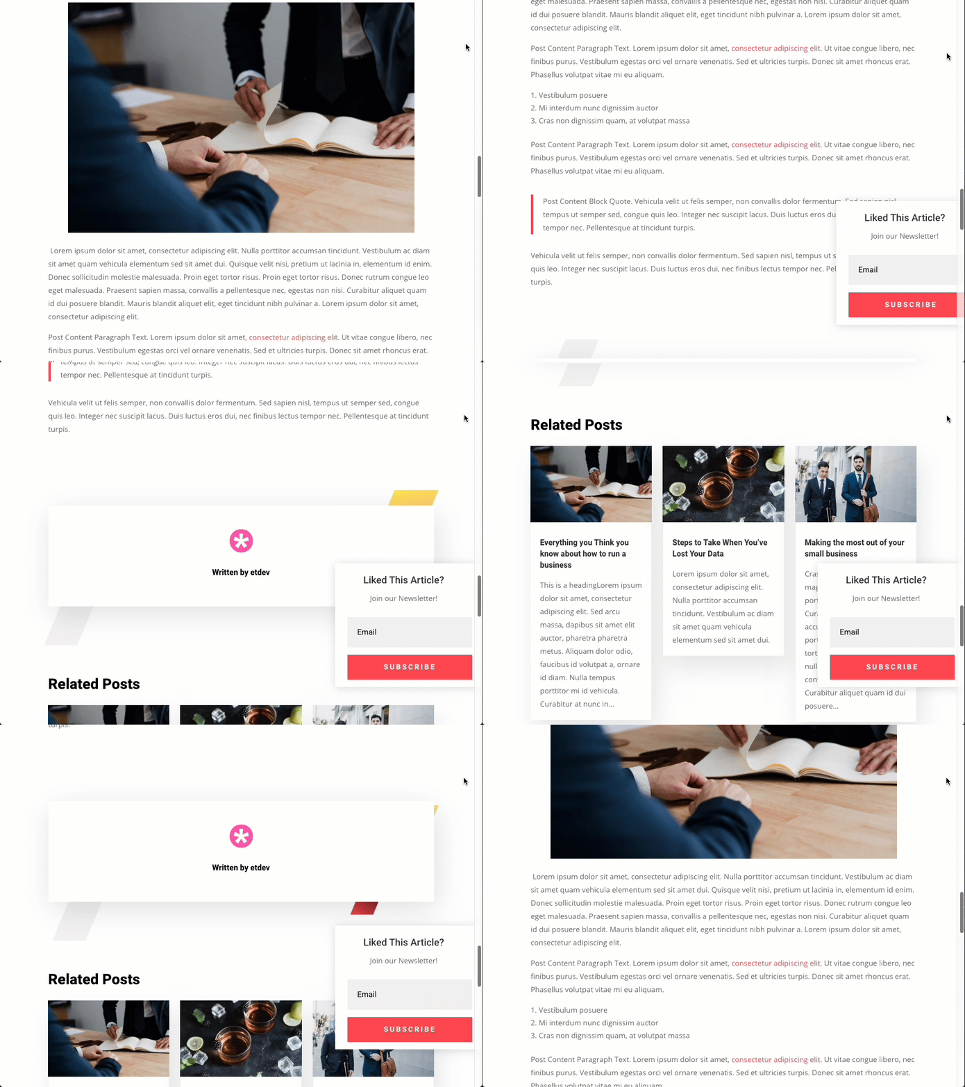
Download the Scroll Triggered Popup Divi Post Template for FREE
To lay your hands on the Post Template from this tutorial, you will first need to download it using the button below. To gain access to the download you will need to subscribe to our newsletter by using the form below. As a new subscriber, you will receive even more Divi goodness and a free Divi Layout pack every Monday! If you’re already on the list, simply enter your email address below and click download. You will not be “resubscribed” or receive extra emails.
To import the layout to your page, simply extract the zip file and add one of the json files into the Divi Theme Builder using the Theme Builder Portability option.
Let’s get to the tutorial shall we?
What You Need to Get Started
To get started, you will need to install and activate the Divi Theme. Make sure you have the latest version of Divi.
You will need to download the Fourth Theme Builder Pack since we will be using the premade post template from that pack for this tutorial.
You will also need at least a few blog posts created for testing purposes in order for the post template to show the results.
After that, you are ready to go.
Creating a Scroll Triggered Pop-Up at the End of Your Divi Blog Posts
Importing the Blog Post Template from the Fourth Theme Builder Pack
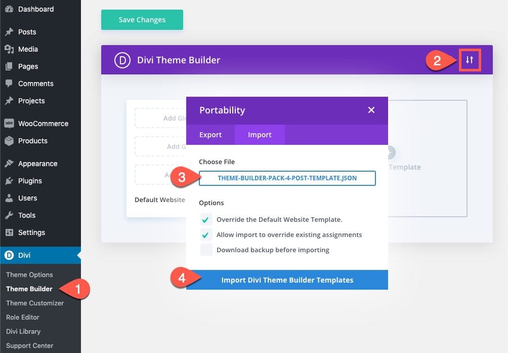
From the WordPress dashboard, navigate to Divi > Theme Builder. Within the theme builder, select the portability icon at the top right of the page. In the portability popup, select the import tab, choose the theme-builder-pack-4-post-template.json file and click the import button. (This import file will be inside the Fourth Theme Builder Pack folder)
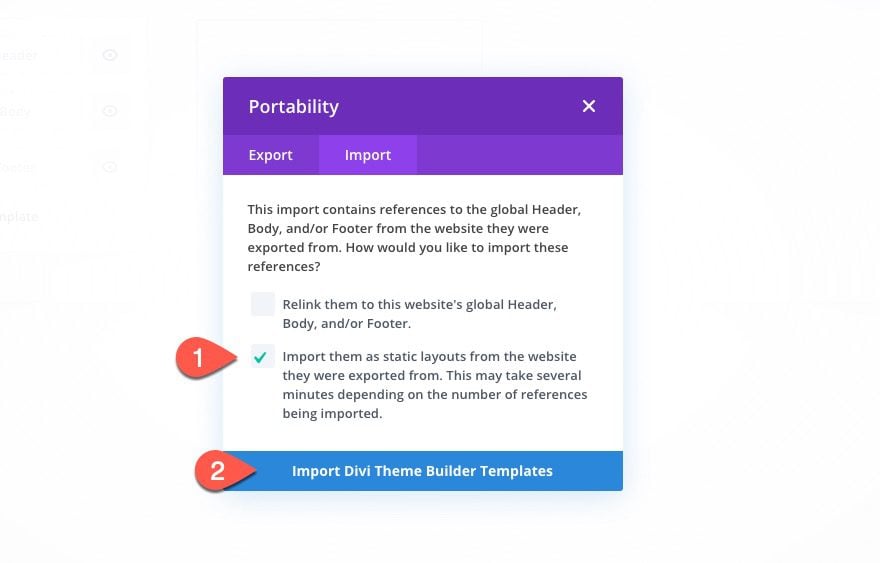
You can also select the option to import the global header and footer as static layouts.
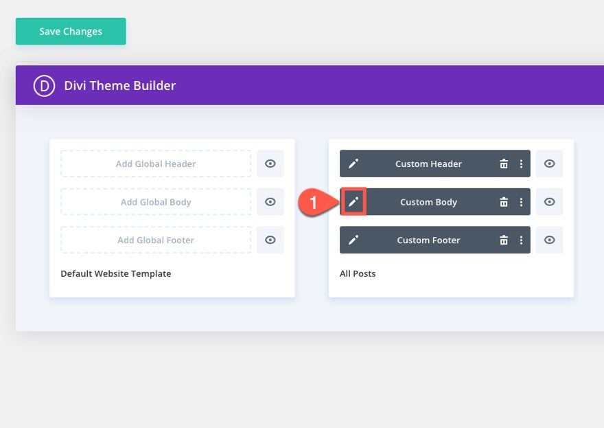
After the template has been imported, click the icon to edit the custom body area.
This will take you to the body template layout editor where we will add the scroll triggered popups.
The popup will be contained by a Divi row. Therefore, once we get the popup functionality in place, you can fill that row with any module to create any content you want. For this first example, we will create a popup featured a related post by category. That way when a visitor scrolls to the bottom of the post, they will get a related post suggested to them in a popup.
Here’s how to do it.
Add One-Column Row
First add a one column row just below the row containing the post content module in the post template layout.
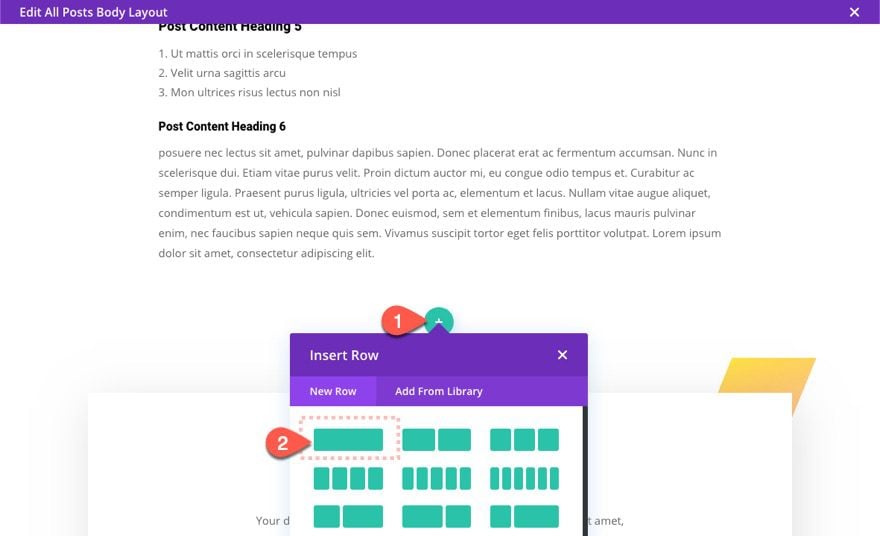
Row Settings
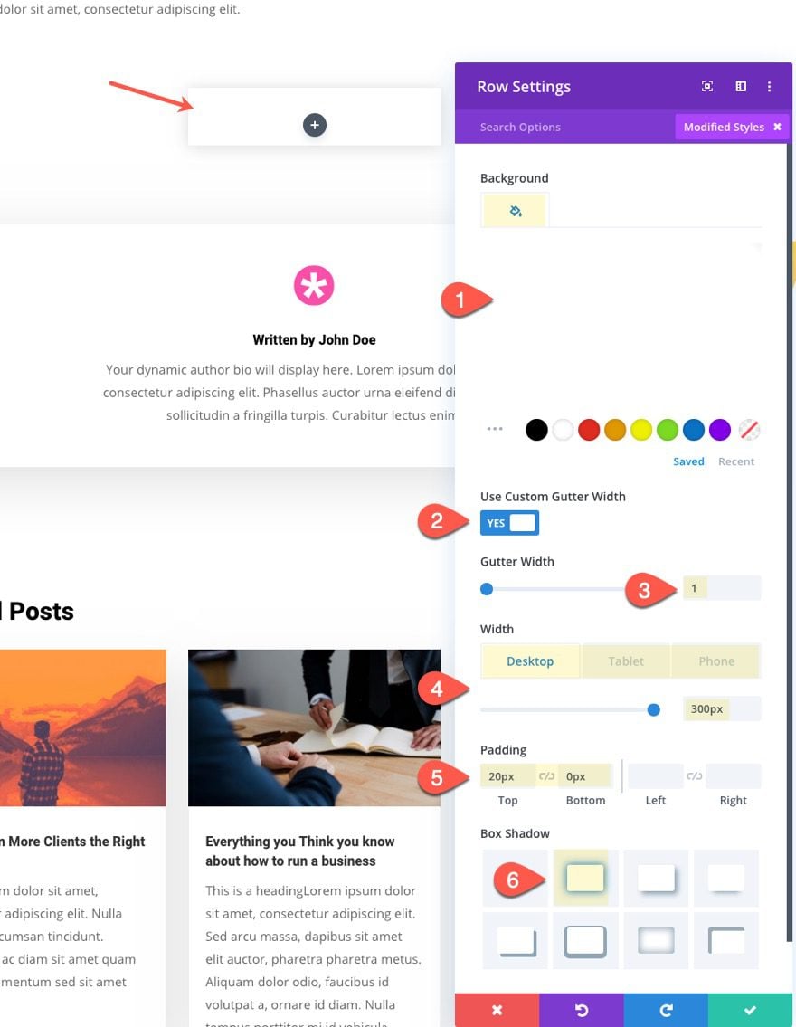
Before adding a module, update the row settings as follows:
- Background Color: #ffffff
- Gutter Width: 1
- Width: 300px (desktop), 200px (phone)
- Padding: 20px top, 0px bottom
- Box Shadow: see screenshot
Add Text Module
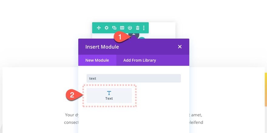
After the row settings are customized, add a text module to the row. This will be the title area of our related post popup.
Content
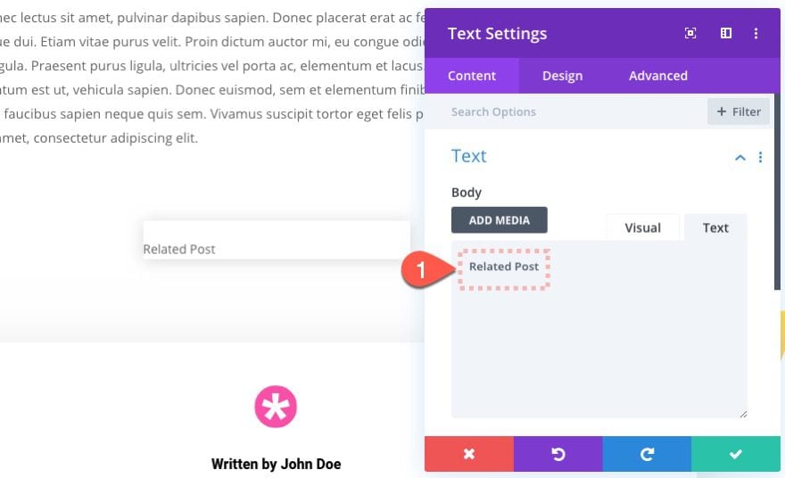
Update the body content with the text “Related Post”.
Design
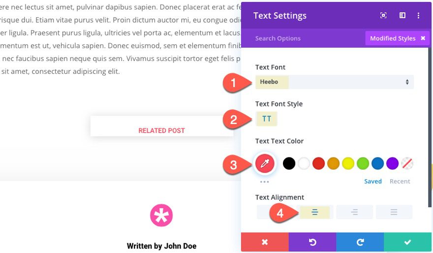
Then update the design settings as follows:
- Text Font: Heebo
- Text Font Style: TT
- Text Text Color: #f94857
- Text Alignment: center
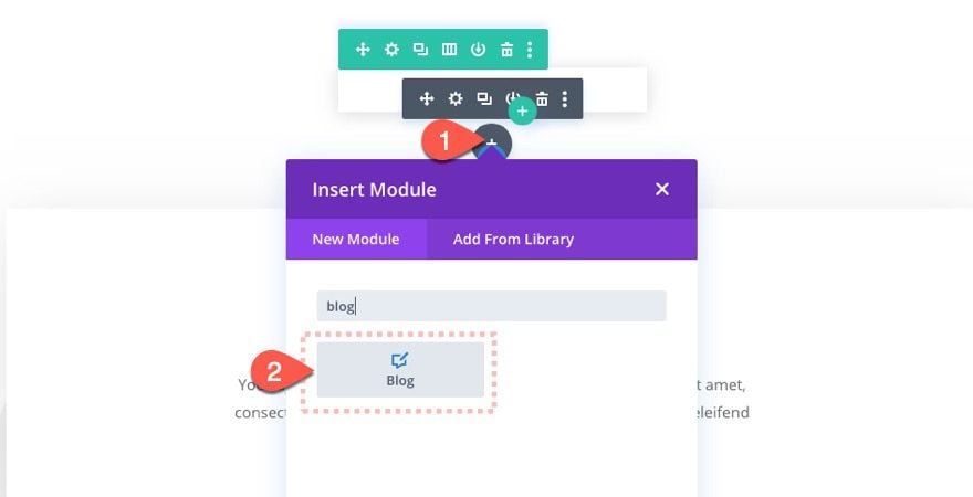
Add Blog Module
Under the text module, add a blog module.
Content
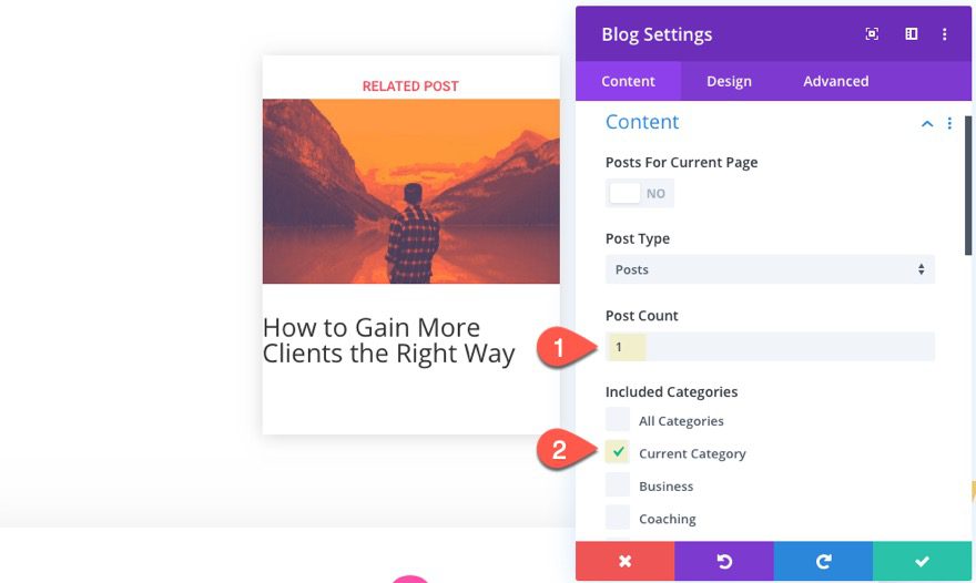
Since we only want to feature one related post, we are going to limit the post count to one and include the “current category” so that the post that shows in the popup will share the same category of the actual post displayed on the template.
Update the following:
- Post Count: 1
- Included Categories: Current Category
Elements
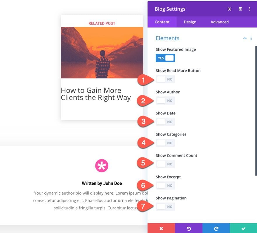
Under the elements option group, make sure that you select to show only the featured image. Hide everything else.
Design
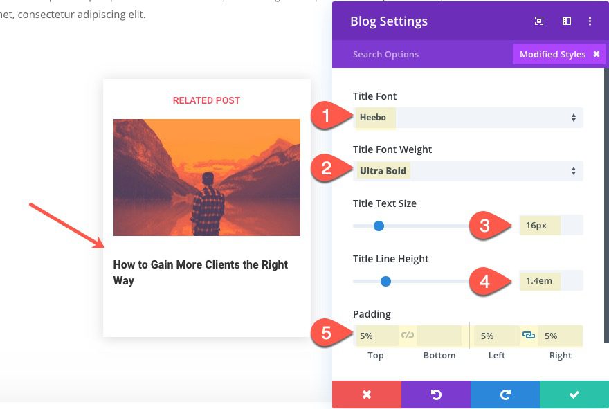
Under the design tab, update the following:
- Title Font: Heebo
- Title Font Weight: Ultra Bold
- Title Text Size: 16px
- Title Line Height: 1.4em
- Padding: 5% top, 5% left, 5% right
Advanced Row Settings
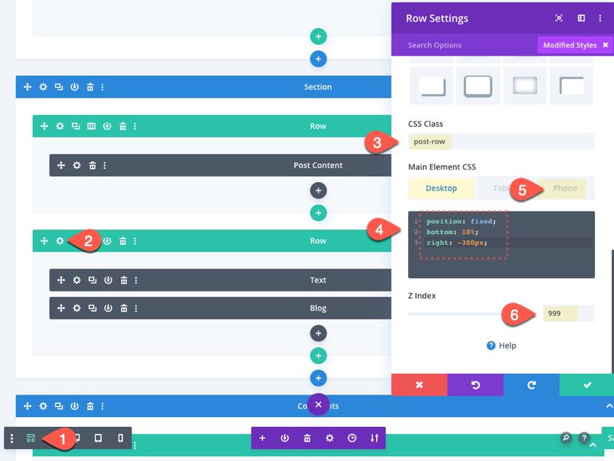
CSS Class, Custom CSS, and Z Index
Under the advanced tab, we need to give our row a CSS class, a little custom CSS, and update the z index so that the popup stays above the other content on the page.
This step will hide the row from view when using the visual builder on the front end. So it may be better to deploy the wireframe view before update these options.
Once in wireframe view mode, open the row settings back up and add the following CSS Class:
- CSS Class: post-row
Then add the following custom css to the Main Element:
position: fixed;
bottom: 0%;
right: -300px;
And update the Z Index:
- Z Index: 999
Add Dividers as Scroll Trigger Points
At this point our popup is ready to go. Now we need to decide where to add our scroll trigger points on the post template, so that once the user scrolls to these points, the popup will be shown or hidden. The scroll trigger points will be determined by an element with a CSS class. Since we are wanting the scroll trigger point to be at the bottom of the post, we can use a divider with a CSS class as our scroll trigger point element.
Add Scroll Trigger Point #1
To add our first scroll trigger point, let’s add a divider module directly under the post content module.
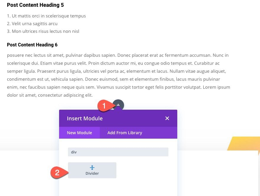
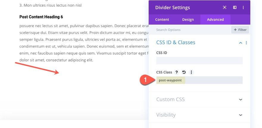
Then add the following CSS Class:
- CSS Class: post-waypoint
That was easy.
Add Scroll Trigger Point #2
Now to add the second trigger point (the one that will hide the popup farther down the page), copy the divider module just created.
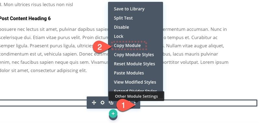
Then paste it at a located farther down the post template where you want the popup to be closed (or hidden). For this example, I’m adding it just below the related posts blog module and right above the comments section of the post template.
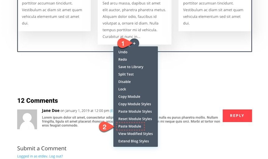
Add Custom Code with Code Module
All that is left to do for this scroll triggered popup to work is a little code.
Go ahead and add a code module to the post template.
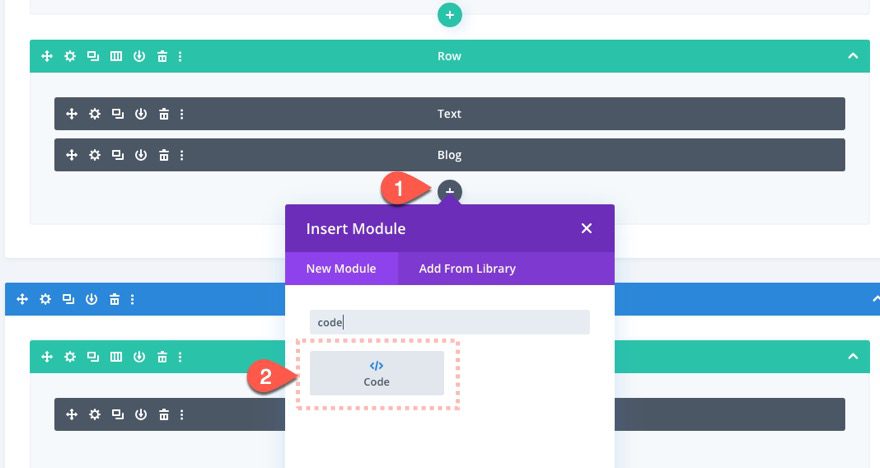
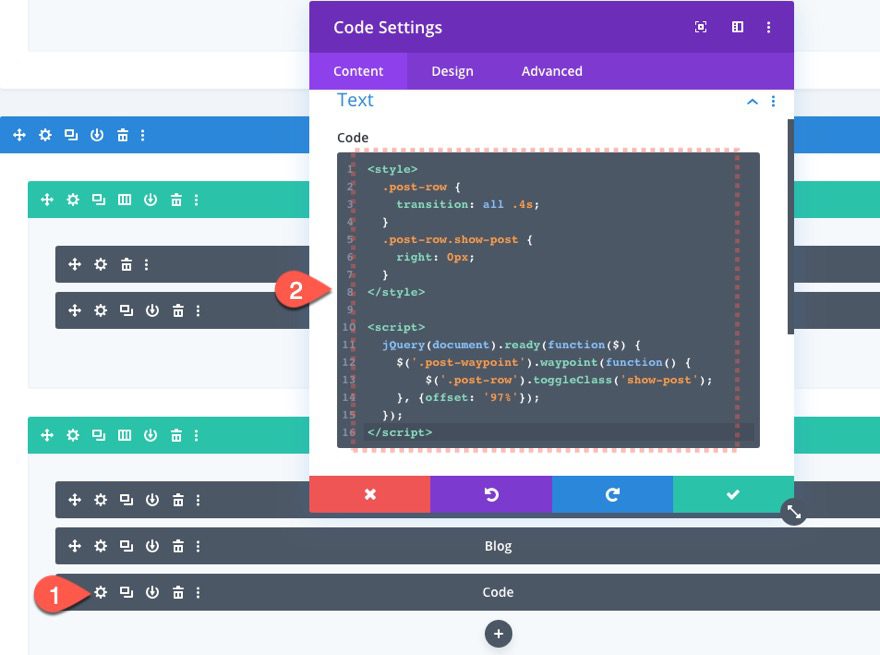
Then paste the following code in the code box:
<style>
  .post-row {
    transition: all .4s;
  }
  .post-row.show-post {
    right: 0px;
  }
</style>
<script>
  jQuery(document).ready(function($) {
    $('.post-waypoint').waypoint(function() {
        $('.post-row').toggleClass('show-post');
    }, {offset: '97%'});
  });
</script>
Result
To see the result, visit one of your blog posts and scroll down the page. You should see the related post popup when you reach the bottom of the post content. Keep scrolling to see it hidden right after the related posts section of the post.


Adding an Email Optin to the Scroll Triggered Pop-Up
The related post popup is cool, but maybe you would like an email optin to popup instead. This is easy to do. In fact, we can even use the email optin already designed in the premade footer layout on this template.
Save Footer Email Optin to Divi Library
Save your layout and exit to the theme builder. Then click to edit the custom footer template layout.
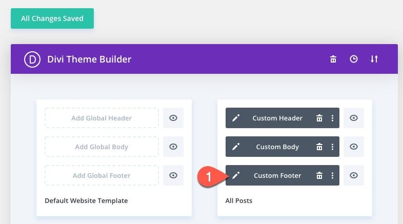
Find the email optin module and save it to the divi library.
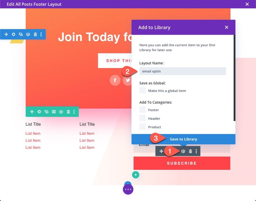
Add Saved Email Optin to Popup Row
Now go back to the custom body template layout and add the saved email optin the same row you are using as the popup. Remember, anything inside that row will show as the popup content.
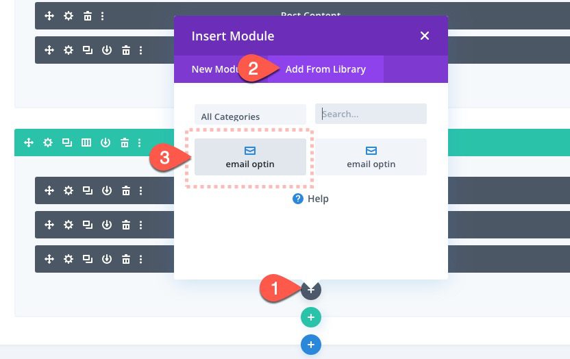
Since you aren’t using the text and blog module, you can disable them from being seen on the front end.
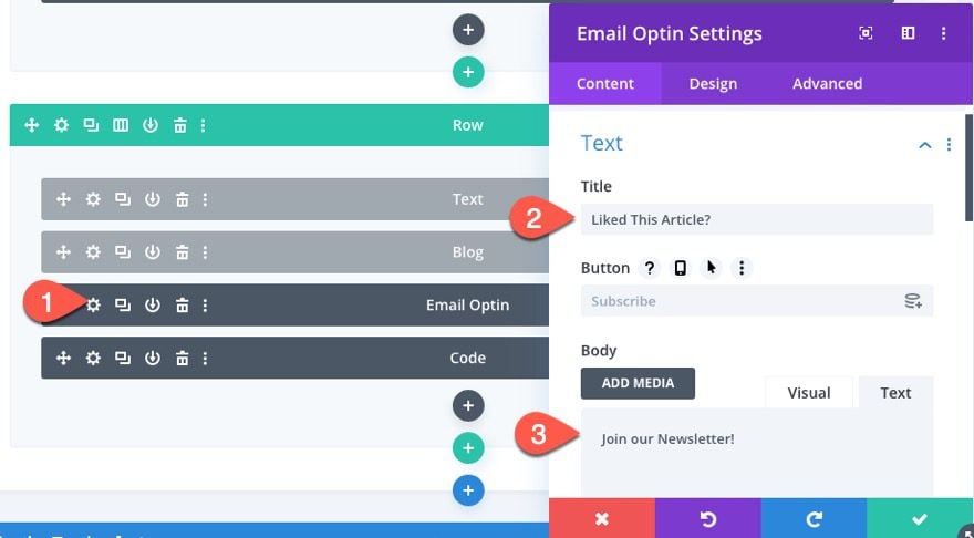
Email Optin Settings
Once the email optin is in place and the other modules are disabled, update the email optin settings as follows:
- Title: “Liked This Article?”
- Body: “Join our Newsletter!”
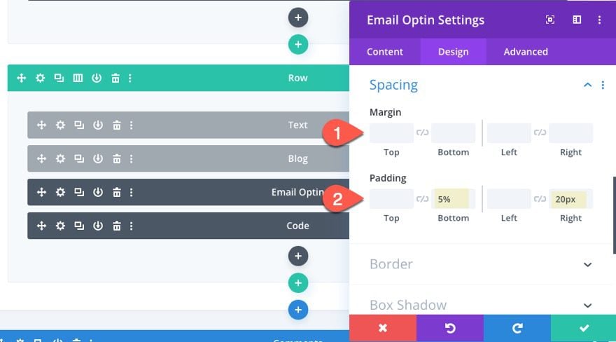
Then add the following padding:
- Padding: 5% bottom, 20px right
Result
Now check out the result on a live post.


Final Thoughts
Scroll triggered popups could definitely be a valuable asset to your blog. They provide an unobtrusive way capitalize on qualified leads. Use a related post popup to keep them engaged on your site or use an email optin to help grow your list. And with Divi, you can add just about any other content you can think of as well. And you can decide exactly when you want the visitor to see those popups which is pretty powerful. I hope you find it useful for your own blog or next project.
I look forward to hearing from you in the comments below.
Cheers!



I just added this widget to my blog, it’s very helpful for me. And from today gonna follow elegant themes.
Wonderful to hear, Rahul.
Jason,
This is very useful and appreciated. I would make a respectful suggestion for those of us who are not full time web pros. Could these tutorials be simplified? I want to add this to a page of mine that already exists and I need to filter out the extraneous instructions for loading a different layout, footers, etc. I think this could be greatly simplified.
Thank you and best wishes for the new year.
Chris,
Thanks for the feedback. I can definitely see where this tutorial can be simplified. However, if you wanted to implement this on your current page, all you really need to do is build the popup row and add the code via the code module. You could even download this template and then save the row and code module to the Divi library and then add it to any page or template that way. Hope that helps.
That helps a lot. I think these are most instructional with very simple models. When there is a ton of formatting instruction, I get lost. Thank you for your consideration.