Divi’s built-in animations provide tons of possibilities when it comes to adding that extra edge to your website. These animations, however, allow you to add one animation to one container at a time. While in most cases this is usually more than enough, there are projects where you’ll want to go the extra mile. You might find yourself wanting to add advanced text animations, for instance. In this tutorial, we’ll show you exactly how to do that. This tutorial is a great stepping stone if you want to learn how to combine Divi, as a framework, with external Javascript libraries. We’ll create our entire design using Divi’s built-in elements and options, and then target our Text Module with the letterize.js and anime.js libraries to create advanced text animations. Once you understand the approach, you’ll be able to create any kind of advanced text animation you can imagine!
Let’s get to it!
Preview
Before we dive into the tutorial, let’s take a quick look at the outcome across different screen sizes.
Desktop

Mobile

Download The Advanced Text Animations Layout for FREE
To lay your hands on the free advanced text animation layout, you will first need to download it using the button below. To gain access to the download you will need to subscribe to our newsletter by using the form below. As a new subscriber, you will receive even more Divi goodness and a free Divi Layout pack every Monday! If you’re already on the list, simply enter your email address below and click download. You will not be “resubscribed” or receive extra emails.
1. Create Hero Section Design
Add New Section
Spacing
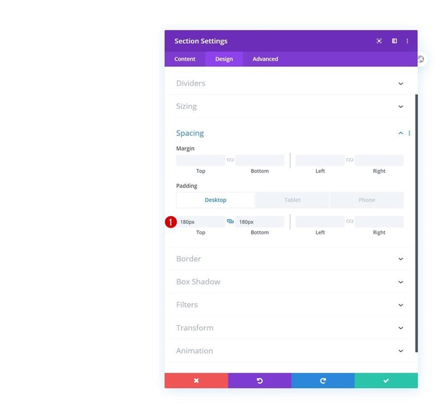
Start by creating a new page or opening an existing one. Inside your page, add a new section. Open the section settings and modify the top and bottom padding across different screen sizes.
- Top Padding: 180px (Desktop), 100px (Tablet), 50px (Phone)
- Bottom Padding: 180px (Desktop), 100px (Tablet), 50px (Phone)
Add Row #1
Column Structure
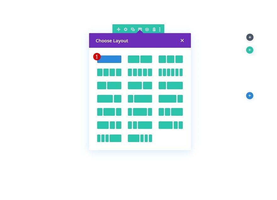
Continue by adding a new row using the following column structure:
Spacing
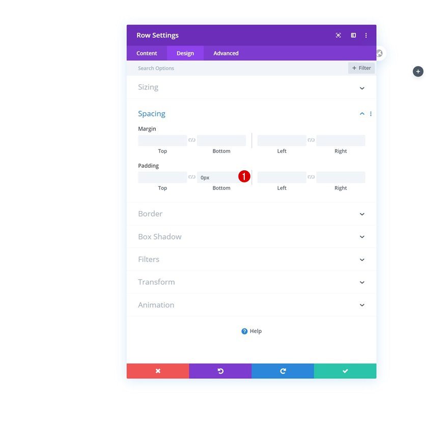
Without adding any modules yet, open the row settings and remove all default bottom padding.
- Bottom Padding: 0px
Add Text Module #1 to Column
Add H1 Copy
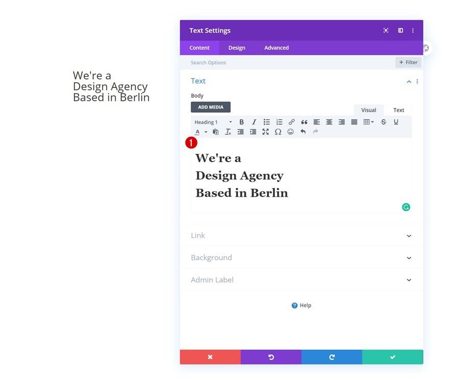
The only module we need in this row is a Text Module. Add some H1 content of your choice.
H1 Text Settings
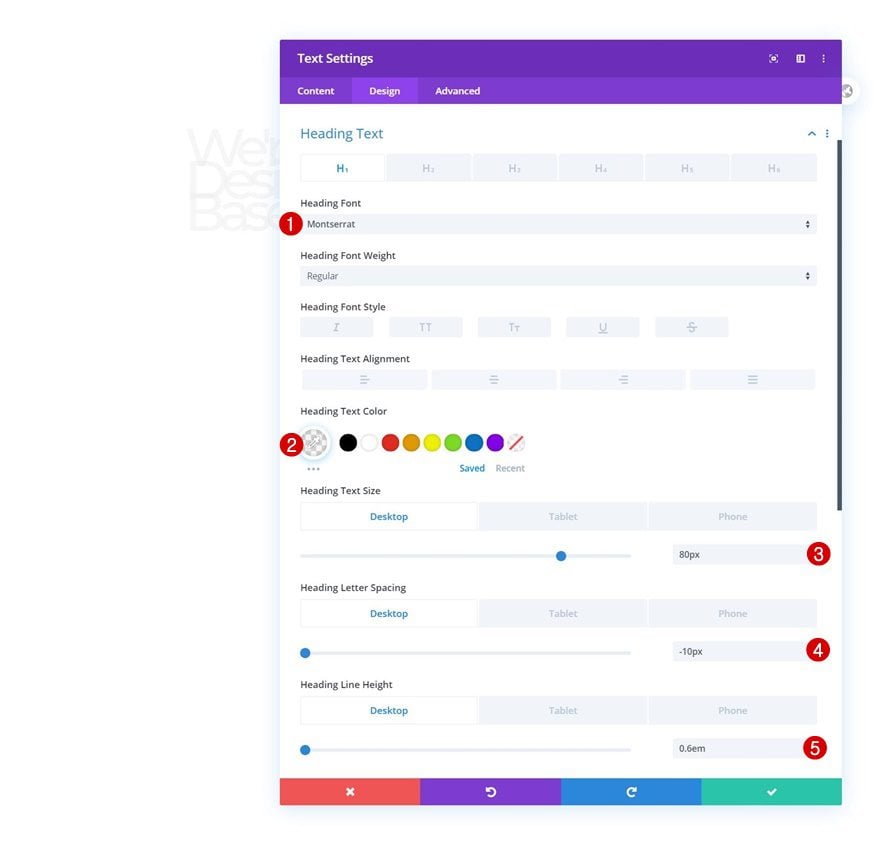
Move on to the module’s design tab and modify the H1 text settings as follows:
- Heading Font: Montserrat
- Heading Text Color: rgba(232,232,232,0.41)
- Heading Text Size: 80px (Desktop), 50px (Tablet), 40px (Phone)
- Heading Letter Spacing: -10px (Desktop), -4px (Tablet), -3px (Phone)
- Heading Line Height: 0.6em (Desktop), 0.7em (Tablet), 0.8em (Phone)
Add Row #2
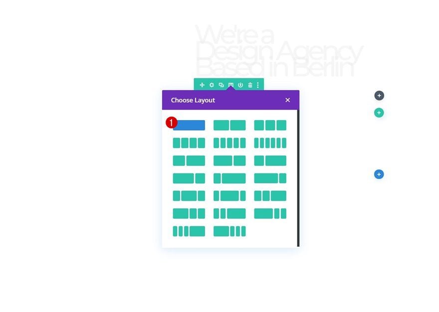
Column Structure
Add another row right below the previous one using the following column structure:
Sizing
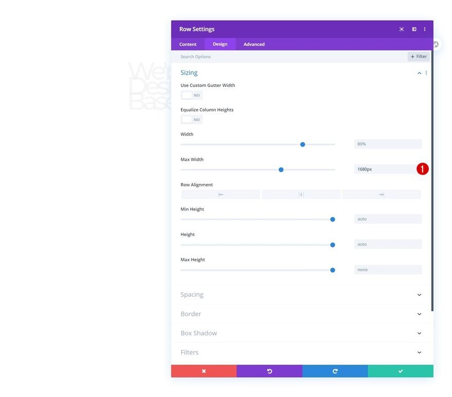
Open the row settings and change the max width in the sizing settings.
- Max Width: 1680px
Spacing
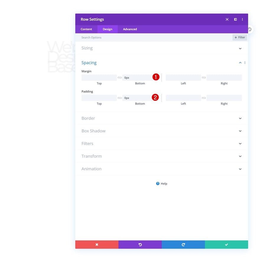
Remove all bottom margin and padding next.
- Bottom Margin: 0px
- Bottom Padding: 0px
Add Image Module to Column
Upload Illustration
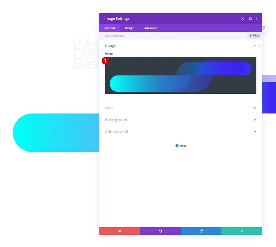
Then, add an Image Module and upload the free illustration that you can find in the folder that you were able to download at the beginning of this post.
Sizing
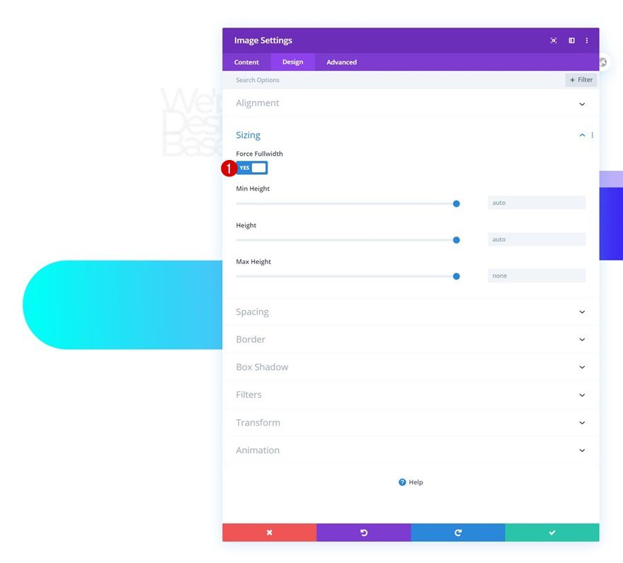
Move on to the module’s design tab and force fullwidth on the image.
- Force Fullwidth: Yes
Spacing
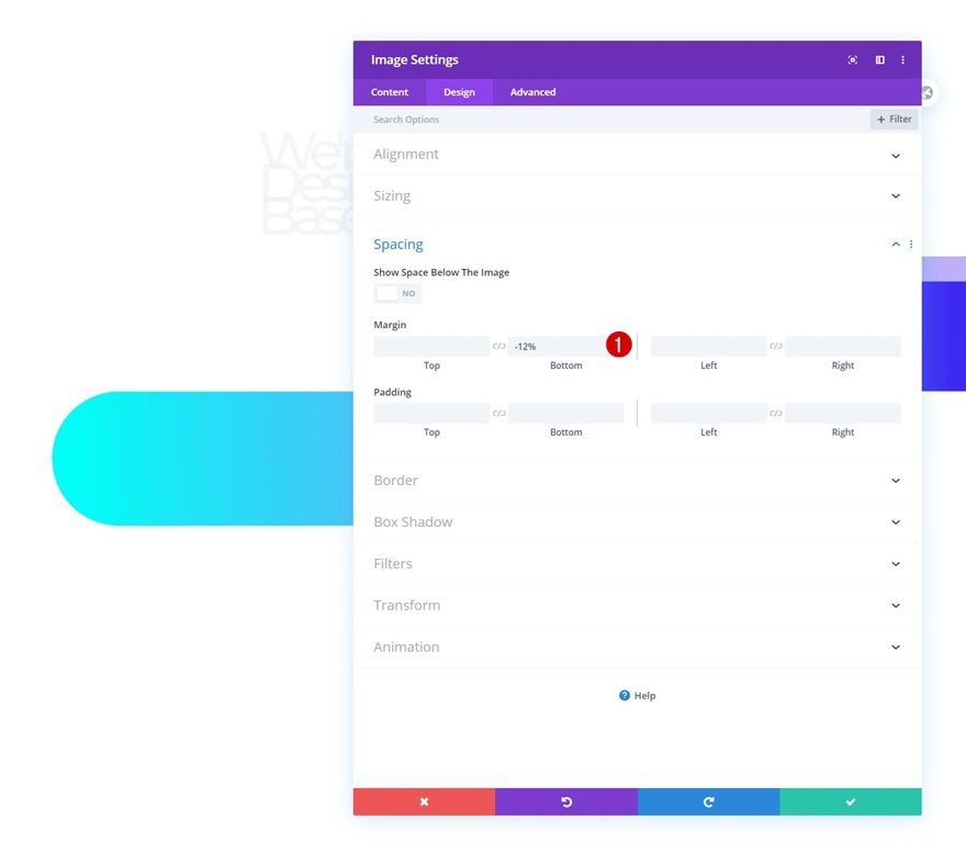
Add some negative bottom margin next.
- Bottom Margin: -12%
Animation
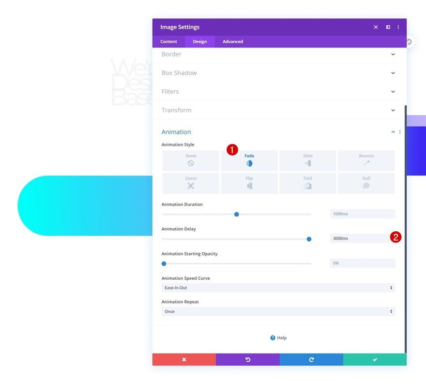
And complete the module settings by adding the following animation settings:
- Animation Style: Fade
- Animation Delay: 3000ms
Add Row #3
Column Structure
On to the next and last row. Use the following column structure:
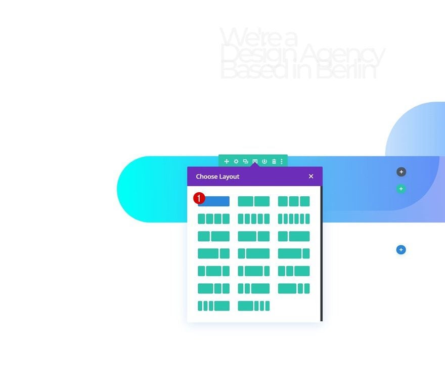
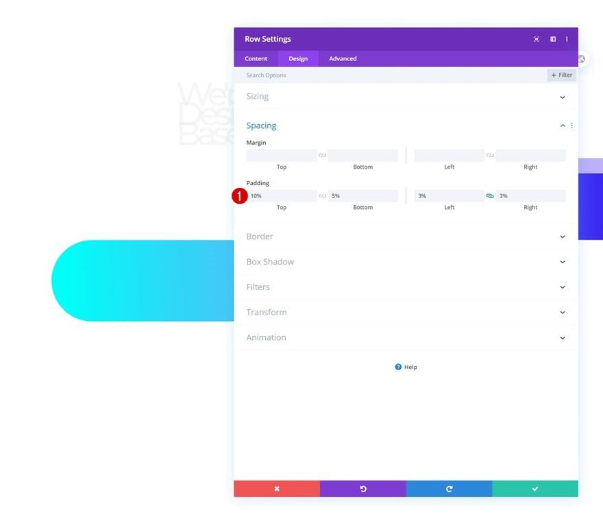
Spacing
Move on to the row’s design tab and add some custom padding values.
- Top Padding: 10%
- Bottom Padding: 5%
- Left Padding: 3%
- Right Padding: 3%
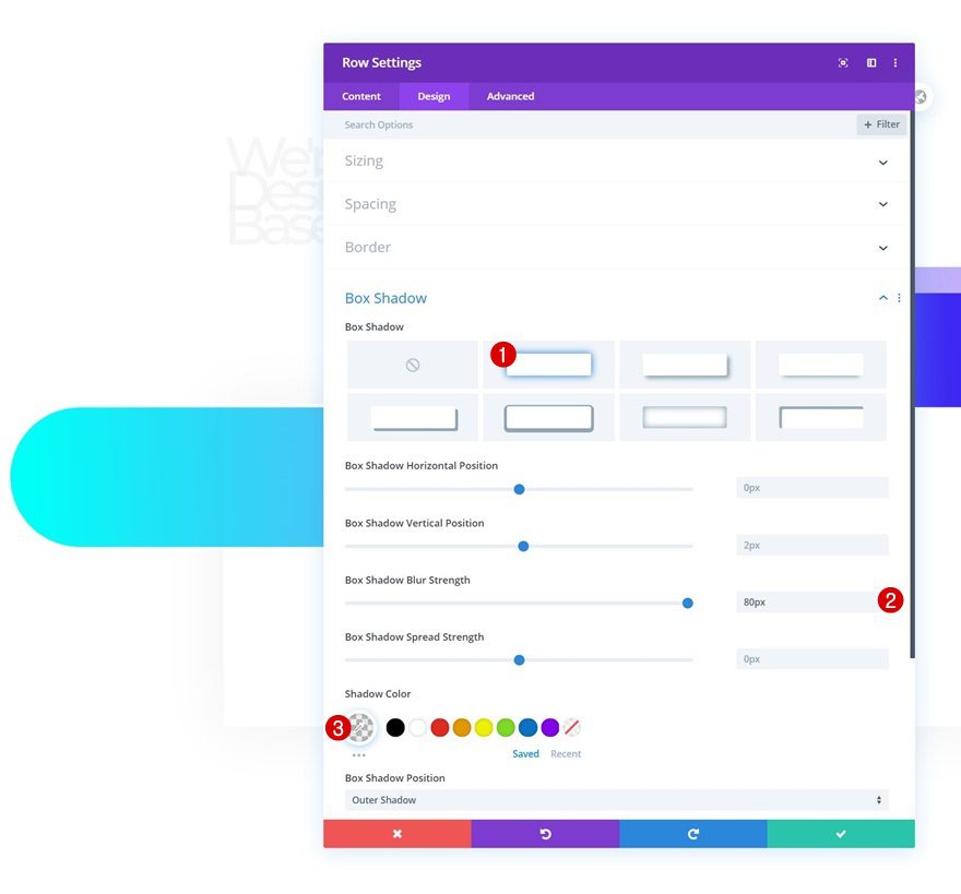
Box Shadow
Then, enable a subtle box shadow.
- Box Shadow Blur Strength: 80px
- Shadow Color: rgba(0,0,0,0.06)
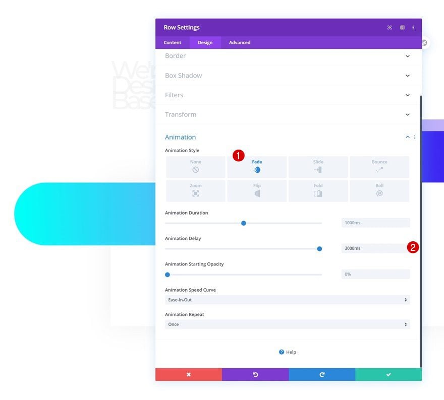
Animation
And complete the row settings by adding the following animation:
- Animation Style: Fade
- Animation Delay: 3000ms
Add Text Module #2 to Column
Add Content
Time to add modules. The first module we need is a Text Module with some description content.
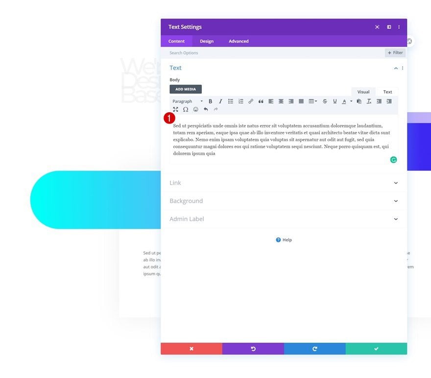
Text Settings
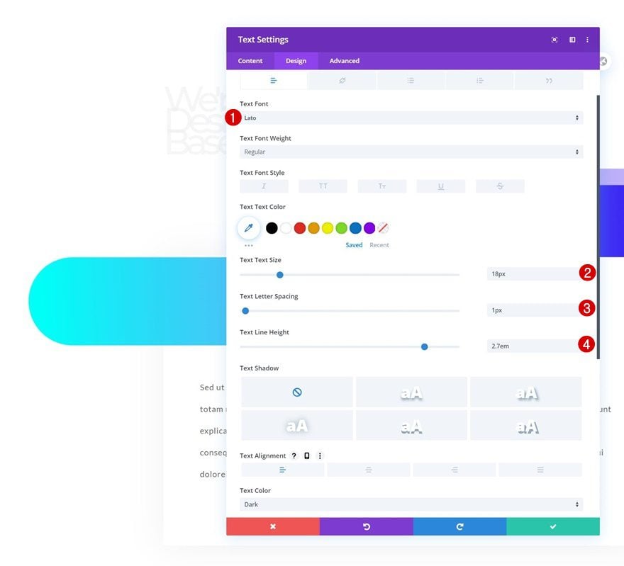
Move on to the module’s design tab and modify the text settings accordingly:
- Text Font: Lato
- Text Size: 18px
- Text Letter Spacing: 1px
- Text Line Height: 2.7em
Add Copy
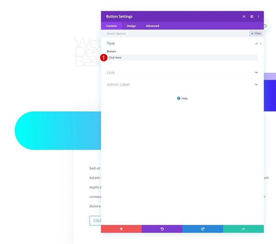
The last module we need is a Button Module. Enter some copy of your choice.
Button Settings
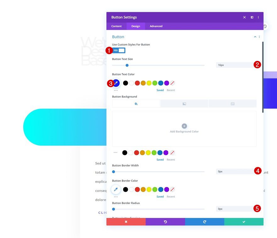
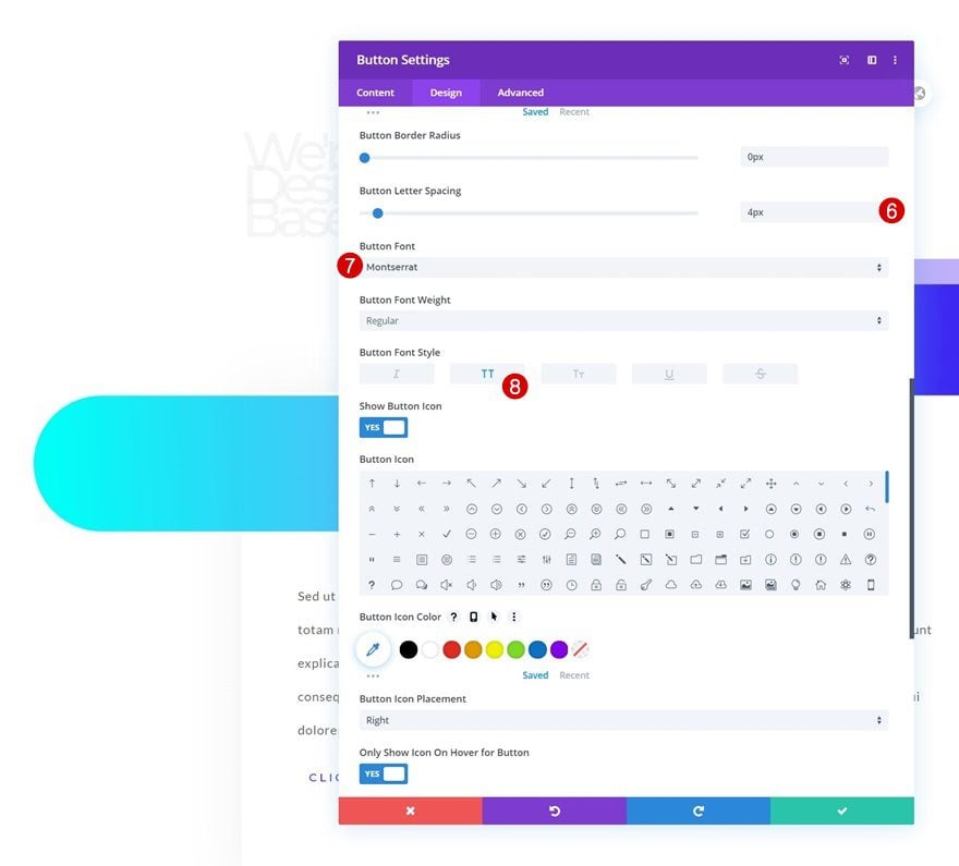
Move on to the module’s design tab and change the button settings as follows:
- Use Custom Styles For Button: Yes
- Button Text Size: 16px
- Button Text Color: #171cff
- Button Border Width: 0px
- Button Border Radius: 0px
- Button Font: Montserrat
- Button Font Style: Uppercase
Spacing
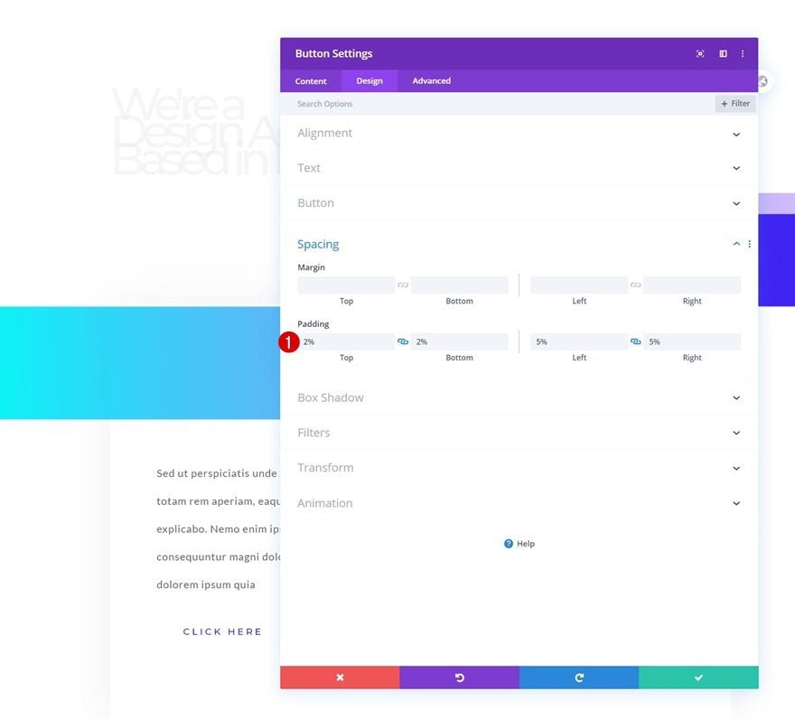
Then, apply the following padding values inside the spacing settings:
- Top Padding: 2%
- Bottom Padding: 2%
- Left Padding: 5%
- Right Padding: 5%
Box Shadow
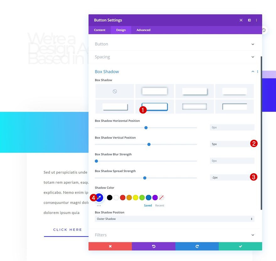
Complete the module settings by adding the following box shadow:
- Box Shadow Vertical Position: 5px
- Box Shadow Spread Strength: -2px
- Shadow Color: #171cff
2. Add CSS Class to Headline
Open Text Module #1 & Click on Text Tab
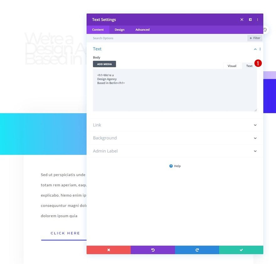
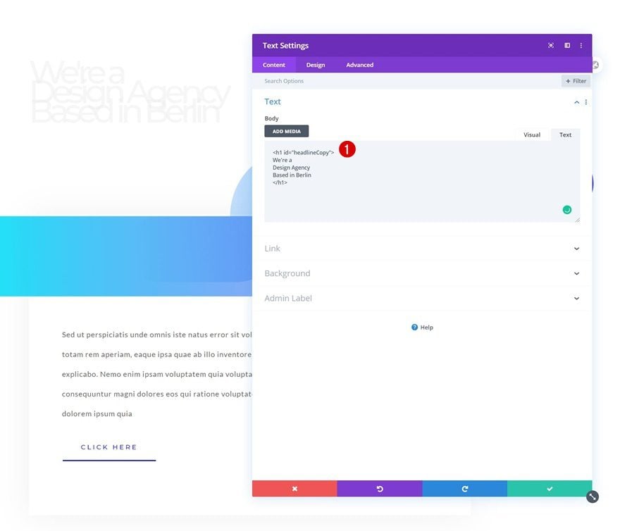
Now that we have all design elements in place, it’s time to add the advanced text animations to our headline. Open the Text Module containing the H1 copy and select the text tab.
Add CSS ID to H1 Tag
Inside the H1 add a custom CSS ID.
- ID=”headlineCopy”
3. Add Letterize & Anime Libaries
Add Code Module to Column
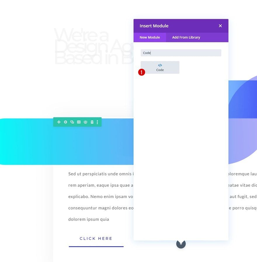
To create the animations, we’re using the letterize.js and anime.js libraries. To add these libraries, insert a new Code Module in your last row’s column.
Add Both Libraries
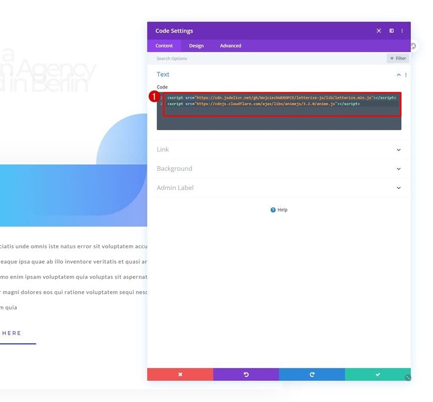
Then, add two different script tags containing the following sources that lead back to the libraries:
- src=”https://cdn.jsdelivr.net/gh/WojciechWKROPCE/letterize-js/lib/letterize.min.js”
- src=”https://cdnjs.cloudflare.com/ajax/libs/animejs/3.2.0/anime.min.js”
4. Add Animation Code
Animation for Letter on Individual Level
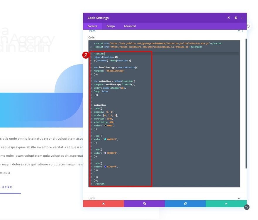
In the last part of this tutorial, we’re going to add the animation code that’s part of the letterize.js and anime.js libraries. To achieve the effect that you were able to see in the preview of this post, we’re going to apply two types of animations. The first animation is applied to each letter individually and consecutively. This is achieved with the letterize.js library. This library, in combination with the first part of the code below, places each letter in your copy inside a separate span. These spans will, then, be separately targeted throughout the animation process. Make sure you place the code below in between script tags.
jQuery(function($){
$(document).ready(function(){

var headlineCopy = new Letterize({
targets: "#headlineCopy"
});

var animation = anime.timeline({
targets: '#headlineCopy span',
delay: anime.stagger(20),
loop: false
});

animation
.add({
opacity: [0, 1],
scale: [0, 1.2, 1],
duration: 1500,
elasticity: 600,
color: '#000',
})

.add({
color: '#00FFF7',
})

.add({
color: '#D2BEFB',
})

.add({
color: '#171cff',
});

});
});
Each add function represents an animation in a timeline of animations. These animations apply to each letter on an individual level. You can modify these add functions however you want, add new ones or remove current ones, just make sure that the last add function is closed properly with a ‘;’ at the end (as you can see in the code above). You can add different CSS properties inside these add functions. You can find out more about the properties and how they’re used in the anime.js documentation examples. In this tutorial, we’ve purposely added multiple animations to show how the timeline works, but you’ll probably want to go with something more subtle or shorter for your own projects.
Animation for Sentence
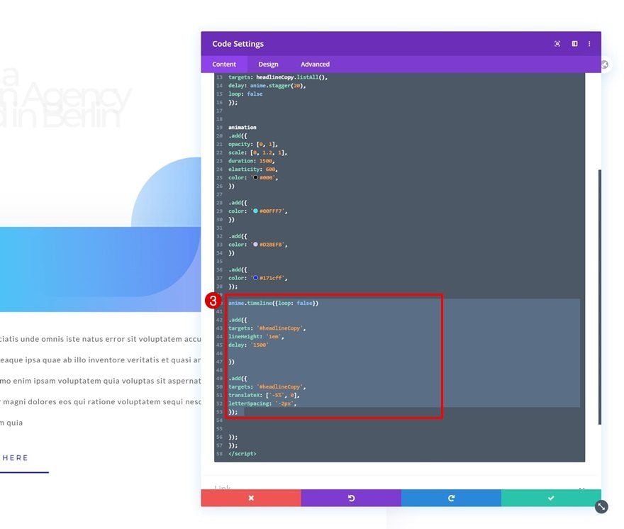
Once you’ve added the first part of the animation, which targets each letter individually, we’ll move on to the second part of our animation. This part targets the entire copy as a whole. The animation approach is the same as above; we’re placing the entire module inside a timeline animation. Each add function represents a different animation inside that timeline. You can modify these add functions, add new ones or remove current ones. Make sure you place this new code before the ending of the script code as you can notice in the print screen below.
anime.timeline({loop: false})

.add({
targets: '#headlineCopy',
lineHeight: '1em',
delay: '1500'

})

.add({
targets: '#headlineCopy',
translateX: ['-5%', 0],
letterSpacing: '-2px',
});
Add Custom CSS for Span
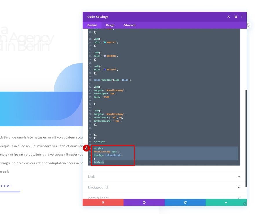
Now, since we’ve created a separate span for each one of our letters, we’ll need to change the display property of each span to allow the letters to appear next to each other. To do that, we’ll add some CSS code to our code module. Make sure you place the code in between style tags.
#headlineCopy span {
display: inline-block;
}
Preview
Now that we’ve gone through all the steps, let’s take a final look at the outcome across different screen sizes.
Desktop

Mobile

Final Thoughts
In this post, we’ve shown you how to create advanced text animations to your headline. We’ve built the entire design inside Divi and combined the framework with the letterize.js and anime.js libraries. If you have any questions or suggestions, feel free to leave a comment in the comment section below!
If you’re eager to learn more about Divi and get more Divi freebies, make sure you subscribe to our email newsletter and YouTube channel so you’ll always be one of the first people to know and get benefits from this free content.


I’ve set this up, but the browser is give me this for both JS files
Js file blocked due to MIME type (“text/html”) mismatch (X-Content-Type-Options: nosniff)
Therefore the animation isn’t working. How can I fix this.
Love this. It totally worked for me. Is it possible to make the animations only start on scroll (when they appear on the screen?). I have this at the bottom of the page but the jumbled animation at the start is already finished by the time I scroll down to that point. Thanks!
Thank you very much for this guide, it’s now easy for me to add creative animations to my website.
I did everything step by step, unfortunately it doesn’t seem to be working.
Hi Nikos,
it didn’t work for me as well until I corrected all ” signs in the above provided code as there were different. Try to replace all manually in the h1 headline and the code. Then it should work. It worked for me 🙂
downloaded the json but it doesnt do any of the animation its just the text
This is new to me. I tried it on my site. How does one change fonts?
I love the effect that is shown. A clean but striking design. But those of us who have an obsession with loading speed….. Does installing the text animation affect the loading speed? Thank you very much.
Great!! We will try. Thank you.
Happy you like it! 🙂
Wow i wish i was optimistic about trying this it seems mega out of my league but ill defo give it a go 👍🏼
Definitely try it, Stephen! 🙂
awesome ! Trying asap. Thanks !
Happy you like it, Fred! 🙂