Featured Plugin On Sale Now In The Divi Marketplace
Divi Background Plus is available in the Divi Marketplace! That means it has passed our review and has been found to meet our quality standards. You can visit Superfly in the marketplace to see all of their available products. Products purchased from the Divi Marketplace come with unlimited website usage and a 30 day money back guarantee (just like Divi).
Color and gradient overlays are excellent design elements that can capture the attention of your audience and make your content stand out. They work great with background images. Add a background image to a section, row, or column, add a color or gradient overlay, and then place your content over that. One problem, though, is color and gradient overlays don’t work with parallax and video backgrounds in Divi by default.
In this tutorial, we’ll show you how to add color and gradient overlays to backgrounds with either an image in parallax or a video using a third-party plugin from our marketplace. We’ll also see the overlays working with section dividers. This would normally require code, but with the right tools, it’s not difficult for anyone to implement.
Let us begin.
Sneak Peek
Here’s a look at what we’ll build in this tutorial.
I’m creating a layout with a parallax background in one section and a video background in another. The parallax background will have a gradient and the video background will have a single color overlay. We’ll also style the section dividers. I’m using the landing page from the Pizzeria Layout Pack because, well, pizza. This is how it looks on a desktop.
This is how the same design looks on a phone.
Standard Divi Parallax and Video Backgrounds
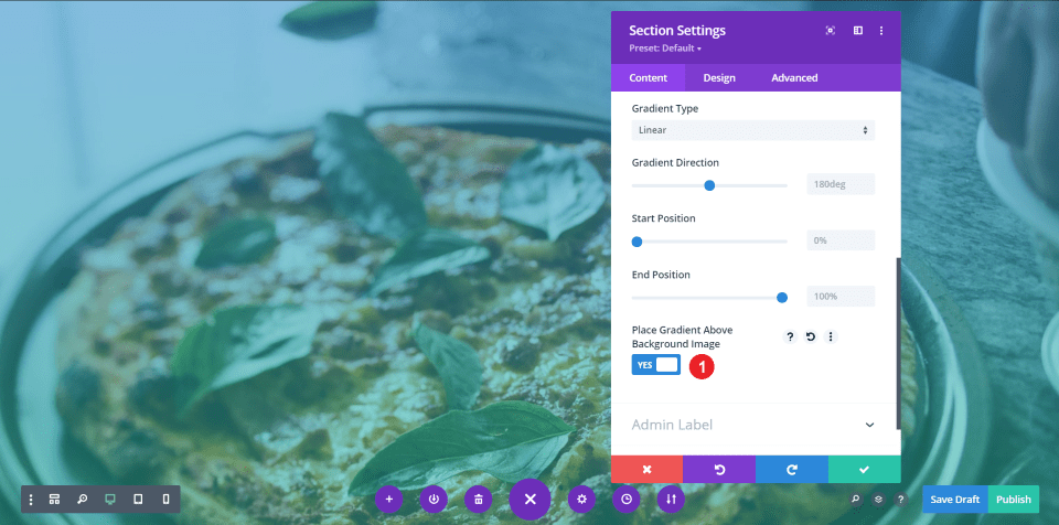
The standard Divi tools allow you to add background images and videos to sections, rows, and columns, but the overlays for them is limited. For background images, you can add a gradient overlay but not an overlay for a solid color. The options for video do not include overlays.
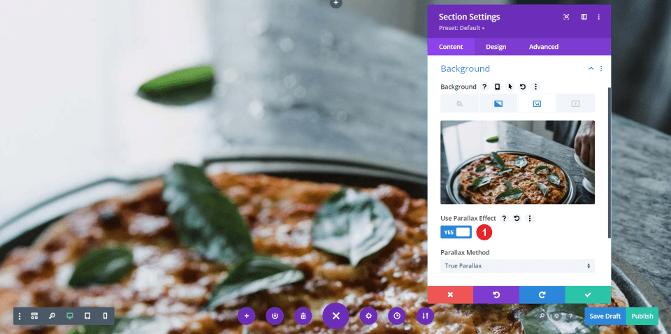
The options for background images do include parallax, but if you enable parallax for the background image, the overlay no longer displays over the image. It’s turned off, even though you have it selected to display the overlay.
How to Add Color & Gradient Overlays to Divi Parallax & Video Backgrounds
We’ll add color and gradient overlays to parallax and video backgrounds using a third-party plugin called Divi Background Plus. We’ll also see how to style the section dividers using this plugin.
Install Divi Background Plus

Divi Background Plus is available in the Divi Marketplace. Let’s see how to get started. First, purchase and download Divi Background Plus to your computer.

In your WordPress dashboard, go to Plugins and select Add New. Click Upload Plugin at the top of the screen.

Select Choose File, navigate to the zipped file on your computer, select the file, and click Install Now.

Once the file uploads, click Activate Plugin. No other setup is needed. The plugin is now ready to use.
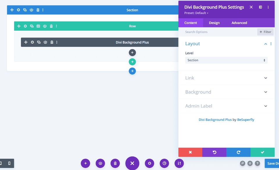
A new module is added to the Divi Builder called Divi Background Plus. We’ll use this module to create our gradient and color overlays for parallax ad video backgrounds. This plugin and the backgrounds in the sections are all we’ll need for this tutorial.
Add Gradient Overlays to Divi Parallax Background

Open the section settings where you’ll upload your background image. In this example, I’m using the background image with the first section in the Pizzeria layout pack, but you can upload it to any section, row, or column you want.
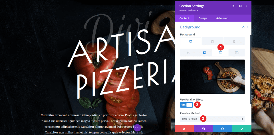
Open the image tab in the Content settings. Enable Use Parallax Effect. I’m using True Parallax, which is the default setting. CSS Parallax works too.
Enabling the parallax effect disables the gradient, but the settings for the gradient are still in place. Rather than using the gradient in the section’s settings, we’ll add the gradient in the settings in the Divi Background Plus module.
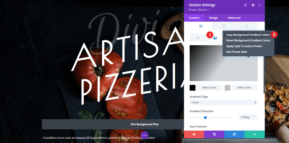
If you want to use the same gradient that’s already used for this section (like I am), select the Gradient tab and right-click somewhere on the gradient. Click Copy Background Gradient Colors.
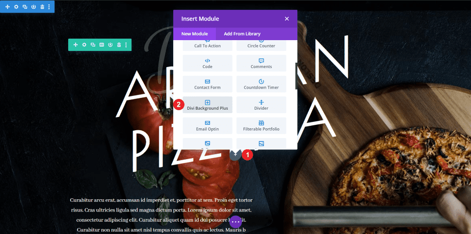
Select to add a new module to the section with your background image and choose Divi Background Plus.
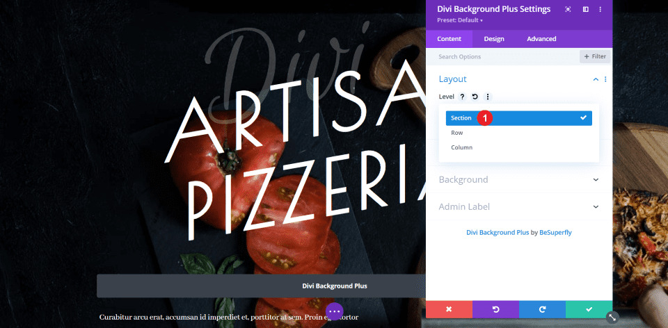
In the Layout settings in the Content tab, choose to apply the settings to the section, row, or column. I’m selecting Section.
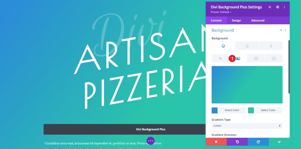
Open the Background settings and select the Gradient tab. The default gradient is automatically applied. You can adjust the opacity so your background shows through, create your own gradient, or use the one from the layout.
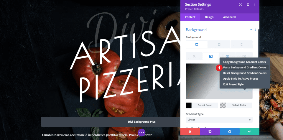
To use the one from the layout, right-click, and select Paste Background Gradient Colors. This will not only apply the colors, but also the settings for the gradient type, direction, start position, end position, and placing the gradient above the background image.
Here’s the result. I now have a version of the original that includes the same image and overlay, but it now displays the background in true parallax.
Here’s how the same layout looks on a phone.
Add Color Overlay to Divi Video Background
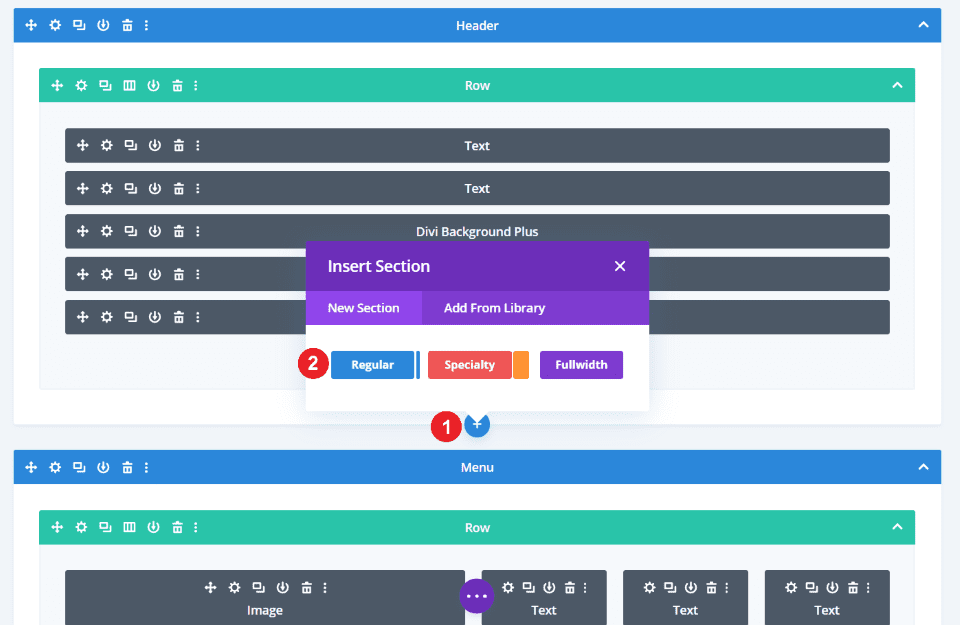
Add a new regular section under the first section. We will add the background video to this section, a Divi Background Plus module for the overlay, and add text modules to display messages, contact information, and a CTA in the overlay.

I plan to use the text from the Call to Action section. This is easy to do with Divi’s Layer tools. To do this, right-click on the section you want to copy and select Go To Layer.

Right-click on the rows you want to copy and select Copy Row.

Then, select the section where you want to place the row, right-click, and select Paste Row. I’m doing this for both rows that I want to copy from this section. Alternately, I could have copied this section and added the Divi Background Plus module to it.

I now have a new section with Divi Background Plus, several text modules, and a CTA.
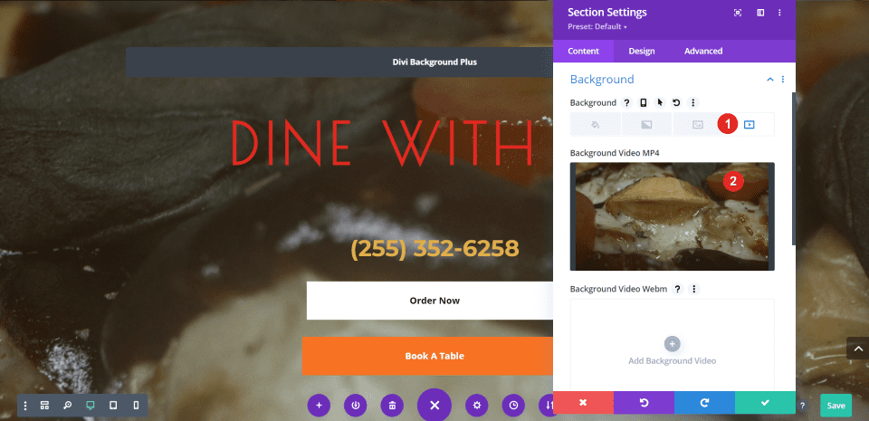
Next, add the video to the background of the section. The colors in the video work well with the colors in the text, but I want to add an overlay to make them stand out a little more. For my background video, I’m using the free video Tima Miroshnichenko’s Mixed Toppings Over a Pizza from Pexels.
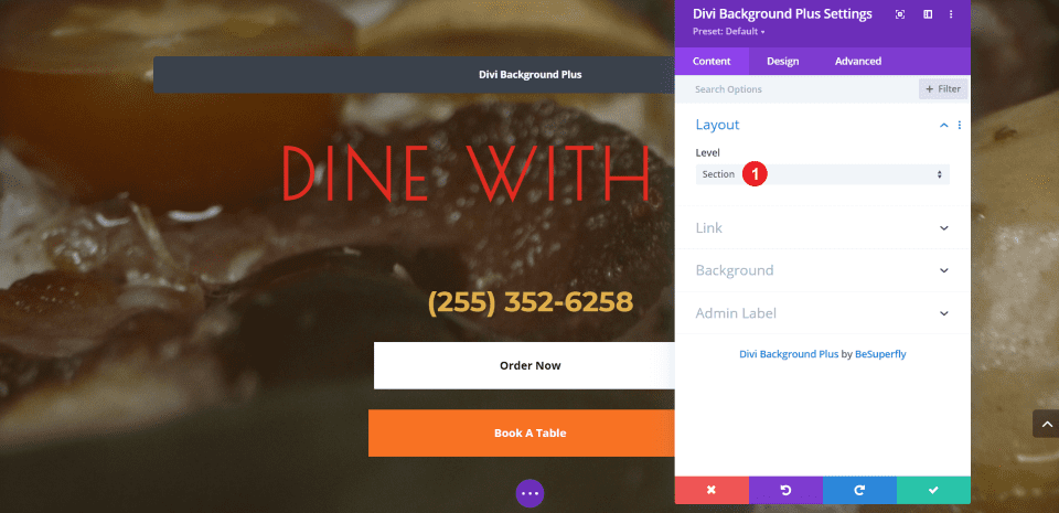
Open the Divi Background Plus settings and choose Section for the layout.
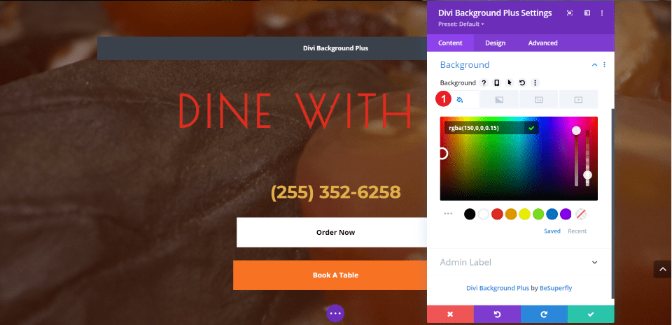
Scroll down to the Background tab and select the color option. Of course, your colors will be different depending on your video. I wanted to give the video a red tint. I’ve used:
- rgba(150,0,0,0.15)
Here’s how the background video with my red-tinted overlay looks on a desktop.
Here’s the same layout on a phone.
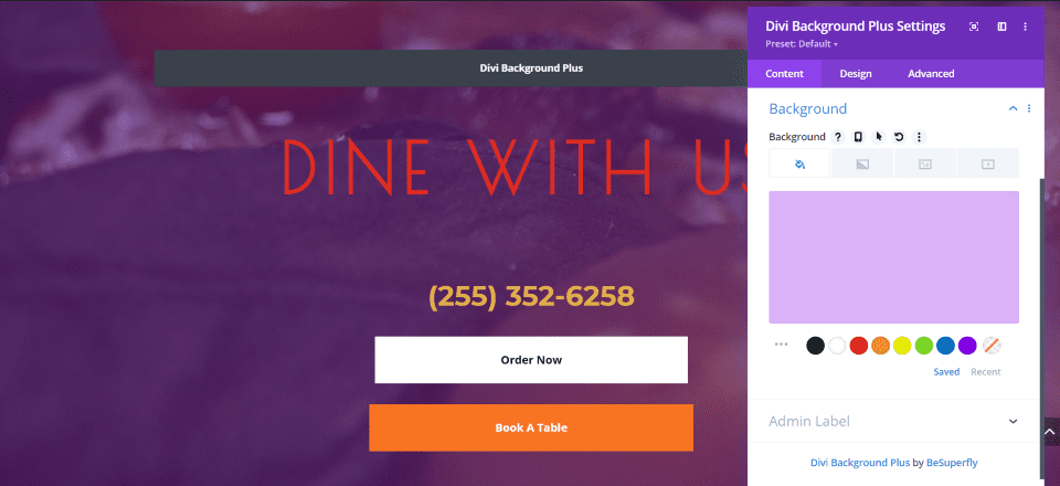
For a few more examples, here it is with the standard purple background with a 30% opacity.
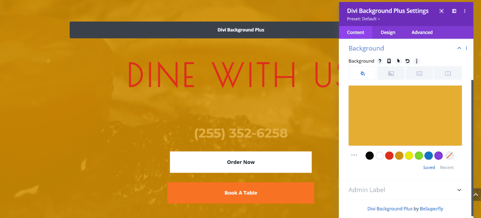
This is the standard orange with an 80% opacity.
Style the Section Divider

The overlays also work with section dividers. To add a section divider, open the section’s settings.
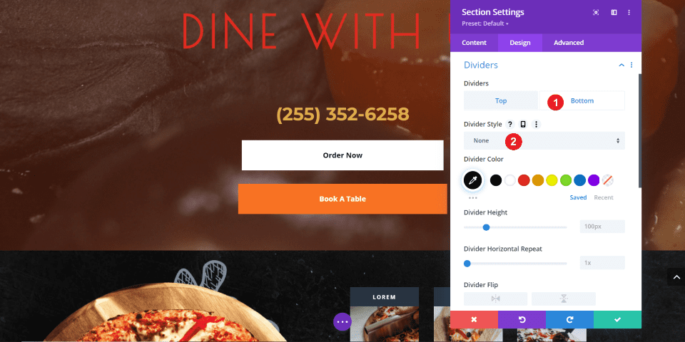
Go to the Design tab, select Dividers, and choose Top or Bottom, depending on where you want to add a divider. I’m adding a divider only to the bottom. Click on the dropdown box labeled Divider Style to choose your divider.

Choose the divider style you want. I’m selecting the fifth style, which creates an angle with two colors.
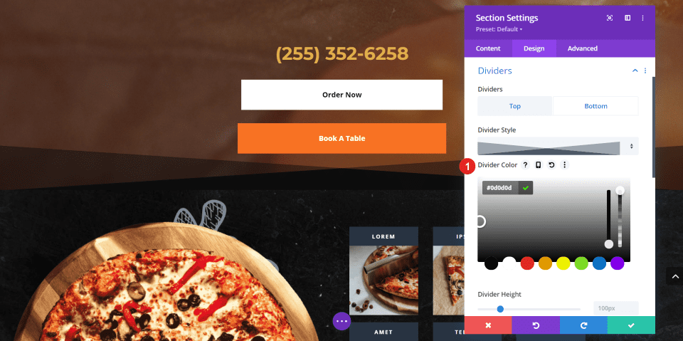
Select the edit icon to add a custom color. This is the color that appears in that section where the divider doesn’t show. The default color is white, as you can see in the previous example. Add the color as a hex code or choose the color from the color picker. I’m adding color #0d0d0d, which is one of the colors in the section below the video.
- Color #0d0d0d

The video now has a styled divider for the bottom of that section. You can see the video showing through the transparent parts of the divider, and it blends well with both sections.
Result
Let’s take a look at how the layout looks on desktop and mobile.
Here’s a look at the desktop version. It has a true parallax background with a gradient overlay in the first section. The second section includes a background image with a color overlay and a section divider that separates it from the next section.
Here’s how the layout looks on a phone. All of the elements work well on mobile devices.
Ending Thoughts
That’s our look at how to add color and gradient overlays to Divi parallax and video backgrounds. Divi Background Plus makes them easy to build and use. It works with sections, rows, and columns and it’s easy to choose between them. All of the customizations are standard Divi tools and settings, so they’re familiar.
Now your backgrounds can include color and gradient overlays without having to disable parallax and videos!
We want to hear from you. Have you created color and gradient overlays for your parallax images and videos with Divi Background Plus? Let us know what you think about it in the comments.
Featured Image via Lauritta / shutterstock.com



Hi! Does blending modes work with this plugin+parallax?
At first I thought this was going to be an actual tutorial. Instead it was a sales push.
With knowledge of jQuery and CSS, you can perform the same thing. Granted the annual $9 price tag is rather handsome and would save developers time, wouldn’t it be more valuable to teach how to use CSS/jQuery to perform the same function?
what do you think video backrounds on mobile devices?
Can you tell me, does this plugin also work with slider sections?
just installed this, and this is really awesome, very eye catchy. very much appreciated. I there any option to add the gradient parallax background with more than 2 colors. thanks in advance.
Could you not just do this using the section’s CSS Before attribute in the Advanced tab? Why use a plugin?
why is this not a native feature??
Thanks for featuring Divi Background Plus! Much appreciated! 😁