The Divi Contact Form Module makes it easy for website visitors to get in touch with you and for you to collect information from your visitors.
By default, the Divi Contact Form Module field labels are displayed inside the input fields. However, sometimes, you might want to display the labels above the contact form fields. In this tutorial, we’ll show you how to accomplish that with a little bit of CSS.
What We’ll Accomplish
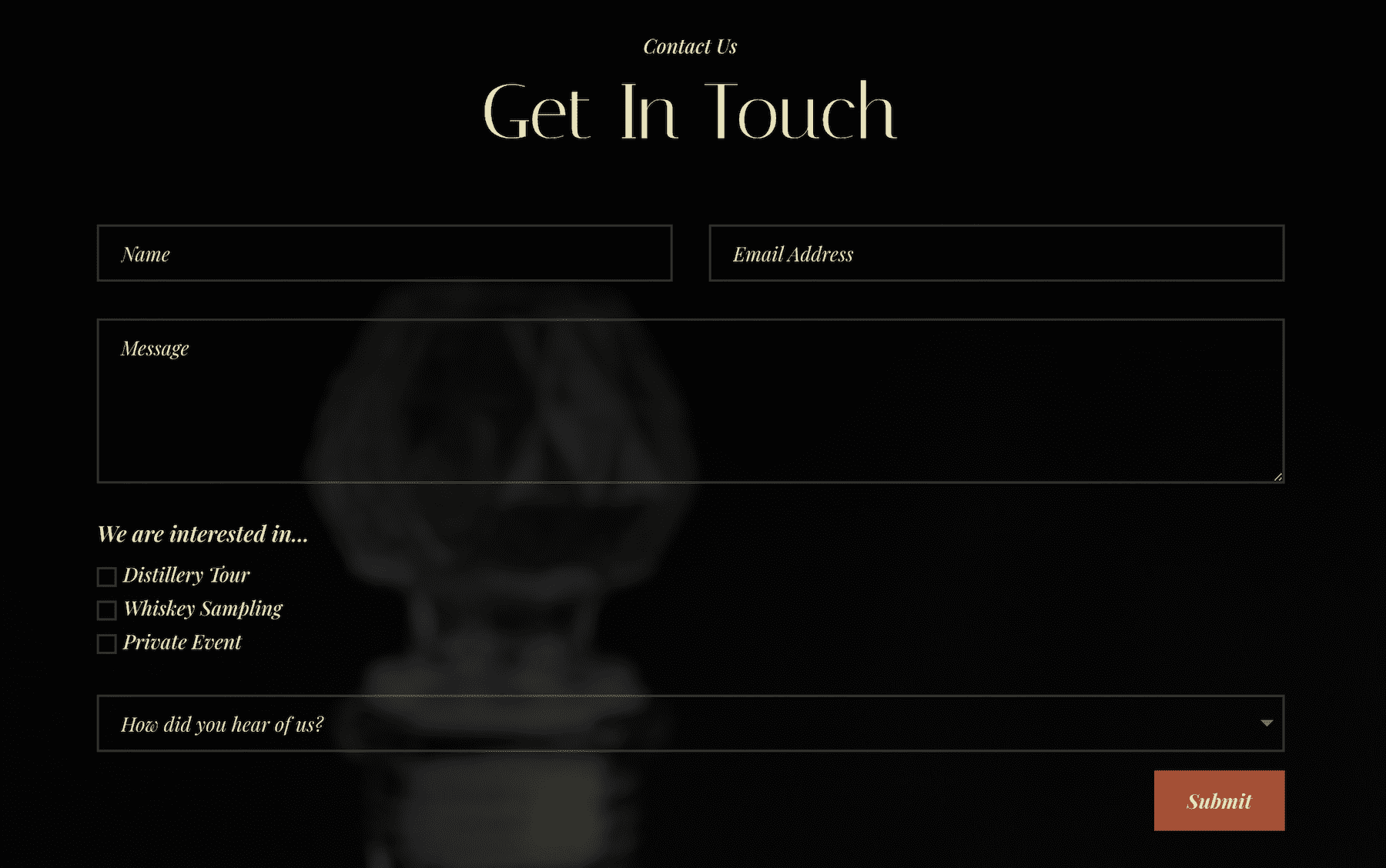
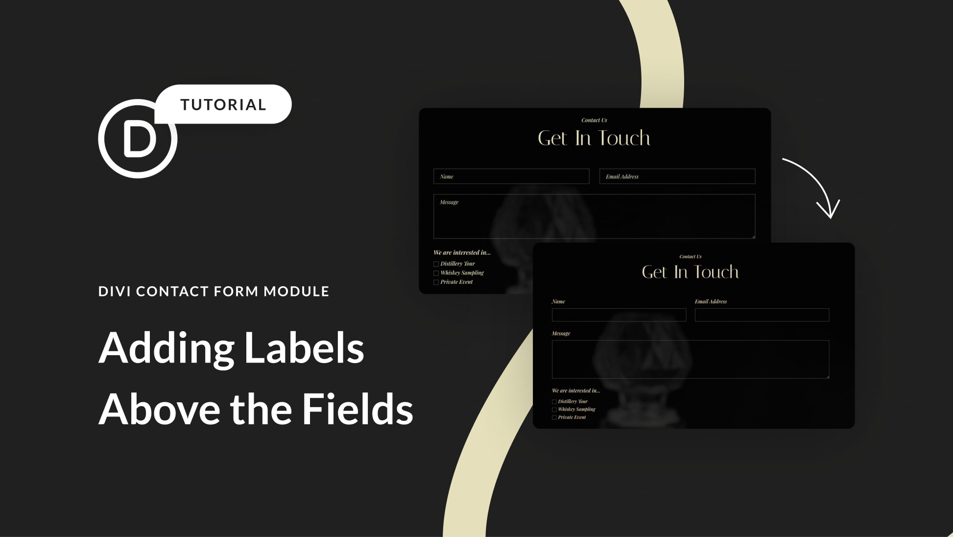
Our goal today is to go from this:
To this:
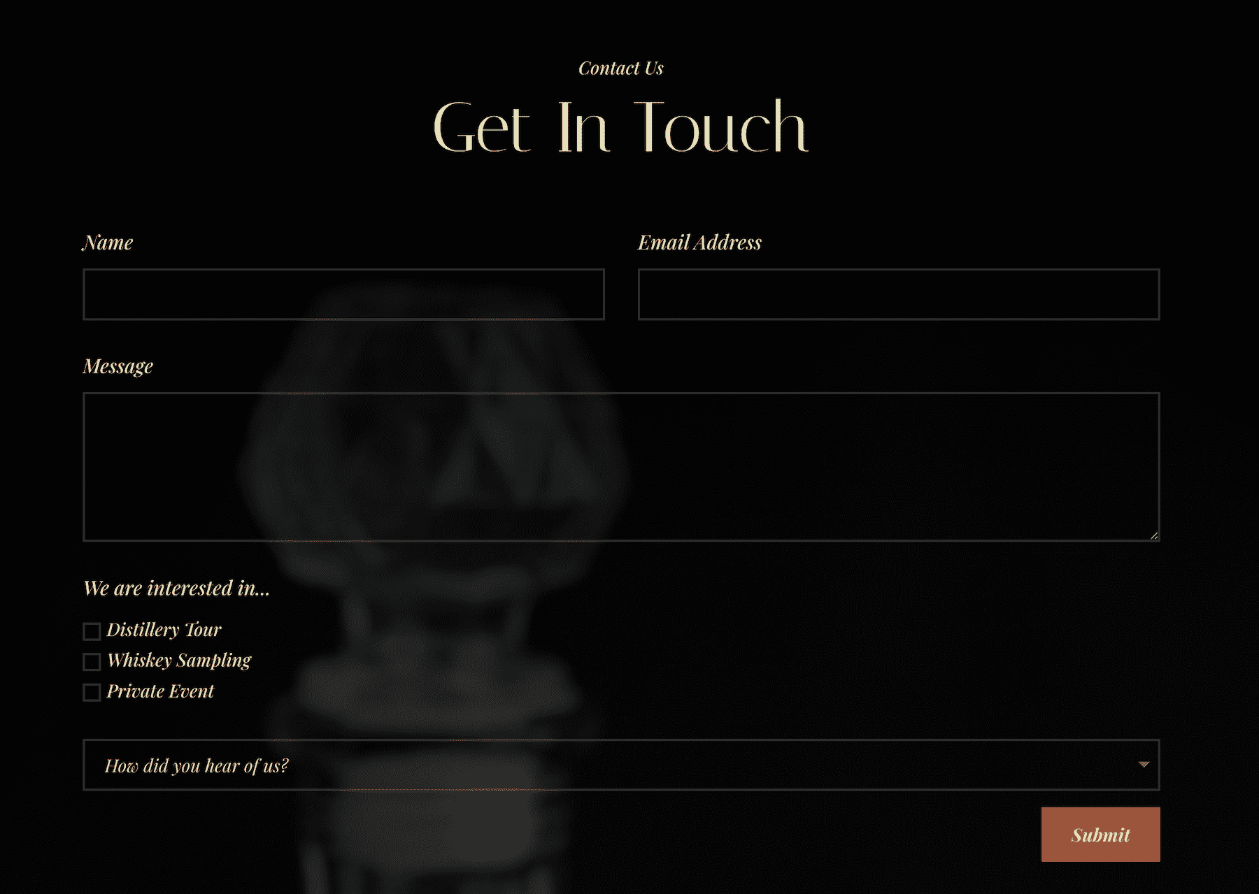
Let’s get to work!
How to Add Labels Above the Fields in Divi’s Contact Form Module
For this demonstration, we will use the Contact page design from the Free Whiskey Distillery Layout Pack. If you’re unfamiliar with how to load premade layout packs, check out this blog post: How to Use a Premade Layout Pack on Your Divi Website.
There are two ways we can input custom CSS on your Divi website: via the Theme Customizer, which will affect all contact forms across your website, or per page in the page’s settings which will affect individual contact forms. First, we’ll try the per-page method, and then I’ll show you how to add the CSS globally.
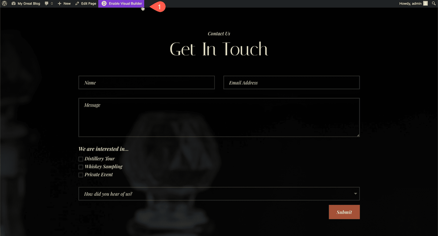
First, navigate to your contact form page and enable the Visual Builder.
Expand the Divi toolbar at the bottom of the page and click the gear icon to bring up the page’s settings. Then navigate to Advanced > Custom CSS and copy and paste the CSS code.
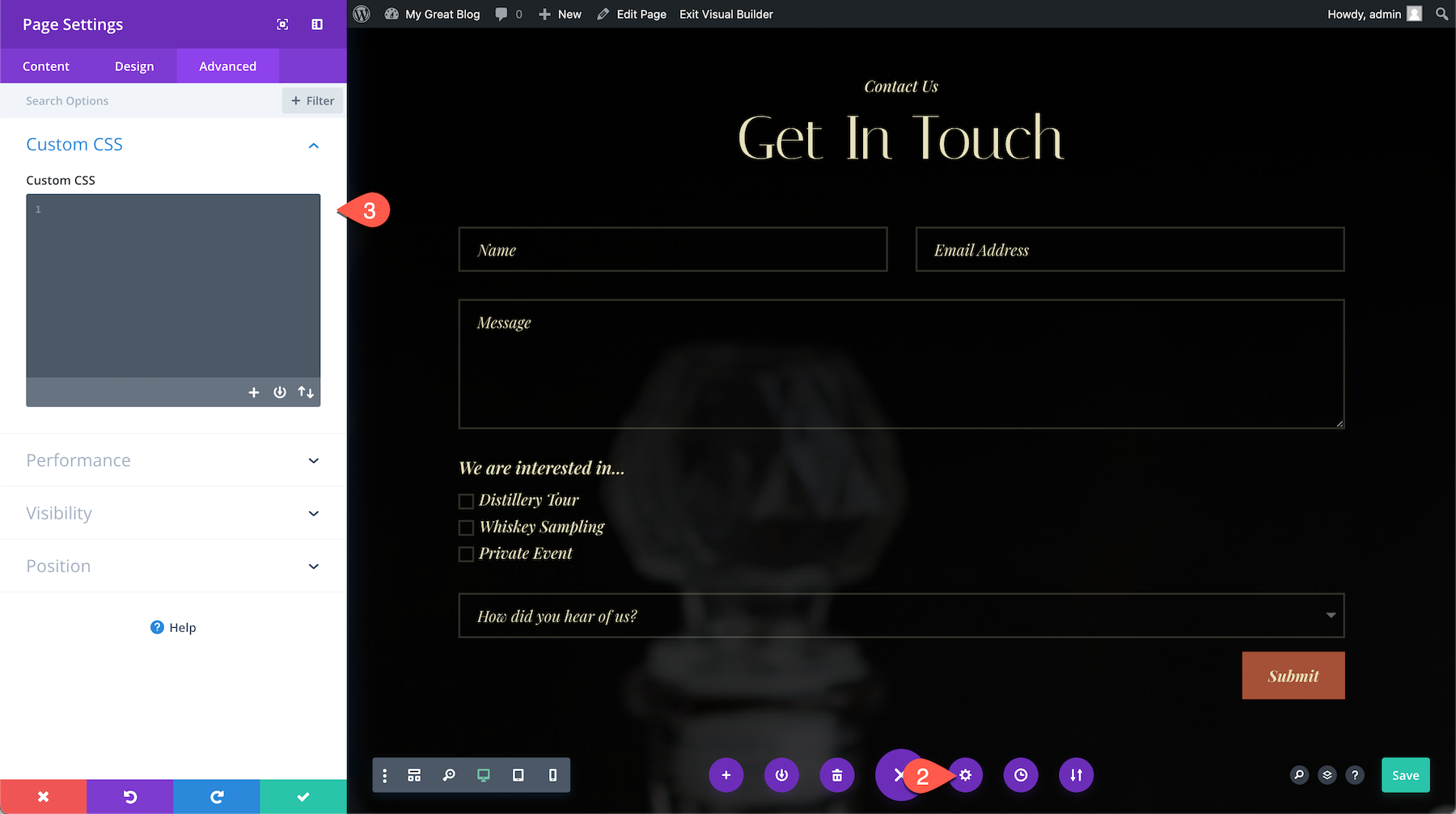
This is the CSS code you’ll have to copy and paste into the Custom CSS box:
/* Displays titles above the fields */
.et_pb_contact_form_label {
    display: block;
}

/* Hides placeholder text */
.et_pb_contact_form_container .input::placeholder {
    color: transparent;
}

/* Hides duplicate titles on checkboxes and radios */
.et_pb_contact_field_options_title {
    display: none;
}
Here’s what we got so far. You’ll notice that our font styling doesn’t carry over, and there is now a duplicate title above the dropdown field.
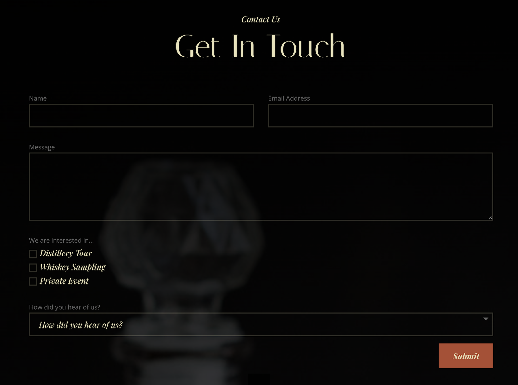
So to fix that, we’ll add some font styling CSS to the code and a few more lines of code to remove the duplicate title above the dropdown field.
Here’s the updated final code:
/* Displays titles above the fields */
.et_pb_contact_form_label {
    display: block;
    font-family: 'Playfair Display';
    color: #E7E2BC;
    font-size: 15pt;
    font-style: italic;
    margin-bottom: 15px;
}

/* Hides placeholder text */
.et_pb_contact_form_container .input::placeholder {
    color: transparent;
}

/* Hides duplicate titles on checkboxes and radios */
.et_pb_contact_field_options_title {
    display: none;
}


/* Remove title above dropdown */
.et_pb_contact_field[data-type=select] .et_pb_contact_form_label {
    display: none;
}
And here is the final result!
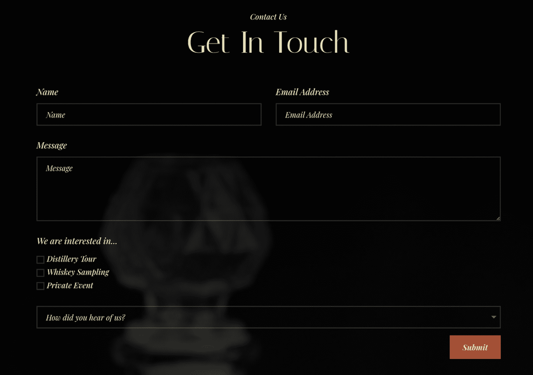
Doing This Globally
Adding the code globally will affect all contact forms on your website. If you want the changes to apply to a specific contact form only, you’ll need to add a CSS ID to the module in the advanced tab. After doing so, place the “#” + your CSS ID in front of every CSS class you’re targeting in the code.
There are three places you can add the CSS code to take effect globally. To your child theme’s style.css stylesheet:
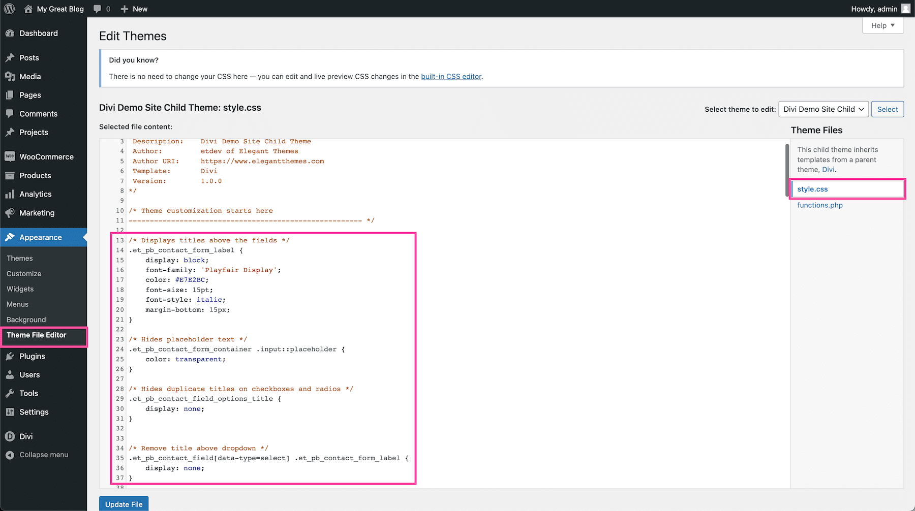
Or the Custom CSS block in Divi > Theme Options:
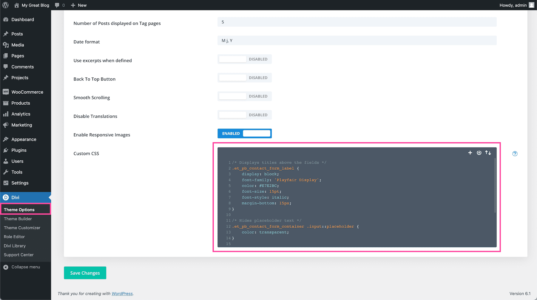
Or to the Theme Customizer:
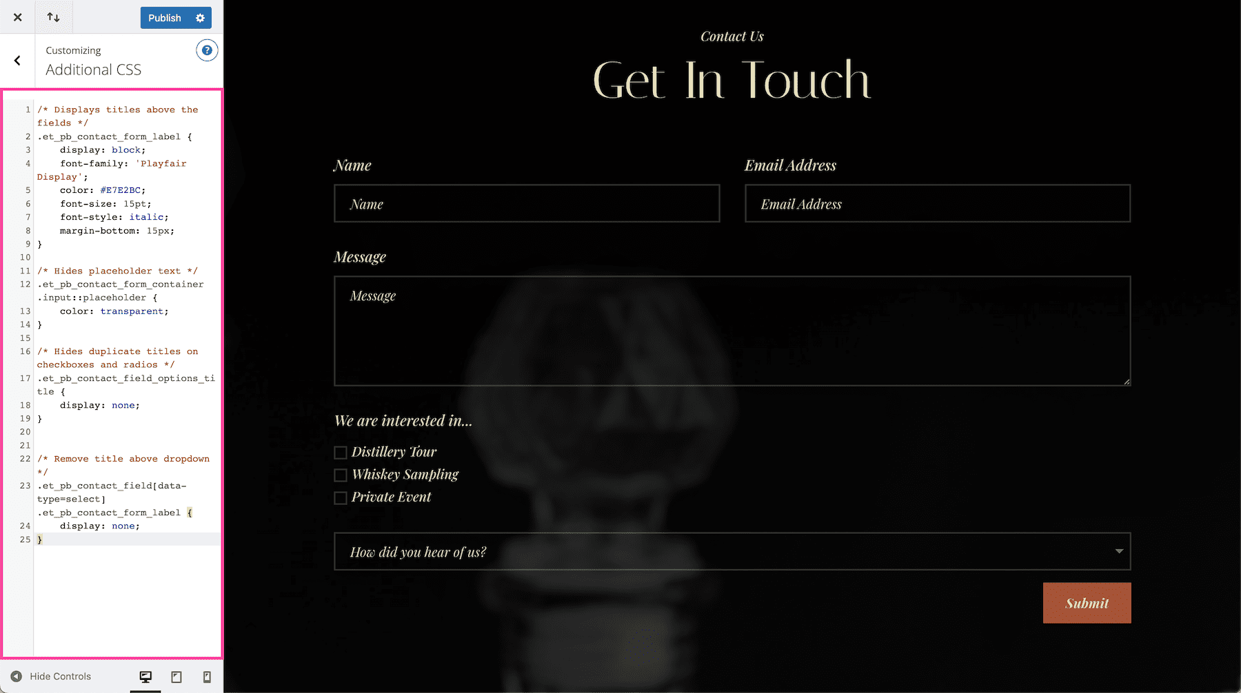
And that’s it!
More Resources
There are so many ways you can style the contact form module to make it all your own. Check out these other tutorials on the contact form to get started!



Photos 6 and 7 should be exchanged. As is, they are wrong w/re to the illustration of the result of adding the CSS.
This thin white font and black BG with a ghosted image behind is impossible for eyes my age to read.
That said, I will try the CSS.
Thanks.
Hiding the placeholder text with this code doesn’t work. Can you please help?
I’ve had the same issue. It seems like the line isn’t actually targeting the placeholder text. Will update if I can figure it out!
This worked for me:
#et_pb_contact_name_0::placeholder, #et_pb_contact_email_0::placeholder, #et_pb_contact_message_0::placeholder {
color: transparent;
}