
This post is part 2 of 5 in our mini series titled 5 Interesting Ways to Style Divi’s Slider Module. Stay tuned for all five unique examples of the slider module and tutorials on how to achieve them!
In today’s slider tutorial we’re going to change the slider animation so that the text and button slide down from the top. We’ll also be styling it using parallax settings so the transparent images we’re using appear to “float” above the background. It’s an appealing effect when done correct and draws the eyes to your call to action.
Let’s get into it!
- 1 Today’s Before & After: The Divi Slider Module
- 2 How to Add Parallax Elements and a Slide-Down Transition to the Divi Slider Module
- 3 The Concept & Inspiration
- 4 Preparing the Design Elements
- 5 Implementing the Design with Divi
- 6 The Section Settings
- 7 The Row Module Settings
- 8 The Slider Module Settings
- 9 The Slide Settings
- 10 Tomorrow: How to Create a “Soft Box Overlay” Slider with Divi’s Slider Module
Today’s Before & After: The Divi Slider Module
The slider doesn’t come with any default images stored inside so I’ve added some background images (and some dummy text) ahead of time, but not changed any of the default settings in the modules themselves.
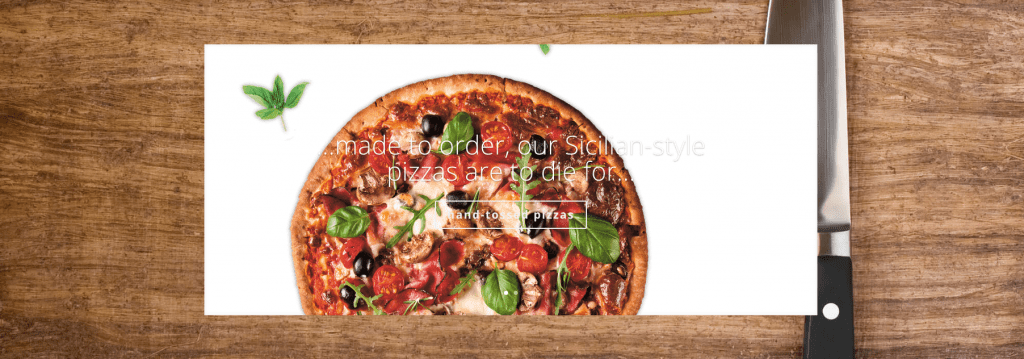
We’ll end up with a fullscreen parallax slider and a nice new effect for the slides. I’m using a restaurant motif since it seemed like a good fit for this style.

How to Add Parallax Elements and a Slide-Down Transition to the Divi Slider Module
Subscribe To Our Youtube Channel
The Concept & Inspiration
I’ve seen this concept before on the interwebs, using transparent png’s on parallax to give the mixed-layer illusion, or “floaty” as I like to call it, I just figured I’d try it with a slider.
Preparing the Design Elements
For this particular layout I prepped my transparent images beforehand. If you’re unsure how to make an image with a transparent background, Elegant Themes has this great tutorial, scroll down to #3.
When you’re searching for images to use, try the query “isolated __________”. This will usually bring up some white background options.
Here are the image dimensions I used in this post:
- Section background: 1920px by 1280px
- Slider background: 1920px by 1500px
Implementing the Design with Divi
I’ll be using the classic backend builder because that’s what I’m most comfortable with, but everything we do can certainly be accomplished and edited with the new front-end Visual Builder–as is shown in the video above.
The Section Settings
We’re going to start with a standard 1-column section and add a slider module to it.
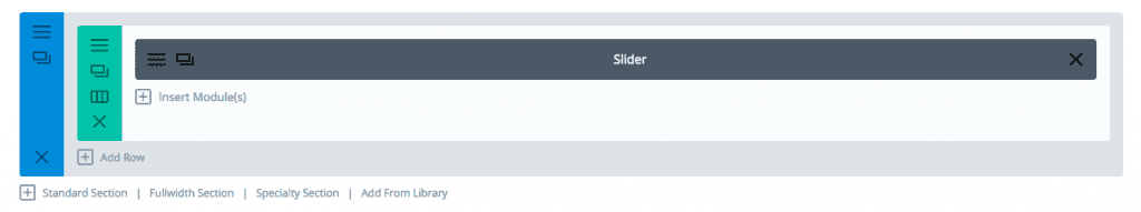
Next we’ll change some settings in the section module itself.
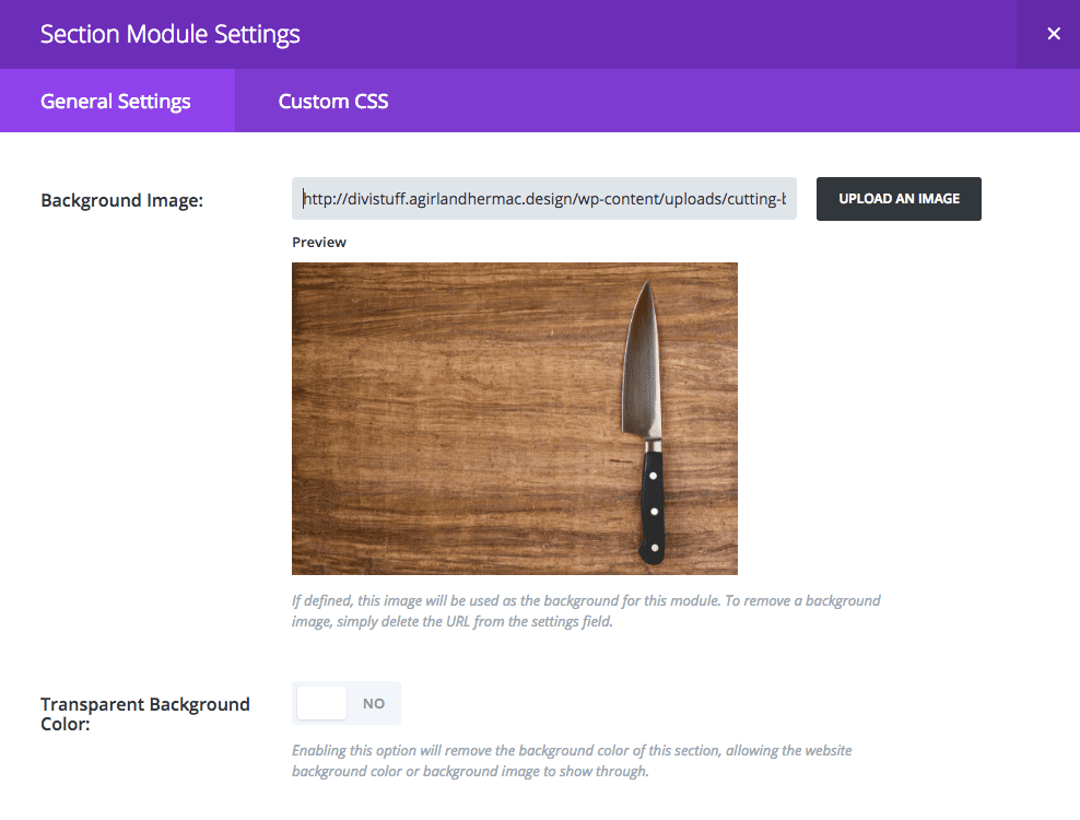
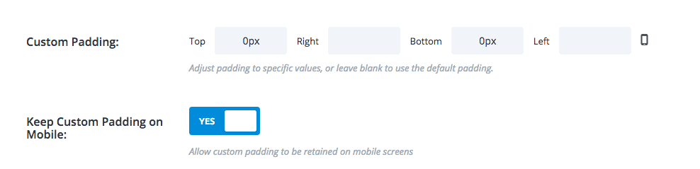
For the Section General Settings I upload my background image and specify some top and bottom padding, top: 0px / bottom: 0px
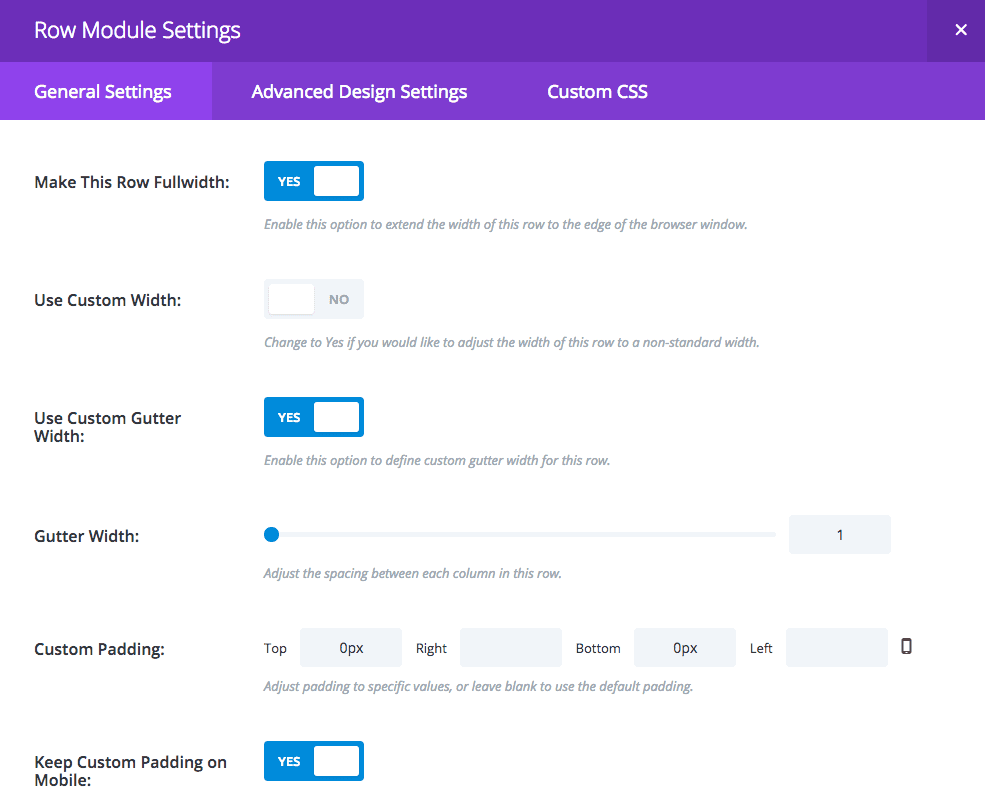
The Row Module Settings
In the General Settings apply the settings like below.
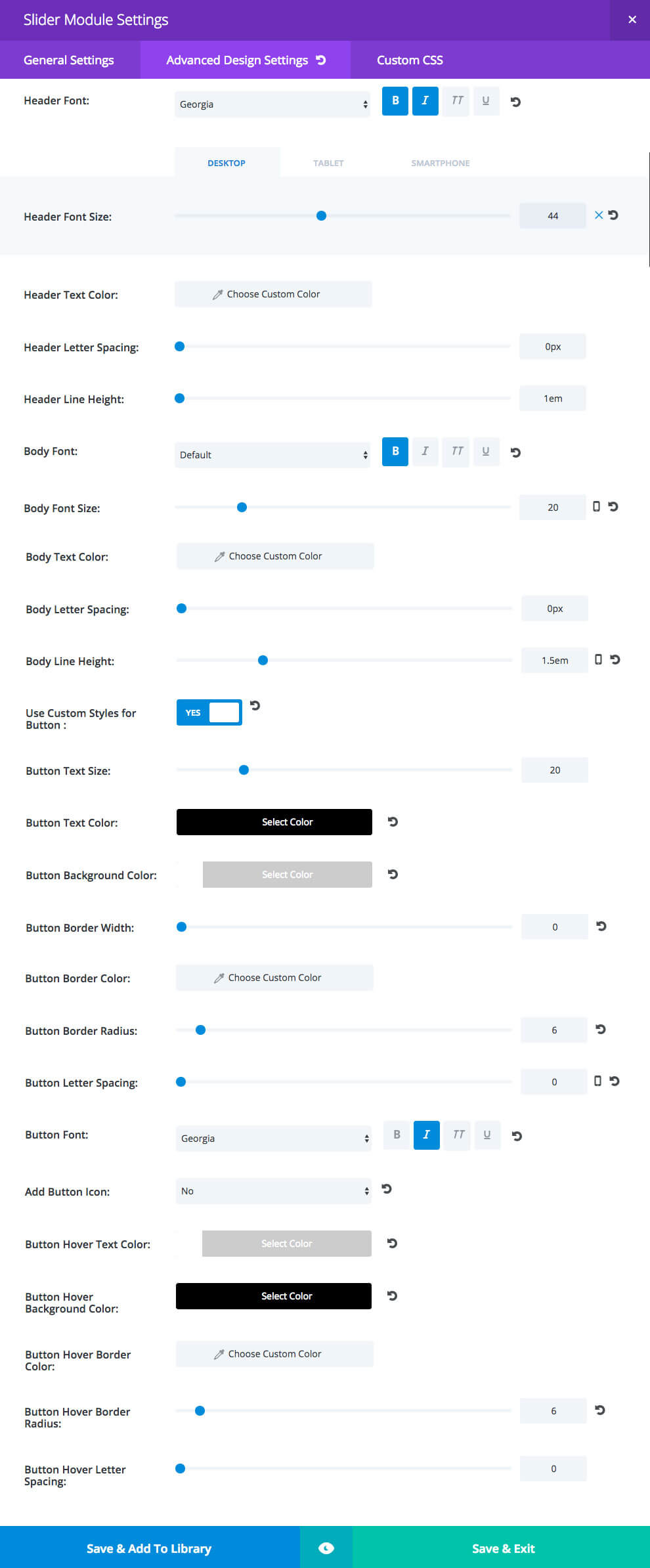
The Slider Module Settings
For the Slider Module General Settings set the following:
- show arrows
- show controls: no
- automatic animation: on
- animation speed set to 8000
- continue automatic slide on hover: on
- use parallax effect: yes
- parallax method: true parallax
- remove inner shadow: yes
For the Slider Module Advanced Design Settings the color you see being used is #000000 (black) and the header font sizes are Desktop: 44 / tablet: 44 / smartphone: 30. You can use #1d1d1d instead of black if you think it’s too harsh on the eyes.
For the Slider Module Custom CSS Settings add the following code:
Slide Description – This is changing the slide animation to slide down from the top and changing the default padding.
animation-name: fadeInTop;
padding: 18% 10%;
Slide Title – We’re not using any body text in the slides so we’re adding a bit more room between the title and the button.
margin-bottom: 15px;
The Slide Settings
For the slide General Settings see below, the background color is rgba(0,0,0,0) and the background overlay color is rgba(0,0,0,0.2)
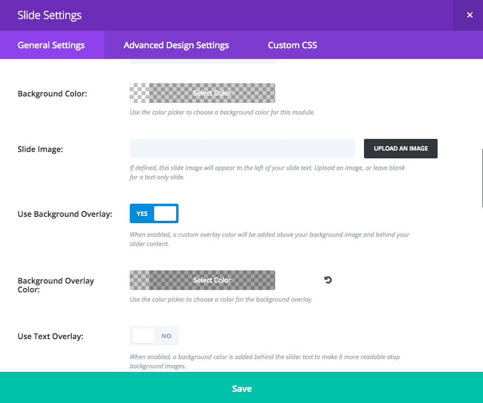
Important: Don’t forget to add your transparent png images as the background image in each individual slide, as well as the title and button text to create the full effect. Also, since we’re using parallax you’ll need to have content below the slider section to be able to scroll and actually see the parallax working.
After you insert all your slide background images you’ve now created a pretty cool parallax slider that should impress your clients and/or visitors. Hope you can make some great use of this tutorial, and feel free to post your uses of it in the comments!
Tomorrow: How to Create a “Soft Box Overlay” Slider with Divi’s Slider Module
In tomorrow’s post I’m going to continue this series on how to style Divi’s slider module in interesting ways. I’ll be showing you how to create a subtle overlay effect with your slider background so that the section background shows through. We’ll also be using css to change the slider transition. See you there!
Be sure to subscribe to our email newsletter and YouTube channel so that you never miss a big announcement, useful tip, or Divi freebie!


Absolutely beautiful … it gives me inspiration for my next creation! Thank you
Where is part 1 of this series?
Here it is! https://www.elegantthemes.com/blog/divi-resources/how-to-style-divis-slider-module-for-a-bold-team-members-area
Is it also possible to change the slide image animation? I tried to do so in the Slider Module Settings Custom CSS area, but no luck.
Thanks for this Leslie. I can’t wait to try it.
Thanks Tammy!! 😀
I find it very confusing that the hardest part is obviously creating those transparent images and it’s not being shown how to achieve that. All the other stuff is easy when comparing it to getting the correct images in my opinion.
I do think these tutorials are helpful, I just find it a bit questionable that the most important part is missing.
Hi Oliver! Actually there’s a link to a tutorial that ET wrote themselves on how to achieve those transparent. I linked to it in this post, maybe you just missed it. Here it is again though 🙂
https://www.elegantthemes.com/blog/divi-resources/5-ways-to-get-creative-with-divi-image-asset-preparation-in-photoshop
Hi Oliver,
I guess these tutorials would be way too long if they were to include every single aspect of web design. There are literally hundreds of tutorials on transparent images out there, e.g. on YouTube, so I can understand the Divi tutorials concentrate on theme details only. 🙂
Where is the example end result? Is there a link I missed?
Hi Arby, no you didn’t miss it. I’m not sure if it will be the same for all the Daily Divi tutorials but for mine there aren’t any demo links. I do have them on my site but links aren’t allowed in the comments here so If you mosey over to my site (click on my name) you’ll see a page titled “Tuts y Mas” where I’ll be linking these posts along with a demo for each. Thanks!!
Wow! Beautiful touch! Again: Love it!
Thanks Elisandro! 😀
Very interesting and I’m looking forward in using this.
But how can you create a .png file 1920×1080 without having image weight issues? An image like that will be minimum 1MB! It’s too much for websites and far too much for mobile! Even compressing it you can’t reach a “human” weight. Have you got any workaround or tips for solving this issue?
We have another post here on the blog where we recommend some best practices for achieving smaller images in photoshop (at the end): https://www.elegantthemes.com/blog/divi-resources/5-ways-to-get-creative-with-divi-image-asset-preparation-in-photoshop
Thanks for this post guys. I am going to implement it right now.
Thanks !
where is the link to part one?
Hi Richard,
See Right Sidebar, Recent Posts, “How to Style Divi’s Slider Module for a Bold Team Members Area”.
Thanks guys!! 🙂
Awesome share.
So simple to create but looks great on frontend.
it is possible to see a preview? it is possible to have .Jason with this modifications?? 🙂
Great job Leslie! This parallax slider is gorgeous!