When it comes to buying products online, great product images are essential to closing the sale. That’s why most product pages have those product images at the top of the page so it is the first thing buyers see. However, as the user scrolls down the page to view more information about the product (descriptions, reviews, etc.), the main product image is no longer in sight. One way to keep those product images in view is to add a sticky product image that stays in view as a potential buyer browses your product info.
In this tutorial, we are going to show you how to add sticky product images to your Divi product page template. To do this, we can optimize Divi’s WooCommerce product image module to show and stick at the top of the page just as the original product image scroll out of view.
Let’s get started!
Sneak Peek
Here is a quick look at the design we’ll build in this tutorial.
Download the Layout for FREE
To lay your hands on the designs from this tutorial, you will first need to download it using the button below. To gain access to the download you will need to subscribe to our newsletter by using the form below. As a new subscriber, you will receive even more Divi goodness and a free Divi Layout pack every Monday! If you’re already on the list, simply enter your email address below and click download. You will not be “resubscribed” or receive extra emails.
https://youtu.be/vwfPFqyVaNM
Subscribe To Our Youtube Channel
How to Upload The Template
Go to Divi Theme Builder
To upload the template, navigate to the Divi Theme Builder in the backend of your WordPress website.
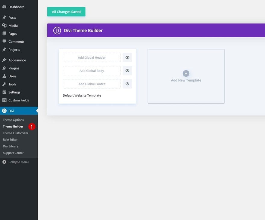
Upload Website Template
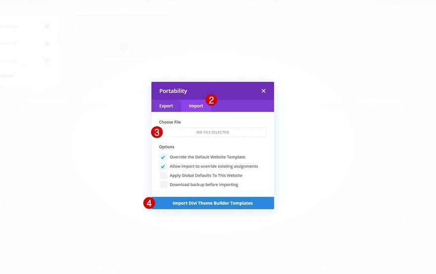
Then, in the top right corner, you’ll see an icon with two arrows. Click on the icon.

Navigate to the import tab, upload the JSON file which you were able to download in this post, and click on ‘Import Divi Theme Builder Templates‘.
Save Divi Theme Builder Changes
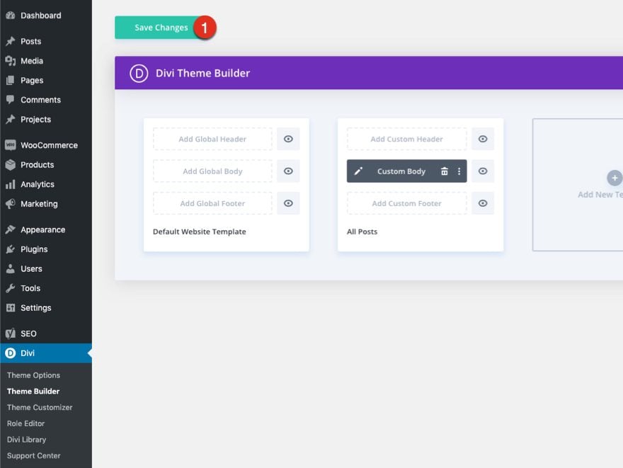
Once you’ve uploaded the file, you’ll notice a new template with a new body area that has been assigned to All Posts. Save the Divi Theme Builder changes as soon as you want the template to be activated.
Let’s get to the tutorial so we can learn to build this thing from scratch, shall we?
How to Add Sticky Product Images to Your Divi Product Page Template
Uploading the Theme Builder Pack 5 Product Page Template
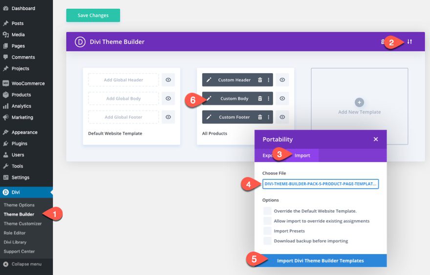
To get started, we are going to get a jumpstart on the design by add one of our premade product page templates. To import the template the Theme Builder, you will need to do the following:
- Navigate to the Divi Theme Builder
- Click the portability icon at the top right of the page.
- Select the Import tab in the Portability popup.
- Download and Import the Divi Divi Theme Builder 5 Product Template File. Once you download the pack here, unzip the file and you will find the “divi-theme-builder-pack-5-product-page-template.json” file you will need to import.
- Click the Import Button
- Once the template has been imported, click the edit icon on the template’s custom body area to edit the template layout.
Add a New Row
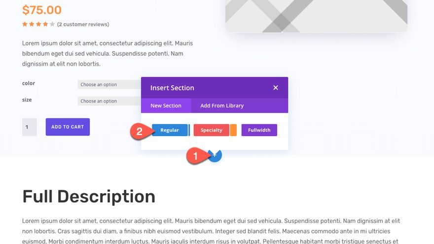
We want the product image to show once the user has scrolled past the top section which already includes the product image (no need to show it there). Therefore, we are going to add it to a new section under the top section of the layout.
Go ahead and add a new regular section under the top section.
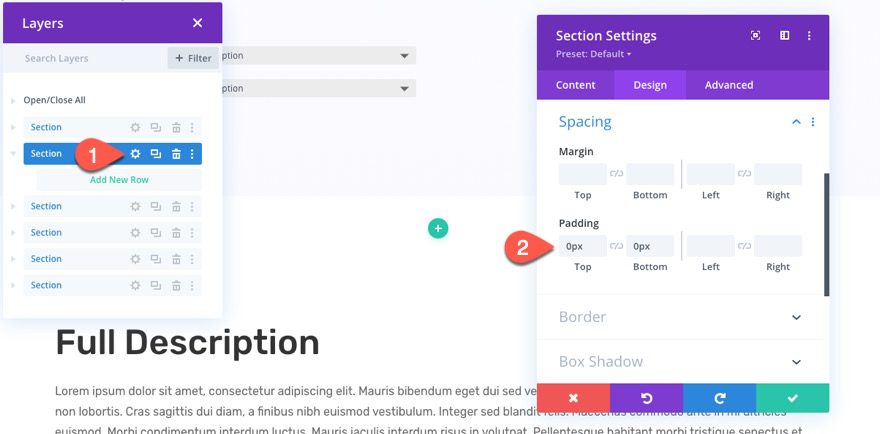
Open the settings of the new section and update the padding:
- Padding: 0px top, 0px bottom
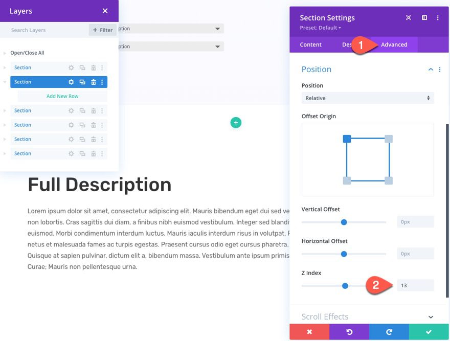
The go to the advanced tab and update the z index:
- Z Index: 13
This is so the image (the child element of this section) will stay above the other sections/elements on the page when scrolling.
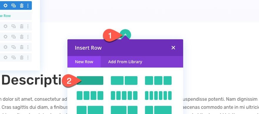
Add the Row
Next, add a one-column row in the section.
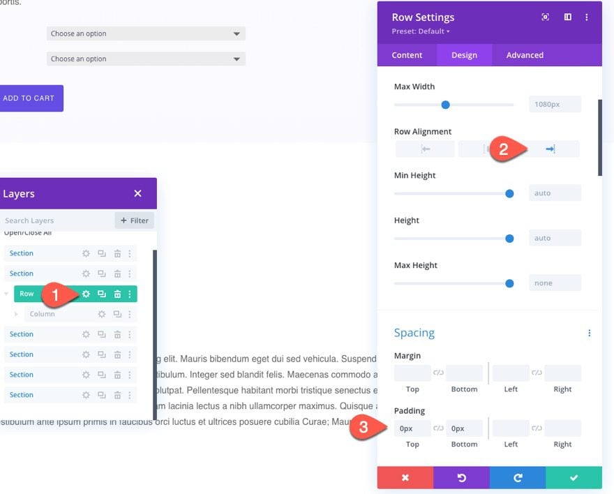
Open the row settings and adjust the row alignment and padding:
- Row Alignment: Right
- Padding: 0px top, 0px bottom
Add Product Image
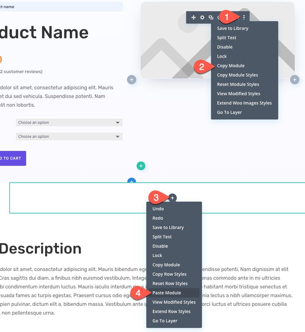
Now we are ready to add the product image that will eventually stick to the top of the page on scroll. To add the product image, copy the existing product image module in the top section, and paste it into our new row.
Woo Images Settings
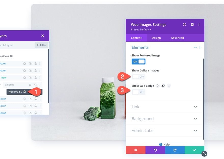
Open the settings for the new woo images module and adjust the content as follows:
- Show Gallery Images: OFF
- Show Sale Badge: OFF
(NOTE: you can keep the gallery images if you want. Just be careful not to take up too much space since this image module will be hovering over other elements on the page.)
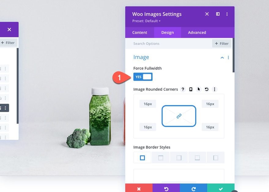
Under the design tab, update the Force Fullwidth option to “YES”.
Then update the following:
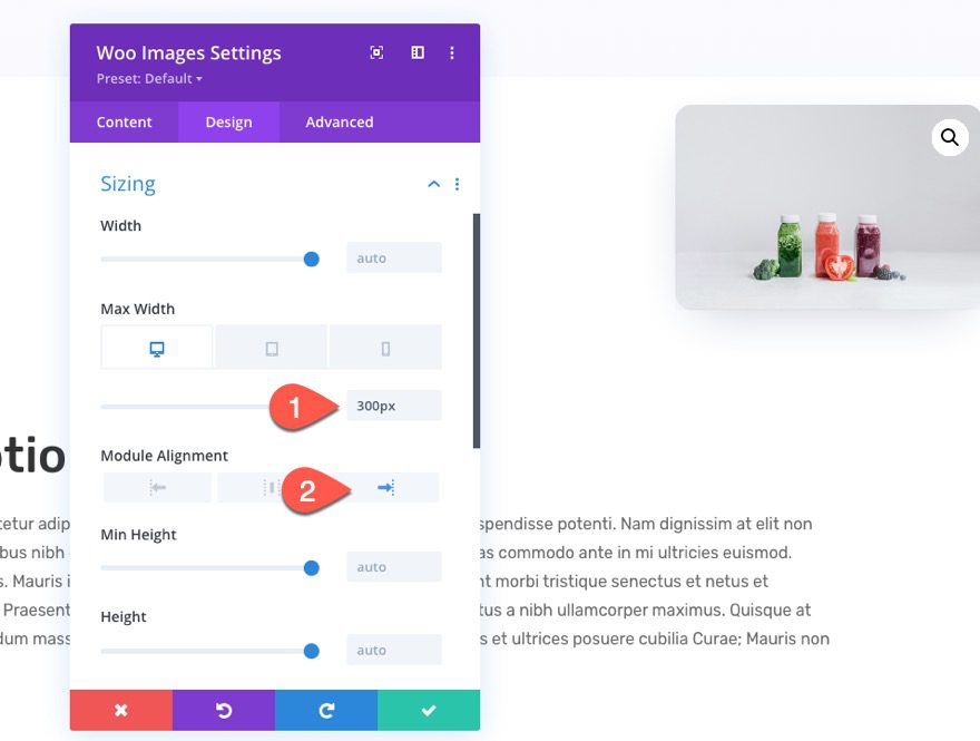
- Max Width: 300px (desktop), 200px (phone)
- Module Alignment: Right
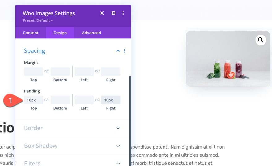
The adjust the padding:
- Padding: 10px top, 10px right
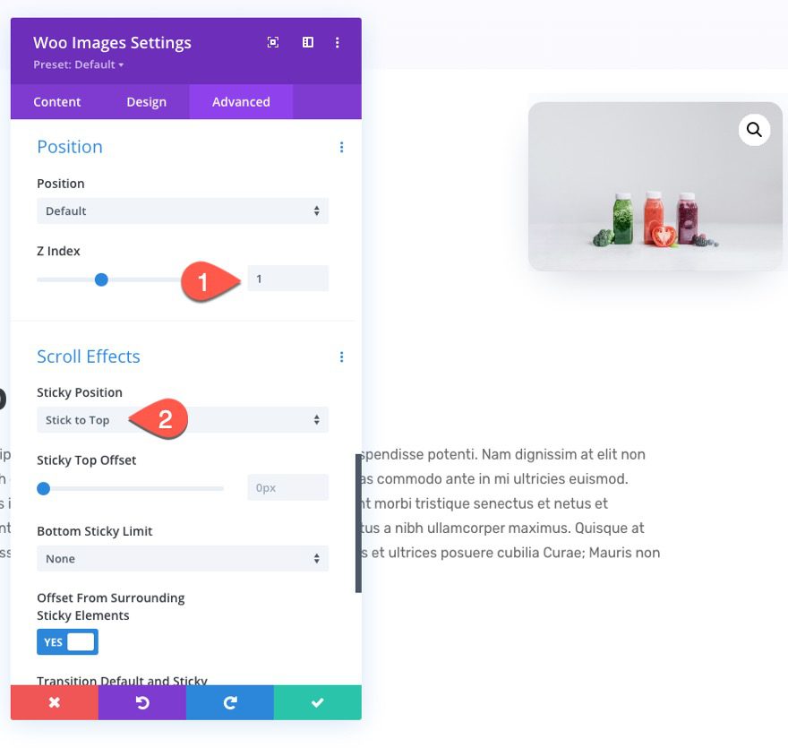
Under the advanced tab, update the following:
- Z Index: 1
- Sticky Position: Stick to Top
This will cause the image to stick to the top of the page once the user scrolls past that image.
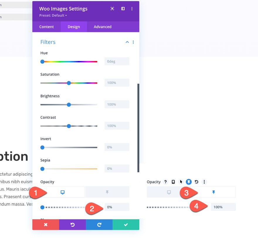
Once the sticky position is in place, go back to the design tab and use the sticky option to update the opacity filter so that it hides the image until it becomes sticky. You can deploy the sticky style option by hovering over the setting and clicking the thumbnail icon.
- Opacity: 0% (desktop), 100% (sticky)
Remove the Spacing of the Section, Row, and Column
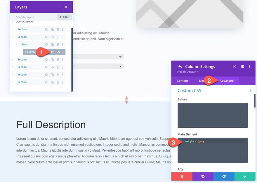
Right now, we have some unwanted spacing that the new product image is using within the flow of our layout. To remove that spacing, all we need to do is give the column a custom height value that is either “0” or something really low. The product image will still show/overflow even though it has a column without any actual height.
Open the column settings and add the following Custom CSS to the Main Element:
height: 15px;
That’s it! We’re all done.
Final Result
Check out the final result by looking at a live post on your site.
Final Thoughts
Adding a sticky product image to your product page template in Divi is a quick and easy way to keep your products in view as visitors explore your product. And, you can also choose to stick that Add to Cart button next to it as well using the same technique. Anyway, hopefully, this will help you with your next project.
I look forward to hearing from you in the comments.
Cheers!



This is Helpful Jason
Regards
Nija Anil
Pro Cochin
I was reluctant to hire a developer, ’cause I was a little tight on my budget. But thanks so much for sharing such an important resource for free. Now I can easily implement it on my website. Cheers.
Thank you so much for providing in-depth information, for past few weeks I was looking for it and could not find any relevant article on other blogs.
This sticky product image looks amazing and sometimes it helps in conversion as well.
Thanks again