Animation has become a common part of the user experience for modern websites. Aside from the fact that it looks cool, it can also add a subtle interactive element that engages the user by bringing content to life. Divi and its built-in animation effects allow you to animate just about any element on a page with different animation styles.
In this tutorial, I’m going to show you how to animate letters for some unique text designs in Divi. By putting individual letters into a text module, you can target the animation of each letter with different animation styles, duration, and delays that will make content stand out in a creative way. This technique is purely for design purposes since the letters that make up the content won’t be very seo friendly. However, the animated letters allow you to share your story with to users in a stunning way.
Let’s get started.
Sneak Peek
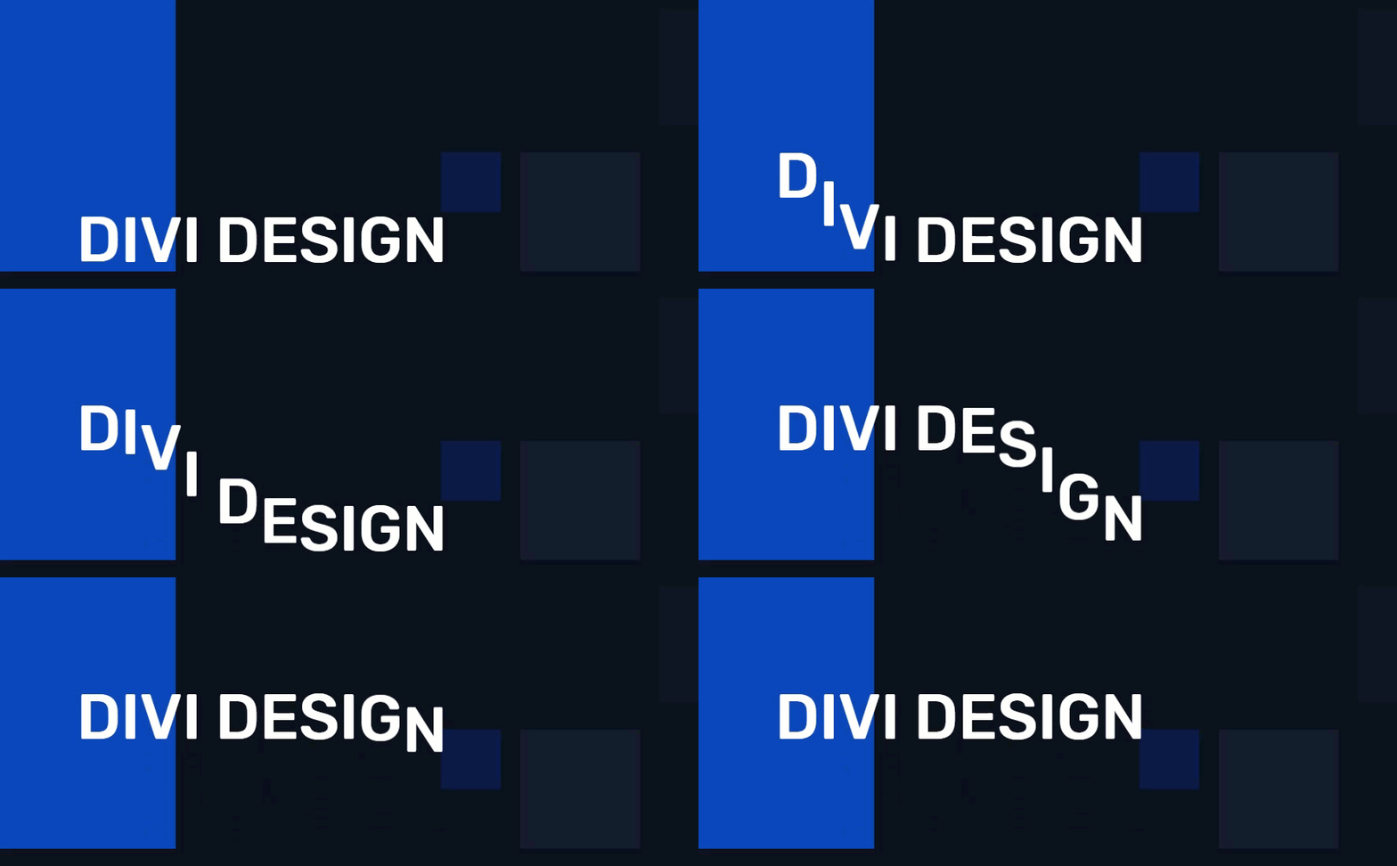


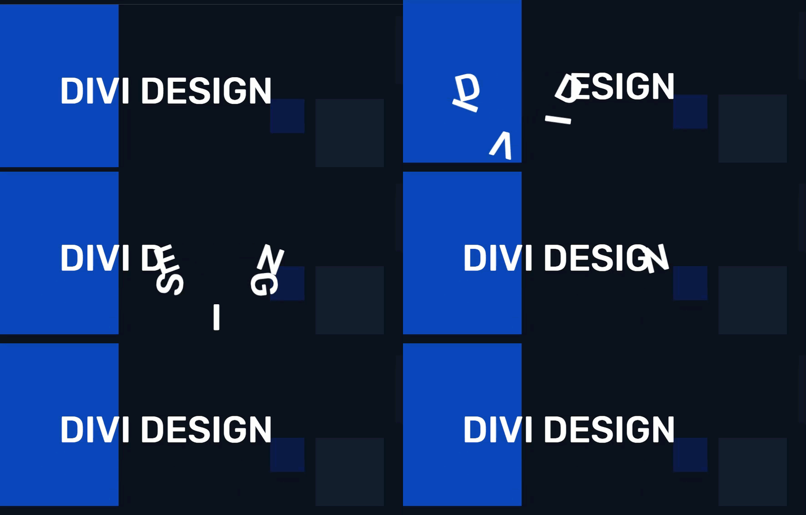


Download the Letter Animation Design Examples Layout for FREE
To lay your hands on the letter animation designs from this tutorial, you will first need to download it using the button below. To gain access to the download you will need to subscribe to our newsletter by using the form below. As a new subscriber, you will receive even more Divi goodness and a free Divi Layout pack every Monday! If you’re already on the list, simply enter your email address below and click download. You will not be “resubscribed” or receive extra emails.
To import the layout to your page, simply extract the zip file and drag the json file into the Divi Builder.
Let’s get to the tutorial shall we?
Getting Started
For this tutorial, all you need is Divi. We will be building the designs from scratch using the Divi builder on the front end. To get started, create a new page, give your page a title, and deploy click to use the Divi Builder. Then choose the option “build from scratch” and click to build on the front end.
Now you are ready to design!
Building the Layout for Animating Letters
Adding the Section, Row, and Column
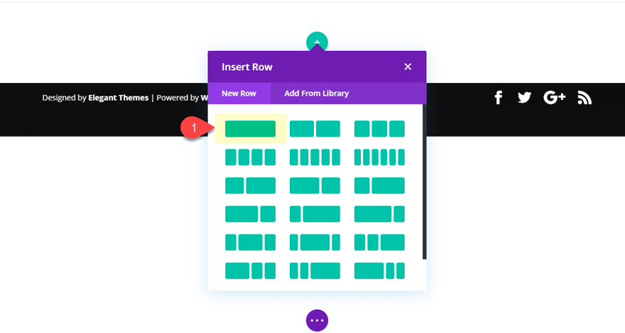
Go ahead and create a new regular section with a one-column row.
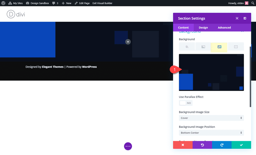
Before we start adding our text modules (which will contain white letters), let’s add a dark background image to the section. Open the section settings and add a background image. I’m using a an abstract background image from the Investment Company Landing Page premade layout.
Creating Individual Letter Blocks with Text Modules
Before we can start adding animation to letters, we must first create a separate text module for each letter we want to add. For this example, we are going to create the text “Divi Design”. Since this text phrase includes 11 character spaces (including the space between the letters, we will need to add 11 different text modules.
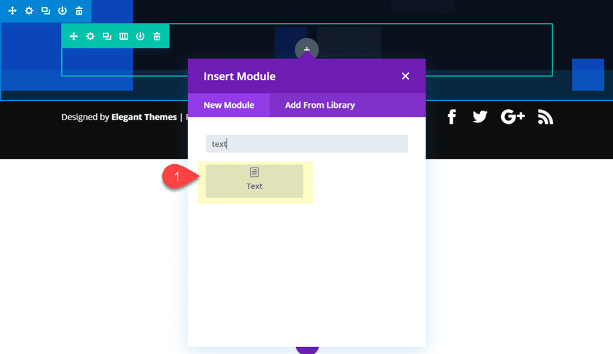
Go ahead and add a text module to the column.
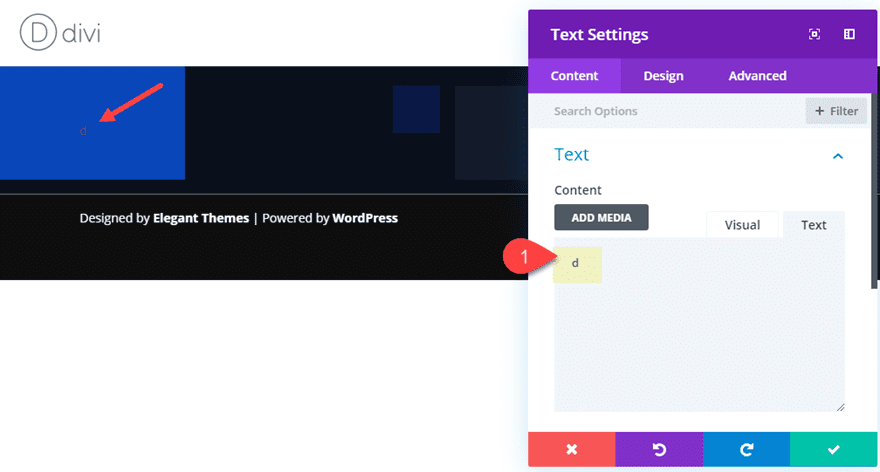
In the content box, add the first letter of your text which in this case is the letter “d”.
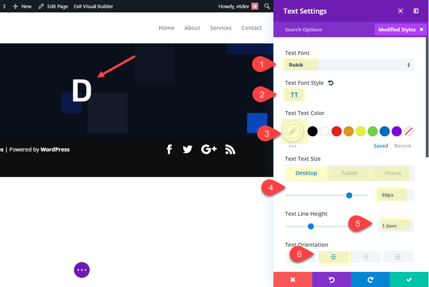
Then update the text design settings as follows:
- Text Font: Rubik
- Text Font Style: TT
- Text Text Color: #ffffff
- Text Text Size: 80px (desktop), 50px (tablet), 30px (phone)
- Text Line Height: 1.6em
- Text Orientation: center
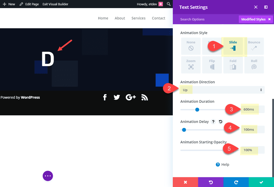
Next add an animation to the text module as follows:
- Animation Style: Slide
- Animation Direction: Up
- Animation Duration: 600ms
- Animation Delay: 100ms
- Animation Starting Opacity: 100%
Duplicate the text module and update the content with the letter “i”. Then increase the animation delay by 100ms as follows:
- Animation Delay: 200ms
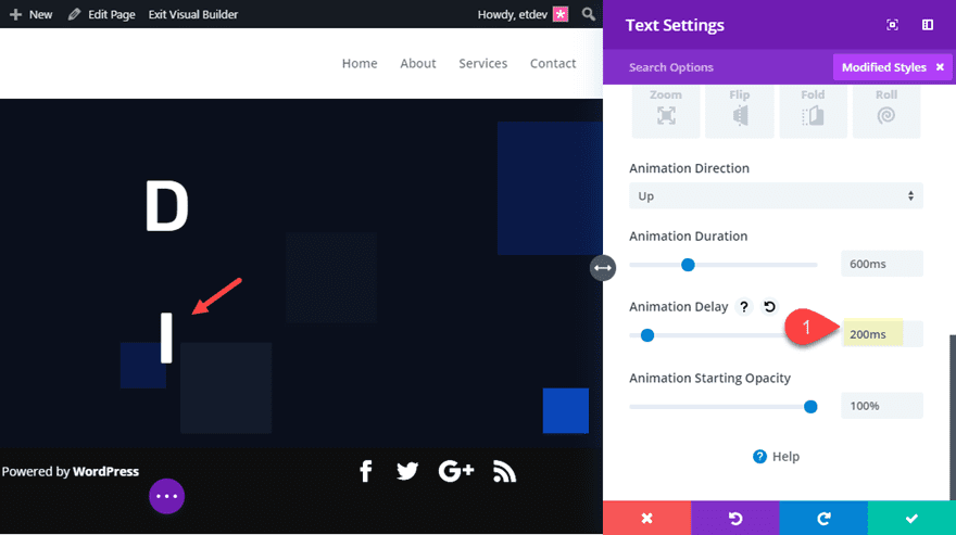
Duplicate the text module and update the content with the letter “v”. Then increase the animation delay to 300ms.
- Animation Delay: 300ms
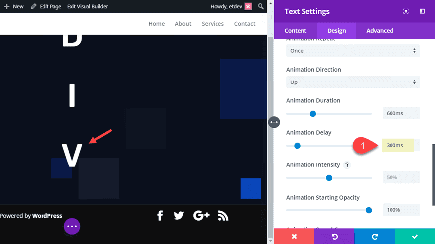
Duplicate the text module and update the content with the letter “i”. Then increase the animation delay to 400ms.
- Animation Delay: 400ms
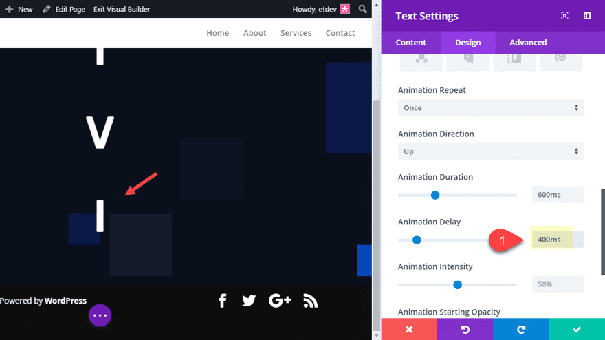
For this next text module we want to add a blank space. Duplicate the text module and add the following html to the content box:
No need to update the animation delay for this one.
Then duplicate the text module and update the content with the letter “d”. This is the first letter in the word “design”. Then increase the animation delay to 500ms.
- Animation Delay: 500ms
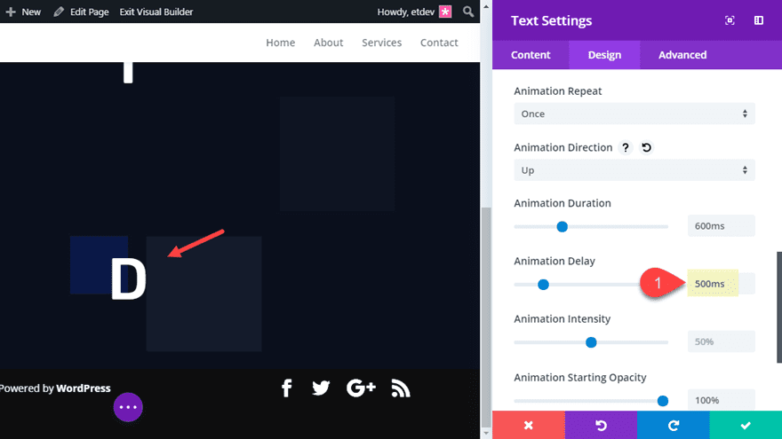
Continue the process of duplicating the text module and increasing the animation delay by 100ms for each of the remaining letters that spell out the word “design”.
- Letter “e”: animation delay 600ms
- Letter “s”: animation delay 700ms
- Letter “i”: animation delay 800ms
- Letter “g”: animation delay 900ms
- Letter “n”: animation delay 1000ms
Here is what the design looks like so far.
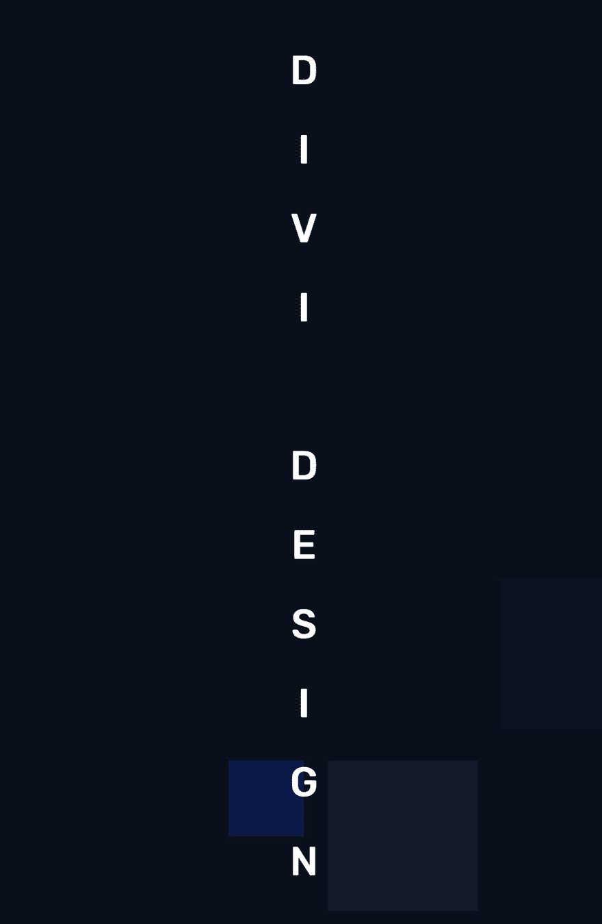
Adding Flex Property to align modules horizontally
Not quite the result we are looking for yet. But all we need to do magically pull the design together is add a small snippet of css to the row column. To do this open the row settings and add the following custom CSS to the Column Main Element.
display: flex;
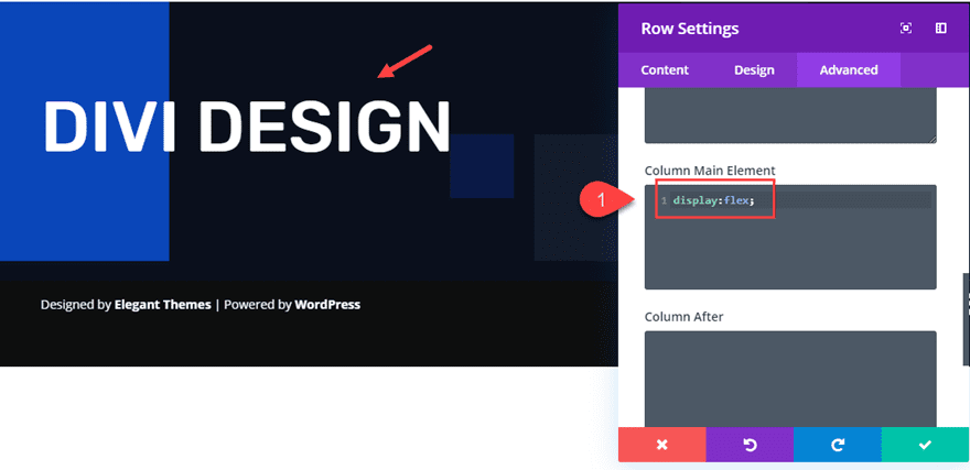
The display: flex property aligns all of the modules horizontally in a flexible table that will adjust to different browser widths beautifully. And since the modules are in a one-column row, the design will not break on tablet or mobile devices.
We also need to add a custom gutter width to take out the bottom margin under the letters and add some top and bottom padding to the row so the letters have some room to animate.
- Gutter Width: 1
- Custom Padding: 5vw top, 5vw bottom
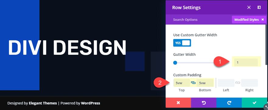
Here is the final result.

Adding Different Animation Styles
With this setup, you can easily add new animation styles for completely unique effects. To do this, you can take advantage of Divi’s multiselect feature to update all of the modules at once. On the front end, hold down shift and click the first and last text module. Then open the settings for one of the selected modules.
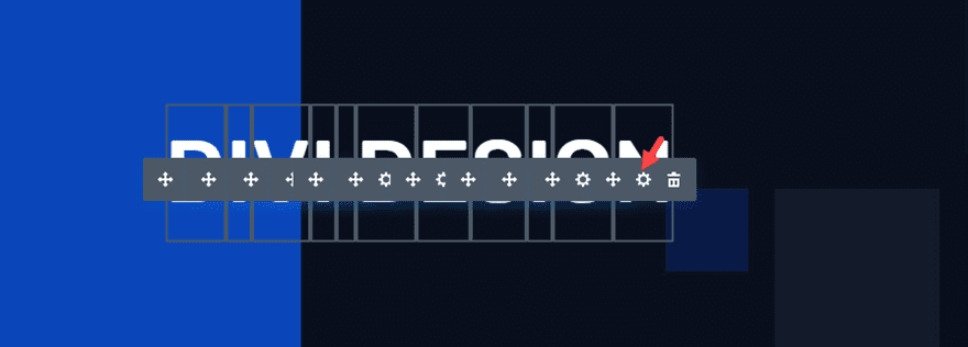
This will open the element settings modal which will allow you to update the settings for all selected modules. We don’t want to change the animation delay because we want to keep the cascading effect on each of the letters. However, we can update the other animation options in different ways to create completely unique results.
I suggest duplicating the section before testing out a new animation so that you can keep the previous examples.
Here are a few examples.
Reverse Zoom Text Animation
To animate letters with a reverse zoom effect, update the element settings (the settings for all modules) with the following:
- Animation Style: Zoom
- Animation Direction: Center
- Animation Intensity: 200%
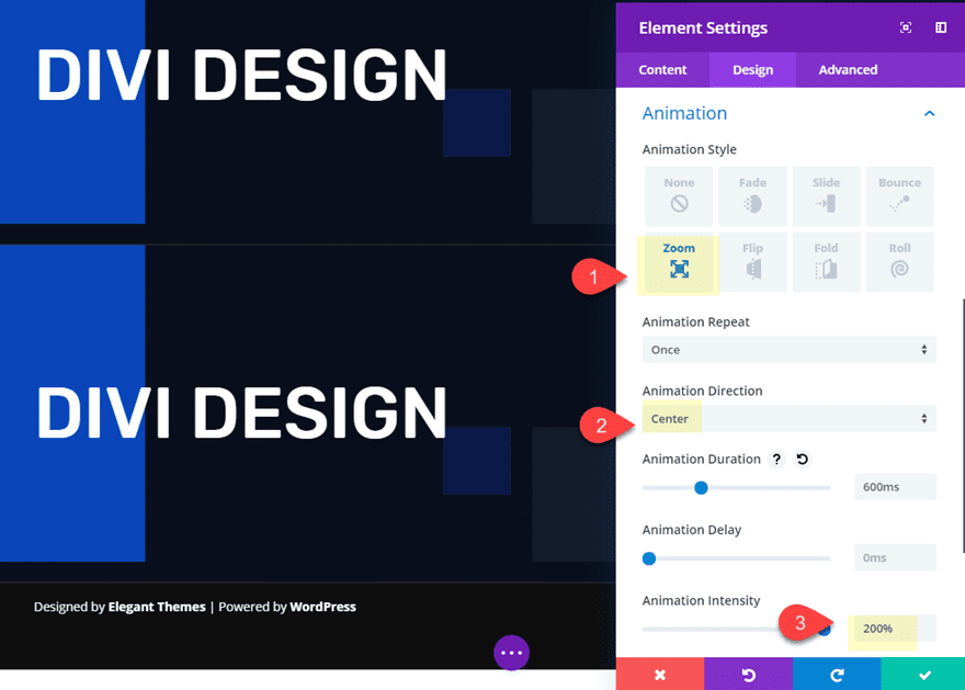
Here is the final result.

Rolling Wave Text Animation
To animate letters with a rolling wave effect, update the element settings (the settings for all modules) with the following:
- Animation Style: Rotate
- Animation Direction: Up
- Animation Intensity: 100%
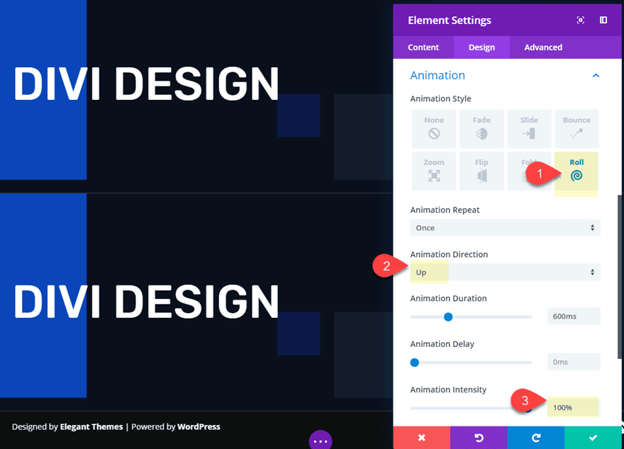
Here is the final result.

Domino Text Animation
To animate text with a domino effect, update the element settings (the settings for all modules) with the following:
- Animation Style: Flip
- Animation Direction: Left
- Animation Intensity: 100%
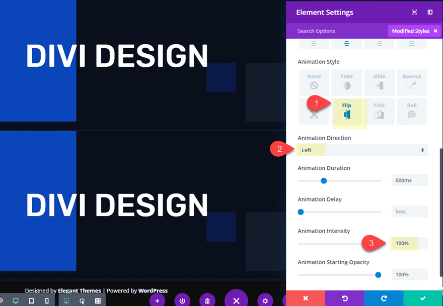
Here is the final result.

Stand-up Text Animation
To animate text with a domino effect, update the element settings (the settings for all modules) with the following:
- Animation Style: Fold
- Animation Direction: Up
- Animation Intensity: 100%

Then add perspective to create a 3d design element by adding the following css to the Main Column Element under the row settings.
Main Column Element CSS:
perspective: 1000px;

Here is the final result.

Animate Letters Using a Combination of Animation Directions
If you want to get more creative, you can animate letters using a combination of animation effects. For this example, I’m going to use a combination of animation directions and intensity for the slide style. This will give us a completely unique presentation.
Here’s how to do it.
First, duplicate one of the sections we built previously so that we can get a head start on the design process.
Then delete the first 4 text modules so that only the text “design” is displayed.
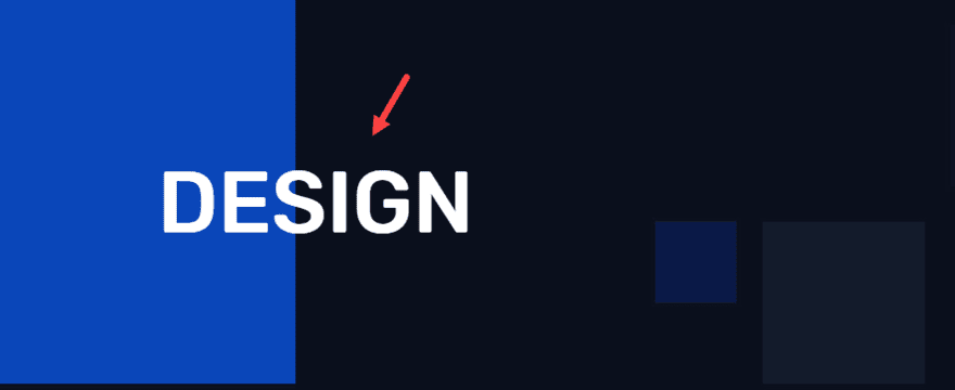
Section Settings
Next, since we want some of the letters in the animation to start outside of the section viewport, we will need to add a small snippet of css to the section settings as follows:
overflow: hidden;
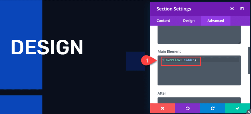
This will keep the letters hidden until the come into the section.
Row Settings
Now, to make sure our text modules (letters) stay centered, we need to add the following css to the row settings:
display:flex;
justify-content: center;
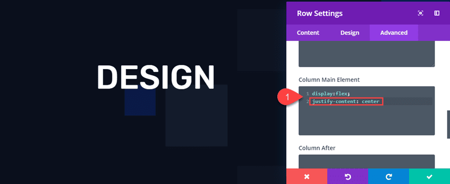
Text Module Common Settings
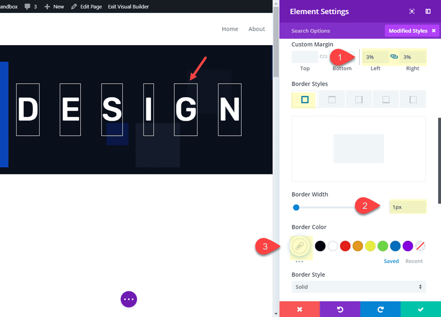
Using multiselect, update all six of the text modules with the following element settings:
- Custom Margin: 3% left, 3% right
- Border Width: 1px
- Border Color: #ffffff
- Animation Style: Slide
- Animation Duration: 2000ms
- Animation Delay: 100ms
- Animation Intensity: 300%
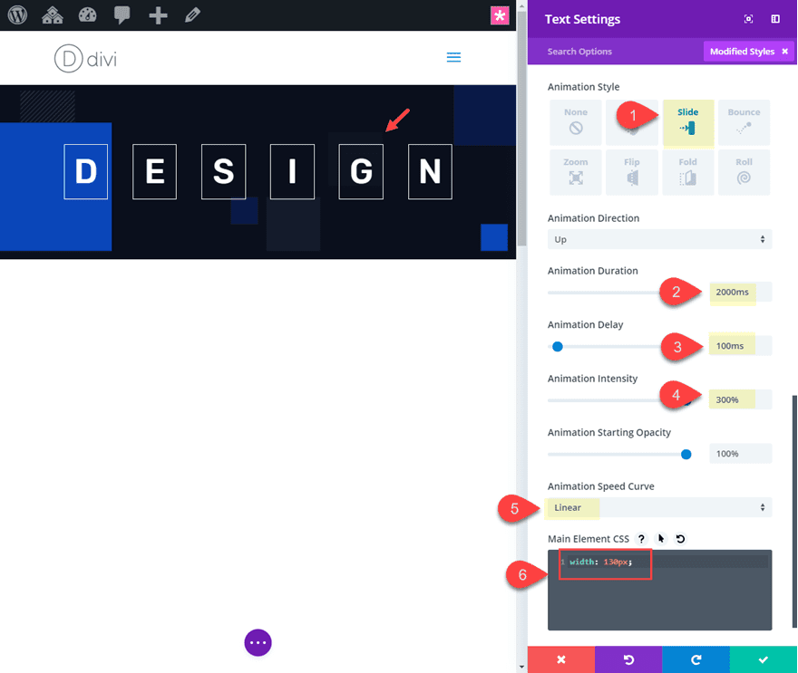
That takes care of the basic animation settings that will be common to all of the text modules. Now we can go in a tweak the animation settings for them individually.
Text Module Individual Settings
At this point, we can have some fun tweaking the individual text module settings to change up the direction of the animation for each. This will allow us to animate letters in a completely unique way. For each letter, update the animation direction and intensity as follows:
- Letter D
Animation Direction: Up - Letter E
Animation Direction: Down - Letter S
Animation Direction: Left
Animation Intensity: 80% - Letter I
Animation Direction: Right
Animation Intensity: 80% - Letter G
Animation Direction: Down - Letter N
Animation Direction: Up
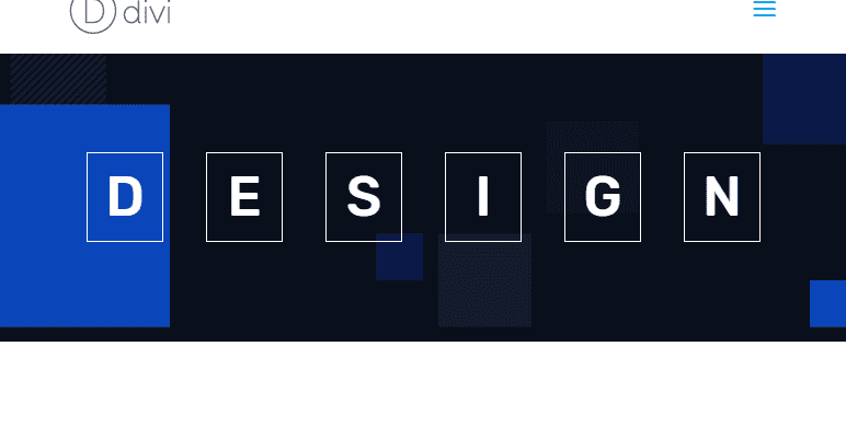
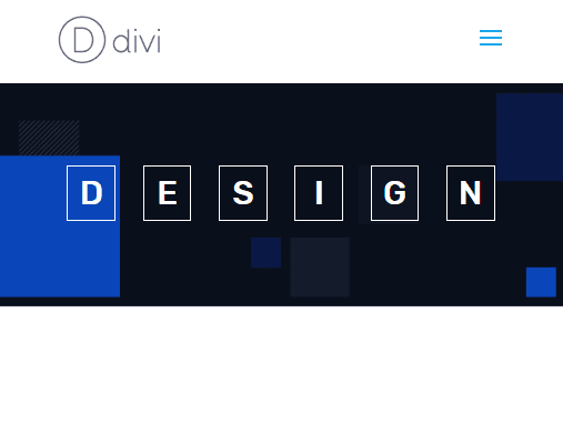
Here is the final design.

And here is how it looks on mobile.
Final Thoughts
I think it is safe to say that Divi has a lot of ways to animate letters once you have the proper setup. And I have to say that it was pretty hard to stop playing around with the animation settings when building these examples. There are so many possible variations to try! Anyway, I hope this gives you a little inspiration for your next project. If anything, you might want to build it out just for the fun of it.
I look forward to hearing from you in the comments.
Cheers!



Tried this, but the “display: flex;” isn’t adjusting the text modules to be in-line. Where might I have gone wrong?
You have to apply the display-property to the column inside the row, not to the row directly. Hope that helps someone in the future!
thanks so much, this is great
thanks so much, this is great
thanks so much, this is great
Wow, this is some great text animations for some super effects to add to your design.
Thanks
How do I get the text to show up animated immediately. I want to use it as a full width header welcome message. I placed it at the top, but it takes some second to start showing the text. First letter has a animation delay of 100ms but not showing immediately?
Thanks.
You should be able to take out the delay on the first letter and set it to 0ms. Is that what you mean?
Then you would just add 100ms to the second letter, 200ms to third, etc…
That’s it’s good for UX
Recently applied on my site
Hello,
still a great tutorial!
Thank you for sharing
Wow, Jason! I was like waiting for the javascript/jQuery and then I realize that you used only the Divi Builder and a couple of css lines. That was super creative! Love those tutorials. Thanks a lot!
Thanks Elisandro. I appreciate the comment. Glad you like it!
Another great plugin which will surely enhance the look as well as its functionality of the site with regard to animations. Definitely going to use that on my website
Huh, plugin?
This is a great tutorial again.
I tried it directly.
This is a great tutorial and Divi thems is a very useful
Nice! This is a very creative use of the animations! I like it!
Thanks PK Son. Means alot. Glad you liked it.
That’s it’s not good for SEO, isn’t it?
Marcos,
As I mentioned in the article, this is main for a design element to accent your content. Animated text using this method will not be seo friendly.
Tried the first style twice and couldn’t make it work. Sorry.
Yes. I was trying to tell users to add the html character entity for a space. If that is confusing you can always a an actual character/letter and then make it transparent.
Third time lucky but I believe there’s a problem with the instructions re adding a space.
Agreed.
I got it to work using the following :
This is a great tutorial again.
I tried it directly.
Is it possible to repeat the complete animation at the end?
You can set animation to repeat or to run once. Just select repeat and the animation should continue to repeat forever.
I’ll have to look into the last design example. I think there may be an issue with it after the latest update. I think it has to do with animation intensity being set to 300%. Anything 200% and below should work. Is that what you are referring to?